is a blog about design, technology and culture written by Khoi Vinh, and has been more or less continuously published since December 2000 in New York City. Khoi is currently Principal Designer at Adobe, Design Chair at Wildcard and co-founder of Kidpost. Previously, Khoi was co-founder and CEO of Mixel (acquired by Etsy, Inc.), Design Director of The New York Times Online, and co-founder of the design studio Behavior, LLC. He is the author of “Ordering Disorder: Grid Principles for Web Design,” and was named one of Fast Company’s “fifty most influential designers in America.” Khoi lives in Crown Heights, Brooklyn with his wife and three children. Refer to the advertising and sponsorship page for inquiries.
This incisive tweet from type designer James Edmonson of Oh No Type Co looks like a humorous one-liner but is actually a brilliant piece of criticism. In just four words, he summarizes the pervasive tendency towards a visual uniformity that seems to draw in nearly every major tech brand operating today.
When I read it it struck me as a good companion—a much more succinct and effective one—to the post I wrote here in January about the near ubiquity of a very specific, narrow band of visual expressiveness in illustrations for tech brands. Like that post, this tweet raises questions about what kind of culture we’re building online and whether it’s as truly diverse as their ostensibly progressive shepherds would claim. For me it also asks the question of why we aren’t examining the design language of these companies with more rigor?
Consider the macro trend of these brands all visually converging alongside the industry’s current mania for design systems. That juxtaposition suggests that we’re far more interested in implementing ideas than we are in ideas themselves. Put another way, as practitioners of design we’re most comfortable asking questions like “How do we implement our brand’s design language, propagate and scale it, and make sure it’s consistent?” We’re much less comfortable asking questions like, “What’s the larger context for the brand we’re building? Are we making a unique and worthwhile contribution to the value of our company, to the world at large, or even to our profession?” It’s the difference between merely executing ideas and really understanding them.
Last week American Airlines failed in its second attempt to register its logo with the U.S. Copyright Office. Apparently the body was unimpressed by the level of distinction inherent in the diagonal shape, meant to suggest both a wingspan and a runway and interrupted in the middle by a stylized eagle’s head. In a written explanation a spokeperson said, “A mere simplistic arrangement of non-protectable elements does not demonstrate the level of creativity necessary to warrant protection.”
This current logo is of course the one that, back in 2013, replaced American Airlines’ longstanding and iconic Massimo Vignelli-designed identity. While I prefer Vignelli’s, I’m surprised by this rejection by the Copyright Office. First, it’s surprising that a major corporation with the heft of American Airlines has been unable to push through a successful copyright application. You would expect them to have more sway.
But I’m more interested in the fact that the Copyright Office is essentially rendering a design judgment here. I know nothing about its operations, but a quick look at the body’s web site shows that its leadership team is largely composed of lawyers and policy makers. I don’t doubt their expertise in copyright law of course, but do they know design? What level of expertise do they have in logotypes and corporate identity, and is that even a required area of knowledge to serve on this board?
More to the point, shouldn’t there be a designer on their leadership team at the U.S. Copyright Office, someone with proven experience in the design industry who can help give context to cases like this? I’d never thought about whether there should be design representation in copyright before, but now I’m very curious about how our industry’s work is affected by how this body operates and renders judgments. To my eyes, this logo is easily more than a “simplistic arrangement of non-protectable elements.” It’s not exactly my taste, but it’s as good as countless others out there.
At the beginning of January, before everyone came back from the holidays, I indulged myself in what is, for a parent of young kids, an unimaginable luxury: one full afternoon spent by myself, at the movies. I started with Steven Spielberg’s Pentagon Papers dramatization “The Post”. And I followed that with Aaron Sorkin’s “Molly’s Game,” which tells the story of Molly Bloom, a former Olympic athlete who came to run a high-stakes poker game for Hollywood’s elite. It was kind of a liberal’s double-header, you might say.
“The Post” is like a lot of Spielberg’s recent prestige fare: overly earnest and really, really on-the-nose about what it wants you to think and feel. It’s also visually nauseating; cinematographer Janusz Kaminski’s highly stylized atmospherics have all the personality of one of those sickly sweet Hallmark posters with little kids giving each other adobrable kisses that they issued to everyone’s dentists in the 1980s. Still, the movie is not ineffective and I found myself wrapped up in it way more than I expected to be. Good flick for the plane, if it happens to be playing.
As for “Molly’s Game,” it’s tough to know which Aaron Sorkin is going to show up for any new project: the brilliant, hilarious storyteller responsible for “A Few Good Men,” “Sports Night” and the best years of “The West Wing”? Or the didactic, agenda-obsessed debate club vice-president of “Studio 60 on the Sunset Strip” and “The Newsroom”? Luckily it’s mostly the former who was on duty for “Molly’s Game” which also happens to be Sorkin’s feature film directorial debut. He generally knocks it out of the park with a smart, expertly paced, fully gripping thriller disguised as a biopic. Mind you, the movie itself is preposterous in its framing of virtue and vice, and it’s as flawed as any Sorkin work. Nevertheless it’s a blast.
Including those two, I watched a total of fifteen movies in January. Here is the full list:
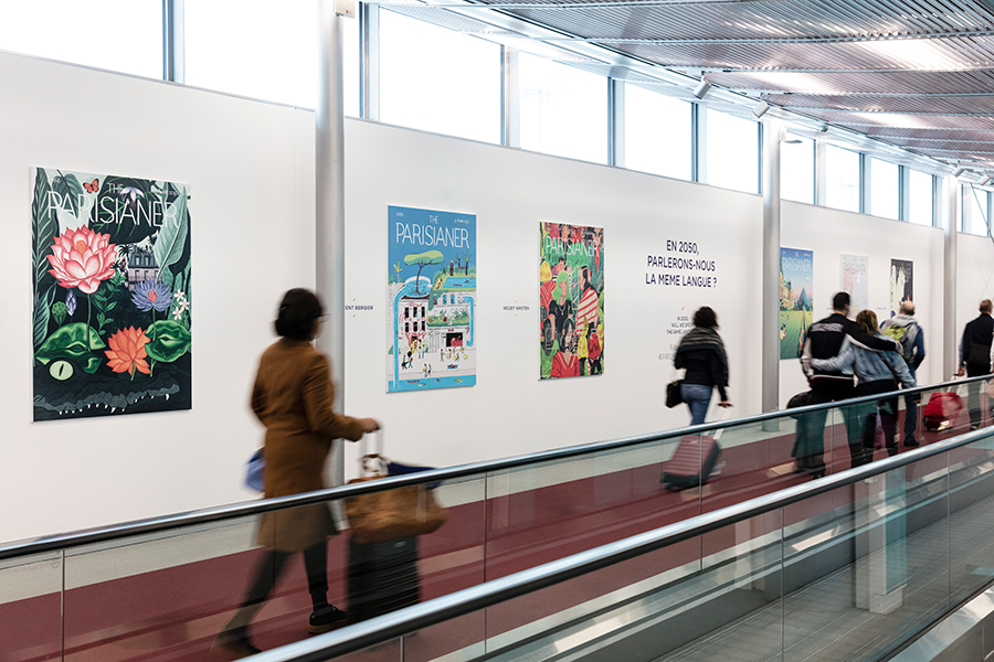
I’ve seen a decent number of airport art exhibitions in my time, but I’ve never seen one as good and as extensive as “The Parisianer 2050,” on display right now at Charles de Gaulle airport in Paris. I landed here this morning on my way to a week of conferences and meetings in Lyon and Berlin, and I was pleasantly surprised to see the fifty or so large graphic prints that make up this exhibition lining the long corridor between my gate and immigration.
“The Parisianer” is of course a riff on the long, grand illustrative tradition of The New Yorker magazine’s covers. There is no Parisianer publication, but as a project it has been running for nearly five years. It’s a kind of ongoing a platform for French illustrators to do wonderful work celebrating the City of Lights. This exhibition is actually a preview of an upcoming book whose theme is imagining the Paris of the future and the artwork is phenomenal. It’s a perfect greeting for visitors and it will be on display for the next few months in Terminal 2E, Hall M.
By the way I’ll be in Lyon the next few days where I’ll be giving a talk about design criticism at IxDA’s annual Interaction 18 conference. Then, on Friday, I’ll be at Awwwards Berlin, where I’ll be giving a talk about how we can level up the design industry. Then, on Monday, I’ll be making an appearance for the IxDA Berlin chapter too. If you’re in Lyon or Berlin, join us!
Below are some samples from “The Parisianer 2050,” prints of which are conveniently for sale at image-republic.com.
This short documentary video that The New York Times posted a few days ago keeps nagging at me. It’s called “Your Train Is Delayed. Why?” and it’s an eleven-minute “explainer” that unravels the many historically thorny reasons why the New York City subway system has come to own “the worst on-time performance of any major rapid transit system in the world.”
If you live in New York or if you’re interested in why this icon of public transportation and civic infrastructure is now in a state of emergency (literally), then this video is genuinely informative. It’s also really bewildering. Its tone is so informal, so whimsical and, occasionally, so irreverent that I’m kind of shocked that it comes from The New York Times. Watch it and you’ll see playfully abrupt edits, humorous captions, vintage film footage, animated cutouts and even a busker who was hired to sing tongue-in-cheek verses about the subway system. It’s not particularly “Timesian,” as they say at the Gray Lady.
It’s actually all pretty entertaining but its style is also pretty patronizing, if you ask me. The Times has never been afraid of explaining things clearly, but at its best its journalism never underestimates its audience. And there are parts of this video where any reasonably intelligent viewer would feel like they’re being talked down to. Skip to the 3:03 timestamp at which point a toy train set (really) is used to illustrate a key historical decision. At first the track is turned to the left towards one possible decision, and then it’s repositioned to turn to the right towards another. Get it?
What nags at me though is not so much this execution as the question of whether this is what journalism needs to look like in this day and age to succeed? Is this video an example of the style—of the attitude—that reporting needs to adopt in order to resonate with online audiences?
The thing is, I don’t even mean to condemn this approach, because it has its merits. A more Timesian video would have been sober to a fault, and probably much less interesting. This, at the very least, is not that. I also recognize that the Times has to find younger audiences in order to thrive, and that the process of learning how to do that will inevitably strike traditionalists as confounding if not appalling. And maybe that’s all this is: one iteration in a process of finding a balance between the organization’s traditional values and the vastly different landscape. That’s fair; I can’t fault them for trying something different. I just kind of hated myself for watching it—which come to think of it is the way the rest of the Internet makes me feel, so I guess they’re on to something.
I’ve written here before about my Fake TV, one of my favorite device purchases from last year. It’s a simple, compact box covered with multicolor LED lights that emulates the effect of a television illuminating a dark room. The idea is to deter prospective burglars by giving the impression that someone is at home.
That same concept is at the heart of Kevin, a new device being funded through this just-launched Kickstarter campaign. Taking its name from Macaulay Culkin’s character in the immortal “Home Alone,” Kevin is what you might call a “smart fake TV.” That means it’s a wifi enabled, internet of things-y, fancy schmancy design object with richer, more varied, and more intelligent light emulation routines than my Fake TV. It also takes the illusion even further by including a variety of ersatz audio—there are sounds that give would-be intruders the impression that the family is home, having dinner, rooting for a favorite team during a big game, enjoying a movie, or even exercising strenuously. Everything can be controlled through Kevin’s mobile app (which looks copiously illustrated in the de rigeur tech aesthetic I wrote about a few weeks ago). This video demonstrates Kevin in action:
The basic technology at the heart of Kevin—programmable LEDs and playback of prerecorded sounds—is straightforward enough that it seems like a relatively low-risk Kickstarter gamble. Its network capabilities also suggest that buying several of them would make for a pretty convincing solution for an entire home; you can imagine programming three or four of them to simulate a fully active household. Kevin also sports a much, much more attractive industrial design than the hideous Fake TV; it looks as good as any Sonos or smart speaker, at least in the press photos. But, at about US$200 each, Kevin is also roughly many times as expensive as a Fake TV. If that doesn’t discourage you, you can back the campaign at kickstarter.com.
Here is an excerpt from an article I contributed to Fast Company’s Co. Design and just published today. It’s titled “Design Discourse Is In a State of Arrested Development,” and it digs into the issue of how we’re talking about our profession—and how we’re writing about it.
We are lucky to have designers actively sharing knowledge, but we’re starved for good journalism and criticism. In some ways, we’re even averse to it. Our tendency is to focus on techniques and tools, and to ignore the deeper questions. And it’s not just that we’re unwilling to examine our failures; we’re just as likely to focus only on the superficial aspects of our successes, too.
This is largely a function of what has become design’s overriding imperative, the one qualification that defers all others: conversion. Did the design turn a visitor into a subscriber, a reader into a prospect, a casual user into a registered member, a shopper into a customer? Did the design induce the user to click again? And, ideally, again and again? If the answer is yes, then nearly everything else is shunted to the side.
And it’s here that those questions about design’s larger meaning in our society and culture go unasked. Amid all the focus on clicks, no one bothers to wonder: Is what was designed actually in the long-term interests of its users? Does it model healthy or unhealthy interactions and behaviors? Does it strengthen the long-term relationship between the brand and its customers? How does it contribute to the way people relate to technology, media, and to one another? Is the design aesthetically good or bad? And why?
It’s a good summary of my thoughts on this current situation and I encourage you to read it. The full article is at fastcodesign.com.
John Lee Hancock’s “The Founder” is not a great movie, but after watching it on a plane a few weeks ago, I can’t seem to stop thinking about it. It tells the genuinely interesting story of how entrepreneur Ray Kroc, entertainingly if unexceptionally portrayed by Michael Keaton, transforms Mac and Dick McDonald’s innovative one-location burger stand into the defining brand in fast food. Hancock’s direction is unfortunately unabashed about the script’s painfully expository dialogue and rarely digs particularly deeply into any of the film’s characters. Nevertheless, there are some interesting ideas at work here, particularly for designers.
The most apparent is a first act sequence in which the McDonald brothers recount how they essentially invented fast food. Frustrated with the inefficiency and commoditized nature of their traditionally operated drive-in restaurant, the brothers decided to drastically narrow the breadth of their menu offering.
To that end they also drastically overhauled the way those items were prepared so that customers’ orders could be fulfilled in a mere thirty seconds. Dragging their kitchen employees along to an empty tennis court, they used chalk to map out possible arrangements for the restaurant’s various cooking appliances and prep stations, essentially user testing their way to the most efficient layout and an accompanying “assembly line” approach to food preparation. You can get a preview of how Hancock recreates this process in this short “Anatomy of a Scene” video from The New York Times:
The brothers may not have immediately recognized that their innovation would change the way the world thinks about food (for better or worse) but they at least understood its value enough to brand their unique workflow as “the Speedee Service System,” and then to christen their first mascot, a burger-headed cartoon figure also named Speedee, after it. That method is also what drew the interest of Ray Kroc who partnered with the brothers and undertook the franchising of the McDonald’s brand and its revolutionary approach, effectively turning it from a local restaurant into a global phenomenon.
Therein lies the controversy implied in the film’s title. Late in the movie, Kroc introduces himself to another character as “The Founder” in a moment loaded with dramatic irony. As viewers we of course know that the McDonalds brothers were the “real” founders of their burger restaurant. The moment is meant to crystallize Kroc’s betrayal of the brothers’ legacy and it symbolizes the point at which Kroc usurps the company, essentially snatching it away from his two business partners.
As viewers, we’re meant to ask, “How could Kroc even think of himself as the founder when he wasn’t there in the beginning and he didn’t invent anything?” Hancock is unambiguous in crediting the McDonald brothers with the traditionally understood traits of founders as genius inventors or a preternatural innovators. Kroc, by contrast, is portrayed much less sympathetically, as a businessman who has low regard for the brothers’ founding vision. In some ways, the movie also implies that Kroc would not have been successful without McDonald’s. Before encountering the Speedee system, it shows him working as a traveling salesman, chasing elusive entrepreneurial dreams with middling success.
Yet there’s another, less idealistic interpretation of these events that’s worth examining. Kroc may not have been the originator of everything that became McDonald’s, but it’s clear that he saw its larger potential and that he undertook the work that was necessary to turn it into a huge corporation. The McDonald brothers had in fact tried to franchise their restaurant, but failed miserably. It was Kroc who turned the concept into a real, thriving business—a Herculean task of its own. It may have been the brothers who started that burger stand, but there’s a reasonable argument that it was Ray Kroc’s own hard work and sacrifices that truly “made” the company. The McDonald brothers founded a restaurant called McDonald’s. Ray Kroc founded the McDonald’s empire.
To Hancock’s credit, he does allow for this reading; he shows us that Kroc’s mantra is persistence, that he believes an unwillingness to give up is the key element in succeeding in business as an entrepreneur. We see Kroc listening to motivational recordings extolling the values of persistence early on, as a traveling salesman in a cheap motel room, without much in the way of success to show for his efforts. And then we see it again at the very end of the film, as Kroc stands in front of a mirror in an expensive tuxedo, rehearsing a triumphant address he’s about to deliver to an audience. The text of his speech echoes the recordings he listened to early on. It’s a key moment that demonstrates the importance of that concept in the realization of his ambitions.
As a designer myself, I’m naturally drawn to tales of brilliant insights and breakthrough designs, and it was fascinating to learn that the origin of McDonald’s was in part the story of inventive design. And, given the way the McDonald’s brand has changed over the years and become a signifier of questionable quality on a mass scale, it’s tempting to look upon Kroc’s achievements as a betrayal of a pure notion of design.
But setting aside the movie’s bias towards the brothers and what we know about the company today, what’s clear from watching “The Founder” is that the work of building a business has a value of its own. For me, this is the most interesting idea from this movie: that there’s always a tension between creation and business, and that ideas, for all their power, sometimes—often—realize their potential only through persistence.
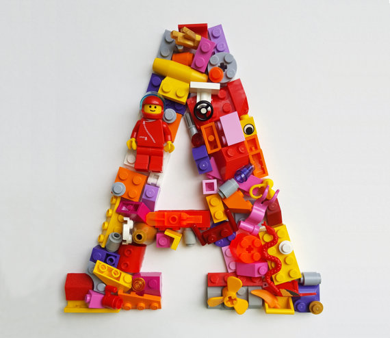
While researching ideas for a Lego-themed birthday party for my Lego-crazed twin boys I came across these clever display letters, custom-made by this Etsy shop. They’ll create any letter for you, though the ones on display spell “C-SPAN,” for some reason. Anyway, an unexpected and impressive overlap of my kids’ interests and mine.
At the beginning of each month I recap the movies I watched the previous month. You can find December’s log further down this post (with some comments on P.T. Anderson’s “Phantom Thread”) but before we get to that here is a wrap-up of everything I watched in 2017. According to my Letterboxd diary that came to a grand total of 191 movies. That beats my 2016 total by five and averages out to just under sixteen a month, a pace I credit to my continued adherence to a largely television-free diet. I’m going into my third year doing this now and I don’t miss TV much at all, especially as eschewing it has afforded me the time to watch and re-watch so many great or obscure or fondly remembered movies that I’d never be able to otherwise. Television is a waste of time, people.
I tried to make a list of the top ten movies of 2017 but when I did so I realized that I didn’t really see ten films that I would consider truly great, just a lot of pretty good ones. That said, there are some notable awards contenders, including “I, Tonya,” “Ladybird,” and “Call Me By Your Name” that I haven’t been able to log yet, and it’s reasonable to say that at least one or two of those would’ve made the list. Nevertheless here are the top six best films from 2017 that I saw.
You can see the running inventory of every 2017 movie that I saw and how I ranked them in this Letterboxd list. For more insight into how I spent my movie time in 2017, have a look at this “annual report” of my movie watching activity. It includes this grid of posters from all 191 movies.
I also saw twenty films in December, making it out to theaters four times. The highlight was “Phantom Thread,” the latest by P.T. Anderson and, reportedly, the last screen appearance that Daniel Day-Lewis will ever make. Anderson’s films tend to be about the courts that men of power convene around themselves and this is one of his best explorations of that milieu. It’s hilarious and chilling and rapturous and deeply, deeply messed up all at once. Don’t read anything about it; just go see it.
For the record, here’s the full list of everything I watched, including December’s twenty movies.
“Moana” Hey, this movie is really, really good, people.
“A Face in the Crowd” An amazing, sadly prescient story of a megalomaniacal TV personality who comes to abuse his outsized influence on the American public.
“Ingrid Goes West” Pretty good though at the end it cops out in a major way.
If you’re interested, you can peruse the 186 movies that I watched in 2016 in this blog post. You can also follow along with my film diary over at letterboxd.com. Here’s wishing you a happy new year of movie watching!