Voting tickets for the 2014 Legislative Council election in South Australia have been released. You can see my summary of the full detail of the tickets here.
In this post I attempt to analyse the key preferences, and at the end I will hypothesise about what the final results could be.
The Least Preferenced Group (or, the most preferenced against group)
The Independent Nick Xenophon Team are the group that are most preferenced against, with a huge 8 last preferences out of 27 tickets. The runner up for most last preferences is a tie between The Greens and Legal Voluntary Euthanasia, but they only have 3 apiece.
If you look more broadly at the least preferences and count the number of preferences in the bottom 5 each group received, it is a tie between the Nick Xenophon Team and the ALP, with 14 groups apiece.
This means that as in the last federal election, the Nick Xenophon Team will be relying on basically just their primary vote to get elected, and they cannot expect many preferences to flow their way.
The ALP, Liberal Party, Greens, and Palmer United Group have also been strongly preferenced against.
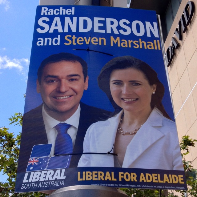
Liberal Party preferences
The Liberal Party have preferenced The Greens above the ALP, a reversal of the position they have taken recently in other jurisdictions. The ALP is preferenced last, and the Greens second last.
Liberal Party preferences flow first into Family First, then into Palmer United, then Nick Xenophon team, then Shooters and Fishers. If there is any Liberal Party overflow this would be a big boost to these groups if they stay in the count long enough.
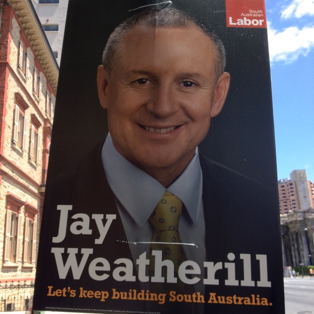
Australian Labor Party preferences
ALP preferences go straight into The Greens, a huge help for them if there is ALP overflow. After that they go into Dignity for Disability, Family First, and then Powerful Communities.
It is a little surprising to me that Family First are preferenced so highly on the ALP ticket. There is nothing in the Family First voting ticket that immediately suggests to me a preference deal, although that is not out of the question.
The ALP have preferenced the Nick Xenophon team seventh.
Greens preferences
The Greens have distributed their preferences through a series of very small parties and groups. The two that they are most likely to help are Dignity for Disability (8th) and the Nick Xenophon Team (14th). The ALP are preferenced 15th.
Nick Xenophon Team preferences
Nick Xenophon has adhered to his usual practice of lodging two preference tickets, one flowing quickly into the ALP and the other flowing quickly into the Liberal Party. Before the major parties, they have preferenced Dignity For Disability, Powerful Communities, and Multicultural Party on both tickets.
The Nick Xenophon Team are a big unknown in this election - how strongly will they poll without Nick Xenophon as an actual candidate?
Other parties and groups
If there's one thing that the micro-parties seem to agree on, it's to preference Nick Xenophon, the ALP, and the Liberal Party very low.
Obviously it is impossible to tell how useful the preference deals they have made with each other will be until we know the results, but for now let's assume nothing about the final order of candidates.
Both Powerful Communities and the Multicultural Party have done well with lots of voting tickets giving them very high preferences, and no tickets giving them very low preferences.
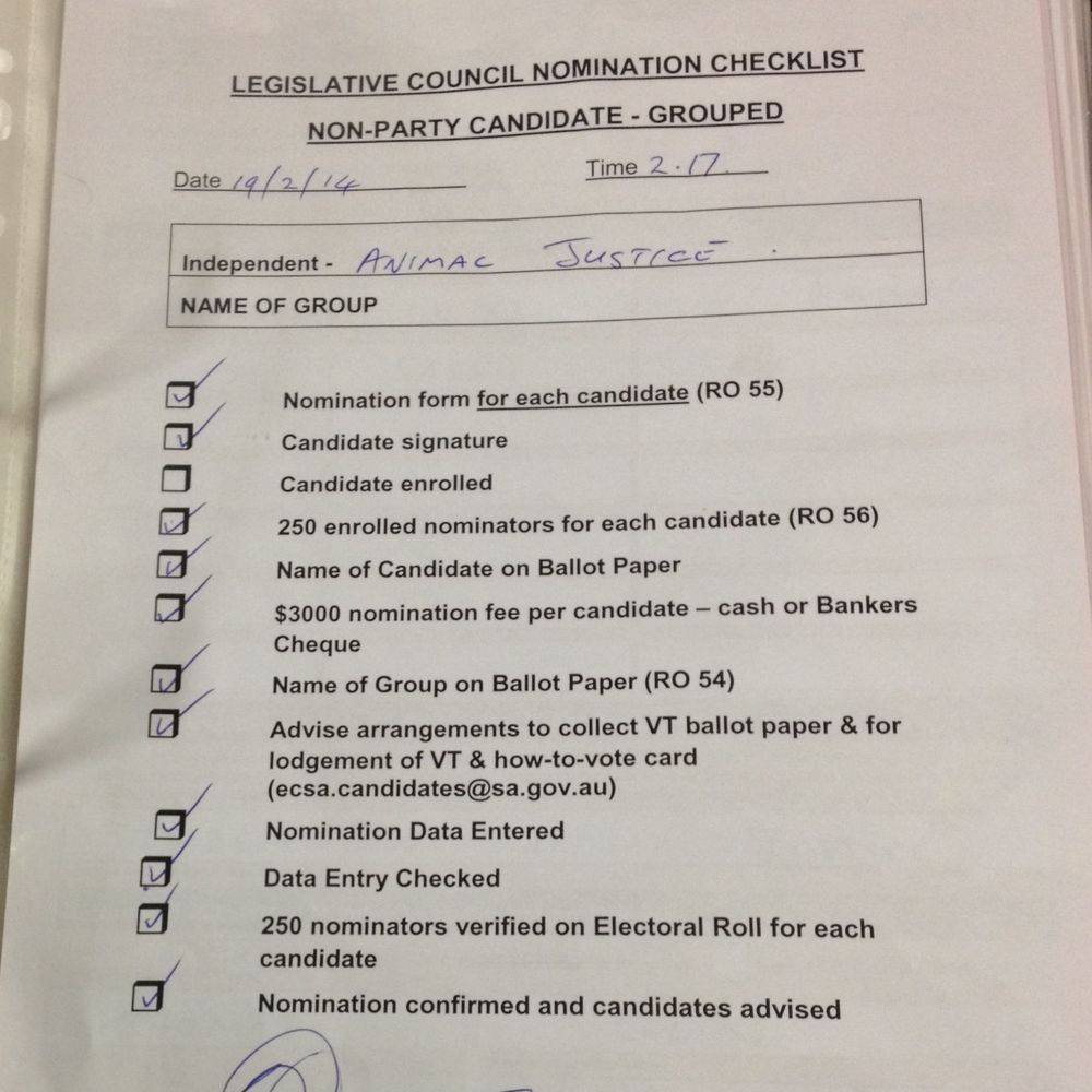
Animal Justice also have lots of high preferences, but they are counter-balanced by some very low preferences.
Family First have a lot of very low preferences, but have picked up key high preferences from Palmer United, Katter's South Australian Party, The Nationals and The Liberal Party. This will be very helpful to them if they can get enough first preferences to avoid elimination before these parties flow (or their overflows do).
The Shooters and Fishers Party have also picked up high preferences from Palmer United, Katter's South Australian Party, The Liberal Party, and the Fishing and Lifestyle Party. Again, this will help them a lot, provided they poll high enough on first preferences.
The Shooters and Fishers and Family First could well find themselves in direct competition for one seat in the Legislative Council.
Guessing the result
No, I'm not going to try and predict the result. As we know by now, small changes in the results can greatly affect the actual results.
But here are a few scenarios that are reasonable and believable outcomes. They are very much guesses and you should really hold very very very little faith in them. I think that these are likely to be the first 9 seats in the Legislative Council (not elected in that order, I've just grouped them by party):
- Liberal Party
- Liberal Party
- Liberal Party
- Liberal Party
- ALP
- ALP
- ALP
- The Greens
- Nick Xenophon Team
For the final two seats, it's a fight between a few parties for each one. I would guess one is likely to go to the 'right' side of politics, and one to the 'left':
Family First OR Shooters and Fishers OR Liberal Party OR Palmer United
The Greens OR ALP OR Dignity for Disability
Alternatively, Nick Xenophon could poll strongly enough to elect two candidates, in which case there would be a huge battle over the last seat.
I told you I wasn't going to predict the result. Those are the parties that I think are most likely to be elected. However, as we know, anything could happen.
I haven't spent a lot of time analysing these preferences, so these are just my initial reactions to the voting tickets. If you think I've missed something or I'm wrong (let's face it, I probably am), leave me a comment or send me a tweet @CaseyBriggs.