bath

photo: sally schneider
The soap dish is one of those inventions that seem destined to NOT fulfill all the requirements we need them too. Designed to keep bar soap from sitting in water, the wet residue from the soap has to end up somewhere, either on the sink/tub surface or in the bottom of the soap dish, requiring cleaning later.
When we moved into our new space recently, finding a well-designed soap dish was not high on our list of endless more-essential things to accomplish. Without thinking, we improvised one: a simple dry sponge we’d had on hand. It absorbed the watery residue from the bar of soap with no mess, and because it barely got wet, there was no issue of mildewing. To clean it, we just wet the sponge and rinse it out. It seems we’d inadvertently found the perfect soap dish.
H-m-m-m. What if we got a nice looking sponge, like a white one ? (Is there such a thing as a white sponge)? We discovered Twist Naked Sponge on Amazon . read more…
07.17.12 |
comments (4) |
in bath, bathing, cheap + great, copy this!, d-i-y, housewares, inside, materials, resources, solutions |

Months ago we clipped a post we’d seen about a Tyvek shower curtain sold by Grain design. We filed it away as a possibility for our soon-to-be-renovated bathroom, since it was touted as being completely waterproof, mildew-resistent and fabric-like (you can even draw on it) with no off-gassing like regular plastic shower curtain liners. The photos on their site showed a pristine, creaseless shower curtain that looks as though it had been ironed.
read more…
06.18.12 |
comments (3) |
in bath, bathing, cheap + great, elements, inside |

photo: sally schneider
Since moving, we’ve realized the insane number of details that comprise “a life”: where is a good dry cleaner in our new neighborhood, what to use for hooks for towels until we find ones we like?…it is endless. We’d bought a nice-looking toilet roll holder only to discover to discover that it would be “a project” – time we don’t have – to install on our sheetrock wall. So we devised one out of…rocks that we’d brought from the other apartment. (We’d hauled them from the beach years ago because they are so incredibly useful and wonderful to look at: a sculptural bit of nature.) read more…
06.14.12 |
comments |
in bath, bathing, cheap + great, d-i-y, hard, housewares, inside, laboratory, materials, reclaim, repurpose |

In 1951, while on tour of the Eames office, New Yorker artist Saul Steinberg picked up a brush and painted a naked woman on an Eames fiberglass arm chair.
Steinberg, in effect, hacked the Eames chair, turning chair into art and cooling out the iconic look; he also broke a taboo against making any changes to an artists work. We LOVE breaking taboos; finding examples fortifies us to ferret out our own. Steinberg is a great inspiration. Dig this bathtub: read more…
06.21.11 |
comments |
in art, bath, copy this!, furniture, people, projects + play, reimagine |

David Dubois (photo: Olivier Amsellem)
We LOVE this simple bed on a base of this rough-cut timbers, one longer than the other to extend beyond the bed to make a built-in side table. This bedroom is part of an exhibition at The Villa Noailles, an arts center located in the hills above Hyères, in the Var, in southeastern France. The villa is an early modernist house, built by architect Robert Mallet-Stevens for art patrons in 1925. (It has quite a history.)
Four designers were invited to design a guest room in a wing of the building, conceiving the basic furniture of a room: a bed, a table-office, bedding, a lamp and a vase.
In this bathroom, the walls were covered with artful photomurals, that expand the space (imagining it with plain walls shows the scope of the transformation, do-able in any untiled bathroom.) read more…
11.29.10 |
comments |
in bath, bathing, cool spaces, copy this!, elements, inside, materials, sleeping, walls + windows |

Could this beautiful sink stand, spotted in tiny photo story about interior designer Abigail Ahern‘s neo-baroque chandelier, REALLY be made of concrete block, one of our favorite building materials? Imagine…For less than the cost of a fiber-board-and-veneer Ikea sink stand, you can fashion one out of block, planning the placement of the blocks like a puzzle.
As we learned from our early post on Marcel Breuer’s concrete block table, there is concrete block and there is concrete block. The ones used for this sink stand are beauties. Check out the possibilities here. We learned a lot from this great “Basic Training” pdf. about concrete block.
Via Style-Files
10.06.10 |
comments (4) |
in bath, bathing, cheap + great, copy this!, elements, hard, inside, materials |

Tara Mann
We couldn’t live without the occasional hot bath to cool-out our over-worked selves. Instead of buying expensive, wonderfully-packaged bath salts, “spa crystals” and oils, we came up with a simple formula for doctoring baths that involves no effort at all, is cheap, and allows us to calibrate really pure fragrances to our mood.
We just dump a couple of cups or so of epsom salts into a hot tub; then we add a few drops of an essential oil distilled from flowers, herbs or other botanicals like lavender or rose geranium: voila, instant aromatherapy.
Epsom salts are an old-fashioned, tried-and-true remedy for stressful living, sore muscles, detoxifying (great at the first sign of a cold). You can buy them read more…
08.08.10 |
comments (5) |
in bath, bathing, cheap + great, copy this!, how-to, materials, resources, stores, strategies |

Daniel Hale
We are so happy to have discovered Serendipity Rising, architect Daniel Hale’s blog that is mostly about the evolution of his home in Napa Valley, which seems to be a sort of laboratory for his ideas. The guy loves soft metals like zinc and lead which he cuts and hammers in unusual ways; he transforms salvaged woods and ‘finds’ by applying modern lines and layers of techniques into an eclectic take, like this incredible flight of stairs: “I layered black over brown and ran a strip of lead sheeting up the middle”. What he does to his own house is freer than the “client” work we’ve seen, as he follows his ideas for his own pleasure. “Tickle” is a recent post – a sort of poem-story (edited here) – about his violent and fearless transformation of an old piano, which had been left in the winery he turned into his studio: read more…
07.19.10 |
comments |
in bath, cool spaces, elements, floors, inside, materials, people, reclaim, repurpose, resources |

Maria Robledo
Whenever I go my artist friends Holton Rower and Maria Robledo‘s house, I see “everyday” things turned on their ear. Like this square bar of soap placed in a too-small bowl in such a way as to shift the usual view AND be a practical way to not have soap sit in water. It reminded me of a “soap dish” Holton made for his studio’s shop years ago: a block of wood with parallel saw cuts that allows the soap to drain. read more…
05.18.10 |
comments |
in bath, copy this!, housewares, why not? |

Ellen Silverman
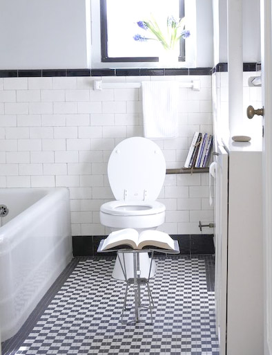
Bathroom reading is a specialized and very personal genre of literature. I imagine everyone has his/her idea of what passes muster for bathroom reading, what its essential qualities must be. Of the books that have had a place on my makeshift bathroom shelf (a pipe) for some time - as opposed to magazines or newspapers that come and go- I look for books that I can open anywhere and find something entertaining, illuminating or educational. Proper beginnings and endings don’t matter. A folding aluminum camp stool (yikes!) I bought at the flea market serves as a book stand.
As a way of finding interesting new things to read and share in the unique sensibilities of ‘the improvised life’s readers, I invite you to join in our first reader’s survey. Please take a few minutes to list your favorite bathroom reads in the Comments.
I’ll start with my current line-up (and an excerpt I came across today): read more…
11.16.09 |
comments (8) |
in bath, bathing, resources books + zines, share |

Suzanne Shaker
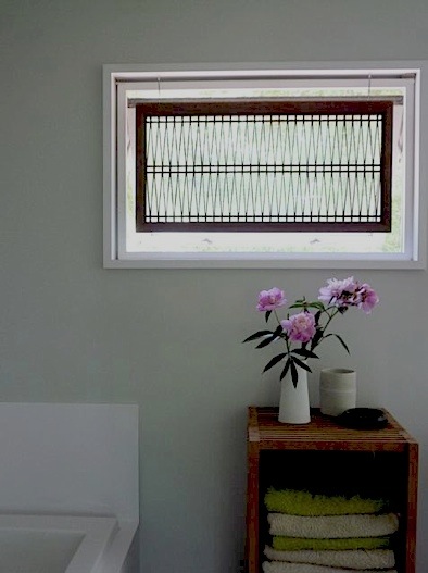
Suzanne Shaker, whose spare modernist house was posted here a while back, wanted a window shade for her bathroom that afforded some privacy, let light in and didn’t block the view completely. She found an old japanese screen with paper on the back that was ripped. She removed the paper and her husband Pete added hooks and simple chain. It’s a beautiful bit of repurposing. Here’s another picture. read more…
10.12.09 |
comments |
in bath, elements, inside, repurpose, solutions, walls + windows |

Ellen Silverman
It’s weird how easily taboos can sneak into our thinking: subtle, almost unconscious “don’t do that”s or “that’s not normal” or “not done”, that keep the status quo. They can apply the all sorts of mundane parts of our lives, and especially our living spaces. The standard height of kitchen wall cabinets is 18 inches above the counter which makes the work surface feel oppressive…why not make them higher? Why not make counters deeper than the standard 24 inches so there’s plenty of room to work, even if the carpenter or contractor says “You CAN’T”.
Ask “Why?” and you often get the answer “Because that’s how it’s ALWAYS done”. “But,” you ask, “if it’s the same amount of work to put an outlet in the middle of the wall (where it’s glaring and ugly) as it is to put it close to the counter where it blends in…why not do it the way that looks best, or is best for the way I live my life?” It can take persistence to identify an everyday taboo, and then to break it.
But taboos also apply to how we live, and what we think we can and cannot do. read more…
10.06.09 |
comments (2) |
in bath, bathing, elements, principles, reimagine, why not? |
. read more…


