Where journalism meets data
Need to learn new data skills, increase your data journalism knowledge or advance your career?
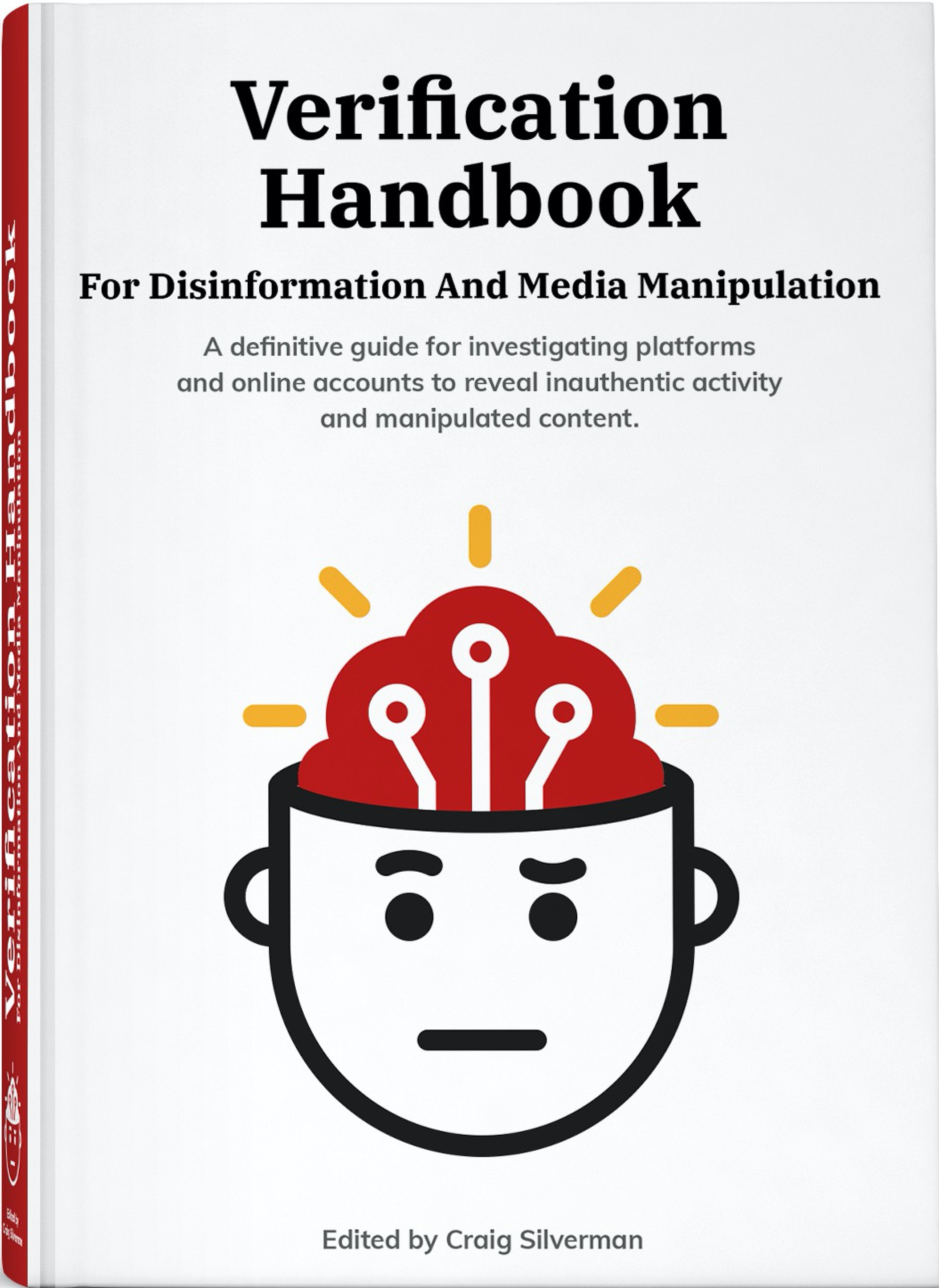
Verification Handbook
For Disinformation And Media Manipulation
The latest edition of the Verification Handbook arrives at a critical moment. Today’s information environment is more chaotic and easier to manipulate than ever before.

Reporting beyond the case numbers
How to brainstorm COVID-19 data story ideas that explain the impact
Data journalist and professor Paul Bradshaw explains how journalists can tell wider stories with data around COVID-19 that go beyond the virus' daily infection rate and death toll.

Simulating a pandemic
The backstory of The Washington Post's most-read article
Harry Stevens' hit story visualised how pandemics like COVID-19 spread, and why social distancing is critical to flattening the curve. We spoke with The Washington Post's graphics reporter about how he used data, design, and code to create compelling simulations that made an impact.

Data, diets, and disease
Best practices on the public health beat
Public health reporting has the potential to empower communities. Yet, medical research is often confusing and easy to misreport. Investigative health reporter Aneri Pattani explains how to understand medical research data, challenge it, and, of course, report it accurately and ethically.

Bringing the power of data to deadline stories
Data journalism isn't just for investigative projects or in-depth reporting. MaryJo Webster explains how to tell quick powerful stories with data when the clock is ticking.

The unspoken rules of visualisation
Designers almost always adhere to a set of strict conventions for their visualisations. Kaiser Fung examines the fundamental rules of data visualisation, why they are important, and when it is okay to break them.

Journalism first: doing advocacy with data on your side
Often referred to as the ‘fourth estate’, journalism is key to a democratic society. But sometimes just reporting on an issue isn’t enough. To promote accountability, Civio founder Eva Belmonte explains how to use data in journalism investigations to bring about change.

Data Journalism Handbook 2
Towards a Critical Data Practice
What is data journalism? What is it for? What might it do? What opportunities and limitations does it present? Who and what is involved in making and making sense of it? This book is a collaborative experiment responding to these and other questions.
Fundamental search for journalists
In this course we're going through some of the tips and tricks on how to make your own research faster and more accurate using Google's tools.

Python for journalists
This course is meant for journalists looking to learn the most common uses of Python for data journalism. You'll learn how to set up Python and all related tools on your computer, clean up messy datasets, analyse data and scrape data.

Our original Long Reads, written by the best data experts
Reporting beyond the case numbers: How to brainstorm COVID-19 data story ideas
While many journalists around the world report the daily infection rate and death toll of COVID-19, audiences are seeking other stories that show the impact of the virus on their lives. How can journalists tell those wider stories with data?
Simulating a pandemic
The most-read piece on The Washington Post's website visualised how pandemics like COVID-19 spread and how social distancing can flatten the curve. We explore the impact of the simulations and how graphics reporter Harry Stevens did it.
Data, diets and disease
Public health reporting has the potential to empower communities. Yet, medical research is easy to misreport. Aneri Pattani explains how to understand medical research data, challenge it, and, of course, report it accurately and ethically.
Bringing the power of data to deadline stories
There’s often a perception that data journalism is reserved for investigative projects or in-depth reporting. MaryJo Webster explains how to tell powerful quick turnaround stories with data -- all on a deadline.
Putting data back into context
Data are never neutral ‘givens’, but always situated in a particular context, collected for a particular reason -- and it’s crucial that data journalists understand these.
The unspoken rules of visualisation
Designers often follow a set of strict conventions when creating visualisations. Kaiser Fung examines the fundamental rules of data visualisation, why they are important, and when it is okay to break them.
The essential lies in news maps
In order to display three-dimensional world we live in, journalists are forced to distort reality. And every map does so in its own way. Maarten Lambrechts looks at commonly used maps and how to avoid being misled by them.
Designing data visualisations with empathy
How do you get audience members, much less the journalists presenting a story, to walk a mile in the shoes of a dot? Or a bar chart? P. Kim Bui provides three approaches for achieving empathy in data visualisations.
The essential lies in news maps
In order to display three-dimensional world we live in, journalists are forced to distort reality. And every map does so in its own way. Maarten Lambrechts looks at commonly used maps and how to avoid being misled by them.
Putting data back into context
Data are never neutral ‘givens’, but always situated in a particular context, collected for a particular reason -- and it’s crucial that data journalists understand these.
Spreadsheets for journalism
Many journalists see themselves as “word people” and shy away from writing about numbers. Brant Houston shows how to embrace math with an overview of spreadsheets and functions for beginners.
Designing data visualisations with empathy
How do you get audience members, much less the journalists presenting a story, to walk a mile in the shoes of a dot? Or a bar chart? P. Kim Bui provides three approaches for achieving empathy in data visualisations.
Our Data Journalism Handbooks
Towards a Critical Data Practice
What is data journalism? What is it for? What might it do? What opportunities and limitations does it present? Who and what is involved in making and making sense of it?
The new edition of the Data Journalism Handbook explores new and innovative ways in which data is analysed, created and used in the context of journalism. And beyond that: it also reflects on the social, cultural, political and economic circumstances in which data journalism is embedded.
How journalists can use data to improve the news
When you combine the sheer scale and range of digital information now available with a journalist’s "nose for news" and her ability to tell a compelling story, a new world of possibility opens up. Explore the potential, limits, and applied uses of this new and fascinating field.

This valuable handbook has attracted scores of contributors since the European Journalism Centre and the Open Knowledge Foundation launched the project at MozFest 2011. Through a collection of tips and techniques from leading journalists, professors, software developers, and data analysts, you’ll learn how data can be either the source of data journalism or a tool with which the story is told—or both.

Detailed courses and expert interviews for all workflow levels
Learn data journalism through the power of community
Join the other 9,000 members to participate in our community, to exchange ideas and stay up-to-date with the latest on data journalism.

Registered data journalism students, from all over the world
Over 27 hours of quality free video courses to watch and follow
30 hours of reading material, including 2 Handbooks and Long Reads
Content from contributors and experts in their field