
(Source: kgthunder)
(Source: kgthunder)
And therein lies the real problem of web 2.0 — whether it takes the form of SEO-driven “news” or crowd-sourced accommodation. To make money — real money — at this game you have to attract millions, or tens of millions, of users. And when you’re dealing with those kinds of numbers, it’s literally impossible not to treat your users as pieces of data. It’s ironic, but depressingly unsurprising, that web 2.0 is using faux socialization and democratization to create a world where everyone is reduced to a number on a spreadsheet.

The new beatport layout is no match for my Katamari skills.
(Source: datadebt)
I’ve designed a fair number of identities in my day, but recently have been mostly focusing on UX/UI stuff, so after seeing the bitcoin logo all over the internet recently and having friends repeatedly ask ‘dude, can you design a better logo than that’ I knew I had to take on this project.
![]()
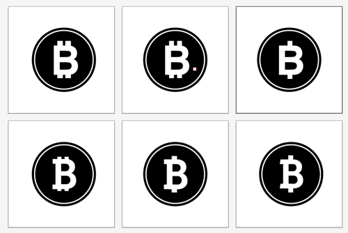
The de facto bitcoin logo going around looks a little cartoony for what is ostensibly the future of currency. The modified B is a good start, but we need something a bit more serious. And why is everything tilted?
![]()
Alright, at least the 'B’ is vertical now. This looks a commemorative poker chip graphic in some casino advertisement though.
We gotta make something hotter than this.
First, let’s look at some other, more established currencies.
![]()
![]()

Now these are some iconic currency symbols. I’m really liking the angles on that Euro. Now, time for some quick drafts in Illustrator.
A quick snapshot of just a few of dozens of B’s that were tried. Serifs look too old school, definitely gotta go with a sans font.

The cleanest most modern looking icon was the last in this series, a modified take on Museo - a very nice, clean, new font.
What’s nice about this execution is its cleanliness and versatility. It’s simple enough to write, and unique enough to stand apart from both the ’$’ and 'B’ characters. And with a bit of color it really pops.

And with a little polish you can still get a nice looking coin icon out of it. I’m horrendous when it comes to shiny metal designs, but perhaps someone will take this idea and run with it properly.
Now, for a proper logotype lockup with a bit more Museo.

Much cleaner!
And now, a proper button for vendors that doesn’t look like the shady, unproven, cryptocurrency that bitcoin is.

Who’s ready to do some online shopping?
That concludes the better bitcoin design hour. All source files are available for free use here.
If you have any questions or comments, please let us know: g [at] handsomecode.com