When we originally built Atta's site it was of course built to
the industry standards and practices of the time. By the time Atta
were ready for a rebuild however, these best practices and the
standards had changed considerably. This coupled with the fact that
Atta wanted a brand new design meant that effectively throwing away
the entire site and rebuilding everything from the ground up was
the only course of action.
A problem with their old site was that due to it's age, new
sections and content had been bolted on in ways that had originally
not been forseen, and which the existing design found it difficult
to accommodate naturally. This is why we went right back to the
discovery, and IA / UX phases. We wanted to ensure that the new
design fullfilled the site's existing requirements, as well being
able to accommodate new requirements when necessary.
 One of the changes we implemented was a much cleaner
and more accessible navigation structure for the new site. With the
old design, visitors could only reach top-level areas from the
homepage of the site. Once they had navigated to a top-level area,
a left-hand navigation menu appeared which then provided access to
sub-sections within that area.
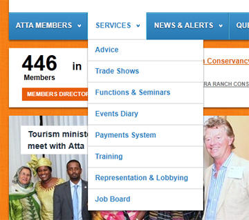
We felt that all pages should be accessible from the homepage,
so we built a clean, attractive drop-down menu that allows access
to all areas of the site from all other areas of the site. In
effect, any part of the site can be reached from any other part of
the site.
Rebuilding the site-wide navigation in this way also allowed us
to ensure that the different sub-sections were categorised and
organised logically and effectively, so that visitors could seek
out the sections they wanted to view intuitively.
The users of the Atta site can be broadly categorised into 2
different types; general visitors to the site (typically tourists)
looking for information on travel products available for the
African continent, and members of the site (which are the companies
providing the products and services). As well as ensuring the
general visitors had a great user experience with the site, it was
also very important that the Atta members were able to use the site
effectively to communicate with the visitors and that they too
received a pleasant user experience.
A key feature of the new site is the questions and answers
section where visitors to the site can post questions related to
travel and tourism in Africa. This is great for the site's visitors
because it allows them find answers to questions relevant to their
own personal requirements, without being directed to a predefined
set of common Q&As that may or may not provide the information
they need. It's also great for members because it allows them a
forum to show off their specialised knowledge and expertise on
subjects related to their specific industry.

We decided to implement a voting system for member's answers in
order to introduce and competitive nature to the questions and
answers section. This allows the most helpful members to be
recognised for the contributions to the site and allows them to
build up a reputation as knowledgable and helpful to both
individual visitors and the wider community as a whole.
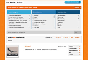
 The member's directory is
another key area of the site. It was already a part of the existing
(pre-rebuild) version of the site, but was simply a
hard-to-maintain static list of members. In the revamped version we
added advanced filtering controls that let visitors filter members
by country, category, activity, or alphanumerically. The filtering
is all based on the client rather than the server, which makes it
blazing fast, and is paginated for the borwser's convenience.
It was also important for Atta that the directory be accessible
to mobile users so that members can be searched and found by
visitors whilst on the move. To cater for this we exposed the
members directory data as a mobile site, using a custom deisgn and
template, and an open-source mobile detection library.