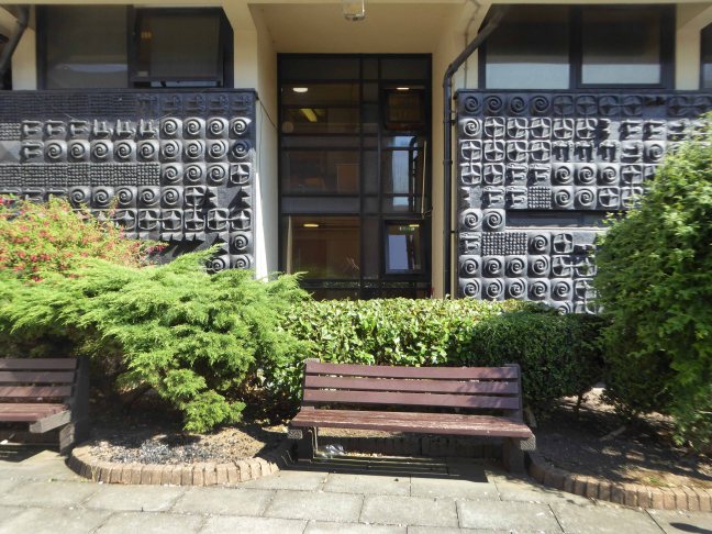
Mitzi Cunliffe – Owen’s Park Manchester

Mitzi Solomon Cunliffe January 1st 1918  December 30th 2006

American born, resident of Didsbury Manchester, sculptor and designer, responsible for, amongst other things, the BAFTA mask.

Mitzi_Cunliffe_Design

Her first large scale commission was two pieces for the Festival of Britain in 1951. One, known as Root Bodied Forth, shows figures emerging from a tree, and was displayed at the entrance of the Festival. The second, a pair of bronze handles in the form of hands, adorned the Regatta Restaurant. She created a similar piece, in the form of knots, in 1952 which remains at the School of Civic Design at Liverpool University, along with The Quickening in the rear courtyard.

p1090554

p1090555-copy

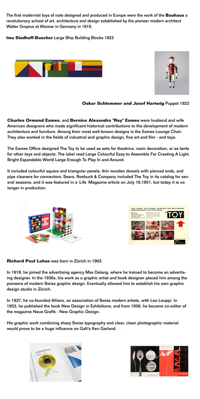
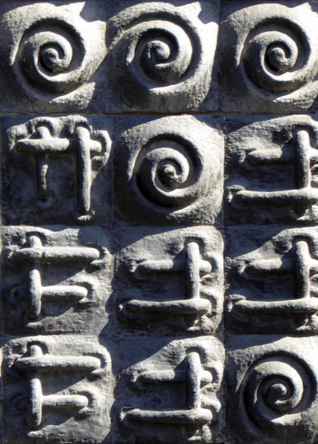
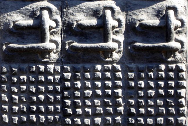
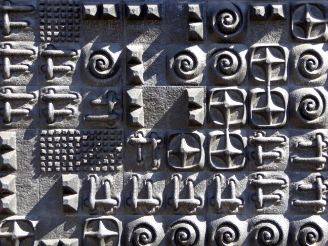
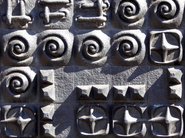
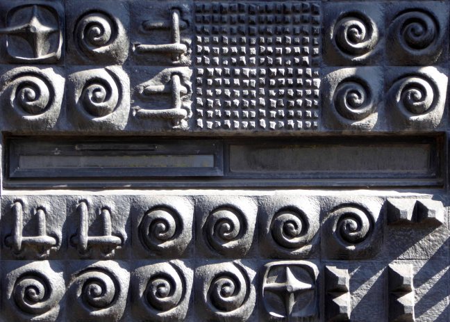
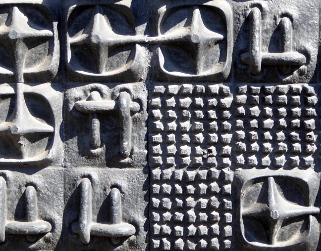
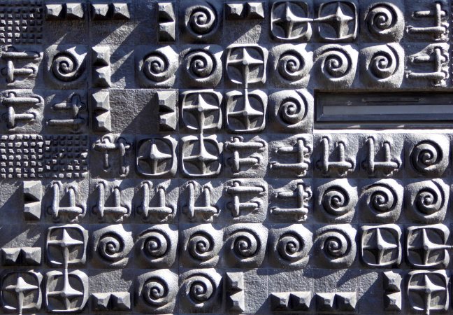
Cunliffe developed a technique for mass-producing abstract designs in relief in concrete, as architectural decoration, which she described as sculpture by the yard. She used the technique to decorate buildings throughout the UK, but particularly in and around Manchester.

d9d483ddd467272577443b6391e5a66a

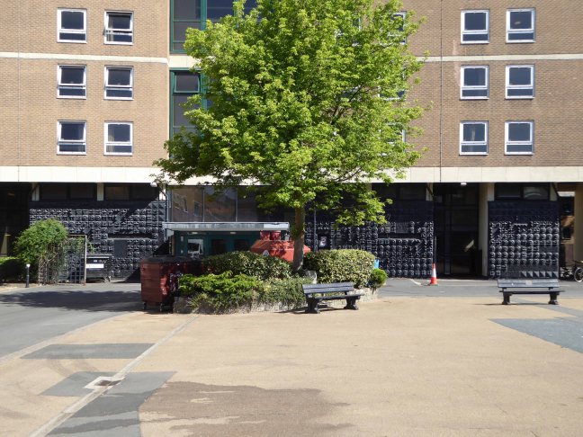
Particularly this example of four modular panels named Cosmos, set in the wall of the student halls of residence in Owens Park, Fallowfield, Manchester.

P1270299

P1270300

P1270302

P1270303

P1270304

P1270306

P1270307

P1270308

P1270309

P1270310

P1270311

P1270312

P1270313

P1270314

P1270315

P1270316

P1270317

P1270318

P1270321

P1270322

P1270323

P1270324

P1270325


Minut Men Totems – Salford

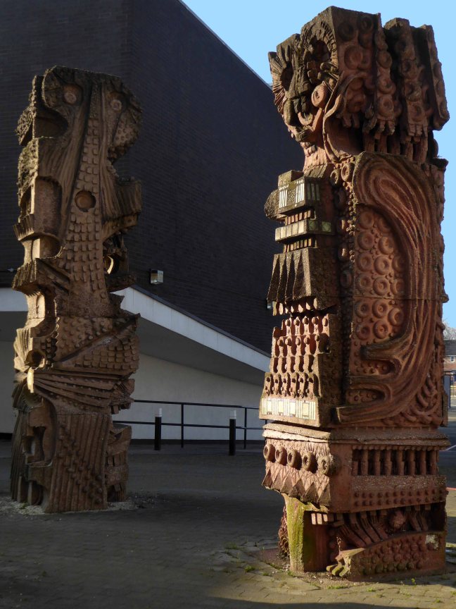
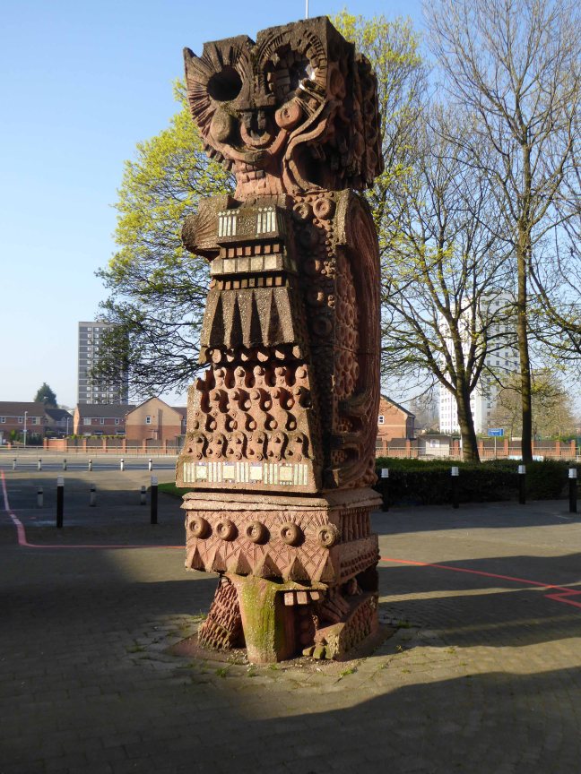
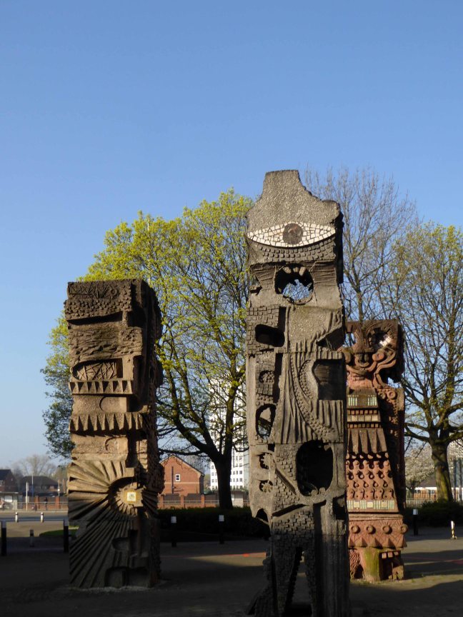
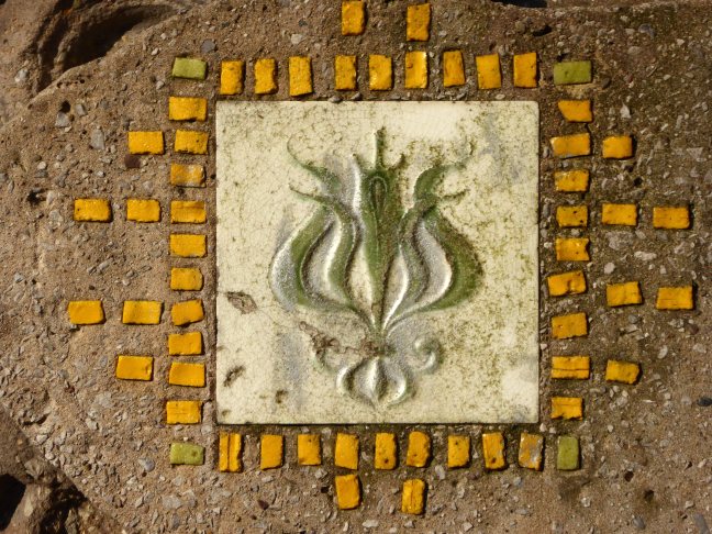
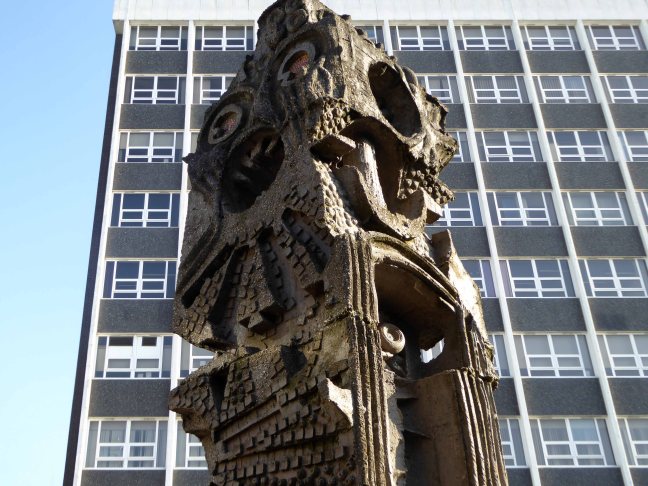
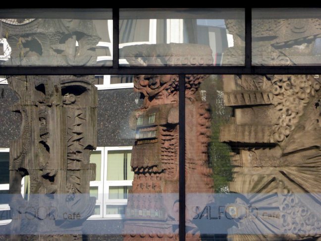
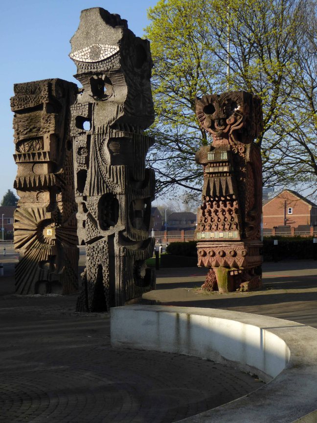
The three concrete totem sculptures of 1966 by William Mitchell, which stand in the courtyard of the Allerton Building, University of Salford, are recommended for designation at Grade II for the following principal reasons: * Historic Interest: as a good representative example of the commissioning of public artwork as an integral element of the design of new higher education colleges and universities in the post-war period, here succeeding in imbuing a distinct identity and image on an otherwise relatively plain complex.

So it seemed appropriate to cycle to Salford early one sunny Saturday morning, in an otherwise relatively plain manner in order to see the three totems.

William Mitchell was a leading public artist in the post-war period who designed many pieces of art in the public realm, working to a high artistic quality in various materials but most notably concrete, a material in which he was highly skilled, using innovative and unusual casting techniques, as seen in this sculptural group. He has a number of listed pieces to his name, both individual designs and components of larger architectural commissions by leading architects of the day.

Historic England says so, they loved them so much they listed them Grade II.

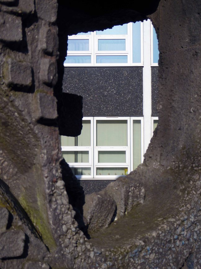
I loved them so much I listed them lovely, especially in lowish spring light, set against a clear blue sky and framed by the surrounding academic buildings.

Further info here on Skyliner

Go take a look.

P1140759

P1140760

P1140761

P1140762

P1140764

P1140766

P1140767

P1140770

P1140771

P1140774

P1140776

P1140777

P1140778

P1140779

P1140780

P1140784

P1140786

P1140789

P1140790


Galt Toys – An Exhibition

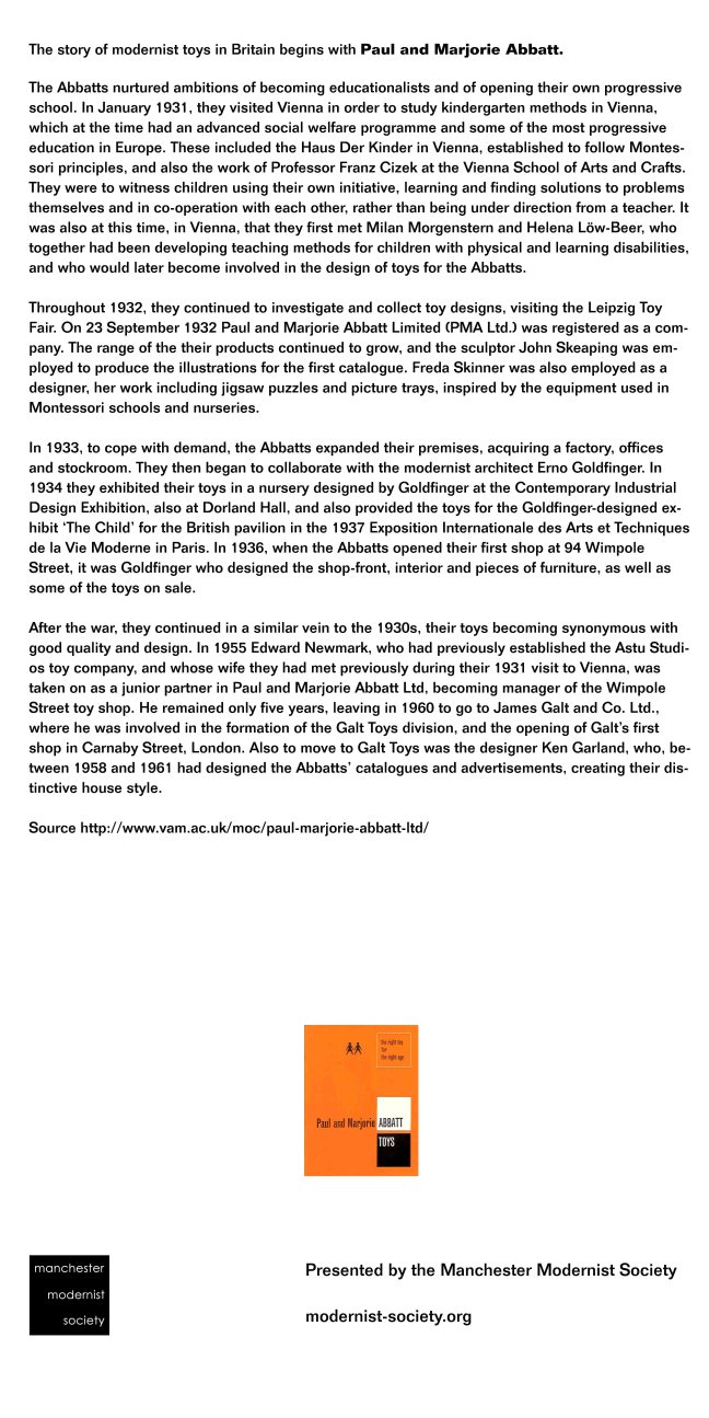
Cheadle, Stockport, Greater Manchester 1962 – and the grey post-war fug of austerity is blown away, almost forever. Though very much a local enterprise their toys, games and puzzles display a strong European influence and were distributed globally.

Educational in nature, non-gender specific, simple, bold, well constructed, collaborative not competitive – employing sound modernist principles and design, they were at that time almost unique in the UK toy industry.

James Galt & Co Ltd. were established in Manchester in 1836 as a manufacturer and publisher of educational books and toys, relocating to Cheadle in 1956.

Ken Garland had worked for the influential Abbatt Toys, formed in 1931 by Paul and Marjorie Abbatt. Paul and Marjorie had collaborated with Modernist architects Oliver Hill and Ernő Goldfinger – committed to designing and producing educational childrens’ toys influenced by the new European movements in art and design.

Paul emphasised the importance of play, described as:

‘A force which can be used for development and valuable experience, a force which, if it is not thwarted by the wrong choice of playthings, develops into the power behind the successful architect or engineer.’ 

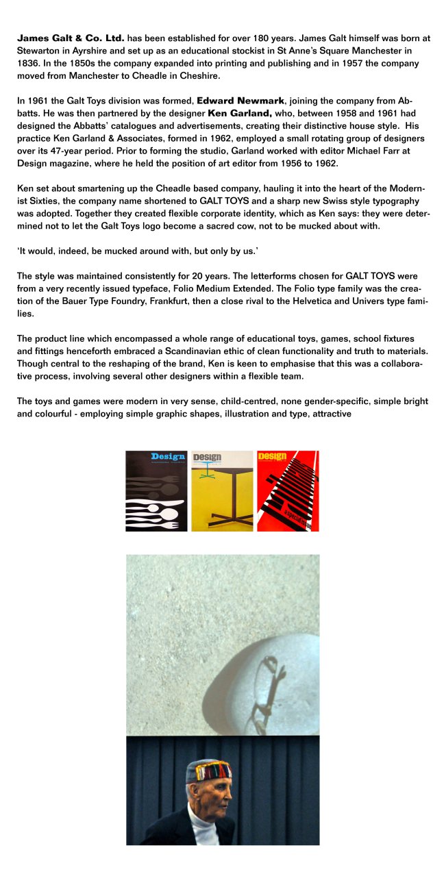
In 1955 Edward Newmark, who had established the Astu Studios toy company, was taken on as a junior partner by Paul and Marjorie. He remained only five years, leaving in 1960 to go to James Galt and Co. Ltd. He was joined the designer Ken Garland, who, between 1958 and 1961 had designed the Abbatts’ catalogues and advertisements, creating their distinctive house style.  His practice Ken Garland & Associates, formed in 1962, employed a small rotating group of designers over its 47-year period. Prior to forming the studio, Garland worked with editor Michael Farr at Design magazine, where he held the position of art editor from 1956 to 1962.

Ken set about smartening up the Cheadle based company, hauling it into the heart of the Modernist Sixties, the company name shortened to GALT TOYS and a sharp new Swiss style typography was adopted. Together they created flexible corporate identity, which as Ken says: they were determined not to let the Galt Toys logo become a sacred cow, not to be mucked about with.

It would, indeed, be mucked around with, but only by us.’

The style was maintained consistently for 20 years. The letterforms chosen for GALT TOYS were from a very recently issued typeface, Folio Medium Extended. The Folio type family was the creation of the Bauer Type Foundry, Frankfurt, then a close rival to the Helvetica and Univers type families.

The product line which encompassed a whole range of educational toys, games, school fixtures and fittings henceforth embraced a Scandinavian ethic of clean functionality and truth to materials. Though central to the reshaping of the brand, Ken is keen to emphasise that this was a collaborative process, involving several other designers within a flexible team.

The toys and games were modern in very sense, child-centred, none gender-specific, simple bright and colourful – employing simple graphic shapes, illustration and type, attractive and durable. The newly designed shop in Carnaby Street, with Verity & Beverley as architects, and a retail/factory/café in Cheadle were equally forward thinking in design and layout, purposely encouraging children to play with the stock, prior to possibly purchasing.

His ancillary work on the design of packaging, catalogues and in-store graphics was similarly ground-breaking, mixing image and text, very much in the mid European manner, pioneered by the likes of Max Bill and Richard Paul Lohse.

Connect exemplifies the best of Garland and Galt, twelve squares of card each with a simple linear motif, which can then be combined in a succession of seemingly infinite permutations – following a simple set of rules, the players can then produce a carpet covered in exciting abstraction. The connection to Harry Beck’s London Underground map is clear, Ken wrote and published Mr. Beck’s Underground Map in 1994, a tribute to the clarity, functionality and modernity of good design. This imaginative use of a single unit  which continually unfolds from limited graphic means to limitless possibilities, was further developed in Ken’s Trap Snap and Anymals.

Bob Chapman and I spent a lot of time developing Connect, based very loosely on dominoes, which turned out to be a best-seller, and still is, in a modified form now produced by Ravensburger Spieleverlag of Germany.  Another associate, Daria Gan, found a most satisfying outlet for her drawing skills in the card games Anymals and Upside-Down Jigsaws.’

Octons was designed by William Edward David Ryan, he was educated at Preston Grammar School and Harris Technical College/School of Art pursuing architecture. He became a member of Royal Institute of British Architects in 1965 and a partner in Derby Fazackerley Wood & Ryan Architects, Preston from 1965-1993. It is an eight sided modular construction toy manufactured in clear, coloured plastic, a slot cut into each face, permitting their interconnection in a mind boggling array of three dimensional forms. Further exemplifying the principles of simplicity and inherent stimulation of the child’s fertile imagination and explorative creativity. It is one of the few Galt games which has remained in production until the present day.

Fizzog remains a firm favourite, a fabulous name, a fabulous game of many faces. Pairing pairs of halved fizzogs, the better to produce ever more inventive and laughter inducing visages.

Kenneth Townsend was based in Hastings and worked as a freelance designer for Galt along with Hornsea Pottery, Chance Brothers, Cuckoo Bird Productions and Merit. His lively and stylised illustrative style enlivens both Super Snap and Remember Remember – these were produced, alongside several other matching games in the golden age of Galt. Employing yet again the use of strong graphic shapes, bold colour and a happy go lucky playfulness that were central to the company’s output. Developing shape recognition, numeracy, colour identification and a simple love of the visual world through play and fun.

So for some twenty years Galt and Garland et al injected some much needed life into an otherwise moribund world of play, their catalogues and products finding a way into the majority of Britain’s schools and homes, from Bauhaus to your house.

Many thanks for the loan and/or sourcing of exhibits to Wayne Astbury, Dawn Bunnell, Gemma Burgess, Paul Burnett, Sue Cook, Gail Eagle, Alison Heffernan, Sarah Moss and Alex Stone.
info panel 1ainfo panel 2ainfo panel 3a

.

Longfield Open Air School – Stockport

Happy days!

I was a delicate child with bronchitis, must have done me good as I went on to serve 39 years in the army!

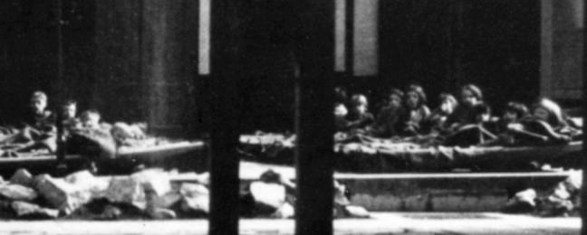
We lay on camp beds for an hour in the afternoons, on bad days on blankets on the floor in the main building.  

Michael Dooley  10/03/2013

Tithe Barn school stands on land which was originally a house called Longfield, the house sign is on the wall near the side entrance to TBS, which was built around 1871 for John Brown who owned Afleck and Brown’s department store in the centre of Manchester. The gardener for the house lived at what is now known as Tithe Barn Cottage.

19800

John later sold the house to his brother William whose wife sold it very cheaply to Stockport Education committee in 1929 to be used as an open air school for children who suffered ill health in the town, mainly through smoke pollution. This was called Longfield Open Air School. Pupils travelled there by bus before breakfast, from Portwood and other parts of the town. Most of them had a sleep outside in the afternoon so that they could take advantage of the clean air of Heaton Mersey. As the town became healthier and the chimneys stopped belching out black smoke, the need for an open air school lessened and it closed in 1968.

The original house was demolished and some of the beautiful wooden interior offered to museums in York where the original bath with its enameled sides and copper shower canopy is now on display in the Castle Museum. The only part kept and used by the architect  was the Venetian glass bathroom window which Mrs Brown had made to remind her of the beautiful water scenes in Venice. This glass panel was installed outside the Headteacher’s office and is still there today.

Penluchtschool – Open Air School

An idea that found its way from continental Europe to the British Isles.

Amsterdam – Johannes Duiker 1930

outddoorclassroom 

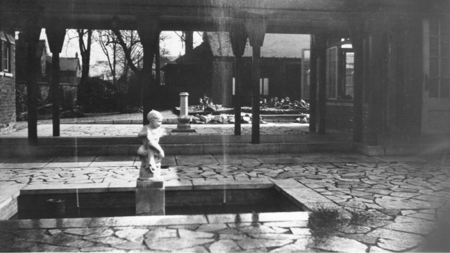
Longfield School in the 1930s

19802

26707

I was lead here on finding this print for sale in Stockport Local Studies Library.

school

Here are the pupils seen in detail.

children

The school in 1968

48786

48787

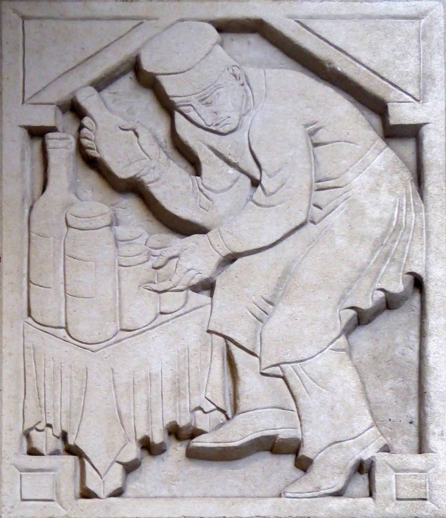
Adolfine Ryland

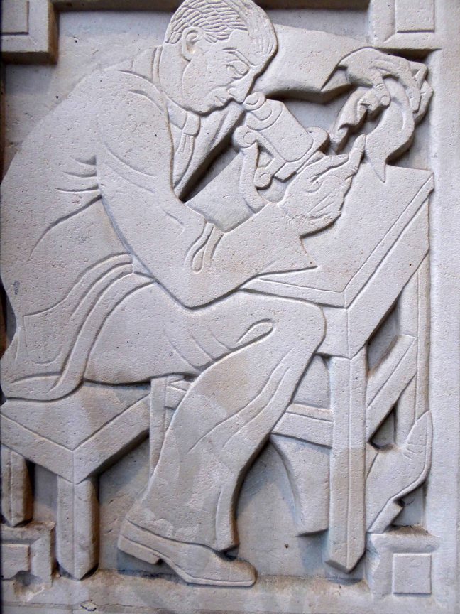
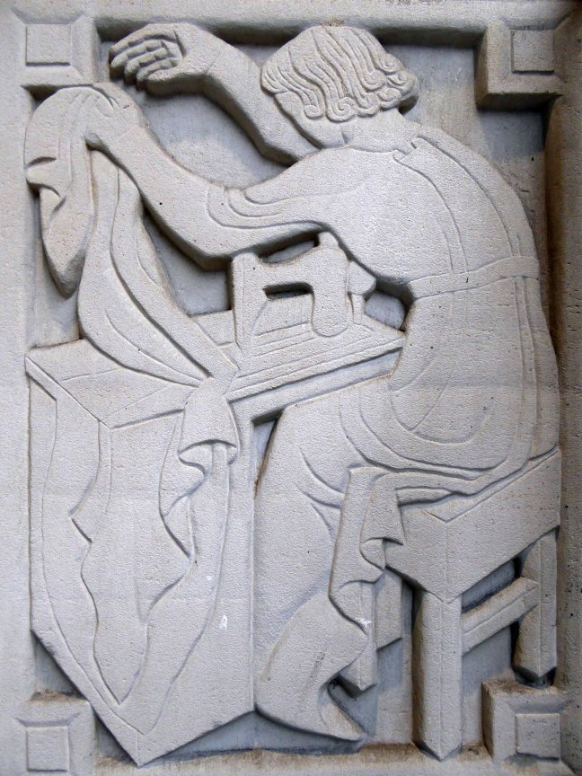
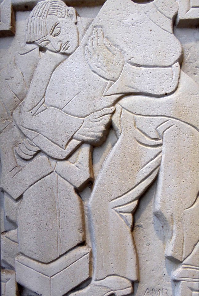
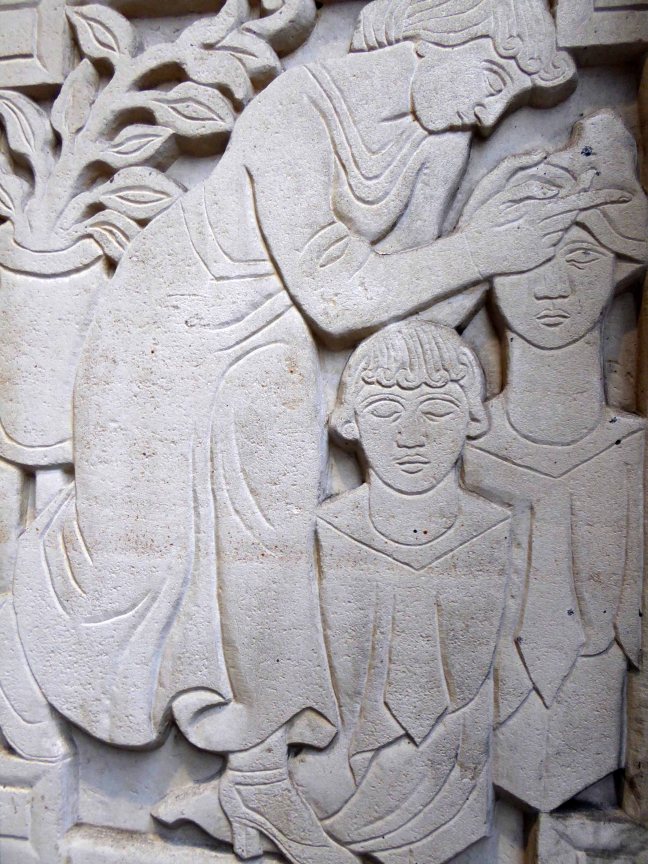
Adolfine Ryland worked as a printmaker, sculptor, painter and designer. Her practice across these different media was united by her keen-edged, modern style and inventive graphics. She had studied at Heatherley’s and at the Grosvenor School of Modern Art under printmaker Claude Flight. 

Ryland’s main exhibiting venue was the Women’s International Art Club, where she showed from 1927 onwards, becoming a member from 1936 to 1954. She also undertook public commissions, and worked for London County Council designing low reliefs for a number of buildings, among them the School of Butchers and St Martin’s School of Art. Her reliefs for the art school, which still decorate the entrance, show students at work. But Ryland’s work is not always easy to identify as she sometimes signed herself ‘Koncelik’, her mother’s maiden name.

In 1987 the Michael Parkin Gallery in London held an exhibition Printmakers of the 20s and 30s and Adolfine Ryland. On show were Ryland’s paintings, drawings, prints, sculptures and designs for book jackets and posters. Amongst them were two designs advertising London Underground, which speak of an optimistic age of efficient, modern public transport to the new suburbs.

It says so here

I was sauntering down Charing Cross Road on Saturday last, minding my own and everyone else’s business, then perchance I chanced upon a series of low reliefs, tucked neatly away in a nearby portal.

The London County College for the Distributive Trades – rightfully adorned with appropriate public art depicting the lasses and lads, going about their very practical business.

These are the work of Adolfine Ryland.

The building is currently in use as Foyles Bookshop.

p1130719

p1130720

p1130721

p1130722

p1130723

p1130724

p1130725

p1130726

Returning home, I did a little online research, turning these examples of her work. As is often the case with those figures considered to be on the margins of the big bad Art World, time and the subsequent neglect, conspire to leave little by way of evidence of their invaluable efforts.

This is our loss.

149557_6d70c380-a7ab-4c68-9103-bf7788fc3391_-1_570

h0433-l06066177

original

Huddersfield – University née Polytechnic

Spanning the Huddersfield canal and set on a hillside site of a hilly Yorkshire town, the University Buildings dominate the Colne Valley area to the south.

Typically their history spans an earlier site which evolves during the 50s and 60s, as part of the drive to develop the industrial/educational base of the area and the burgeoning growth of the provincial Polytechnics.

The result is a confident yet dizzying panoply of styles and materials on a fairly compressed but expanding site.

Brick, concrete, glass and more recent modern clad additions collide in a bun fight of assertive volumes.

It all seems very exciting.

“David Wyles, The Buildings of Huddersfield: four architectural walks – facing us now is the impressive bulk of the Central Services Building in front of which stood a six-storey building; its structure emphasised by the reinforced concrete frame which projected skeleton-like above the main roof level. This was part of the earlier Technical College development which included several buildings of similar style designed from 1957 onwards by Frederick Gibberd. The six-storey blocks have since been demolished.

The focal point of the campus, the Central Services Building, was designed by Hugh Wilson and Lewis Womersley of Manchester and constructed between 1973 and 1977 at a total cost of £3,651,000. The building contains the main non-teaching facilities.

Much of the layout derives its form from the hillside site and this is accentuated by the undercover concourse leading through to the canal, which gives access to all parts of the building. The construction is based on a grid of reinforced concrete with floors supported on circular columns. The building is clad in light buff coloured bricks intended to harmonise with local sandstone.”

https://www.hud.ac.uk/about/the-university/history-of-huddersfield/