The design of your site says a lot about your brand. It shows that you’re fun and quirky, knowledgeable and trustworthy, or innovative and imaginative. It’s the first impression you make on potential customers, followers, and clients.
And with WordPress.com, you don’t need to hire a developer to get the look you want. Instead, you can use the new global styles to customize elements on a site-wide level without needing to edit a single line of code.
What are WordPress global styles?
Global styles are a new feature of WordPress.com, part of the full site editing experience. So let’s take a step back.
Full site editing allows you to edit your entire website using blocks, including headers, footers, and page templates. You can do this with the same block editor that you’re already using to build pages and posts. And the changes that you make to each element will apply across your entire site, so you only have to make them once. This can save you a tremendous amount of time and hassle.
Global styles apply this concept specifically to the aesthetics of your WordPress site. You can set colors, fonts, spacing, and more, and edit the default appearance of blocks. This helps your website have a cohesive look that impresses your visitors and shows off your brand.
How can I use WordPress global styles?
To begin, you’ll need to use a theme that supports full site editing. There are more and more to choose from all the time, including:
In the WordPress dashboard, go to Appearance → Editor. This will open the full site editing experience. Here, you can edit global site elements like your header, footer, and page layouts.
In the top right corner, click on the Styles icon, which looks like a half-filled circle.
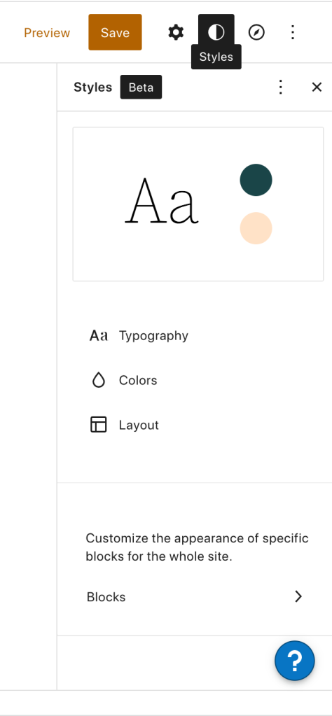
This will open the global styles for your website. Let’s take a look at how you can use these styles to customize your site design.
1. Set global fonts
If you click on Typography, you’ll open a panel that lets you edit the fonts used for text and links throughout your website.
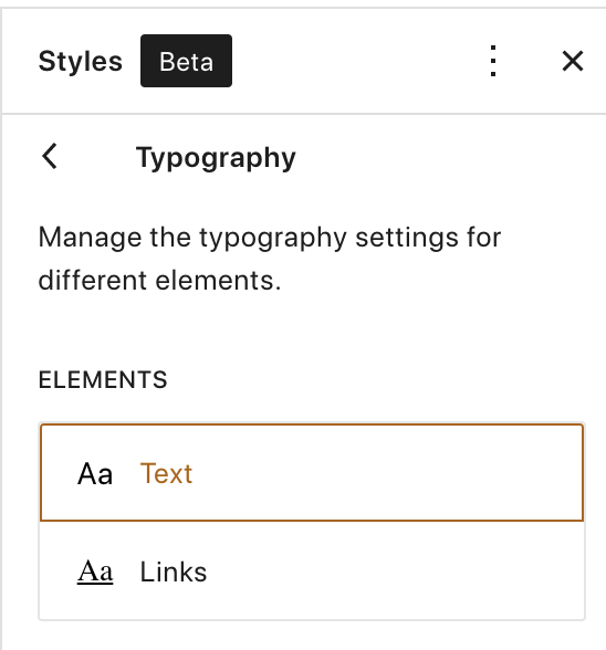
Choose either Text or Links to see individual options.
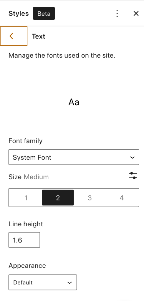
Click the dropdown under Font family to select the font that you want to use. There are dozens available, and you can preview each one as you select it. Think through the look you’re going for — what feeling do you want to communicate to site visitors? For example, a cooking blog might use the friendly, approachable Poppins font, while an accounting firm might use the clean and professional Merriweather font.
Under Size, you can choose to make your text appear smaller or larger. Make sure that it’s large enough to read on devices of all sizes, especially for those who may have vision impairments.
Line height is the space above and below a line of text. You can adjust this to make paragraphs easier to read for your visitors.
In the Appearance dropdown, you can choose to make your font thicker or thinner, italicize it, or bold it. For example, you could make your links bold and italicized so they stand out from the rest of your text.
2. Set global colors
Open the Colors panel to choose the shades you’d like to use for your design.

If you click on Palette, you’ll be able to set the colors that are available by default for blocks across your website.
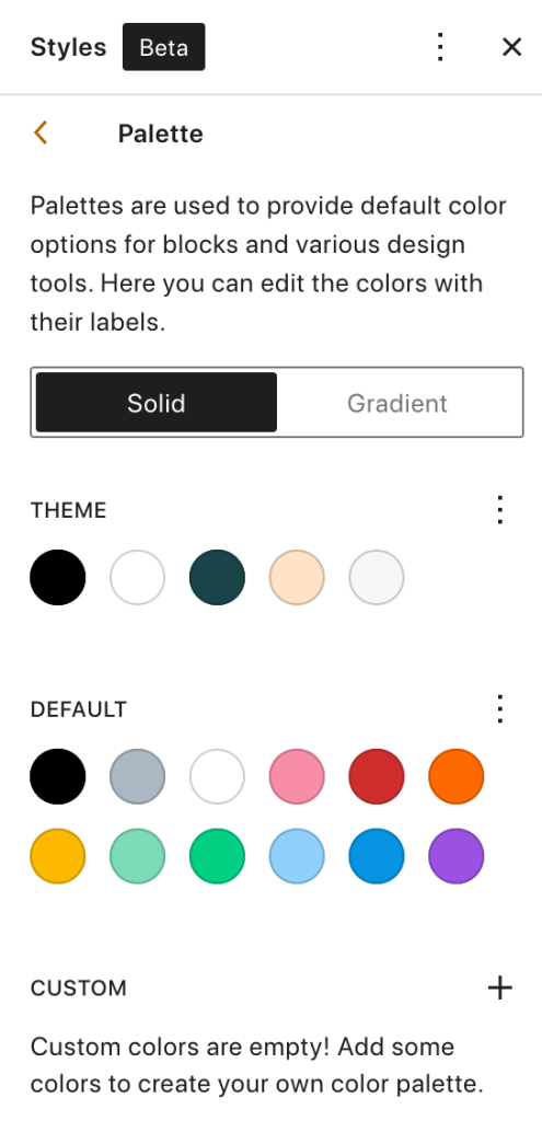
The Theme colors can be used throughout your theme’s settings. The Default colors can be used in the blocks you use to build your pages and posts. You can also create a completely custom palette in the Custom section.
Click the three vertical dots beside one of these areas to change the colors that fall into each one. A list will appear that includes all the colors currently in that palette. Click on one to edit it.

You can either drag and drop the color slider or click the Show detailed inputs icon to add your brand’s HEX, RGB, or HSL code.
The Palette panel opens to Solids by default, but you can also click the Gradients tab to add gradients to your color options. A gradient is essentially a smooth transition between multiple colors. Just like with your solid colors, you can set Theme, Default, and Custom options by clicking the three vertical dots beside each one.
Click on a gradient to edit it. A slider will appear that allows you to set the colors that make up the gradient. You’ll need at least two, but can add additional ones if you’d like. You can also drag and drop the colors along the slider to meet your exact specifications.
Under Type, choose from Linear (transitions in a straight line) or Radial (transitions in a circle). You can also edit the angle of your gradient. Feel free to play with these options until you find the look you’re going for.
Once you’re done with your palettes, navigate back to the Colors panel. Under Elements, you can change the colors of your site background, text, and links. Click on the one you want to edit and a new screen will show your color options. You can either select from the palettes you set earlier, or click the current color option to set your own. As you make changes, you’ll see the design of your site update on the left.
As with the Palettes section, you can use either solid colors or gradients to create a completely custom look and feel.
3. Edit your site’s layout
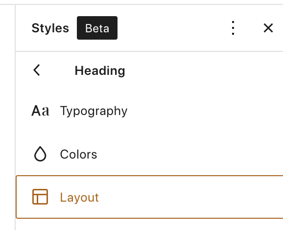
In the Layout panel, you can adjust the padding for your website. Padding is the blank space — also called white space — around the elements of your site. There are four areas you can adjust the padding for: left, right, top, and bottom. By default, these are locked. This means that when you adjust the padding, it will update all four at once. But if you click the lock icon, you can change them separately.
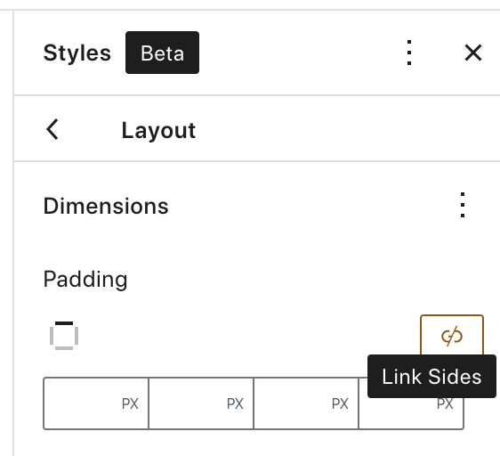
The measurements are automatically set to be in pixels, but if you click PX, you can choose between other units of measure. As you change the padding of your site, you’ll see the spacing adjust on the left side of the screen.
4. Change the style of specific blocks
The Blocks section shows an entire list of blocks that you can customize on a site-wide level. The changes that you make here will apply to all blocks of that type throughout your site, unless you customize one individually in the block editor.
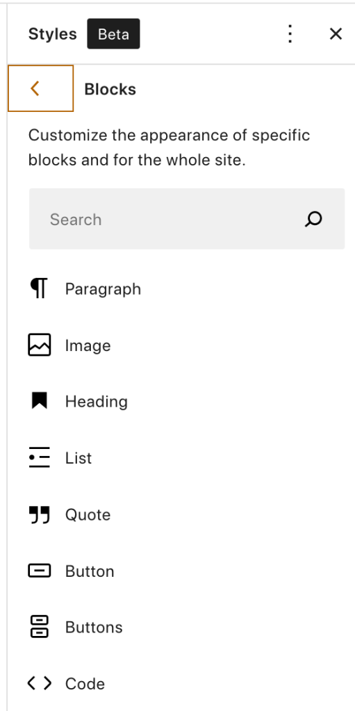
The options that are available vary widely depending on the block that you’re editing, so you may want to explore each one to see what you can change. Let’s look at a few here.
The Button block
Buttons are an excellent opportunity to guide site visitors to additional content or encourage them to take a desired action, like purchase a product or sign up for an email list.
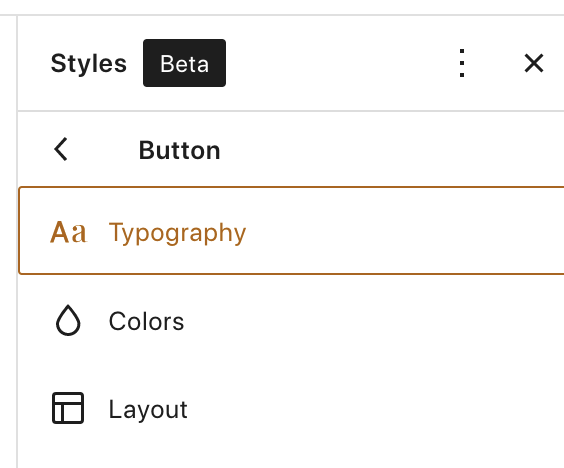
If you click on Button in the list of blocks, you’ll see that you can customize:
- Typography. Use your default font settings or choose a custom font and size just for your buttons.
- Colors. Set the color for the button background and text.
- Layout. Specify the padding around your button text and decide to make your button edges curved or straight.
Ideally, you’ll edit your buttons so that they stand out from the rest of your content.
The Heading block
Headings work like titles, dividing your content into sections. On an About page, for example, you might have headings for How We Started, Our Vision, and Our Team. And because they help visitors understand the content on each page or post, you’ll want them to stand out from paragraphs and other elements.
Choosing Heading from the list of blocks will allow you to customize:
- Typography. Set the size, line height, appearance, and letter spacing.
- Colors. Choose the color of heading backgrounds, text, and links.
- Layout. Set the margin around each heading.
The Search block
The Search block enables visitors to look for exactly what they want on your site. They can type in a keyword and see the results that appear, including pages and posts. You might add this block to your sidebar or footer, and want to style it to match the design of the area around it.
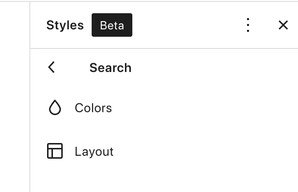
Click on Search from the list of blocks. There, you can change:
- Colors. Switch the color of the background and text.
- Layout. Add a border to the block and set the radius for that border.
These are, of course, just three examples of the blocks that you can edit. Peruse the entire list and customize them to your heart’s desire!
Create the perfect site for your brand
Global styles put the power of design in your hands. Customize your site to fit with your brand’s colors, use the exact fonts you want, and change the layout of blocks however you’d like — all from one easy-to-use settings panel.
Want more information? Read the full documentation on global styles.

