“ Hey Justin, thanks for your reply earlier. Just wanted to expand on my previous ask - do you have any tips for achieving colour harmony across an entire painting? I often feel like the objects in my paintings look disjointed, like I haven’t chosen the ‘right’ brown for trees or the ‘right’ green for grass when I use opaque brushes, this isn’t so much of an issue when I’m painting a single object or character but when painting an entire scene I find it very difficult to tie everything together. “
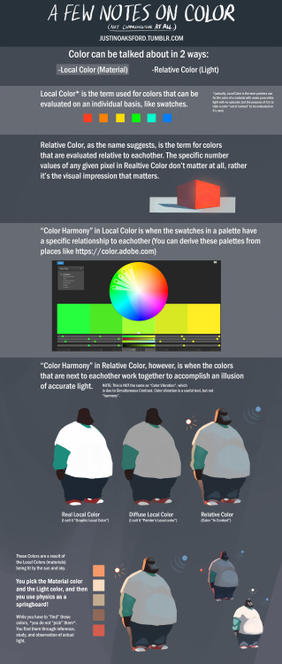
btw, this is COMPLETELY UNACADEMIC- I mean, parts may be “academic” but this is not meant to be a textbook. Terms are used VERY CASUALLY and the information is not at all comprehensive. This is an extremely brief superficial look at the term “Color Harmony”.
If you want ACTUAL color education, either take Sam Nielsen’s Schoolism class, or get James Gurney’s Color and Light book, or do both!!!!!
i literally love how your color and shade if it’s ok do you have any tips on digital coloring? you don’t have to answer this if you don’t feel like it :) thanks!!
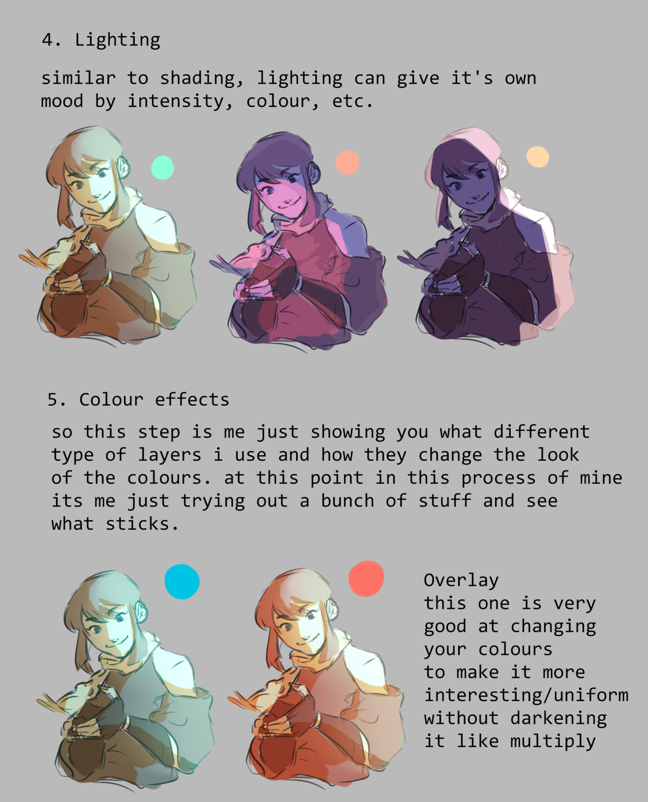
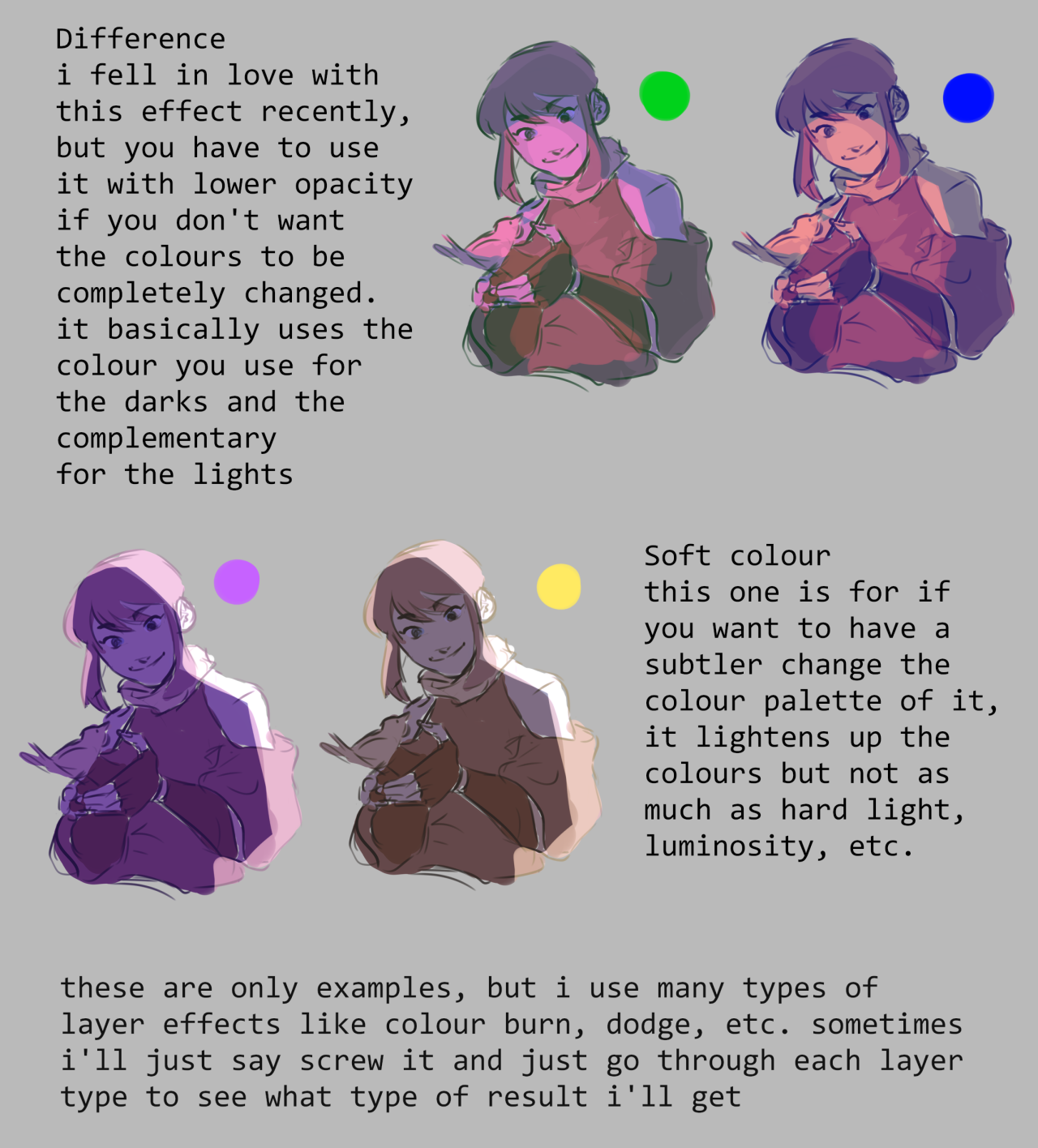
hello friend!! i have a tutorial i made on twitter a while ago which is more or less how i make my colours more interesting. i still use the technique and in general it’s just a lot of colour adjustment nothing too special LOL here!!
there’s a lot of really good color theory materials out there that would explain how it all works far far better than i ever could
but i will show you a couple of good tricks i learned along the way that will save you a lot of time and trouble if you don’t like watching/reading loads of theory (which you should still watch/read btw, i’m not saying to ditch it altogether) and more of a practical learner as i am
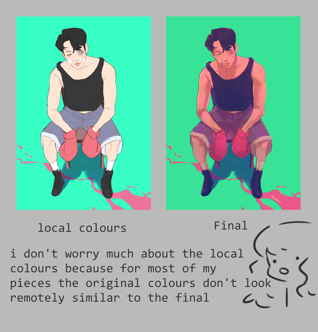
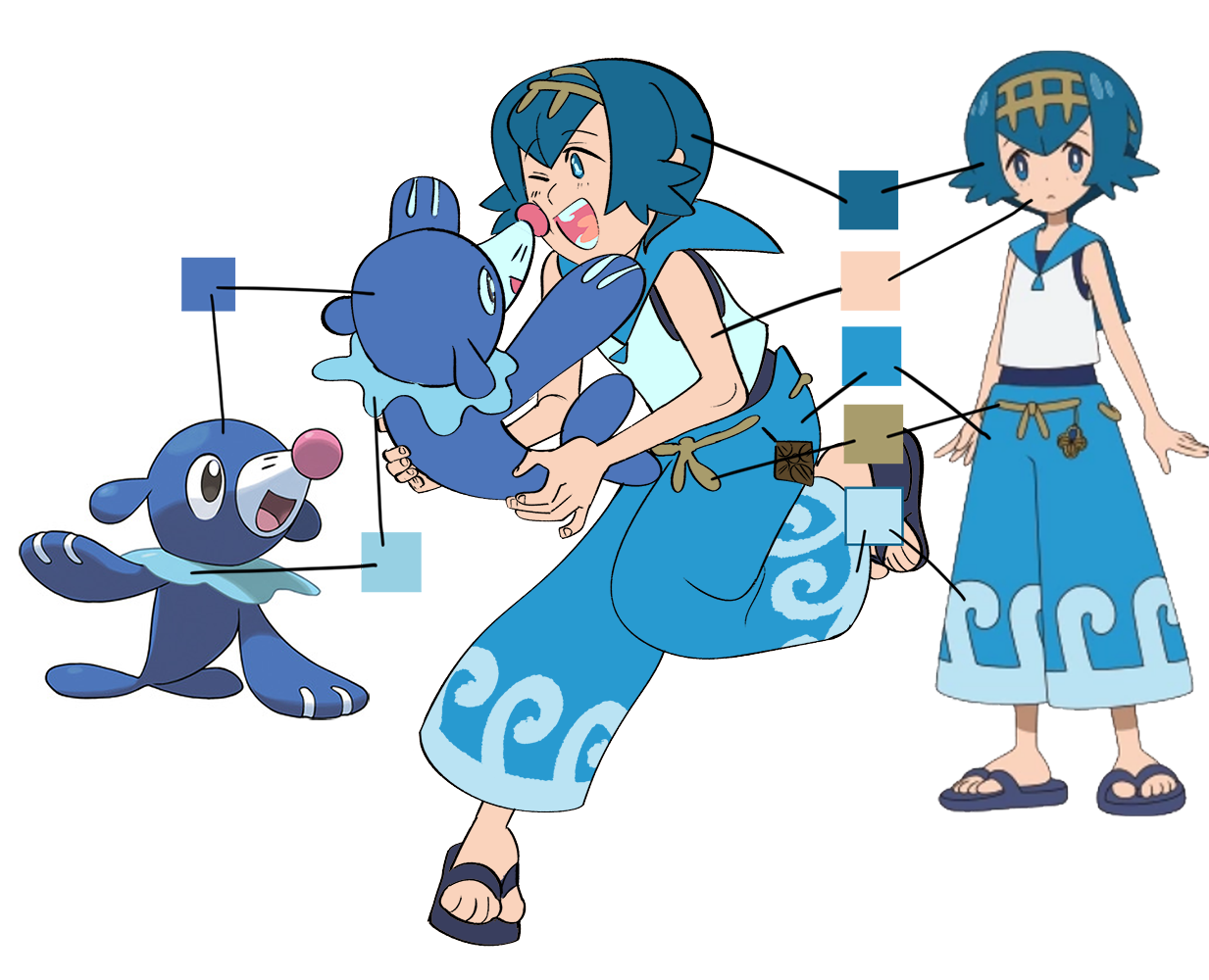
i often start coloring with simply using an eyedrop tool to choose base colors, it helps to keep the same color relations as the original, that way you won’t end up with white-washed characters or wrong tones of clothing
in case of this drawing the final piece has water right under the characters, so i chose to make palette warmer on the top and colder on the bottom
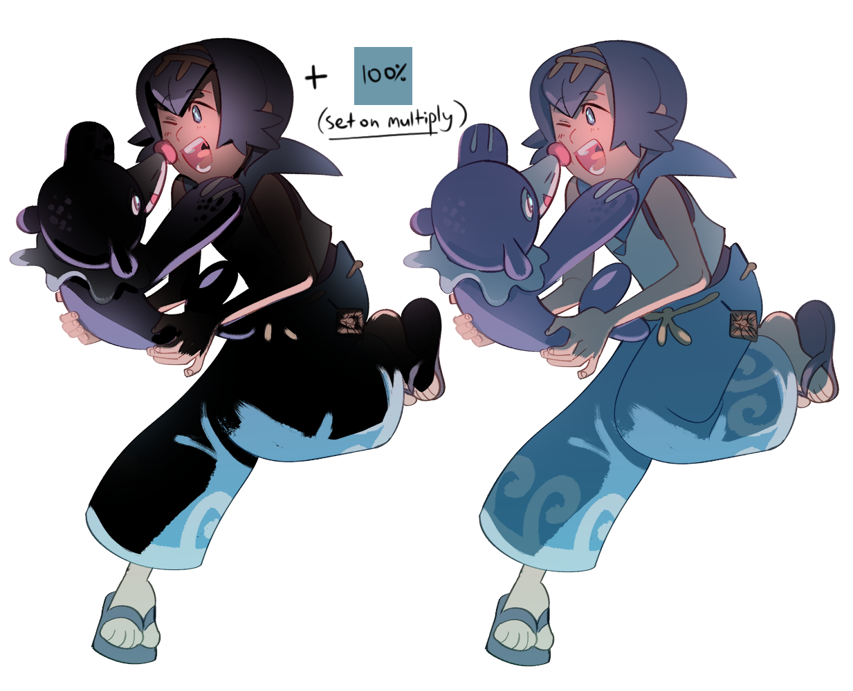
the easiest way to make a soft, less contrast palette with the same color relations is to add a solid color or a gradient under the lineart; no overlay style, just a semi-transparent layer with color; on the contrary if you want a more contrast image you’d set overlay on multiply etc
colored lineart is optional, really. a lot of times you’ll hear DON’T COLOR/LINE WITH BLACK!!!!!!! that’s fake news, black lineart can make an image pop very well, but it doesn’t work with everything, so choose wisely
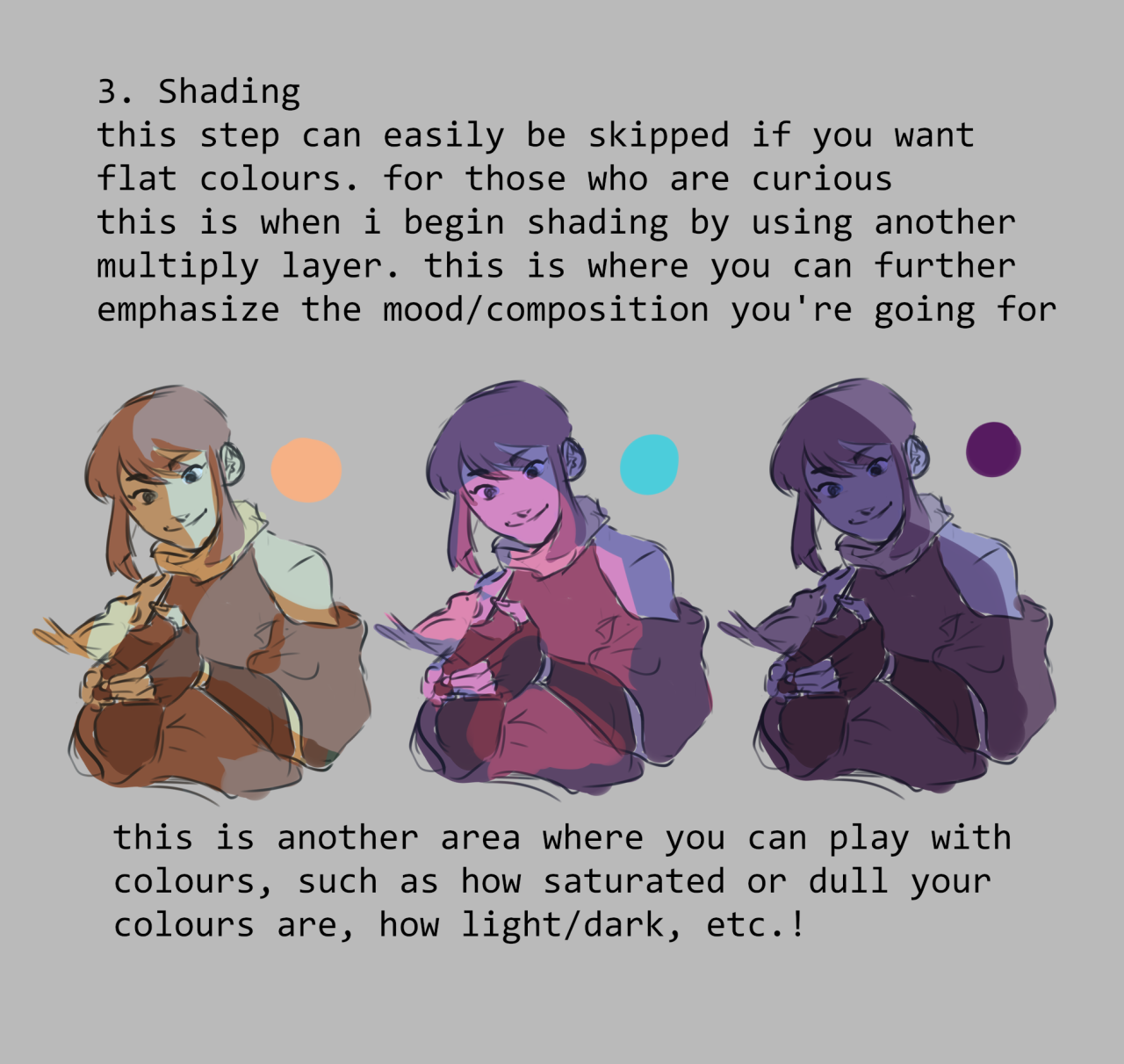
there’s two ways to add shadows to your drawing - by adding shadows (duh) or by adding the absense of shadows
i use both ways but since i almost never see anyone mentioning the second one: what i mean by it is you need to fully cover your characters in solid shadow and then erase the parts with light
a lot of artists choose the color of shadow individually for every part of the drawing - skin, hair, clothes etc; i personally like to choose one color for shadow and
one whole shadow layer not only saves you a ton of time, unlike choosing color individually, but it also means you can freely play with the color of it, which can affect your image A LOT
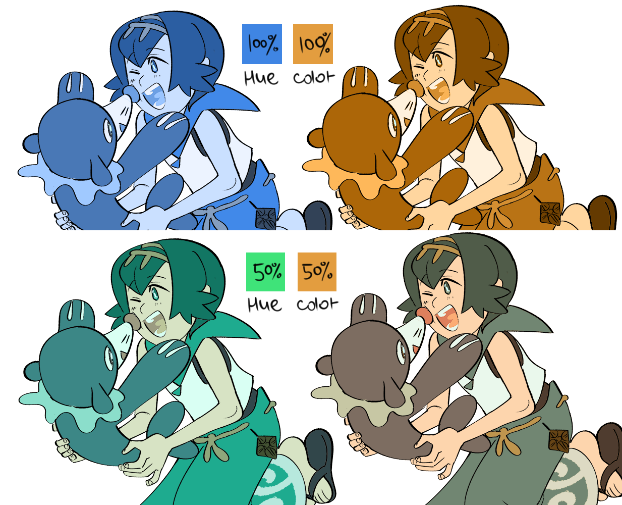
now back to the main palette! this trick is for photoshop only as far as i know
PS has 2 really helpful overlay styles - Hue and Color and as the names suggest it changes the hue or color of your image based on the color above it
PS also has a fun thing called Gradient Map (Image -> Adjustments -> Gradient Map) that converts the monochrome tones into ANY colors of the same relation
the last trick i’ll show you is particularly useful when you’re too lazy to color the lineart
i fill base colors by using paint bucket tool, it’s simple and fast, but it also means no colors under the lines
which is annoying but what can you do right? ¯\_(ツ)_/¯ actually there is something you can do! here’s a step-by-step
that’s all that comes to mind for now, hope it was helpful in any way! most of these tricks were born out of the notion “how do i produce a really good image with as much saved time and actions as possible”, which probably won’t do for perfectionists, but to all the lazy artists out there like me - try it lmao
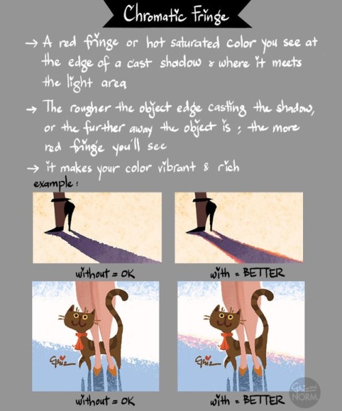
Hi! Happy Tuesday! Today’s tip is on one of my favorite subject, color theory; specifically on chromatic fringe.
It is the red fringe or hot saturated color you see at the edge of cast shadow and where it meets the light area. The rougher the object edge casting the shadow or the further away the object is, the more red fringe you’ll see. This is different than chromatic abberation, which is color fringing caused by lens failure. You can see chromatic fringe with your eyes. The more you paint from life and make observation, the easier it is to see. It’s one of those things that once you see it, you cannot unsee. :) XO,
Griz
#griz #grizandnorm #tuesdaytips #colortheory #chormaticfringe #grizandnormtuesdaytips #grizandnormkittycatclub
ps. On stylized painting, where you want to have a hard edge on a shadow, you don’t always have to put it. Like everything in art, you can choose to put something in or not. But it’s always good to know your basic and know the rules before breaking it. Happy painting!
i get a lot of asks asking me how i choose colours / how i colour so i thought id make a post on the main ways i choose what colours to use - doesn’t really talk about how i physically colour though, sorry!!
keep in mind im not an expert this is just how i choose my own colours haha