Attempting to Fix Post Comments on Themes
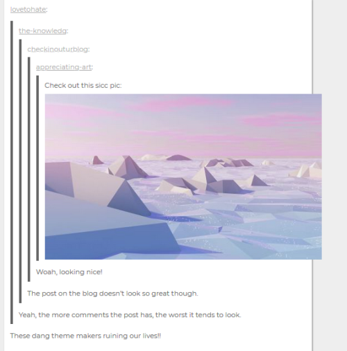
Hi everyone! Today I wanted to look at why some posts look absolutely horrible when they’re riddled with comments. To remind you of what it may look like (in a rather tame case), I’ll add an image below. Please be careful for the sight may be utterly horrendous.

Basically the more comments, the more piled on those blockquotes get, which push the images out of the post, which looks really terrible, and makes your blog look really bad, and you know.
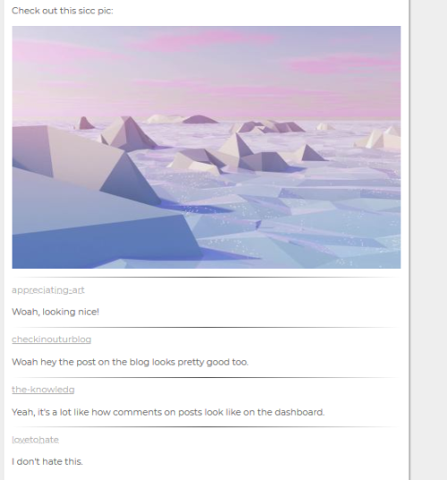
Unfortunately, this is what Tumblr defaults their posts to, which is weird since they changed the look in the dashboard. But nonetheless! I have arrived to propose a new (or I guess…familiar) look:

This was a bit tricky to pull off so I’m not sure if it will break other posts or not, and so I’m not sure if I want to just update this into revamped themes now. I’m considering adding an option where you can change this to the default way Tumblr renders it if needed. What do you guys think? Any thoughts?


