is a blog about design, technology and culture written by Khoi Vinh, and has been more or less continuously published since December 2000 in New York City. Khoi is currently Principal Designer at Adobe. Previously, Khoi was co-founder and CEO of Mixel (acquired in 2013), Design Director of The New York Times Online, and co-founder of the design studio Behavior, LLC. He is the author of “How They Got There: Interviews with Digital Designers About Their Careers”and “Ordering Disorder: Grid Principles for Web Design,” and was named one of Fast Company’s “fifty most influential designers in America.” Khoi lives in Crown Heights, Brooklyn with his wife and three children.
Somehow this happened: I’ve been included in Fast Company’s 2019 ranking of The Most Creative People in Business. This is largely based on the work I did to bring voice features to Adobe XD last year, making XD the first and only design tool that actually allows designers to work in the dimension of voice. (You can read about that in this announcement from last fall. And if you want to learn more about voice and design, I still think this interview with Mark Webster of Sayspring that I did in 2017 is a roadmap for the future.)
I’m incredibly humbled by the whole thing but I have to say it’s directly a function of the rich culture for innovation at Adobe. I’ve said before that the reason I work there is that, as the only multibillion dollar professional creativity company in the world, Adobe allows people like me to work on problems that no other company would even be interested in, much less realize the potential of. It’s an honor to get this recognition, but I’m only one of many, many people at Adobe who are frankly having the time of our lives reimagining what professional creativity can be.
You can read the write-up about me in Fast Company’s ranking at fastcompany.com. Also, note that I’m one slot ahead of actor and icon Michelle Pfeiffer. I can’t tell you how good it feels to finally have an edge in my years-long rivalry with Michelle Pfeiffer.
I got out to theaters twice last month to see “Shazam!” and “Avengers: Endgame,” both jam-packed with super-hero action and special effects (and, incidentally, virtually indistinguishable from one another). But the most thrilling new movie I saw in April was Steven Soderbergh’s very odd “High Flying Bird”—on my iPad.
Despite possessing a vibrant sense of verve and daring, this original Netflix release from director Steven Soderbergh is almost perfectly designed to be swallowed up whole by today’s media landscape, before anyone notices. It’s ostensibly a drama about the world of professional basketball but it includes virtually no basketball; its cast is noticeably lacking in star power, even if the performances by up-and-comers André Holland and Zazie Beats are transfixing; and its plot is so obtuse as to practically defy any buzz spread by word-of-mouth. It’s almost unsurprising that when it debuted back in February, it was met with a mixed reception before promptly sinking into the deep, mealy swamp that is Netflix’s bottomless catalog.
Still, I found it riveting. “Birds” is the latest vehicle for Soderbergh’s fascination with iPhone cinematography, and the result is, if not uniformly pleasing, never less than alive, imbued with a powerful, hyper-aware detail and immediacy. In many ways the aesthetic is perfectly matched by the unapologetically ambitious script from screenwriter Tarell Alvin McCraney (who also wrote the Oscar-winning “Moonlight”). Both are intensely precise—deep focus imagery and dense, nuanced dialogue—yet paradoxically vague and open to interpretation, and both are beautiful in inelegant, even brutalist ways. You never quite know what you should be looking at or even listening to, but the wallop they pack together is undeniable.
Here is a full list of all seventeen movies I watched in April.
“Avengers: Infinity War” (2018) Re-watched it, didn’t like it any better the first time around.
“Avengers: Endgame” (2019) A triumph of lowered expectations on a mass scale. That means I thought it was crap. Read my review.
This is the latest roundup of my monthly movie consumption. You can also see what I watched in March, in February, in January and a full list of everything I watched in 2018, in 2017 and in 2016. And, if you’re interested, you can follow along with my movie diary at letterboxd.com.
Here is a presentation that I made last week about how to understand the design process, explained through the lens of Thanos, that lovable scamp from “Avengers: Endgame.” (Mild spoilers included.)
If we want more awareness of and appreciation for our work, explaining design to people who aren’t already well-versed in the field is one of the most worthwhile things that we can do as professionals. It’s also one of the hardest. Which is probably why I procrastinated so much in preparing for this talk last week, when Gimlet Creative invited me to come and help them “get a little smarter about design.” Gimlet is of course the production house behind “Wireframe,” the podcast about design that I host, but the invitation was to address the entire team of audio producers working on many different shows on many different topics.
I lecture fairly frequently and so have a good number of talks in hand but I didn’t have one that lays out the basics of the design process for an uninitiated audience. Some people can just extemporize grandly on anything even vaguely relevant to their areas of expertise, but I always need to have plenty of time to write and rehearse. In my head, I had expected to be able to devote one day early last week to writing it from scratch and another to rehearsing, but that didn’t quite work out, suffice it to say. I ended up cramming it all into Wednesday night, the day before my appearance at Gimlet.
Actually, to be totally frank, what happened was that I came by two tickets for “Avengers: Endgame” on Tuesday, and so of course, nothing got done. By the time I sat down to start writing on Wednesday, I had that feeling of being in a real jam, as I was due to give my schpiel on Thursday at 10:30a. Not only was I running out of time, but I was completely stumped as to how to tell a story that would resonate. How does one explain a subject that’s as expansive and nuanced as design, without boring the heck out of an audience as smart and discerning as this? And how to figure that out the night before?
After an hour or so of panic, I had a realization that there was an “in” here that would, at the very least, make the topic more accessible for me: I could explain design through the lens of “Avengers: Endgame.” This would require accepting a pretty silly conceit: the idea that the master plan that Thanos, the central villain, enacts in “Endgame” and its predecessor, “Infinity War,” was in fact a kind of design. Or, at the very least, it’s an example of design gone wrong, and that in itself could be a useful way of explaining how design works.
Settling on that concept allowed me to power through the rest quickly—I just used the notion of Thanos being a fairly incompetent designer as a framework on top of which I could hang a bunch of stuff about design that I already knew. The whole talk is hardly genius, but I would contend that it’s mildly fun, at least, which is a useful step towards making design a little bit more relatable. And based on the massive box office receipts for “Endgame,” even if this makes design more relatable for a tiny fraction of moviegoers, that would be a victory.
The full presentation is embedded above. Of course, unaccompanied by my talk track, my intention isn’t always apparent so I’ve added excerpts from my talk track to selected slides. For maximum legibility though, the deck is available over at speakerdeck.com. Enjoy.
An article published yesterday in The Washington Post demonstrates the danger of design’s failure to broaden popular understanding of our craft. It tells the story of hackers compromising Nest Cams in private homes by taking advantage of lax security on the cameras. And it pins the blame for this on technology companies’ focus on reducing “what Silicon Valley calls ‘friction’—anything that can slow down or stand in the way of someone using a product.” The assertion is that Nest and other companies could better secure devices like the Nest Cam by requiring measures such as two-factor authorization of user accounts, but are reluctant to do so because that would make the products more difficult to use.
Nik Sathe, vice president of software engineering for Google Home and Nest, said Nest has tried to weigh protecting its less security-savvy customers while taking care not to unduly inconvenience legitimate users to keep out the bad ones. ‘It’s a balance,’ he said. Whatever security Nest uses, Sathe said, needs to avoid ‘bad outcomes in terms of user experience.’
It’s certainly true that more could be done to encourage better security practices for Nest Cams (and in fact for most every other smart home device; the category is in desperate need of a privacy and security overhaul). But the concept of user experience writ large is not to blame here; what’s actually at fault is bad user experience practice.
There are at least a few other designs that could have been more conducive to users’ interests here: Nest could force users to consciously opt out of two-factor authorization; it could more clearly warn users of the danger of not opting into two-factor authorization; it could offer an option where account access is restricted entirely to local IP addresses; and many more possibilities. Privacy and security are not at odds with user experience; in fact privacy and security are raw materials that designers must use to create good products.
Nest just happened to make an injudicious design decision. But the framing of the problem in this article equates a focus on low-friction user experience design to be suspicious at best, and inherently compromising at worst. Any professional product designer knows that’s hogwash, of course, but the gospel of our profession—the idea that designers are motivated to make people’s lives better—is lost on the audience of a mainstream news organization like The Post’s.
We could chalk this up to lazy journalism but in fact the fault lies with us, with designers who have utterly failed at explaining what it is that we do to the world at large. There is little comprehension of what design does or how to define user experience, and what possibilities exist within these broad, amorphous concepts for everyday people. Design, as I’ve argued many times, is still a mystery to the uninitiated—including otherwise savvy reporters. In absence of understanding, suspicion and fear rush to fill the void, which is what is on display here.
I almost didn’t get out to the movies at all last month, and really, I may as well not have at all, because the only thing I watched in theaters was the moribund “Captain Marvel,” the eight-hundred and sixty-seventh in a line of “essential” installments in the pointless saga that is the Marvel cinematic universe. I say “I may as well not have at all” because I go to the movies to experience a sense of joy or celebration or surprise or discovery. But despite the landmark moment that this movie should represent by being the first female-led Marvel movie, all it did for me was to leave me feeling so incredibly sad for the state of the contemporary popcorn flick.
To be clear, I’m not above super-hero movies at all, even those you would classify under the category “dumb fun.” But it’s no fun to watch these slipshod exercises in corporate auteurism, because they have so little fun themselves. The plot of “Captain Marvel” is literally about the first time that humanity encounters otherworldly life, and the blasé, perfunctory way that that ostensibly mind-bending event is treated by the plot, by the actors, by the whole enterprise just demonstrated the utter lack of imagination going on behind the camera.
What’s truly regrettable though is the outsized financial success of this movie and others like it, because they reinforce the incredibly low expectations that we’ve all come to accept in our cinema. Imagination, surprise, artistry, even logic are immaterial to these films; all that matters is that they somehow, by hook or by crook or by horrifically unsightly computer graphics, advance us to the next purchase, to the next movie ticket, to the next video game, to the next whatever. The most important message of each of these films is that they are essential viewing in order to consume what we’ll be sold next. The only filmmaking going on in this cinematic universe is of the Power Point variety; these flicks are marketing plans, not movies.
“The Sisters Brothers” (2018) Never manages to feel bigger than its meager budget.
“The Muppets” (2011) Rewatched this. It’s not without its charms, but it’s not really The Muppets, either.
“The Savages” (2007) Pretty decent for a story most people wouldn’t want to watch.
“The Handmaiden” (2016) Like watching a master origamist folding a beautiful, complex sculpture.
This is a monthly roundup of my movie consumption, so you can also see what I watched in February, in January and a full list of everything I watched in 2018, in 2017 and in 2016. And, if you’re interested, you can follow along with my movie diary at letterboxd.com.
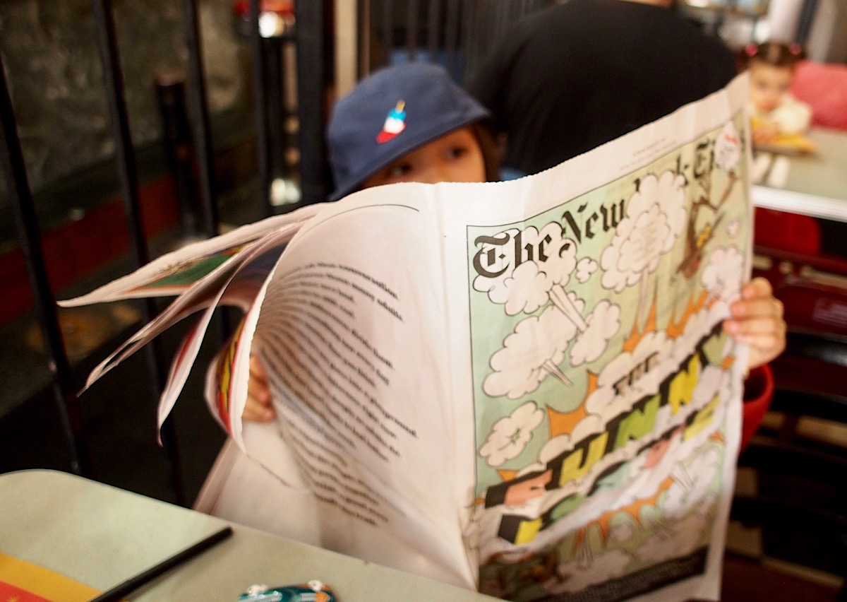
My news consumption has been so thoroughly digital for years that I honestly never expected to subscribe to home delivery of The New York Times again. But two years ago the paper started running a special, print-only section for kids on the last Sunday of each month. My daughter happened to come across a few of the installments here and there and pleaded with us to subscribe. Since the cost of Sunday-only home delivery is only nominally more expensive than a digital subscription, we relented.
I’m not particularly happy about the resulting stacks of newsprint in the house, but I have to admit, the sight of my kids poring over the paper makes it worthwhile. It reminded me of my own youth, when I would read The Washington Post’s Sunday comics section cover to cover. It always bewildered me that The Times refused to run a comics section; any excuse to get kids exposed to newspaper consumption seems like an essential path to future customers. (For a while, The New York Times Magazine ran a “Funny Pages”” feature, which was like Sunday comics for people too arrogant to read comics; I hated it.)
This is not a comics section though. It is, appropriately, a newspaper within a newspaper for younger readers:
…The special section is a kid-centric version of The Times and mimics regular sections in the paper, including sports, national news, food and arts. Need career advice from an animator or a recipe for the best homemade slime? This package has you covered.
This is both unsurprising, because that is exactly what you would expect from a section officially titled The New York Times for Kids, and surprising, because the paper has so effectively dispelled its traditional buttoned-up (some would say stuffy) airs in order to create something genuinely fascinating to the younger set. The stuff you find between its pages is completely unassuming, wittily written, graphically arresting, and thoroughly kid-centric in its worldview. This week’s edition is the humor issue and my daughter pronounced it “Really funny.” The ol’ Gray Lady has some tricks left in her yet, and one of them seems to be knowing that a kid’s heart leads to a parent’s wallet.
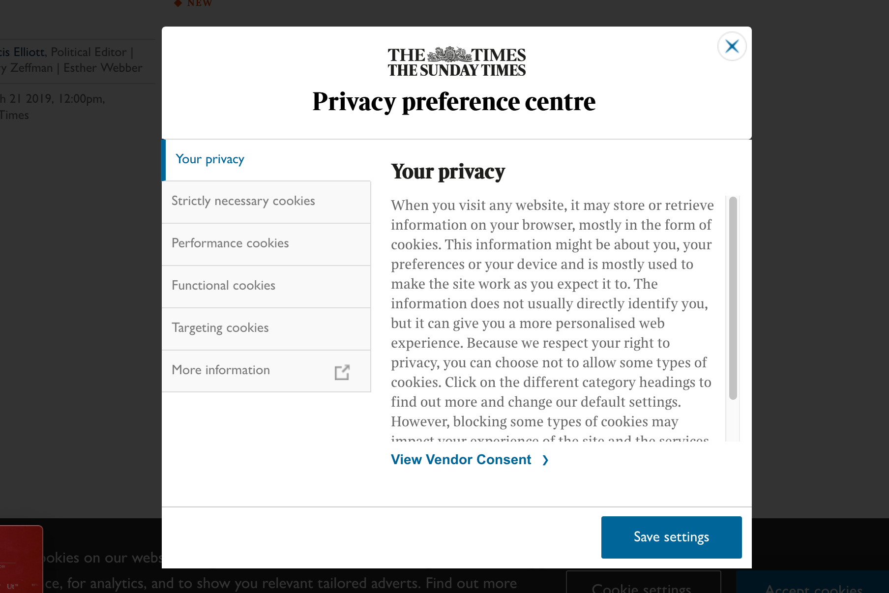
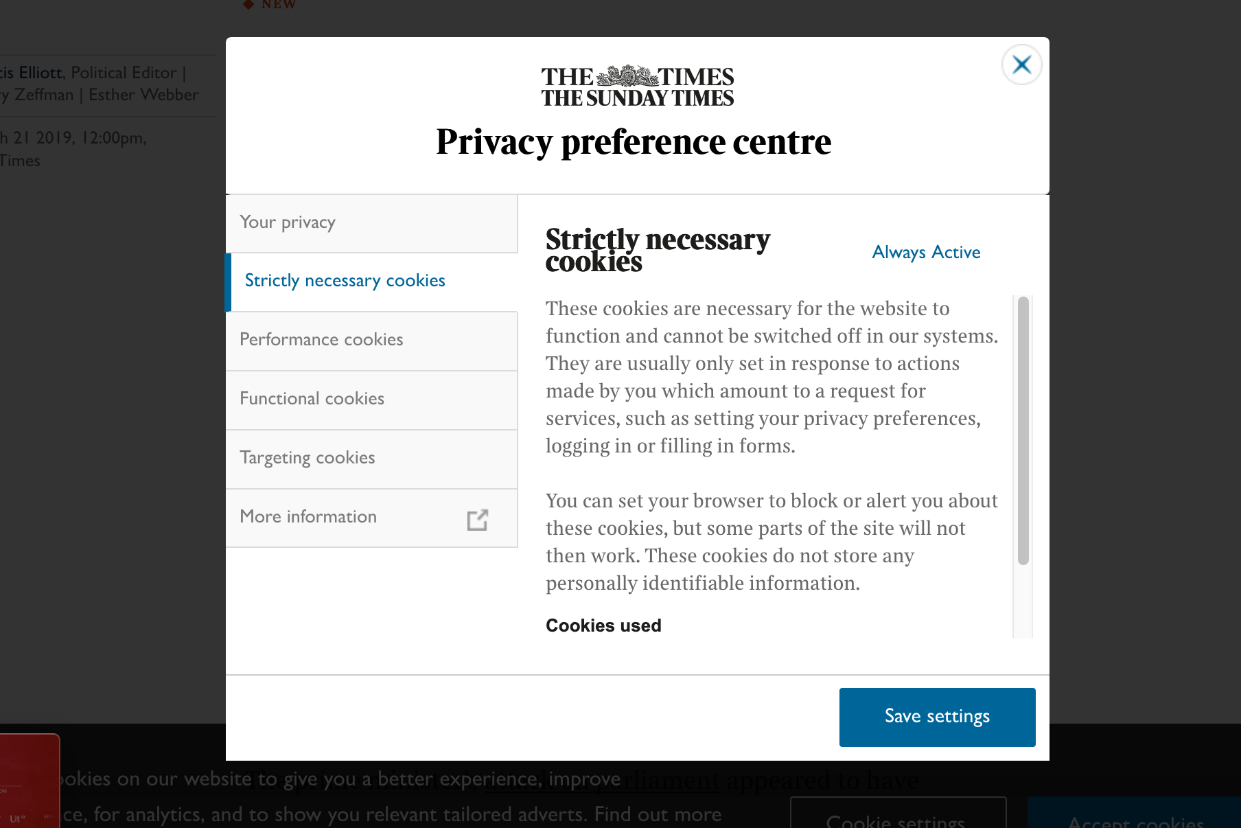
Any time I’m confronted with a standard GDPR privacy warning on a web site, I reflexively click the option to accept cookies and move on. Recently though, while reading an article at The Times of London’s web site, I accidentally clicked on the option to manage my settings instead. What I got was this “privacy preference centre” dialog box. I was pleasantly surprised by its unexpectedly succinct design.
I can only imagine it took a lot of effort to wrestle the gnarly details of a privacy policy into as straightforward a form as this. The left-hand tabs are clearly and plainly labeled, and the text on each tab is reasonably concise, running about eighty words or so. Just as importantly, each section makes an honest attempt at explaining that particular privacy concept in direct, jargon-free language.
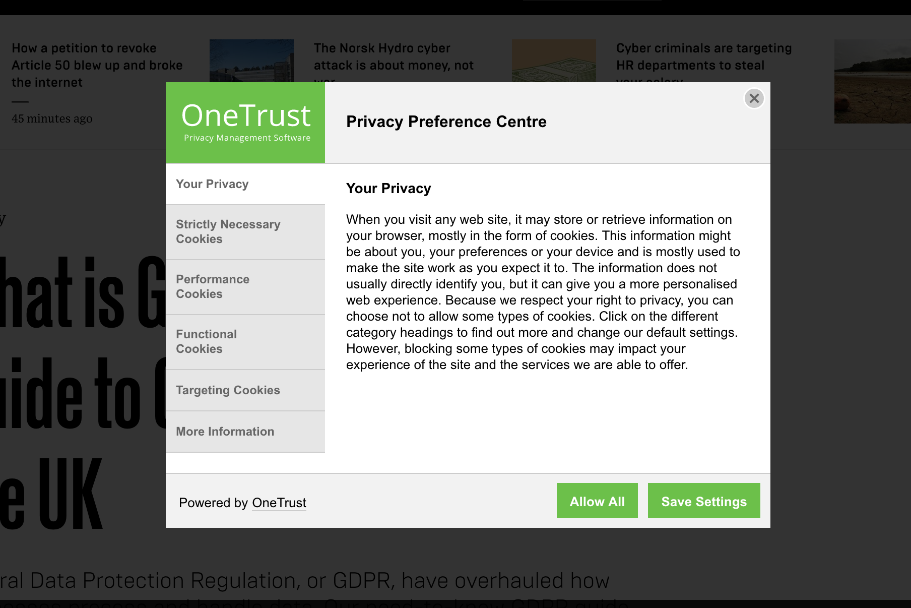
The presentation of these settings is almost certainly powered by One Trust, a service which allows customers like The Times to easily create and customize preference panels for cookies and tracking software, and then to embed them easily on their own sites. One Trust claims it provides similar privacy interfaces for thousands of customers. Here’s a more “straight out of the box” example that hasn’t been tailored to fit a host brand.
The team at One Trust have obviously distilled their considerable domain knowledge into a thoughtful, efficient design that mitigates some of the opaqueness that always seems to accompany privacy experiences. Of course, you could argue that half a dozen tabs, no matter how elegant they are, is still too much to expect the vast majority of users to ever contend with. But it’s also fair to say that among the countless user-hostile privacy experiences that web sites have implemented out there in the wild, this is more user-friendly than most.
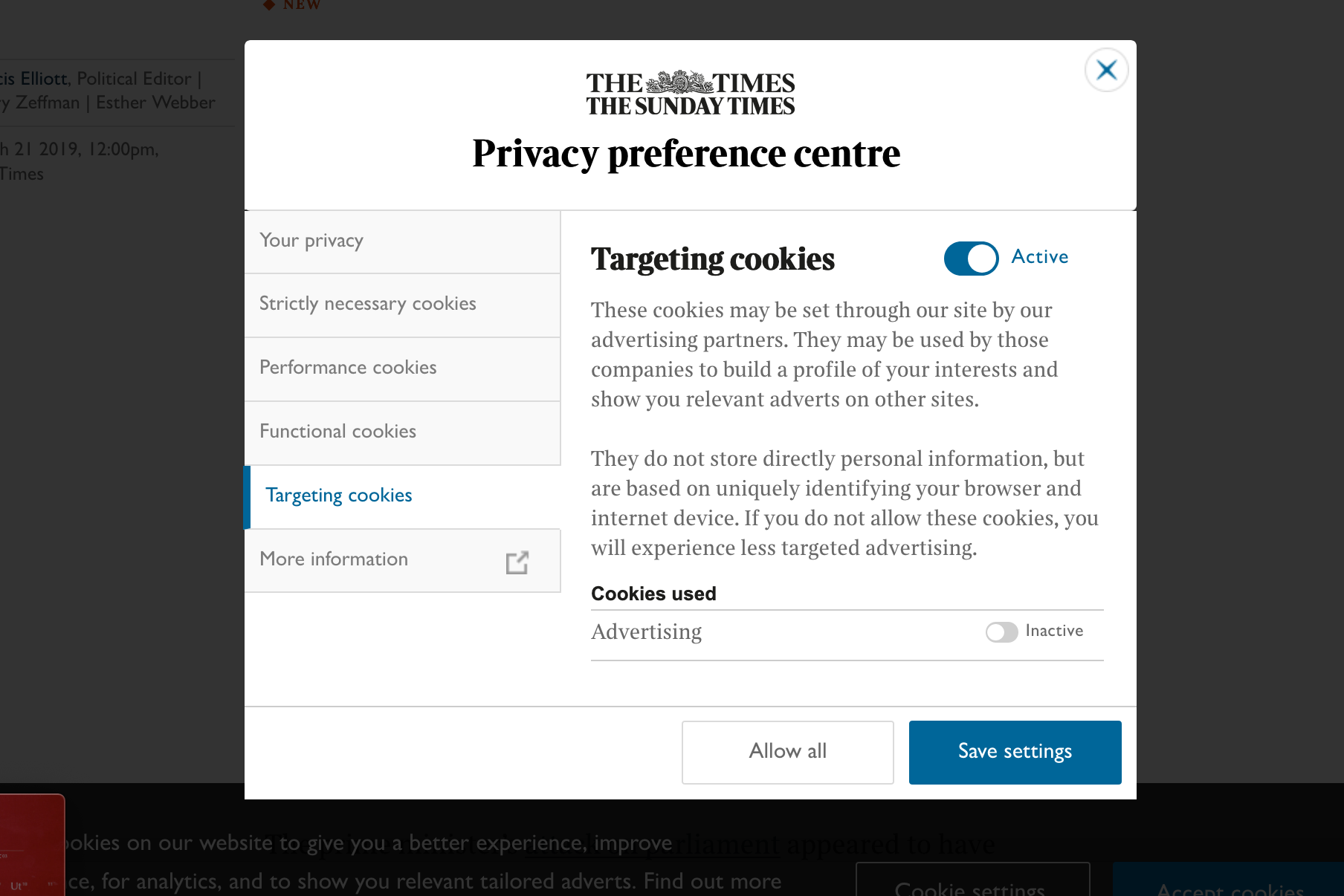
In some ways though this level of design refinement can actually be misleading to users. It portrays the privacy choices available to site visitors as being a simplistic set of controls. It looks like visitors can exert the full extent of their privacy rights by toggling just three or four toggles, like the ones shown here.
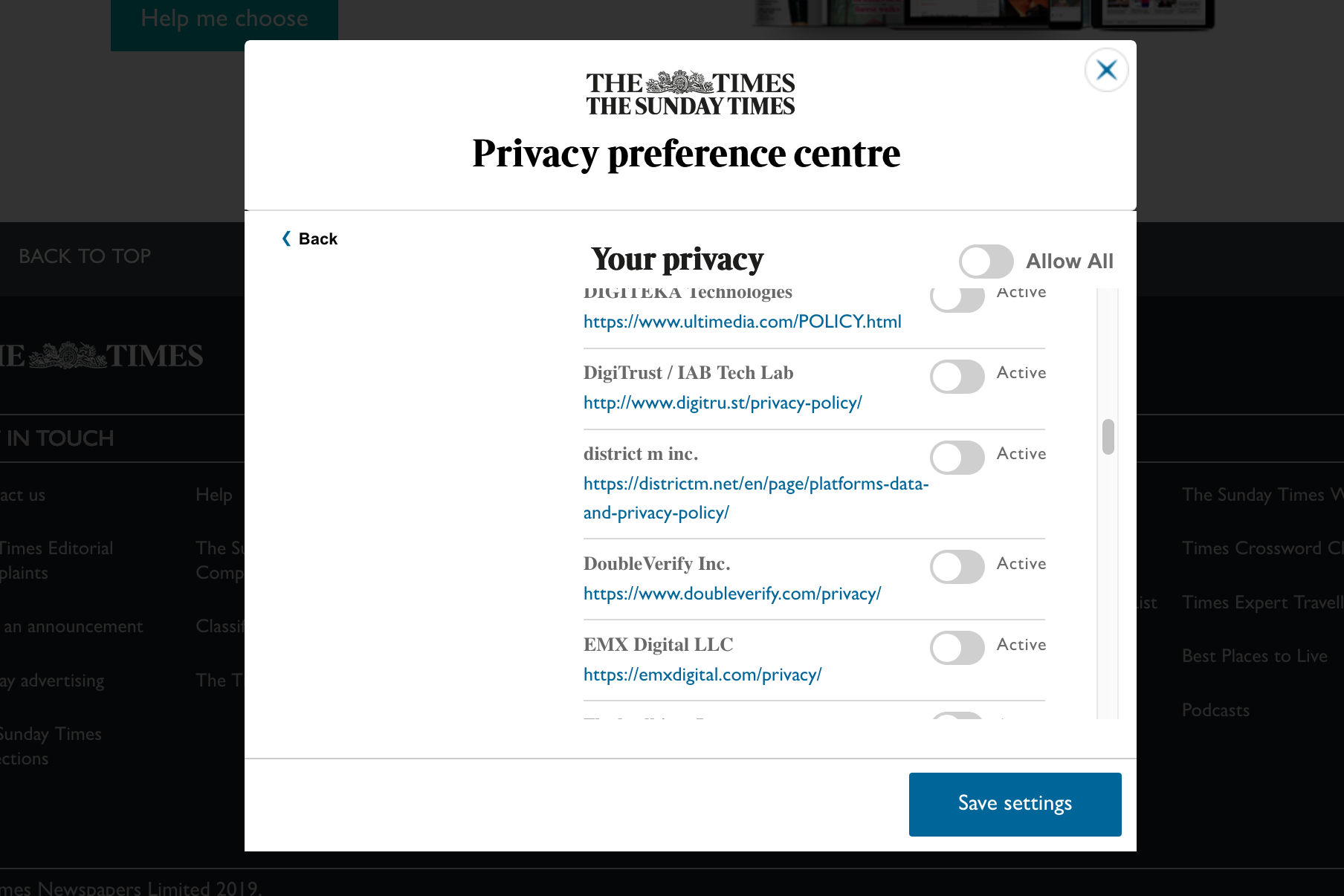
In reality though, even if you switch those off, there is another layer of controls that’s effectively hidden behind The Times’s elegant presentation. Back on the first tab of this privacy centre, there’s a seemingly benign link labeled “View Vendor Consent” that belies this simplicity. Clicking on it is a bit like lifting a rock to find a colony of living organisms thriving underneath. What you get is a list of literally dozens of ad networks that are enabled on the site, all of them toggled on by default. (I turned mine off for this screen shot.)
Of course, this is the reality of operating a content site in 2019: ad networks like these are essential to publishers’ business models. So it’s hard to fault One Trust or The Times for the existence of these settings. They have made this internecine world more approachable than it otherwise might be, imperfect as it might remain.
Still, this is a useful illustration of design’s limits in the realm of privacy—at least right now. Privacy as an experience is a product of complex business imperatives and technologies that have largely evolved without the participation of design. Even in a case like One Trust, where design has been brought to bear to improve the experience, it can only do so in a limited way—this is efficient window dressing, but in the end it’s still only window dressing.
The implication, of course, is that there’s an opportunity here to level up the experience of privacy through the application of design as a discipline. What’s needed is not just better interfaces like these, but a redesign of the whole ad network ecosystem. For now, that is a challenge that any single design team, whether at a publisher like The Times or a service provider like One Trust, would sem unlikely to be able to surmount on their own. But if it’s ever going to get fixed, if we truly want a world in which privacy controls are comprehensible to mere mortals, then design should play a role.
We’re officially “on hiatus” between seasons of “Wireframe,” my podcast about how design shapes technology to fit into our lives. But that didn’t stop us from recording a new episode, available right now in your podcast player of choice. Go listen to it here!
This episode was actually recorded live a few weeks ago at On Air Fest in Brooklyn, New York. On Air is a unique conference about creativity in sound, sort of a mashup of everything audio—not just music and radio, but podcasting, sound design, and art, too. Take a look at the line-up; it was full of amazing folks doing amazing stuff in this space.
We decided that On Air was the perfect place to take a look at voice design and the world of Siri, Alexa, Google Assistant, et. al. To do that, we first dug into some early examples of voice-enabled human-computer interaction, unearthing clips of some fascinating precursors to today’s voice assistants. That was followed by a live discussion with two guests who are working at the forefront of voice interaction design: Katie Briggs, product designer at NPR, and Will Hall, chief creative officer at RAIN, an agency focused on voice.
If you’re not familiar with “Wireframe,” it’s a unique kind of design podcast, hosted by yours truly. Instead of merely interviewing well known designers, we dig into the world of interaction design via deeply researched reporting and engaging narratives. In other words, stories instead of résumés. You can read more about it in this blog post, and listen to the first season here.
Last month I took my kids to go see “The Lego Movie 2: The Second Part” which was totally fine. It’s not exactly one for the canon, but I’ve come to the conclusion that anything that the creative team of Phil Lord and Chris Miller are involved in is worth watching. They don’t always hit it out of the park but they do always take a big swing. Even their lesser movies (does anyone remember “Storks”? It wasn’t bad!) are way more interesting than they need to be. It’s actually a shame that there’s no Academy Award for producing because it’s clear that there’s no way “Spider-Man: Into the Spiderverse” would have taken home an Oscar last month if it weren’t for their involvement as producers. These two are building an amazing body of work.
Actually “The Lego Movie 2” was the only new movie I saw in theaters last month. I also managed to get out to see a screening of Alfred Hitchcock’s 1945 classic “Spellbound,” which was showing at The Metrograph. That’s a wonderful revival theater in downtown Manhattan that, I’m embarrassed to say, I’d never been able to visit before. “Spellbound” is not premium Hitchcock, but it did inspire me to go home and watch another of the director’s movies: “Notorious.” I hadn’t seen that one since I was a teenager, and I was happy to find that it’s still as magnificent as ever. It was the best thing I watched all month.
Here are all nineteen films I watched in February.
“The Oath” (2018) Terrific and hilarious, even if it goes off the rails a bit.
“Peter Rabbit” (2018) Exceeded my very low expectations—by a little.
“Hail, Caesar!” (2016) You know the term “inside baseball”? This is “inside Hollywood,” but, like, old. I mean, I enjoyed every minute of it. Rewatched.
“Okko’s Inn” (2018) Little more than an excuse for gorgeous hand-drawn animation.
“Notorious” (1946) One of those rare films where everything went exactly right.
By the way, my new goal in life is to get these roundups posted within two weeks of the end of each month. You can also see everything I watched in January and a full list from 2018. And, if you’re interested, you can follow along with my movie diary at letterboxd.com.
I don’t know a lot about security but I do know that when I use public wi-fi—whether on my phone, tablet or laptop—I should be protecting my traffic with a virtual private network.
For those unfamiliar with VPNs, the concept is basically that you use a simple piece of software to open up a private channel to a trusted server, through which you route all your browsing, email, uploading and downloading, etc. A good VPN keeps your identity private, your data secure and helps mask your location, even from the provider of the Internet connection you’re using to connect to the VPN. Those benefits are highly desirable in today’s privacy-scarce world, and by and large, VPNs are not technically demanding to use. Still, the whole concept of consumer-ready virtual private networks is sorely lacking when it comes to good user experience design.
Most VPN providers provide dedicated client apps or utilities through which you use their service. All you need to do is click a button, wait a moment for the software to connect with the VPN server, and then go about your business. For the most part, this is a straightforward, reliable process, but of course since you’re introducing another factor into your technical setup, it does on occasion present hiccups—VPNs can occasionally make it difficult to connect to certain servers, or certain sites or services can get tripped up when routing through VPNs. All in all though, the benefit of added security and peace of mind is well worth the minor hassle of the occasional problems that VPNs introduce.
My provider of choice is a company called IVPN, whose service is well-reviewed and reasonably performant (it worked great for me in Europe and Japan last month). But there are actually exactly one million, eight-hundred and seventy-three other VPN providers out there that you can choose from, so it’s really a buyer’s market.
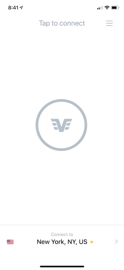
In fact, relatively little distinguishes one VPN provider from another in terms of features. Speed, reliability, availability, and trustworthiness are generally the make-or-break factors to consider when deciding from among competitors. The software they provide is, in my experience, more or less commoditized; aside from branding and a few low-level features, they basically all do the same thing, with roughly the same level of design quality. Here’s the main IVPN’s iPhone app:
There’s a settings screen too, but trust me, there’s not much more to this app than this.
So there’s certainly room for an ambitious and design-savvy VPN provider to create a best-of-class software experience for their service. The current crop leaves a lot to be desired in terms of aesthetics, interaction, and overall thoughtfulness in the user experience. It wouldn’t take a lot of effort to raise the game by simply rendering the standard features that one finds in every company’s VPN apps at a higher level of fit and finish.
Moreover, there’s also an opportunity for VPN software to make the very value they’re providing more understandable and transparent. I have yet to come across one that shows me my usage and performance statistics (elegantly), that highlights and explains any connection problems I’ve experienced, that automatically suggests switching to faster servers when appropriate. VPN software could also highlight how they’re making my data safer too, perhaps by highlighting the route that it takes to get to their servers, or mapping the potential dangers of the public networks that I join. Even though this software is not hard to use, it still rests on an assumption that consumers understand why they’re using it and how it works, which seem like areas that are ripe for friendlier, more plainly articulated explanation.
But I think there’s actually a bigger opening for VPNs—and security—as a concept, here. With so many providers to choose from, a consumer new to this concept is very likely to be overwhelmed by the choice. When I first investigated the idea of using a VPN service for myself, I felt incapable of evaluating the fitness of a given provider for my needs. None of the brand names were familiar, and my lack of in-depth understanding of the particulars of security protocols meant that each company’s technically-oriented selling points were largely lost on me.
What I found myself wondering was: why doesn’t a simpler, more consumer-oriented option exist? It’s clear that most people could benefit from using a VPN, but VPN providers seem to market almost exclusively to technologically-savvy users. That’s a situation where a good product can do wonders—particularly by abstracting the inherent technical complexity.
A single company could try to tackle this, but it might be more interesting—and effective—to abstract the entire category. What if there was an extremely well-designed VPN app that didn’t belong to any one provider, but that would serve as a gateway to the very best ones? New customers could download this “meta VPN” app from their app store, fire it up and then browse a gallery of vetted, high quality VPN companies. This listing could include user ratings and reviews, and perhaps be ranked by performance relative to the user’s current location. Having this sort of curation would impart to novice users the lay of the land when entering this market for the first time, and of course it could also let them subscribe and connect to a provider—all from right from within the same app, so it would be easy to try out many different providers without having to download software for each.
Even better, what if, instead of forcing you to choose one company, this meta VPN allowed you to essentially use all of these preferred providers via a subscription that effectively blends them all together? Imagine that if, by paying one monthly fee, your VPN traffic would, each time you connect, be routed through a different provider’s closest/fastest server. This would not only greatly increase the number of available options you have as you travel, but it would also randomly distribute your traffic and data among many independent parties. The huge potential benefit there is that it would give you even more security and anonymity, making it much more difficult for any government body to ever be able to successfully subpoena your records in any coherent form.
As I said at the top, my knowledge of this category is thin at best, so these ideas may be impractical. But in a way that level of naïveté seems like something that this category needs. Security and privacy are only becoming more vital and essential, and demystifying VPN technology on a large scale—for the benefit a large swath of consumers with little knowledge of it—could really catalyze this market. It would also be a valuable design contribution to the public, because it seems clear that design is what’s needed to level up this technology. And with design having been complicit in so many detrimental societal changes lately, that would be welcome.