is a blog about design, technology and culture written by Khoi Vinh, and has been more or less continuously published since December 2000 in New York City. Khoi is currently Principal Designer at Adobe. Previously, Khoi was co-founder and CEO of Mixel (acquired in 2013), Design Director of The New York Times Online, and co-founder of the design studio Behavior, LLC. He is the author of “How They Got There: Interviews with Digital Designers About Their Careers”and “Ordering Disorder: Grid Principles for Web Design,” and was named one of Fast Company’s “fifty most influential designers in America.” Khoi lives in Crown Heights, Brooklyn with his wife and three children.
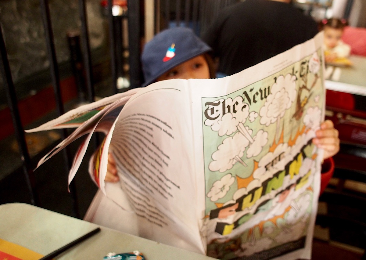
My news consumption has been so thoroughly digital for years that I honestly never expected to subscribe to home delivery of The New York Times again. But two years ago the paper started running a special, print-only section for kids on the last Sunday of each month. My daughter happened to come across a few of the installments here and there and pleaded with us to subscribe. Since the cost of Sunday-only home delivery is only nominally more expensive than a digital subscription, we relented.
I’m not particularly happy about the resulting stacks of newsprint in the house, but I have to admit, the sight of my kids poring over the paper makes it worthwhile. It reminded me of my own youth, when I would read The Washington Post’s Sunday comics section cover to cover. It always bewildered me that The Times refused to run a comics section; any excuse to get kids exposed to newspaper consumption seems like an essential path to future customers. (For a while, The New York Times Magazine ran a “Funny Pages”” feature, which was like Sunday comics for people too arrogant to read comics; I hated it.)
This is not a comics section though. It is, appropriately, a newspaper within a newspaper for younger readers:
…The special section is a kid-centric version of The Times and mimics regular sections in the paper, including sports, national news, food and arts. Need career advice from an animator or a recipe for the best homemade slime? This package has you covered.
This is both unsurprising, because that is exactly what you would expect from a section officially titled The New York Times for Kids, and surprising, because the paper has so effectively dispelled its traditional buttoned-up (some would say stuffy) airs in order to create something genuinely fascinating to the younger set. The stuff you find between its pages is completely unassuming, wittily written, graphically arresting, and thoroughly kid-centric in its worldview. This week’s edition is the humor issue and my daughter pronounced it “Really funny.” The ol’ Gray Lady has some tricks left in her yet, and one of them seems to be knowing that a kid’s heart leads to a parent’s wallet.
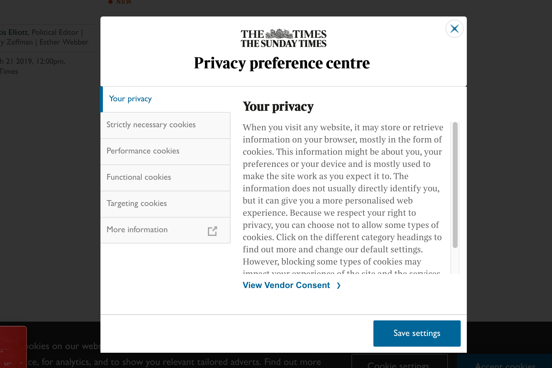
Any time I’m confronted with a standard GDPR privacy warning on a web site, I reflexively click the option to accept cookies and move on. Recently though, while reading an article at The Times of London’s web site, I accidentally clicked on the option to manage my settings instead. What I got was this “privacy preference centre” dialog box. I was pleasantly surprised by its unexpectedly succinct design.
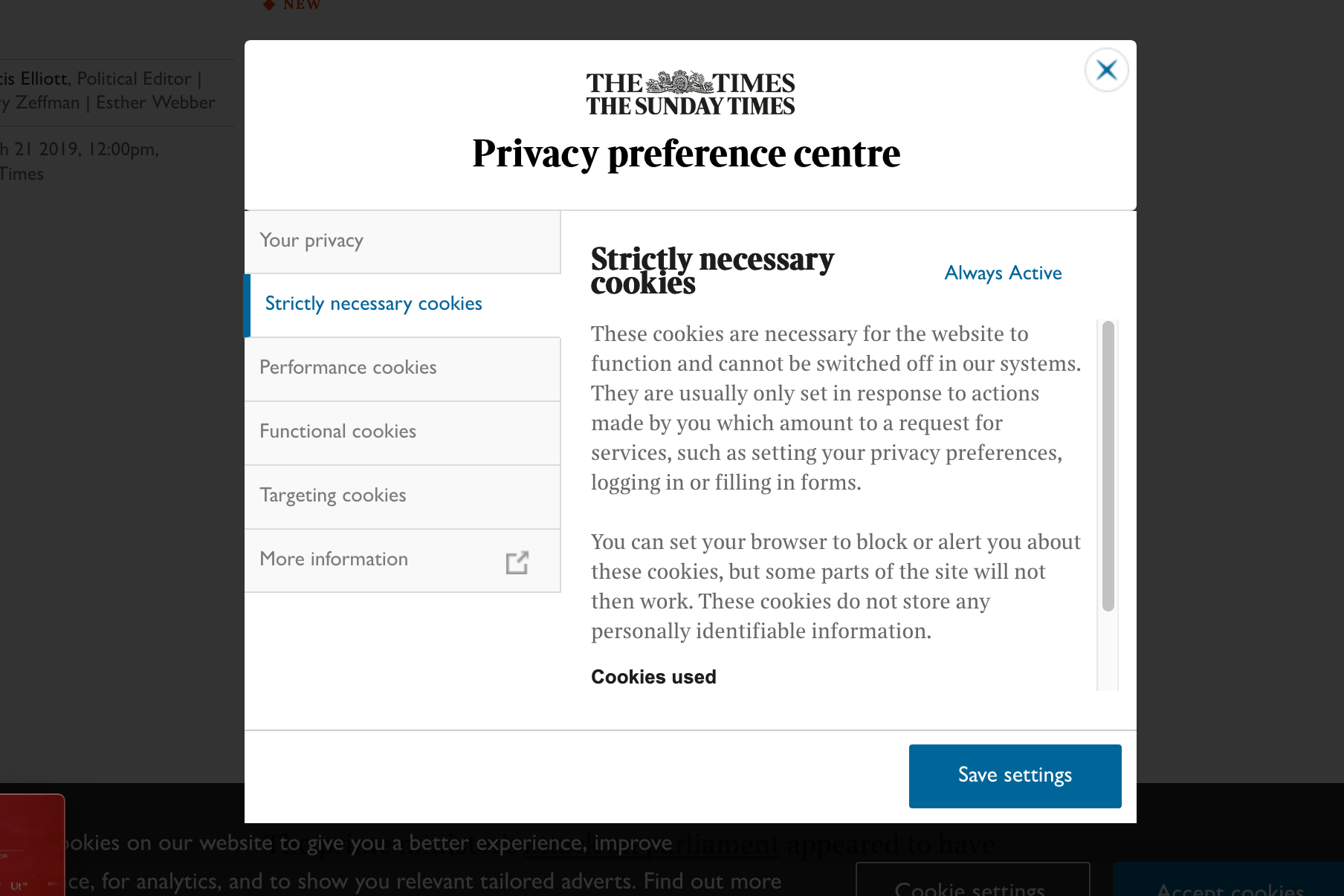
I can only imagine it took a lot of effort to wrestle the gnarly details of a privacy policy into as straightforward a form as this. The left-hand tabs are clearly and plainly labeled, and the text on each tab is reasonably concise, running about eighty words or so. Just as importantly, each section makes an honest attempt at explaining that particular privacy concept in direct, jargon-free language.
The presentation of these settings is almost certainly powered by One Trust, a service which allows customers like The Times to easily create and customize preference panels for cookies and tracking software, and then to embed them easily on their own sites. One Trust claims it provides similar privacy interfaces for thousands of customers. Here’s a more “straight out of the box” example that hasn’t been tailored to fit a host brand.
The team at One Trust have obviously distilled their considerable domain knowledge into a thoughtful, efficient design that mitigates some of the opaqueness that always seems to accompany privacy experiences. Of course, you could argue that half a dozen tabs, no matter how elegant they are, is still too much to expect the vast majority of users to ever contend with. But it’s also fair to say that among the countless user-hostile privacy experiences that web sites have implemented out there in the wild, this is more user-friendly than most.
In some ways though this level of design refinement can actually be misleading to users. It portrays the privacy choices available to site visitors as being a simplistic set of controls. It looks like visitors can exert the full extent of their privacy rights by toggling just three or four toggles, like the ones shown here.
In reality though, even if you switch those off, there is another layer of controls that’s effectively hidden behind The Times’s elegant presentation. Back on the first tab of this privacy centre, there’s a seemingly benign link labeled “View Vendor Consent” that belies this simplicity. Clicking on it is a bit like lifting a rock to find a colony of living organisms thriving underneath. What you get is a list of literally dozens of ad networks that are enabled on the site, all of them toggled on by default. (I turned mine off for this screen shot.)
Of course, this is the reality of operating a content site in 2019: ad networks like these are essential to publishers’ business models. So it’s hard to fault One Trust or The Times for the existence of these settings. They have made this internecine world more approachable than it otherwise might be, imperfect as it might remain.
Still, this is a useful illustration of design’s limits in the realm of privacy—at least right now. Privacy as an experience is a product of complex business imperatives and technologies that have largely evolved without the participation of design. Even in a case like One Trust, where design has been brought to bear to improve the experience, it can only do so in a limited way—this is efficient window dressing, but in the end it’s still only window dressing.
The implication, of course, is that there’s an opportunity here to level up the experience of privacy through the application of design as a discipline. What’s needed is not just better interfaces like these, but a redesign of the whole ad network ecosystem. For now, that is a challenge that any single design team, whether at a publisher like The Times or a service provider like One Trust, would sem unlikely to be able to surmount on their own. But if it’s ever going to get fixed, if we truly want a world in which privacy controls are comprehensible to mere mortals, then design should play a role.
We’re officially “on hiatus” between seasons of “Wireframe,” my podcast about how design shapes technology to fit into our lives. But that didn’t stop us from recording a new episode, available right now in your podcast player of choice. Go listen to it here!
This episode was actually recorded live a few weeks ago at On Air Fest in Brooklyn, New York. On Air is a unique conference about creativity in sound, sort of a mashup of everything audio—not just music and radio, but podcasting, sound design, and art, too. Take a look at the line-up; it was full of amazing folks doing amazing stuff in this space.
We decided that On Air was the perfect place to take a look at voice design and the world of Siri, Alexa, Google Assistant, et. al. To do that, we first dug into some early examples of voice-enabled human-computer interaction, unearthing clips of some fascinating precursors to today’s voice assistants. That was followed by a live discussion with two guests who are working at the forefront of voice interaction design: Katie Briggs, product designer at NPR, and Will Hall, chief creative officer at RAIN, an agency focused on voice.
If you’re not familiar with “Wireframe,” it’s a unique kind of design podcast, hosted by yours truly. Instead of merely interviewing well known designers, we dig into the world of interaction design via deeply researched reporting and engaging narratives. In other words, stories instead of résumés. You can read more about it in this blog post, and listen to the first season here.
Last month I took my kids to go see “The Lego Movie 2: The Second Part” which was totally fine. It’s not exactly one for the canon, but I’ve come to the conclusion that anything that the creative team of Phil Lord and Chris Miller are involved in is worth watching. They don’t always hit it out of the park but they do always take a big swing. Even their lesser movies (does anyone remember “Storks”? It wasn’t bad!) are way more interesting than they need to be. It’s actually a shame that there’s no Academy Award for producing because it’s clear that there’s no way “Spider-Man: Into the Spiderverse” would have taken home an Oscar last month if it weren’t for their involvement as producers. These two are building an amazing body of work.
Actually “The Lego Movie 2” was the only new movie I saw in theaters last month. I also managed to get out to see a screening of Alfred Hitchcock’s 1945 classic “Spellbound,” which was showing at The Metrograph. That’s a wonderful revival theater in downtown Manhattan that, I’m embarrassed to say, I’d never been able to visit before. “Spellbound” is not premium Hitchcock, but it did inspire me to go home and watch another of the director’s movies: “Notorious.” I hadn’t seen that one since I was a teenager, and I was happy to find that it’s still as magnificent as ever. It was the best thing I watched all month.
Here are all nineteen films I watched in February.
“The Oath” (2018) Terrific and hilarious, even if it goes off the rails a bit.
“Peter Rabbit” (2018) Exceeded my very low expectations—by a little.
“Hail, Caesar!” (2016) You know the term “inside baseball”? This is “inside Hollywood,” but, like, old. I mean, I enjoyed every minute of it. Rewatched.
“Okko’s Inn” (2018) Little more than an excuse for gorgeous hand-drawn animation.
“Notorious” (1946) One of those rare films where everything went exactly right.
By the way, my new goal in life is to get these roundups posted within two weeks of the end of each month. You can also see everything I watched in January and a full list from 2018. And, if you’re interested, you can follow along with my movie diary at letterboxd.com.
I don’t know a lot about security but I do know that when I use public wi-fi—whether on my phone, tablet or laptop—I should be protecting my traffic with a virtual private network.
For those unfamiliar with VPNs, the concept is basically that you use a simple piece of software to open up a private channel to a trusted server, through which you route all your browsing, email, uploading and downloading, etc. A good VPN keeps your identity private, your data secure and helps mask your location, even from the provider of the Internet connection you’re using to connect to the VPN. Those benefits are highly desirable in today’s privacy-scarce world, and by and large, VPNs are not technically demanding to use. Still, the whole concept of consumer-ready virtual private networks is sorely lacking when it comes to good user experience design.
Most VPN providers provide dedicated client apps or utilities through which you use their service. All you need to do is click a button, wait a moment for the software to connect with the VPN server, and then go about your business. For the most part, this is a straightforward, reliable process, but of course since you’re introducing another factor into your technical setup, it does on occasion present hiccups—VPNs can occasionally make it difficult to connect to certain servers, or certain sites or services can get tripped up when routing through VPNs. All in all though, the benefit of added security and peace of mind is well worth the minor hassle of the occasional problems that VPNs introduce.
My provider of choice is a company called IVPN, whose service is well-reviewed and reasonably performant (it worked great for me in Europe and Japan last month). But there are actually exactly one million, eight-hundred and seventy-three other VPN providers out there that you can choose from, so it’s really a buyer’s market.
In fact, relatively little distinguishes one VPN provider from another in terms of features. Speed, reliability, availability, and trustworthiness are generally the make-or-break factors to consider when deciding from among competitors. The software they provide is, in my experience, more or less commoditized; aside from branding and a few low-level features, they basically all do the same thing, with roughly the same level of design quality. Here’s the main IVPN’s iPhone app:
There’s a settings screen too, but trust me, there’s not much more to this app than this.
So there’s certainly room for an ambitious and design-savvy VPN provider to create a best-of-class software experience for their service. The current crop leaves a lot to be desired in terms of aesthetics, interaction, and overall thoughtfulness in the user experience. It wouldn’t take a lot of effort to raise the game by simply rendering the standard features that one finds in every company’s VPN apps at a higher level of fit and finish.
Moreover, there’s also an opportunity for VPN software to make the very value they’re providing more understandable and transparent. I have yet to come across one that shows me my usage and performance statistics (elegantly), that highlights and explains any connection problems I’ve experienced, that automatically suggests switching to faster servers when appropriate. VPN software could also highlight how they’re making my data safer too, perhaps by highlighting the route that it takes to get to their servers, or mapping the potential dangers of the public networks that I join. Even though this software is not hard to use, it still rests on an assumption that consumers understand why they’re using it and how it works, which seem like areas that are ripe for friendlier, more plainly articulated explanation.
But I think there’s actually a bigger opening for VPNs—and security—as a concept, here. With so many providers to choose from, a consumer new to this concept is very likely to be overwhelmed by the choice. When I first investigated the idea of using a VPN service for myself, I felt incapable of evaluating the fitness of a given provider for my needs. None of the brand names were familiar, and my lack of in-depth understanding of the particulars of security protocols meant that each company’s technically-oriented selling points were largely lost on me.
What I found myself wondering was: why doesn’t a simpler, more consumer-oriented option exist? It’s clear that most people could benefit from using a VPN, but VPN providers seem to market almost exclusively to technologically-savvy users. That’s a situation where a good product can do wonders—particularly by abstracting the inherent technical complexity.
A single company could try to tackle this, but it might be more interesting—and effective—to abstract the entire category. What if there was an extremely well-designed VPN app that didn’t belong to any one provider, but that would serve as a gateway to the very best ones? New customers could download this “meta VPN” app from their app store, fire it up and then browse a gallery of vetted, high quality VPN companies. This listing could include user ratings and reviews, and perhaps be ranked by performance relative to the user’s current location. Having this sort of curation would impart to novice users the lay of the land when entering this market for the first time, and of course it could also let them subscribe and connect to a provider—all from right from within the same app, so it would be easy to try out many different providers without having to download software for each.
Even better, what if, instead of forcing you to choose one company, this meta VPN allowed you to essentially use all of these preferred providers via a subscription that effectively blends them all together? Imagine that if, by paying one monthly fee, your VPN traffic would, each time you connect, be routed through a different provider’s closest/fastest server. This would not only greatly increase the number of available options you have as you travel, but it would also randomly distribute your traffic and data among many independent parties. The huge potential benefit there is that it would give you even more security and anonymity, making it much more difficult for any government body to ever be able to successfully subpoena your records in any coherent form.
As I said at the top, my knowledge of this category is thin at best, so these ideas may be impractical. But in a way that level of naïveté seems like something that this category needs. Security and privacy are only becoming more vital and essential, and demystifying VPN technology on a large scale—for the benefit a large swath of consumers with little knowledge of it—could really catalyze this market. It would also be a valuable design contribution to the public, because it seems clear that design is what’s needed to level up this technology. And with design having been complicit in so many detrimental societal changes lately, that would be welcome.
At the beginning of last year, I wrote a post about the woeful lack of aesthetic diversity in illustrations used for tech products—a phenomenon I described as a kind of a pervasive “monoculture.” That caught the attention of illustrator and designer Mark Grambau, who has since launched a new podcast called “How to Draw a Startup” which focuses on “illustration’s evolving role in the tech industry.” Grambau describes it as a podcast mini-series that “explores why illustration is utilized, how illustrated brands are crafted, and where illustrators fit in creative teams.”
The show’s fifth episode digs further into this monoculture topic, asking whether my assertion was valid, and how designers and illustrators can advocate for more unique aesthetic approaches in technology. Grambau includes this quote from an interview he did with me, in which I suggest some of the implications of this monoculture:
The question is: At what point does the value become commoditized? And at what point does the lack of distinctiveness, the lack of unique voices really start to hurt the company themselves and also hurt the community of users and customers?
I mean, if you’ve got a wide range of apps and services—you know, everything from ride hailing to apartment sharing to recording your physical and health data—if all of these services speak in the same language, are you essentially talking to one kind of user out there? Or one kind of customer? Or maybe effectively excluding other people? Or are you missing opportunities to make your brand, your company, your service distinct from the others? Ultimately, are we all just limiting the the use cases that we solve for? Limiting the problems that we’re trying to tackle?
And I’m exaggerating a little bit here about what the outcome is of these kinds of aesthetic choices, but if you look at how technology has chosen to apply itself over the past decade, the kinds of problems that technology has applied itself to, it’s actually no accident that this kind of illustration caught on. It’s very anodyne. It’s very benign. It’s not very challenging. It doesn’t really seek to address a wider worldview, doesn’t seek to acknowledge diversity in the audience that it’s communicating to. And that matches up to the kinds of apps and services that we’ve seen over the past decade or so, where, you know, you have services devoted to getting your laundry done or getting alcohol delivered to, you know, your condo. I mean, basically services that are oriented towards treating customers as, you know, privileged children.
“How to Draw a Startup” is unusual in that it eschews the normal interview format that the vast majority of design podcasts take. (In this way it’s similar to what we’ve tried to do with my own podcast, “Wireframe.”) Instead, it opts to edit together multiple voices and perspectives into a cohesive narrative, with Grambau weaving it together as the host—and doing it all superbly, I might add. In this fifth episode alone, Grambau includes not just comments from me but also from Maryland Institute College of Art illustration chairperson Allan Comport, Google Doodler Jennifer Hom, former Intercom designer Stewart Scott-Curran, Dropbox designer Kristen Spilman, illustrator Quentin Vijoux, and Buck creative director Kevin Walker—whew. You get the idea; Grambau is thorough.
And not just in his sourcing, either. In addition to meticulously weaving together a number of disparate voices, Grambau also provides full transcriptions for each episode on the show’s site, copiously illustrated (of course) with supporting visuals. Each installment becomes more than just a show; it’s a complete resource, even a lesson in the topic at hand. And the topics that “How to Draw a Startup” takes on are substantive; Grambau dives deep into the gap between aesthetic and systemic visual work, illustration methodology, cultural representation and more. No one has covered this increasingly important nexus between technology and illustration with as much detail and thoughtfulness. What’s more, it’s extremely listenable; as host, Grambau takes pains to tell his stories with clarity and to explain complex or obscure topics in plain language for the uninitiated.
The entirety of episode five is embedded here for your listening pleasure. You can also subscribe to “How to Draw a Startup” at Apple Podcasts, Stitcher, Spotify and wherever you get your podcasts (personally, I use Pocket Casts).
Ugh, the Oscars ceremony was last night. Seeing the results this morning, there’s so much to complain about, but it’s probably better for me to skip all that and just get to my very delayed round-up of the sixteen movies I watched last month.
That included two that I got to see in theaters: “Roma,” which I watched in 70mm, and “If Beale Street Could Talk,” Barry Jenkins’s unflinchingly painful adaptation of the 1974 novel by James Baldwin. Both were gorgeous on the big screen (“Beale Street” perhaps even moreso than “Roma”), and are clearly the work of true masters of their form. But I’m honestly bewildered by the relative lack of attention paid to the latter; this was one of the very best films of last year.
Meanwhile, at home, I also undertook a long postponed project: watching the entire run of “Harry Potter” films. I’ve never read the books and had only seen the third film (the one directed by Alfonso Cuarón) before, but my daughter has been fanatically immersed in J.K. Rowling’s world for some time now, so I wanted to experience some of it for myself. I managed to watch “only” the first seven (the first seven!) before the end of the month and finished the eighth early in February. My reaction: Wow. That was a long way to go to arrive at some pretty obvious conclusions.
Here’s the full rundown:
“Solo: A Star Wars Story” (2018) When are we all going to admit that we’ve dragged this “Star Wars” thing out way too long now?
“How to Train Your Dragon 2” (2014) Apparently our current decade’s films are obsessed with the idea of mother figures being banished to purgatory.
“Harry Potter and the Deathly Hallows: Part 1” (2010) What this franchise needed but never got was a creative team more interested in making good movies than in adapting the books.
You can also see everything I watched in 2018 (and more) in my year-end roundup. And, if you’re interested, you can follow along with my movie diary at letterboxd.com.
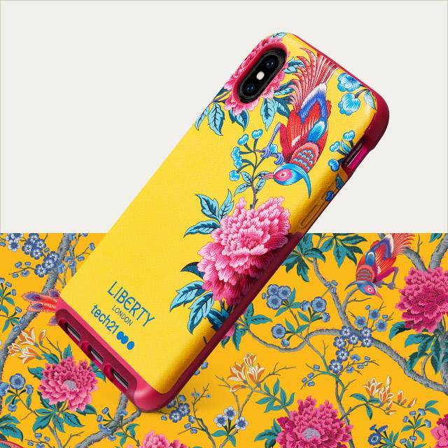
You could plausibly argue that most iPhone cases, protective qualities aside, hide and even detract from the aesthetic beauty of the phones themselves. I mean, we all know Jony Ive sheds a tear every time an Otterbox is sold. But there is a line of cases from Tech 21 that might actually have a legitimate claim to making your iPhone look better. That’s because they feature original decorative designs from Liberty London, drawing on over a hundred and forty years of distinctive, art nouveau-inspired textile prints. They’re stunning, actually.
Their formal attractiveness aside, what draws me to this line of cases is the idea of creating a connection, however tenuous, between the distinctly contemporary iPhone and an historically significant design legacy like Liberty’s. If nothing else, the pairing of these two seemingly unrelated kinds of design draws a contrast worth considering between a technological product that few people expect to last more than two or three years and an aesthetic tradition that has lasted nearly a century and a half.
I’m not really a floral print kind of guy, but I’ve long admired the aesthetic acuity of Liberty prints. What’s more, I would actually sport one of these myself if I didn’t already own a case (also made by Tech 21, but just a boring, dark gray color)—and I wouldn’t necessarily choose the darkest, “manliest” option, either. There are ten total designs and you can see them all at tech21.com.
Folks, at long last, I made it to Japan. Like just about every designer I know, I’ve felt spiritually drawn to that country for years, but for some reason I just never found the opportunity to go. Then I was asked to take part in “Why Design Tokyo,” a new conference for user experience design organized by Adobe’s UX Dojo team and UX Milk, and hosted by the folks at DMM.com. So two weeks ago I packed a bag and flew there for two days of talks, workshops and getting to know the local community.
It was an incredible visit, but altogether too brief—just three full days. That’s far too little to do anything more than see a fraction of Tokyo’s architectural diversity, experience just a smattering of its otherworldly shopping culture, sample just a few of its amazing restaurants (I did get to eat at a Michelin-starred ramen joint though—a major highlight), and meet just a small number of the amazing designers who call Tokyo home.
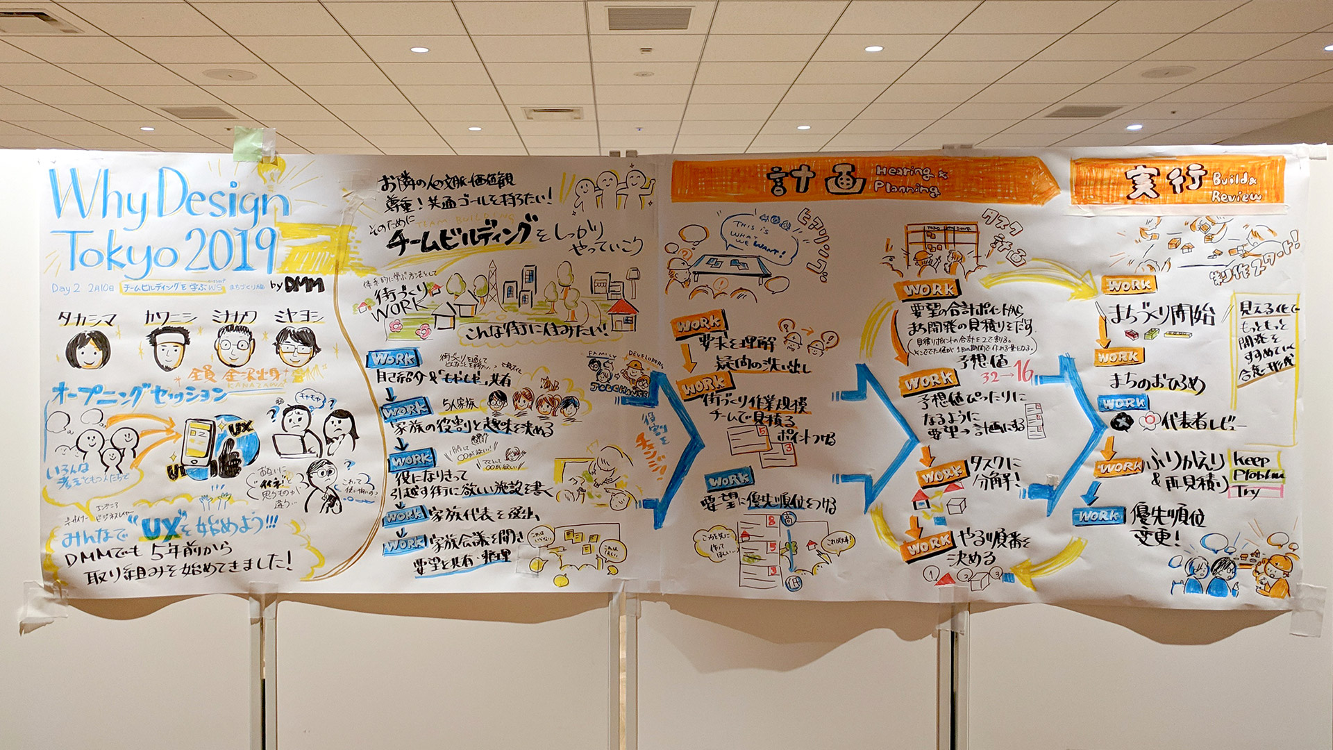
What I did see of the design scene there was really wonderful: truly energetic, deeply curious designers who fully immersed themselves in the conference. I was particularly astonished by how thoroughly their uniquely Japanese aesthetic manifested themselves in everything they did. One of the other speakers, Google’s wonderful Travis Neilson, ran a wildly successful workshop in which teams of designers collaborated on product ideas. The worksheets they produced were stunning in and of themselves, but also shockingly consistent with what finished graphic design looks like in Japan. I snapped these pics.
I was asked to give a keynote talk that, in the words of one Japanese member of the organizing team, would encourage designers in Japan to “get out of their daily routines and take a new step” in their practice. Delivering the lecture itself was a new kind of experience for me; I’ve never had to give a talk with an interpreter before, right there on stage with me. It forced me out of my usual, rambling style; I had to articulate each idea as succinctly as possible in English, then wait for the real time translation to be delivered to the audience before I could continue to the next point. The result was one of my more streamlined talks, which I’ve annotated and embedded here via Speaker Deck.
My main takeaway: it was really humbling to experience such a rich design culture whose operating fundamentals are so different from my Western-biased assumptions about how “good” design is created. I’ve seen design up close in a lot of countries, but I usually feel like I have some sense of how it works, and can find my bearings in how it’s practiced. By contrast, I feel like a true neophyte when it comes to Japanese design, with little understanding for its dynamics. It just leaves me awed and inspired. I imagine this is how untrained audiences for design feel in the west—and everywhere. It’s actually kind of a marvelous sensation. I can’t wait to go back.
When designers ride public transportation, they can’t help but notice the signage—especially if it’s confusing. Most of us just tsk-tsk to ourselves or complain vainly to uncomprehending companions. But New York-based designer Adam Fisher-Cox actually does something about it: he undertakes self-initiated projects to propose redesigns and shares them with the world.
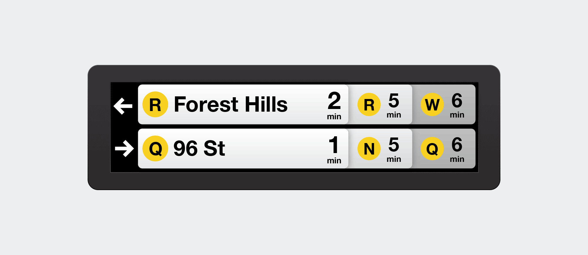
Here’s one good example: several years ago, the Metropolitan Transit Authority, which operates New York City’s subway, installed countdown clocks throughout the system. These LCD display boards let riders see at a glance just how much time remains before the next train arrives, finally remedying a perennial source of bewilderment and pain that has plagued generations of subway riders. Suddenly you could tell at a glance whether you’d be better off staying put and waiting, walking to another platform to catch an alternate route, or even exiting the station altogether and hailing a cab—and usually the information is actually even accurate. For those who live in cities where this kind of technology is already common, you have to understand: this subway system is over a hundred years old.
Still, despite providing long needed information to riders, the countdown clocks are hardly a paragon of information design. They provide only room enough to show two pending train arrivals at a time, which is too slow a pace in some stations where the train you’re actually waiting for may be third or even fourth behind the next one to arrive. Some countdown clocks also need to show countdowns for multiple trains arriving in two different directions at once, and so waiting for the information you need to be displayed can be tediously time consuming.
Fisher-Cox proposed a redesign that uses overlapping cards to indicate the next several trains arriving in two directions. It’s a whipsmart solution. You can read about the thinking that went into it in this blog post he wrote.
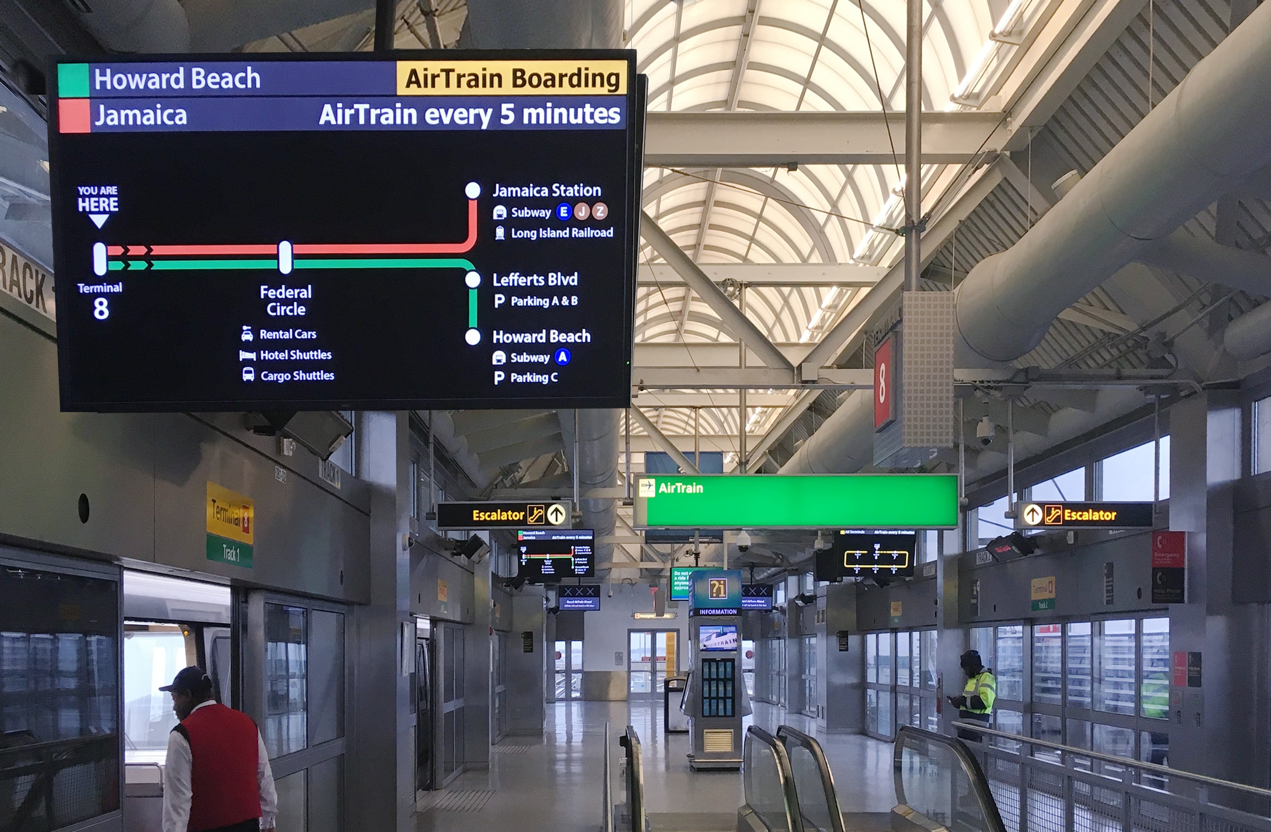
Fisher-Cox also did something similar for the wayfinding system for the AirTrain at JFK airport, this time with some real world impact.
This one immediately caught my attention not just because the work is very good, but because I happen to use that particular light rail system all the time. JFK is the closest airport to me, and I prefer to get there by taking the subway to Howard Beach, Queens, where I transfer to the AirTrain to get to my departure terminal. The whole journey takes not much longer than traveling by car and costs just US$7.75, but the real benefit is you’re not burning fossil fuels along the way.
The AirTrain itself is much more modern and reliable than the subway, but its wayfinding signage is plagued by mediocre typography, questionable aesthetic choices, and less than optimal labeling and directional instructions. I mean, take a look.
After riding it himself for the first time, Fisher-Cox wrote this extensive critique and mocked up some possible solutions. This led to him actually getting hired by the Port Authority of New York and New Jersey, the agency responsible for the airports and their attendant light railway lines, to create a pilot solution for the real thing.
Fisher-Cox’s resulting redesign is much less ornamental, much more legible, and significantly easier to understand, even at first glance. His case study lays it out in detail.
Additionally, Fisher-Cox wrote this revealing blog post in which he walks readers through the reasoning behind his solution. It’s an invaluable lesson in how to design wayfinding, but also in fundamental principles of usability. Read it at adamfishercox.com. Then maybe go out and redesign the public transportation signage in your city.