is a blog about design, technology and culture written by Khoi Vinh, and has been more or less continuously published since December 2000 in New York City. Khoi is currently Principal Designer at Adobe. Previously, Khoi was co-founder and CEO of Mixel (acquired in 2013), Design Director of The New York Times Online, and co-founder of the design studio Behavior, LLC. He is the author of “How They Got There: Interviews with Digital Designers About Their Careers”and “Ordering Disorder: Grid Principles for Web Design,” and was named one of Fast Company’s “fifty most influential designers in America.” Khoi lives in Crown Heights, Brooklyn with his wife and three children.
As of January 1st a new price transparency law now requires U.S. hospitals to publish a list of their standard charges on the Internet, something they had not typically done before. Over at Quartz, reporter Anne Quito and visual journalist Amanda Shendruk took a look at the published prices of 115 of the largest hospitals. What they found is that this ostensibly revealing information is going to be of little use to most customers. First, the lists are usually hidden in obscure, difficult to find corners of the hospitals’ websites, and second, the data is rarely human-friendly.
After locating the list, there’s the matter of understanding it. To comply with the law, many hospitals published their entire chargemaster, a list that contains thousands of items—from a cotton ball to an organ transplant—written in terms and codes unintelligible to most consumers. A chargemaster is essentially an internal document that hospitals send insurance companies to negotiate the amount they’re going to receive. The prices listed are typically higher than what most patients actually see on their medical bills, unless they’re uninsured.
As an example of how inscrutable this can be, Quartz published a screen grab from Florida Hospital Orlando’s pricing list. It’s a wonder of illegibility.
Quito asked me to comment on how design might have helped make this information more relevant to consumers, and a few of my quotes are included in the article. There’s no question that more specific guidance in the law on how the information should be presented, alongside some actual consideration for user experience on the part of the hospitals, would have gone a long way to improving the effectiveness of this effort. Design could have helped enormously.
At a higher level though, the healthcare system is so daunting, its overall user experience needs so much more than good design. Quito closes the article with some of my thoughts on this:
‘It’s crazy that we have this enormous healthcare system, and it’s so complex and you’re expected to negotiate it on your own with no help,’ says Vinh.
If you think of the healthcare system as a civic institution not unlike the legal system, the proposition for mere mortals starts to look absurd. Few of us would feel comfortable representing ourselves in courts of law without a lawyer, and yet we’re all expected to make our way through the complexity of healthcare entirely on our own, without an experienced advocate to help us understand our options and ensure our safety, to say nothing of maximizing the value of what we pay for.
The bad news is that for some reason Google’s excellent Chromecast Audio adapter has been discontinued. The good news is that while supplies last, you can get one for just US$15—a steal.
For those unfamiliar, the Chromecast Audio plugs into any traditional speaker and lets you stream music to that speaker from Chromecast enabled phones, tablets and other devices. You can network one or more Chromecast Audios with a Google Home device and you’ve built yourself a Sonos-like, voice-enabled, whole-house sound system for a fraction of Sonos’s healthy premium. This also allows you to set up groups of speakers, e.g., one group just for certain rooms, another for the entire house, etc. And the groups are all voice-enabled, so we can say, “Okay Google, play Halsey on the first floor speakers” (Halsey is a popular musical artist, right?).
On top of that, you’ll have a smart speaker-enabled household (provided you’re comfortable with the inherent privacy concerns) that lets you control smart bulbs, plugs, thermostats, etc. It generally works really well and in many ways, it’s the kind of seamless experience that I once would have expected out of a connected home experience from Apple.
We were a committed AirPlay household for a long time, actually, but Apple neglected that standard so much—kept it proprietary and under-delivered with the Home Pod—that the Google alternative became too tempting to resist. Now we’re a Google household with a Google Home in the kitchen and a series of Google Home Minis spread all over the house. Our favorite feature is the broadcast functionality which lets us use the devices like an intercom system, saving us the trouble of hollering between floors for everyone to come to the table for dinner, etc.
I’m actually surprised that Google is discontinuing the Chromecast Audio in the face of Apple’s recent renewed interest in AirPlay—it was announced last week that AirPlay is coming to smart TVs for the first time. In fact, I’d gladly switch back to AirPlay if Apple were to bring Alexa- or Google Assistant-quality services to Siri underpinned by Apple’s much more appealing privacy approach. In the meantime though, Google Home is the solution for us. In fact, I took took advantage of the clearance pricing and bought two more Chromecast Audios, just for good measure.
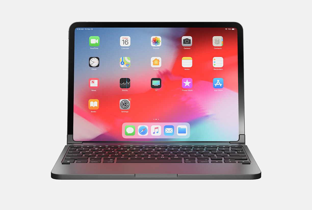
Brydge, longtime makers of laptop-like keyboards for tablets, has stirred up a lot of excitement (at least among those who care about this kind of thing, and I count myself among them) with its latest product: the new Brydge for iPad Pro 2018 is a MacBook-like, backlit keyboard available for both the 11-inch and 12-inch models. It’s also impressively styled with an aluminum housing, if the product shots are a reliable indicator.
The Brydge Pro attaches to the iPad at its corners via two reasonably elegant, padded hinges. This allows the tablet itself to be positioned at any angle, or at least many more angles than the two allowed by Apple’s own Smart Keyboard Folio for iPad. You can see it in action in this video:
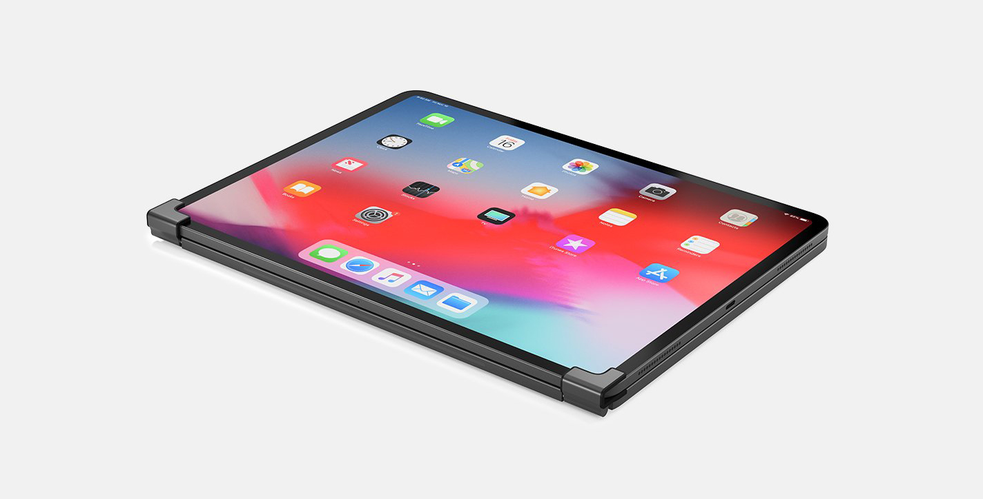
Presumably, attaching and detaching the iPad via those hinges is straightforward, because Brydge touts the ability to flip the tablet around so that it faces away from the keyboard. This lets you prop the iPad up in touch-only mode, like a kiosk.
This also allows you to fold the iPad and keyboard together flat, in what Brydge advertises as “tablet mode.”
The irony of attaching a tablet to a keyboard that promises you a “tablet mode” seems lost on Brydge, but it highlights the central tension of any keyboard made for the iPad: is the goal to augment the iPad with optional keyboard functionality, or to turn it fully into a laptop? The challenge of balancing these two impulses is the reason why, in my estimation, the perfect iPad keyboard has yet to be invented.
While I have my reservations about Apple’s own Smart Connector line of iPad keyboards, they evince a better understanding of this quandary than most. Part of the beauty of the iPad is that it can be either a pure tablet or an incredibly mobile laptop. Because Smart Connector keyboards attach and detach with terrific ease, they don’t force you to choose between the two modes.
For my money though, the iPad keyboard that came closest to this ideal was the Belkin Qode line, which I used to use with my iPad Air 2 several years ago.
The Qode was actually made of two pieces: the first was a keyboard that was not dissimilar from the Smart Keyboard Folio in that you could position the iPad at two angles, secured by two magnetic strips just north of the keys. The second was a quite sturdy case for the tablet itself, which was a real boon. I find tablet cases essential because I carry my iPad with me much more often and in far more real world situations than any laptop, and also because I’m generally clumsy. The Qode’s case and the keyboard worked together perfectly, snapping together easily and, when detached, actually powering down the keyboard so as to save power. This let me use my iPad as both as a tablet or a laptop at any time, but it also did not force me to choose between having a keyboard and a case, a choice that is implicit with many tablet keyboards.
To be fair, the Brydge Pro does offer some protection for the iPad with an optional snap-on magnetic cover, but it doesn’t protect the corners. It also emblazons the company brand across the back which, well.
Unfortunately the Brydge Pro, like the Belkin Qode before it, connects to the iPad via Bluetooth. (You can also connect via USB-C cable but then you’re using a cable.) My Qode had to be manually re-paired with my iPad every week or two, an annoyance that I would be surprised if the Brydge Pro can avoid. Apple’s proprietary Smart Connector technology is far superior, of course, but even that is not without its drawbacks: the Smart Connector on the new iPads has been reconfigured such that it doesn’t allow for a fully protective case to work with the Smart Keyboard Folio.
At the risk of repeating myself: we’re still waiting for the perfect iPad keyboard. But if you’re intrigued by the Brydge Pro, you can pre-order yours at brydge.com.
Over the holiday break, I had what I’m pretty sure was my first “civilian” encounter with augmented reality. At a New Year’s Eve party, a friend of the family showed me a bottle of wine from Rabble Wine Company which, when viewed with the company’s smartphone app, reveals an AR-powered animation that’s three-dimensionally mapped onto its label. You can see it in action in this video.
Not too bad, right? For a clearer view, this video clip displays the same animation, flat.
To my somewhat mild surprise, Rabble’s bottles are hardly unique. A number of wine and spirits companies have employed AR technology to bring their labels to life. Here’s another attractive (if more salesy) example, this time for Gentlemen’s Collection Wines.
In fact, both of these AR designs are among several projects for alcohol brands created by Tactic, a San Francisco-based studio that specializes in immersive media experiences for brands. And of course, neither Tactic nor the beverage industry are unique in deploying AR in this way: Ikea, Tesco and Kate Spade are just a few of the brands experimenting with this medium.
What I found notable though was that it wasn’t until the very last day of 2018 that I had any kind of a real world conversation about augmented reality with someone who is not a technologist or designer or somehow directly involved in the tech industry. Given the relentless drumbeat around augmented reality, this is surprising. If it’s inevitable, as futurists and technology pundits have claimed for some years, wouldn’t it be reasonable to expect more “organic” conversation about augmented reality outside of tech circles by now?
Muted genuine enthusiasm for AR is less surprising when you consider the friction involved in accessing this kind of content. I looked over that bottle of Rabble Wine and couldn’t find a single hint on the label that the “experience” of it could be complemented by a smartphone app. Even if you go to the Rabble website and follow the link to buy a bottle, there’s no mention of AR there at all either. So a customer would need to not only know, somehow, that the app was available, but he or she would also have to have the wherewithal to actually download and install the app.
In our app-friendly society, that probably doesn’t sound like a tremendous hurdle, but it’s already too many steps for the average person to bother with. To some extent I’m impressed that my friend went through the trouble of acquiring the app and then showing it to me at all. Still, I doubt many people would bother to do the same. If decades of tech product development have shown us anything, it’s that with each step that a user is required to undertake in order to use something, the potential audience is diminished exponentially.
What’s more, the Rabble app and others like it are essentially single-purpose pieces of software—there’s nothing else you can really do with them if you’re not pointing them at very specific bottles—and even then, the value they offer is extremely narrow. A technology with few purposes and few opportunities to take advantage of those purposes makes for pretty limited “virality,” as they say.
All of which suggests that the use case for augmented reality, at least in these examples, still seems poorly imagined at best. This kind of implementation frankly has no answer to what the media theorist Neil Postman described as one of the most important questions that should be posed of any new technological innovation: “What problem does this solve?” It’s clear that augmented reality, which I happen to personally believe is rife with potential, is still waiting for its iPhone moment: the debut of a product innovation that makes it not just technologically possible but useful, easy to access—and worth talking about.
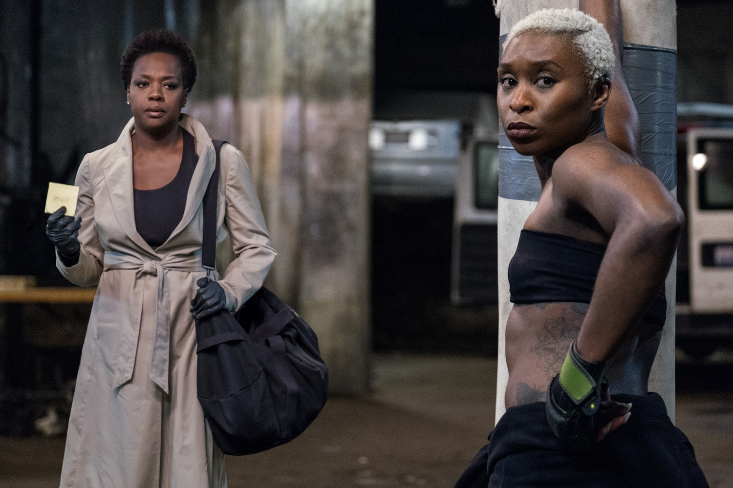
I’d watch just about anything Steve McQueen directs, so mesmerizing has his past work been. Like “Hunger,” “Shame” and “Twelve Years a Slave,” his latest feature, “Widows,” is imperfect, but McQueen has such complete command over what appears inside his frame that it’s impossible to look away. That makes this a heist picture like no other; its genre format is merely a vessel for the director’s nuanced observations on the way people struggle with the constraints of their own lives. It’s also a showcase for the formidable powers of the magnificent Viola Davis, whose smoldering eyes are a perfect match for McQueen’s sense of gravity. This movie came and went at theaters before most people even noticed, but I suspect it will be long remembered in the future.
Expectations can make all the difference when you walk into a movie theater. For instance, when I went to see Damien Chazelle’s new Neil Armstrong biopic “First Man” last month, my expectations were fully informed by the director’s previous movie, “La La Land.” I’m not really a fan of musicals but I was stunned into belief by that one, and it quickly became one of my all-time favorites. I’ll defend it from all haters.
Unfortunately, my fondness led to precipitously lofty expectations for whatever Chazelle’s follow-up would be. I regret to report that “First Man” falls short. On the one hand it’s a marvel of careful observations and precise, studious execution. But like its subject, it’s forbiddingly remote—maybe necessarily so. In order to render his portrait of Armstrong’s extreme reticence, Chazelle built an emotionally stifling framework around his subject and the movie never breaks out of that. It’s a vision of space travel so authentic you’ve never seen it before, but it also never enraptures the audience with the wild unknown of space. I liked it, but I’m pretty sure I didn’t enjoy it.
On the other hand, I walked into “Bad Times at the El Royale,” a thriller from screenwriter and director Drew Goddard, with very few expectations, good or bad. If you’ve seen the trailer you’d probably expect a suspenseful, violent and perhaps quirky B-movie, likely derivative of the early work of Quentin Tarantino. That’s pretty much what it is, but it’s also really well done and immensely fun. I liked it and I enjoyed it.
Here are all eighteen of the movies I watched in October.
Here it is, our last episode of the first season of “Wireframe,”” the podcast that tells the stories behind good interaction design. This installment tells the story of the shift from designing for accessibility to designing inclusively. Along the way, it looks at the challenges of tweaking the design of the WordPress interface and how hacking the Xbox game controller opened the door to new gamers. The story actually starts in an unexpected place: the kitchen of Julia Child’s “French Chef” cooking show, which, I was surprised to learn, was the first TV show ever to broadcast captions for the hearing impaired. It all ties together, believe me!
On a personal note, putting together these six episodes (plus our short bonus episode) has been amazing for me. I learned so much. Not just about podcasting, of which I knew very little beforehand, but also about design too. I thought I knew how to talk about what designers do, but the process of translating our ideas, methods and work into relatable, compelling stories was eye-openingly challenging. The language of design is so biased towards those already in the know and aimed pretty much only at other designers while remaining opaque to the uninitiated. Forging these stories showed me how valuable it can be to open up our culture. I’ve heard from so many people who enjoy “Wireframe” who would otherwise never dig into the subject at all. I also heard from so many designers who saw their work in a new light because of the way “Wireframe” helped put it into a broader context. Design doesn’t have to be a niche conversation.
To be clear, I can only claim a fraction of the credit for this. None of these stories would have been possible without the amazing talents of the Gimlet Creative team. They did the heavy lifting, they were the ones who sweated each and every episode, who did the reporting, the interviewing, the editing, the endless revisions and tweaking that brought the show to the level of quality that, I don’t mind saying, outclasses every other design podcast out there. I’m particularly grateful to the core of the team, producers Isabella Kulkarni (who joins me for today’s episode), Rikki Novetsky and Amy Standen, all of whom you hear on various episodes. And especially senior producer Abbie Ruzicka, whom you never hear but who was instrumental in guiding each and every show. And I should also say that there would be no podcast at all without the efforts of my colleagues at Adobe: not only did Lindsay Munro, Leah Walker and Paige Young actually master the funding and logistics that made this possible, but from the start they had an even bigger vision for what it could be than I did. I learned from every one of these people.
If you haven’t listened to “Wireframe,” it’s not too late! It’s a unique kind of design podcast, hosted by yours truly. Instead of merely interviewing well known designers, we dig into the world of interaction design via deeply researched reporting and engaging narratives. In other words, stories instead of résumés. You can read more in this blog post. And—we hope to return for a second season before too long. Stay tuned for more on that!
Finally, one last bit on the subject of podcasting. Last week, the Pocket Casts app launched a major new redesign. I had used previous versions on Android but I was pleasantly surprised by how elegantly executed the new iOS version is. (There’s a great write up of it over at MacStories.) After only a few days, it became my default podcast app. All of this was before (I swear!) I noticed that the marketing site for the app features the “Wireframe” show art right in the main image. So you know they have great taste over there. Give the app a try.
Our fifth episode of the “Wireframe” digs into the intersection of design and ethical practice. In it we trace the origins of Facebook’s famous Like button back in time to a frenzied hackathon in the last decade when it was conceived as a way of easily spreading positivity all over the Internet. We then look at the massive, unintended consequences of that tiny but momentous bit of UI, and how it demonstrates a model for creating products you love so much you can’t put down, for better or worse. This was one of my favorite episodes because it endeavors to ask questions every designer should be thinking about in his or her work.
If you’re not familiar with “Wireframe,” it’s a unique kind of design podcast, hosted by yours truly. Instead of merely interviewing well known designers, we dig into the world of interaction design via deeply researched reporting and engaging narratives. In other words, stories instead of résumés. You can read more in this blog post.
This graphic gathers together just about all the posters for the sixty or so films—most of them amazing, wonderful experiences—that I’ve watched over the past two years on FilmStruck, the indie, arthouse and classic films streaming service that, it was announced two weeks ago, will be shutting down at the end of this month. If you weren’t already familiar with the service, this is the way I described it in my subscriber-only newsletter earlier this year:
It’s basically like Netflix, but with good movies instead. Lots of good movies. Actually, most of the best movies ever made. If I had to make a choice, I would cancel Netflix in order to preserve my FilmStruck collection—in a heartbeat.
Looking back now, I realize I inadvertently referred to “my FilmStruck collection,” which of course is not accurate. As its impending demise underscores, nothing on the service was actually mine; I just had a month-to-month lease on it. It just felt like mine because it was so special to me.
Most of us accept the maxim that the modern internet makes it possible to have virtually any content at any time, from high-resolution scans of great works of art to obscure television shows from long ago. But it’s clear from this news that there’s a heavy bias towards that which is optimized for today’s consumption habits—the new, the novel, the binge-able.
That’s fine. Capitalism, et cetera. But what galls me about the closure of FilmStruck is that the service was doing more than just servicing a particular niche of movie fandom. It was a portal to film history, a rich trove of our cultural heritage.
To a lot of people, that sounds like homework, like tedium. I get it. But the genius of FilmStruck, what made it more than just an academic indulgence, was how the team behind it focused so much on making our collective cinematic back catalog accessible and fun. It combined the Criterion Collection’s peerless catalog of challenging films with Turner Classic Movie’s bevy of some of the most entertaining, crowd-pleasing Hollywood fare ever released.
And it was all curated brilliantly, with not just evident passion for film but also a sense of how film’s past continues to be relevant to its present. There was terrific original content, interviews with today’s filmmakers talking about how they were inspired by the movies you could now find on the service. And often, a current release in theaters would inspire terrific editorial collections. For the recent remake of “A Star Is Born,” for example, the editors put forward all the previous versions of that film that have been made over the decades.
That curation helped turn just the simple act of browsing FilmStruck into a pleasure—and an education. You couldn’t help but continually learn more and more about cinema as you perused the thumbnails and read the brief summaries, each one like a ray of light emanating from a doorway behind which laid a trove of cinematic history that might previously have been hidden to you. And that was just the individual films; the staff was constantly turning out all kinds of wonderful collections of movies, grouped by director or theme, usually illustrated with eye-catching graphics that underscored how special the whole experience of film was. Just the bundling of films together like this was a treasure, so beautifully designed and thoughtfully adorned with bonus materials and related films. It was like getting a new boxed set of special edition DVDs every time you opened the app.
As I alluded to in my quote above, I frequently thought about how my experience with FilmStruck compared to my experience with Netflix. I paid for both, so it was natural to weigh the value I was deriving from each. Not long I ago I realized that when I add a movie to my Netflix list, it’s with a feeling of resignation, practically a sense of defeat. It’s as if I do so with no real intention of ever watching it, just this vague idea that I may as well try and separate some of the wheat from Netflix’s abdundance of chaff.
By contrast, each and every movie that I saved to my FilmStruck watchlist was a movie that I knew that one day soon I would absolutely watch. I’ve gotten so much value from the two short years since the service launched that I expected to be a subscriber for life. I was looking forward to decades of great moviewatching.
So to see FilmStruck’s death sentence come so quickly is utterly heartbreaking. It also seems terribly shortsighted. The service’s operational cost can’t possibly represent anything more than a rounding error to its corporate parents, especially given how it serves as a beacon not just for quality, but also as a commitment to cultural history. I would’ve thought that you can’t put a price on that kind of cachet, but apparently I was wrong.
Maybe the saddest thing of all about this news is that there is nothing to replace FilmStruck. Sure, there are other services like Fandor, which can provide a substitute for some of what FilmStruck did (and they’re even offering a discount to aggrieved FilmStruck customers right now). But it seems unlikely that any other single service will be able to give us the same breadth and depth. When Oyster, a “Netflix for books,” shut down its subscription service, avid readers could still go to their public libraries. And if Spotify were to shut down, you could easily switch to a competitor. But it seems unlikely anyone else out there will be able to replicate the utterly unique, harmonious pairing of the Turner and Criterion catalogs—the nature of film licensing makes that a near impossibility.
What the FilmStruck team did was truly special: a destination that you could point your browser, phone or tablet to that was truly wonderful and legitimately enriching. Its impending demise makes for a terrible comment on the current state of our culture. We can make infinite room for “binge-worthy” shows that go on for far too many episodes, and for an endless parade of useless photos of ourselves. But we can’t spare a relatively tiny haven for a century’s worth of some of our richest cultural heritage. It makes me sad for the kind of Internet we’re building.
Two things that I highly recommend today: first, go vote. And make sure everyone you know at home and at work goes to vote, too. This essay from the legendary Roger Angel sums it up nicely: “What we can all do at this moment is vote.” Save it to Pocket or Instapaper so that you can read it while waiting in line to cast your ballot.
My second recommendation is: listen to episode four of “Wireframe,” out today. The title is “Good Design Is Why You’re Not Wearing AR Glasses,” and it digs into what role design plays in this new immersive technology. In it, you’ll meet a guy who’s been wearing a computer on his face since even before Google Glass made it cool!
If you’re not familiar with “Wireframe,” it’s a unique kind of design podcast, hosted by yours truly. Instead of merely interviewing well known designers, we dig into the world of interaction design via deeply researched reporting and engaging narratives. In other words, stories instead of résumés. You can read more in this blog post.