As of today, my time at Automattic has come to a close, so I picked out my favorite photos from trips I took between 2010 and 2016.
2010
Austin

San Francisco

Seaside

San Diego
Ireland

As of today, my time at Automattic has come to a close, so I picked out my favorite photos from trips I took between 2010 and 2016.


It’s so easy to say that Decembers have always been complicated months for me. Who isn’t it complicated for? Every year, we run around and we try to express ourselves to our family and friends with commerce and we put pressure on ourselves to have the most fun ever on the very last night of every year.
I don’t think I’ve ever had a simple December, starting in 1994 when as a sophomore in high school, 4 days after Christmas, my family moved a thousand miles east to a place that felt ten thousand miles away culturally.
In 1997, this feeling of anxiety toward the last month of the year was heightened when as a freshman in college I had to tell my parents my 17-year old girlfriend was pregnant. I proposed to her on Christmas Eve that year with a ton of my family around, and it felt right for such a monumental decision to be made during December. We were married for 15 years, something no one expected when neither the bride nor groom could legally drink at their own wedding.
On December 13, 2013, my son Ian heard a gunshot while in class, and was subsequently put in lockdown for the next six hours. An 18-year old senior used a legally-purchased shotgun to come to Arapahoe High School and murder a girl named Claire in the hallway. He shot her in the face, which was the first shot my son heard. I’m not sure if my son heard the second shot, which was the murderer taking his own life.
This was by far the worst ordeal I’ve ever lived through, and am just now getting the help I need to manage the panic attacks that rarely but still happen to me.
I wrote my 6th-ish album for a simple reason: I needed to get these feelings out of my brain and music is the easiest way for me to do it. This album is made up of three tracks and is only 10 minutes long. Each song represents the month of December for the year it’s named:
This song is my exploration of what it was like to go through the process of learning my son was locked inside of his school with an active shooter two years ago. I started it with a ton of siren sounds, which I toned back a lot for the final version because it was a little too jarring. When I wrote this song, I forced myself to walk through the memories of that day, and to take the conflicting and misaligned emotions and turn them into music. This song started out as a trigger for my anxiety, and has since become a way to focus on the pain so that I can heal from it.
Last December wasn’t nearly as traumatizing as 2013, but it came with its own set of ups and downs. I spent a good portion of it jet-lagged and sad in Rome. On the first anniversary of my son living through the shooting, I was 5,500 miles away on a work trip and separated from his mother, well on our way to divorce. I missed my girlfriend a lot and I’d had some really tough travel to get to Italy and wasn’t looking forward to the trip back. The month did end in a pretty amazing way on New Year’s Eve, for having such a turbulent middle. This song attempts to roll that all into one, which is hard. Drums ended up being unnecessary.
Which brings me to this year. The calmest December I’ve had in a while, it still started with me desperately needing (and starting) therapy for the PTSD I’ve been suffering since the shooting. This year also ended with me learning that it’s unhealthy and untenable to hold on to dreams you first felt when you were a child. I learned this year that it’s easy to build someone up in your heart and mind into a sculpture of a human that no one can live up to. This was painful to experience and this song attempts to capture the loss I’ve felt this year, and the destruction I put myself and others through just to experience it.

My father’s a guy who builds rockets. And I don’t mean that he builds the model rockets you see at the park that get blown onto neighbor’s roofs by a slight wind, I mean that he builds the giant Atlas V rockets that launch actual shit into actual outer space.
So when I was kid, there were key points I can remember when we’d all head down to the pizza place closest to my dad’s plant to watch his and his coworkers’ work launch satellites into space. It’s a unique experience to witness your father witnessing his own work do something so mind blowing.

So while my father builds the rockets that launch satellites into space, I manage to do some (much less complicated, and much less tension-inducing) building and launching of my own: I work for the company that builds WordPress.com, the platform I’m blogging on right now, and we just launched some pretty cool stuff that we’ve been working on for quite a while.
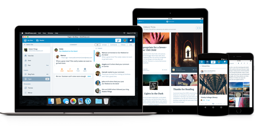
I’m very happy to share that as of today, Automattic has released the source code for Calypso, our JavaScript- and API-powered interface that runs on WordPress.com. This has taken a huge effort on our part for the better part of two years, and I couldn’t be prouder. This comes with a shiny-new interface that we also used to build a Mac app.
So, is your website a satellite being shot into orbit? Not quite, but it wouldn’t be far off to think of WordPress.com as an Atlas V rocket to get your site on the web, anyway. 🙂
In September 2005, I was 26 years old. A decade ago.
I called Scott Upton on the phone and asked if he was happy at his job and if they were hiring. A week later I’d had my interviews, handed in my resignation for a second time at Spiremedia and began a new chapter in my career: I was about to spend 4 years at a company in Boulder called Wall Street on Demand.
Wall Street on Demand specialized in taking hundreds of live-streaming stock market data feeds and turning them into beautiful interfaces for making financial decisions. We designed and built investment research interfaces for everyone from the E-Trade home investor managing their retirement account to the Merrill Lynch institutional investor trading hundreds of millions of dollars at a time.
These were not small local clients whose deadlines could slip when the process didn’t go according to plan, with business plans I’d seen a hundred times before. These were clients like investment banks and cable TV news networks who demanded financial visualization expertise from our staff on a daily basis.
If I put a percentage instead of a dollar amount in a table cell showing Earnings Per Share, it would be called out long before my work made it to the client’s inbox. The amount of training to be done with new hires was incredibly high before we were allowed to run our own projects without a CD at the helm, something as a Senior Designer I was expected to do fairly soon.

Competition is not the best way to get ahead
We had posters on the walls extolling the virtues of collaboration. The design team at Wall Street was not competitive: as a team of teams, we had a lot of design leadership and structure facilitating our collaboration at every level. The structure looked like this:
Before my tenure was up, we’d add a couple new titles, Associate Creative Director and Junior Designer. It was a unique system that had the added benefit of Chris, the company Creative Director, essentially working at the C-level with James, the CEO and Catherine, the COO: all three of them were related.
This was more or less a design-focused, family-run business with Goldman Sachs as the Board of Directors.
Chris had domain expertise in interaction design and financial design. He’d been educated at Johns Hopkins for creative writing and this education gave him a passion for concise, effective communication. He’d later go on to do post-grad work at UCLA for data visualization and he was a god-damned whirlwind to work with. It was exhausting to try and keep up.
This was by far the most design-led organization of which I’ve ever been a part. There was a truly talented design brain with actual power in the executive suite who demanded at the highest level that our own organization be true to a specific design philosophy.

There was a lot to learn. There was new, insane shit showing up in front of my eyes every day. Page designs containing ideas more complicated than I had ever imagined myself designing were casually discussed over cubicle walls, all around me. It felt like being in college again – except everyone was obsessed with the stock market for some reason.
I’d had a similar feeling before in my life: junior high school with my friends, coding Pascal and BASIC. I’d had it at Spire when I was 20 years old, coding Flash animations for websites whose domain names cost 10 times my salary. It was the feeling of being a little fish in a big pond, and it was good for me. “I will never know everything there is to know here” was something I thought to myself on a daily basis. I engaged in learning without fear, and applied that knowledge immediately.
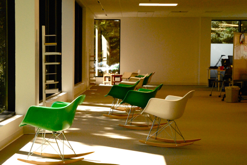
The design staff carved out many physically-communal design spaces. We started out having our design meetings in a room labeled Aspen, named after the trees that swayed right outside its window. When we leased more space across the street, Chris oversaw the entire design and construction of the new office, building it specifically for designers and developers to collaborate.
We had two rooms separated by a substantial but removable accordion wall made entirely out of whiteboard. These rooms were named after Charles and Ray Eames and were reconfigurable as we needed.
We’d gather every Friday morning, bright and early. Coffee in hand, we’d file into whichever space we were using at the time and we would nerd out as designers together. We’d discuss three things:
We all sat near each other in the office. We went on design- and art-oriented outings together, and we created a culture that really worked to get beautifully-finished work out the door.

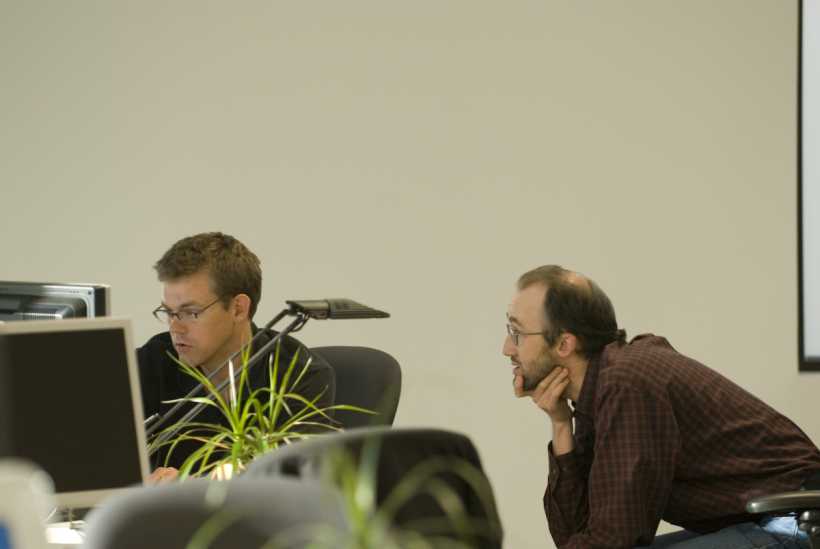
The funny thing about all of this collaboration was that I resisted it at first. We had a global Creative Director running the entire Design & Development division and I had Kent, a Creative Director, directly managing my work. I’d never had this many bosses before. During the first few months, I was a little unhappy about how much direct contact I was having with Kent. It was the first time in a while where I was working directly beneath someone who checked in on my progress multiple times a day. He’d show up right behind me at my desk and pull up a chair:
Whatcha up to, Kev?
was his usual phrasing.
Fuck you, Kent.
was the usual response in my head. I didn’t say it. I’d stop reading the NY Times article that was probably on my screen, tab back over to Photoshop, and show him my work.
He’s ask me questions that would make me frustrated, because of course I wasn’t done with it yet. He’d ask me something I hadn’t gotten to or he’d challenge me on basic things like color usage:
Why’d you use yellow here? It’s not in the palette.
for instance.
I’m designing the warning panel you assigned me. I chose a yellow with similar attributes to the family of colors already on the page, so it works to add it.
and he’d go
Ok.
to which I would again in my head reply
Fuck you, Kent.
This didn’t last long, and I’m giving Kent a hard time about it. We got past it and I moved on to learn an incredible amount of data visualization and general financial knowledge directly from him.
The moment of truth was when work started getting really hard. I was driving home to Denver every night in a daze, feeling like I wasn’t keeping up. Kent’s own design work was taking up more and more of his time, and yet I was not owning much about my designs or my clients. Even though he didn’t change my work much any more, it all seemed to hinge on his opinion, and so I felt powerless. The day he shocked me out of my daze was when he sent me a heart-pounding email. It said simply:
Kevin,
I need to you to engage now.
– k
I had no idea what this meant. I went to Chris and asked him what on earth I was supposed to do with this. Chris told me:
If you ask me, it sounds like he’s saying it’s time for you to jump in. If you don’t know what that means, then it’s up to you to decide.”
I was afraid at first. I was the only designer on a project for the very first time here, and I knew I didn’t know very much yet. All of the experienced designers were working on the cool stuff like stock charts for BusinessWeek and CNN. I was designing UIs for people to get email alerts. I wanted the big-name work, but was terrified when I was given something serious to handle on my own.

I decided it was time to start using my design skills to actually get design accomplished. I started drawing diagrams of how I understood the system I was designing to work. I took these diagrams to the client and then to my company’s developers and we iterated on them until they made sense and everyone agreed. Then I started wireframing in HTML. We had clickable prototypes with no CSS before we had a design language, which followed on quickly. I scheduled meetings with people downstairs I’d never met but with whom I needed to create relationships because my client was requesting a brand-new way of handling incoming data feeds, which needed to be written from scratch. I worked closely with the client to determine their systemic and visual requirements. At the very end, some crucial final understanding of the client’s needs came from Kent’s involvement in days-long meetings.
By the time it launched, I’d written the final production HTML and had handed it to our developers who plugged in the data calls and re-arranged things to work with our nascent pre-ajax technology.
In the end, what got us ahead and to a good place was that the whole team came together and collaborated, not that I could do the design work perfectly in a silo on my own, which was what I thought my role as a designer had been up to this point.
At the end of that project I had a sense of pride I’d never felt before. Many teams worked together, and I learned to lean on my team lead at crucial moments, pushing through a UI I knew was up to speed with what the rest of the design staff was producing.

I just described an intense project, and it was the first of many to come. Over the next 4 years, I’d learn that some resistance from the first-floor engineering teams was something of a common theme. As we grew and grew quicker and quicker, more inexperienced project managers were being hired to manage more and more work.
By 2009, people like me who’d been at the company a while and had shown leadership promise were moved into new positions. On the design team, this new position was called Associate Creative Director. It was our job to essentially work closely with our CD and start adapting their responsibilities into our workflow, namely managing the relationship alongside the Account Director and selling the client on new work at every turn.
This was new! And challenging! And I didn’t take much to it.
What I could do: execute high-quality UI and UX work on a weekly basis, in a novel and compelling way, driving the less-experienced designers on my team to do the same. As Associate Creative Director I really tried to know everything there was to know, just like it looked like the other CDs were doing when I started, and I began to lust after the wrong thing: prestige.
I started forgetting to collaborate. I’d react strongly in internal meetings where I felt developers didn’t care as much as I did about turning out a great product. I’d push clients toward what I thought the correct solution was, without really listening to what they were trying to accomplish. I’d bully other designers into trying to learn to code, despite their protestations that they just never really understood it. “Every designer should learn to code!” I’d say, dismissing their views entirely.
And so I burned myself the hell out. I burned everyone around me out on working with me. It’s true that when I left this job, my clients called emergency meetings in Boulder to plan the roadmap for how they were going to continue working with Wall Street in my absence, but I was fending off internal talk from above that I wasn’t quite working out in this position. What I needed though was something I couldn’t find at this company anymore: I needed to be a little fish again.
I needed to learn to collaborate with other designers again, without the ego attached as I rose the ranks and earned respect. I didn’t know it yet, but what I needed was to go work at Automattic, something I’d have the chance to do sooner than I’d know.
The night of July 7th, 2000, I couldn’t sleep. I’m prone to insomnia so this wasn’t new to me but as I was lying there in a fugue between desire to sleep and annoyance at being awake, I managed to start building up an idea that I just couldn’t let go. It sounds counter-intuitive, but in order to rest, I needed to get out of bed and build this idea on my 15-inch gray-translucent computer with a hockey puck for a mouse.
I was thinking back over my day, going through how long it took me to get to work, what I ate while I was there, what things I had done during the day, and so on. While doing so, I envisioned some kind of layer beneath the surface of my life that recorded what I was doing at that moment into a document to be read later in a sort of Defending Your Life kind of way, and it occurred to me that HTML was a pretty neat way of capturing that. It’s an idea I’d find brilliantly visualized by the agency MK12 in Will Ferrell’s Stranger Than Fiction some years later:
Anyway, so I took the main data points of my previous day and codified them into an XML/HTML-type language. As this was an art project, it was important to me that the code be highlighted and colored so that when you looked at it as a web page in a browser, it resembled what HTML might look like when edited in BBEdit:
With a rough draft complete, the idea was mercifully out of my head and I could finally sleep. I remember nothing about the next day.
You can view the project on Codepen or download it from Github.
(Looking at it closer now, it’s no surprise to me that I love React/JSX so much. Also, a lighter version of it won some awards in a web contest in 2001, which I can ironically no longer link to).