is a blog about design, technology and culture written by Khoi Vinh, and has been more or less continuously published since December 2000 in New York City. Khoi is currently Principal Designer at Adobe. Previously, Khoi was co-founder and CEO of Mixel (acquired in 2013), Design Director of The New York Times Online, and co-founder of the design studio Behavior, LLC. He is the author of “How They Got There: Interviews with Digital Designers About Their Careers”and “Ordering Disorder: Grid Principles for Web Design,” and was named one of Fast Company’s “fifty most influential designers in America.” Khoi lives in Crown Heights, Brooklyn with his wife and three children.
In spite of all the high-minded cinema fare I profess to care for so deeply, the movies I get most excited about are usually popcorn action thrillers. That explains why, if I’m honest, “Mission: Impossible—Fallout” was probably the movie I’ve looked most forward to all year. Its predecessor, “Mission: Impossible—Rogue Nation” pulled off the unthinkable feat of being both the fifth and most interesting installment in an already excellent franchise. When I learned that its director, Christopher McQuarrie—one of the best filmmakers working today—would return and that “Fallout” would be a direct sequel, I started getting very, very excited.
For my money, this is a series that has only gotten better with each new installment. No one asked me to rank them from least to most favorite, but I will now anyway, as the ordering is actually quite elegant: I, II, III, IV (“Ghost Protocol”), and then V (“Rogue Nation”). In fact, I re-watched them all in July in anticipation of “Fallout” which, as it turns out, completes the progression by being the best one yet. We’re all well aware by now of star Tom Cruise’s almost disturbing obsession with risking his own life for our entertainment, but in this outing he and McQuarrie achieve an almost sublime synthesis of character development and action. What’s communicated through stunts, body blows and explosions here is as meaningful as what’s expressed through dialogue. It’s as close as a large-scale Hollywood action has ever come to an auteurist psychological drama.
One of the unintended consequences of having banked a string of six highly successful, generally well-reviewed films in a row is that the series has also created an unmistakable snapshot of popular contemporary thinking. Beyond the cracking good action, after watching the complete series it became clear to me that at heart these movies are about the tension between physicality and technology.
This has been true from the start. The very first installment also happened to produce the series’ most lasting image: that of Tom Cruise dangling from wires as he attempts to extract data from a highly secure computer terminal. Since then, a similar act of extraction has figured intrinsically into the plot of all of these films. Over and over again they posit that human movement and physical action is the only reliable way to render some crucial value required by people from the intractable grip of technology, whether what must be breached is a data center at a CIA compound, a nonsensically located server room on a forbiddingly high floor of the Burj Khalifa, or any number of situations made fraught by technology’s uncannily accurate ability to subvert the truth (read: the countless masks that are a hallmark of the franchise).
It’s also no accident that Tom Cruise is commonly referred to as today’s “last movie star.” As a conceptual whole, “Mission: Impossible” tries to make sense of how a classic, cinematic idea of masculinity can overcome technology’s encumbrances. Sure, Cruise’s Ethan Hunt character is always abetted by his technologically incisive colleagues Luther Stickell (Ving Rhames) and Benji Dunn (Simon Pegg), but these are strictly secondary characters—comic relief, even. Ultimately the resolution of the plot falls to the alpha male, Cruise himself. This series is a reflection of society’s struggle to reconcile heroism and hacking.
And that’s all I have to say about “Mission: Impossible” for now—unless you want to subscribe to my newsletter, where I’ll have some more totally unnecessary thoughts for subscribers only. Meanwhile, here is the full list of all fifteen movies I watched last month, only seven of which starred Tom Cruise!
To our own detriment, designers prefer to think about “how” much more than “why.” This was demonstrated in my blog post from earlier this week but here’s another good example—or perhaps it would be more appropriate to call it a bad example. You may or may not find it disturbing.
Last month the widely respected, “evidence-based user experience research, training, and consulting” firm Nielsen Norman Group published a fascinating report on best practices to consider when designing websites for children. Its author, Feifei Liu, summarizes a study that the firm did in which they interviewed kids aged three to twelve to learn how they behaved performing a series of interactive tasks. Liu writes:
Our research with kids on the web and mobile devices shows that the physical development of motor skills and motor coordination influences children’s ability to interact with devices.
Roughly, children under five have limited motor abilities and require very simple physical interactions on touchscreens. For kids between six and eight years old, their developing motor skills allow them to perform simple interaction gestures on laptops like clicking and simple keyboard usage. Whereas starting around the age of nine years, more advanced interaction techniques become possible. Around the age of eleven years, children become able to use the same range of physical interactions as adult users. (Though obviously, their mental development stage and educational level still dictate simpler overall user interfaces for eleven-year olds than for adults.)
That’s the executive summary, leading off the top of the report. The rest of it digs into those findings, detailing a series of recommendations for designers creating websites for kids. Some of these include: emphasizing swiping, tapping, and dragging on touchscreens; avoiding interactions that require dragging, scrolling, and clicking small objects; and generally accommodating the limited motor-coordination facility of this audience.
Useful stuff. I don’t dispute the findings at all. But it’s disturbing that the report focuses exclusively on usability recommendations, on the executional aspect of creating digital products for kids. There’s not a single line, much less a section, that cares to examine how design impacts the well-being of children.
This seems particularly egregious when one considers current societal discussions about how digital technology impacts younger users. Recent studies point out that mobile device usage among young children has skyrocketed to an average of as much as two hours per day, up from as little as just five minutes a day at the beginning of this decade. Meanwhile, the American Academy of Pediatrics revised their recommendations for device usage amongst children this year to just one hour per day, arguing that “Too much media use can mean that children don’t have enough time during the day to play, study, talk, or sleep.” The non-profit group Common Sense Media found that, contrary to advice from pediatricians, much of this time spent in front of screens is happening just before bedtime, and children in lower-income families are much more likely to spend more time on devices than those from more affluent families. And a lot of attention has been paid to San Diego State University professor of psychology Jean M. Twenge’s studies of the first generation of teenagers to grow up with mobile technology, and the radical and often worrying shifts in behavior that smartphones have engendered in them.
In fairness, none of this is incontrovertible proof that screen usage is harmful to children, but it’s also safe to say that there’s reasonable cause for concern. At the very least thoughtfulness is warranted in the design of digital products for this audience.
It’s also worth noting that Nielsen Norman Group is famously focused on the narrow subject of how to make digital experiences as usable as possible; their expertise on usability is widely recognized and rightfully acclaimed. The larger question of whether a design solution is in the best interests of its users has always been purposefully beyond their scope. But pretending that there is no link between the usability of an experience and the long-term well-being of its users is, frankly, a specious position at best. Particularly for this target group of users.
Habits are formed around the usability of a product; if an app or website makes it easy to complete a task, users are likely to do it more often than not. Usability advocates often treat this as an inherently good quality; by and large every business wants their products to be easier rather than more difficult to use. But as the aforementioned research suggests, it’s become clear that guilelessly encouraging longer, more frequent sessions isn’t necessarily better for kids.
I would contend that it’s really no longer useful—or responsible—to think of the work we as designers do in such narrow terms. You don’t even need much imagination to expand the definition of “usability” in this way. Beyond just the study of practices that make digital products easier to use, it’s reasonable to think of usability as a field that considers what’s in the best interests of the user. Clearly, there are best practices to be learned when it comes to limiting children’s time, signaling danger to parents, discouraging successive sessions over short spans, and even for encouraging physical movement. That all sounds like usability to me.
We’re moving past the stage in the evolution of our craft when we can safely consider its practice to be neutral, to be without inherent virtue or without inherent vice. At some point, making it easier and easier to pull the handle on a slot machine reflects on the intentions of the designer of that experience. If design is going to fulfill the potential we practitioners have routinely claimed for years—that it’s a transformative force that improves people’s lives—we have to own up to how it’s used.
This lengthy, thoughtful screed was inspired in part by an article that I wrote earlier this year for Fast Company called “Design Discourse Is in a State of Arrested Development,” the gist of which was to say that what gets written, read, discussed and lectured with regard to design is, on the whole, very shallow. I argued that that superficiality points to a systemic failure in design: an unwillingness to “ask tough questions,” and an inability to push the craft forward in the interest of both its practitioners and of its audience.
As publishers and key participants in the world of design discourse, Teixeira and Braga admit that they have played a part in perpetuating this environment. They write:
Last year, we published and shared 4,302 articles and links with the community — through Medium, our newsletter, our chatbot, our yearly trends report, Today, Journey, and many other channels.
That’s a lot of links.
Most of them 5-minute Medium articles.
Not as thorough as we would like them to be.
Not deep at all.
Not as honest as our industry deserves.
Give them credit though for “being the change they want to see in the world,” as their essay uses my article as a jumping off point to look much more deeply at the problem than I was able to.
In an extensive exploration of the subject, Teixeira and Braga examined every link they found on major online design forums (e.g., DesignerNews, WebDesignerNews, StackExchange UX, and Reddit UserExperience, Sidebar, Product Weekly, UX Curator, and UX Collective itself) for a month. “Every link shared between 12 Feb and 11 Mar 2018,” they say, “was put under the microscope, through the lenses of independence, honesty, breadth, and depth.”
They then plotted each article’s on a spectrum with “tactical” articles on one side (with templates, kits and tutorials at the extreme) and “strategic” articles on the other (with discussions of ethics, responsibility and impact). While acknowledging the subjective nature of the exercise, the results are nevertheless eye-opening: as seen in the chart below, the vast majority of the links fall on the “don’t make me think” end of the spectrum.
It’s clear that the currency of design discourse is really concerned with the “how” of design, not the “why” of it. As Teixeira and Braga write:
While designers tend to be skeptical of magic formulas—we’re decidedly suspicious of self-help gurus, magic diets, or miraculous career advice—we have a surprisingly high tolerance for formulaic solutions when it comes to design.
That’s a pointed criticism but, from my perspective, it’s also quite accurate. Rather than leaving that conclusion on its own, though, the essay tries to come to grips with, appropriately, why this is. Consistent with the habits of good designers, Teixeira and Braga undertake a bit of “user research” to understand how design content gets consumed, and who actually generates it. They even dig into one of the key paradoxes of an art form that is examined almost solely by its own practitioners: its highest functioning leaders usually can’t spare the time to write about their own perspectives.
The whole article is full of valuable insights like this but it’s worth reading for another reason alone: it shines a light forward for design discourse by first recognizing its deficiencies and then by modeling a way forward. Read it in full at essays.uxdesign.cc.
Sometimes you need to explain what design is to people who don’t understand it, but need to. This is the situation I found myself in this week: I’ve been collaborating on a project with some incredibly smart people outside of the company who have a passing understanding of what UX/UI design is, but who need to get a better sense of its particulars, of what it is and what it isn’t, of who does it and how it’s done, and how it’s similar to and different from other flavors of design. After trying to explain it orally and inarticulately, it became obvious that it would be more productive to try and explain in written form.
Lucky me, I had a bout of insomnia at 4:00a this morning. So I got out of bed and, in roughly an hour, hammered out a kind of primer on UX/UI design, which I’m publishing below. It’s a very unformed, rambly screed that I won’t pretend is at all definitive or even fully accurate. In fact it’s still basically a first draft; I literally typed it out in bullet point form, as shown below, a trick I used in order to absolve myself of the responsibility of writing a fully articulated essay. It proved useful to those colleagues of mine and so I thought it might prove useful to readers here, too. Let me know what you think.
A Primer on UX/UI Design
Virtually any time you use software—an app on your phone or your laptop, a website, a check in kiosk at the airport—you are actually interacting with an interface created by a designer. In effect, the designer shapes the technology into something understandable, useful and, ideally, delightful to the user.
At the simplest level, the designer does this by laying out, or visually organizing what you see. She decides where the buttons and text go on a screen, what other elements like photos, illustrations and/or graphics belong on that screen, and what happens when the user clicks, taps or otherwise interacts with parts of the screen. This is the interface.
The interface is where UX/UI design most clearly intersects with “traditional” graphic design, because it is in the layout of the interface that the UX/UI designer uses many of the same elements and tools as designers who create books, posters, packaging etc. Specifically, both kinds of designers employ typefaces, graphics, photos and/or illustrations; make deliberate color selections; think extensively about the composition of the elements they are placing on their canvas; integrate or even design from scratch logos and brand systems. There is significantly overlap here and many professionals practice both, but UX/UI design and graphic design are not exactly the same.
When the UX/UI designer “decides what happens,” she is determining both the behavior (i.e., whether a button changes color, shape, shifts in place or otherwise responds to the user’s input) and the flow (i.e., what screen the user goes to, or what new parts of the interface are presented to the user).
Taken together, the interface, the behavior and the flow form the user experience. This is a gross simplification, but it’s a reasonable way of understanding that term.
These terms aren’t absolute; one of the most frustrating things about our profession is that there are few fixed terms for our tools, methods and work product.
To perform her duties, a designer almost always has to work closely with engineers and product managers, people who are responsible for building the actually technology for the app, website, etc.
In decades past, how a designer worked with engineers was much more rudimentary, even perfunctory. Oftentimes engineers would effectively determine the majority of the interface, behavior and flow, and would allow the designer only to embellish what had already been established, e.g., changing fonts or colors, making slight modifications to the layout or behavior, and rarely allowing the designer to change the flow. The result of course was very poorly designed and frustrating to use software.
Professionals often refer to this minimal role as “window dressing” or “prettifying”; the implication being that it is a circumscribed version of the full scope of what a designer’s job should be. Oftentimes, this way of working is pejoratively referred to as “visual design” or “graphic design,” and there are some designers who are wholly disinterested in this aspect of the job altogether; they believe that design is really about the behavior and flow of an experience. Of course there are other designers who believe that the visual design is just as important as the behavior and flow of an experience. To put it succinctly, there are many gradations between the two beliefs. Our belief is that every point on the spectrum is valid.
When digital technology was relatively young and its value was novel, “window dressing” was generally acceptable, because users accepted that they had to submit to poorly designed interfaces in order to harness the power offered by technology. This is how we got many of the terrible interfaces that marked the first generation of desktop software.
As digital technology matured and became more capable, and as it at the same time became more widespread and commonplace—first with the web and then later with mobile apps—the bar for UX/UI design was progressively raised. Site by site and app by app, consumers were exposed to more and more good design, and they soon came to expect every digital product to meet a minimum bar of design quality, even if they are still not able to articulate what good design is.
Today, the commonly understood definition of good design among professionals has generally moved far beyond design as a superficial layer on top of technology. Designers tend to think more holistically about the problems they work on now.
This often means that a designer doesn’t just apply her skills to a solution, but also to defining the right problem. Good design means asking the right questions, questions that are in alignment with both the business goals of the company she is working for and with what the intended users of that company’s app or website want to accomplish when they’re using it.
The act of researching a given problem is commonly understood to be part of the design process now. Research can mean interviewing and/or observing users, examining data on existing usage patterns, interrogating the motives of the company and/or the engineering team and more. It can also mean “testing” a design solution for its usability or acceptability to users. Research is now a common and critical part of good design practice.
Design professionals have also come to embrace the highly iterative nature of designing for digital products. This stands in contrast to traditional graphic design where, because of the fixed nature of the medium, it was relatively difficult (if not impossible) to make changes to a design solution. In digital media, design solutions are easily altered, and as a result they are often thought of as being in perpetual evolution. This is why apps and websites are constantly being redesigned, not just in major, easily identifiable overhauls, but also in countless subtler methods. Designers now embrace the ethos of iteration as a part of the design process are commonly involved in continually perfecting their work product.
This more expansive definition of design has led modern practitioners to define design as more than just the visual. Every “touchpoint” where a user or customer interacts with a company’s products or services is seen as an opportunity to apply the principles of good design, from the emails they get to the technical support they receive to even the quality of offline, in-person interactions with the brand. The end result is no longer just a “good looking” or “user friendly” interface; the goal is now to create a satisfying if not delightful overall experience for users.
As we move into immersive media like augmented reality and virtual reality, design professionals are continuing to apply this broader view of design. Voice interfaces, for instance, are now a logical extension of UX/UI design even though they the longstanding visual elements of interfaces are largely absent.
This trend of design becoming defined more and more expansively will continue. On the one hand, it will mean more opportunity for more designers, but on the other hand it will also mean more and more people will be undertaking design—not just designers. Design is a process, and while designers will always be in the lead with regard to how it is practiced, just as with engineering, that process has become so important to the success of businesses and organizations that it will become necessary for those who aren’t designers to take part in it. Whether they’re marketers, strategists, writers or engineers, it is very likely that within the next decade, design as a process, as a way of thinking, will become a part of many more people’s jobs.
Paul Schrader’s “First Reformed” does not itself fully stare into the abyss of human callousness, but it’s enough that it shows us what happens when someone does that, how it consumes the soul with horror and isolation. This is the same trick Schrader pulled off when he wrote the script for “Taxi Driver” more than four decades ago.
His ability to successfully revisit this cinematic territory is both easy and difficult to believe, as I discovered when I saw “First Reformed” in the theater last month. On the one hand, the character of Rev. Ernst Toller, played by Ethan Hawke, is a logical contemporary update to Robert DeNiro’s Travis Bickle, where the struggle against the decay of modern society is replaced with an attempt to reckon with environmental disaster. On the other hand it’s hard to believe that this movie was made by a seventy-one year old, so vital and alive and surprising is Schrader’s filmmaking here. If he’d made this four years after “Taxi Driver,” that would not have been difficult to believe, but forty-two years? This film is a miracle.
In addition to “First Reformed,” I also saw fifteen other films last month, listed below. One of them was Christopher Nolan’s “unrestored” print of Stanley Kubrick’s “2001: A Space Odyssey,” in 70mm projection. I knew this movie was beautiful and transcendent, but I had no idea of the depth of its beauty or the extent of its transcendence, having never seen it on the big screen before. If you get a chance to experience it, you owe it to yourself to go.
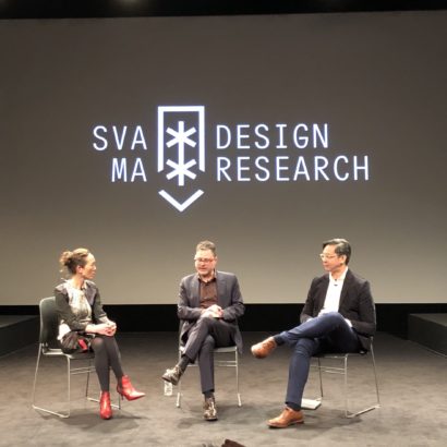
A few weeks ago I was invited to appear as a guest on the second episode of Mule Design’s new podcast, The Voice of Design with hosts Erika Hall and Larisa Berger. It was a great discussion that sprang in part from my article “In Defense of Design Thinking, Which Is Terrible” back in May. It was a great talk about the state of the design industry and what we have to do to level up our profession.
You can have a listen to the episode below and you can also subscribe to the podcast on iTunes.
Jason Reitman is one of those journeyman movie directors who can pass as an auteur. Usually, as in the case of “Thank You for Smoking,” “Up in the Air” and “Young Adult,” it’s pretty easy to see past his ambitions to the clumsy conceptions that are the real heart of his moviemaking. But in the case of “Tully,” his charmingly narrow look at the trials of motherhood and post-partum depression, he manages to transcend his level best. A little. It’s not a great film but it mostly works—at least in a New-Yorker-short-story-of-the-week kind of way.
The main reason it’s any good is Charlize Theron’s performance, a fully committed deep dive into the chasm between youthful ambition and middle-aged helplessness. I’m usually not a big believer in the maxim that gaining weight equals great acting, but the startling body transformation Theron underwent for this role deserves merit for being more than just a superficial if physically demanding affectation. Rather, it demonstrates Theron’s formidable willingness to find highly specific, uncritical empathy with the characters she plays. It’s getting harder and ignore the fact that she’s one of the best actors working today.
Here is a list of all sixteen films I watched in May.
“Tully” A pretty big improvement over this creative team’s previous outings, even if you can see the central plot twist coming a mike away.
“Molly’s Game” On re-watch, still flawed, but still very good.
“The Incredibles” By a mile, the best super-hero film of this century. So far!
“Maggie’s Plan” More or less a Woody Allen film not made by Woody Allen.
No one pays attention to Netflix’s discs-by-mail business anymore but for those who are curious, the subscriber base continues to decline steadily and the company’s operations have shrunk from a peak of fifty distribution centers across the United States to just seventeen remaining. Some projections show the division winding down as soon as 2025, but it’s also worth noting that in the meantime its profit margins continue to grow.
That’s probably thanks in no small part to efficiencies like “The ARRM,” or the Automated Rental Return Machine, a robotic disc-processing machine that intakes countless returned Netflix envelopes, extracts their contents and repackages the discs for mailing to new customers. It’s pretty fascinating to see in action, as this video demonstrates.
That video was produced by Netflix’s marketing department and so it has an elegant sheen to it. If you want to get a better look at the ARRM in action, this decidedly more prosaic video from Bronway, the automation vendor who created it for Netflix, is also fascinating. It offers more detail on how efficiently—almost ruthlessly—the machine executes its tasks.
There doesn’t seem to be a lot of human intervention necessary with the ARRM, which makes it sort of interesting—maybe sad, maybe scary?—to think of how Netflix has basically built a robot to serve a dwindling population. In a very real sense, they’ve optimized the profit margins for a dying customer segment. It’s the end of the world as they know it, and they feel fine etc.
I’m one of those holdouts who still subscribes to discs by mail, mostly because my appetite for films you can’t watch on streaming services is pretty high. Still, even I can see that the writing is on the wall for this service; a couple of years ago I downgraded from the two discs-per-month plan to one-per-month, and not long after that I got in the habit of pausing my subscription during summers or periods when I knew I’d be traveling extensively.
Even if the shuttering of Netflix’s DVD service won’t be exactly the same as a final nail in the coffin for disc media, it’ll still be meaningful. Netflix buys tons of physical media; once it stops doing that, the economics of movies on disc will only get worse.
The real shame will happen when movies stop coming out on DVDs and Blu-Rays altogether. That’s not because they were such a lovable way to package films (they have their pluses and minuses); it’s because with the loss of each media format, we also lose some titles forever. The list of movies that never made it from VHS to DVD is not insignificant. Usually these “lost” titles are somewhat obscure, but even a major film like “Air Force One” can get lost in the shuffle. As this Collider story recounts, even though that movie is available in a recently pressed Blu-Ray edition, it isn’t available to stream—not just from subscription services like Netflix and Hulu, but it’s not available to rent from iTunes or Amazon, either. It’s hard to say how many more titles we’ll lose when you can only watch movies online, but it’s something to think about as we so eagerly embrace that future.
There’s no doubt in my mind that augmented reality is going to be amazing and that people will build incredible new experiences with Apple’s ARKit, version 2 of which was announced earlier this week at the company’s annual World Wide Developers Conference. But in order for that reality to come into focus, developers—and designers—are going to need to bring greater thoughtfulness and creativity to the new medium, or at least more than was on display during the LEGO demonstration portion of the keynote.
If you missed it, you can watch the video, below. In it, LEGO director of innovation Martin Sanders and a colleague use iPads trained on a real, physical LEGO model to unlock a layer of augmented reality. The real time visual coordination of the physical and the virtual is impressive. Sanders claims that the combination of the two “really opens up those creative play possibilities.”
I found it to be a surprisingly thoughtless take on how kids actually play with LEGO toys.
My kids have been obsessed with LEGOs for about a year now, and so I find myself, somewhat unexpectedly, with a lot of opinions about the experience of playing with bricks. We’ve built a lot of kits together, roughly about as complex as the one shown in this video, and I can easily imagine them being enthusiastic if those kits could be combined with what is essentially a video game layer. That’s not unique to them, of course; pretty much any five year old in Western society is going to be wildly receptive to any video game opportunity.
But that’s at cross purposes with what I, as a parent, find most valuable about LEGO bricks: their tactile, physical nature. I fully buy into all the clichés of the benefits of LEGO play: they build fine motor skills; encourage problem solving; enhance coordination; stoke the imagination; and even teach the value of cleaning up after yourself (that last one is not to be underestimated). And in a major bonus, they do all of this without batteries, keyboards or screens. For our family, LEGOs are great because there’s no tech involved. The fact that they are not video games, that they engage our kids in a wholly different way from video games is a valuable feature, not a shortcoming.
Even setting aside my mildly Luddite attitude towards digital toys, what struck me about yesterday’s demo was that it fundamentally and carelessly subverts the purpose of LEGOs. Presumably, once a set is completed, it must remain more or less intact in order for the AR component to work. Sure, you could probably change up a decent portion of the parts and the software could be smart enough to account for the change, but it seems logical that if the kit were to be disassembled too much, the VR experience would stop working entirely.
The problem with that approach is that, at least in our household, the completion of a LEGO kit is just one stage in its useful life, so to speak. Even incredibly complex models that took hours or days to complete will come apart eventually, either through the natural disassembly that happens when they’re stored in toy bins or through purposeful dismantling. For us, no LEGO brick ever has a truly permanent use.
In fact, what happens to bricks after they’re combined to look like what you see on the box is, for me, much, much more interesting. My kids and I regularly sit down and build fantastical new creations that pull parts from countless other kits, whether they’re wheels from a police car, arches from a building, a rowboat from a picnic set, or maybe weirdly organic shapes from a LEGO dragon. Here’s an example of one that we’ve been working on for the past two weeks:
Anything and everything goes into these odd assemblages; they have no plan and no purpose. That’s what makes them so fun; they’re free-associative improvisations with no real limits or constraints other than that they need to be stable enough to stand on their own. And even then, if they fall apart, that’s fine too; we just remove what didn’t work and then we add something else. There’s no wrong answer to the question “What do we add next?”
This freeform method of play is what truly unlocked LEGOs for my kids and me. When they first started getting obsessed with them, I was somewhat cool to the process of following the extensive instruction booklets that are necessary to assemble the sets—to me, they just seemed like preparation for a life of putting together IKEA furniture. But once we removed the rules and the sense that anything we built was ever meant to stay that way, it became much, much more interesting for everyone. Now we collaborate on these creations together, and anything the kids want to add is just as interesting as anything I contribute—usually more so.
That kind of play seems incompatible with what the LEGO team presented at WWDC. Their vision of combining bricks and augmented reality changes the goal from building for the joy of it to building in order to unlock a video game. The assembly of a LEGO kit becomes just a preliminary stage in spending more time looking at screens. And as any parent will attest, the allure of screens for kids is so potent that this new take on play effectively limits the usefulness of the physical toys. Disassembling a LEGO model, reusing its pieces for other creations—these natural behaviors are inhibited when AR is introduced in this way, because they would cut off that intoxicating gaming layer. There’s not a kid out there who would be willing to take apart something that allows him or her to spend more time on an iPad.
To be fair, early applications of new technologies are often shallow interpretations of the true potential of the medium at hand. As we become more acquainted with what AR can do, it will become more apparent both how AR can be used more effectively as well as how AR should be used. Augmented reality has the potential to enable true innovation, but it would be a shame if that potential is mostly harnessed to subvert what works so well without it, as it seems to do in this case. For designers and developers, when we think about what we can make with technologies like this, it’s perhaps more important than ever for us to think about what is good for our users—is it really in the best interests of kids to use LEGOs just to play video games?
I’m certainly not arguing that makers of physical toys shouldn’t be investigating how AR can complement their products. It does seem logical that there will be something pretty interesting to come out of combining LEGO bricks and AR—maybe an app that you point at a pile of random LEGO parts that then shows you what new creation can be made from those pieces? Or an app that lets you point at any object and then generates instructions on how to build a LEGO version of it? Maybe an app that lets you identify two or more kits that you own and shows you how they might be combined? Concepts like these are admittedly more complex to execute than simply adding a video game layer to an existing kit, but if augmented reality is to be as truly game changing as it’s been advertised, it probably won’t be enough to settle for simple concepts like what was shown by the LEGO team at WWDC. This new immersive future is going to require us not just to build more ambitious products, but to be more thoughtful about them, too.
Here’s an update on a post that I wrote at the beginning of the year about how China has upended the way recycling works. In short, Americans recycle as much as 66 million tons of would-be waste each year, the majority of which used to go to China. However, as part of a new policy aimed at improving its own environmental conditions, China no longer allows imports of those foreign recycling materials. The result is essentially a crisis in everything but name, as this article in The New York Times details:
In the Pacific Northwest, [Republic Services, one of the largest waste managers in the country] has diverted more than 2,000 tons of paper to landfills since the Chinese ban came into effect, Mr. Keller said. The company has been unable to move that material to a market ‘at any price or cost,’ he said. Though Republic is dumping only a small portion of its total inventory so far—the company handles over five million tons of recyclables nationwide each year—it sent little to no paper to landfills last year.
But for smaller companies, like Rogue Disposal and Recycling, which serves much of Oregon, the Chinese ban has upended operations. Rogue sent all its recycling to landfills for the first few months of the year, said Garry Penning, a spokesman.
Western states, which have relied the most on Chinese recycling plants, have been hit especially hard. In some areas—like Eugene, Ore., and parts of Idaho, Washington, Alaska and Hawaii—local officials and garbage haulers will no longer accept certain items for recycling, in some cases refusing most plastics, glass and certain types of paper. Instead, they say, customers should throw these items in the trash.
Some waste managers are holding out hope that China may change its mind and begin accepting recycled waste again, which may or may not be a realistic aspiration.
What’s truly amazing, though, is the idea that even with this major change in the way the ecosystem for waste works—and even with the growing problems stemming from climate change—there has been little or no change in awareness of how recycling works. The Times article hints at this reality: its title is “Your Recycling Gets Recycled, Right? Maybe, or Maybe Not,” and an accompanying article called “6 Things You’re Recycling Wrong” offers a primer on recycling fundamentals that is so basic that it’s embarrassing that most people don’t already understand it.
Both underscore the idea that Americans clearly have no idea what it means to recycle—not just how to do it properly, but whether it’s truly a net positive for the environment or the economy. The assumption is that recycling is a magical cure-all for the deleterious effects of uninhibited consumption, when it clearly is not. There is a wanton disinterest in consequences here that is astounding but perhaps not surprising as choosing to ignore facts is clearly becoming the hallmark of our age.
If you’re interested in learning more about how waste can be tempered not just with recycling but also with a mindful approach to reduction and reuse, I recommend this episode of the 1A podcast.