Advertisements
Posted by: Doug Henwood | March 15, 2018

Fresh audio product

Just added to my radio archive (click on date for link):

March 15, 2018 John Clarke of the Ontario Coalition Against Poverty on what’s wrong with a Universal Basic Income • Isabel Hilton on Xi Jinping’s becoming China’s president for life

Advertisements
Posted by: Doug Henwood | March 9, 2018

Fresh audio product

Just added to my radio archive (click on date for link):

March 8, 2018 Jason Wilson on dwindling numbers on the far right • Tim Shorrock on the relations among the two Koreas and the U.S.

Posted by: Doug Henwood | March 3, 2018

Fresh audio product

Just added to my radio archive (click on date for link):

March 1, 2018 Liza Featherstone, author of Divining Desire, on the history and meaning of focus groups [disclosure alert: Featherstone is the host’s wife]

Posted by: Doug Henwood | February 23, 2018

Fresh audio product

Just added to my radio archive (click on date for link):

February 22, 2018 Marcie Smith, lawyer and adjunct econ professor at John Jay College (CUNY), on the recently departed Gene Sharp, revered but problematic theorist of nonviolence and friend of the intelligence services

Posted by: Doug Henwood | February 19, 2018

Smaller strikes also in decline

Several readers responded to the recent post on strikes by asking if the BLS stats, which cover stoppages involving 1,000 or more workers, are missing smaller-scale actions. (And I should say that I’m being imprecise by calling all stoppages “strikes,” since the figures also include lockouts.) Alas, no.

The Federal Mediation and Conciliation Service publishes data on all work stoppages, regardless of the number of workers involved. The numbers from 1984 through 2016 are graphed below.

Smaller strikes peaked at 1,142 in 1985, which looks big by recent standards. If the trajectory is anything like larger strikes, then 1985 was probably a major comedown from the 1950s through the 1970s; the average that year was down 82% from the 1950–1979 average. Even so, 2016’s total of 88 was down 92% from 31 years earlier.

Strikes - smaller

The 2017 data runs only through the third quarter. There were only 39 strikes in the first months of the last year; if you annualize that, you get 52 strikes, 41% fewer than 2016, and 97% fewer than in 1985.

If you look at days of “idleness,” as they say, the decline is even starker: 93% from the 1984 peak (yes, different peak year, and not a typo for “1985”). If you annualize the days of idleness for 2017, you get a 99% decline.

So there’s not much striking going on under the radar either.

Posted by: Doug Henwood | February 15, 2018

Fresh audio product

Just added to my radio archive (click on date for link):

February 15, 2018 Max Sawicky on Trump’s budget • Edward Luce, Financial Times columnist and author of The Retreat of Western Liberalism, on the crisis of the American class system

Posted by: Doug Henwood | February 9, 2018

The disappearing strike

According to Bureau of Labor Statistics figures released this morning, last year saw the second-smallest number of major strikes in recorded history: seven. This is close to the record low set in 2009, five—in the depths of the Great Recession, when the unemployment rate was approaching 10%. Last year’s average unemployment rate was less than half that, 4.3%.

Here’s the grim history of the decline of labor’s most powerful weapon in two graphs:

Strikes

The number of days of “idleness”—a curiously moralizing word for an instrument of class struggle—wasn’t as close to a record low. There were four years in which this measure (the number of workers involved times the length of the strike) was lower—all recent years (2009, 2010, 2013, 2014).

Between 1947 and 1979, there were an average of 303 “major” strikes (involving 1,000 or more workers) every year; since 2010, the average has been fourteen. The average number of days of “idleness” went from almost 24,550,000 in the first period to 708,000, a decline of 97%. This decline just might have something to do with stagnant wages, greater job instability, and disappearing benefits, though of course turning it around is a lot harder than writing an exhortatory blog post.

Most of those days off the job, 79% of them, came from just one strike, the IBEW‘s against Charter Communications, which is in its 318th day as I’m typing this. Just two other strikes were against private-sector employers (AT&T and car dealers in Chicago). One was against a university hospital system (Tufts—see Jane McAlevey’s article on that strike, one of the few inspiring stories in this bleak landscape, here). And three were against government employers, all in California (Riverside County, the City of Oakland, and the University of California). Private employers have absolutely no reason to worry about a strike, and haven’t for more than a decade. And when the Supreme Court hands down its decision in the Janus case, which will almost certainly eviscerate public sector unions, government employers are likely to feel the same way.

McAlevey’s mentor, Jerry Brown (the former president of 1199–New England, not the California politician), used to say the strike was like a muscle: if workers didn’t exercise it regularly, it would atrophy. It’s atrophied.

Posted by: Doug Henwood | February 9, 2018

Fresh audio product

Just posted to my radio archive (click on date for link):

February 8, 2018 DH on stock market madness (longer version is here) • Yasha Levine, author of Surveillance Valley, on the military/intelligence roots of the internet, which live on today (hi NSA!)

Posted by: Doug Henwood | February 8, 2018

About that stock panic

Stock markets have stabilized, at least for now, after a few days of what the press likes to call “turmoil.” What does it all mean?

There’s no doubt that stocks have been due for a comeuppance for some time: they’re very expensive. Since stocks represent claims on corporate profits, present and future, the conventional way to value them is by measuring their price against those underlying profits (or “earnings” in Wall Street lingo, since to the owning class, profits from capital are just like wages for labor: as they like to say, they put their money to work). Ideally they’d be measured against future profits, but no one knows what they are, so the next-best thing to do is measure them against past profits.

The standard measure for that is the price/earnings (PE) ratio—the price of a stock (or a stock market index) divided by corporate profits per share (or total profits of the stocks in the index). Since the late 19th century, the PE ratio for the broad stock market has averaged 16; since 1950, it’s averaged 18. It’s now 27. But PE’s can be volatile. To adjust for that, Yale economist Robert Shiller invented a longer-term measure, which adjusts profits for inflation and measures current prices against their ten-year trailing average. The century-plus average is 17; since 1950, it’s 19. It’s now 33. As the graph below shows, Shiller’s PE is higher today than it was at any point in a history that begins in 1881 except for the climax of the late-1990s bubble. It was lower in 1929 than it is today.

Shiller CAPE

Another valuation technique is comparing the value of all stocks outstanding to GDP. That is now only a hair below its 2000 peak (see graph below).

Market cap

And what about profits? Profits recovered far more quickly and dramatically than wages after the end of the Great Recession. In the first three years after that miserable event came to a formal close (2009–2012), corporate profits after taxes rose 55%. Meanwhile what corporations paid their employees rose just 12%. Stocks became quite rationally exuberant, celebrating the rise in profits and its likely continuation. Over those three years, stocks (measured by the S&P 500) rose 85%, taking them close to where they were before the financial crisis hit. The momentum in profit growth slowed (and that in wages and salaries picked up), but that didn’t stop stocks from rising further, surpassing the 2007 high in 2013, and then adding another 56% through the election of Trump. All that despite the fact that, as the graph below shows, corporate profitability peaked between 2012 and 2014 and has been edging down since.

NFCB - profitability

Stocks paused for a week or so after the election as traders sussed out what this unexpected turn of events might mean, but as soon as it became clear that whatever his idiosyncrasies, Trump meant tax cuts and deregulation. So it was back to the races. Stocks added another 29% between November 2016 and January 2018, taking us to the extreme valuations described above. Rational exuberance was succeeded by the less rational kind.

strong economy?

Since Trump has been bragging for months about the stock market’s strength, the selloff is a marketing challenge for him. His administration weighed in with the customary reassurances, with both White House flack Raj Shah and Treasury Secretary Steven Mnuchin pronouncing the “fundamentals” of the economy “strong.” (You might think that officialdom might be reluctant to repeat the sort of language used by Herbert Hoover in 1929 and John McCain in 2008, but no.)

When people say the economy is strong they mean that unemployment is low and we’re adding 180,000 jobs a month. But millions have dropped out of the labor force. If the same share of the population were working now as at the 2006 pre-recession peak, 8.4 million more would be employed. As the graph below shows, this is the second-worst expansion for job growth out of eleven.

Expansions E growth

And by the most conventional measure of all, GDP growth, this is the slowest expansion since quarterly GDP stats begin in 1947. It’s now the fourth expansion in a row to be slower than its predecessor. Though the 1970s are mocked as a time of economic misery, growth was twice as fast between 1975 and 1980 as it has been since 2009.

Expansions - GDP

Another standard measure of the strength of an economy is the growth in productivity—the value of output per hour of labor. It is quite weak, hovering close to 0. The politics of productivity are complicated. Productivity can be boosted through speedup and other forms of brutalizing labor. And productivity gains could all be captured by bosses in the form of higher profits and not by workers in the form of higher wages. But slow productivity growth puts a lid on income growth over time, and by the most orthodox of standards is a sign of a sickly loss of economic dynamism.

A major reason productivity growth is so weak is that corporations have been stuffing their shareholders’ pockets with cash rather than investing it in buildings and equipment. Since 2012, nonfinancial corporations have made net investments—net meaning after allowing for the depreciation of existing assets—of $2 trillion. Over the same period, they distributed $6 trillion to shareholders in the form of dividends, stock buybacks (intended to boost share prices), and takeovers. Instead of providing investment funds to businesses (which is what most people think it does, but it really doesn’t, and never has very much), the stock market has served as an instrument of value extraction for the last 35 years. It’s as if the owning class has given up on the future and just wants to load up on private jets and Roederer Cristal. In that sense, the current administration, which is full of asset-strippers, starting with Trump, is the perfect representation of this version of capitalism.

the selloff

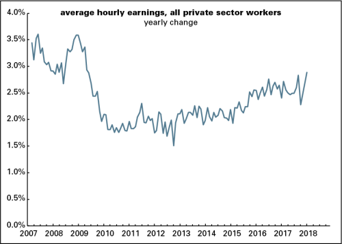
The spark for the selloff came from last Friday’s monthly employment report, which showed a pickup in wage growth in January. (As this post shows, the pickup all came from upper-tier workers; the bottom 80% didn’t participate.) This was read as a sign of inflationary pressures that would drive the Federal Reserve to push up interest rates more aggressively than they might have otherwise. Higher rates are generally bad for stock prices and make it more expensive to be a professional speculator operating on borrowed money.

Through the Great Recession and its aftermath, there’s been more worry about deflation than inflation, and the normally inflation-averse Fed was looking for a bit more of it as insurance against a deflationary spiral. But as the unemployment rate kept falling, alarm about a tightening labor market—when the labor market is tight, not only can wages rise, but workers can develop an attitude problem—fueled increasing fears of incipient inflation. That inflation never really arrived—until, in a lot of eyes, that January spike in wage growth. Of course, one month’s numbers don’t mean all that much, but a lot of market players were just looking to be spooked.

It’s not only rising interest rates that are worrisome. To fight the 2008 financial crisis, the Fed and its central bank comrades around the world drove interest rates to record-low levels and promised to keep them there for a long time. But in addition to that they injected vast gobs of money into the financial system, a process called quantitative easing (QE). In the U.S., the Fed bought $3.6 trillion in Treasury and mortgage-backed bonds; other central banks around the world did similar things. Those purchases flooded the markets with money, which was supposed to stimulate the real economy by encouraging lending, but it didn’t do much of that. (Word is that former Fed chair Ben Bernanke thought that what the slumping economy needed was more fiscal stimulus—spending and/or tax cuts—but since those were politically impossible, QE was the only game in town.) It did, however, stimulate the financial markets mightily. Aside from providing money managers more cash to play with, the Fed’s guarantee that interest rates would stay very low sent investors searching for higher yields, great news for riskier assets like stocks (and more exotic assets like Silicon Valley startups).

This is all now going into reverse. The Fed is allowing the bonds it bought to mature and isn’t buying new ones; its assets have been declining slowly. It’s not sucking money out of the markets, but it’s not pumping in a trillion a year anymore, either. And the likely trajectory for interest rates is modestly higher this year and beyond. Markets love easy money (as long as workers aren’t getting a piece of the action), and they were always going to have to get use to harder money. The wage spike made it seem like money was going to get harder more quickly than they’d thought.

meaning

How much does this matter? It’s quite possible the market could recover. The selloff was intensified by algorithm-driven trading; that could turn around. But at some point high valuations will revert to the mean, or worse, and that is often not a calm process. Higher interest rates breed bear markets and, eventually, recessions.

For most people, the direct, immediate effects of the stock selloff are minor. Though Trump kept urging people to check their 401(k)’s for proof of his excellence, only half (52%) of the population has a retirement account, and of those that hold one, its median value is $60,000. (These numbers come from the Fed’s triennial Survey of Consumer Finances.) More broadly, only about half the population (51%) owns stock, either directly or through a mutual fund; the median holding is $40,000. People in the middle of the income distribution own $15,000 worth of stock.

As the graphs below show, even retirement accounts, which are supposed to be more “democratic” than the stockholdings of the rich, skew massively upwards. Among the richest tenth, 92% have retirement accounts; among the poorest fifth, just 11% do. The top tier’s median holding is $403,000, up 380% from 1989; the bottom’s, is $7,800, up 4%.

SCF - retirement accounts

But a stock market crash can do damage if it’s deep enough, or if it’s a symptom of problems in the credit system. The market tanked during the 2008 financial crisis, but the reason that we lost almost nine million jobs during the recession was the implosion of the credit system. Banks wouldn’t lend and even solvent individuals and businesses didn’t want to spend, much less borrow. The driving force of the crisis was the unwinding of the mortgage boom, made worse by all the clever financial products it spawned. Things don’t seem so dire now (though you never know).

As the graph below shows, household debt, mostly mortgages, soared during the mid-2000s boom, as did that of the financial corporations that made and repackaged those mortgages. That went into reverse after the crisis and hasn’t gotten going again. Aside from the federal government, the only major sector that has been bold with debt since the crisis has been nonfinancial corporations, who’ve been borrowing despite all the transfers to their shareholders reported above. (Some of that borrowing goes to fund the transfers—stock buybacks and takeovers—which doesn’t seem prudent.) No doubt there are some stinkbombs hidden in the financial system—derivatives we won’t understand until months after they blow up, say—but overall the credit system doesn’t look as vulnerable to a total meltdown as it did then.

Debt by sector

But what hasn’t happened is coming up with a new model for the economy. With the Reagan years came a war on labor—the busting of unions, the repression of wages, the war on our meager welfare state—a war whose gains were consolidated in the Clinton years, as the Democratic party was turned into a pure business party. With household incomes under pressure, people used credit cards and mortgages to fund the semblance of a middle-class standard of living. The financial crisis busted that model apart. Household incomes are still under pressure, but money has been far less easy for the middle and lower ranks than it has been for the upper. Slow growth and popular rage are the result.

When stocks were falling hard, left social media lit up with predictions (laced with hope) that this was It—It being the crisis that was finally going to wake people up and foment rebellion. That’s not the way things usually work. The U.S. got more civilized in the 1930s thanks to the New Deal but you can’t say that about Germany. Crises often drive people to the right not to the left.

I don’t think a rerun of the 2008 meltdown is in the cards. But whether you measure by conventional indicators, like GDP and productivity growth, or more humane ones, like the capacity to deliver a decent and stable standard of living to people with less than six-figure incomes, this economy is anything but strong. Signs of wage increases should not be occasions for panic, but when the economy is organized around the needs of the top 10%, they are.

Posted by: Doug Henwood | February 5, 2018

Bosses getting raises, working stiffs not

Stock markets have been swooning, in no small part because last Friday’s U.S. employment report showed that average hourly earnings (AHE)—the average wage, excluding benefits, received by private sector workers—rose smartly in January. This prompted fears that inflationary pressures are mounting, wages will eat into profits, and the Federal Reserve might raise interest rates more aggressively than had been thought as recently as last Thursday. Or, as the New York Times put it in a headline, with its patented mix of dullness and alarm:

NYT scare headline

What these scaremongers aren’t telling you is that it’s only bosses that are getting the raises.

Here’s a graph of the yearly growth in AHE.

AHE - all worker

You may notice that this series begins in March 2007. That’s because the Bureau of Labor Statistics (BLS) only started reporting hourly earnings for “all workers” in March 2006. It has been reporting monthly AHE stats for “nonsupervisory” or “production” workers since 1964. Nonsupervisory workers—defined by the BLS as “those who are not owners or who are not primarily employed to direct, supervise, or plan the work of others”—are about 82% of the private sector workforce, a share that has hardly changed over the last 53 years.

Most Wall Street analysts have been focusing on the all worker series, because it’s broader, and because many of them have a hard time thinking about more than one thing at a time. And if you’re looking to alarmed about something, you can find a rising trend in the graph above. Yearly wage growth (not adjusted for inflation) hit a post-recession low of 1.5% in October 2012; in January 2018, it rose to 2.9%, the highest in almost nine years. Yes, the number is noisy, but there’s no mistaking the rising trend.

But those who’ve been panicking about a wage explosion haven’t bothered to look at the nonsupervisory series. That has shown no rising trend at all over the last two years. AHE for nonsupervisory workers were up 2.4% for the year ending in January—just as they were in December, and less than September 2017’s 2.6%. In January 2016, the gain was 2.4%. In other words, for more than four out of five private sector workers, there’s been no acceleration in wage growth—which, by the way, is barely ahead of inflation.

The BLS doesn’t report AHE for supervisory workers. But since we know the nonsupervisory share of the workforce and the all-worker and nonsupervisory AHE numbers, we can estimate what the supervisory wage looks like with some middle-school math. Here’s a graph:

AHE - sup vs nonsup

For the year ending in January, supervisory wages were up 3.9%, compared with 3.0% in December. Over the last three months, supervisory wages are up 6.4% at an annual rate. (In January, nonsupervisory wages averaged $22.34, and the lbo-news estimate of supervisory earnings was $47.35.) In 2015 and 2016, both series moved pretty much together, but the boss sector began pulling ahead of the bossed in early 2017, and the gap has been widening since.

The series does bounce around a lot, and it’s quite possible that some of the January spike will be reversed in February. But the central point is this: the alarming acceleration in wages is not a mass phenomenon. It’s for the $95,000 a year set, not the $45,000 crew.*


*Yearly earnings are based on 2,000 hours a year times the relevant hourly wage.

Posted by: Doug Henwood | February 1, 2018

Fresh audio product

Just uploaded to my radio archive (click on date for link):

February 1, 2018 David Palumbo-Liu on the right-wing attacks on him and on academic freedom (the Stanford Politics article on the Thiel network is here) • Jodi Dean on how to think about Trump

Posted by: Doug Henwood | January 27, 2018

Fresh audio product

Just added to my radio archive (click on date for link):

January 25, 2018 Vijay Prashad on Syria, Trump, and the state of the global left • Jennifer Cohen of Miami University on feminism and economics (the NYT article is here)

Posted by: Doug Henwood | January 19, 2018

Fresh audio product

Just added to my radio archive (click on date for link):

January 18, 2018 Sandra Cuffe on Honduras after a stolen election and waves of official violence • Alexander Main on U.S. policy towards Latin America under Trump • Janet Capron, author of Blue Money, on drugs and prostitution (without regret) in 1970s NYC

Posted by: Doug Henwood | January 19, 2018

Janus risk

Chris Maisano reminded me on Facebook of something I forgot to mention in today’s union density post—the forthcoming Supreme Court decision in the Janus case. I appended this to the closing paragraph of the original:

A major threat to that [getting union density up]: the forthcoming Supreme Court decision in the case of Janus v. AFSCMEwhich would make public sector union dues optional. Should the Court decide against the union, which is almost certain given the configuration of the cast of robed ghouls, many workers would stop paying dues and not bother to join the union, and the “public” line will, as they say on Wall Street, accelerate to the downside.

Posted by: Doug Henwood | January 19, 2018

Shocker: unions hold their own

Unions had a pretty good year in 2017: they didn’t lose any ground.

According to the latest edition of the Bureau of Labor Statistics annual survey, released this morning, 10.7% of employed wage and salary workers were members of unions, unchanged from last year. There was a mild uptick in the share of private-sector workers represented by unions (aka union density), from 6.4% to 6.5%. Density was unchanged at 34.4% for public sector workers—mildly surprising, given the war on labor being conducted by Republican governors and legislatures across the country.

As the graph below shows, 2017’s flatness is a bit of stability amidst a long-term decline; we saw similarly unchanged density readings in 2013 and 2015. While the rate of decline has slowed from the rapid rates of the 1980s and 1990s, density for private-sector workers was down 1.0 percentage points from 2007 to 2017; for the public sector,  it was down 1.5 points. Declining density is not new to the public sector—it peaked in 1994 at 38.7%, 4.3 points above last year’s reading—but the pace of slippage has accelerated over the last five years or so.

Union density 2017

Declining union density is bad for at least two reasons: it’s bad for working-class power and for living standards. Yes, most unions are weak subordinates of the Democratic party establishment, serving as little more than ATMs and get-out-the-vote operations for boring candidates who do little for their labor supporters once elected. But they do serve as a brake on the political class’s most barbaric instincts, which is why politicians like Scott Walker and moneybags like the Koch Bros. (who funded Walker’s anti-union drive in Wisconsin) have it out for them.

And, as the graph below shows, unions bring higher wages—especially for workers who are neither white nor male.

Weekly wage union vs non

For example, black men who are not in unions earn 71% as much as all white men (union and nonunion); with a union, that rises to 89% as much. For black women, the numbers are 65% for nonunion and 81% for union. For what the BLS calls Hispanic or Latino workers the union boost is even sharper: from 69% of white men for nonunion men to 98% for unionized ones, and from 60% for nonunion women to 94% for union. Unions also narrow gender gaps. Nonunion women of all races/ethnicities earn 82% as much as men; that rises to 88% for unionized women. Unions add 21% to the average weekly wage for men, and 30% for women. In other words, unions reduce inequality along all the familiar demographic axes—and make it harder to pit workers against each other.

Admittedly, the nonunion/union figures compare workers across a variety of occupations, sectors, and regions; a more rigorous analysis would control for those differences to isolate the union effect alone. (There’s a version of that here.)  But even after controlling for those things, you’d still find a substantial union wage advantage of 10% or more—not to mention far better health, retirement, and vacation benefits and greater job security, things not captured by weekly wage stats.

There are good reasons employers hate unions, which is why we need to get those union density graphs pointing upwards. A major threat to that: the forthcoming Supreme Court decision in the case of Janus v. AFSCMEwhich would make public sector union dues optional. Should the Court decide against the union, which is almost certain given the configuration of the cast of robed ghouls, many workers would stop paying dues and not bother to join the union, and the “public” line will, as they say on Wall Street, accelerate to the downside.

Sources: 1930–1999, Barry T. Hirsch and David A. Macpherson; 2000–2017, BLS

Older Posts »

Categories

%d bloggers like this: