While the main focus of Storefront 2.2 is the new user experience, we also intend to make small adjustments that improve the overall design.
Homepage hero section
The first design change we’ve made is the treatment of the homepage content when using the homepage template included with Storefront. Currently, if you add a featured image to your homepage you’ll see something like this;

Not particularly inspiring, huh?
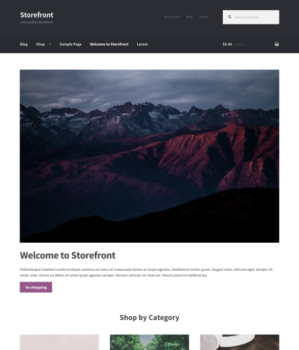
From 2.2 onwards, adding a featured image to your homepage will automatically create a ‘hero’ component. The featured image will be used as a background and your homepage content will be overlaid on top of it. It’ll look something like this;

New header colors
You’ll no doubt have noticed that the content section isn’t the only difference between the two screenshots above. The other noticeable change is the header colors.
All Storefront versions prior to 2.2 set the header background to a dark gray/blue color by default. We’ve decided to change this to white moving forwards. Here’s why;
Product priority
With such a vast contrast between the header / content background colors in 2.1 there is a lot of visual competition for attention, especially when pages first load. The eye is generally drawn to the header first. But seeing as the header is right at the top of the page it already occupies an appropriate place in the visual hierarchy and doesn’t need additional focus. In 2.2 we want product imagery to be the star of the show and making the header background white (to match the main content area) facilitates this.
User behaviour / logos
Generally speaking, logos are designed to be placed on lighter backgrounds. I’ve noticed a lot of Storefront users don’t always change the header background color straight away so this will provide a better experience in most cases when first adding a logo.
In fact, a lot of users don’t change the header background at all which suggests that many folks just want to install a theme and go, with minimal set-up shenanigans. Using a more appropriate default background color will improve the Storefront experience for many folks who exhibit those tendencies.
Typography tweaks
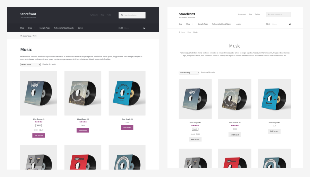
Adjusting the header background to be lighter revealed just how heavy our typography styles were. So, embracing the ‘make products images top dog’ mantra from before we’ve lightened font weights here and there. We’ve also adjusted button background defaults and a few typographic treatments when using the full width template. The overall result is a more streamlined / minimal aesthetic.
Below you can see before and after side-by-side:

Hopefully you’ll agree that the new design helps shift the visual focus squarely on to the most important thing at the store – the products!
Backwards compatibility
While the differences are quite visually striking, there’s not a huge difference in the code, so I hope that backwards compatibility won’t be a big issue. Of course, the new header background color will only be applied to existing stores if you’ve not already changed from the old default. The same goes for buttons. If you’ve customised Storefront it’s unlikely you’ll even notice any of the color changes.
The typographical changes can easily be reversed with a few lines of CSS to change the heading weights, if required.
If you’re doing something unique with the product content then the new hero component should be thoroughly tested before updating Storefront core.
When’s it due?
This is all a work in progress and we still have quite a bit to do. But we still hope to release at least a beta by the end of Q1. Stay tuned!


