This is a building placed bang in the newish centre of town (the centre of Birmingham having edged westwards since the 1980s), right next to the rep theatre, concert hall, conference centre, new business district. I knew it was going to be big, but when I went there I was still surprised at just how big it has turned out to be. The largest in Europe, they say. It cost £189m. It opens to the public on Tuesday (Sept 3). It is designed by Dutch architects Mecanoo (pronounced like the construction toy), a firm headed by Francine Houben. She has made it something more than its ostensible function. It is a kind of public forum but it is also a memorial, a shrine, to the book and to literature.
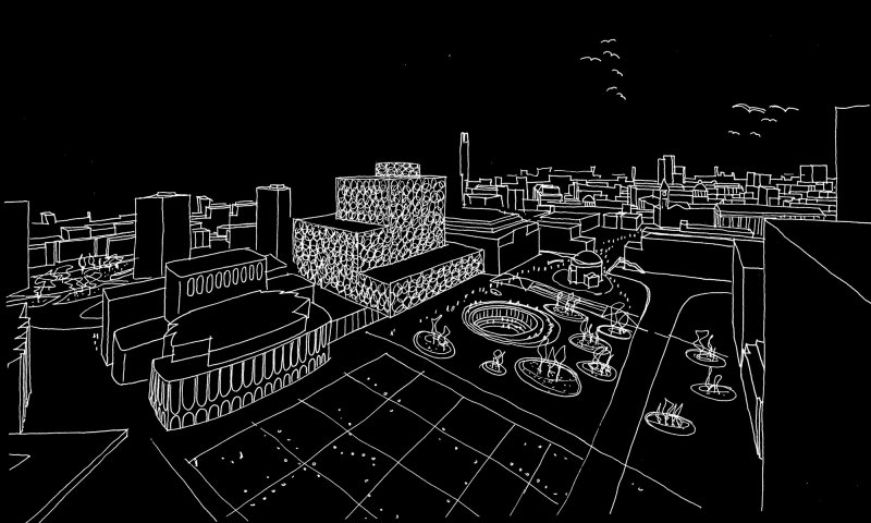
 Yes, but what kind of architecture is this? Clearly the idea is to be non-institutional, open. Equally clearly, this is another example of the New Ornamentalism at work. The old modernist idea, first floated by Chicago architect Louis Sullivan in the 1890s, that ornament should be avoided, that the naked structure ought to be enough, that form should follow function, is amply demonstrated by the 1974 inverted concrete ziggurat of Birmingham’s previous Central Library nearby, by architect John Madin. That’s a good building, one which deserves to escape demolition and find a new use even if it’s not quite as great as some make it out to be. Mecanoo, however, have swung right back the other way. Their arrangement of staggered shallow boxes – a joggled heap of books, say – is enriched or disguised, depending on your preference, by a highly-worked geometrical outer casing of interlocking aluminium circles. There’s a bit of sun-shading going on in places here but there are other ways to achieve that: it’s also a way to do something about otherwise blank facades where windows aren’t wanted. This is why New Ornamentalism is popular for generally windowless department stores.
Here you could see it as the gold tooling on the cover. 15 years ago, say, when architecture was still in recovery from the generally dubious excesses of 1980s postmodernism, this might have seemed outrageous. Today, it is merely interesting: when Houben says this blinginess (not her word) refers to Birmingham’s nearby jewellery-making district, we nod politely. New Ornamentalism is one of the ways that postmodernism reasserted itself as one of what became many strands of mainstream architecture. Sullivan himself, by the way, though he successfully got to grips with the possibilities of the early American steel-framed building, is remembered as much for his rich ornament as for his functionalism.
 This building is arranged in such a way as to allow for public roof gardens on levels two and seven. It can do this because, being a big building on quite a tight site, it has to go tall, ten levels. If you do that and want not to appear too monolithic, then the time-honoured devices is to set back or shuffle around layers of floors, and this leaves flat bits sticking out sideways that you can use. It’s what Houben’s compatriot Rem Koolhaas did with the equally ambitious Seattle Central Library in 2004. But where Koolhaas enclosed his resulting public spaces in a taut latticework skin, Houben leaves them open as landscaped gardens. They have little mounds which, she says, echo the ‘soft hills’ of the area which you can see from up there. And it’s true, Birmingham and the Black Country is remarkably green these days.
Fascinating though it is, this business of buildings wearing clothes that are for style rather than function, this is by no means a skin-deep building. If anything, the architecture gets richer on the inside. The interiors are very varied, sometimes strange – as in the lower of the two floors jutting out at the front to provide shelter, where the weight of the building above is picked up by long shallow arches and half-arches, and you start to feel you are in some Roman aqueduct. Elsewhere, the tall concrete columns sometimes seem randomly spaced , with random thicknesses, like trees in a forest. And while lesser architects might have punched an atrium straight from top to bottom, Houben and her colleagues have staggered this too, so that the sense of spaces unfolding into each other works vertically as well as horizontally.
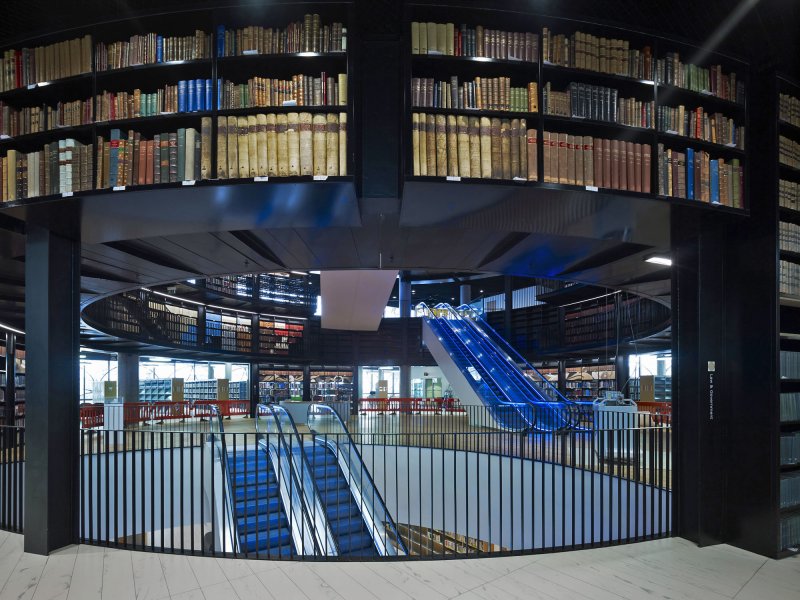
 There is a big, very yellow children’s library down below, opening up into an oval piazza scooped out of Centenary Square in front. The tall foyer at ground level extends across to include the Birmingham Rep Theatre, with a new studio theatre. Escalators take you up to the main adult library areas and archives, and here comes the big interior moment: the rotunda lined with galleries of books. It’s pure theatre, this, the books all around you are accessible but principally for show, like the King’s Library in its huge glass case rising through the levels of the British Library in London. And so you continue on up until – the other moment of theatre – you get to the golden drum right on top of the building. Here you enter a double timewarp: it memorialises the library’s historic Shakespeare collections, in the form of a salvaged panelled room from an earlier, Victorian, city library. This is the second time it has moved. The collections are now stored elsewhere in the building, so you are left with museum-like displays in a room that has in surreal fashion been absorbed and elevated in this massive new structure.
Public lending libraries and academic libraries are very different things, with different needs, for different people. Here the two varieties are stacked one on top of the other. From the outside, Houben’s Mecanoo makes it clear which are which: the floors of historic, therefore academic archives (including an important photographs collection) are tricked out in gold. It’s simplistic symbolism, sure, but it works. And slyly it introduces a bit of function into the ornament, which starts to act as a signalling device. But beyond that, this library is also other things. It is designed for performances (music, readings, drama), exhibitions, meetings and general hanging-out. The exhibitions, revealing the treasures in the archives, will be important.
What I like about it is the fact that it is anything but apologetic. It’s not shoved into a corner somewhere. It’s a proud new civic building, at a time when very few of those are being built. It says that there is something to city life that is about more than working and shopping and drinking, that learning and entertainment can co-exist, and so can analogue and digital. That one can look beyond the politics of class and envy, and provide a gracious place of common resort. The architecture will quickly become a period piece. That’s fine too, so long as it hangs together: all being well, it will mark a moment of enlightenment, emerging from dark times.

Words © Hugh Pearman, photos © Christian Richters courtesy of the Library of Birmingham. First published in The Sunday Times, London, September 1, 2013.
Mecanoo architects: https://www.mecanoo.nl/
The Library of Birmingham: https://www.libraryofbirmingham.com/


