Between the Lines with Map Legends

In her continuing blog series, “The Hidden Meanings of Maps”,  Anne-Laure Freant’s new posting focuses on map legends. As noted in her blog:

Most cartographers neglect map legends. They put a lot of effort in the projection and scale choice, data and pretty colors selection, but then they just want to add a powerful title and press the “share” button. That is a mistake, as the cartographical legend is the key to understand the map. It is like building a beautiful door and forgetting to put a keyhole on it. It sounds obvious to say, but it is a major communication issue found in very prestigious media maps, still today. When maps were made by hand, making the legend was part of a very artistic process. This article puts side by side recent maps made with computers and ancient ones, drawn by hand, on purpose, to illustrate better the importance of skills and knowledge over technology when it comes to mapping.

Once again, for anyone who works with maps, Ms. Freant’s new posting is well worth reading.
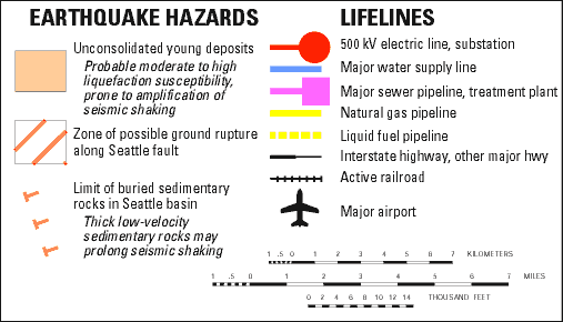
Lifelines and earthquake hazards in the greater Seattle area (From: http://tiny.cc/etsb9w)

A map legend example: “Lifelines and Earthquake Hazards in the Greater Seattle Area” (From: http://tiny.cc/etsb9w)


The Hidden Intent of Map Makers?


Hawaii's volcanoes revealed - U.S. Geological Survey Geologic Investigations Series I-2809 by Barry W. Eakins, Joel E. Robinson, Toshiya Kanamatsu, Jiro Naka, John R. Smith, Eiichi Takahashi, and David A. Clague.

A map example: Hawaii’s volcanoes revealed – U.S. Geological Survey Geologic Investigations Series I-2809 by Barry W. Eakins, Joel E. Robinson, Toshiya Kanamatsu, Jiro Naka, John R. Smith, Eiichi Takahashi, and David A. Clague.

The blog series, The Hidden Meanings of Maps posted by Anne-Laure Freant, is well worth reading for all who make and use maps. The main theme to the blog set is basically – how well does a map carry its meaning to viewers? The map making blog series  includes the following topics:

-  The Projection Choice

- Why Scale Matters

- Design and Colours

- Between the Lines of Legends

- The Art of Data Selection

- Making a point of Mapping

As Ms. Freant notes:

Just like the photographer or the painter, the map maker turns into a messenger bringing back data “from above” to the people “on the ground”.  It is not meaningless, and it is certainly never purely objective.

The first three blogs in the series are now posted. The postings include map scale, map projection, and map design and colors.