is a blog about design, technology and culture written by Khoi Vinh, and has been more or less continuously published since December 2000 in New York City. Khoi is currently Principal Designer at Adobe, Design Chair at Wildcard and co-founder of Kidpost. Previously, Khoi was co-founder and CEO of Mixel (acquired by Etsy, Inc.), Design Director of The New York Times Online, and co-founder of the design studio Behavior, LLC. He is the author of “Ordering Disorder: Grid Principles for Web Design,” and was named one of Fast Company’s “fifty most influential designers in America.” Khoi lives in Crown Heights, Brooklyn with his wife and three children. Refer to the advertising and sponsorship page for inquiries.
This movie still from Vanessa Gould’s masterful documentary “Obit.” is a snapshot of one of the most exquisitely crafted talking-head film compositions I can remember seeing. First, it gives full, unfussy attention to New York Times obituary writer Margalit Fox, allowing the full range of her mesmerizing articulation of the nuances of the obit trade to flourish on the screen. But she’s placed off-center in an extremely clever way; we get the context of the Times newsroom behind her, or at least a charming corner of it with shelves teeming with books and covered with sticky notes, and even a manual typewriter just behind her (not just anachronistic set dressing; the typewriter actually serves a narrative purpose elsewhere in the film). The space that the frame leaves to Fox’s right allows her arm and hand to gesture about balletically as she underscores her words. And, to her far right, the camera just manages to fit in her nameplate mounted on the edge of her cubicle (in the actual film you see the full nameplate, but in this capture I found online it’s cropped slightly for some reason). So much information and expressiveness conveyed in one deceptively simple shot.
There’s much more to like in “Obit.” too. The film is a wonderful examination of the counter-intuitively life-affirming profession of obituary writer. It follows the atypically large staff of these specialized journalists at The New York Times as they scramble to write respectfully cogent and compelling stories about the lives of people who have just passed away. Like its subject matter, director Vanessa Gould has produced a careful, thoughtful film full of unexpected joy. It also continues the surprisingly strong batting average of that cinematic sub-genre known as “the newspaper movie.” “Obit.” holds its own next to more dramatic or hallowed fare like “Spotlight,” “All the President’s Men” and “His Girl Friday” by diving deep into the process of reporting. The results are fascinating not just from the perspective of understanding the process of how obituaries are created, but also understanding how we think about and memorialize notable lives.
Also worth mentioning: “Obit.” sports a gloriously tasteful poster. This thing is gorgeous.
“Obit.” is available for streaming now. Learn more at obitdoc.com.
This sketch from Saturday Night Live making fun of the use of the font Papyrus in the logo for James Cameron’s fantastically boring “Avatar” has already made the rounds. It’s hilarious.
It made me think though: with the possible exception of Helvetica, the only time popular culture acknowledges typography is when something has gone wrong—really wrong. Think of Comic Sans, which has earned a wide reputation for being a severely overused, terrible choice. Or Calibri which figured centrally into a major corruption story in Pakistan earlier this year (that scandal even became known as “fontgate”). Papyrus now joins those ranks as being remarkable for being notorious.
It says something about our craft when the only time the uninitiated have an opinion about it is when it’s gone off the rails somehow. This is not to say we shouldn’t have a sense of humor about what we do. We should—this SNL short had me in stitches. At the same time though, it would be nice to be recognized for the good we do, too. Design needs to do a better of job of explaining the value that we contribute to society, otherwise it’s just going to mean more ridicule.
Thanks in part to a ridiculous amount of recent business travel I managed to watch seventeen movies in September, though I only got out to the theaters to see one of them, the sublime “Logan Lucky.” Actually, to be more accurate, I watched it in one of the 330 drive-in theaters that still exist in America. That number is down from 4,000 or so when the phenomenon of watching a movie outdoors from the comfort of your own car was at its peak. And visiting the Hyde Park Drive-in Theater in upstate New York almost felt like a time warp back to that era. The concessions stand, a wide, low-profile concrete structure towards the back of the lot, clearly looked like a remnant of post-War architecture’s least exuberant building trends. But everything looked over a half-century old, too: weathered and repainted over dozens of times, as if maintained by ghosts on a budget.
It wasn’t exactly what you’d call a cinephile’s experience, either—the sound was tinny over the FM frequency that you tune your car radio to, and the picture wasn’t particularly crisply projected onto the patchy, billboard-sized screen. But I’ve never been to a drive-in theater before, and I could see the appeal, even in this age when 4K screens and Dolby Atmos audio can be had at home. One, you’re watching a huge movie screen out under the stars; we went on a particularly perfect late summer evening, when the air had a cool snap to it without being cold. And two, you’re not at home, you’re out in the world, with other people. That’s a good thing.
As for “Logan Lucky,” it was kind of implausible and silly but it was good solid fun. Maybe more importantly it brings the talents of Steven Soderbergh back to the big screen; even his most trifling cinematic dalliances are fascinating works. I liked it a lot and can’t wait to watch it again.
Here’s September’s full list of the movies I watched.
“Moana” Hey, this movie is really, really good, people.
“A Face in the Crowd” An amazing, sadly prescient story of a megalomaniacal TV personality who comes to abuse his outsized influence on the American public.
Just a quick note to say we’ve updated Bumpr—the simple but indispensable Mac utility that lets you choose which app you want to open your links in, on the fly—so that it works beautifully with the newly released macOS High Sierra. Bumpr 1.1.8 is available right now in the Mac App Store.
If you haven’t used Bumpr before, you’ll wonder how you ever lived without it. Here’s how it works:
Click on a web link in, say, Slack or Preview or your desktop Twitter client—basically any desktop app—and Bumpr seamlessly intercepts the link. Basically, Bumpr is acting as your default web browser, but instead of opening your page, it very, very speedily displays a simple, compact menu of the web browsers you have installed. Click on one and that link opens in that browser. It’s simple and easy and fast, and it’s particularly useful if you have more than one Gmail or G Suite account and want to use a different browser for each.
Bumpr also handles email links the same way, so if you use more than one mail app, Bumpr will let you choose which of them to use with any given link. Just as with web links, Bumpr gives you the power of choice, letting you use the right mail app or browser for whatever your needs are at any given time. I still use Bumpr every day on every one of my Macs, and I can’t live without it.
As a side note, we’ve been cooking up some pretty cool enhancements to Bumpr for a big new release coming up soon. Stay tuned for that, but in the meantime, grab the latest version in the Mac App Store right now.
Here’s a brand new product that I cooked up with my friends over at Baron Fig, makers of exquisitely useful notebooks, pens, bags and more: it’s called Unfinish and it’s “an interactive notebook.” Wait, it’s much more interesting than that sounds!
Actually “notebook” isn’t quite the right word for it, and neither is “sketchbook.” Unfinish is more of a “doodle-book.” Instead of confronting you with hundreds of stark white blank pages, it gives your creativity a bit of a kickstart with a unique, quirky, incomplete image printed on each page. There’s a horse without a head, a floating lighthouse, the top of a suit of armor and much more—a different one on each of its 192 pages. Each of them is unfinished in some way, inviting you to add a background to it, trace it, extend it or even ignore it altogether. (The images are printed in non-repro blue ink so it won’t transfer when photocopied and is easily dropped out in image editors.)
There’s no implied meaning to the images, no goal or purpose aside from whatever you might want to bring to it yourself. You would think that this would be true for any old notebook or sketchbook as well, but I think a lot of people would agree that a blank page can be so confrontational that sometimes it actually demands a declaration of purpose. So when I first dreamed up Unfinish, I wanted to defuse that blank page problem and to make a playground for your brain, a space to free-associate, stoke your creativity and most importantly to have fun.
The team at Baron Fig did an amazing job bringing this to life. Unfinish is based on the company’s signature Confidant notebook line—it’s got acid-free paper, the book opens and lays flat for easy doodling and writing, and it’s bound in beautifully tactile hardcover material. It’s also a limited edition, which means it ships in a gorgeous, collector-grade box and it’s on sale only for as long as supplies last. You can get yours today for just US$20 at baronfig.com. If you pick one of these up—please snap some pics and show me your doodles!
There are more important problems in the world than where to park one’s car but in New York City, particularly, a good parking solution can be irrationally satisfying. There aren’t a lot of driveways here, you see, and so New Yorkers are left with painfully imperfect alternatives. There’s street parking, of course, which is free if you don’t get ticketed and cutthroat no matter what. There’s the option of paying for monthly parking in a garage, which in some cases costs as much as renting a place to live. And there’s even buying a dedicated spot, which can cost hundreds of thousands of dollars (and are sometimes even pitched as investment opportunities).
If you lack the financial temerity to rent or buy a spot, the on-demand parking service DropCar presents another option. When you don’t need your car for at least several hours, you can use the DropCar app to schedule one of their “personal car concierges” to meet you anywhere within the service’s coverage area and drive your car off to one of their centralized parking lots. When you need it back, you just schedule a dropoff and a concierge will drive it to you and hand the keys back over.
DropCar costs a still-not-insignificant US$349 monthly, but it does let you order ten pickups and dropoffs each month. (The company also offers a parallel service that sends a valet to mind or move your car for US$15 per hour, handy if you have business in a place where there’s no parking. It sounds especially handy for Manhattan and doesn’t require a subscription, but I have yet to try it.) The service is not cheap, but on a recent trip out of town I left my car at long-term airport parking for fourteen days and that alone cost me US$290. That was basically for one pickup and dropoff that I had to do myself—and to and from a particularly inconvenient parking lot. When you consider that DropCar also picks up and drops off at LaGuardia Airport and JFK Airport the service starts to look somewhat more reasonable.
Travel, in fact, is the excuse I’ve allowed myself for trying DropCar. If you lack the financial temerity to rent or buy a garage spot, street parking your car is particularly inconvenient when you’re away from home. Neither my wife nor I use our car to commute (or much during the week, really), so when I’m off on a business trip, as I seem to be a lot these days, the chore of re-parking the car is a burden on her. New York’s extensive alternate side parking rules mean that you can’t leave a vehicle parked in one spot on the street for more than a few days at a time. DropCar allows us to schedule a pickup at the start of my trip and a dropoff when I’ve returned, dramatically simplifying stints of soloing parenting.
We’ve been using the service for several weeks now and it’s been great. On all but one occasion, the valets have been prompt or even early (the one time a valet was late, he texted me well in advance and gladly rerouted to a more convenient dropoff point that was even outside of DropCar’s coverage zone) and they’ve been consistently polite and friendly. Using DropCar’s iOS app is fairly straightforward even if its design and user experience are rough around the edges—the interface looks like a clumsy web interface unetnthusiastically wrapped in a native mobile app. Customer service has also been reliable; responses to my inquiries generally came within a day or two, though apparently from generic mailboxes (they were all written by “Trevor,” a seemingly nonexistent agent).
In fact, I have only one major complaint with DropCar—which, in a way, I’m grateful for. The company boasts parking lots in Brooklyn and the Bronx, and it even allows you to follow the path your valet drives your car on a map view in the DropCar app. Though our pickups and drop offs have all been in Brooklyn, more often than not our car gets driven to the Bronx, some fifteen or so miles away.
This means that we have to be sure to order a dropoff at least an hour in advance (one valet suggested at least two) but more importantly, the distance means a each trip consumes a nontrivial amount of gas and generates a nontrivial amount of pollution. That, combined with whatever small but still meaningful contribution the trips make to traffic congestion in New York City, makes it hard to set aside my nagging conscience: as a service, DropCar makes my life easier, but it’s probably not doing much good for the planet. I find this fact to be something of a relief because, well, it’s a sufficiently concrete reason not to indulge in a DropCar subscription. The service is a great luxury that I would enjoy immensely but I can’t justify the environmental impact let alone the cost.
There’s probably some version of DropCar that makes sense in the near future though, and maybe the company can hang on where other, similar services like Luxe and Zirx have stumbled. When electric cars are the norm then the round trips to the Bronx will be significantly easier to justify for the environmentally minded. On the other hand, if and when our roads are dominated by self-driving cars, it may turn out that valets become moot and every paid parking lot becomes a remote lot; we’ll all just be sending our driverless autos to the Bronx via an app.
This article at Co. Design by Kelsey Campbell-Dolleghan asks the astute question “What comes after user-friendly design?” It features a quote by yours truly but even if that weren’t the case I would still be applauding its willingness to consider the long-term effects of our craft.
Campbell-Dolleghan makes the argument that for decades now designers have been working steadfastly to make things simpler and more elegant. That campaign has been hard fought, and somewhat understandably designers have not always thought very deeply about the implications of the end results. Now, more and more, it seems that the full impact of what we do is becoming an important issue to examine in detail. In particular, Campbell-Dolleghan highlights the work of Simply Secure, a non-profit leading the way in thinking about how to build trustworthy user experiences and products.
In part, Simply Secure’s approach focuses on educating designers themselves about best practices… That means convincing the design community that privacy and security are part of their ambit–that these issues aren’t boring or impossibly complex, but rather are design problems that demand elegant design solutions. For instance, how do you communicate when and how a voice assistant is collecting data about a person? How can design foster trust in an e-commerce site’s security? How can design help people understand the way their products work, and give them the agency to control their own experiences?
Simply Secure’s focus is principally on security and privacy which are of course of paramount importance in the present. But it’s not a stretch to say that within a few years it will be incumbent upon design as a craft and designers as professionals to answer many more questions about our work than just “Does it convert?” That’s why the ability to think critically about design is going to be an indispensable skill before too long.
There’s probably only a very small fraction of all the many, many hours of various “Star Trek” shows that I think are genuinely good, but I still do have great affection for the franchise in all of its iterations. This video of composer Jeff Russo conducting a live orchestra recording of the theme to the newest series, “Star Trek: Discovery,” is nice enough, but when the familiar trombones come in at the 1:56 mark, I must admit I choked up a bit.
They say a compelling story comes not from plot but from character. But Marvel Studios confounds this truism. As they demonstrate in the passable “Spider-Man: Homecoming,” which I finally got around to seeing in August, the producers fully grasp the title character, probably better than any previous creative regime who have handled him. In Tom Holland they’ve cast the best of the actors to ever play Spider-Man, one who is a perfect fit with the motivations they’ve written, and one who delivers each line with total, infectious alacrity. And yet, this keen understanding of character fails to inspire a particularly compelling story. Instead what you get is a mostly forgettable joy ride of a plot—the highest tension the film ever achieves happens during a conversation in a car ride, while all of the other action set pieces wilt away almost as you watch them. In fact “Homecoming” is more transactional than it is narrative; the movie moves along from cinematic universe obligation to cinematic universe obligation, tirelessly invoking its tiresome franchise debts. The saddest thing is that there’s virtually no point in complaining about this, as this movie could never have existed outside of the confines of the corporate strategy PowerPoint deck that brought it to life. And its ninety-two percent Rotten Tomatoes rating shows that Marvel’s decade-long campaign to lower our standards as moviegoers has succeeded. They won, we lost.
On the bright side, I did get to see seventeen other films in August, many of which were wonderful. Of particular note was the special theatrical screening of “Three Days of the Condor” at Alamo Drafthouse Cinema in Brooklyn. It was followed by an enormously entertaining Q&A with novelist James Grady, whose book was the basis for the movie. That’s a pretty good example of how a great understanding of character can power a legitimately great movie.
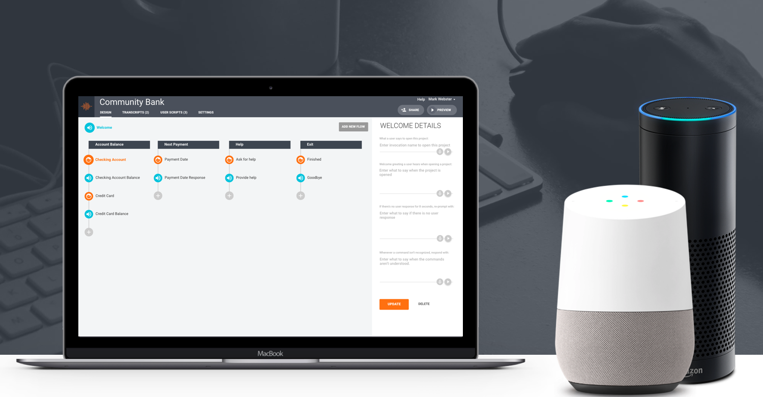
Of the major technological shifts that designers are all constantly being told we need to prepare for, the idea of voice assistants becoming a major method for interacting with computers fascinates me most, in no small part because it seems the most inevitable. Whether or not we’ll soon all be wearing augmented reality glasses or immersing ourselves in virtual reality spaces for hours at a time, it’s easy to imagine a role for a voice-based interface like Alexa, Google Assistant or Siri in these new experiences, not to mention in plain old real life. We are at the very beginning of this phenomenon, though, and the tools for creating applications on these platforms are still primitive.
That’s why I was so impressed when I saw Sayspring for the first time earlier this year. While there are plenty of development tools for voice out there, Sayspring is the first I’ve seen that treats voice user interfaces explicitly as a design problem, which immediately struck me as exactly right. The app allows even those with no prior experience in voice UIs or bots to get a prototype Alexa skill or Google Assistant service up and running within minutes—on an actual Echo or a Home, no less. More than just technically impressive, that fast track ability quickly makes it clear that the experience of a voice app requires lots of iteration, careful trial and error—in other words, design. Of course, thinking about voice UIs in this design-centric way raises all kinds of questions about how this technology can evolve into a language (no pun intended) that resonates with users. So I interviewed Sayspring founder and CEO Mark Webster about his ambitions for Sayspring and his thoughts on voice assistants in general.
Khoi Vinh: What makes Sayspring different and better than the development kits that Amazon and Google provide?
Mark Webster: As you mention, both Amazon and Google have been focused on releasing code templates and tutorials to help developers quickly build simple apps, like quizzes and fact generators. This has been great to help everyone get their feet wet with these platforms, but it has also resulted in some lame voice apps. While these platforms are new, so are voice interfaces themselves. Product teams don’t have much experience with them. What’s needed to fulfill the promise of this powerful new medium is not a focus on how to build for voice, but what are we building, why are we building it, and who is it for?
Answering those questions requires making design a part of the process, and doing that requires a set of tools that removes all the technical barriers to working with voice. That’s what Sayspring does. Our collaborative design software lets designers, UX professionals, and product people craft voice-powered user experiences, and actually talk to them in real-time, without needing to code or deploy anything.
Our belief is that great voice experiences start with focusing on the user journey, and that is how the process of designing and prototyping on Sayspring begins. You don’t need to know anything about the underlying technology of voice to use Sayspring. You just plan out the flows of the experience, add some commands and responses, and start talking to your project on any device. You can even share it with others, to do user testing prior to development.
The best companies understand the value of a proper design process across web and mobile. Sayspring is bringing that disciplined approach to voice. Over time, we’ll make it easier for every person in the organization to work with voice apps, from design to development to production. But I strongly believe that if you begin product creation with a weak design approach, everything that comes after it is a waste of time so that’s why we’re starting there.
The design and prototyping approach kind of upends what everyone expects from a voice UI tool at this stage in the evolution of voice UIs: that they should help you deploy a completed product as well. How important—or unimportant—is that to Sayspring, now and in the near future?
Let’s take a look at where we are in the current evolution of voice UIs. When it comes to voice applications, Alexa alone already has over 11,000 Alexa Skills, so the deploying of completed products is continually happening. The process could definitely be easier, but developers are figuring it out. But many of these applications are underwhelming and quickly abandoned.
Every disruptive medium has an early period where creators take something from an earlier medium and just move it to the new one. The first television shows were radio shows in front of a camera, the first mobile apps were just smaller versions of websites. It takes some time to understand the nuances and power of a new medium, to create the experiences that fully leverage the possibilities available.
For voice, we’re trying to push the process forward by empowering designers to work in this new medium in a way that’s impossible without Sayspring.
We’re at the dawn of a massive shift in computing, unlike what we’ve seen in the past. Voice promises to deliver interactions closer to how we all communicate as human beings. Applications have to adapt to people now, instead of the other way around. There is no mouse or keyboard or screen to learn how to use. We all know how to speak to one another, and voice applications have to conform to that. This is maybe the biggest design challenge we’ve seen in the digital world.
One huge advantage to working with voice UIs over visual UIs is that they’re ultimately text-based, so the division between design and development is more blurred than it traditionally has been in the past. This means that once you’ve completed the design process, moving into development and deploying is relatively straightforward and Sayspring will be able to do a lot of the heavy-lifting to bring that product to production. Our mission is to become the one place where a team can design, build, and manage their voice applications across multiple voice platforms. So we plan to handle the end-to-end process of creation, but first we all collectively need to focus on designing experiences worth shipping.
Do you believe that voice UIs will continue to be “ultimately text-based,” as you say? I’m thinking about Apple’s CarPlay, Google’s Android Auto and obviously Amazon’s recently announced Echo Look. These seem to suggest that voice and screen can be an effective combination.
I meant that the output of the voice design process—intents, utterances, entities, the actual speech—is ultimately text-based, so from a workflow standpoint, moving from design to development tends to be more seamless.
Many voice-driven experiences will involve a screen though, in addition to voice simply being a method of input for a traditional GUI-based experience. We’re already working on display support for Sayspring. The visual components for Alexa and Google Home are currently restricted to text and one image, so it’s easy to implement. As they get more involved, Sayspring would integrate with other tools like Photoshop or Sketch, to handle the visual aspect. I can’t see Sayspring ever trying to rebuild the popular products we already have for visual design.
We think a lot about the multi-modality of voice and screens. One thought exercise we often use is to imagine an assistant following you at all times with a laptop they’d use to perform the tasks you ask for. You could have a conversation to get things done, and at certain moments it would make sense for them to turn the laptop around and show you the screen.
So you might tell them you want to see a Broadway show this weekend, and have a dialog about what kind of show you’re interested in, what you’ve already seen, and what’s available. If you decide to buy tickets, they would likely want to show you a seat map of the theater on the screen. You’d tell them what tickets to buy, and they’d finish the transaction. That’s the way ticket purchasing through a VUI would likely happen as well.
I imagine that kind of metaphor or mental model is helpful for imagining what a voice-based user experience can be, since the form is relatively new. How much do you think it’s Sayspring’s job to help your users grok the unique challenges of designing in this medium?
Considering how new this medium is to most people, we feel a huge responsibility to both our users and to the design community as a whole. We’re not only helping people work through the process of voice design, we’re also out there advocating that voice experiences need to be designed in the first place. Too many voice applications are being created by developers with no design input, and most companies working with voice have yet to establish a proper design process. We see ourselves as advocates for design within the broader conversation about voice.
Helping designers work with a new medium also brings with it some product challenges for our team. To give you one example, personality design is a crucial part of the voice design process. Beyond just selecting the words to use, speech can be styled with SSML (Speech Synthesis Markup Language) to add pauses, change the pronunciation of words, and include certain tone or inflection changes.
SSML looks similar to HTML, and we’re considering adding a rich-text editor for SSML to Sayspring. Now, there aren’t many designers out there asking for better SSML tools, and it doesn’t come up in user feedback. But do we put it out in the world anyway, with the belief that it will help users create better voice experiences? How opinionated should we be in steering the establishment of voice design practices? Or should we just be responsive to a more organic evolution? It’s a tough question to answer for us, and we think about that balance each time we prioritize our own product roadmap.
These kinds of considerations really suggest that this is an entirely different kind of design. Do you have a sense yet what makes for a good voice designer? And where is the overlap with what makes for a good visual interface designer?
While it’s going to be a new kind of design for many designers, it should still be based on the design process most of us are familiar with. All design work, including voice, should follow the fundamentals of defining the problem, doing research, brainstorming ideas, designing solutions, collecting feedback, and iterating. Ultimately what will make a good voice designer will be people who are thoughtful and process-driven in their visual design work, bringing that over to voice.
Sayspring wants to be the canvas where designers work with a medium that’s new to them, that is based on the process they already know and is inspired by the tools they’ve used before, but created specifically for voice. We view this new form of voice design as a remix of several disciplines that all have a long history to borrow from. Designing for phone-based interactive voice response (IVR) systems involves crafting a voice-driven user journey. Copywriting and screenwriting focus on word selection, delivery of message, narrative, and personality. And sound design or voice-over work has a lot to say about pacing, inflection, tone of language, and auditory atmosphere.
We’ll also eventually have multiple designers, with specific specialties, all working together on voice projects. Including sound design is a great example actually. Most creators of Alexa Skills or Google Assistant Actions have yet to explore using non-verbal audio as part of the experience. For example, “earcons” are short, distinct sounds that can be used to landmark a user to where they are in the application, almost like using varying header colors to identify sections of a website. Almost no one is using them. Nearly every Skill lets you know you’ve opened it by saying “Welcome to Skill Name” instead of playing a short, familiar audio clip. That will change over time.
I think we’ll soon see the design of voice application involve an interaction designer to construct it, a copywriter to write the actual speech, and a sound designer adding enhancements, cues, and atmosphere to the experience. And we want that all to happen in Sayspring.
Do you think that having more diversely skilled teams and richer workflows is what’s needed to help these Alexa Skills and Google Assistant Actions get to the next level? By some estimates, the vast majority of these apps go unused–they’re hard for new users to discover and even if a user installs one of them, the chances that she’ll be using it again in week two or week three are vanishingly small. Aside from Spotify, I’m not sure there’s another app that has broken through in a serious way.
I think smarter teams gaining a deeper understanding of how to use this new medium, along with platform improvements (like changes to discovery), will drive the shift to voice.
Alexa knowing more about you is important to fix discovery. For example, music is an ideal use case for voice interfaces, but the option to connect to Spotify then never having to ask for Spotify again helped. We’re seeing more and more of this happen. Alexa just released a new video API to connect to cable boxes and streaming services that doesn’t require the specific invocation of the skill or app. Dish already launched this type of skill for Alexa, so now saying “Alexa, go to ESPN” changes the channel on your TV. That will help repeat usage tremendously. But they also need to make sure that skill is well-designed and easy to use.
Many early skills are starting points. Domino’s pizza launched an Alexa Skill, which allows you to reorder a pizza you’ve ordered before. Domino’s CEO Patrick Doyle has said the growing use of that skill has convinced the company to devote more resources towards the voice ordering experience. They’re working on being able to create an order from scratch now. With different sizes, toppings, deals, and sides, that’s a much harder design problem, and requires a more thoughtful design process.
But also, the shift to voice is bigger than just Skills and Actions. Google Analytics just announced voice support, on mobile and desktop, so you can ask “How many visitors did we have last week?” instead of fiddling with an interface. And twenty-five of all desktop Cortana queries on Windows 10 are voice. With 100 million active monthly Cortana users, that’s a lot of people already talking to their desktop computer. Designing voice interfaces will soon be a required task for any digital product design team.
I appreciate that a pizza order is more involved than playing music, but I wonder about the limits of voice UIs in terms of dealing with complex tasks of any real scale. In my personal experience, even the cognitive load of playing music is more than I would’ve expected. Unless I have a really, really specific idea of what I want to hear, I have to keep this catalog of music and artists that I like in my head, and that means I tend to play the same few things over and over. Yet when I look at iTunes, for better or worse, I can happen across all kinds of stuff that I wouldn’t be able to recall standing there in my kitchen, talking to Alexa or Google Home. Is there a practical limit to what these voice interfaces can do? Without an accompanying visual UI, that is?
Every medium has different strengths and weaknesses, and designers need to keep pushing the perceived limits of that medium to find solutions that users find valuable. For example, a lot of Alexa users deal with the issue of music discovery you mention, so last week Amazon Music launched support for over 500 activity requests like “pop music for cooking” or “classical music for sleeping” to help address it. I will say though that having spent a chunk of my career in streaming media, discovery is its own beast and definitely wouldn’t be solved just by adding a screen. I mean, the whole reason Pandora exists is to help you find something to listen to, regardless of the interface.
I wouldn’t think of voice interfaces in terms of having a practical limit, but rather back to this idea of its strengths and weaknesses. Everything shouldn’t be crammed into a voice-only experience. Something like browsing Pinterest wouldn’t work without a screen. Getting ideas for redesigning your kitchen requires a visual display. However, sitting on your couch, watching the TV screen and using a voice interface to ask for ideas, make suggestions, and browse through photos of kitchen concepts, glass of wine in hand, sounds delightful.
That does sound kind of delightful–but maybe just because of the glass of wine? All kidding aside, I think what you mean is that voice represents a much more casual, laid back approach to computing, is that right? And that we probably shouldn’t look to voice for major productivity?
It doesn’t feel either/or to me. It’s a more responsive form of computing, which offers entirely new opportunities for user-centric design. If I walk into my house, and want to turn on some lights and music with ease, voice is a great interface to deliver on that. If I’m a pharma sales rep who is driving between appointments and want to update my Salesforce records, instead of having to do them at the office later, voice serves that situation well too. Either way, it’s going to be fun to get our hands dirty figuring it out. And with seventy percent of the market right now, Alexa is great place to start designing for voice.
Last question: would you care to wager who will win this race, Alexa, Siri, Google Assistant, Cortana, other?
Overall, I think different platforms win different spaces. Alexa might take the home, Cortana might win the enterprise, Google Assistant or Siri could win the car. But it’s fair to say that if you’re competing directly with Amazon, on anything, you should be worried.