The Samey Aesthetics of Startup Minimalism

Outdoor Voices Branding Photo

The online publication Racked is not where you’d normally expect to find thoughtful consideration of the arcana of design and visual communication. It’s true that like all Vox Media properties it’s smartly written but its focus is not on design but rather shopping:

Racked covers shopping from every angle and in various forms, from service stories to reported features to essays to longform. We publish pieces about how and why we buy things, but also use shopping as a frame to tell all sorts of smart and diverse stories, both big and small. At Racked, shopping pertains to clothes, accessories, and beauty, not home or wellness.

And yet, Racked published an article last month that might just be the most insightful piece of design criticism I’ve read in a long time. It’s certainly the most perceptive commentary on design from a publication not explicitly focused on design that I can recall. Written by senior reporter Eliza Brooke, the piece finally asks a simple but little discussed question: “Why Does Every Lifestyle Startup Look the Same?

Brooke argues that in recent years a preponderance of new consumer brands have all settled on a surprisingly samey aesthetic. She labels it “startup minimalism,” a mixture of visual principles borrowed from mid-century modernism and sans serif typefaces that owe varying levels of debt to Futura. (I would also add that it includes a twee layout and photographic sensibility influenced by Wes Anderson films.)

…this genre of branding has become especially, almost predictably, concentrated among venture-backed lifestyle startups like Outdoor Voices, Bonobos, Frank And Oak, Lyst, AYR, Reformation, Glossier, Allbirds, and Thinx. Some use it for nearly everything on their websites but the logo, and some use it for nearly everything, including the logo.

One of the remarkable features of startup minimalism is its flexibility. It can sell anything.

…The more you see branding like this, the more the individual data points seem to coalesce into a single mass.

More than just simply identifying the trend, Brooke’s article endeavors to understand its history and examine its implications. I found this passage about the implicit promise of startup minimalism particularly observant:

Simple branding also reinforces many startups’ pitches, which go something like this: They’re making great-quality products and selling them straight to you at a low price, because they’ve cut out the retail markup. They offer at-home try-ons and free return shipping, with the label pre-printed and included in your delivery. Not only does pared-down branding mimic the straightforwardness of the customer experience, but, as Critton points out, it holds the brand responsible for the quality of its service. There are no trimmings to disguise a shoddy product or user experience—unless, of course, startup minimalism has become that very trimming.

Brooke’s article is insightful on its own merits, but as an example of design criticism—and make no mistake, this is criticism—published in a non-design forum, it’s remarkable. Asking fundamental questions like “Why do all of these brands look the same, and what does it mean?” begs answers that are so potentially far-reaching, it’s almost an embarrassment that we haven’t seen this discussed much more exhaustively in design circles. Seeing it on Racked also highlights how the language of design can be made relatable to a non-design audience; Brooke’s prose is lucid and convincing and refreshingly light on technical jargon. My only complaint about the article is that there aren’t many more like it.

Read it in full at racked.com.

+

Share

Use an iPad as a Second Monitor with Luna Display

Luna Display

Few companies seem to be as uniquely devoted to the iPad as Astro HQ. Their AstroPad software turns an iPad into a Wacom-like graphics tablet, complete with support for Apple Pencil. (I wrote about it back in January.)

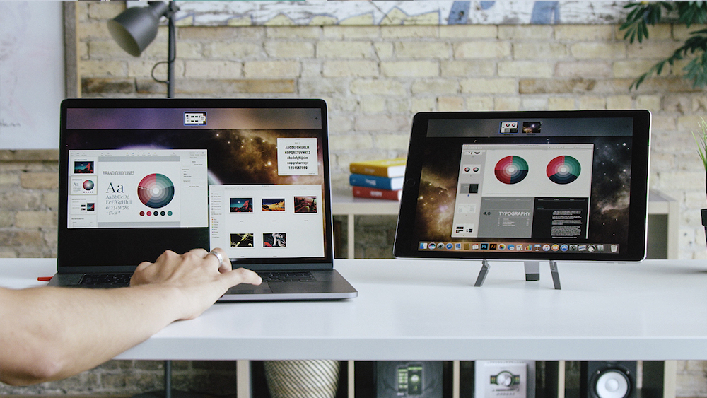
This week they’re announcing their first hardware product: Luna Display is a compact dongle that plugs into your Mac’s Mini DisplayPort or USB-C port and turns your iPad into a second monitor with refresh speeds to rival a direct wired connection. This instantly gives you more screen real estate either at the office or on the road.

Luna Display Plugged In

One unexpected benefit of a wireless, touch-enabled secondary display is that you can also take it off of—and away from—your desk. As this video demonstrates, that means you can effectively run macOS on your iPad from, say, your couch. This is a great way to get access to those few Mac-specific features that the iPad doesn’t yet support.

The team is raising money for the initial production run right now via Kickstarter. The campaign has just begun but incredibly it raised over five times its target goal in under an hour.

+

Share

Loving Vincent Van Gogh

Keyframe from “Loving Vincent”

I mean, really loving him. Loving him so much that you would join dozens of other artists to hand paint over 62,000 frames in a new biopic of his story, together bringing to life one of the most unique rotoscope-style animated films ever made. Just take a look at this stunning trailer to see the effect.

According to the website, “Loving Vincent” is a new movie made in a completely unprecedented way. It started with original, live action footage which was then translated into ninety key “design paintings.” These established the overall aesthetic of what a film would look like had it been entirely painted by Vincent Van Gogh himself. Then using those design paintings as a kind of style guide, ninety-five artists manually painted, on canvas board, the starting frame for each of the movie’s 853 shots.

Aside from sounding epically laborious, that methodology makes perfect sense to me. But the process from there on out truly surprised me. To create each subsequent frame, the artists would then paint directly over that scene’s original starting painting. After that new version was photographed, the artist would then paint the next frame, and so on and so on. The end result is some 62,450 captured animation cells—but only 853 oil paintings of the final frame in each shot. All of the interstitial steps were effectively lost, buried under countless new coats of paint. That’s a shockingly unflinching and fragile way of working, but it does seem to be a fitting tribute to the deeply analog nature of oil on canvas.

The film is due to be released in October. Until then you can explore the process at lovingvincent.com, or read coverage about the project at nytimes.com.

+

Share

Carry a Little More to Waste a Little Less

It frustrates me how much senseless waste we all generate on a daily basis simply by going about our business. Plastic bags, paper napkins, plastic cutlery, water bottles… it’s unnecessary and, maybe obviously but perhaps not imperatively enough, it’s also incredibly damaging to the planet. I’m just one person and can only do so much, but nevertheless a while back I decided to start carrying these three essential items in my work bag—my attempt at doing a tiny bit to help reduce all this consumption.

First is this OutSmart titanium spork. As the name implies it’s a fork and a spoon but it actually has a little serrated edge that lets it do triple duty as a reasonably effective knife too. Being made of titanium, it’s super lightweight as well as surprisingly strong. Additionally, it’s TSA-approved for your carry-on bags and it’s healthier than shoving crappy plastic cutlery in your mouth. Just US$11 from Amazon.

Everyday Carry Less

Next up is this amazing Zojirushi stainless steel water canister. Any water bottle will do but this is the best one that I’ve ever owned. It keeps cold drinks cold for days and features a surprisingly effective lock mechanism to help ensure that its contents don’t spill all over your other belongings. This canister alone has reduced my plastic consumption immeasurably simply because it’s allowed me to stop buying bottled water—which in my opinion are maybe the most wasteful products of all. At US$28 from Amazon, it costs way more than I would recommend spending on a water bottle, but maybe ask for it at the holidays.

Zojirushi Stainless Steel Water Canister

Finally, I also keep a simple, lightweight canvas tote bag rolled up in my bag. There’s nothing special about this bag at all. It’s exactly the same as any of a dozen canvas tote bags you might have gotten at some conference or event or fundraiser or whatever. But having this with me has allowed me to say “no thanks” countless times when cashiers offer to put my purchases in plastic bags. Of all the items I carry, this is the one that I’ve had with me most consistently and for longest, and I like to think about the reasonably substantial pile of plastic bags that I’ve saved from the landfill as a result. Don’t buy your own—just wait until someone gives one to you for free.

Canvas Tote Bag
+

Share

Comics Have Lost the Plot

Have a look at this adorable comic book cover featuring the version of The Joker that appeared in this year’s kid-friendly “LEGO Batman Movie.” Sure he looks a little menacing here but not much. This is after all, a little kids’ toy. Plus that movie was super playful and fun, right?

Batman LEGO Cover

Now take a look at the actual contents of this same comic book.

Batman Comic Book Interior

Something’s isn’t right here, wouldn’t you say? Inexplicably, the publisher wrapped a kid-friendly image from a PG-rated blockbuster movie around a comic book story of what appears to be truly gruesome horror. If you look carefully at the right-hand side there, I’m pretty sure that it shows an appallingly frightful version of The Joker fingering the rag-like skin of a disembodied face. That’s actually one of the most disturbing things I think I’ve ever seen in a comic book.

This came to my attention, I regret to say, the other day when my wife and I made the stomach churning mistake of buying this comic book for our four year-old boy—without examining its contents. We were completely aghast at the contents when we finally looked inside.

Surely there’s a disconnect here. This disgusting switcheroo can’t have been the intended result. Someone in some department somewhere messed up. My intention here is not to call them out on their error. I mean, it would have been nice if this hadn’t happened. But in the end this unfortunate episode is on my wife and me, as parents. Caveat emptor. We’ve all been warned countless times not to judge a book by its cover, and this time we simply didn’t heed that advice.

However, I think it’s worth asking, “Who are comic books for, anyway?” Because if this represents the mainstream of comic book storytelling today, it’s not an exaggeration to say that they’re no longer appropriate for kids.

You might think from that remark that I hold comics in low regard but just the opposite is true. I read lots of comics as a kid and I still read them today, though only occasionally. Whatever modest artistry that I bring to my profession I owe at least in part to my lifelong love affair with the medium.

In fact, when I was reading comics they were already getting more “grown-up”; the common refrain at the time was that “Comic books aren’t just for kids anymore.” I read Art Spiegelman’s “Maus” in its first edition. I also bought—and pored over—every issue of both Alan Moore’s “Watchmen” and Frank Miller’s “The Dark Knight Returns” as they were released. Some of these remain among the best things I’ve ever read in any medium. Comics in that era seemed bursting with new possibility. New kinds of stories were being told with a new level of visual ambition. The future seemed limitless.

Now, looking back at that time and seeing what has become of comics since, I can’t help but think that it all went wrong. There are still some wonderful, challenging, grown-up comics being made today, it’s true. But I think it can also be argued that that burst of innovation we saw those many years ago never truly benefitted the mainstream of comics the way many people thought it would. We never really got more of the likes of “Watchmen” and “Dark Knight Returns.” Or, at least, we got much, much more of what I found myself holding in my hands with disbelief this week: tedious soap operas teeming with self-seriousness and tasteless shock value. These comics aren’t for kids and yet they aren’t really for adults either. Instead they’ve become exactly what those who’ve never understood the medium have always accused them of being: an exploitation of that nexus between childhood and adulthood, schlock intended for unrepentant adolescent minds trapped in grown up bodies. It makes me really sad.

+

Share

Upgrading to an Older MacBook Pro

In spite of the fact that I’ve publicly doubted whether I’ll personally buy another laptop again, my employer does mandate that my main computer should be a laptop. So for a while now I’ve been using a 13-inch MacBook Pro with Touch Bar. It’s fast, has a beautiful screen and comes in a pleasingly sleek form factor with a gorgeous space gray finish.

However, for reasons too complicated to explain, for the past week or so I’ve been using an early 2015 model MacBook Pro. There’s no Touch Bar, the screen is not as sophisticated, and it’s both thicker and heavier. But you know what? It feels like an upgrade.

I say this for a bunch of reasons, but maybe the most socially significant of them is the fact that this older model has a keyboard that produces hardly any noise at all as I type on it. By contrast, my newer MacBook Pro’s abrasively loud keyboard has become a major annoyance in my work life. The clamorous, hard-to-ignore clickety-clack of its keys is so disruptive in live meetings and, especially, over conference calls (where the mic seems to hone in on the specific frequency of the tapping) that it effectively makes the MacBook Pro with Touch Bar harder to use than other laptops. It doesn’t matter how great a piece of technology is when your usage of it is hindered by the irritation of your colleagues. I’ve been dealing with this all year and I’m tired of it.

The deeper problem with the new model MacBook Pro is, of course, its blithe reliance on USB-C as the only available type of physical port. A lot has been written about this but it bears repeating that it’s a pain in the neck. I’ve had to buy a host of adapters and dongles and now tote them along with me constantly, unnecessarily complicating an aspect of my tech life that, as a rule, should always be trending towards simpler.

Of course, the MacBook Pro with Touch Bar also uses USB-C for its power supply, a technically impressive feat that’s also a nontrivial hindrance. It makes me long for the halcyon days of MagSafe power adapters, which were so profoundly elegant that they still seem essential. MagSafe had become nearly ubiquitous by the time Apple conspicuously omitted it from this model. Between my office and home, I couldn’t even count the number of MagSafe adapters I own or have easy access to. Now I’ve got just one hateful USB-C power adapter and I have to carry it everywhere.

Suffice it to say that my 2015 MacBook Pro has MagSafe, older style USB ports, and works will all of my devices (even my Google Pixel phone, which is itself USB-C-based). Using it as my primary computer feels like rejoining the world of the living.

Apple has a history of making bold leaps forward that also obsolesce popular technology—usually ports and media formats—and I’ve been on board with just about all of them. To my mind, these dramatic shifts work best when they bring with them demonstrable, near term benefits to the user. When Apple omitted the floppy drive from its first iMac, it showed that network transfer of files was much more elegant—and faster. When Apple killed the beloved FireWire port, it opened up the world of more widely available USB peripherals. When Apple ditched optical drives, they hastened the demise of physical media and spared customers the expense of the cumbersome hardware. And even when Apple retired the old, iPod-style Dock connector, it gave the world the infinitely better designed Lightning cable.

But after living with the MacBook Pro with Touch Bar for months now, I can only conclude that its “bold leap forward” is an ambition that leaves me cold. I just don’t see any immediate, material user benefit to consolidating on USB-C, at least to the premature exclusion of Thunderbolt, HDMI, MagSafe and the older USB standard. Between those four technologies, there are far more devices out there in the wild than there ever were of the older technologies that Apple defiantly obsolesced in the past. This makes life today much more difficult for more people than during any of Apple’s previous technology shifts. It’s true that there are some meaningful benefits to the Touch Bar itself (I’ve barely mentioned it here because I barely use it), but that feature is hardly contingent on the omission of these others. And it’s also true that USB-C is becoming more popular, but that’s a reality for another day. Today’s reality is that the MacBook Pro with Touch Bar could stand to inherit much from its immediate predecessors. My only hope is that Apple realizes this.

+

Share

Food by Famous Directors (Sort Of)

S’mores in the style of Quentin Tarantino

These videos were made by food stylist David Ma, whose skills apparently include filming his work in distinctive directorial styles. Each short movie imagines a simplified recipe through the lens of one of today’s most recognizable filmmakers.

Waffles rendered in the over-the-top bombast of Michael Bay…

Ceremonially precious s’mores à la Wes Anderson…

And spaghetti and meatballs ’sploitation, Quentin Tarantino style…

Ma also has a video of Alfonso Custom-esque pancakes that I wasn’t quite as impressed by, but you can see it at youtube.com.

+

Share

Bite-sized Bits of Design Criticism

Back in June I hosted a panel at SF Design Week about the importance of criticism in design. I was joined on stage by Molly Fulghum Heinz, chair of the Department of Design Research, Writing & Criticism at the School of Visual Arts, and Anne Quito, design and architecture reporter for Quartz, and we had a terrific conversation about the ins and outs of examining the craft with a critical lens. The session lasted about an hour and you can watch it in full here. But if you don’t have the time, the team here at Adobe has helpfully extracted six key moments, each clocking in under two minutes, so you can get a sense of the conversation really quickly. It’s one of the best ways you can spend a quarter hour today, money-back guaranteed!

+

Share

Reimagining New York Architectural Landmarks

One Wall Street Concept by Hollwich Kushner

Designers who can’t help but want to hypothetically redesign everything they see may enjoy these conceptual renderings from architecture firm Hollwich Kushner. Entitled “New(er) York,” it’s billed as a “research project” that “applies contemporary construction techniques and design methodologies to timeless Art Deco landmarks,” essentially refashioning them as if they were being built in the 21st Century.

The aesthetic merit of this work, of course, is dependent on your personal taste. The rendering above is the firm’s take on the 1931 Art Deco classic One Wall Street which in real life looks like this:

One Wall Street, New York City

This diagram and the reference below show the scope of the project.

New(er) York Overview Diagram
Photos of Existing Buildings

So, you know, you decide the hits and misses.

Here’s a rendering of 214 West 29th St., a less well heralded building in what was once Manhattan’s “fur district,” but appreciated nevertheless for its exquisite details.

214 West 29th Street Concept by Hollwich Kushner

And here’s The Eldorado building, which is a distinctive part of the skyline along Central Park West.

The Eldorado Concept by Hollwich Kushner

More about the project at hwkn.com.

+

Share

Are Smartphones, Social Media—and Designers—Ruining Teenagers?

Last week The Atlantic published this amazing feature-length article by San Diego State University professor of psychology Jean M. Twenge. After two-and-a-half decades of researching generational change, Twenge contends that she is seeing abrupt, perhaps unprecedented changes in psychological behavior among today’s teens that suggests a looming “mental health crisis.” She argues that this phenomenon can be directly attributed to the advent of the smartphone and the rise of social media.

It’s a shocking contention perhaps not best served by the provocative title “Have Smartphones Destroyed a Generation?,” and I initially approached it with some skepticism. Twenge makes far-reaching assertions—“The arrival of the smartphone has radically changed every aspect of teenagers’ lives, from the nature of their social interactions to their mental health,” she writes—that make for an ambitious polemic. Even casual observers of popular commentary on technology would recognize the trope of a new technology or media form being accused of “ruining” today’s kids. Indeed, some education observers are calling some of Twenge’s facts into question, though the main of her argument hasn’t been fully refuted, at least as of yet.

It’s also not necessarily logical to say that just because it fits an historical pattern that that means it’s also wrong. If nothing else, there are some aspects of Twenge’s argument that are worth examining in greater detail, including the idea that there is a correlation between unhappiness or even depression and teens spending more time than average with screens. She writes:

There’s not a single exception. All screen activities are linked to less happiness, and all nonscreen activities are linked to more happiness. Eighth-graders who spend 10 or more hours a week on social media are 56 percent more likely to say they’re unhappy than those who devote less time to social media.

More to the point, the unhappiness and depression are leading to worrying changes in the data on suicides:

Girls have also borne the brunt of the rise in depressive symptoms among today’s teens. Boys’ depressive symptoms increased by 21 percent from 2012 to 2015, while girls’ increased by 50 percent—more than twice as much. The rise in suicide, too, is more pronounced among girls. Although the rate increased for both sexes, three times as many 12-to-14-year-old girls killed themselves in 2015 as in 2007, compared with twice as many boys. The suicide rate is still higher for boys, in part because they use more-lethal methods, but girls are beginning to close the gap.

Of course, teen behavior is a product, at least in part, of parental attitudes. As a father myself, I recognized a number of widespread smartphone- and social media-oriented habits that I have internalized myself and inadvertently presented to my kids as acceptable behavior. These include, of course, an addictive propensity to check one’s smartphones, often at the expense of remaining present in real world situations; the habit of sleeping with a phone by one’s bedside or even with the phone in bed; and the reflex of looking at the phone before literally any other function upon waking up in the morning. These have all become normalized over the past decade, and it’s pretty clear they’re not doing much good for anybody.

Twenge only passingly touches on culpability in her article, suggesting briefly that social media companies’ motivations are “complex.” But clearly there are many difficult questions to be asked here—asked of the entire tech industry, really. And that would include designers, too, who clearly bear some responsibility in constructing this potentially toxic mix of hardware and software. Perhaps without realizing it, we have all consented to the idea that design should be measured almost exclusively by the concept of conversion, on a solution’s ability to get a customer to click or tap, again and again, as quickly and often as before. You could say that that has become the primary motivation of this current generation of design professionals—we have become drug dealers, in a sense, focused only on propagating addiction. That’s a potentially incendiary assertion in and of itself, but even if it’s not accurate, it seems evident to me that we’re in an era now where the craft of design is able to achieve much of the influence that it has always longed for—and so it must contend soon with the consequences of that influence.

The full article is well worth a read and can be found at theatlantic.com. Twenge’s findings will be published more extensively later this month in a book called “iGen” by Simon & Shuster.

+

Share