is a blog about design, technology and culture written by Khoi Vinh, and has been more or less continuously published since December 2000 in New York City. Khoi is currently Principal Designer at Adobe, Design Chair at Wildcard and co-founder of Kidpost. Previously, Khoi was co-founder and CEO of Mixel (acquired by Etsy, Inc.), Design Director of The New York Times Online, and co-founder of the design studio Behavior, LLC. He is the author of “Ordering Disorder: Grid Principles for Web Design,” and was named one of Fast Company’s “fifty most influential designers in America.” Khoi lives in Crown Heights, Brooklyn with his wife and three children. Refer to the advertising and sponsorship page for inquiries.
To my regret the only movie that I got out to see in theaters last month was the overwrought “The Lost City of Z.” Reviews were largely glowing for James Gray’s old Hollywood-style adventure-in-the-Amazon tale but I found it turgid and, worse, hypocritical; it pays significant lip service to treating indigenous people with respect but devotes practically zero screen time to giving them a voice. You can skip this one.
This was particularly disappointing because it was a pretty slow month for moviewatching. I only saw a dozen films, with a good number of them kids’ fare that I watched with the family. Aside from re-watching a few favorites, none of the other movies I watched really moved me very much. Oh well, there’s always next month.
“Jennifer’s Body” It had all the elements to be a cult great but it really, really wasn’t.
Last fall, Adobe, Apple, Google and Microsoft jointly announced a specification for variable fonts, a potentially dramatic reinvention of the way fonts are digitally constructed and delivered. In his announcement post at Typekit’s blog, Adobe Head of Typography Tim Brown imagines “a single font file gaining an infinite flexibility of weight, width, and other attributes without also gaining file size.”
This will essentially allow a much greater range of typographic options for designers like you and me. For instance, if you need to condense or extend the widths of certain characters, adjust a font’s x-height slightly, or even subtly modify the sharpness or roundness of letterforms, a variable font will allow you to do that while tapping into the built-in rules and logic encoded by the type designer. The end result will be richly expressive typography customized in accordance with the aesthetic intentions of the designer of the typeface itself—no more ill-informed modifications using the brute force of vector editors. This animated GIF by Dutch type designer Erik van Blokland hints at some of the possibilities.
The specification is just the first step towards building this glorious future, though. I talked to my colleague Dan Rhatigan about what it will take for us to get there. Rhatigan is a Senior Manager for Adobe Type and a veteran of the industry, having worked as a typesetter, graphic designer and typeface designer and teacher, including stints in London and New York as Type Director for Monotype. He is a key figure in this critical early stage for variable fonts, having participated in the development of the specification and also now spending time helping to turn its promise into reality.
Khoi Vinh: My initial understanding of the variable fonts announcement was that it’s multiple master fonts done right. Maybe we can start there—what did the original multiple masters fonts specification get wrong?
Dan Rhatigan: Variable fonts build on the ideas of a couple of older font formats: not just Adobe’s Multiple Masters but also Apple’s OpenType GX.
It’s a shame that Multiple Master fonts never lived up to their potential as commercial products, because the idea of letting users pick their own preferences within a given typeface’s range of options was a great one. In reality, though, it was a clunky way to work. As a user, you got a file that contained all these possibilities, but you had to use Adobe Type Manager (I think I may have also used a QuarkXPress plug-in) to play around and choose your desired mix of options, then spit out a new font file with the results. You couldn’t get a live preview in your documents, and then you had to manage all these files you’d create. I played around with Multiple Masters when I worked in publishing, and it was a hassle to keep track of the custom styles everyone on the team would create.
There’s an elegance to this new variable font model: you use a single file all the time, and rely on your browser or software to generate the desired result out of that file. The trick now, though, is getting all the software we use to implement good controls for making all those possible adjustments.
The great legacy of Multiple Master fonts, though, has been that they changed the way type designers work. Most of us type designers have been designing big families using the organizing ideas of the technology: you draw the key weights or widths or other styles, and allow your font tools to interpolate the styles in between. So at least we have an entire generation that learned to think about designing type along the same principles we need to produce variable fonts.
Is it right to say that there hasn’t been a lot of innovation in type technology since then, or have there been significant changes happening out of the public eye?
OpenType was the last really major development in type technology—twenty years ago! Even web fonts have been more of a revolution in how we use and deliver fonts, rather than in the fonts themselves. This is a big challenge when it comes to the major leaps we’re seeing now, like variable fonts, like SVG color fonts (both considered extensions of the OpenType specification). Fonts are software, after all, and the pace of development was bound to catch up with the increasing sophistication of all our other software. It’s really the demands of the faster, more powerful digital world around us that’s requiring our fonts to become smaller and that’s requiring a more sophisticated means of delivering typeface designs to people.
In software terms, twenty years is a basically an ice age. Are we in for a major disruption with variable fonts? What’s going to change?
We might have a major disruption, depending on how much other pieces of software are willing to adapt their typesetting controls. A lot depends on how well the implementation helps people understand the new capabilities of the fonts. Applications might choose to stick with a simple mode that just presents a variable font like it’s a typical font family, and ignore the potential of working with the in-between areas of the design. What I hope, though, is that that apps will see that this could be a real opportunity to handle type differently, with better automation of things like copyfitting or size-specific adjustments, or giving users a way to create and manage their custom type styles.
I think the first real disruption will happen with the people tinkering with CSS and variable fonts, who will be the ones to explore the possibilities a little more freely at first. Besides, the compact file sizes will make it much easier to deliver web fonts if they’re variable fonts, so we may finally see a broader range of styles on a page, and much more variety for sites with Chinese, Japanese, or Korean text.
First, though, there is still work to do at the infrastructural level: enabling support for variable fonts at the OS level, and then at the level of app-specific rasterizers, and then UI controls…
There’s a lot to unpack there that I want to get back to. But first let’s talk turkey: how will this change the way graphic and UX/UI designers use fonts? Will there be a learning curve?
There are already lots of fonts available, but not many ways to use them. The easiest way to play with variable fonts is to visit axis-praxis.org using Webkit or Chrome Canary in the latest version of MacOS. It’s a test site using a couple of variable fonts already lurking in MacOS, as well a number available through various Github projects.
Other than building web pages to test the fonts in experimental browser builds, there may not be many ways to work with variable fonts until other pieces are in place toward the end of this year, and then in 2018.
What are those major pieces? Is it principally support from the major operating systems that we’re talking about?
Exactly that. The specification for variable fonts is relatively fresh, so work on the the rasterizers—the underlying support for interpreting the fonts—is underway, and then that has to be integrated into OS updates, so that browsers and other apps can draw upon that support.
Okay let’s suppose that that comes along next year. You said that we might see some applications present variable fonts simply, perhaps not exposing the full richness of what they can do, and maybe others will provide an interface that handles type very differently from what we’re accustomed to today. This sounds to me like a we could have a situation where there are a thousand different font selection user experiences, with each app handling it radically differently, emphasizing various aspects of the standard. Is that right? Or is there a possibility that we might get a single, uniform user experience for handling type? And I present these options without judgment—clearly there are pros and cons to both.
I definitely think we’ll see a variety of user experiences, especially since we’re already seeing some experiments pop up with axis-praxis.org, underware.nl and Decovar.
However, the likelihood of a variety of new approaches to application UI both excites me and scares me a little. It would be great for applications to rethink how they can help users improve their typography, but I know that people often resist change to controls that they’ve used for ages. I think a delicate balance is needed: an updated experience that leads people to understand the capabilities instead of just dumping new options in front of them. But I think there’s also a lot of potential in accessing some of the capabilities variable fonts under the hood—automating use of axes (when available) to control optical sizing, or weight and width depending on context in a document, maybe.
That’s an interesting perspective: the idea that all of these new options might actually impose a responsibility on application UI designers to help users improve their typography, not just simply give them access to fonts. Is there anything in the variable fonts spec that can alert a user when a particular variation has gotten too tall, or wide or just plain ugly? Should there be? I’m only half joking.
Sort of in-font alarm system? No, but there are built-in controls. Type designers need to specify minimum and maximum values for any design axis in a font, so some reasonable parameters are inherent in the font format. Anyone who uses the font, however, will still need to show some good judgement about what they use, within that “safe space” determined for each typeface. This increases the type designer’s responsibility, though, to make sure that they anticipate and resolve what can happen in the design space where different axes may intersect. That is, if there are axes for weight and width available to the user, then the designer needs to make sure all the possible outcomes that are allowed will work well.
How about the business implications? This is a lot more work for type designers. Are we going to see fonts get more expensive as a result?
Honestly, the business outcomes are still anyone’s guess. Every type designer I’ve talked to about this has had a different theory, but since we’re a ways off from widespread support, it will be a while before foundries test the waters and some patterns emerge.
Fair enough, but if you’ll allow me I’m going to press you a bit on the state of font licensing, which in my opinion serves neither type designers nor type customers particularly well. Most font licenses are restricted to a finite number of devices, which seems antiquated when fonts—like most contemporary software—should really be a kind of service, distributed on a usage basis via the cloud. Now we’ll soon have variable fonts, which sounds like a fundamental sea change in the mechanics of the technology—which in turn suggests a once in a generation opportunity to rethink the way fonts are licensed. Put another way: does it make sense to license next generation fonts with last generation terms?
That model of licensing is just one of many that are used now, though. Web fonts and apps, in particular, shook up a lot of the industry’s assumptions about licensing already, since actual font data is distributed. Subscription services—like Adobe Typekit, for instance—have already been gaining ground. Variable fonts will surely add another wrinkle to licensing models, since they have so much potential capability. So far, I’ve heard plenty of theories and ideas how they might be treated, but no consensus, since no one has yet to see what the value of the fonts in use will really be.
So a lot is up in the air, which is exciting but also somewhat fraught. Do you believe that the value that variable fonts brings to designers makes their success inevitable? How would you rate the chances?
The big players have plenty of reasons to want variable fonts for their compression and programmability, so one way or another they will at least find their niche. While there may also be lots of potential on the web, I worry that it will come down to how apps handle variable fonts for creative work that will make or break them as widely used commercial products. It will probably come down to UX decisions that make them vital design tools rather than a specialized technical solution.
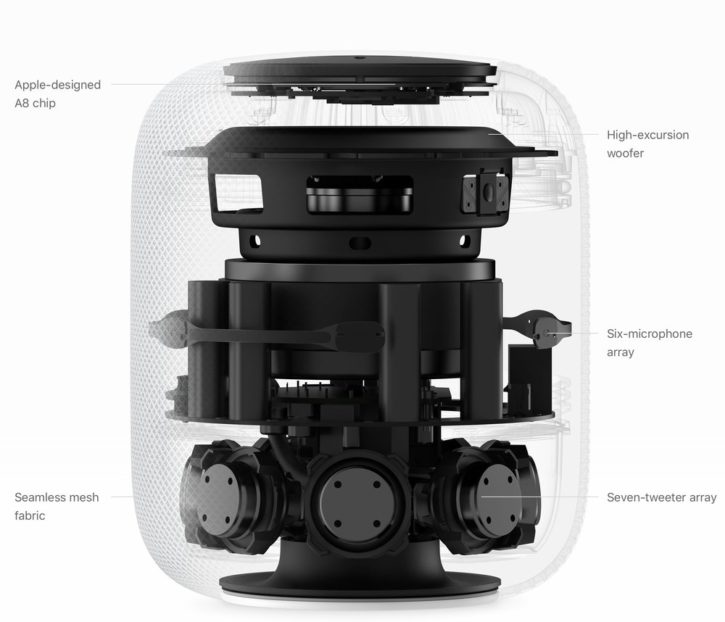
In general I’m pretty excited about smart speakers and voice assistants, but I’m not sure what to make of HomePod, Apple’s newly announced entry into this category. It won’t be out until December and relatively little information has been released about it. In particular there’s not a lot of detail on whether it will have a rich ecosystem of apps or third-party integrations, which has thus far been a somewhat useful measuring stick for Amazon Echo and Google Home.
However, I do think that Apple has gotten at least one thing right: the fact that Echo and Home have somewhat oversold the idea of these devices as assistants that can do anything for you. It’s true there are thousands of skills available for Echo but that is a red herring as most of them are useless and/or abandoned. This article at Recode claims that even if a user discovers a skill and enables it, “there’s only a three percent chance, on average, that the person will be an active user by week two.” And if you look carefully at the weekly emails that Amazon and Google send out touting their products’ newly added capabilities (I own both so I get both), you’ll immediately notice a pattern: most of these incremental “skills” boil down to voice-based searches that aren’t exactly earth-shattering (e.g., “Tell me what time ‘Better Call Saul’ is on”).
The truth is that what these devices are best at is playing music from streaming music services. In my experience, this is far and away the most valuable task that they can complete reliably. In fact, you might argue that music is all that Amazon Echo and Google Home are good for.
I’m not sure if Apple would go as far as that, but the apparently extensive engineering that they’ve invested in making HomePod a serious music device shows us that, at the very least, they understand how essential it is to get that one use case right, to hit it out of the park, even. I think that’s smart.
What I’m less sure is smart, however, is HomePod’s relatively rich price point of US$349. Most people compare that to the ~US$150 price point of the fully fledged Echo and Home devices—and of course the even cheaper Echo Dots—and feel that Apple has missed the mark in a pretty bad way. They may be right; I do worry that at that price point most consumers will take a pass on HomePod. But then again we’ve had this conversation almost every time Apple releases a new product line, whether it was the iPod, iPhone, iPad, Apple Watch etc. Apple products are always more expensive, sometimes surprisingly so, and yet they tend to succeed nevertheless.
My belief is that these voice assistants are still at the “Palm Pilot” stage of their evolution. That is, they’re better and more useful than the first iterations of their products—you could say Sonos speakers are the Star-TAC to Echo’s Palm Pilot. But they’re not that much better, and it will take an iPhone-like breakthrough to really demonstrate their potential.
As of now I can’t be sure if HomePod is that breakthrough or not. What throws me more than anything is that I had anticipated that Apple’s speaker would come with a screen because in my estimation, tying in a visual interface to the voice UX is critical for making these devices truly useful. I was genuinely surprised that HomePod lacked this but then I considered that perhaps Apple is counting on the screens that we already own and that they already dominate. Imagine issuing a Siri command to HomePod and getting a corresponding visual interface on your iPhone, Apple Watch and/or your television (with an Apple TV attached). These devices could instantaneously switch into “Siri mode,” providing truly rich responses to what users input by voice. That sounds incredibly powerful and like a brilliant way of reinforcing the ecosystem that Apple has already built in our homes and lives. It’s the kind of thing that no other company could do, which tends to be a leading indicator of when Apple succeeds. We’ll see, though; I’m looking forward to getting my hands on a HomePod later this year.
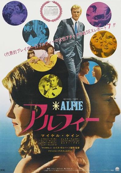
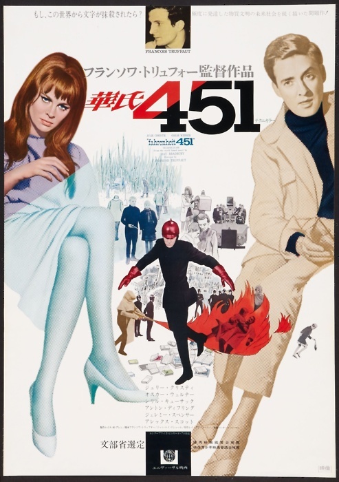
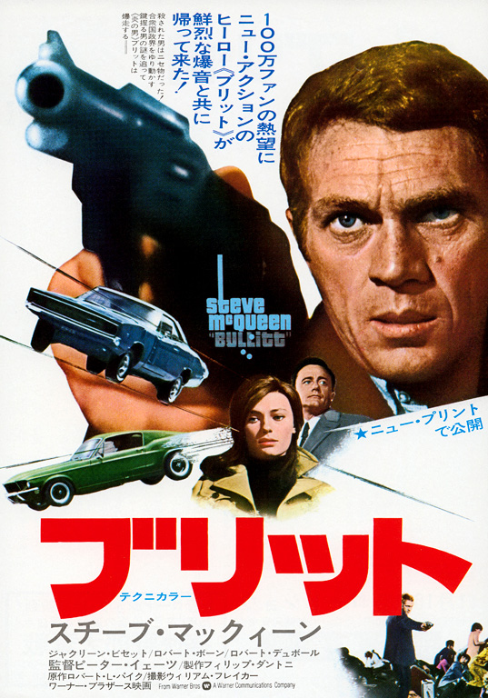
I really enjoyed these Japanese posters for Western films from the 1960s collected over at the retro site Voices of East Anglia. The visual sensibilities are fascinating—generally more modern and graphical than I associate with these pictures, but sometimes weirdly at odds with their actual content. The poster for the Paul Newman film “Hud,” for instance, is stunning from a design perspective, but it seems fairly alien to the experience of actually watching that movie. See a few more and explore the many other troves of vintage goodness at voicesofeastanglia.com.
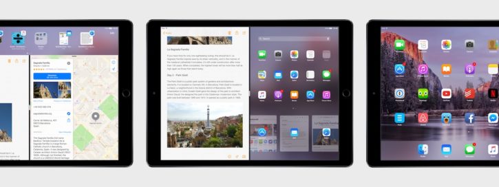
This is a lavishly produced video brimming with inventive ways that the next major version of iOS can dramatically improve productivity on iPads. There’s so much good stuff here that in some ways I worry that it will make whatever Apple announces at next month’s Worldwide Developer Conference seem like a letdown. But if Apple were to ship even half of these enhancements it would still be a triumph for the platform. There’s still tremendous potential in tablet computing; it just needs a bit of a kickstart.
The impressively ambitious production is the work of designer Sam Beckett and MacStories founder Federico Viticci, who has been tirelessly championing iPad productivity for some years now. He also published an extensive accompanying article that goes into great detail for each of the ideas rendered in the video. I highly recommend you read it over at macstories.net.
Not long ago I picked up a great productivity tip that’s helped me enormously in my day-to-day work life: Keeping copious notes for every meeting you attend is a waste of time. It’s laborious and distracting. The best thing to do is, after a meeting is over, think of just one or two important things that you want to recall later and write them down. That’s it.
This advice absolved me of the pressure I previously felt to write down everything. Without that distraction, I’ve been able to generally stay more focused and absorb more of what’s said in meetings. And with fewer notes, the act of searching them later becomes much easier too.
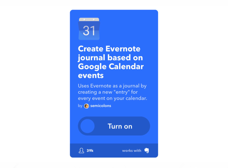
To be honest this advice didn’t become truly useful for me until I combined it with a bit of automation. Before that, I always intended to write down the highlights of each meeting but never really had a good place to do it. That problem was solved when I discovered this very handy IFTTT applet, which scans my calendar and, fifteen minutes before each meeting, automatically creates a fresh note in Evernote with the date, time, subject and attendees of that event. The applet effectively creates a journal for me with the baseline information in place already; all I need to do is write down what I remember. The applet is written to work with Google Calendar but you can also easily adapt it for Exchange. Get it at ifttt.com.
I use this every day and it’s been invaluable but given my way, what I would really want is to be able to see all my notes in calendar form. Having notes in list form, as Evernote presents them, is somewhat useful for searching. But the visual chronology of meetings is for me incredibly useful for recalling meetings. There’s no good reason to effectively mirror my calendar inside of Evernote, especially when Evernote can’t mimic the chronological organization of the original calendar.
Actually the ideal form would be to add my own notes to each event within my calendar app. Calendar events can accommodate notes, of course, but you can only edit them if you’re the meeting organizer, and of course the notes are visible to all of your invitees. Basically all I need is another text field where I can capture private notes for my own reference. It begs the question why notes apps and calendar apps aren’t just the same thing, or at least the question of why someone hasn’t created a product that merges them together.
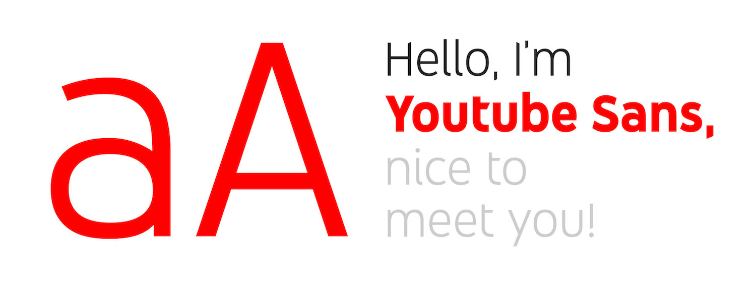
Worldwide agency Saffron did some superb work for YouTube’s brand, as detailed in this case study. Resisting the temptation to discard the brand’s enormous preexisting equity in favor of a flashy new mark and aesthetic, Saffron instead redrew the nearly ubiquitous “play” icon. They also developed, in partnership with Letterjuice, URW++ and YouTube’s own product design team a new, bespoke typeface called YouTube Sans. The results are a pleasing evolution that builds upon and strengthens the brand; I wish more branding work was as thoughtful as this.
YouTube Sans is a notable achievement on its own. It’s at once unassuming—most casual users are unlikely to notice it—and distinctive with clever, diagonally cut terminals that stake out unique territory for the brand.
I’m particularly fond of this animated demonstration of its legibility at various sizes.
In truth the principal virtue of the redrawn icon is that it’s basically the same as what came before—Saffron’s designers knew better than to mess with it too much. However like almost every design agency, they did feel compelled to justify the value of their work with this diagram of the architectural core of their redesign. Witness and—be impressed by—a bunch of hidden circles and some grids and lines and stuff revealed here:
There’s also this diagram that shows a similarly architecturish link between the geometry of the redrawn icon and YouTube Sans’s letterforms. I’m not sure I understand what it’s saying, but it looks complicated.
I’ve written before about my general skepticism about designing logos with grids, a technique that usually strikes me as either fanciful or superfluous. Whether you agree with that or not, my main complaint here is the general insecurity on display. When it comes to presenting work like this, it should be sufficient to highlight its aesthetic merits. Put another way, this logo looks great and its execution is skilled and artful—and that should be enough. It shouldn’t be necessary to concoct a largely implausible structural rationale for it.
In the past I’ve defended the irrepressible absurdity of the “Fast & Furious” franchise but when I saw the eighth installment last month, I left the theater with little enthusiasm for future sequels. These movies have never been particularly airtight in their conceits, but the sheer stupidity of “The Fate of the Furious” was beyond the pale. Many of the players in the ever expanding cast continue to be entertaining, but any joy they managed to get on screen was practically extinguished by the humorless, charisma-free egomania of Vin Diesel. I never need to see him in another movie again.
Thankfully, I managed to watch eleven other movies in April too, none of which starred Mr. Diesel. Here is the full list:
“Trainspotting” Pretty sure it’s not just nostalgia that makes this seem still incredibly alive today.
“Blue Is the Warmest Color” An impressive, mesmerizing ride, but ultimately did not leave much of an impression.