is a blog about design, technology and culture written by Khoi Vinh, and has been more or less continuously published since December 2000 in New York City. Khoi is currently Principal Designer at Adobe, Design Chair at Wildcard and co-founder of Kidpost. Previously, Khoi was co-founder and CEO of Mixel (acquired by Etsy, Inc.), Design Director of The New York Times Online, and co-founder of the design studio Behavior, LLC. He is the author of “Ordering Disorder: Grid Principles for Web Design,” and was named one of Fast Company’s “fifty most influential designers in America.” Khoi lives in Crown Heights, Brooklyn with his wife and three children. Refer to the advertising and sponsorship page for inquiries.
+Top Posts
-

A Dumb TV Is a Smart TV
Over the weekend I bought a new television, a Vizio M55-D0. It sports a beautiful 4K display with vibrant colors…
-

Questions to Ask Yourself When Reading About Design
What gets written on the Internet about the design of apps, web sites, icons, identity systems and digital experiences of…
-

A Conversation About Fantasy User Interfaces
As a user interface engineer at Google, Kirill Grouchnikov brings real world UIs to life, but he devotes a considerable…
-

Interview with Tom Krcha, Adobe XD
A few weeks ago Adobe released the first public preview of what the company is now calling Adobe XD, its…
-

How They Got There—Now in Hardcover
Back in March I released my latest book “How They Got There: Interviews With Digital Designers About Their Careers” as…
-

Project Comet
There were two big highlights from the keynote for Adobe’s annual MAX Conference this morning that I’m unabashedly excited about.…
-

Why I Don’t Own an Apple Watch
I’d like to own an Apple Watch. Or rather, I really want to want an Apple Watch. On several occasions…
-

Ad Blocking Irony
I’ve been kind of neutral on all of the hubbub around Apple’s new ad blocking technology in iOS 9. But…

Japanese Posters for Western Films


I really enjoyed these Japanese posters for Western films from the 1960s collected over at the retro site Voices of East Anglia. The visual sensibilities are fascinating—generally more modern and graphical than I associate with these pictures, but sometimes weirdly at odds with their actual content. The poster for the Paul Newman film “Hud,” for instance, is stunning from a design perspective, but it seems fairly alien to the experience of actually watching that movie. See a few more and explore the many other troves of vintage goodness at voicesofeastanglia.com.
+Concepts for iOS 11 on iPad from MacStories

This is a lavishly produced video brimming with inventive ways that the next major version of iOS can dramatically improve productivity on iPads. There’s so much good stuff here that in some ways I worry that it will make whatever Apple announces at next month’s Worldwide Developer Conference seem like a letdown. But if Apple were to ship even half of these enhancements it would still be a triumph for the platform. There’s still tremendous potential in tablet computing; it just needs a bit of a kickstart.
The impressively ambitious production is the work of designer Sam Beckett and MacStories founder Federico Viticci, who has been tirelessly championing iPad productivity for some years now. He also published an extensive accompanying article that goes into great detail for each of the ideas rendered in the video. I highly recommend you read it over at macstories.net.
+Remembering What’s Important After Meetings
Not long ago I picked up a great productivity tip that’s helped me enormously in my day-to-day work life: Keeping copious notes for every meeting you attend is a waste of time. It’s laborious and distracting. The best thing to do is, after a meeting is over, think of just one or two important things that you want to recall later and write them down. That’s it.
This advice absolved me of the pressure I previously felt to write down everything. Without that distraction, I’ve been able to generally stay more focused and absorb more of what’s said in meetings. And with fewer notes, the act of searching them later becomes much easier too.
To be honest this advice didn’t become truly useful for me until I combined it with a bit of automation. Before that, I always intended to write down the highlights of each meeting but never really had a good place to do it. That problem was solved when I discovered this very handy IFTTT applet, which scans my calendar and, fifteen minutes before each meeting, automatically creates a fresh note in Evernote with the date, time, subject and attendees of that event. The applet effectively creates a journal for me with the baseline information in place already; all I need to do is write down what I remember. The applet is written to work with Google Calendar but you can also easily adapt it for Exchange. Get it at ifttt.com.

I use this every day and it’s been invaluable but given my way, what I would really want is to be able to see all my notes in calendar form. Having notes in list form, as Evernote presents them, is somewhat useful for searching. But the visual chronology of meetings is for me incredibly useful for recalling meetings. There’s no good reason to effectively mirror my calendar inside of Evernote, especially when Evernote can’t mimic the chronological organization of the original calendar.
Actually the ideal form would be to add my own notes to each event within my calendar app. Calendar events can accommodate notes, of course, but you can only edit them if you’re the meeting organizer, and of course the notes are visible to all of your invitees. Basically all I need is another text field where I can capture private notes for my own reference. It begs the question why notes apps and calendar apps aren’t just the same thing, or at least the question of why someone hasn’t created a product that merges them together.
+New YouTube Branding by Saffron

Worldwide agency Saffron did some superb work for YouTube’s brand, as detailed in this case study. Resisting the temptation to discard the brand’s enormous preexisting equity in favor of a flashy new mark and aesthetic, Saffron instead redrew the nearly ubiquitous “play” icon. They also developed, in partnership with Letterjuice, URW++ and YouTube’s own product design team a new, bespoke typeface called YouTube Sans. The results are a pleasing evolution that builds upon and strengthens the brand; I wish more branding work was as thoughtful as this.

YouTube Sans is a notable achievement on its own. It’s at once unassuming—most casual users are unlikely to notice it—and distinctive with clever, diagonally cut terminals that stake out unique territory for the brand.


I’m particularly fond of this animated demonstration of its legibility at various sizes.
In truth the principal virtue of the redrawn icon is that it’s basically the same as what came before—Saffron’s designers knew better than to mess with it too much. However like almost every design agency, they did feel compelled to justify the value of their work with this diagram of the architectural core of their redesign. Witness and—be impressed by—a bunch of hidden circles and some grids and lines and stuff revealed here:
There’s also this diagram that shows a similarly architecturish link between the geometry of the redrawn icon and YouTube Sans’s letterforms. I’m not sure I understand what it’s saying, but it looks complicated.
I’ve written before about my general skepticism about designing logos with grids, a technique that usually strikes me as either fanciful or superfluous. Whether you agree with that or not, my main complaint here is the general insecurity on display. When it comes to presenting work like this, it should be sufficient to highlight its aesthetic merits. Put another way, this logo looks great and its execution is skilled and artful—and that should be enough. It shouldn’t be necessary to concoct a largely implausible structural rationale for it.
See the full case study at saffron-consultants.com.
+Colossal Head of Youth

Movies Watched, April 2017

In the past I’ve defended the irrepressible absurdity of the “Fast & Furious” franchise but when I saw the eighth installment last month, I left the theater with little enthusiasm for future sequels. These movies have never been particularly airtight in their conceits, but the sheer stupidity of “The Fate of the Furious” was beyond the pale. Many of the players in the ever expanding cast continue to be entertaining, but any joy they managed to get on screen was practically extinguished by the humorless, charisma-free egomania of Vin Diesel. I never need to see him in another movie again.
Thankfully, I managed to watch eleven other movies in April too, none of which starred Mr. Diesel. Here is the full list:
- “Trainspotting” Pretty sure it’s not just nostalgia that makes this seem still incredibly alive today.
- “Blue Is the Warmest Color” An impressive, mesmerizing ride, but ultimately did not leave much of an impression.
- “The Fate of the Furious”
- “Five Came Back” Illuminating history lesson, but not for everyone.
- “The Last Seduction” Crackerjack.
- “T2 Trainspotting” Not entirely successful but a valiant attempt.
- “Perfect Friday” A tidy little romp.
- “The Shallows” Yeah actually not bad at all.
- “Louis C.K. 2017”
- “Love & Friendship” Re-watched this and enjoyed every minute of it.
- “Elle” I’m not smart enough to understand why this was so widely praised.
- “Straight Outta Compton” Plasticized and unconvincing.
If you’re interested, here is what I watched in March, in February and in January, as well as my full list of everything I watched in 2016. You can also follow along with my film diary over at letterboxd.com.
+Textbooks Could Look Like Comic Books
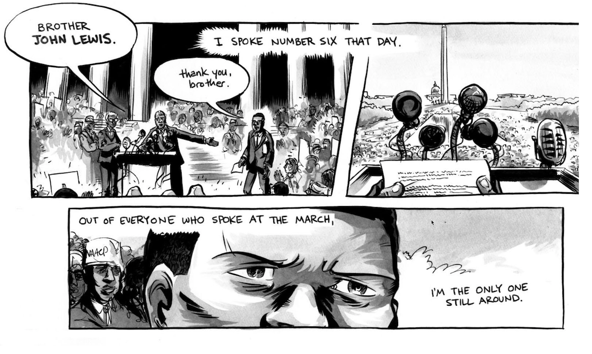
This short article from Good Magazine packs a big idea: what if the books that students (of all levels) learned from looked less like the textbooks we know today and more like comic books? One example of this would be “March” by John Lewis (above), a personal account of the American civil right movement told in graphic novel form.
Heretical as the concept may be, the article argues that such a shift in format would have a positive impact on learning, citing research by Jeremy Short, a professor at Price College of Business at the University of Oklahoma. Short found that among two groups of students who studied the same material in two different formats—one as a traditional textbook, the other as a graphic novel—the latter group performed better in retaining information and even in comprehension.
The idea that more—if not most—textbooks could look like comic books is radical but it also sounds surprisingly achievable when you think about how hard it is to effect positive change in education. It would also make for a watershed event in the history of the frequently derided but nevertheless wonderfully resilient art form of comics. For one thing, it could dramatically change the industry of comics itself, creating new demand for the talents of comic book writers and artists, probably stoking popular interest in comics, and raising the bar for comics in general. For a medium that was once nearly decimated by accusations that it corrupted the minds of young children, this would be the ultimate rehabilitation.
Read the full article at education.good.is.
+Talking Design at Yale School of Management

Last month I was honored to be invited to New Haven, Connecticut to the Yale School of Management where I guest lectured in a class taught by Jessica Helfand and Michael Bierut. It was a unique experience for me, as the class was not populated with design students but rather MBA candidates. By teaching this course about how design functions and partners with business, Helfand and Bierut are essentially playing a long game, propagating design savvy among tomorrow’s business leaders. Very smart. Like any good school experience, I think I gained as much knowledge—if not more—by leading the class as the class did from what I had to say.
Unfortunately there’s no recording of my lecture but afterwards I did sit down with Helfand and Bierut to record an episode of their excellent podcast “The Design of Business | The Business of Design.” You can listen to that below. You can also subscribe to hear the other, far worthier interview subjects who have appeared on past episodes over in iTunes.
Designing Sound
We don’t think much about the foley artists when we go to the movies but as this video demonstrates they play a critical role in shaping the feeling of a film. Using David Fincher’s surprisingly enduring “Fight Club” as a case in point, it shows how a thoughtful Foley artist (or team of artists) can enhance the believability if not the realism of a given scene through the use of painstakingly creative recreations or simulations of ambient sounds. It’s perhaps incongruous to think of this as a form of a design but it clearly is, and as voice interfaces become more prevalent there will be lots of lessons to learn from this discipline.
+