New YouTube Branding by Saffron

YouTube Branding by Saffron

Worldwide agency Saffron did some superb work for YouTube’s brand, as detailed in this case study. Resisting the temptation to discard the brand’s enormous preexisting equity in favor of a flashy new mark and aesthetic, Saffron instead redrew the nearly ubiquitous “play” icon. They also developed, in partnership with Letterjuice, URW++ and YouTube’s own product design team a new, bespoke typeface called YouTube Sans. The results are a pleasing evolution that builds upon and strengthens the brand; I wish more branding work was as thoughtful as this.

YouTube App Screens

YouTube Sans is a notable achievement on its own. It’s at once unassuming—most casual users are unlikely to notice it—and distinctive with clever, diagonally cut terminals that stake out unique territory for the brand.

YouTube Sans
YouTube Font in Use Behind CEO Susan Wojcicki

I’m particularly fond of this animated demonstration of its legibility at various sizes.

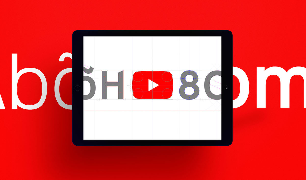
In truth the principal virtue of the redrawn icon is that it’s basically the same as what came before—Saffron’s designers knew better than to mess with it too much. However like almost every design agency, they did feel compelled to justify the value of their work with this diagram of the architectural core of their redesign. Witness and—be impressed by—a bunch of hidden circles and some grids and lines and stuff revealed here:

There’s also this diagram that shows a similarly architecturish link between the geometry of the redrawn icon and YouTube Sans’s letterforms. I’m not sure I understand what it’s saying, but it looks complicated.

YouTube Icon and Font Sample

I’ve written before about my general skepticism about designing logos with grids, a technique that usually strikes me as either fanciful or superfluous. Whether you agree with that or not, my main complaint here is the general insecurity on display. When it comes to presenting work like this, it should be sufficient to highlight its aesthetic merits. Put another way, this logo looks great and its execution is skilled and artful—and that should be enough. It shouldn’t be necessary to concoct a largely implausible structural rationale for it.

See the full case study at saffron-consultants.com.

+

Share

Movies Watched, April 2017

Movies Watched, April 2017

In the past I’ve defended the irrepressible absurdity of the “Fast & Furious” franchise but when I saw the eighth installment last month, I left the theater with little enthusiasm for future sequels. These movies have never been particularly airtight in their conceits, but the sheer stupidity of “The Fate of the Furious” was beyond the pale. Many of the players in the ever expanding cast continue to be entertaining, but any joy they managed to get on screen was practically extinguished by the humorless, charisma-free egomania of Vin Diesel. I never need to see him in another movie again.

Thankfully, I managed to watch eleven other movies in April too, none of which starred Mr. Diesel. Here is the full list:

If you’re interested, here is what I watched in March, in February and in January, as well as my full list of everything I watched in 2016. You can also follow along with my film diary over at letterboxd.com.

+

Share

Textbooks Could Look Like Comic Books

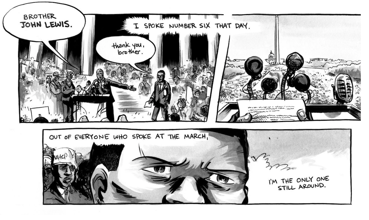
Detail from “March” a Graphic Novel by John Lewis

This short article from Good Magazine packs a big idea: what if the books that students (of all levels) learned from looked less like the textbooks we know today and more like comic books? One example of this would be “March” by John Lewis (above), a personal account of the American civil right movement told in graphic novel form.

Heretical as the concept may be, the article argues that such a shift in format would have a positive impact on learning, citing research by Jeremy Short, a professor at Price College of Business at the University of Oklahoma. Short found that among two groups of students who studied the same material in two different formats—one as a traditional textbook, the other as a graphic novel—the latter group performed better in retaining information and even in comprehension.

The idea that more—if not most—textbooks could look like comic books is radical but it also sounds surprisingly achievable when you think about how hard it is to effect positive change in education. It would also make for a watershed event in the history of the frequently derided but nevertheless wonderfully resilient art form of comics. For one thing, it could dramatically change the industry of comics itself, creating new demand for the talents of comic book writers and artists, probably stoking popular interest in comics, and raising the bar for comics in general. For a medium that was once nearly decimated by accusations that it corrupted the minds of young children, this would be the ultimate rehabilitation.

Read the full article at education.good.is.

+

Share

Talking Design at Yale School of Management

Khoi Vinh at Yale School of Management, April 2017

Last month I was honored to be invited to New Haven, Connecticut to the Yale School of Management where I guest lectured in a class taught by Jessica Helfand and Michael Bierut. It was a unique experience for me, as the class was not populated with design students but rather MBA candidates. By teaching this course about how design functions and partners with business, Helfand and Bierut are essentially playing a long game, propagating design savvy among tomorrow’s business leaders. Very smart. Like any good school experience, I think I gained as much knowledge—if not more—by leading the class as the class did from what I had to say.

Unfortunately there’s no recording of my lecture but afterwards I did sit down with Helfand and Bierut to record an episode of their excellent podcast “The Design of Business | The Business of Design.” You can listen to that below. You can also subscribe to hear the other, far worthier interview subjects who have appeared on past episodes over in iTunes.

+

Share

Designing Sound

We don’t think much about the foley artists when we go to the movies but as this video demonstrates they play a critical role in shaping the feeling of a film. Using David Fincher’s surprisingly enduring “Fight Club” as a case in point, it shows how a thoughtful Foley artist (or team of artists) can enhance the believability if not the realism of a given scene through the use of painstakingly creative recreations or simulations of ambient sounds. It’s perhaps incongruous to think of this as a form of a design but it clearly is, and as voice interfaces become more prevalent there will be lots of lessons to learn from this discipline.

+

Share

Label Hop

Label Hop

This is a blog that celebrates “the diversity in beer label design.” It’s not exhaustive but it’s a terrific survey of what’s out there nevertheless. Also, it’s interesting to note that for a product category whose marketing has often been not particularly enlightened—or frankly downright sexist—these labels are remarkably restrained in their use of sexist imagery.

Have a look around at labelhop.co.uk.

+

Share

Outmoded Technology You Might Encounter On Your Next Visit to The Ace Hotel

Sign for The Ace Hotel

If you’ve ever stayed at one of the many fine Ace Hotel establishments—like I did yesterday while attending the terrific Collision Conference in New Orleans—you’ve had a chance to enjoy the quirky design and decor sensibility that they bring to every location. Rooms are tastefully appointed with quirky anachronisms like acoustic guitars, antique refrigerators (rebuilt to serve as minibars), soap-on-a-rope, turntables with a selection of used vinyl records, and even working manual typewriters. It’s delightful.

Well get excited, because I’ve just come across a top secret list of new examples of outmoded technology coming soon to an Ace Hotel room near you. Imagine the fun you’ll have when your magnetic key card unlocks the door to your room and you walk in to find one or more of the following:

  • A butter churn
  • A loom
  • A Sony Mini-Disc player with the complete Genesis and Phil Collins discography (through 1994)
  • A CD-ROM with 200 free hours of AOL
  • A Minitel videotex terminal (still works!)
  • An unfinished homemade HAM radio set (please ground yourself before touching)
  • An antique surgery table with matching scalpel set, slightly rusty
  • An outhouse (with soap on a rope)
  • A child laborer from the 19th Century (speaks with a Cockney accent)
  • A room-sized mainframe computer with punchcard input system (rooms with single beds only)
  • A Flowbee
  • A pair of crutches (not technically outdated, but still cool)
  • A diesel farming tractor
  • A slide rule
  • An ear trumpet
  • A George Foreman Grill

Also rumored but not confirmed: starting later this year, Ace Hotel guests will be automatically enrolled into a new, exclusive social network that operates via telegraph wire.

+

Share

Princess Leia’s Stolen Death Star Plans

Cover Art for “Princess Leia’s Stolen Death Star Plans”

I was initially very skeptical of this when I first clicked on the link but ultimately I could not resist its sheer audacity. It’s a complete set of cover songs of The Beatles’ immortal album “Sgt. Pepper’s Lonely Hearts Club Band,” but every lyric has been modified to tell the story of “Star Wars Episode IV” in order. To be clear, the first song tells the story of Princess Leia starship absconding with the stolen plans; then each subsequent song continues to recount subsequent parts of the movie, ending with the final song narrating the destruction of the Death Star—and it all matches the track order of The Beatles’ original album. Here are the first few songs, matched to clips from the movie with the lyrics subtitled, to give you a sense of how complete is the execution of this crazy idea. You can see the rest of them on this YouTube page.

All told, it’s kind of an amazing lark that required perhaps too much free time, an unhealthy preoccupation with the source material and an absurd dedication to following through on inadvisable ideas. But it works and it’s incredibly impressive and highly entertaining. Musically, the cover versions themselves aren’t bad either. Even better, the whole thing is a fan project and so its makers are giving away the tracks for free. You can find download links and read more about it at paletteswapninja.com.

+

Share

Generating Design Elements Directly from Code

Illustration for React-sketch.app

React-sketch.app is a new, open source library from the team at Airbnb Design that allows templates and working assets from the company’s extensive design system to be generated directly from code. It obviates the need for a design system to maintain its constituent elements both as “drawn” objects in a layout app and as a snippet of code in a repo, thereby eliminating the inevitable inconsistencies that arise as the system evolves. In react-sketch.app, a given button, say, is created by React components, so that the designer is ostensibly working with the exact button itself.

It’s a fascinating project that minimizes the distance between design and code and it could have some interesting long-term implications for how design is practiced—at least for the production aspect of large scale design operations. Read the announcement at airbnb.design, fancifully titled “Painting with Code.”

+

Share