The annual HIV surveillance figures are out today and, as usual, there is lots of reporting of apparently bad figures. “Australians newly diagnosed with HIV totalled 1050 during 2009, the highest number in almost two decades,” according to this AAP story.
Indeed, there was a rise in HIV diagnoses last year, and we’ve crossed the seemingly symbolic 1000-cases barrier, and that is of course significant cause for concern. But HIV diagnoses have been up around the 1000 mark for several years now, and deaths from AIDS are at an all-time low – just nine people were reported to have died from AIDS-related causes in 2009, a piece of good news that the media has pretty much ignored. Because of this, the number of people living with HIV in Australia has risen every year, and so the number of new HIV diagnoses should be read in that context.
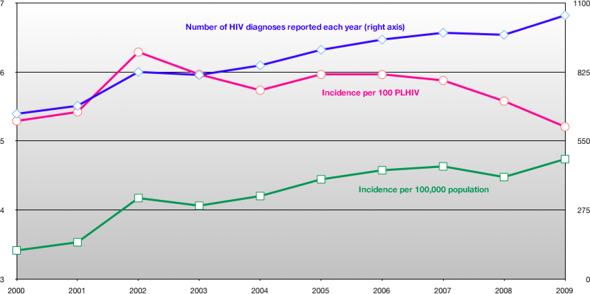
The chart below shows what happens when you do. The blue and green lines show the number of HIV diagnoses per year since 2000, and the consequent raw incidence rate per 100,000 population. The pink line shows the raw incidence rate per 100 people living with HIV, and shows a clear downward trend since 2005, as HIV infections have not risen in proportion to the number of positive people living in Australia. (Click the image to see a larger version).
To my mind, this is a significant piece of good news that the media has ignored. But that’s not surprising as NCHECR’s annual surveillance report doesn’t include this measure, making a ‘bad news’ interpretation of the data almost inevitable.
That falling pink line suggests that positive people are succeeding in preventing onward HIV transmission. With a larger HIV-positive population, you’d naturally expect more HIV transmission to occur, yet this isn’t happening.
If this falling incidence rate were acknowledged, we could begin to ask why it is so. What has changed since 2005 to reduce HIV incidence, and how can we extend that success? Reported rates of unprotected sex among gay men have risen during that period, so how do we explain this apparently contradictory effect? These are important, and potentially valuable, questions.
HIV incidence is falling, not rising, when you take into account the growing positive population. This is something we should be celebrating, and for which positive people should be congratulated, instead of focusing on raw numbers that give a skewed perception of the epidemiology of HIV in Australia.
There are several caveats to the data I used for the chart. Most of the data came from the published NCHECR surveillance reports, which can be found here and from ABS population data. The 2010 report isn’t up yet, so I have taken the figures for 2009 from today’s media reports. And as I say, I’m no statistician, so I will accept criticism of my methods with my usual sanguine humour.
I am sorry to disagree with you but the all important numbers to look at are both the diagnoses and the incidence per 100,000 of the population. The latter deals out the rise in overall population numbers and just tells you in any point in time this is the incidence of HIV. This is sadly increasing and has done as per your graph since 2000. Thus indicating that there are now more people living with HIV in every 100,000 than there were ten years ago. Thus more infections have occured to increase the numbers of people with the virus. This is mirrored by the parrallel blue line that tells you that the numbers of diagnoses, i.e. people who when tested are poz. It is rising at the same rate at the incidence approx. Thus one can conclude that the numbers of infections occuring is also increasing not decreasing. If the diagnoses only had risen one could speculate that it was due to the fact that we were being more efficient or diligent in getting tested and identifying people who have been poz but up to now undetected by test.
I’m not sure I follow your reasoning. Yes, the raw numbers are increasing, but my point is that HIV incidence is, by definition, a function of HIV prevalence, and when the numbers are considered in this context the picture is quite different to that painted by the raw incidence figures.
If you like, what I’m doing here is presenting the HIV surveillance data from the point of view of people living with HIV. The number of infections per person living with HIV is clearly going down, and that’s evidence that positive people (and their negative partners) are doing something right. Unless we acknowledge that fact, we don’t get to the point of asking what we’re doing right.