- published: 21 Dec 2012
- views: 34401
-
remove the playlistPlot (graphics)
-
remove the playlistLatest Videos
-
remove the playlistLongest Videos
- remove the playlistPlot (graphics)
- remove the playlistLatest Videos
- remove the playlistLongest Videos
- published: 25 Nov 2008
- views: 1626510
- published: 04 Dec 2015
- views: 3320
- published: 26 Apr 2010
- views: 597616
- published: 08 Mar 2012
- views: 16502
- published: 21 Feb 2010
- views: 61594
- published: 27 Aug 2015
- views: 16792

A plot is a graphical technique for representing a data set, usually as a graph showing the relationship between two or more variables. The plot can be drawn by hand or by a mechanical or electronic plotter. Graphs are a visual representation of the relationship between variables, very useful for humans who can quickly derive an understanding which would not come from lists of values. Graphs can also be used to read off the value of an unknown variable plotted as a function of a known one. Graphs of functions are used in mathematics, sciences, engineering, technology, finance, and other areas.
Plots play an important role in statistics and data analysis. The procedures here can broadly be split into two parts: quantitative and graphical. Quantitative techniques are the set of statistical procedures that yield numeric or tabular output. Examples of quantitative techniques include:
These and similar techniques are all valuable and are mainstream in terms of classical analysis. There are also many statistical tools generally referred to as graphical techniques. These include:
This article is licensed under the Creative Commons Attribution-ShareAlike 3.0 Unported License, which means that you can copy and modify it as long as the entire work (including additions) remains under this license.
- Loading...

-
 10:14
10:14Plot Function - Plotting graphs in mathematica - A Basic Tutorial
Plot Function - Plotting graphs in mathematica - A Basic TutorialPlot Function - Plotting graphs in mathematica - A Basic Tutorial
This is a basic tutorial on using the plot function This is a very basic tutorial and probably won't find it useful unless you are a beginner. Please rate and leave a comment. Mathematica 6 -
 8:56
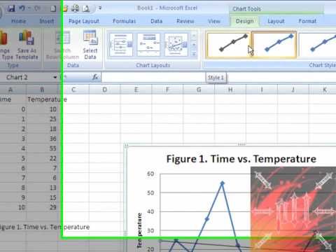
8:56Easy Way to Make a Graph on Excel FROM SCRATCH - Excel 2007 or 2010
Easy Way to Make a Graph on Excel FROM SCRATCH - Excel 2007 or 2010Easy Way to Make a Graph on Excel FROM SCRATCH - Excel 2007 or 2010
A fast and easy to follow tutorial on how to make a good looking graph on Microsoft Excel 2007 and 2010. Example: Scatter plot With bullets and straight lines Line of Best Fit Graph Title Axis Titles Comment, rate, and SUBSCRIBE! ^ ^ ^ ^ ^ | | | | | | | | | | -pH- -
 6:36
6:36R Tutorial - How to plot multiple graphs in R
R Tutorial - How to plot multiple graphs in RR Tutorial - How to plot multiple graphs in R
This part will explain you how to plot multiple graphs using R. Join DataCamp today, and start our interactive intro to R programming tutorial for free: https://www.datacamp.com/courses/free-introduction-to-r We'll be working with the shop data set: it contains 27 observations of a company's sales figures in relation to the amount of money spent on advertising, the number of nearby competitors, the current inventory and the overall size of the district. Have a look at its structure. Suppose now that we want to get a first idea of the correlation between the net sales, in the `sales` column, and the other 4 variables, `ads`, `comp`, `inv` and `size_dist`. We could build four separate plots, but it can be a good idea to create a grid of plots, to compare the correlations more easily. The easiest way to do is, is by specifying the graphical parameter `mfrow` with the `par()` function. Remember from before that you could use the `par()` function to list all the parameters, like this: But you can also use it to set graphical parameters. Let's set the `mfrow` parameter to a vector containing two times two, to tell R that you want to build 4 subplots on a 2 by 2 grid: Nothing really happens. It'll become clear once you start building some plots though. Let's start with net sales versus ad spending: The plot shows up in the top left corner. If you now also plot `sales` versus `comp`, ..., it appears next to it. Adding the third plot, the relation with the inventory, and the fourth plot, that shows the relation with the size of the district, we end up with four figures: Pretty cool huh! You saw here that the plots got added in a row-wise fashion. If you instead specify the graphical parameter `mfcol`, instead of `mfrow`, with the same specification, ..., and do the four plots again, one by one, you'll see that the graphs are added in a column-wise fashion. This vector c(2,2) denotes that you want to have a layout of two rows and two columns, in this order. To reset the graphical parameters such that R plots a single figure per layout, you can set either mfrow or mfcol to a vector that denotes that you want a 1 by 1 grid: Apart from specifying the mfrow or mfcol parameters using the `par()` function, there's also the `layout()` function, that allows you to specify more complex plot arrangements. This function expects a matrix, in which you specify the location of the figures on the output device. Have a look at this matrix, `grid`, that specifies the locations that 3 figures can take: If you pass this matrix to the `layout` function, and do three plot calls afterwards, ..., You'll see that the first figure spans the entire width of the first row of the layout. You can go pretty far with customizing your layouts, but that's something for more advanced visualization courses. To reset this layout, you can simply call this command to specify a 1 by 1 layout, or you can again use the mfcol or mfrow parameter to reset the grid Resetting this layout afterwards, every time you have been adapting the graphical parameters, can be quite tedious. Another, often easier way is to copy the old graphical parameters to a new variable first, like this. If you then do your customizations, for example setting the overall color to red and make a plot, you can easily clean up afterwards by restoring the old graphical parameters. If you now the same plot again, the red color is gone again. Apart from building layouts to show different plots next to each other, you can also choose to stack different graphical elements on top of each other, as if you are adding layers to the same plot. Let's see how this works with an example. Let's first try to plot the sales versus the advertisement spending with some basic customization: Next, let's try to build a model that models sales based on advertisement spending with the `lm()` function. The `lm()` function returns an lm object, which contains the coefficients of the line representating the linear fit. You can now use these coefficients to plot a straight line on the plot. The `abline()` function helps us out: This function can take the coefficients of a straight line as a vector, or as separate values. The `lwd` argument stands for line width here. Instead of building a new plot with simply a line, the previous plot is kept, and the straight line is added to the plot. This is a great way of adding more information to your plot! -
 6:42
6:42How to make a line graph in Excel (Scientific data)
How to make a line graph in Excel (Scientific data)How to make a line graph in Excel (Scientific data)
-
 3:15
3:15Plot a graph in Excel (high definition tutorial)
Plot a graph in Excel (high definition tutorial)Plot a graph in Excel (high definition tutorial)
This is how you can plot a simple graph using Microsoft Excel. Learn how to add a linear trendline and an equation to your graph in Excel. We recommend viewing this video in HD (full screen). We have used Microsoft Excel 2003 for this video. Good luck with plotting your graphs! -
 23:22
23:224-2: Plotting Data using Python and Turtle Graphics
4-2: Plotting Data using Python and Turtle Graphics4-2: Plotting Data using Python and Turtle Graphics
In this video you learn how to use Turtle Graphics to plot data in your program. Check out my book called "Python Programming Fundamentals" on the website http://cs.luther.edu/~leekent/CS1. This book is used by colleges in an introductory Computer Science class, but it can also be used by you to learn computer programming. The book has lots of examples and the series of videos I have published on YouTube complement the material found in the text. In fact, I have been using these videos as my lectures for my class that I teach at Luther College. The website also has links to files that I have used in my examples. -
 5:02
5:02Introduction to Plotting in R
Introduction to Plotting in RIntroduction to Plotting in R
Introduction to plotting simple graphs in R -
 9:54
9:54Plotting XY Graphs and Linear Regression in LabVIEW
Plotting XY Graphs and Linear Regression in LabVIEWPlotting XY Graphs and Linear Regression in LabVIEW
This tutorial shows how to plot XY datasets in LabVIEW and how to perform linear regressions on them. It was created for undergraduate Mechanical Engineering students at the University of Minnesota. -
 32:05
32:05Plotting in R tutorial: Gorgeous graphs with ggplot2
Plotting in R tutorial: Gorgeous graphs with ggplot2Plotting in R tutorial: Gorgeous graphs with ggplot2
Learn how to use the ggplot2 library in R to plot nice-looking graphs and find out how to customize them in this step-by-step guide. Downloadable data is available to use with this tutorial at https://deltadna.com/blog/plotting-in-r-tutorial/ as is a written version. Please note that the data source has now changed from 'demo-co.deltacrunch' to 'demo-account.demo-game' & all login details have been changed. Loading in the data 01:10 Working with times using lubridate 03:05 Your first ggplot 05:58 Different geoms 08:37 Fixed variables and aesthetics 09:05 Faceting 11:44 Histograms 13:00 Converting a variable into a factor and accessing help 14:05 Bar graphs 16:05 Stacked bar graphs 17:07 Grouped bar graphs 18:34 Proportion bar graphs 20:06 Basic heatplot 21:30 Advanced heatplot, including labels, new colours and text 25:54 -
 7:43
7:43Matlab plot multiple lines
Matlab plot multiple lines
- Adolphe Quetelet
- Alan MacEachren
- Antenna
- Arrhenius plot
- Arthur Bowley
- Arthur H. Robinson
- Assay
- Automatic control
- Ben Shneiderman
- Biplot
- Bland-Altman plot
- BMJ
- Bode plot
- Box plot
- Bruce H. McCormick
- Cartography
- Chart
- Chartjunk
- Chemical imaging
- Clifford A. Pickover
- Computer graphics
- Confidence interval
- Continuous function
- Contour line
- Contour plot
- Control theory
- Crime mapping
- Dalitz plot
- Data
- Data analysis
- Data set
- Data visualization
- De Finetti diagram
- Device under test
- Diagram
- Economic equilibrium
- Edward Tufte
- Engineering
- Engineering drawing
- Enzyme kinetics
- Equilateral
- Feedback
- Finance
- Five-number summary
- Flow visualization
- Forest plot
- Frequency response
- Funnel plot
- Galbraith plot
- Game theory
- George G. Robertson
- Geovisualization
- Geyser
- Graph drawing
- Graph of a function
- Graphic design
- Graphic organizer
- Graphical technique
- Histogram
- Hypothesis
- Ideogram
- Imaging science
- Information graphics
- Information science
- Jacques Bertin
- Jock D. Mackinlay
- JSTOR
- Lineweaver–Burk plot
- Location parameter
- Logarithm
- Map
- Mathematical diagram
- Mathematics
- Medical imaging
- Mental image
- Meta-analysis
- Metallurgy
- Michael Friendly
- Michael Maltz
- Mineralogy
- Molecular graphics
- Neuroimaging
- Nichols plot
- Nigel Holmes
- Normal distribution
- Nyquist plot
- Old Faithful
- Ordinate
- Otto Neurath
- Outlier
- Petrology
- Phase space
- Photograph
- Pictogram
- Plot (graphics)
- Plotter
- Polar coordinates
- Population genetics
- Probability plot
- Psychrometric chart
- PubMed Central
- PubMed Identifier
- Q-Q plot
- Quantile
- Quantitative data
- Radiation pattern
- Random sample
- Recurrence plot
- Regression analysis
- Scale parameter
- Scatter plot
- Scatterplot
- Schematic
- Science
- Scientific modelling
- Shape
- Shmoo plot
- Signal processing
- Spaghetti plot
- Spaghetti plots
- Spatial analysis
- Standard error
- Star plot
- Statistical graphics
- Statistics
- Stemplot
- Stuart Card
- Study heterogeneity
- Supply and demand
- Surface plot
- Table (information)
- Technical drawing
- Technology
- Ternary plot
- Thomas A. DeFanti
- Triangle
- Univariate
- Violin plot
- Visual analytics
- Visual culture
- Visual perception
- Volume rendering
- Weibull distribution
- William Playfair
-

Plot Function - Plotting graphs in mathematica - A Basic Tutorial
This is a basic tutorial on using the plot function This is a very basic tutorial and probably won't find it useful unless you are a beginner. Please rate and leave a comment. Mathematica 6 -

Easy Way to Make a Graph on Excel FROM SCRATCH - Excel 2007 or 2010
A fast and easy to follow tutorial on how to make a good looking graph on Microsoft Excel 2007 and 2010. Example: Scatter plot With bullets and straight lines Line of Best Fit Graph Title Axis Titles Comment, rate, and SUBSCRIBE! ^ ^ ^ ^ ^ | | | | | | | | | | -pH- -

R Tutorial - How to plot multiple graphs in R
This part will explain you how to plot multiple graphs using R. Join DataCamp today, and start our interactive intro to R programming tutorial for free: https://www.datacamp.com/courses/free-introduction-to-r We'll be working with the shop data set: it contains 27 observations of a company's sales figures in relation to the amount of money spent on advertising, the number of nearby competitors, the current inventory and the overall size of the district. Have a look at its structure. Suppose now that we want to get a first idea of the correlation between the net sales, in the `sales` column, and the other 4 variables, `ads`, `comp`, `inv` and `size_dist`. We could build four separate plots, but it can be a good idea to create a grid of plots, to compare the correlations more easily. Th... -

How to make a line graph in Excel (Scientific data)
-

Plot a graph in Excel (high definition tutorial)
This is how you can plot a simple graph using Microsoft Excel. Learn how to add a linear trendline and an equation to your graph in Excel. We recommend viewing this video in HD (full screen). We have used Microsoft Excel 2003 for this video. Good luck with plotting your graphs! -

4-2: Plotting Data using Python and Turtle Graphics
In this video you learn how to use Turtle Graphics to plot data in your program. Check out my book called "Python Programming Fundamentals" on the website http://cs.luther.edu/~leekent/CS1. This book is used by colleges in an introductory Computer Science class, but it can also be used by you to learn computer programming. The book has lots of examples and the series of videos I have published on YouTube complement the material found in the text. In fact, I have been using these videos as my lectures for my class that I teach at Luther College. The website also has links to files that I have used in my examples. -

Introduction to Plotting in R
Introduction to plotting simple graphs in R -

Plotting XY Graphs and Linear Regression in LabVIEW
This tutorial shows how to plot XY datasets in LabVIEW and how to perform linear regressions on them. It was created for undergraduate Mechanical Engineering students at the University of Minnesota. -

Plotting in R tutorial: Gorgeous graphs with ggplot2
Learn how to use the ggplot2 library in R to plot nice-looking graphs and find out how to customize them in this step-by-step guide. Downloadable data is available to use with this tutorial at https://deltadna.com/blog/plotting-in-r-tutorial/ as is a written version. Please note that the data source has now changed from 'demo-co.deltacrunch' to 'demo-account.demo-game' & all login details have been changed. Loading in the data 01:10 Working with times using lubridate 03:05 Your first ggplot 05:58 Different geoms 08:37 Fixed variables and aesthetics 09:05 Faceting 11:44 Histograms 13:00 Converting a variable into a factor and accessing help 14:05 Bar graphs 16:05 Stacked bar graphs 17:07 Grouped bar graphs 18:34 Proportion bar graphs 20:06 Basic heatplot 21:30 Advanced ... -

Plot Function - Plotting graphs in mathematica - A Basic Tutorial
- Order: Reorder
- Duration: 10:14
- Updated: 21 Dec 2012
- views: 34401
- published: 21 Dec 2012
- views: 34401
Easy Way to Make a Graph on Excel FROM SCRATCH - Excel 2007 or 2010
- Order: Reorder
- Duration: 8:56
- Updated: 25 Nov 2008
- views: 1626510
- published: 25 Nov 2008
- views: 1626510
R Tutorial - How to plot multiple graphs in R
- Order: Reorder
- Duration: 6:36
- Updated: 04 Dec 2015
- views: 3320
- published: 04 Dec 2015
- views: 3320
How to make a line graph in Excel (Scientific data)
- Order: Reorder
- Duration: 6:42
- Updated: 10 Dec 2012
- views: 1291737
- published: 10 Dec 2012
- views: 1291737
Plot a graph in Excel (high definition tutorial)
- Order: Reorder
- Duration: 3:15
- Updated: 26 Apr 2010
- views: 597616
- published: 26 Apr 2010
- views: 597616
4-2: Plotting Data using Python and Turtle Graphics
- Order: Reorder
- Duration: 23:22
- Updated: 08 Mar 2012
- views: 16502
- published: 08 Mar 2012
- views: 16502
Introduction to Plotting in R
- Order: Reorder
- Duration: 5:02
- Updated: 22 Nov 2012
- views: 20471
Plotting XY Graphs and Linear Regression in LabVIEW
- Order: Reorder
- Duration: 9:54
- Updated: 21 Feb 2010
- views: 61594
- published: 21 Feb 2010
- views: 61594
Plotting in R tutorial: Gorgeous graphs with ggplot2
- Order: Reorder
- Duration: 32:05
- Updated: 27 Aug 2015
- views: 16792
- published: 27 Aug 2015
- views: 16792
Matlab plot multiple lines
- Order: Reorder
- Duration: 7:43
- Updated: 29 Jan 2014
- views: 64933
-

Mirror's Edge Catalyst - The Shard - 1080p Ultra Graphics
WARNING: PLOT SPOILERS AT 15:50 NOTE: All cutscene stuttering caused by high CPU usage during recording, does not occur in normal gameplay. After installing Windows 10 and updating to DirectX 12, I wanted to revisit "The Shard" to see how far I could push my hardware. This was the end result. Enjoy! Hardware - GPU: Sapphire TRI-X OC R9 290 4GB 512-bit GDDR5 CPU: AMD FX-8350 16GB RAM Windows 10 / DirectX 12 Twitch: https://www.twitch.tv/woulfstylegaming Facebook: https://www.facebook.com/WoulfStyleGaming/ Twitter: https://twitter.com/Woulf_Games -

GraphINK Press - Plot - Print Custom Decals. vinyl decal cut (Start to finish)
How are Vinyl Cut Graphics and Lettering made? Brendan from https://www.facebook.com/GraphINK2766 goes over production methods from start to finish for custom vinyl cut, die cut graphics. Want a custom decal contact us for a free quote, we ship Australia wide www.decalsandstickersalive.com.au -

C# NumericUpDown vs graph
C# create a graph vs numericupdown. This is example using value from numericupdown for creating plot. See & enjoy it! Share it if it's useful! Thanks for watching Subscribe for Channel: https://www.youtube.com/channel/UCmCQa0Q-gmZX934Fu7NYP3A?sub_confirmation=1 Google+: https://plus.google.com/u/0/110836664169996401991/posts -

Presenting Data-Showing Variability-Dot & Whisker Plot
Effective technique to demonstrate group means and variability. Reference: Correll, M & Gleicher, M. (2014). Error bars considered harmful: Exploring alternate encodings for mean and error. Visualization and Computer Graphics, 20(12), 2142-2151. -

-

How to Write the Mathematica codes and plot graph of the function
Write the Mathematica codes to define a function as a Mathematica function and to plot graph of the function. -

Scilab Tutorial : 2D plots
This video shows how to plot 2D plots. And also it shows how to use concerned parameters to get the right plot which we want. In this tutorial you will learn how to plot points, line, functions curve, 3D plots etc -

64 how to title a plot or graph in r add axes and other text or words with the axis and text functio
-

Xlib Programming in C and Linux Tutorial #07 - Plotting (Graph of) a Function
An example on how to plot a function (graph of a function) using the Xlib routines. y=x^2 and y=sin(x) are demonstrated in this video.
Mirror's Edge Catalyst - The Shard - 1080p Ultra Graphics
- Order: Reorder
- Duration: 22:42
- Updated: 26 Jun 2016
- views: 1
- published: 26 Jun 2016
- views: 1
GraphINK Press - Plot - Print Custom Decals. vinyl decal cut (Start to finish)
- Order: Reorder
- Duration: 5:31
- Updated: 05 Feb 2016
- views: 25
- published: 05 Feb 2016
- views: 25
C# NumericUpDown vs graph
- Order: Reorder
- Duration: 2:45
- Updated: 03 Feb 2016
- views: 395
- published: 03 Feb 2016
- views: 395
Presenting Data-Showing Variability-Dot & Whisker Plot
- Order: Reorder
- Duration: 10:58
- Updated: 16 Dec 2015
- views: 126
- published: 16 Dec 2015
- views: 126
Plot.io - Data Graphics
- Order: Reorder
- Duration: 7:05
- Updated: 03 Nov 2015
- views: 44
How to Write the Mathematica codes and plot graph of the function
- Order: Reorder
- Duration: 6:31
- Updated: 18 Oct 2015
- views: 72
- published: 18 Oct 2015
- views: 72
Scilab Tutorial : 2D plots
- Order: Reorder
- Duration: 7:25
- Updated: 12 Oct 2015
- views: 4856
- published: 12 Oct 2015
- views: 4856
64 how to title a plot or graph in r add axes and other text or words with the axis and text functio
- Order: Reorder
- Duration: 2:10
- Updated: 06 Oct 2015
- views: 124
- published: 06 Oct 2015
- views: 124
Xlib Programming in C and Linux Tutorial #07 - Plotting (Graph of) a Function
- Order: Reorder
- Duration: 7:37
- Updated: 29 Sep 2015
- views: 526
- published: 29 Sep 2015
- views: 526
-

Plotting with Lattice Graphics Demo
-

[Android] Learn how to create a real time line graph with MPAndroidChart
Android tutorial to learn how to create a real time line graph with MPAndroidChart. MPAndroidChart is an open source graph library available on GitHub : https://github.com/PhilJay/MPAndroidChart -

Legend of Zelda Skyward Sword Plot, Gameplay, and Graphics Opinions
In this video I give you my opinions on the upcoming new wii game, the Legend of Zelda Skyward Sword and talk about the plot, gameplay, new mechanics, and the graphics! I think this game is going to be really awesome and I'm really excited about all the new features they plan to add. Also, I have trailers of Twilight Princess, Wind Waker, and Skyward Sword so that you can see how much the graphics and animations have been updated in Skyward Sword. And you get to see a boss battle with Ghirahim! Enjoy and please remember to comment, like, and subscribe! :) -

Houston Data Vis Meetup - interactive graphics on the web with plot.ly + Lightning Talks
-

MATLAB/@GnuOctave Tutorial - 03 Plotting Data and Graphics
Learn how to plot data using different styles, manipulate axis labels, title, legend, make colorful 3D surface plots, also 2D bitmap graphics. Based on MATLAB R2015a Primer: http://www.mathworks.com/help/pdf_doc/matlab/getstart.pdf?s_tid=int_tut This is less of a MATLAB/GNU Octave Math Programming Language "tutorial" and more of a learning-by-sharing video. :) -

Including function graphs into latex documents
In this video I show how to generate graphics using maxima and how to include those graphics into latex documents. I also show how to draw a free hand graphic and include it into the latex document. -

Mathematica For Beginners
How to use mathematica How to solve equations, optimization problems and integrals. How to plot functions. How to create dynamic input. How to use free-form linguistic input. How to send queries to Wolfram Alpha. How to create 3D graphics. How to create Movies. How to create output ready for 3D printing. How to study social networks. -

Python In Education: 2D Plots
Python is a great way to make very high quality 2D plots/graphs that you can easily export into your other documents. In this video I show how to use Python/Matplotlib in the context of your classes to make plots of your data and mathematical functions that arise in science or math courses. This is part of a video series on how to use Python in an educational environment. Python is an easy to use, but also very powerful, tool that allows you to do many things across the curriculum. And, it is free! Please see all of the other videos in this series as well. All of the Python scripts in this series are available at New Planet School's Google Drive, which is located at: https://drive.google.com/?authuser=1#folders/0B-Hob7Evc6ImdDVUcDZEU05id1k Enjoy the videos and using/modifying the star...
Plotting with Lattice Graphics Demo
- Order: Reorder
- Duration: 21:24
- Updated: 17 Sep 2012
- views: 8547
- published: 17 Sep 2012
- views: 8547
[Android] Learn how to create a real time line graph with MPAndroidChart
- Order: Reorder
- Duration: 28:02
- Updated: 25 Apr 2015
- views: 18450
- published: 25 Apr 2015
- views: 18450
Legend of Zelda Skyward Sword Plot, Gameplay, and Graphics Opinions
- Order: Reorder
- Duration: 22:55
- Updated: 08 Jul 2011
- views: 3766
- published: 08 Jul 2011
- views: 3766
Houston Data Vis Meetup - interactive graphics on the web with plot.ly + Lightning Talks
- Order: Reorder
- Duration: 144:31
- Updated: 10 Feb 2015
- views: 43
- published: 10 Feb 2015
- views: 43
MATLAB/@GnuOctave Tutorial - 03 Plotting Data and Graphics
- Order: Reorder
- Duration: 51:59
- Updated: 28 Mar 2015
- views: 366
- published: 28 Mar 2015
- views: 366
Including function graphs into latex documents
- Order: Reorder
- Duration: 23:10
- Updated: 26 Mar 2013
- views: 8018
- published: 26 Mar 2013
- views: 8018
Mathematica For Beginners
- Order: Reorder
- Duration: 32:12
- Updated: 07 Oct 2013
- views: 30965
- published: 07 Oct 2013
- views: 30965
Python In Education: 2D Plots
- Order: Reorder
- Duration: 41:39
- Updated: 25 Jan 2015
- views: 1519
- published: 25 Jan 2015
- views: 1519
- Playlist
- Chat
- Playlist
- Chat

Plot Function - Plotting graphs in mathematica - A Basic Tutorial
- Report rights infringement
- published: 21 Dec 2012
- views: 34401

Easy Way to Make a Graph on Excel FROM SCRATCH - Excel 2007 or 2010
- Report rights infringement
- published: 25 Nov 2008
- views: 1626510

R Tutorial - How to plot multiple graphs in R
- Report rights infringement
- published: 04 Dec 2015
- views: 3320

How to make a line graph in Excel (Scientific data)
- Report rights infringement
- published: 10 Dec 2012
- views: 1291737

Plot a graph in Excel (high definition tutorial)
- Report rights infringement
- published: 26 Apr 2010
- views: 597616

4-2: Plotting Data using Python and Turtle Graphics
- Report rights infringement
- published: 08 Mar 2012
- views: 16502

Introduction to Plotting in R
- Report rights infringement
- published: 22 Nov 2012
- views: 20471

Plotting XY Graphs and Linear Regression in LabVIEW
- Report rights infringement
- published: 21 Feb 2010
- views: 61594

Plotting in R tutorial: Gorgeous graphs with ggplot2
- Report rights infringement
- published: 27 Aug 2015
- views: 16792

Matlab plot multiple lines
- Report rights infringement
- published: 29 Jan 2014
- views: 64933
- Playlist
- Chat

Mirror's Edge Catalyst - The Shard - 1080p Ultra Graphics
- Report rights infringement
- published: 26 Jun 2016
- views: 1

GraphINK Press - Plot - Print Custom Decals. vinyl decal cut (Start to finish)
- Report rights infringement
- published: 05 Feb 2016
- views: 25

C# NumericUpDown vs graph
- Report rights infringement
- published: 03 Feb 2016
- views: 395

Presenting Data-Showing Variability-Dot & Whisker Plot
- Report rights infringement
- published: 16 Dec 2015
- views: 126

Plot.io - Data Graphics
- Report rights infringement
- published: 03 Nov 2015
- views: 44

How to Write the Mathematica codes and plot graph of the function
- Report rights infringement
- published: 18 Oct 2015
- views: 72

Scilab Tutorial : 2D plots
- Report rights infringement
- published: 12 Oct 2015
- views: 4856

64 how to title a plot or graph in r add axes and other text or words with the axis and text functio
- Report rights infringement
- published: 06 Oct 2015
- views: 124

Xlib Programming in C and Linux Tutorial #07 - Plotting (Graph of) a Function
- Report rights infringement
- published: 29 Sep 2015
- views: 526
- Playlist
- Chat

Plotting with Lattice Graphics Demo
- Report rights infringement
- published: 17 Sep 2012
- views: 8547

[Android] Learn how to create a real time line graph with MPAndroidChart
- Report rights infringement
- published: 25 Apr 2015
- views: 18450

Legend of Zelda Skyward Sword Plot, Gameplay, and Graphics Opinions
- Report rights infringement
- published: 08 Jul 2011
- views: 3766

Houston Data Vis Meetup - interactive graphics on the web with plot.ly + Lightning Talks
- Report rights infringement
- published: 10 Feb 2015
- views: 43

MATLAB/@GnuOctave Tutorial - 03 Plotting Data and Graphics
- Report rights infringement
- published: 28 Mar 2015
- views: 366

Including function graphs into latex documents
- Report rights infringement
- published: 26 Mar 2013
- views: 8018

Mathematica For Beginners
- Report rights infringement
- published: 07 Oct 2013
- views: 30965

Python In Education: 2D Plots
- Report rights infringement
- published: 25 Jan 2015
- views: 1519
Unidentified Turkish Official: Istanbul Airport Attackers 'Russian, Uzbek And Kyrgyz'
Edit WorldNews.com 30 Jun 2016Pentagon Budget Caps Will Return to Confront Clinton or Trump
Edit Bloomberg 30 Jun 2016After 5-year voyage, NASA spacecraft nears rendezvous with Jupiter
Edit Baltimore Sun 30 Jun 2016Rio's week of horror: Body parts wash up near Olympics beach volleyball site
Edit CNN 30 Jun 2016Boris Johnson Surprises Faithful, Drops Out Of Tory Race
Edit WorldNews.com 30 Jun 2016Movie review: ‘The Neon Demon,’ high fashion flop
Edit The Oklahoman 30 Jun 2016Updated: 35 best PC games: the must-play titles you can't afford to miss
Edit TechRadar 30 Jun 2016Transfer of shares out of treasury (Global Graphics SE)
Edit Public Technologies 30 Jun 2016Transaction in own shares (Global Graphics SE)
Edit Public Technologies 30 Jun 2016Maharashtra looks at more residential development in Bandra Kurla Complex
Edit Indian Express 30 Jun 2016Australia teen pleads guilty to plot to kill policeman
Edit The Miami Herald 30 Jun 2016COLOR CONSISTENCY AND UP-TIME OF FUJIFILM’S J PRESS 720S A PERFECT MATCH FOR WALSWORTH (Fujifilm Holdings America Corporation)
Edit Public Technologies 30 Jun 2016COLOR CONSISTENCY AND UP-TIME OF FUJIFILM’S J PRESS 720S A PERFECT MATCH FOR WALSWORTH (Fujifilm Medical Systems USA Inc)
Edit Public Technologies 30 Jun 2016Change in major shareholdings (Global Graphics SE)
Edit Public Technologies 30 Jun 201630 June 2016 Tickets Now on Sale for Batman: The Killing Joke (Village Roadshow Limited)
Edit Public Technologies 30 Jun 2016Terrorism charges dropped against Operation Appleby target Maywand Osman
Edit Sydney Morning Herald 30 Jun 2016Raina Telgemeier’s ‘Ghosts’ has a 500,000 copy first printing
Edit The Beat 30 Jun 2016- 1
- 2
- 3
- 4
- 5
- Next page »


