Posted by: Doug Henwood | April 18, 2017

How employed are we?

A few weeks ago, I made fun of Sean Spicer for this word salad:

I think there’s a question between the total number of people that are employed, and the President’s comments in the past have reflected that his big concern was getting to the bottom of how many people are working in this country, and that the denominator—meaning the percentage rate of the total number of people—is not the most accurate reflection of how many people are employed in this country.

And, God knows, he deserves a strong dose of mockery. But he seemed to be staggering around a serious point: the unemployment rate tells only a partial story about the job market. If that rate is low because a lot of people have given up on the job search as hopeless, and are therefore not counted as unemployed, then a low unemployment rate would be telling a misleading story. (For more on that, see the post linked to above.) So does Spicer—channeling Trump—have an actual point here, even if he’s incapable of expressing it?

Yes he does. Despite years of recovery from the depths of the Great Recession (GR), the so-called employment/population ratio (EPOP)—the share of the noninstitutional population over the age of 16 working for pay—remains below earlier cyclical peaks. (“Noninstitutional” means not in a prison, mental hospital, or a nursing home. Given the vast size of the U.S. prison population, this is not a small consideration—but it’s one for another post.) If the same share of the population were employed today as was in December 2007, just as the GR was taking hold, 4.3 million more people would have jobs. If it were the same share as the all-time high in April 2000, 7.3 million more people would be working for pay. Either one is a big number, even in a country where 153 million people are employed.

Here are some graphs to make the point. First, the broad EPOP since the modern monthly numbers—computed from a very large survey of households—began in 1948.

EPOP all

Several things stand out from this graph. First, compared to those for men and women, the “all” line looks rather flat. It began at 56.6% in 1948, and was at 60.1% in March 2017—down from a peak of 64.7% in April 2000. But the gendered lines take very different trajectories. The male EPOP has been in a steady downtrend, intensified during the GR—for most of the past seven decades, from 83.8% in January 1948 to 66.0% in March 2017. At the overall peak in 2000, 72.1% of adult men were working. In contrast, the women’s line rose more steadily than men’s fell, from 30.9% to a peak of 58.0% in 2000, a near-doubling; it’s since drifted lower, to 54.7% last month. To return to the peak 2000 EPOPs, 4.9 million more men and 2.8 million more women would need to find work. Though women suffer plenty of discrimination in the labor market, and more men are employed than women, the GR was a lot harder on men (though the recovery from those lows has been kinder to them).

Why has the U.S. economy failed to generate enough jobs to return to pre-2007 levels of employment? (I’ll bracket the gender angle for now, except to say that long-term structural changes have taken a toll on male-heavy industries like manufacturing while they’ve boosted female-heavy ones like retail and health care.) It’s not that robots are taking our jobs. Productivity growth is close to zero now—a sharp contrast with the years leading up to the 2000 employment peak, when it was very strong, as was employment growth. (More on this in another future post.)

An explanation favored by Democrats during the Obama years was the aging of the population; older cohorts are employed at a lower rate than younger ones. But that’s only a partial explanation. Economic growth has been very slow in this expansion, the slowest of any since the end of World War II. Strange as it may seem, employment growth has actually been stronger than GDP growth would suggest, based on their tight historical correlation. If robots really were the culprit, the reverse would be true.

Let’s look more closely at the aging issue. Here are some graphs showing the EPOP by age cohort. First, so-called prime-age workers, those aged 25 to 54.

EPOP prime

The long-term decline in male employment is softer, and the rise in female, stronger, but the story is not profoundly different from the overall graph above.

Next, younger workers.

EPOP younger

Teen employment is sharply below where it was in 2000, though it’s recovered some since the depths of 2009–2010. These trends are milder for the 20–24 set, and milder still for the 25–34 group. One reason for the weakness among the younger is that more people in their late teens and early 20s are going to school. This will presumably lead to improved job prospects in the future, contrary to some of the fashionable clichés to the contrary floating around now. (More on this too in a future post.) But even those aged 25–34, who are getting established in the job market rather than just setting out, are employed at lower levels than in 2000 or 2007. Some of this may be lingering damage to their careers inflicted during the GR, but we don’t know for sure yet.

And now older workers.

EPOP older

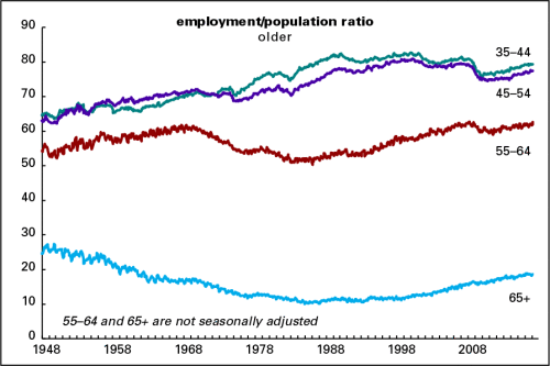
Those aged 35–44 and 45–54 have yet to return to their 2000 and 2007 peaks—but those aged 55–64 have, and those over 65 have surpassed them (though obviously a much smaller share of the 65+ population is working than the rest). One can only surmise that a weakening pension system is at least partly responsible: many older people just can’t afford to retire as they once did.

Here’s a summary graph of the change in EPOPs since 2000.

EPOP change since 2000

On this evidence, the aging population theory doesn’t hold much water, since EPOPs for the five youngest cohorts have fallen, and those for the oldest have risen.

Another approach would be to do a statistical simulation of what the EPOP would look like were the population’s age structure like it was back in the early days of the millennium. That’s what I did here: the simulation is done by taking the EPOPs of each cohort and creating a weighted average using 2001 population shares. (I used 2001 because that’s when the business cycle peak happened, even though EPOP peaked a year ahead of the broad economy. The difference between using 2000 and 2001 shares is trivial.) These calculations are rough. I used only broad age ranges for the cohorts; doing it more precisely would use much narrower age ranges. But that wouldn’t change the broad conclusion: an aging population explains about half the shortfall in the EPOP.

EPOP - actual vs 2001 pop

What else is responsible for EPOP’s sluggish behavior? The prime culprit is slow GDP growth, which is running at less than half the post-World War II average for a business cycle expansion (2.1% vs. 4.4%). Growth rates have been declining with each successive upswing since 1991, but this one is the weakest by a fairly wide margin.

Business cycle averages

Why has growth been so slow? This too is a topic in itself but there are several reasons. One, popular among mainstream economists, is that very deep recessions, like the 2008–2009 affair, have historically left deep scars that make recovery slow and difficult. Another, less orthodox, way of interpreting those “scars” is that a very deep recession is itself a sign of serious structural problems beyond the normal ups and downs of capitalist economies. In the U.S. case, the long-term problem is that the squeeze on wages and living standards that began in the early 1980s succeeded in raising corporate profitability (and in making the rich very much richer), but at the expense of undermining the foundations of an economy dependent on high levels of mass consumption. That contradiction was resolved for a while by rampant levels of borrowing, which compensated for stagnant wage and salary income. But with the financial crisis of 2007–2008, that aggressive borrowing was thrown into reverse, and households began to reduce their debts—which made sense at the level of the individual household, but put a lid on consumer demand. That problem could be mitigated by policies to shift income downward, through higher wages and more generous spending on social programs and infrastructure, but those routes look politically impossible. In other words, the neoliberal model has run out of steam, but there’s nothing to take its place.

And yet another explanation is that despite copious profits, firms are shoveling vast pots of cash to their executives and shareholders rather than investing in capital equipment and hiring workers. From 1952 to 1982, nonfinancial corporations distributed 17% of their internal cash flow (profits plus depreciation allowances) to shareholders; that rose to about 30% in the 1980s and 1990s, and to 48% since 2000. (In 2016, the average was an incredible 64%.) This is one result of the shareholder revolution that began in the early 1980s: the whole point of corporations’ existence is to raise the stock price and make their shareholders, who contribute literally nothing for all their taking, richer. More on all that in a future post too.

Advertisements
Posted by: Doug Henwood | April 17, 2017

Job demographics

Paul Krugman asks plaintively “why don’t all jobs matter?” To answer, he enlists the help of Slate’s Jamelle Bouie:

Finally, it’s hard to escape the sense that manufacturing and especially mining get special consideration because, as Slate’s Jamelle Bouie points out, their workers are a lot more likely to be male and significantly whiter than the work force as a whole…. Laid-off retail workers and local reporters are just as much victims of economic change as laid-off coal miners.

The loss of newspaper jobs, a trend of many years, has been very bad news for society as well as reporters—and the damage speaks to all of us in journalism, no matter how marginal. (See here for more on the grim employment picture.) The loss of retail jobs is a phenomenon of the last two months—employment in the sector was down 61,000 in February and March, but it was up 198,000 in the year ending in January. This shrinkage may be a new trend, as online shopping displaces the mall, but we’d need some more data before we can be sure this isn’t just statistical noise.

Unlike retail, the loss of manufacturing and mining jobs is a long-standing trend. Manufacturing accounted for 30% of total employment in 1950; that was down to 21% in 1980, and 8% in March 2017. Since 1980, overall employment is up by 55 million jobs—but manufacturing is down by almost 7 million. Over the same period, retail rose by almost 6 million; health care, 16 million; and bars and restaurants, 12 million.

Detailed data for the mining sector doesn’t go as far back as manufacturing, but it’s a similar story of relentless decline, though from a much smaller starting point. The entire mining and logging sector was 1.5% of total employment in 1958 (when the numbers begin); that was down to 1.1% in 1980, and 0.4% in March 2017. The sector includes oil and gas, which started losing share in the mid-1980s, with the collapse in oil prices; it went from 0.3% of total employment in 1982 to 0.1% in 2005. Then fracking kicked in, taking the share up a few hundredths of a percentage point over the last decade. Coal mining has long been a tiny sector, accounting for just 0.2% of total employment when the stats begin in 1985 (or 0.18%, to be more precise), to just 0.03% last month. That’s just 50,000 jobs in coal mining, which is about a week’s worth of employment growth at current rates. That’s 120,000 fewer than in 1985, but 170,000 jobs wasn’t all that much even 32 years ago.

What about the Krugman/Bouie explanation for why these sectors matter? Yes, mining is very heavily white and especially male. (See table 9 here for the raw data.) Almost 80% of the sector’s workers are white and male, nearly twice their share of the overall workforce. (The culture of mining is also deeply macho.) But there’s another reason coal miners get attention: because of our crazy system of voting, coal mining states like West Virginia are disproportionately important in the electoral map.

Manufacturing is another story. Almost 70% of the sector’s workforce is male—though 30% is female, not a trivial share. But it’s not a “white” sector: just over 6% of its workers are black men, compared with their 5% share of the overall workforce. Another 11% of factory employment is accounted for by Latino men, a point above their share of the workforce. Asian men are also overrepresented in manufacturing (4% in the sector, 3% overall). Just ask your average resident of Detroit or Gary whether they feel like the decline of manufacturing is a white issue.

There’s another reason for the attention paid to the loss of mining and manufacturing job: pay. In March 2017, average hourly earnings in the service sector were $25.86 (not including fringe benefits). They were $32.54 in mining and logging, 26% higher. Manufacturing paid on average $26.37 an hour, 2% above the service sector average—down from an almost 10% premium in 1980. Average earnings in retail were $18.01 an hour, 30% below the service sector average. And workweeks in retail are short—just over 30 hours, compared to almost 41 in manufacturing. So the average weekly wage in retail is $554; in manufacturing, $1,071, nearly twice as high. Almost 9% of manufacturing workers are unionized, compared with 4% in retail. And 92% of manufacturing workers have access to health insurance benefits, compared with 56% in retail.

Yes, mining and manufacturing jobs are often dirty, dull, and dangerous. But there are some good reasons other than bigotry why their loss is widely mourned. The 2008 winner of the Bank of Sweden Prize in Economic Sciences in Memory of Alfred Nobel should know this. Krugman is right that we could do much more to “limit the human damage” when jobs disappear. But it just doesn’t look good when urban elites are so out of touch with life in less favored zones.

Posted by: Doug Henwood | April 13, 2017

Fresh audio product

Just added to my radio archive. Click on the date for the link.

April 13, 2017 Max Sawicky on Republican tax schemes • Vijay Prashad on Syria


Posted by: Doug Henwood | April 6, 2017

Fresh audio product

Just added to my radio archive:

April 6, 2017 Nick Srnicek and Alex Williams, authors of Inventing the Future, on getting beyond folk politics to a world where robots work more and people (supported by a basic income) work less

Here’s an Indiegogo site to raise money for a documentary about the book.

Posted by: Doug Henwood | March 30, 2017

Fresh audio product

Just posted to my radio archive:

March 30, 2017 Jodi Dean on why the temptations of populism should be resisted • Jane McAlevey, author of No Shortcuts, on real organizing, not fake organizing

Posted by: Doug Henwood | March 24, 2017

Fresh audio product

Just posted to my radio archive:

March 23, 2017 Chris Arnade on his travels through the busted heartland of America (Guardian author page) • James Livingston, author of No More Work, on how jobs suck and we should all get free money

Posted by: Doug Henwood | March 23, 2017

Varieties of unemployment

This is the first in a series of lbo-news posts about the state of the U.S. job market.

On March 10, when the Bureau of Labor Statistics (BLS) released the employment report for February showing a robust job market, Donald Trump finally liked the numbers. His press agent, Sean Spicer, quoted him as saying “They may have been phony in the past, but it’s very real now.” Trump himself retweeted Matt Drudge’s gloss on the news that employers added 235,000 jobs in the month as proof that America was already “GREAT AGAIN.”

That was a remarkable turnabout from as recently as December when Trump said this:

The unemployment number, as you know, is totally fiction. If you look for a job for six months and then you give up, they consider you give up. You just give up. You go home. You say, ‘Darling, I can’t get a job.’ They consider you statistically employed. It’s not the way. But don’t worry about it because it’s going to take care of itself pretty quickly.

Almost none of that is true, but more on that in a moment. A Washington Post review found that Trump claimed the numbers were “cooked” or “phony” at least 19 times since 2012.

When asked to reconcile these strong claims with Trump’s celebration of the latest batch of numbers, which also showed the unemployment rate dropping 0.1 point to 4.7%, Spicer responded with his usual clarity and thoughtfulness:

I think there’s a question between the total number of people that are employed, and the President’s comments in the past have reflected that his big concern was getting to the bottom of how many people are working in this country, and that the denominator—meaning the percentage rate of the total number of people—is not the most accurate reflection of how many people are employed in this country.

How many jobs are created, how many people are getting back to work, how many companies are committing to hiring more people is a much more accurate assessment of where we’re headed as our country—where our employment is, where our economy is headed.

Aside from not knowing what a “denominator” is, not to mention how to express himself in terms that people can actually understand, Spicer also seems to know nothing about how the employment statistics are constructed.

But when I made the requisite fun of Trump and Spicer on social media, several of my left-wing pals also revealed some misunderstandings of the (un)employment stats. In the interest of accuracy, here are a few observations.

The monthly employment report, typically released on the first Friday of the month, is based on two surveys, one of employers and the other of households. The first, known as the Current Employment Statistics (CES) program, or informally as the establishment or payroll survey, covers almost 150,000 businesses and governments representing over 600,000 worksites. It is the source of the headline jobs number (e.g., “Employers added 235,000 jobs in February”), as well as information on hourly earnings and the length of the workweek. The other is known as the Current Population Survey (CPS), which polls about 60,000 households every month; it’s commonly known as the household survey. It asks respondents whether they were employed during the previous month (during the week containing the 12th, to be specific, known as the reference week); if so, at what kind of work; if not, why not, and did they want a job. It also breaks these numbers down by demographic categories like race, sex, age, nativity, and education. Both these surveys have extremely large samples—a typical opinion poll might survey just 1,000 people—which then get translated into national figures. No survey can ever represent the full universe it’s surveying completely, but these are about as good as surveys can get.

February’s gain of 235,000 in the payroll survey was a bit above the average over the last year of 196,000. But there’s just no way the February number was right and earlier ones were wrong—nothing has changed in the way the figures were gathered or processed. And every quarter, the survey results are compared with the near-full coverage of the employment universe provided by the unemployment insurance (UI) system, and the monthly estimates have been within one- or two-tenths of a percent of the definitive UI numbers. Gallup should be so good at predicting elections.

While the household survey also measures employment, it’s most noted as the source of the unemployment rate. Many people, not just Donald Trump, really don’t understand this number at all. It has nothing to do with whether someone is receiving unemployment benefits, for example; fewer than a third of the officially unemployed are getting checks. The count of the unemployed hinges on the answers that respondents give to the CPS. People are counted as unemployed if they didn’t work at all during the reference week, but only if they’ve been actively searching for work. (Work for pay, that is; even the “unemployed” often do plenty of unpaid work.) You need only work an hour to be counted as employed. If you’re not looking for a job, you’re considered to have dropped out of the labor force.

That minimalist definition of employment, along with the requirement that you search for work to be counted as officially jobless, is often criticized as a ridiculously loose standard. It would be if the unemployment rate were meant to be a measure of human deprivation. But it’s not—it’s really a measure of labor market tightness. Employers want to know just how desperate or demanding workers will be. When jobs are easy to find, the help wants higher pay and nicer working conditions; when jobs are hard to find, employees will take whatever the boss wants to shove down their throats. The unemployment rate is a measure of the balance of class forces between capital and labor. People who are neither working nor actively looking for work—who are outside the labor force by the official definition—are near-irrelevant to calculating that balance of forces.

But the BLS also calculates a broader measure of unemployment, one that does a much better job of measuring deprivation. It’s called the U-6 measure, the broadest of the six measures of unemployment that it publishes. (The headline rate is called the U-3. For a history of these measures and detailed explanations, see here.) The U-6 rate includes “discouraged” workers—people who want a job but didn’t search in the last month but did within the last year—and half those who want full-time work but can only find part-time. In February 2017, the U-3 rate was 4.7%, the U-6, 9.2% Here’s a graph of both since 1994, when the current series began.

U-3 and U-6

The graph on the bottom is the ratio of the two rates, along with a line capturing the underlying trend of the volatile monthly numbers. A couple of things stand out from that graph: one is that the ratio falls during recessions (though we only have a sample size of two since 1994), and the other is that it rose during the weak 2002–2007 expansion, as well for most of the recent (also weak) expansion. (The trendline also rose from 1994–1996, the adolescent years of the 1990s expansion.) It rises in expansions because the U-3 unemployed find work more quickly than the U-6 unemployed, and falls in recessions because as people are laid off they join the U-3 ranks, swelling them relative to the U-6. But as an expansion goes on, it finally draws some of the U-6 crowd into the job market.

The ratio fell for several years in the late 1990s, which featured the strongest labor market in a generation. More recently, it started falling in late 2015. One way to read these declines is that it takes a really long expansion to draw in people on the margins of the labor market. A more pessimistic way of reading it is that that only happens as an expansion is approaching the end of its life. One hopes that we’re not in a similar place now.

But let’s return to Sean Spicer, and his word salad around the word “denominator.” It’s likely that what he had in mind was two things called the employment/population ratio (EPOP), the share of the adult (over-16) population in paid employment, and the labor force participation rate, the share of that population either working or looking for work. Those give a much less upbeat picture of the job market than the unemployment rate, as the graph below shows.

LFPR and EPOP

Even though the unemployment rate is close to its 2000 and 2007 lows, both these measures are considerably weaker. The reason is that millions of people have dropped out of the labor force since the Great Recession. Part of the reason for this is that the population is aging; older cohorts are less likely to be in the labor force and older boomers are retiring. But that only explains about half the decline. I’ll have more to say about all this in the next installment of this series.

Posted by: Doug Henwood | March 22, 2017

Never demand.

Matt Bruenig already wrote about this (now deleted) tweet from Paul Waldman, which was a response to one from Bernie Sanders…

Waldman tweet

…and before typing any more, I must confess to feeling guilty about writing a second blog post (god knows there are probably more) about a tweet. But, onwards.

As Bruenig writes, “The difference between Obamacare and AHCA is 24 million uninsured people while the difference between single-payer and Obamacare is 28 million uninsured people.” Obamacare, with all its omissions and cost-shifting, isn’t innocent of monstrousness.

There’s a point about political strategy here worth drawing out here. Waldman, who self-identifies as “Washington Post blogger. Columnist for The Week. Senior Writer at the American Prospect.,” was on the Cabalist, a secret listserv for liberal pundits which I strangely spent two or three years on. (I assume he still is, though I can’t know now that I’m off the thing.) I was invited on, I suppose, for ideological diversity, but left as what most members probably saw as an annoying provocateur.

Waldman’s tweet reflects a consensus on the list that one must never make demands or express ambitious political goals in the way Sanders’ tweet does. All we can do it defend what we have, because the right holds all the cards. I never could convince them that this was a doomed strategy—that, principle aside, if you don’t make big demands you can’t win even small victories, or that without radicals pushing things in threatening ways their wimpy appeals to compromise will have no audience. To your modal Cabalister, to push for single-payer would be to “relitigate” (a favorite word of theirs, reflecting I suspect their preference for litigation over actual politics) Obamacare, and so expose it to repeal. That was their line a couple of years ago, when no one could have imagined President Trump. Now that it is under the threat of repeal, it’s more urgent than ever to assume a defensive crouch.

You can see this sort of thinking behind the Democrats’ responses to Trump. They’re still stuck in the Hillary mode of treating him as an anomaly, something different from a “normal” Republican. They obsess about his alleged Russia ties, but offer nothing as a serious alternative to the Trump (or Ryan) agenda.

Obamacare has never been so popular now that it may go away. Millions of people have gotten something good out of it, as flawed as it is. Imagine how popular a program that offered everyone full coverage would be.

Posted by: Doug Henwood | March 22, 2017

How unpopular is Trump?

Trump’s low approval ratings have gotten notice, but the closer you look the worse they are. At the risk of engaging in wild psychoanalysis, this must be very hard on a pathological narcissist, assuming he’s been fully briefed on the issue.

Here’s a graph of the history of Gallup’s presidential approval question. They started asking the question—“Do you approve or disapprove of the way X is handling his job as president?”—in 1942. But timing was patchy at first, and didn’t approach a monthly schedule until around 1950. Polling has been daily since Obama took office (who, by the way, spent almost all of his time below the average line).

Presidential approval

Trump was at 40% on March 21, up from a low of 37% three days earlier. (That’s the dot on the right end of the graph. Daily updates here.) His average for March so far, 41%, is at the 13th percentile of monthly readings since 1950 (meaning that in only 13% of all months since January 1950 has a president’s approval rating been lower). It’s 12 points below the average of the 67-year history shown.

More remarkably, March is only Trump’s second full month in office. The average for his predecessors’ ratings for their first two full months in office is 64%; Trump is 24 points below that average, and 15 points below the previous basement-dweller, Bill Clinton. Trump is well-practiced at the art of the honeymoon, but that experience isn’t carrying over to the presidency.

As satisfying as this information is, it’s not clear what can be done with it. It’s sometimes said that approval ratings affect a president’s ability to get things through Congress, but Trump is an unusual president and Congress is controlled by reactionary loons. Together the two branches don’t yet look like a well-oiled machine. Perhaps that will change. But Trump’s unpopularity does argue against reading him as the true expression of a toxic American inner essence. We’ve got problems, but we’re not quite that bad.

Posted by: Doug Henwood | March 16, 2017

Fresh audio product

Just posted to my radio archive:

March 16, 2017 Steffie Woolhandler of Physicians for a National Health Program on Ryancare, Obamacare, and the prospects for single-payer • Cinzia Arruzza on the women’s strike


Posted by: Doug Henwood | March 9, 2017

Fresh audio product

Just added to my radio archive:

March 9, 2017 Yanis Varoufakis back on BtN for the first time in over two years! He discusses the interminable eurocrisis, austerity, Brexit, the nationalist international (Trump, Le Pen, etc.), and DiEM25, among other things. The full Varoufakis–Ali–et al. debate is here.

The version of this show that ran on KPFA was truncated because the station is fundraising. Please donate and keep this worthy enterprise going. If you do, please mention Behind the News!

Posted by: Doug Henwood | March 2, 2017

Fresh audio product

Just added to my radio archive:

March 2, 2017 Mark Blyth on neoliberalism and global Trumpism (the Guardian/Observer article on Mercer and Cambridge Analytica he talks about is here)

The version of this show that ran on KPFA was truncated because the station is fundraising. Please donate and keep this worthy enterprise going. If you do, please mention Behind the News!

Posted by: Doug Henwood | February 23, 2017

Fresh audio product

Just added to my radio archive:

February 23, 2017 Angela Nagle, author of this and the forthcoming Kill All Normies, on the alt-right •  Laleh Khalili on Lt. Gen. H.R. McMaster, Trump’s new national security advisor

This show didn’t run on KPFA because the station is fundraising. Please donate and keep this worthy enterprise going. If you do, please mention Behind the News!

Posted by: Doug Henwood | February 16, 2017

Fresh audio product

Just added to my radio archive:

February 16, 2017 Sean Guillory (author of this) on the rich history of Western Russophobia • Larry Bartels, co-author of Democracy for Realistson the prospects for democracy with a detached, ill-informed electorate

Posted by: Doug Henwood | February 9, 2017

Fresh audio product

Just added to my radio archive:

February 9, 2017 John Ackerman on Trump and Mexico • Art Goldhammer surveys the French political landscape as a presidential election approaches

Older Posts »

Categories

%d bloggers like this: