The rapid rate of change in technology makes website design a moving target. There is one certainty, though. Relevant, well-written content will always matter. And more people will want to read this content on mobile devices.
 The Vic.gov.au site is a prime example of this. In 2011, only 12.07% of visits to the site were via handheld devices or tablets. It’s hard to imagine now, but less than 1% of these visits were on a tablet.
Three years later, the changes are astounding. In 2014, there were almost 3 million visits to the site. A third of these were via a mobile device. The humble tablet accounted for almost 12% of these visits. In just a few years, hundreds and thousands of more people opted to get online on the run rather than on their desktop.
If users are switching between a smartphone on the tram in the morning, a desktop at work and a tablet on the couch at home at night, how do you deliver content that reads well on different size screens? Not that long ago, that might have involved rewriting content to fit different devices. It’s no surprise that a web-design solution for this dramatic change has been developed in the past few years.
Powerful New Website Design Tool
Responsive Web Design allows content to be automatically reformatted for screens of all sizes, resolutions and orientations. As a device gets smaller, the amount of content and images can decrease as well.
This fluid approach is a powerful advancement in website design as it directly addresses how people use technology. A user on a desktop computer has more screen space – and possibly more time – to review pages of information. Smartphones are useful for quickly displaying opening hours or basic facts.
How does it work? Proportion-based grids change according to the screen size. Images resize to cleanly fit. A smartphone might have only one-column of content while a desktop might have four columns. Many online website builders offer the tools to create responsive sites. Some of them are free.
Going responsive makes good business sense for many reasons. The easier a site is to read and navigate on mobile devices, the greater the audience reach. In late 2014, Google launched a “mobile friendly” label that’s displayed on search results. Sites earn the label if they avoid software that’s incompatible with mobile devices, such as Flash, and sizes content to the screen (Google will analyse your own site’s mobile friendliness here – https://www.google.com/webmasters/tools/mobile-friendly/). In the future, it might also boost search rankings as Google says it’s considering weighting a mobile friendly result.
Case Study: Royal Botanic Gardens
 The team behind the Royal Botanic Gardens website considered a host of options when they decided to redesign in 2012. Developing an app was one, says team-member Samantha Moon, Digital Marketing Officer in Marketing and Communications for the RBG. But with so many different types of users with diverse needs, it would mean packing the app with a lot of information. A good app would also try to boost a users’ experience beyond that, too.
A responsive-design approach made sense to cater to everyone. Students and horticulturalists have time to pore over the wealth of data held by the site while general enthusiast might use their phone to look up the opening times of the gardens. “From our own analytics and analysis of our online visitors, we were able to ascertain that there was definitely a growth in who was using our site and that they were visiting from the mobile – and we knew we had to do something about it,” says Samantha.
The RBG decided to bring in the expertise of a digital agency that could support all the stages from initial planning to delivery and post-launch. The project took about 10 months from early planning to going live in mid-2013. The result is a vibrant and informative site that’s easy to navigate on any device. “You really need to think about your content strategy and content delivery, especially for responsive [design],” says Samantha. “Because you’re dealing with a different way of how a consumer digests information.”
On a desktop, blocks of information sit cleanly over several columns, filled with colourful photos. On a smartphone, one column achieves the same results, with an obvious hierarchy leading users through location information down through the events calendar and news.
Responsiveness has been a success for the RBG. The site has an across-the-board increase in visits, not only in the number of mobile users but time spent on the site.
Hits and Misses for Government Websites
Along with the RBG, many other government sites use the responsive design approach – some more successfully than others.
 As the state’s environment protection authority, EPA Victoria has essential regulatory information on its site as well as environmental monitoring forecasts and calls to action to report pollution. That can be a challenge to translate from desktop to tablets and smartphone but the responsive EPA site keeps a clear hierarchy with a few relevant images that helps users navigate quickly.
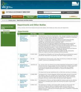
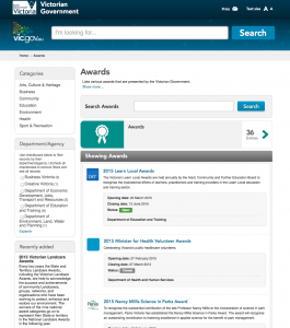
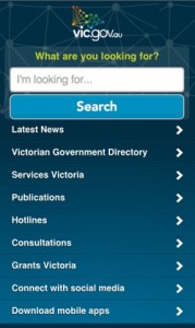
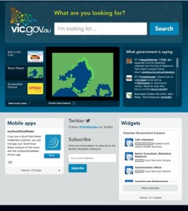
Vic.gov.au launched its responsive site in March 2013 and emphasises the search box at the top of the page on desktop and tablets, rather than a hierarchy of sections. For a user knowing which key words to search, this is a quick solution. But it can be time consuming for those preferring to scroll through core information. The smartphone site is the most responsive as it simply lists the key areas of the site.
Other successful examples of RWD: VicRoads, State Library Victoria.
Future Trends in Website Design
The use of mobile technology is only going to increase. Apple has just forged another path in mobile devices with the impending Australian release of its smart watch. While the first-generation Apple Watch doesn’t offer Internet surfing, that could change.
So, even though we can guess at what’s to come, user experience will always be at the heart of good website design. It’s important to invest the time to listen and understand audience needs.
“In a way, the future of design won’t hamper what you’re planning now if you continue to refine in the future,” says RBG’s Samantha Moon. “Have a good plan post-launch of the site and plan to invest resources and funding into post-site monitoring, reviewing, refining. Don’t just build it, make sure that you maintain it and that you continue building on the platform that you have there.”
Responsive Design Tools
- The Responsinator – A free site that allows website makers to preview what a responsive site will look like on different devices
- Screenfly – A site that allows responsive screen testing on monitors, tablets etc.
- Froont – Subscription-based responsive-design site that provides tools to design on the web
- Webflow – A site builder for designing websites
- Google mobile friendly test page
Sites
Royal Botanic Gardens – www.rbg.vic.gov.au
EPA Victoria – www.epa.vic.gov.au
VicRoads – www.vicroads.vic.gov.au
State Library Victoria – www.slv.vic.gov.au
Apple – www.apple.com/au/watch
