

Craig Butt
60 followers -
Data journalist at The Age
Data journalist at The Age
60 followers
Craig's posts
Post has attachment

Public
The Alfred provided this statement on their vaccination policies but it came too late for me to add it to the story I had on the subject today.
Here's the statement:
"Alfred Health has a robust staff vaccination program in place to help protect the health and wellbeing of our patients and staff.
We have comprehensive guidelines that provide clear information on responsibilities around immunisation, and instruct staff on which vaccinations are required prior to, and during, employment.
Staff need to be aware of the potential risks that not being immunised for vaccine-preventable diseases may pose to patients, and healthcare workers are asked to provide evidence of their immunisation status prior to starting work.
Staff may choose to get vaccinated at their own doctor, or take advantage of the on-site staff clinic at The Alfred."
Post has attachment
Public
I've got a couple of graphs to accompany my story on flu cases so far this year. I couldn't get them to work online. Click the graphs to enlarge them.
The first graph shows the number of new laboratory-confirmed flu cases each month since 2008. You can see a definite pattern, with cases peaking during the winter months and falling off during summer.
The worst month over this time for cases was July 2009. In that month alone - at the height of fears about swine flu - there were 30,000 confirmed flu cases. August last year was also a bad month, with about 27,000.
While numbers for this year so far do not compare with the height of flu season, there have been more cases in 2015 between January and May than in any other year.
There haven't been any changes to data collection over the seven years I have graphed, but keep in mind that it all depends on people with flu symptoms seeing their GP in the first instance.
A Health Department spokeswoman said: "The quality and completeness of data compiled in the National Notifiable Diseases Surveillance System (NNDSS) are strongly influenced by the healthcare seeking behaviours of patients, testing and notification practices and follow-up by jurisdictional health departments. Pandemics and other events can influence these behaviours and factors."


2015-06-04
2 Photos - View album
Post has attachment
Public
Just a quick clarification on the graphic on my story about sugar and salt content of cereals.
In the panel I've included the five saltiest cereals of the 20 the OPC analysed, which says how many equivalent pinches of salt there are in 100g of cereal.
For example there are 1.1 pinches of salt in every 100 grams of Crispix. However, this isn't saying there are 1.1 grams of salt in every 100 grams of the cereal, because a pinch is about 250mg.
The adult recommended daily salt intake is 6 grams, which is about 24 pinches.
We're fixing the graphic to remove any ambiguity now.

Post has attachment
Public
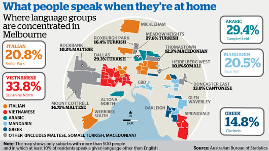
I've got a piece I helped work on today about language distribution in Melbourne.
One thing with the interactive map though - it shows the most widely spoken non-English language in each suburb but not the proportion. So one suburb may have 15% Greek speakers and the other 1% but both will come up as showing Greek as the dominant non-English language.
Also, the map only shows suburbs with more than 500 residents.
I had hoped to build a dashboard that looked at the percentage of each suburb's population that spoke languages other than English at home as well as the distribution of languages like Italian and Mandarin throughout the state, but alas I ran out of time.
Also, I had some stuff comparing Melbourne and Sydney in the draft of the story but I cut it out for space reasons. The demographers I spoke to said language groups were more concentrated in Sydney than in Melbourne, owing to geography more than anything. You can pretty much head out in all four directions from the CBD, whereas in Sydney land for housing is more scarce.
Post has attachment
Public
More apartments are being built in Melbourne at the moment than at any time in its history and about 6000 will be finished both this year and next year.
I've made another interactive for this piece as well.
I've made another interactive for this piece as well.

Post has attachment
Public
The number of homes in the City of Melbourne almost doubled between 2002 and 2012, and now there are 24 city blocks packing in between 150 and 500 dwellings per hectare.
I built the interactive that runs with the story in the new version of Tableau, which has a new storytelling feature that works really nicely in leading people through the data.
Designing interactives can be quite hard, especially when it comes to balancing explanation and exploration, but I think the storytelling feature makes it easier to find that balance.

Post has attachment
Public
My first book review for The Age and SMH, a look at Social Physics by Alex Pentland. He has some interesting insights into how ideas spread and the intersection between data science and social science.

Post has attachment

Post has attachment
Public

Wait while more posts are being loaded