
The creatives behind the new branding for the $1.2 billion Perth Stadium have avoided controversy by using a colour associated with probably the only Perth sports team unable to play there.
West Perth-based Rare completed work on the stadium's brand following liaison with stakeholders and architects after winning the initial tender.
More WA News Videos
- Video duration
- 00:59
Perth Stadium by drone
Perth Stadium by drone
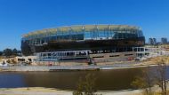
Brett Flatters took his drone out of a spin across the river in East Perth on Saturday to check out the process of the new Perth Stadium.
Up Next
Danny Green's charming interview

- Video duration
- 03:17

- Video duration
- 03:17
Danny Green's charming interview
Danny Green's charming interview
Danny Green discusses Friday night's fight against Anthony Mundine. Vision: Today Perth News.
Up Next
Don Spiers on the toll of losing his daughter Sarah
- Video duration
- 04:16

- Video duration
- 04:16
Don Spiers on the toll of losing his ...
Don Spiers on the toll of losing his daughter Sarah
In a rare television interview, Mr Spiers revealed the toll of losing his daughter and how it drove him to a breakdown. Vision: Nine News Perth.
Up Next
Perth's wettest January in 17 years
- Video duration
- 01:42

- Video duration
- 01:42
Perth's wettest January in 17 years
Perth's wettest January in 17 years
Perth has endured its wettest January in 17 years and there's more rain on the way. Vision: Today Perth News.
Up Next
Victoria Park armed robbery caught on camera

- Video duration
- 00:29

- Video duration
- 00:29
Victoria Park armed robbery caught on ...
Victoria Park armed robbery caught on camera
A 44 year old woman was home alone in the house at the time, one of the men held the victim around the neck, while the other stole items from the house.
Up Next
Top cop defends policing model

- Video duration
- 00:00

- Video duration
- 00:00
Top cop defends policing model
Top cop defends policing model
The WA Police Union says officers are a breaking point in regards to the amount of workload.
Up Next
Perth set for wet weather

- Video duration
- 01:31

- Video duration
- 01:31
Perth set for wet weather
Perth set for wet weather
Perth is bracing for more wild weather, with a severe thunderstorm set to batter the city this morning. Vision: Nine News Perth.
- Video duration
- 02:11
Perth grandfather bashed in Thornlie
Perth grandfather bashed in Thornlie
The 70-year-old was driving through a carpark when he was ambushed by the group. Vision: Nine News Perth.
Perth Stadium by drone
Brett Flatters took his drone out of a spin across the river in East Perth on Saturday to check out the process of the new Perth Stadium.
Rare said the brand identity communicates Perth Stadium's vision of a vibrant and active precinct; inclusive, diverse and uniquely West Australian.
Importantly, the colours do not represent either of the stadium's main tenants - AFL teams Fremantle and West Coast - but instead probably WA's most successful sporting organisation, the Perth Wildcats, who are well settled at their new Perth Arena home.
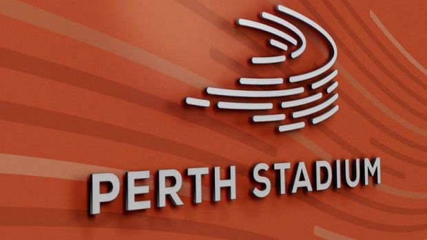
But WA's T20 team, the newly-crowned BBL champions Perth Scorchers, could play at the new stadium, with the logo strongly resembling the franchise's colours and design.
Rare said its branding drew inspiration from the Stadium's linear facade and halo roof line, with the aim of creating a sense of energy and movement.
Creative director Brett Wheeler said the agency was proud to have been involved in the project.
"It's not every day of the week you get to create the brand identity for such a major landmark," he said.
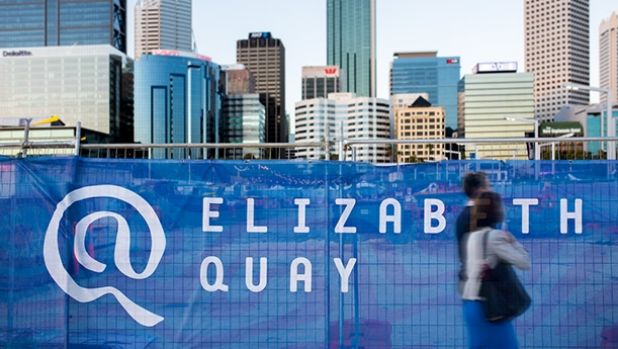
Perth Stadium is the third brand Rare has designed for a major WA project, having already completed logos for the new Perth Children's Hospital (not released as yet) and Elizabeth Quay (pictured).
Work on the Elizabeth Quay branding took years to finalise, and includes the striking 1.6km hoarding and visual identity system that surrounds the landmark.
Poll
You will need Cookies enabled to use our Voting Feature.
Do you like the new Perth Stadium logo?
Poll closes in 22 hours.
Disclaimer: These polls are not scientific and reflect the opinion only of visitors who have chosen to participate.
Do you like the new Perth Stadium logo?
Poll closes in 22 hours.
Disclaimer: These polls are not scientific and reflect the opinion only of visitors who have chosen to participate.
0 comments
New User? Sign up