According to psychologists, these are the keys to good communication. Broadly speaking, we follow similar rules in our business too, nobody wants to create a brand personality that’s a bit vague, unfriendly and mean spirited.
To increase the chances of our messages being well received, rather than rejected, we torture test them.
You need to imagine you’re the most skeptical member of the public, then you question like there’s no tomorrow.
For example, let’s say we are working with a cheese company.
They’re very good at making cheese and are insisting we tell the World that they make the best cheese in it.
The questioning starts:
1. Is this message true? This is more important to ask today than at any other point in history. Spin, half-truths and plain lies will be exposed and shared instantly.
2. Do we have evidence? People won’t believe us just the person who has the most to gain from it being true, says it. 3. Is the evidence credible? Being factually correct is different to being believed. 4. Will anyone care? A certificate is produced from a World Cheese Authority, you would still have to ask whether people buy cheese based on world rankings? 5. Is it contemporary? Is this new news or something that’s been found on some dusty old scroll? If it isn’t in the last few years it may have no relevance.
3. Is the evidence credible?
Being factually correct is different to being believed.
4. Will anyone give a shit?
Even if a certificate is produced from a World Cheese Authority, you would still have to ask the ‘Do people buy cheese based on world rankings? ’
5. Is this new news?
If this is something that’s been unearthed on some dusty old scroll in their basement it may have no relevance.
6. How do we handle it tonally? It’s true that if we are too meek we won’t even register. But ‘Best Cheese in The World!’?
We could come over like yet another bullshitting, over-claiming ad, the result being that people may find our cheese company arrogant and unlikeable.
7. How do we make it relevant to people’s lives? What’s their cheese consumption?
What are their cheese issues?
Are they happy with their current cheese’s performance?
Etc, etc.
8. How do we make it cut through? There’s general agreement that the best way to cut through is to distil down.
This process is a pain in the arse, but it stops you putting out fatuous messages that get rejected. Donald Trump seems to have no truck with this kind of process. He’s creating new rules. He distilled the process down to one question ‘What do people of dream of?’ and one answer ‘I’ll say I’ll give it to them…within an hour of taking office.’ ‘Possible’, ‘credible’, ‘do-able’ and all the words that end in ‘ble’ don’t seem to get a look in. He’s like a kid running for class representative, telling class mates what they want to hear ‘Coke machines in every class…Ice-creams at the end of every day…oh yeah, and the teachers will foot the bill, from their own pockets folks’. But, people seem to be buying it. As I write this, he is neck and neck with Hilary Clinton. Pundits are saying that traits such as ‘expertise’, ‘intelligence’ and ‘knowledge’ are viewed by skeptically by the public, as if they’re some kind of trick pulled by the well-educated elite. If that’s the case, it has enormous implications for mass communication. Should the worst happen and we find ourselves referring to Trump as Mr President, we may need to learn from his success in communicating with the masses.
It may usher in a new way of communicating.
Are our vocabularies about to get smaller?
Will our product claims start getting bigger?
Is the word ‘braggadocious’ going to become a mandatory on creative briefs?
Watch this space.
Hey Sid, where were you brought up? The Bronx, about three miles south of where Len Sirowitz was brought up. In those days you were left by yourself in the street.
We went out at 9 o’clock in the morning and except for lunch and dinner we were out and about fending for ourselves.
You learned a lot about how to handle yourself and also about relationships with other people. There were no organized activities so you made up the games and just kind of went along with it.
I guess that helped form the creative process; we manufactured our own scooters, our own wagons and even our own stickball bats. We created our own games and if we got into trouble with the police we had to get out of it on our own.
You never wanted your mother or father finding out.
You attended the High School of Music and Art. Isn’t that the one in Fame? In the eighth grade in junior high school I got into some trouble and my art teacher kind of took pity on me and he told me about The High School of Music & Art.
He also said that if I took their test and passed, he’d take the incident off my record.
Well, I had no idea what a high school of music and art was, but I figured I’d give it a shot. I passed the test and the rest is history. It changed my life. It was there that I learned about classical music, art history, politics. Children of all different ethnic and social backgrounds came from all over New York City , so it really broadened my horizons.
Many famous Broadway producers, artists, television and movie stars came from that school. The ‘Fame’ high school was called the high school of performing arts and years later they were combined and made into LaGuardia high school which exists now.
Where did you go next? Cooper Union, five years at night,that too was on a scholarship. The first year there was a foundation course consisting of architecture, typesetting, drawing, oil painting and two dimensional design. Later I went on to graphic design and advertising design.
Who inspired you at the time? Paul Rand was everybody’s design hero. Also I was inspired by everything that was coming out of CBS television. …And of course Push Pin Studios.
What was your first design job? Ziff-Davis publications. I was in charge of designing posters for the sides of delivery trucks.
On the artwork for one of them, I signed my name in very, very, very tiny letters, not realizing that when It was blown up it would be about 10 inches tall once on the side of the truck.
I couldn’t wait till that week was over and the sign came down off the trucks. You get a job at Vogue magazine, did you work under the great, deliriously happy looking, Alexander Liberman? I was an assistant to Dick Loew and I learned a lot from him about type design, spatial relationships and photography. Alexander Libermanwas the head art director and when we showed him our year’s work for review he said one of the most important things that I’ve ever heard from anyone in the business.
He said ‘everything is very, very nice but I don’t see any mistakes’.
Wow! What a great thing to say to a young artist.
Richard Avedon was on staff at Vogue at the time.
Did you shoot with him? At Vogue I got to use many great photographer’s photos in the material I designed.
Such as Penn, Avedon, Horst.
I don’t think Avedon was on staff, but he was a favorite of Jessica Daves, the editor at the time. Why switch to advertising? After about three years at Vogue I got a call from Murray Jacobs, the head Art Director at DDB Promotion. I’d worked with him at Vogue before Dick Loew.
I had no idea what DDB was about but I trusted Murray when he said it was a good move for my career.
Also my second child was born and I needed more money.
After about a year I was promoted to the National Department.
Coming from the high fallutin world of fashion, what did you make of DDB on day one? It was culture shock…at Vogue everyone was dressed like they’re going to a cocktail party; suits, ties, hats, dresses, gloves.
At DDB it looked like a scene from West Side Story with jeans, turtle neck sweaters, boots, capes and all kinds of funky headgear.
One office, on the sunny side of the building, had a Cannabis plant growing in the window. Creativity was bursting out of every office.
One art director who came to be interviewed remarked “walking down this hallway is like seeing the 1927 NY Yankees batting order, George Lois…BAM, Len Sirowitz…BAM, Sid Myers…BAM, Bert Steinhauser…BAM.
I’m sure he would have mentioned Bob Gage, Bill Taubin and Helmut Krone but they were on the other side of the building.
Do you remember the first ad you got passed by Bill? It was probably one for The Israel Government Tourist Office.
Luckily a new writer was also assigned to it, named Bob Levenson. We were sent to Israel with the photographer Elliot Erwitt and came back with lots of beautiful photos.
One of the ads we did was called “High Tea on the Dead Sea”, showing a man floating in the sea reading a newspaper with a cup of tea balanced on his knee.
Whilst looking for that ad I found it’s been used in a few trendy art collages. That man is you isn’t it Sid? Yes that’s me.
Bob Levenson and I visited the Dead Sea, we came up with this idea while there, because it wasn’t planned we had no model, so the photographer borrowed a cup and saucer from the restaurant and threw me into the Dead Sea.
I was also assigned to Eversweet Orange Juice, which was fresh orange juice in a container, unheard of at the time, the copywriter was Paula Green. Newspapers were just introducing colour, we did an ad showing orange juice flowing out of a faucet to fill a pitcher, the headline was “You can’t get fresh orange juice out of a tap”, which was the the way you made juice from concentrate.
I love the Ohrbach’s Mens Shop ad. It looks so punk now! I can’t imagine what it looked like to people on the New York Subway in the sixties? In the late 60s and early 70s graffiti was rampant in New York City. It was all over the place. Subway cars, buses, sidewalks, the walls of buildings.
The poster was taking advantage of a current craze and it seemed an unusual and memorable way to announce the opening up of Orhbach’s mens shop.
I’m in the process of putting a book together on David Abbott,(with writer Richard Foster) and along the way I came across an anecdote regarding an El Al ad of yours.
David was sent from London to the New York office for a year to understand the DDB culture.
On his first day he reported in to his new group head, Bob Levenson, to introduce himself. When he entered the office Bob was hanging a framed copy of ‘We’ve been in the travel business a long time’. David instantly put his hands over his eyes and started reciting the copy, word perfect. “Nice first impression Mr Abbott” Bob commented.
Ever heard that? I never met David Abbott though I would’ve liked to, I think I left before he got to DDB. Why illustrate the ad yourself, why not get someone who could draw? The drawing that I did for that ad was for the comp to show the client but everybody thought it was so charming that they wanted me to use it.
I guess in retrospect it was a good idea because if I’d got somebody to do it professionally it might’ve overshadowed the message.
You worked on The National Airline of Israel and the Israel Government Tourist Office. Were you also selling those Nazi cars at the same time? No, I never worked on Volkswagen. The girl in the seat was the co-star of ‘Get Smart’. I did the ad with Bob Levenson, I laid it out before Bob had seen it, just to get an idea of the length of the copy. Bob came in and read it, then said ‘I can’t do better than that, let’s use it like that’.
Around 1960, Bill Taubin and David Reider come up with an idea for a beer campaign featuring talking steins.
DDB pitched it to various brewers, but found no takers.
Then a little known beer; Utica Club, comes in for a presentation.
Utica Club’s former vice-president of Advertising Frank Owens – ‘They already had this idea of talking beer steins, and they were just presented in sketch form – they were not named at the time. But by the time we got there, the idea had been developed a little further.’ The generic steins now had nicknames and personalities. One of the steins, “Schultz,” was a Bavarian tankard with a nose, two eyes and a Prussian helmet. Another stein, “Dooley,” was an earthenware lidded mug with a green shamrock painted on his front. “Schultz was quite Teutonic and reactionary, and he feels that ‘beer iss not made de vay it used ta be,'” said Owens, “and Dooley was a mild, philosophical Irish type of mug, patterned after Barry Fitzgerald in Going My Way.” Utica Cub bought it and Sid was put onto the account. A year later Schultz & Dooley were famous and Utica Club were selling 50% more beer.
You got Robin William’s hero Jonathan Winters, the great improvisational comedian to voice the ads, how was that? We’d start recording a 60 second commercial at about 9 in the morning and Winters would just go off at tangents, it was hard to keep him focussed, he’d talk about all kinds of stuff, the Marines, he was an ex-Marine, space travel, everything, all kind of weird crazy stuff.
We’d stagger out of the studio late at night, having recorded just one 60 second voiceover.
I don’t know whether you kept any Dooleys or Schultz’s Sid, but they’re worth a fortune on Ebay? Yeah, I hear that’s right.
How did you come to be involved in the campaign to re-elect President Johnson in 1964? When the account came in Bill Bernbach put Stanley Lee and I together as the creative team.
Stanley was a straight ahead, intelligent guy from the Midwest and I was a slightly off center, brawler from the Bronx. It worked out pretty good. It was a heady time. Here I was a 32 year old kid from the Bronx sitting in the Oval Office…in the president’s chair behind his desk.
I almost picked up the phone to the Kremlin but had second thoughts.
Anyway I don’t speak Russian.
The ‘Daisy’ ad is widely considered to have changed the world.
It got Johnson re-elected with a landslide and changed the public’s views on the nuclear option. That campaign, for good or bad has become the gold standard for attack advertising. It’s amazing that the Daisy ad comes up every four years during election time, especially now that Trump is being compared to Goldwater in 1964.
At the moment almost every newscaster is showing one or more of the ads that we did in 1964, relating the situation with Goldwater back then to the situation we have now with Trump. It’s amazing, the Daisy ad has created a whole media industry. A fellow called Bill Gearhart has devoted a whole website to the making of the commercial, (google CONELRAD). Then there was also a book written about it by Bob Mann, called “Daisy Petals and Mushroom Clouds”.
Now someone is writing a play about the conception of the commercial, so you see, 55 years later it’s still alive and kicking.
It was on the cover of Time magazine, was a staple of cartoonists at the time, …and is still referenced in culture today. The ad outraged the opposition, did you ever worry some Goldwater nut would track you down? No. I was young…and dumb. I didn’t really think about.
Your ads hammered him, then everyone else jumped in. Did you ever feel guilty or sorry for Goldwater? No.
It was like a crusade at the time, don’t forget that only a few years before was the Bay of Pigs, nuclear annihilation was in the air, people were talking about it and thought it was a real possibility.
Goldwater was saying stuff like he wanted to lob an ‘A’ bomb in the men’s room at the Kremlin, or that he would give the Field Commanders in Vietnam the right to use tactical Nuclear weapons against the Viet Cong.
We were worried about what he might do…a bit like Trump today.
Which reminds me, I see that Hilary Clinton has been watching those old LBJ ads.
Here’s your 1964 original ‘Phone’ ad.
Here’s the 2016 remake; ‘PHONE 2. This time it’s personal’.
(Here’s Sid talking about the similarities to CNN: http://cnn.it/1U1EaJq and below are the posters from the new play ‘Daisy’, about the creation and effects of the ad.)
The Rheingold Beer campaign was a big deal at the time? That line, “We must be doing something right”, became an iconic line that was used for every local business for years to come.
Rheingold was a local beer in New York City was being undercut by a national brand.
We found out that the local neighborhood grocery stores were selling more Rheingold beer than anyother brand so we targeted ethnic groups with commercials that ran on the Met’s baseball games. We would get a group of real people from different ethnic groups and film them having a party, shoot raw footage and then edit it , using the music of that the particular group. Ron Rosenfeld came up with a great tagline: “In NYC where there are more Italians that in Salerno, more Italians drink Rheingold than any other beer, how come? We don’t know, but we must be doing something right.”
You’ve worked with some of the best photographers ever; Bert Stern, Wingate Paine, Lester Bookbinder, Howard Zeiff, never with Irving Penn or Richard Avedon, but the Melvin Sokolsky shot for The Continental Insurance Company is my favourite.It took two days to shoot.
One day to build a set in a railroad yard, another day to shoot. The most interesting thing is that Ali McGraw was Mel Sokolsky’s assistant and she arranged the whole thing. It was done in one shot, no strip-ins, no retouching.
You managed to get a super young George Carlin to appear in a Whirlpool ad? He was just beginning to get known, of course he wouldn’t have done a commercial if he was the George Carlin we know now.
I’ve read a lot about Helmut Krone, but I’ve never heard him described as ‘a barrel of laughs’? Humour was a big part of my approach to advertising, but it seems that a tube of humour was not in Helmut’s paintbox. As I said before, Helmut was my supervisor but he had as much interest in supervising me as my dog Cleo, which put a lot of pressure on me to come up with ads that would stand on their own without much supervision.
Both Helmut and Bob Gage were immensely talented. Helmut’s approach was more intellectual, while Bob Gage’s approach was more humanistic. I hope I picked up a little bit of insight from both of them.
What about Doyle & Dane, what were they like? Mac Dane was a very sweet gentle man who ran the business end of the agency and when he walked down to the creative floor probably said to himself; “What are all these strange people with top hats and red capes doing in my agency?” Ned Doyle was a wonderful Irishman who once told me when I was leaving to open up my own business, that you only have to be right 51% of the time in business to make a lot of money, but if you’re right only 49% of the time you’re going to lose your ass.
I remember the very first TV spot I did was a black and white commercial with the cast of the “Leave It To Beaver” show, to be filmed in Los Angeles.
I was so thrilled to be at the Beverly Hills Hotel in glamorous Los Angeles, that I took my wife to share this exciting experience.
This was a considerable expense for a young couple.
We were at a little table for two in the corner of the Polo Lounge sharing a Salad Nicoise for dinner when I felt a shadow cross the table.
I looked up and there was Ned Doyle. “Aren’t you the new kid on Polaroid?”
I sheepishly said “yes”.
“What’s that you’re eating?” he said. I
replied,” Salad Nicoise”.
“GET RID OF IT! What’s your favorite food?”
Still stunned, I said, “Steak”.
“ORDER IT!”. he barked.
He turned to my wife who by this time was halfway under the table “And your favorite?” “LLLLLobster,” she demurred.
“ORDER IT, your’e working for DDB now.!”
And with that he wheeled and headed straight for the bar.
I asked Len Sirowitz who, from of all the famous names at DDB, was most underrated.
Let me be clear, I don’t mean ‘not rated’. I meant in such a hugely talented department, who should be better known like Helmut, Bob and George. Another person who also didn’t get enough recognition was Bert Steinhauser. He did some wonderful ads for Chivas Regal, Clairol and Heinz ketchup. Bert was so enthusiastic someone described walking into his room was like walking into a room of flying colored feathers. Ever consider starting your own shop? Around 1966 Len Sirowitz, Bob Levenson, Ron Rosenfeld and I got together and talked about opening up an agency. We actually did some spec ads for Hertz and pitched the account but unfortunately, or fortunately, it went nowhere. I also had some conversations with Phyllis Robinson about opening an agency but that also kind of petered out. That’s unbelievable, didn’t DDB had Avis at the time? Bernbach surely would’ve had you executed if that had happened. Bill Bernbach was not happy when any of his children left the nest.
You worked with so many Hall of Fame writers, who was best? I worked with some of the best copywriters at DDB… Bob Levenson, Ron Rosenfeld, Evan Stark, Paula Green, David Ryder they all had different strengths. Some were great at concepts, some wrote great body copy, some were great headline writers. So…the best was? Why leave? I left the agency in 1968 for two reasons. The first being I started directing my own commercials and really loved it and I was getting calls from production companies to join them. The other reason was I was a vice president and associate creative director and I didn’t have the temperament to get involved in the politics of the agency. Also, when things get too comfortable, my senses start getting dulled. I need a little bit of fear again from going into something that’s unknown.
You seem to have worked with every star under the sun; Frank Sinatra, Dean Martin, George Burns, Joe Nameth, Yogi Berra, Reggie Jackson, Rodney Dangerfield to name but a few. What did you learn?
The bigger the star the easier they were to work with.
Frank Sinatra was interesting, he was always known for giving directors a hard time, only doing one take. I shot a Chrysler ad with him, he was a friend of Lee Iococa, it was a favour to Lee Well, we shot all these beauty shots of the car, and finally the car ends up at a private airport.
Frank Sinatra is supposed to get out, to everyone’s surprise, wink at the camera and walk out of shot. That’s it, just one shot.
I decided I’d turn the tables, just do one take.
We did one take and I said ‘Great, let’s go to the next set up’.
He said ‘What?…was that ok?…was my tie straight?..you get the wink ok?’ He was terrific, he wouldn’t have been if I’d been pleading for more takes.
What did you look for when hiring? I looked for creatives who looked at life 5° off centre, those were the ones who did memorable and original work. I also look for some mistakes which means that there trying to do something original. Nobody’s allowed to make mistakes anymore. I’ve seen some great outdoor poster advertisements. What’s the best ad you’ve done so far? At DDB it was the 1964 President Johnson political campaign, three or four of the spots I did 50 years ago are being shown today on national newscasts showing how relevant they are to this year’s election.
Are you a Mad Men fan? It was fun to watch but was light years away from the work we were doing at DDB.
It was like they were on a different planet.
What was the last good ad you saw? I can’t understand why there is such a dearth of good work being done today with all the new venues opened up like social media and the internet.
Hopefully a new Bernbach will come upon the scene and create a new BauHaus of advertising.
You’ve recently opened the oldest start up ever? At the 50th reunion of the DDB 1960 Creatives I met Don Blauweiss and Chuck Schroeder and after a couple drinks we decided we still have the chops, so why not start a new creative revolution? So we formed Senior Creative People. Thanks for your time Sid, good luck with the agency.
John O’Driscoll, where were you brought up? Before I answer that question are you sure about this interview? I don’t give short answers and have a tendency to go on a bit!
Ask my family! Yeah, I’ve heard that. I was born and bred in a Surrey village called Hersham.
Birth place of Julie Andrews and Jimmy Pursey of Sham 69.
What was the first ad you remember? It wasn’t until I was 13 that I remember seeing an advert that I actually read.
It was in a pile of magazines that my mum had bought home from her job as a cleaner in a posh house.
The magazine was destined for the grate to help get the fire going, but because it was American I thought it might contain pictures of film stars, so I flicked through this magazine called The New Yorker and discovered it was full of writing and cartoons.
I didn’t understand the humour.
There were a lot of ads for cars using sleek photos, always with a woman either in a bikini or an evening dress, or standing next to a bloke in hunting gear, standing either side of a Cadillac, Pontiac, or some other car.
I then came across a VW ad; a black and white picture of Beetle shot from the rear view, it had a chalk marks around the rear window.
The headline read ‘The Italian designer suggested one changed’
Up until then I had thought that VW’s were ugly fuckers, and who’d want to own one?
But the fact and Italian designer suggested that all they had to do was make the back window bigger made me think “What do I know?”
Were you an art school kid? Not even a consideration.
Even if I could’ve got into one I couldn’t have gone, I had to get a job as my dad wasn’t too well and unable to work.
So how did you end up in advertising? I don’t really know, accident might be a good word for it.
My ambition was to be an international athlete and a sign-writer.
Athlete/sign-writer? Good mix.
Why a signwriter? As a child I used to love watching those blokes up ladders painting shop names, being a bit of an attention seeker I thought that’s the job for me.
Also, I was encouraged by Mr Rowland, a benevolent art teacher at my school, he used to give me lettering assignments to compensate for my inability to draw.
Then a careers officer advised me that the advent of cut out letters in plastic and neon signs meant there wasn’t much call for sign-writers who went up ladders anymore.
The only local place that offered apprenticeships in sign-writing wasBAC/VICKERS, they made aeroplanes like the Viscount and VC10.
It just so happened that they had a place available, I filled in an application form and got the job.
Two pound twelve and six a week. (£2.60).
What was life as signwriter like? At BAC it wasn’t good.
There was sign-writing to be done, but most of the jobs done by my department involved spray painting the planes, inside and out.
Being an apprentice I spent most of the time preparing the surfaces for spraying, and as I was a skinny fuck in those days, I was sent up into the tail of the planes to dab the rivets because the other painters couldn’t reach.
Only occasionally would I get an opportunity to practice sign-writing.
Alf, a man in a beret who’s job was painting the name of the plane near the forward door of the aircraft, would let me paint a second coat on top of lettering he’s laid down, then he’d finish it off with a top coat.
It taught me how to hold a brush and mole stick.
The best part of the week was the day release course when I’d go to Guildford Art School for a painting and decorating course.
It was at the art school that I first realised that the factory life was not for me.
Why? Girls.
The college was full of them.
The only women one ever saw at the factory was pushing the tea trolley.
What happened next? Wally Beavais.
He was a member of my athletic club and knew I was an apprentice sign-writer, one day he told me there was a similar job called a ‘lettering artist’, and that these ‘lettering artists’ worked in places called ‘studios’, usually in London.
It turned out that he was one before he dropped out to become a hippy.
I also saw the cover of THE SATURDAY EVENING POST, another magazine my mum bought home, the cover showed a man sitting at a drawing board lettering the word ‘POST’.
The combination of ‘lettering artist’, ‘Studio’ and the Norman Rockwell illustration rewired my ambition to be a lettering artist and not a sign-writer.
So you got a job as a Lettering Artist? Well, always the fantasist, I put together a little set up in the corner of my bedroom, replicating the Rockwell scene.
Fucking tragic.
I used to sit there with my sleeves rolled up in the freezing cold, pretending I was the bloke in the illustration, what a dope.
With the help of Wally, who’d showed me some samples of his work, I put together a little portfolio. One Saturday morning I took it along to the local Youth Employment Office and told a man smoking a pipe that I wanted to be a lettering artist.
He didn’t have a clue what it was, but said he’d make enquiries.
A week later he’d arranged an interview for me as a studio junior in a package design company.
I took a sickie off from the factory, put on a jacket and tie and made my way to up to Tandy Halford and Mills in Dover Street, Mayfair.
A lovely man called Cyril Poore interviewed me.
Did you get the job? I did, but as a pot-boy and messenger. I had to get in half and hour before all the lettering artists to change the water in their water pots, then spend the rest of the day running messages around London.
Not much lettering then, did you mind? You’ve got to be fucking joking, it was a fantastic place.
In the interview Mr Poore had taken me on a guided tour of the company and apart from the posh reception and lovely offices, the place was full of girls in mini skirts.
I was nearly in a dead faint half the time, but the clincher was the studio, it blew me away, it was full of people sitting at drawing boards silently lettering away.
It was a beautiful sight, the Norman Rockwell scene but for real, only ten times over.
The lettering artists at THM were the best in town, one of them, Derek Benee, could tick in 6pt Universe caps that looked like it was type set.
He was so good he even did early test paintings for Pop artist Bridget Riley to see if her op-art ideas worked. But no matter how much I tried, it was deemed by those who knew better that I didn’t have ‘it’, so I was sent into the finished art studio, given a white coat and got taught how to prepare finished art for printing. I was being trained to be a high quality paste-up artist.
You asked me not to forget to ask you about David Bowie, so, what’s all this about David Bowie John? Thought you’d never ask. One of the other finished artists in a white coats was a bloke called Brian Balcombe, he was in one of Bowie’s early bands, one day he asked me if I wanted to join his band mates in ‘The Society Of The Prevention of Cruelty To Long-Haired Men’, as I was sporting a decent mop at the time. Then one lunch time this bloke with two different coloured eyes turned up at the office and was introduced by Brian to me as his mate Dave, we shook hands and had a little chat and he fucked off. He never asked me to join though, apparently my hair wasn’t long enough.
Did you leave or were you pushed? I was advised to move on by another finished artist, a lovely man called John Turton, who thought I had skills in other areas, like graphics.
So I was sent by THM to evening classes in graphic design at St Martins College, I’d bring my stuff in the next day and show the designers. They weren’t unkind but weren’t very encouraging either.
But John Turton lined me up with an interview as a finished artist working for ex-THM designer called John McConnell.
Sadly the interview was cancelled as his wife had had a baby a bit earlier than expected.
But good old John Turton, God love him, was so determined for me to move on that he made me answer an ad in Ad Weekly, a kind of Campaign before Campaign.
It was for a paste-up artist in an advertising agency called John Collings and he thought I’d be better suited to agency life.
What did you know of John Collings? Fuck all, in fact I didn’t even know what an advertising agency was, I just pretended I knew, John Turton was such a knowledgable and supportive bloke that I thought working in an ad agency must be okay, so I took a book full of my lettering work along and got offered a job. John Collings isn’t a big name with the teenagers today, what was it like? It wasn’t a big name in those days either.
It was a small agency made up of two halves, one did the posh ads for accounts such as El Al and Sekonda watches, the other half did postal and direct response ads, for things like muscle-building contraptions and rubber knickers that claimed they helped you lose weight around your arse, the kind of ads that appeared in the back-end of the Daily Mirror and Daily Sketch on a Saturday.
I presume you weren’t in the posh bit? No. I worked under a man called Ken Clifton, the agency’s only art director. Ken could do anything needed for direct response advertising, he could draw and was a good lettering artist.
His starbursts were masterpieces.
Ken taught me how to do type mark-ups and if anything turned me on to typography. He was good fun and a nice bloke.
What were the poshos in the other bit doing?
The posh ads were written by a free lancer called Denis Hackett, whose day job was the editor of NOVA magazine, they were designed by Derek Birdsall the legendary graphic designer.
Derek had his own man in to do his art work, so I never got the opportunity to work on the so-called good stuff.
Still, I was happy enough working there as I had a good view out the window into Soho Square and as long as I could get away early to train at my athletic club, life was okay until I got ill. I got glandular fever and was off work for two months. When I came back it was all change. The direct response client was in a bit of trouble financially and was spending less so that side of agency business was diminishing and that was the end for poor old Ken Clifton. For a time I thought that it was for me too but there was a‘last in first out’ policy so others got the chop before I did and there was also a change afoot in the agency as all the proper ads were to be done in-house by a new art director bloke called John Hegarty.
Name rings a bell, what was this John bloke better than Ken? The others in the paste-up studio were a little hostile about John, one of them even nicknamed him ‘The part time flour grader’ because was so pale.
But being a first class crawler I got on with him.
He was fantastic and very kind to me and before I say anymore, if I owe anyone big time, it’s Sir John Hegarty. For the want of a better phrase, John showed me the way.
Not long after I got back from being ill, John invited me into his office for a chat about the future.
John had prefaced the meeting by saying that one of the management had said I was an ‘enthusiastic hard worker’ and that I should know what was going on in the company.
As I hadn’t been in John’s office it was a surprise to see the ads he had pinned to his wall, among them was the VW ad I first seen as a 13-year-old.
I told him I’d seen the ad before and he said he’d had that tear sheet for years, he’d kept it since art school, he went on to tell me that the VW ads were done by an American agency called DDB and that they were responsible for other great work.
This is the feel good story of the year, what else did he say? The plans for the future of the agency, he told me that two friends from his days at Benton & Bowles were joining from CDP, and together they were going to turn the place around. His friends were Ross Cramer and Charles Saatchi. At that moment I’d never heard of DDB or CDP, let alone hid mates Ross and Charlie, but John made it all sound so exciting that I wanted to be part of it, whatever ‘it’ was. What were they like? I only exchanged about a dozen words with Charlie in all the time, he was so reserved, but Ross was very funny and it was from him that I discovered that piss taking was an art form.
To me it seemed like Ross was the brains of the two because Charlie never said a word.
They did some great work together, but none of it ran.
What about that John bloke? I found him very reassuring and he gave me hope.
When I declared that I had no drawing ability and asked whether that would be an obstacle to me being an art director, John said that the art of good advertising is not down to being an artist but having a good imagination.
At that very moment I grabbed that notion and have held on to it ever since. The conversation also helped me to refocus my ambitions, as my girlfriend had just dumped me and The Head Coach on the Olympic Potential Course had advised me that I had no future as an international triple jumper; my legs were too short! So over the next few weeks John enlightened me more about advertising, telling me about other great New York agencies like PKL, Wells Rich Greene and Delehanty Kurnit & Geller.
He bought to my attention names like Helmut Krone, Bob Gage, Bill Taubin, Len Sirowitz, Bert Steinhouser and George Lois.
He introduced me artists like of Seymour Chwast and Milton Glazer of the Push Pin studio and to maybe the greatest type designer ever, Herb Lubalin.
He also gave me his back copies ofan American magazine called Art Direction, the firstmagazine I ever paid a subscription to, pure advertising porn, and as John had also made me his assistant I subscribed to another mag called Ad Assistant. I was that keen.
What was the first ad you worked on? The first I ad I put together was a four-inch double for Eugene.It was their anniversary and John said I could design and put it together.
It was nothing special but it was a first thing that was all mine.
Then John then gave me another anniversary ad to do, but this time to write.
It was for Sekonda, the Russian watch maker.
I wrote a headline which went something like ‘Congratulations from your top British agent.’ which at the time wasn’t too bad a thought as the cold war was still going on. Never ran though.
But most of the time was spent cutting and pasting up ads.
How did you get into DDB? Well, it seems every time I was away from John Collings something changed. I went on holiday for a fortnight and when I came back John told me he was leaving to join Ross and Charlie in a start-up; Cramer Saatchi. I was crestfallen, but needn’t have been as John had arranged an interview for me with an old college friend of his called Doug Maxwell, Head of Art at DDB. I got the job in the Bullpen, (American name for the paste-up studio), and at the same time Doug made me his assistant.
What was the DDB like? Fantastic.
The offices had just been done up and were very modern, for the time, and the girls were beautiful, and the men were tall dark and handsome, bar Malcolm Gluck, a gay writer at FCB used to say he got a hard-on every time he walked past the DDB building.
How was the Bullpen? Like a town square; everything revolved around it, all the art directors offices looked out on to it.
There was such pride in the work that even the account men would come and watch the ads being put together. The job was fantastic.
There was no photosetting at that time so all the type was set in metal, headlines were cut up to make the spacing look right, body copy was cut up to get rid on unwanted gaps between letters. Copy was changed if it was felt that there was too much space in lines.
It was finicky but satisfying.
That’s how I learnt how to be an Art Director.
Got a picture of the studio team which includes the UK’s greatest art director Neil Godfrey. What accounts did you work on? First things I put together were for a Lufthansa campaign that David Abbott had written, I always liked them but David told me latterly, even when they got in the D&AD annual that year, that he hated the art direction, done by an American AD who had just gone back to the States.
Doug had been working with David Abbott on LWT which had just won the franchise for weekend TV, so I got to put some of them together.
They were lovely ads and all got into the D&AD annual.
How did you claw your way out of the Bullpen? Did you say crawl?…I think being a very enthusiastic secretary for the DDB football team might have been an advantage, it was mostly managed by the Creative Department and as I organised all the fixtures I got to spend a lot of time in their company. It was a good team as it happens, we had an ex Spurs Junior called David Bryce was a winger. Our captain was Martyn Walsh, the one who doesn’t get enough credit for the ‘Labour isn’t working’ poster, Tony Brignull was our centre half and a dirty bastard and on occasion, David Abbott played in goal, David Brown, the writer of the famous Ridley Scott directed Hovis film where the lad pushes his bike up the hill to Dvojak, was a dead ringer for Georgie Best, not only in hair style but how he played. He was brilliant.
I was an effective right-winger because as a club sprinter I was clocking 11.01 for the hundred metres, which was very useful on those small pitches up at Hyde Park, all agency left backs were fat fucks so I pissed past them.
We did quiet well and even got to the Ad Agency Cup Final, only to be defeated by Royds.
My memories of the occasion are that the Isthmian league team Hendon’s pitch was too big for a bunch of blokes used to those postage stamps up at Regents Park, both teams were fucked by half time and that the medals were presented by the legendary cricketer and Arsenal winger Denis Compton.
Who was pissed. How was David Abbott? David was the Copy Chief when I arrived, but it wasn’t long after he was made Creative Director, as the previous one, John Withers, had just gone back to the U.S. The great thing about David was that he gave everyone one a chance, so all the assistants were given the opportunity to have a go at doing an ad.
What was the first ad you created? I was put together with a lovely writer called Mike Doyle, a plastic Paddy like myself, to do an ad for Lufthansa. It was to appear in the Travel Trade Gazette feature a lady at the airline who specialised in organising flight arrangements. Not a spectacular brief, and in the end not a spectacular ad, but it was an opportunity. So for the first time ever I sat in an office with someone, feet up on a desk, talked shite and did an ad. It was the first real ad and I got to work with a real photographer and art directed it myself. It was because of that ad that I was made a Junior Art Director, I moved out of the Bullpen and into an office. Well,half an office, it was a space with a desk, a phone and a half a wall around it, a cubicle.
What else did you work on? The first dealer campaign for Volkswagen, I was put with an Australian writer called Terry Bunton.Two points: It’s the wrong font, it should be Futura and VW ads are supposed to be black on white, not white on black? Dawson Yeoman and Arthur Taylor a campaign that was binned by Bill Bernbach.
Arthur came through the ranks at DDB New York, he was assistant the great Bert Steinhauser and had a fondness for bold looking art direction. So his and Dawson’s ads bore no relation to the Helmut Krone look. As you say, it was the reverse; giant headlines set in Standard Extra Boll with Rockwell medium copy. See, can still remember it!
Mr Bernbach did not like it. This all happened a bit late for Terry and I, we’d already done the dealer ads in that look and they were out there in the showrooms.
I have a fond memory of the time as Peter Mead, the ‘M’ in AMV, was the account man on VW took Terry and myself out as a ‘Thank you’, to the famous 60’s Mario and Franco’s ‘Terrazza’, the equivalent of The Ivy these days.
Another reason I remember well is because it’s was the first time I’d eaten spaghetti that hadn’t come out of a tin.
Writer David Brown and I discovered that a designer at Rolls Royce drove a Beetle.
But he wouldn’t appear in our ad because he thought it might not go down to well with his bosses. What ads influenced you at the time? All the ads were sent once a month from the New York office.
It was like Christmas, but every four weeks.
We’d all stand around the big cutting table as the studio manager Keith Craddock would unravel the ads from the tube.
I can remember to this day when the ‘Rat ad’ by Bert Steinhauser and Chuck Kollewe was unfurled. That was a moment!
Why leave for PKL? Things changed, at first for the good as I’d climbed up the greasy pole to become a proper art director, given a proper office and proper accounts to work on like Atlas Copco, Bankers Trust, Northern Irish Tourist Board, Tern Shirts and VW. I was lucky in those days with writers, I struck up a good working relationships with two in particular, Terry Bunton and David Brown. David and I did a lot of ads for VW, but one of our first ads together would’ve been the first thing I got in the D&AD annual, for the Banker’s Trust, but the creative secretary cocked-up with the entry forms and it was credited to another art director. This disappointment was followed when David Abbott, who’d become Managing Director as well as CD of the agency, dramatically left to set up French Gold Abbott. To replace him DDB bought an agency called Gallagher Smail, their ethos wasn’t quite the same as the DDB I’d grown to love under David. Gallagher Smail were originally a breakaway from Mather & Crowther, (later O&M), and were more like a JWT, Y&R or McCanns in spirit. That said, in hindsight they had some good creatives and among them was your hero Paul Arden.
What was PKL like? The agency I joined was actually BBDO, as they had not long bought PKL.
The future author of ‘A year in Provence’ Peter Mayle was the Creative Director.
The place was a hoot, I’ve never laughed so much in my life.
There was some great characters in residence, very funny people.
Legendary agency wit Rick Cook was there.
The creative department was nick named ‘Peter Mayle’s Toy Box.’
The Christmas ‘do’s’ were legendary.
They were called Tupperware Parties, everyone in town wanted an invitation, we were such inverted snobs we made sure that the ones who really wanted to come didn’t get one!
What about the work? Like after all mergers, the work was patchy but going in the right direction with Tim Delaney and his art director Desmond Serjeant leading the way, they did some great work on Sony and exquisite work for the wine vituallers; Grant of St James.
I went to work with a writer called Madeleine Thornhill for a time but she left to become a picture framer so, I was put to work with a very young Paul Weiland.
Did you and Paul do anything good together? We wrote and made one commercial for Adams Cheeses titled ‘pantomime Cow’ that was reviewed in Ad Weekly with just seven words: ‘This commercial is too awful for words.’ It was.
Your writer was a lanky chap called Tim, how was Mr Delaney? Well you know what he’s like! I was put to work with Tim by Peter Mayle after Desmond Serjeant went off to work with David Abbott at FGA, because he said I wasn’t scared of the skinny fucker.We also worked on the Body Language Bra account. Maybe the best account I’ve ever worked on! The client used to brief us by way of private fashion shows on a specially built cat walk.
Models of all shapes and sizes would parade up and down in bras and corsets.
Tim and I would sit there watching, holding our breaths and barely containing our trousers while the client, with a straight face, would discuss the finer points of how lift and separate bras worked. Schoolboy hysteria used to break out in the cab on the way back to the agency.
Not that the visits went to waste, we put together a campaign for an under bra for ladies who were not over bosomed.
Tim’s line on the ad below could still run now and not sound too shabby. One of the best ever copywriters in town, the grumpy fucker. Was he scary then? Maybe to some he could be a little intimidating. As you know our Brendan, (Tim’s second name), is very sure of his opinions, especially about ads and politics, and if you can believe it, even more so in early 70’s.
He was very quick to share with them with people whether they wanted to hear them or not.
In fact his nickname was the ‘Blushing Bully’ on account that he used to go red when he got really going. Did you two get on? Oh yeah. I learnt a lot from Tim, he’s a very classy and erudite man considering he’s of the same bog Irish class as I am, we had a laugh most of the time, but on occasions he was a little critical about my layout skills, which apparently he did with all his art directors.
It got to me one day and I went into his office with the sole purpose of hanging him out the window by his skinny ankles, but before I could lay my hands on him I burst into tears.
Told him what I was going to do and he just laughed, but I have to say after that he was as good as gold. For a fortnight! The ad above was a stand-in which we ran while we waiting for John Gorham to finish his illustrations. The one below was done after John finally got the illustrations to me. Mr Delaney was at his best on Sony, we did an ad that showed a family watching a giant flat screen TV , hanging over the fire place.
In 1975.
That was his vision not the clients.
How far thinking was that?
I was even in the room when he thought of using John Cleese to write the award-winning Sony radio commercials. We didn’t work together that long.
At the time there were management changes in the agency, Peter Mayle had left to go to BBDO New York to facilitate his exit from advertising, so he could write books.
Before he went he made Tim the creative director, which was great for him and the agency but in the long run, but was not a lot a fun for me as had to spend a lot of late nights in the office and working Saturdays, as during the day Tim was in meetings.
PKL morphs into BBDO and you get a new writer; John Kelley, did you click straight away? Yes, something did click.
I’ve been very fortunate with nearly all the writers I’ve worked with as they all have been ego free. John was, and is, the most easy-going and uncomplicated man to be with.
He just got on with it.
There was never any competition to get to idea first, even though John usually did, but if I’d had a better one he’d cast any thoughts he had aside.
We’d got together when John’s art director, John Horton, had gone on a big BP shoot in Australia, leaving him without someone to work with, and as Tim was so busy being a CD we were put together to work on a pitch for Skol lager.
Which ad got you two noticed? There wasn’t one. How did you come to be at CDP then? Because of John Kelley. He and John Horton had done an animated campaign for Mace food stores, with talking prices.
It was wonderful.
Frank Lowe’s wife at the time had produced it at BBDO, and had obviously told him about the campaign, he loved it so asked John to join CDP, John then asked me if I’d go with him.
I thought about for a millionth of a second and said yes. Got lucky there old boy!
That all said I still had to go through an interview process with the CDP’s Head of Art, the U.K.’s best ever art director, Neil Godfrey.
I must have past muster with him as he didn’t object to my appointment.
Arguably, CDP had the best creative department in the country, were you intimidated? Nervous more that intimated, because there was no hiding place at CDP. You couldn’t blame your shortcomings on anybody. Not the account men or women. Not the planners, who were more friends than foes. Most of important of all; not the clients, who’d placed their business with the agency for the same reason we worked there; they wanted to make good ads. Even the media department good, run by the amazing Mike Yershon. He would haunt the floor of the creative department seeking out ads or commercials so he could show them off in the best possible way to the public.
One of your first ads at CDP, based on the cunning insight that when scientists left their laboratories for a dinner party they didn’t want to have to lug around their heavy ballpoint pens.
Tell me about the ever so slightly sexist Palio ad? We thought it was just a bit of fun at the time, but understandably it would be considered very un-PC today. It upset a few people back then too, a postcard was soon circulating that showed the poster in situ with graffiti written on ‘If this was a man it would get it’s face slapped.’.
Quite right!
Why on earth did this win a silver at D&AD? Terry Lovelock, ‘Mr Heineken refreshes the parts etc’, originally penned a headline that read “I’m Lena, Fry me”, it was a spoof of the National Airline campaign.
Problem was that the sausage wasn’t actually leaner, so the line was change to ‘Meaty’.
Now why did it win? I don’t know? Blame the D&AD poster jury at time.
Might’ve been because they got the gag and the shot, by Ed White, is maybe the best picture of a sausage ever to have graced a poster site. AN ANECDOTE: I was a so-called expert witness in a court case where the widow of an up and coming photographer Peter Barbieri was suing the City of Westminster and the Gas Board for negligence. One late evening Peter ran over the pot hole while on his motorbike causing him to be thrown over the handle bars with fatal consequences.
During my testimony I had to show my credentials and the D&AD annual with the Wall’s poster in it was used to confirm that I had some standing in the ad business.
The book was handed to the presiding judge who took a long look at the ad, shook his head and commented that the banger looked a “Mighty fine sausage”.
I’m pleased to report that eventually both Westminster council and the Gas Board admitted their guilt, the judge awarded substantial damages Mrs Barbieri.
Now that’s worth a silver don’t you think?
Presumably you presented your work to notorious creative curmudgeon Colin Millward? No, as Colin had retired by the time we’d got there, John Salmon was the CD.
I didn’t think Colin was scary until he pulled me up sharp one evening, we were in New York for a Heineken voiceover session with Victor Borge.
He and Frank Lowe, (who always attended the Borge V/O sessions), were in town en-route to Arizona for the B&H ‘Swimming pool’ shoot.
We all went out for pre-dinner cocktails at a bar on the top of the Twin Towers in New York.
While sipping a gin martini I gave some flippant reply to Frank when he enquired about how the casting was going on another job, Colin very sternly reminded me that I should give a proper answer as I was paid enough to do so.
That was after spending the entire afternoon with him visiting art galleries.
Up and until then I thought him and I were best mates.
Apparently not.
You worked on the early Heineken stuff? To keep the client onside so the business came along to the fledging Lowe Howard Spink, Frank briefed us to give the poster campaign a more continental feel in both concept and graphics, so Tony Kaye and I sat down to meet the challenge. Thus the flags and no ‘Heineken refreshes the parts that other beers cannot reach.’ It’s safe to say that as soon as the client signed on the dotted line the flags were soon taken down and the ideas returned to that on home turf.This rough was shown to the Greek client, he went absolutely mad as those guards on ceremony were considered sacred. The photograph below was taken by the great photographer Elliott Erwitt as it was based on a picture he’d taken for the French Tourist board in the 60’s.
While at CDP, you and John Kelly competed with Paul Weiland & Dave Horry on who could have the most ads on air at any one time. Who won? As far as John and I were concerned we just got on with our own work, not worrying what the others were doing.
Also David and Paul were old friends from the past so we took as much pride in their work as they did.
We all won our fair share of gongs and some did better than others.
For the record, Horry and Weiland would take first prize as they both have black pencils in their satchels.
You had the brief to follow-up one of the best ads ever? You mean the Benson and Hedges sequel film that no ones ever heard of?
Not quite a poisoned chalice but maybe a cup of cold tea.. but that said, on reflection it’s a good film and it’s journey to the screen is indicative on how brilliant the agency worked.
John Salmon asked us to have a go as other teams were struggling to come up with another film as good as ‘Swimming Pool”.
We were happy to have a go but thought we wouldn’t crack it either.
To be quite frank, the B&H campaign wasn’t our sort of thing, we always thought it was the domain of the arty farty teams in the agency.
It’s a great ad. Thanks to an art director called Rob Morris.
Rob had put together a B&H poster that was to run in three parts.
First one showed a safe laying on the sea floor all chained up.
Second poster had it open, full of B&H gold boxes. Third poster just showed the empty safe. That thought stuck with us, so we worked out a script that showed scuba divers go down to a sunken ship and discovering a hold full of B&H packs. All this was to take place in green-blue waters just off some coral reef somewhere exotic. Our fantasy was be sitting on a beach somewhere while a crew shot the film then surfaced to show us the results on the video play back. We’d nod ‘Yes’, the carry on sipping our Pina Coladas or whatever was on offer. That script was put to one side so we could work on other ideas. One was an homage to all the posters where we showed all the previous work, can’t remember the detail, but it was titled ‘Surreal St’. Anyway we showed them to John Salmon, he took to the one with the pack in the sunken ship, but suggested that the film should look more industrial and take place in somewhere in the North Sea, more like a BBC2 documentary. After a rewrite we showed it to the account director on B&H, John Spearmen, who suggested would it be a nicer idea if the film took place at night to look even more dramatic.
Why Hugh Hudson not Ridley Scott? Good question.
You see in those days Ridley was considered by the agency as a bit of a glossy director, Hugh was considered more of a ‘film maker’, even though Ridley had just made a feature film; ‘The Duelist’.
When the commercial was due to be in pre-production Hugh was in post production with ‘Chariots of Fire’, andhe didn’t want to leave London as the premiere of the film was coming up, so he suggested our ad was shot by the Tower of London with Tower Bridge in the back ground. Hugh also suggested we made the pack 40 feet tall. See what happens when you get top quality people on the job, easy peasy.
By the way Hugh won the silver for best direction for the film so it couldn’t have been that bad.
You became an album designer for a while? Only when working on EMI 20 ‘golden greats’ assignments.
The album design came with the brief.
Most likely the best work I ever done as an individual. Is that all the covers you did for EMI? I was asked to coordinate with Gerald Scarfe on The Pink’s ‘The Wall’ album sleeve. Cool. No way.
I found Scarfe as a bloke a bit of a disappointment, despite his quite hard arsed satirical cartoons he seemed a bit wimpy and through out the process, he seemed to get bullied by Roger Walters, who I believe was, and still is, a bit of a twat.
I finally got dumped from the project after delivering the dummy of the album to the band’s manager one Saturday morning.
I then had to deal with the record company not wanting to pay the bills of all the suppliers I’d got involved in the project.
Have had an intense dislike of anything Pink Floyd ever since. Wankers.
Then on to publishing? Only in a small time way.
Alfredo Marcantonio joined CDP.
I had known Marc as a client on VW when I worked at DDB. He’d always wanted to be a writer and eventually came to CDP to work with Rob Morris.
At a lunchtime Creative Circle awards ‘do’ he told me he had the idea for the book and asked me if I was interested in doing it with him. A great experience.
As David Abbott was a co-author, Marc and I got to meet Bill Bernbach and shake his tiny little hand and have a chat. By the way the book now in its 5th edition and available through our website http://www.greatvwads.com Buy now while stocks last! I noticed you’ve got a sticker on the books saying ‘The ads that made the mad men Mad.’ Has the series helped book sales? A bit.
What about the sausage book? Yes, I’ve been working on ‘Max The Flying Sausage Dog’ with Richard Kelley and the celebrated children’s book Illustrator Arthur Robbins since 2006.
It’s been classic Kelley relationship. No egos just hard work and collaboration.
We started off naively by getting Arthur to do the illustrations and put a dummy together not realising that’s not how it’s done, as I found out after a meeting with an editor at one of the country’s leading publishers, he said “I find a story I like, and work closely with the author and when I think the text is right I choose a suitable illustrator, then I brief a designer to put a dummy together”
Thought that comment was a one-off but it was a mantra from publishers there after.
That said we did come close with one big one but the deal was so awful we decided we’d self publish.
That was two years ago and we are now on our third book and proving, that through social media, you can sell books.
And not to miss a selling opportunity readers, for those with young sprogs it available at http://www.amazon.co.uk/Max-The-Flying-Sausage-Dog/dp/099103645X Buy now while stocks last! You’d be surprised how young some of my followers are.
I’m sure if their mums buy them copies they’ll love Max The Flying Sausage Dog.
What is your favourite piece of work from your days at CDP? Well, apart from the EMI covers and the films that went with them, we also did a campaign launching the tabloid size of the Daily Express.
The paper had the rights to the auto biography of the eccentric millionaire Howard Hughes and wanted to use excerpts for the launch.
We wrote trailer type commercials, which at the time were considered ‘fresh’, wonderfully shot by Alan Parker.
We did a Heineken commercial called ‘Tennis’ based on the Pong game that was all the rage in pubs at the time.
There was also a Fiat commercial we made called ‘Train’ that I think is the best film John and I wrote together. Very nice story about a man, along with his family, is seeing his mum off home on a train and as it pulls out of the station its realised her suitcase is still on the platform, there then followed a chase across the Tuscan country side to catch up with the train at the next station. Beautifully cast and filmed by Michaeal Seresin. So…everything you did then…that was your favourite?
CDP blows up and you leave to join Lowe Howard-Spink as a founding partner and Head of Art? It didn’t blow up, a group of us set fire to it. Frank Lowe was not in a good place at the agency because of bit of a problem with the taxman so he was no longer in charge and as he wanted to be his own boss so he and Geoff Howard-Spink set up their own place and invited John Kelley and I to join them as Creative Director and Head of Art. Seemed like a good idea at the time.
This poster was most the most original poster idea both John and I did for Heineken. I commissioned Phil Jude to take the picture, he was one of Lester Bookbinder’s most trusted assistants and a great photographer in his own right. Despite Phil’s warning that what I was asking for might look a little insipid, I insisted that he took the shot as I wanted, as I was worried the ‘i’ might be missed in the logo.
It wasn’t until the proof came in I discovered he was right, It was insipid. I went to Frank and admitted that I’d fucked up, he just said go away and re-shoot it.
This time I let Phil do it his way. Insipid it aint!
Did you do any good work there? If I am honest we didn’t do anything on the level when we were at CDP.
We did do quite a nice film for Fiat that got in the annual and a Bird’s Eye film that now seems to be the only commercial that John and I did together that the public of a certain age remember. When sometimes asked by the occasional oldie, who I haven’t met before,“So what would you have done anything I’ve seen on telly all those years ago?”, I say the Heineken ‘Tennis’, Fiat ‘Train’ and the B&H film.
The response is usually blank, but when I start to sing the opening lines to the jingle we wrote for Birds Eye Steakhouse Grills, it was sung by a group of workmen in the back of a transit van in the ad “Will it be chips or jacket spuds, Salad or Frozen peas… Will it be mushrooms, fried onion rings. we’ll have to wait and see…Hope It’s chips, it’s chips, we hope it’s chips,it’s chips, we hope it’s chips,it’s chips” their faces light up!
The fuckers sometimes even join in with me and sing the chorus.
When I see it now it seems like a bit of fun, but at the time our chums thought it was naff, when visiting Soho eating establishments, so called friends would start singing silently under their breaths “Hope it’s chips, It’s chips. We hope it’s chips, it’s chips”.
It was John and I’s resignation script from Lowe and Howard-Spink, we presented it to Frank at the same time we resigned.
We were told after leaving that the ad was so successful that the client wanted more of the same from the agency, which Frank didn’t want to do as he hated the film.
The business moved on shortly after and I think we were never forgiven.
What was Frank like? I can categorically state that in my humble opinion Frank Lowe was the best account man ever in British advertising.
Ever.
As a director I’ve met a lot so-called good ones in pre-production meetings.
None of them in the same league.
If there was fear factor at CDP, getting an ad past Frank was more important than anything else, that included getting one approved by John Salmon, who again, in my opinion, was the best creative director of the lot too.
Frank didn’t have a creative thought in his head but he knew a good ad or script when he saw one and broke his arse selling it.
I could go on with his virtues as an adman but it would take all day.
He’s worthy of another blog post Dave, but with those who knew him better.
Why Abbott Mead Vickers? To be quite honest I don’t think we suited the job of bosses.
We were a little disappointed we had to deal with contractual arrangements with Frank and Geoff, so it all felt a little flat for John and I, and this dissatisfaction must have got to David’s Abbott’s ears as he gave us a call.
So we jumped ship again. Was the AMV David different from the DDB David? No, exactly the same. Same man, same suits, same haircut, same modus operandi and he still sang out of tune. I loved the place but not the job anymore. Why? Planners…they were in the works. ‘A planner in the works’ Makes me laugh! What’s wrong with planners? Whats right with them!
Only joking.
For some reason, albeit rather naively, I couldn’t deal with the level of interference of planning in the creative process at AMV.
It hadn’t been that important in all the previous agencies I’d worked in.
Up until then, John and I had worked on the basis of ‘Get the brief.’ ‘Do the ad.’ Get it approved by the client’ Make it’ and ‘Move on.’
Personally, I couldn’t deal with the planning or for that matter Joe public having a say in the work. This churlish and old-fashioned view led to me losing the old mojo for making ads.
Despite working with John Kelley, one of the best creative talents in the U.K, my heart wasn’t in it anymore, which coincided with Paul Weiland asking me to join him at his production company.
So off I went to be a director. Thanks John, it’s been wordy, and a pleasure.
Nb. For those who want to O.D. on O’D: A bit more John.
His chair.
I bet there were few takers for the 1966 National Library Week brief amongst DDB New York’s creative department.
Because the previous year Charlie Piccirillo had produced the definitive ad.
It looks so simple and innocent.
But try ignoring it.
Or forgetting it.
It’s impossible.
It makes you think about books and libraries in a new way, without big dramatic photos or imaginative colourful drawings, using only the very product it’s promoting; the alphabet. Whilst interviewing a couple of guys from that sixties creative department I stumbled upon this and couldn’t resist sharing it.
“One of my earliest assignments after being made an Art Director was a PSA ad for the Public Library. Full page, NY Times. Wow. How did this one get by my supervisor, Bill Taubin who seemed to glom all the plums? Probably because he also assigned me a ton of small space ads for EL AL that would run in the Tel Aviv News, where the ads would be translated into Hebrew. In any event it was a big opportunity for me and Monte Gherlter so we spent some long nights working on it.
We finally came up with the idea of using the alphabet as the visual.
abcdefghijklmnopqrstuvwxyz
I set the line in 12 pt type and placed it in the middle of a full page of white space. Monte’s headline still holds the record of being the longest headline ever written in DDB history. However, it was brilliant: In your Public Library they have these arranged in ways that can make you cry, giggle, love, hate, wonder, ponder and understand. I sent the copy out for type (remember that) and in the morning did a rough paste up. I was so excited I decided to show the ad off to the art director next door, which just happened to be Helmut Krone. He took a long look, then he said, or rather growled, “Boring”. I was crushed. I spent the next 2 days and nights putting together a dozen new versions, using every imaginable alphabetical visual device from children’s blocks to a bowl of alphabet soup. Then the trouble was, I couldn’t make up my mind. So I called Nancy and asked if I could come up and see Mr.Bernbach. To my surprise Nancy said he was coming down to see Bob Gage and would stop by my office on the way. Bill come to my office? I called all my Art Director buddies to come take a look. When Bill came in I had all 10 versions pinned to my corkboard. He glanced around and looked as confused as I was. Then he said: “This is a really good idea Charlie, but boy did you screw it up”. Why don’t you just put down the alphabet in small type across the page as the visual. It would be much more powerful.” I said, Bill, that’s the way I started, but Helmut thought it was boring. Bill shook his head, and as he walked out he said, “Charlie I’m going to see Bob Gage now, and the first thing I’m going to tell him is to give you a raise, then I’m going to tell him change your office”. The Library ad won my first Gold Medal at the 1962 Art Directors Club Award Show. It’s still my most treasured.“
I used to walk past this poster every week for about a year . I was fifteen an my Art teacher had got hold of a 48 sheet, or I should say 48 sheets, as it was life-size, twenty or thirty foot long, and papered the corridor leading to our classroom. We were all bemused by it at first, but once the gold pack was discovered we thought it was cool. Who knew adverts could be so hip, sophisticated and playful?
It made a lasting impression.
1965: The Government banned cigarette companies from advertising on T.V.
Press and posters become crucial to Tobacco companies.
1971: The Government declares that cigarettes must carry a health warning, and that press and poster advertising must donate a strip at the bottom of their advertising to print the message ‘Every pack carries a Government Health Warning.’ In retrospect, that’s the least they could’ve done, but at the time it must’ve caused outrage in agencies with cigarette accounts; ‘You mean we need to take a piece of OUR pages and posters, space that WE’VE paid for, to say bad things about our product?’ So you’d have all the creative bods in an agency trying to say good things about their brand of tobacco in the top bit of the ad, and effectively, at the bottom it would say ‘Yeah, whatever, we think it’s RUBBISH. signed THE GOVERNMENT.‘
1976: The Government come up with some more rules for the Advertising industry: ‘If you’re advertising Tobacco DON’T feature people using the product, in fact, DON’T feature people at all. DON’T say anything about the product, don’t even mention it, DON’T even write it’s name on the ad, DON’T even think about its name when you are creating these ads.
Come to think of it, the only words we want to see, and we want them in black on white, clearly legible, nice and big, saying “This product gives you lung cancer or can kill you”. Capiche?’
1977: Benson & Hedges agency, Collett Dickenson Pearce, are increasingly irritated by the number of companies aping their original Gold Box campaign.
It meant that B&H advertising was starting to get lost in the crowd.
The account guy on the business, John Ritchie, made a big call; ‘Forget all we’ve done! we need something completely new!’ It was a big ask; the ‘Gold Box’ campaign was famous, award-winning and had turned a niche product into the brand leader.
As if that wasn’t pressure enough, the new Government rules meant you couldn’t show or say anything about the product.
So not only have you got your hands tied behind your back, you have one leg tied too.
Art Director Alan Waldie and Copywriter Mike Cozens were one of the teams given the task. Waldie: “Days drifted into weeks and Ritchie, who was forever chasing me, said “What have you got?” I said we’ve got something. It’s probably not quite ready. It’s a bit different. It’s dare I say, a bit advanced. I’ll need to explain it”
“You won’t need to explain” said Ritchie “Let’s have a look”.
Silence descended on the room as they gazed at some totally incomprehensible layouts of birdcages, mouse-holes, eggs, sardines. No messages. No words at all. Unified only by a solitary gold pack.
A rival team had also created a campaign. Unsure of which to go for, CDP M.D. Frank Lowe takes both to his mentor, former CDP Creative Director Colin Millward, for his view.
‘One will let you sleep at night, the other will make you famous’ was Millward’s verdict. Sleep wasn’t a priority for Frank Lowe or CDP, so the ‘famous’ campaign was presented to the B&H Chairman Stuart Cameron and Marketing Director Peter Wilson. They loved it, telling the agency to spare no expense in photographing the ads. When money was no object Brian Duffy was the guy, he was promptly called upon to turn Waldie’s drawings into photographs. An ‘arty’ choice.
He wasn’t the consummate commercial photographer.
He was opinionated, experimental and very creative.
Brian Duffy was one of the trio of famous cockney snappers, (the others being David Bailey and Terrence Donovan), probably the least known, arguably the most talented.
Duffy went to work and had the sets built in his Primrose Hill studio. Duffy: ‘I changed the colour and scale of everything, which looks pretty weird today.
I played with optical illusions, since I know enough about what lenses can do and plate cameras and changing perspective.
They’re real photographs and it’s quite complex to do things like that, which look like trick photography. They’re not phoned in from the coast, it’s all done in the camera.’ The first shot was ‘Mousetrap’, showing a pack replacing to lure to a presumably nicotine addicted mouse from its hole. He tried five different lighting set-ups before settling on the final image.
It set the style for the campaign. Duffy’s son and assistant Chris remembers that ‘Birdcage‘ was a very simple set unusually lit, ‘We lit it with an old Rank projector light and through it we projected an image of a bird that we had reversed out on a negative.’ David Montgomery was then called in to shoot these two. Adrian Flowers shot the last of the first years campaign. The shots still look amazing. They looked even better when blown up and put on billboards. They were like nothing people had seen. If they ran tomorrow they would still be like nothing most people had seen. Here’s an from of one at Victoria Station in 1978. The campaign became so famous even the Government spoofed it. The brief was then opened up to the whole creative department.
Here’s what Neil Godfrey and Tony Brignull made of it with photographer Jimmy Wormser. (Shot for real.
The agency and photographer turned up in Egypt on Sunday.
Scouted the location on Monday morning; perfect.
Turned up Tuesday to shoot; too hazy.
Turned up Wednesday; too hazy.
Thursday; too hazy.
Friday; too hazy.
Saturday; too hazy.
Sunday; too hazy.
Monday; perfect.
It turned out the hazy effect was pollution from the local factories, only after a weekend of not pumping out crap was it shootable.) (This one was shot on the top floor of the National Liberal Club, the payment was the luxurious fitted carpet used for the shot. Because the young people were in and out of each others rooms all night, photographer Adrian Flowers used a ’20 – 30 minute exposure, so that they wouldn’t show up on the film’. Again it took a week to get a result they were happy with.) Two years in, the question was asked how would this new surreal B&H behave in film? The answer, created by Waldie, and Mike Cozens was shot by Hugh Hudson.
It was also featured in the Guinness Book of Records every year until the mid-eighties as the most expensive commercial ever made. (Worth every penny.)
This was followed by another Hugh Hudson epic, this time created by Johns O’Driscoll and Kelley. Not as famous, equally mesmerizing.
The photographer of this one; Max Forsythe recalled: “The finished shot looks very much like the original layout, but the struggle was how to light it. No conventional lighting seemed suitable. After about 2 days of messing about I finally settled on sunlight coming through the studio window with a bit of BBQ grill to cast the shadows. The Chameleon and the pack were both models, we did get a real one in the studio, but soon realised that it was not possible to work with it (it kept disappearing). They were about 5 times real size which made it possible to shoot on 10×8.” The writer of this one is unknown. In the eighties, art director Nigel Rose takes the reins. Here are some of Nigel’s fantastic roughs for ideas that didn’t get bought. Looking at back at these posters I can’t help wondering why people aren’t producing posters like this at the moment.
Instead of trying to shout a dull message across the street, why not create something that intrigues, makes people lean in, then rewards them by creating a smile in the mind? Kind of interactive.
Over the last couple of months I’ve had quite a bit of feedback from colleges; ‘Do more posts that go through the decision making process, we like them best’. It’s flattering that the colleges are using my blog, but weird for me, because if I’ve got the choice of interviewing say…Dave Trott or talking about why I picked Futura over Baskerville or preferred the word kerfuffle more than brouhaha, I’d choose the former every time. But I’m going to try and post a few more of the latter, showing the micro decisions made along the way.
ENCOUNTER 1. I first saw the critter back in 1999, he was flogging subscriptions for ITV Digital. Monkey, or ‘Monkeh’ as he’s known to his friends, disappeared shortly after along with ITV Digital. He made a brief appearance in The Office. When the liquidators turned up at ITV Digital looking for stuff of any value, they came across Monkey, then came a dispute over who owned him – the liquidators or Mother, the agency that gave birth to him. An agreement was reached that neither should own him, he should be adopted by Comic Relief and put to work pulling in donations. Why would an ad agency would want the rights to a now defunct character from an advert? who’s going to want a character previously associated with a company that went belly up? Then, and I’m not sure whether by chance or design, the only company in the country with a monkey as a spokesman turns up with a problem ‘They can no longer use real monkeys in their ads’ its cruel. What are the chances? So monkey starts peddling tea, PG tips tea.
ENCOUNTER 2.
By the time I got to work with Monkey he’d shed 200lbs, or Al, as he was known. The initial task was a handful of ads about the variants; Fruit, Gold and Green. My first concern was how do we bring Monkey to life in static media? He doesn’t look himself illustrated, and when photographed he often looks… well, like what he is; a stuffed sock puppet.
Exhibit A.
Who could breathe life into this sock puppet?
What photographer would even take a puppet seriously?
Who would be sensitive to the character of a puppet?
What kind of photographer would be arsed to worry whether his little woolen mouth looked like it was an ironic smile not a naive smile?
Oh, and also make the images look cool, and graphic?
What kind of nutcase gives a shit about that kind of stuff?
I get mark Mark Denton on the phone.
After seeing the layouts Mark makes a great observation; ‘Make him small in the frame, that’s part of his charm in the tv ads.’ Like all the best observations, it’s bloody obvious once someone says it.
In retrospect Monkey looks more like a gorilla when filling the frame.
With Mark on board we start shooting.
FRUIT TEA SHOT. The questions were;
a) Is the Carmen Miranda visual a little too familiar?
b) Is there a more humorous pose for Monkey? As we are not dealing with a temperamental actor we can shoot forever.
c) If we try something else, how do we handle all those packs?
The pose was funnier, admittedly only 11% funnier, but funnier all the same. We had a last minute headline switch.
‘POSH’ TEA SHOT. Here were the questions;
a) Mark’s rough, as usual, was magnificent, full of life, frankly you could run the rough, but are there too many elements?
b) Where will the headline go and will it be light or dark enough to be read/seen?
c) How will it look posh without lots of props?
I managed to cut five words from the headline and made it sound posher by swapping ‘I’ to ‘one’.
GREEN MONKEY SHOT. The big debate on this shot was whether we really needed to shoot it? It kind of worked didn’t it?
So our questions were;
a) Would a colour that contrasts with green make the green look more noticeable?
b) Showing five means people won’t focus on any, could we show less?
c) Would he look better smaller in frame?
We reshot it. It’s similar to the mock-up, just better.
ENCOUNTER 3. ‘Al’, Monkey’s big boned chum has departed and a new campaign is needed.
In a world where Coffee is eating Teas lunch, how can we position PG tips and Monkey?
The planning department proposed positioning PG tips as honest, no nonsense and real alternative to coffee.
Planner/creative hybrid guy Chris Vernon a neat line the summed up the thought ‘Keep it tea’, meaning ‘Keep it real’, (only with ‘tea’ in it).
A lot of funny work had been done, but the sticking point seemed to be what was Monkey’s role?
Should the campaign be based on him hanging out with people who were’t keeping it tea?
Learning about what was or wasn’t ‘keeping it tea’?
Observing others that weren’t keeping it tea?
Etc, etc.
I thought the simplest way was to get Monkey to call out the pretentious, gimmicky and downright silly. My first thought was to literally do just that; create spoof, pretentious content and have Monkey calling it out. In tv he could walk on half way through the ad to call it to a halt or in print he could be standing opposite, reacting, generally being appalled.
We shared them with the client. A couple of questions emerge:
a) ‘The two parts are a bit complicated, could it be simpler?’ – Mark Waites. It’s a fair point.
b) ‘Monkey is a bit passive, couldn’t he be a bit more involved?’ – Client. Fair point.
c) ‘Couldn’t we do it without paying for ads for lots of other companies?’ – Mark Waites. Again, fair point.
So, how do I get the pretentious bit and the response bit within the same half?
In a simple way? With Monkey being funnier?
Well, Comedians do it.
They stand alone and call out the nonsense in the world.
Take Jerry Seinfeld, he’s always pointing out the silly or pretentious things we all do, like ‘why do Chemists have to be a foot and a half higher than the public?’
Let’s have Monkey pointing out stuff that isn’t keeping it real, like Jerry, only more English.
What can I poke fun at? Oh joy, I’m in Shoreditch, let’s have a look out of the window.
Young people with beards, (mainly men).
Sock-less hipsters.
Pretentious phrases.
What else is annoying? Endlessly being told I simply HAVE to watch The Wire/Breaking Bad/Game Of Thrones/etc, etc.
The whole palava around ordering a coffee. Some were starting to work, but there were watch-outs.
1: Avoid being too judgemental.
2: Avoid being too Shoreditch.
3: Avoid being non-funny.
Words generally feel different in type than handwriting, more formal for one thing. I thought it would be worth seeing how they felt tonally once mocked-up. So how should they look and feel?
a) We have to use the PG font; Cheltenham.
b) We should use the PG tips brand colors; green and red.
c) We need to make them look simple; it’s an ad.
d) We should avoid them looking too designed; it goes against the idea of ‘keeping it real.’
e) They should feel contemporary; withtea consumption falling every year and PG tips being nearly a hundred years old, it’s important to make the brand feel relevant to today.
FIRST ROUGH: Looks a bit rubbish. And cheap. Maybe if we minimize the colors by making Monkey black & white? A tone on the background might make it feel less cheap, less like a mac run out. Also, ‘keep it tea’ feels like it’s floating, maybe it should link to the logo?
SECOND ROUGH:Better.
Right, what else isn’t ‘keeping it real’?
The fashion industry.
The tech obsessed.
Those overly friendly ads.
Language.
And beardy writer Craig Ainsley pops over with a neat dig at Shoreditch.
NEWSFLASH! NEW PACKAGING ABOUT TO BE INTRODUCED. Fortunately it’s been designed by JKL, so it’s magnificent. We have to switch our font to their new one; Neutraface.
Good result, Neutraface is a better, more contemporary font. Maybe Monkey should have ‘Keep It Tea’ on his t-shirt? We would lose an element and link the line to Monkey.
Looks a bit crap, plus it seems to make the line feel more bombastic, in a bad way.
Maybe we run the endline on from the headline and let the colors separate them?
Better, more contemporary, simpler and slightly cooler.
(To run in January 2015.)
Mark Waites chips in a line on his way to the loo.
Nick Hallberry & Dave Colman nail the inevitable ‘amazeballs’ execution.
And one from planner/creative hybrid guy Chris Vernon.
Placement team Raine & Lisa* pop over with a slightly left field script.
(Now known as ‘Permanent team Raine & Lisa’.) Not sure of it as a script, but love the static image of Monkey mimicking Kim Kardashian. Let’s do it as a poster. Find the exact Kim reference then mimic it. Oops, the brown is a bit weird. Lose the brown. Box is a bit weird. Lose the box. Looks a bit fiddly. Simplify the type by putting it in a single line along the bottom of the poster. Make Monkey black & white and fitness the arc of the tea. Also, let’s put some little splashes in the tea cup, for 7% more humour. Let’s push the mug onto the edge of Monkey’s bum, it’ll give us another 3% humour uplift. It feels more comfortable to follow the arc of the tea from left to right, the way people read, also it means we end on the PG tips logo, so let’s switch it around. And where’s the background tone? Let’s angle the cup, as if it may fall off at any moment, (4% more humour) and try the tea in black & white too. Black & White tea looks too weird. Better.
Maybe, because ‘Keep it tea’ is new we should lead on it, to launch the idea? The observations could be smaller, secondary? Good theory, but the jokes get lost. Back to where we were.
We shoot with Mark again. (He brings in Fern Beresford for technical support.) My son Louis gets to hang with Monkey. I get to hang with ‘Of-Course-You-Can’ Malcolm, who now operates Monkey.
ENCOUNTER 4.
At a bus stop.
Unfortunately I missed the last bit of the process due to leaving Mother.
Mark, Nick, Dave and planner/creative hybrid guy Chris pushed it over the finishing line without me.
He’s the one in the mirror, taking a picture of his taxi driver dad. After spending time studying at, dodging bullets in WW2, then studying at Cooper Union again, he took jobs as a junior designer.
At 26 he was made art director at Seventeen magazine, at the time it made him the youngest art director of a major magazine in New York. A few years later he started studying photography after work at The New School, under the most admired magazine art director in the world; Alexey Brodovitch. He taught Kane and many others, including Richard Avedon, Irving Penn and Diane Arbus, to go in search of the unseen. His doctrine was simple; ‘Astonish me!’. He starts to gain awards and recognition at Seventeen. One day a friend, the art director Robert Benton, tells him that Esquire magazine want to do a feature on Jazz, and asks whether Kane, still an art director at Seventeen, could brainstorm a few ideas for a picture. Kane suggests an idea; ‘I want to bring together as many musicians as possible photograph them. On 126th street in uptown Harlem.’ At that point Kane had never taken a professional photograph and didn’t own a single piece of photographic equipment. Esquire Editor Harold Hayes liked the idea, so notices were put up in all the jazz clubs, and at the local Musicians’ Union office, announcing the photo shoot and informing the Jazzers that it was scheduled for 10am. (August the 12th, 1958). Possibly showing his lack of experience, he organizes the shoot for 10am August 12th 1958.
10am? A ridiculous time to shoot people whose lives revolved around late nights.
As one of them puts it in the documentary ‘Most of those guys didn’t know there were two 10 o’clocks in the same day’.
(Worth a watch if you’ve got the time, it’s great.)
Never the less, Charlie Mingus, Count Basie, Thelonious Monk, Dizzy Gillespie, Gerry Mulligan, Gene Krupa, Art Blakey and fifty others turned up. The novice Kane managed to keep them all in focus whilst pressing the shutter.
Not bad for his first commission; possibly the best Jazz photo ever? He thenswitches to photography. His early work showing his graphic eye and background.
It’s worth noting that when Kane became a professional photographer ‘professional’ photographers used large format, plate cameras.
35mm cameras were looked down upon, considered amateur because 35mm film was felt to be too small for publication. Art Kane loved 35mm, he used it almost exclusively.
It was liberating.
Because the camera wasn’t big and cumbersome it allowed his eye to keep moving, keep seeking the new. It allowed him to shoot from angles that would never be considered if shooting with a large format camera.
His early pictures feel like he must’ve spent most days on his back or knees.
It made his images feel fresh, intimate and energetic.
Weirdly, although you don’t need to put a black cloth over your head with a 35mm camera, he did, in the form of his jacket. “I looked ridiculous with my jacket over my head, because nobody would cover up like that when shooting with a 35mm, but I just loved that sense of alienation, of being totally removed from the outside world, as if I had my own little theatre available to me.”
Here’s an example, presumably shot whilst laying on his side on a dewy putting green, capturing an Arnold Palmer putt.
It resulted in less formal, more intimate images.
His portraits show his art director background.
They aren’t reportage, they’re ideas. “I want to communicate the invisible elements in a personality”.
Lenny Bruce. Joe Louis. Ali McGraw. Art at Keith Moon’s drum kit. Louis Armstrong.
Art Kane: Paper Dolls by Kane, Art
His 1968 article for Life magazine ‘THE NEW ROCK’ was seminal.
In search of new ways to ‘astonish’, he comes up with the idea of making ‘film sandwiches’, as he he calls them.
Because we are all so familiar with Photoshop today the results look familiar. But you have to imagine trying to do this back in the late sixties. He would work with nothing more than a light box, scalpel and a magnifying glass. Here’s his letterhead from the around this time, feeling groovily sixties.
Towards the end of the sixties Kane, like many other Americans, gets a conscience.
Shooting more symbolic images:
a) Sit-Ins. This one at Alcatraz.
b) Viet Nam veterans.
c) Questioning peace.
d) Race.
e) Race again.
f) And again.
g) The Viet Nam War.
h) Nuclear weapons.
h) The American judicial system.
i) America itself.
In the early seventies he moves studios and get his friend, Herb Lublin to knock a suitably seventies looking ad for the opening.
Around ’74, he joins up with internationally renowned pornographer Bob Guccione, to become Corporate Design Director for Penthouse & Viva.
Viva was a new magazine; ‘The International Magazine For Women’, basically an erotic magazine for women. As well as taking care of the design, he also shots many of the ‘stories’.
Some, show signs of Brodovitch’s ‘astonish me’ mantra, like this. And I guess this. Most are more just soft porn, like this. (NOTE TO EDITOR: There seem to be a lot of pictures of naked women in this ‘International Magazine For Women’?)
Towards the end of his career Art seems to have shot lots of semi-clad women as well as some cool portraits.
Artist Robert Rauschenberg.
Actor Tim Curry.
Whitney Houston.
Some of the last images of Art’s were those for Cacharel.
I’m not sure what all the men are running away from, but the images are very evocative.
One of the last portraits of Art.
Unfortunately, in 1995, aged 69, Art Kane committed suicide by shooting himself.
Last year his son Jonathan put together a book of his father’s work; ‘Art Kane. The Eye of Photography’.
Check it out, he deserves to be remembered.
N.b. A Campaign Design & Art Direction article from 1982
DAVE: Where were you bought up? MIKE:Farley Road, Catford, S.E.6. Mr Smiths was where the Richardson Gang had their 1966 Gangland slaying. My Mum worked there. Frankie Frazer used to escort her up the Road.
He famously said ‘I’ll take you home Lilly, you meet some dodgy characters around here’. That’s where I was dragged up.
DAVE: Was advertising your first choice? MIKE: Not exactly. I was invited to leave Haberdashers Askes at the age of sixteen. Fortunately the only teacher who had any faith in me was the History master.
He asked me what my father did for a living. “A Co-op butcher, but I don’t fancy putting my hand up a Turkey’s arse for a living” I replied.
He asked me what my other relatives did. “My Uncle’s in the Print and had a bigger car than my Dad”, (my Dad drove a Reliant Robin, just like Del Boy’s.) The History Master said his neighbour worked in an Advertising Agency, and he’d have a word, he said it’s close to the Print. He then said “Mind you Cozens if all else fails you’re a big lad, how about the Police Force?” I Thanked him, but couldn’t see my self as a Copper. To cut a long story short I sent off letters to J.Walter Thompson, London Press Exchange, and Colman Prentice & Varley and was offered a job in the postroom of each one.
DAVE: A post boy at Colman Prentiss Varley. A surprising amount of your generation’s great creatives started life in the post room. MIKE:Yes, for the princely sum of £3 per week!
DAVE: How did you switch to creative? MIKE: I was offered a job as a typographer. Out of ten other Typographers I was the general dogs-body, my nickname was“Bread”as I got the sandwiches every day.
DAVE: At the time, CPV was probably one of the most creative agencies in the country, how did you get into the creative department? MIKE: I was already in there albeit, as a lowly Typographer.
But I was keen and determined to make a name for myself.
I used to tinker with the body copy and the Copywriter never spotted it, imagine Tony Brignull or the late David Abbott not spotting that.
DAVE: What ads were getting you all hot and bothered at the time? MIKE: One ad that stood out from CPV was for Yardley lipstick which had a holster, with lipsticks instead of bullets. Shot by the late great Terry Donovan. And almost anything that came out of CDP. It was London’s answer to DDB New York. The work was first class. I can still recite the names Alan Parker, Charles Saatchi, Paul Windsor, Terry Lovelock,etc, etc.
DAVE: I’ve only ever seen Colin Millward’s name preceeded with the words like ‘dour’ or ‘genius’ next to it. What was he like? MIKE: Working under Colin Millward was exactly that, unpredictable one day, unyielding the next. I don’t remember him shouting, he was actually a very quiet man.
Frank Lowe invited him on the Benson and Hedges shoot, which was going pear shaped because of the weather. The Arizona desert had never been that flooded.
Each evening we had a pow wow back at the hotel.
Also four of the Iguanas had died due to the cold weather.
The ones in the film were as John Cleese would say a ‘Deceased Iguana’.
Hugh Hudson never put a foot wrong, a joy to work with. I couldn’t imagine any other Director doing such a fine job.
DAVE:You then moved from C. J. Lytle to L.P.A. MIKE: The print ad above was the very first ad of mine that got into the D&AD book. I was at LPA with a bunch of like minded Creatives, including Alan Midgley and Ron Mather. DAVE: I found the ad above in a magazine from 197o, but it features in the 1973 D&AD Annual. Don’t know what happened there? Long judging process?
DAVE: How did Peter Mayle come to hire you at BBDO? MIKE: I was working at the Lonsdale, Crowther Agency with that very fine Art Director John Foster when we both decided we’d had enough of mediocrity.
John was a mate of Des Sergeant, who was Head of Art at the new look BBDO. This was the big one for both of us.
Peter Mayle was the Creative Director and a fitness fanatic.
I decided to join his Gym and not let him know I was an up and coming copywriter.
Fortunately Des was doing the interviewing, as Peter was on a shoot somewhere.
To cut a long story short, John and I got the job and fitted in perfectly.
DAVE: We’ve shared a boss; Tim Delaney, how was he for you? MIKE:Probably the same as it was for you. DAVE: Yeah, I enjoyed it too.
DAVE: BBDO seemed to have been a breeding ground for the more fancy Collett Dickenson Pearce? MIKE: Peter Mayle left and created a big gap.
I voted for Ron Brown rather than Tim Delaney.
My days were numbered when Tim got the job.
Everyone at BBDO had their books and reels in Colletts.
Most of us got the jobs there.
DAVE: You’re teamed up with a young rascal called Alan Waldie, how was that? MIKE: Waldie, (no one uses his Christian name), is apparently not a well man.
I won`t go into the negative side, suffice to say that it wasn`t all Guns and Roses…
Waldie was like nobody I’ve ever worked with.
His reputation as a drinker was legendary. I nicknamed him the Jeffrey Bernard of Adland. The B&H campaign was what made our name. We also took over the Heineken campaign, and the Olympus camera campaign. I teamed up with Graham Watson who was in my group and together we went to TBWA.
DAVE: What was the brief for the B&H campaign? MIKE: “Do something that’s never been done before”
DAVE: How did your roughs go down internally, did anyone understand them? MIKE: I can’t draw. Waldie was a brilliant Artist, his roughs were superb.
This was 1978, when planning was in its infancy. DAVE: I’ve read that when the posters first went up people would just stop and stare. Presumably trying to work out what the hell they meant? Dave Trott told me he was one of those people, he thought ‘They used to have all those puns about ‘gold’, now what are they telling me…Benson & Hedges are like cheese? MIKE:True. You couldn`t fail to notice them. DAVE: Look at it in situ, it’s so powerful, why don’t people create posters like this anymore? MIKE:We had an open canvas, a great client, and a strong creative team.
On our day Waldie and I were second to none. Sometimes 1+1 does add up to 3.
DAVE: The posters didn’t make much sense, so how did you translate that into film? MIKE: Waldie and I independently came up with Hugh Hudson as the Director.
We’d never worked with him before but that was beneficial.
The three of us had many meetings and a few arguments mainly over the resolution shot at the end. Hugh wanted to keep it abstract and obscure, I wanted to keep it simple.
We came up with Battersea Power Station which worked superbly.
The music was written by Kevin Godley and Lol Creme. It was taken off their Consequences Album
DAVE: Did you know how good the ad was when you wrote it? MIKE: We knew we couldn`t have done any better.
DAVE: CDP was the best creative department of the day, fun or stressful? MIKE:It was fun and stressful. But the BBH creative department was better.
DAVE:How did you find Frank Lowe? MIKE: Who? DAVE: Curly bloke, tall, cricket jumper? MIKE: Oh him!
DAVE: It couldn’t be going better, why leave? MIKE: Graham Watson was in my group at CDP. I was in the CDP bar when he came over and asked if I was happy at CDP? I said not particularly why are you. Not particularly he replied. He arranged a meeting with John Hegarty and John offered me the job. On the first day of 1980, Graham and I pitched for the Knorr account. Which we won. And on the second day we wrote “Kipper”. Not bad for two days work.
DAVE: After creating one of the best three commercials of the decade, you make another one; ‘Kipper’ for Lego.
The absolute polar opposite of the B&H spot. ‘Iguana’ was filmic, arty and used an amazing music score and stunning locations. ‘Kipper’ was stop-frame, funny and used a voiceover and a simple tabletop in a studio? MIKE:I never wanted to write so called “Arty stuff”.
Looking at both “Iguana”and “Kipper” I know which one I prefer, Kipper by a long shot.
Its as funny today as it was when we first wrote it.
DAVE: At this time you must’ve considered opening Cozens, Thingy & Wotsit? MIKE:I always felt more comfortable bouncing ideas about. DAVE: How did you come to be one of the five founding partners of BBH? MIKE:Bartle, Bogle and Hegarty invited Graham and myself up to the Double O 7 bar, above the Hilton. When we got up there Jerry Judge, and Martin Smith two great account men were also invited.
DAVE: What were the first few months like? MIKE: We had so many meetings in John’s House in Highgate that it was referred to as ‘the office’.
DAVE: The early Levi’s work seemed to really set it apart as an agency for classy products? MIKE: There were two commercials that Graham and I wrote. ‘Rivets’and ‘Stitching’. Both were intended to show how tough the jeans were.
DAVE: In 1985, you leave BBH to direct? MIKE:BIG BIG MISTAKE, Its cold out there.
DAVE: Paula Yates persuades you to chuck in directing? MIKE: True, once I heard she was directing commercials I thought I’d pack it in.
Too many directors out there and not enough good scripts.
DAVE: How did you end up back in your old seat at BBH opposite Graham Watson? MIKE: John Hegarty rang me up and offered me my old job back with Graham.
I was very grateful. DAVE: In 1989 you become the envy of creatives everywhere when join Grey for a ‘Triple Seymour’. MIKE:A triple Seymour was £300,000. DAVE: (For the kids out there a ‘Seymour’ was one hundred thousand pounds. That was the ceiling busting amount paid to lure CDP’s Geoff Seymour transfer from CDP to Saatchi & Saatchi. Also, in the 80’s, £300,000 was a lot of money.)
DAVE: At the time, Grey Advertising was probably the most appropriately named agency in the world? MIKE:Yes it was an eye opener, but I think they are doing better work now.
DAVE: You got them doing some good stuff, particularly the Bernard Manning ads? MIKE: Yeah, the first year went well.
DAVE: I used to work with Derrick Hass, the most sensitive creative I’ve come across, how did you find turning down his ideas? MIKE:The worst day of my Advertising life was having to fire Derrick Hass.
DAVE: We can’t end on that gloomy note.
So I’m going to end on a rumour I heard you, if true, there’s no better demonstration of just how different the life of a creative was in your day; Whilst at BBH you and Graham Watson bet another creative team that you could get bought lunch by suppliers every day for a year. True? MIKE: The ‘Greedy Bastard’ lunch champions were not myself and Graham, but Paul Smith and Mike Everett at CDP. If they were short of a ‘Knife and Fork’, they would badger me for one. All the suppliers were on their guard, especially when the big hand was on its’ way to one o’clock. This was in the days when one of them nicked a huge wad of receipts from the Kebab and Hummus and sold them to the junior members of the creative department.
John Richie(Father of Guy) was one of two Directors who could sign the lunch off. Sadly, Nigel Bogle saw things differently. Ah those were the days.
Most people would imagine them something like this. Mid-shots. Side on. With the main object in the middle of the frame. Almost in 2D, a bit like a diagram. It’s hard to imagine pictures from other angles.
Even harder to draw them. So most layouts start life a s a kind of 2D diagram, a bit like the pictures above.
It’s always been the case.
But over the last ten years or so, the ‘mock-up’ has grown. So now, after the art director has drawn rough, we look for a better, photographic representation of what the art director has drawn. The client signs the ad off.
Now we have a blueprint for the photographer to match. The photographer doesn’t have to think about it too much. Why reinvent the wheel? It can be embellished, but essentially the image is related to the one we used in the mock-up. Otherwise why mock it up?
Consequently the idea was stunted at birth. It didn’t evolve from that very basic 2D drawing. Good photographers work in 3D.
They can find angles which can make an idea more dramatic, more surprising and more emotional. Useful when you’re trying to get someone to engage with your message. At the moment too many photographers are simply used to colour in, not create. It’s a waste, because they know all the angles.


 Hey Sid, where were you brought up?


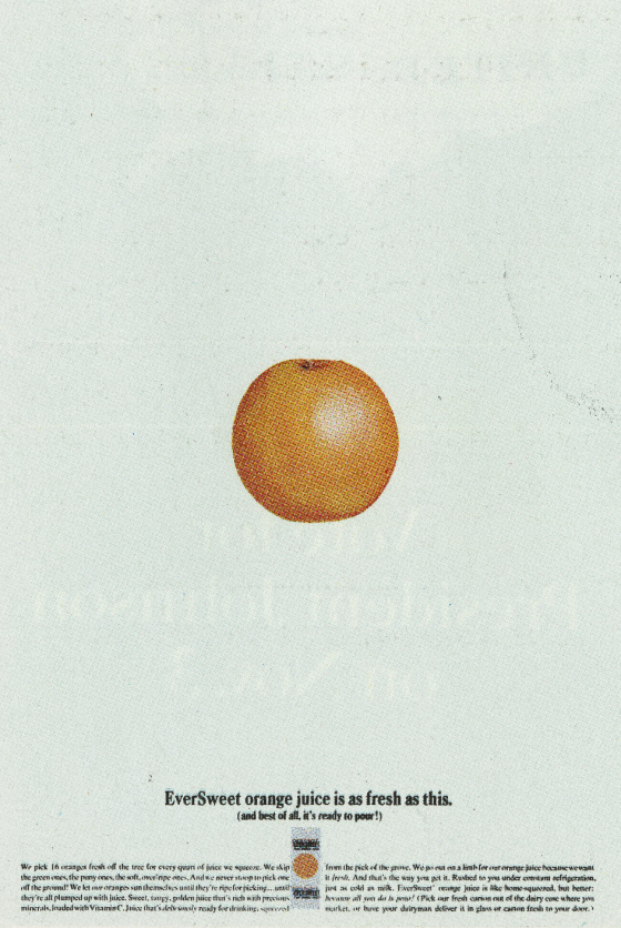


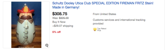


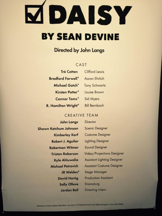


 What were they like?
 It was their anniversary and John said I could design and put it together.


 We also worked on the Body Language Bra account. Maybe the best account I’ve ever worked on!
 Was he scary then?

 The ad above was a stand-in which we ran while we waiting for John Gorham to finish his illustrations.


 Better.


 He’s the one in the mirror, taking a picture of his taxi driver dad.


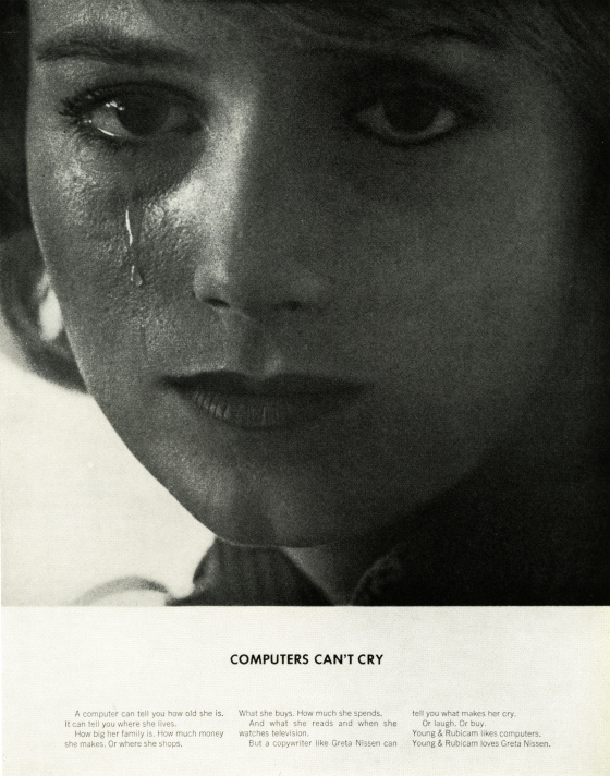


 DAVE: Where were you bought up?


