Visualization, analysis, interactive maps and real-time graphics
Can you guess the gender breakdown of performers at music festivals?
A HuffPost / WNYC investigation into lead contamination in New York City
Find buildings with lead violations in New York City
Live results and interactive maps of each race
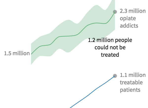
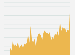
An interactive map showing how opioid abuse rates outpace treatment capacity 2 to 1
A HuffPo investigation into the dearth of treatment options available to opiate addicts living in rural America
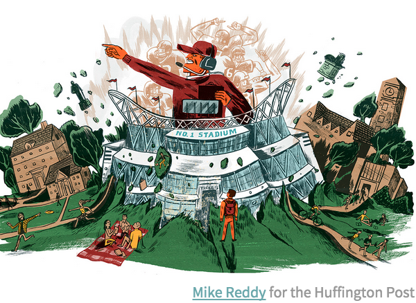
Interactive charts showing the $10 billion divide between elite college sports programs and all the rest
Details on how more than 200 public universities use student fees to subsidize athletic programs
A HuffPo investigation into how college students are bankrolling the athletics arms race
A HuffPo investigation into how frequently citizen complaints are dismissed
A series of graphics depicting how climate change will affect our planet
An interactive map showing where uninsured rates remain disproportionately high
An interactive display of survey results from women who chose not to have children
Your browser does not support our video player.
A Huffington Post investigation into resettlement abuses associated with World Bank-financed projects
A Huffington Post investigation into treatment options for heroin addicts
Live election results and related data for Senate, House and governor's races
Forecasts for 2014’s Senate races, based on HuffPost Pollster’s poll-tracking model
Forecasts for 2014’s races for governor, based on HuffPost Pollster’s poll-tracking model
A Huffington Post investigation into the business of dying
Match summaries and player statistics, updated in real-time during the World Cup
Probabilistic bracket generator for the 2014 Men's NCAA basketball tournament
Longform layout for a series on veterans struggling with the moral ambiguities of war
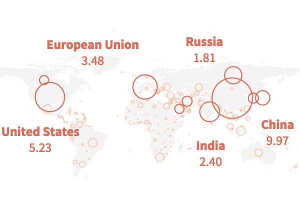
A look at CEO salaries and boards of directors of Fortune 100 companies
Schedule, medal table, and individual results from the 2014 Sochi Winter Olympics
Interactive charts and map illustrating recent bombings and deaths in Iraq
Longform layout about a victim of gun violence
A look at how different mapping techniques reveal different voting patterns
Live returns with real-time historical and demographic scatterplots
Interactive story with animated map
Interactive story with inline snippets of annotated documents
Block-by-block map of votes in the Democratic mayoral primary
Live results for the Democratic and Republican primaries in New York City
Tracking support for the use of force in Syria in the House and the Senate
Audio clips of voicemails left by relatives of veterans who died by suicide
Live results and historical context for the special election for John Kerry's seat
Tracking support for the comprehensive immigration reform bill in the Senate
Audio clips of voicemails left by survivors of gun violence
Map of price disparities across hospitals around New York City
Live results and historical context for Mark Sanford's attempt to reclaim his House seat
Links, dates and location of every gun death since Newtown
Predictions and aggregated stats for the 2013 Academy Awards
Analysis of proposals to allocate presidential electors by congressional district
Tracking where Democratic senators stand on filibuster reform
Detailed live election results for desktop and mobile, U.S. and international editions
Live results of the 2012 marijuana legalization ballot measures
Live results of the 2012 marriage equality ballot measures
Polls, ratings and analysis of the 2012 House races
Polls, ratings and analysis of the 2012 Senate races
Crowd-sourced quantification of rhetoric at the Democratic and GOP conventions
Interface for developers to remix polling data assembled by HuffPost Pollster
Results and medal counts for the London Games
Cartogram puts medal counts in context of global economic inequality
Interactive event schedule for the London Games
Animated results compare county-level returns to the 2008 gubernatorial race
Explore and share electoral scenarios
Maps and charts of HuffPost Pollster's election prediction model
Embeddable, customizable charts combine thousands of aggregated opinion polls
Live results and delegate counts for ten GOP primaries and caucuses
Maps illustrate the growth of suburban poverty over the past decade
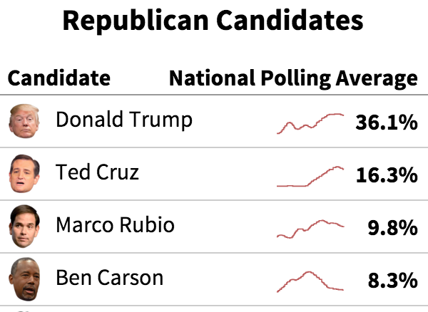
Reported and aggregated stats on GOP primary candidates
Live election returns, charts and county-level maps of each Republican primary