


AS THE US election results rolled in, the world watched as states lit up in red or blue depending on whether they voted Republican or Democrat.
Much was made of critical “swing states” including Florida, Ohio and Pennsylvania. In the end, it was Hillary Clinton’s failure to attract voters in the “rust belt” states and win critical ones like Florida that dashed her campaign hopes.
She scored just 228 electoral college votes compared to 290 for Donald Trump, despite winning more of the popular vote, with 60,274,974 votes compared to Trump’s 59,937,338.
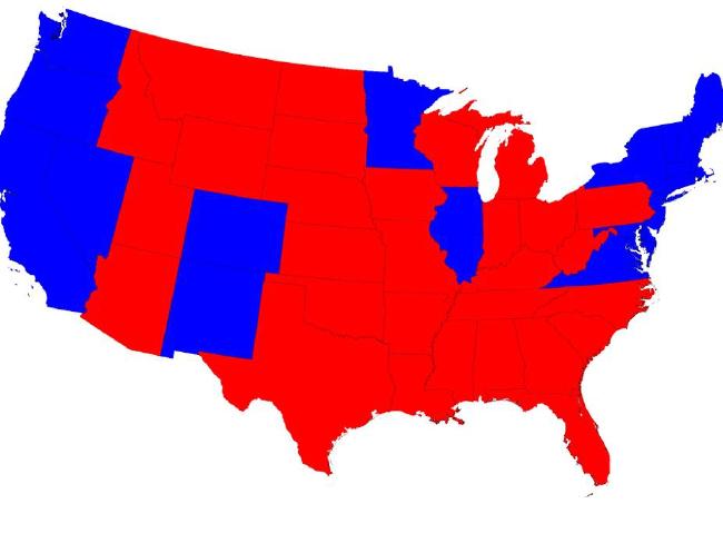
A typical map of the US election with Republican states in red and Democratic in blue. Picture: Mark Newman.Source:Supplied
Now startling new maps created by University of Michigan physics professor Mark Newman show the breakdown of voters across the country which tell a very different story about how America voted.
They clearly show the red/blue divide is not a case of state-by-state, rather a split between those who live in urban and rural areas, which work out relatively evenly when adjusted for population.
“The typical red and blue election map shows which states voted which way, but it’s not easy to tell who actually won an election, because some large states have small populations and some small states have large populations,” Mr Newman told news.com.au.
“These maps change the sizes of the states to be proportional to their population or -- better still -- their votes in the electoral college. Then, just by looking at the areas of red and blue you can easily see who won.”
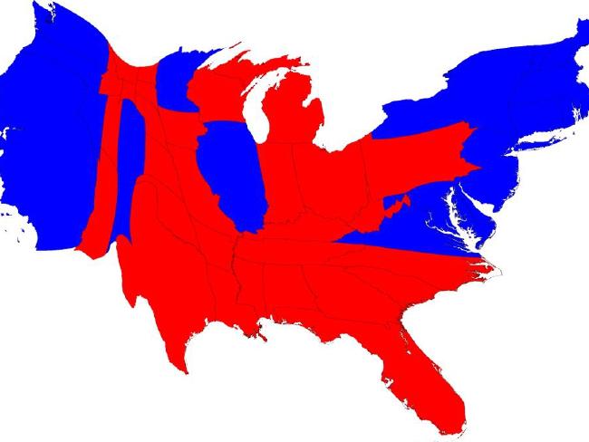
A cartogram of the 2016 election with red and blue states adjusted for population size. Picture: Mark Newman.Source:Supplied
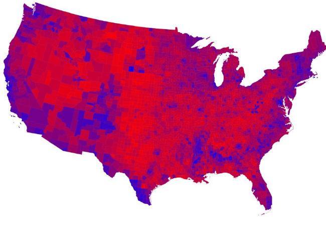
Breaking down results to county level is even more startling, showing how Democrat voters are clustered in major cities along the coast.

California and New York are home to millions of Democratic voters, while states in the middle of the country tend to be home to Republicans. Picture: Mark Newman.Source:Supplied
Another example shows a blend of colours to break down votes by percentages which illustrates just how mixed the difference really is.
Mr Newman said it’s a useful visualisation tool that allows people to see election results at a glance and the electoral college.
“Discussions of the election results often mention the numbers of electoral college votes each state gets, but I feel a map like this makes clearer the different contributions of the states to the overall total,” he said.
Shades of purple show where the vote is split between Republicans and Democrats. Picture: Mark Newman.Source:Supplied
Finally, a cartogram of the shaded map provides perhaps the clearest representation of how America voted in 2016.
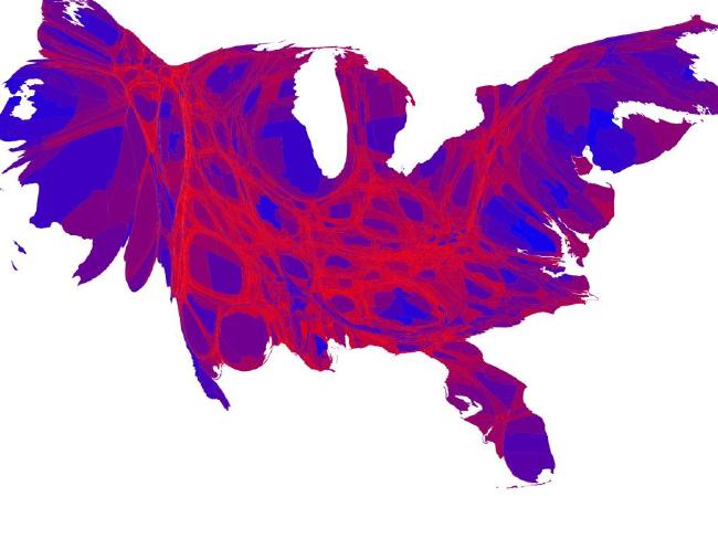
What America really looks like in 2016. Picture: Mark Newman.Source:Supplied
It seems the country is not as divided as it might look.