Sam Brown

Designing the new Foursquare

On Wednesday August 6th we released the latest version of Foursquare to the world. We crafted, designed and engineered this version from the ground up, and today you can download it.

I thought I would write up my thoughts on the journey of leading the design efforts, with a truly great team, for our biggest launch to date.

Earlier this year we sat down as a company and looked at all the amazing pieces of technology we had built. Foursquare then had two distinct use-cases — keeping up and meeting up with friends, and finding places to go — and we’d tried just about every way possible to have them live together in a complementary way. We came to the conclusion that there were millions of people that want a better and more personalized search experience than currently exists, but are averse to check-ins and location sharing.

After much deliberation we decided it was time to take the next natural step and separate those use-cases into standalone apps with their own branding, marketing, feature sets, and interfaces that clearly served their distinct needs.

The overarching document that outlined the issues and solutions was aptly titled ‘Batman and Robin’, and those two names would go on to be the internal code names for our two apps.

Foursquare (Batman) and Swarm (Robin).

Research, wireframe, prototype, repeat

Our research team started out doing research with outside participants while the design team quickly got to work looking at what was out there to see what was being done well, what we thought we could do better and defining an early style guide for the new Foursquare. The initial version of our style guide was a lofty moodboard, it talked about how we wanted the app to feel: “intelligent, relevant and useful”, “magical and fun”, “trustworthy and highly-regarded”. It showed some fun directional color schemes as well as laid out much of the groundwork for our overall information architecture and navigation.

We spent much of the early days talking, sketching, wire framing, and prototyping ideas and directions for the new version of Foursquare. We had regular meetings with all of the stakeholders involved, where we presented our progress, refined our ideas and honed in on what everyone was feeling strongly about. We threw away 90% of the work we did. No idea stayed sacred for too long.

At times, that was hard to stomach. We had worked hard on something, and felt strongly about it. But, ultimately, it’s pushing through those barriers as a designer that results in some of your best work. The regeneration of ideas born from past experiences provides some of the best output.

One of our first big research projects was on a quickly built working prototype on Android and our research team was off to work. We felt good about the direction, even when there was a lot of polish missing. Doing research on a working prototype with real people who would use the app was invaluable. We got great answers to behavioral and UX questions relating to some of the new features, and evaluated the effectiveness of the different ways to find places to go that our initial prototype proposed.

We took the results of the research and did a lot of iteration and refinement on some of our initial designs and assumptions. We used everything from Sketch and Keynote to Flinto and Skala, web-based prototypes and hacked together builds to get things in front of employees and research participants in search of answers. We did this multiple times over until we got to where we are today, and even now we have more research slated for straight after launch. We are committed to never resting on our assumptions.

Rebranding

From the beginning we had planned to rebrand Foursquare. With a new and improved app direction should come a new and improved logo. The old app icon was a checkmark which was so closely associated with checking in, and the word mark itself felt like a relic of a bygone era.

The new logo and word mark were designed in conjunction with Red Antler to represent something bigger, something new, to be a combination of map pin icon and superhero emblem. We’re really stoked with the outcome. From mood boarding and ideating with them in their offices, to having their designers work out of our own, it was a fun and rewarding experience.

Endless visual design explorations

We had a really great mix of designers working on the new Foursquare, from those people who specialize in IA and UX, graphic design and branding, to visual design and prototyping. The best process for experimenting with different visual design directions for us was to start as broad and wild as possible, narrowing down into something that was universally loved. That took time, a lot of time, and a lot of versions.

Once we had locked down features and softened out any of the complex areas, we were heads down in building out our visual system. That started with the creation of an internal style guide that covered everything from color, iconography, type styles, how to use imagery, button use cases, and reusable components. Laying that foundation allowed us to move together in unison, multiple designers working on different aspects of the app design with ease and efficiency that resulted in a single uniform design style app-wide.

The standout color scheme that had evolved from our branding work really started to shine when we began working it into the app. It didn’t take long for everyone to fall in love with the pink — watermelon — color. The tastes feature of the new Foursquare is such an interesting and unique data set to get to design around, and was quickly adorned with our punchy new color. Tastes and personalization have a unique look in the new app, allowing you to quickly spot out those results. Why should you get the same results as someone else when searching for something, our results are for you.

The last throes of any big project like this evokes feelings of excitement, anxiety, nervousness and euphoria. We’ve felt them all. It took a lot of time, love, care and attention to detail to get both our Android and iOS apps ready to ship. We poured our hearts and souls into this version, and the team around me is the best I’ve ever worked with.

It’s really fun looking back over the past 8 months, the amount of effort and work that was put in by everybody at the company to get us to where we are was phenomenal. This is the beginning of a new chapter for Foursquare.

On December 10th of last year, we showed this slide at the company meeting. It said, if we aren’t so fucking excited, we’re not launching. Today as you finally get to play with it, our entire team believes in and is behind the new Foursquare. We are so fucking excited.

If you like what you see and are interested in knowing even more about design at Foursquare, or perhaps, you don’t like something and think you can help us make it even better, you should get in touch. sam@foursquare.com

This article was originally posted on Medium.

Designing for better first impressions

First impressions are everything. Whether it be another person, product packaging or a digital interface, we judge things almost instantaneously forming a mental image and opinion that we carry forward with us.

With that firmly in mind, today we rolled out new venue detail pages on the Foursquare website. The goal of this project was to re-imagine how these pages looked and were organized to give visitors a better first impression of the places we visit every day, based on all the knowledge and data Foursquare has compared to other services out there.

At Foursquare, we think about our check-in data as PageRank for the real-world. Importantly, our data is based on people actually visiting these locations, those are explicit signals that live in our ecosystem and can be combined with all of the other data we have to provide visitors with a legitimate and truthful view of a business.

Our venue pages are some of the most heavily trafficked pages on foursquare.com seeing 50 million visitors per month. We wanted to make sure that visitors were able to understand what they were seeing on this page after only a few seconds, find the information that they needed to help them form an opinion of that place and then act on that knowledge.

Peels - Foursquare

Visual design was a big component of this project but it was being smarter with the data we have at hand that was the biggest challenge here. Deciding the information hierarchy of almost 50 unique data points on this page took the most effort while still adding new unique and useful features.

Now our venue detail pages showcase smarts like similar places to the one you are looking at and places people go after visiting this venue, a personal favorite. All the while doing a better job at laying out all of the data in an easy to digest format that’s both familiar and understandable.

The logged-in version of our venue pages are significantly more personalized for each user, our Explore engine can help justify why a place might be worth visiting for you. Perhaps it’s that brands you like have left pro tips, sushi connoisseurs go there regularly or that it’s new in the neighborhood. We also showcase which of your friends have been there, whether they liked it or not and some of the content that they might have left in the forms of photos and tips.

All of this together will hopefully give visitors to the page both a greater impression of the business and what they offer as well as showcasing the power of using Foursquare for local discovery and search.

Great architectural experiences in NYC

I’d like to do something with architecture too. I just started a page on Foursquare that’s all about buildings in New York that I love. I have a classic text by Paul Goldberger called The City Observed: New York, which is now out of print. The author is still alive and I thought it would be cool to get his permission to take new photos of each building in his text, give each building its own web page, and tie it all into Foursquare. You could essentially go from building to building and discover the history—who designed the building, what compromises were made, what changed over the years. That’s interesting to me and there are only a few cities where you could go to town with an idea like that.

This is a fantastic use case for foursquare Lists, marrying historical data with location data that you can have with you in your pocket at all times. I can’t wait to start crossing off some more of these Great architectural experiences in NYC that Jeffrey has kindly put together.

Quote from The Great Discontent’s one year anniversary interview with Jeffrey Zeldman.

Not getting trapped in incrementalism

“This new foursquare release brings exactly the kind of big changes that take courage to make because inevitably there will be users who won’t like some or even all of them. It would be so much easier to get trapped in incrementalism but that’s not what startups are about. I am thrilled that foursquare is still behaving this way.”

Really liked this quote from Albert Wenger, a partner at USV who invested in foursquare. Sometimes big changes need to happen for you to make that next step up and I’m super proud of our entire teams efforts in launching v5.0 of foursquare. We believe really strongly in our vision for the future and in the company we are building, this is only the beginning.

The challenges of working remotely

I get asked about this a lot. How does it work? Do I enjoy it? Am I more or less productive? I have had many conversations about working remotely over the years. I felt compelled to write some thoughts and tell you a little about how it works for me. In doing so hopefully expelling some myths and answering some oft asked questions.

Working from home is something I have been doing for the past 6 years. The majority of that time I was self-employed working with clients from all around the world (Fun fact: I had 2 local UK clients in 5 years). This last year and a half I have been working for foursquare based in New York City. I make regular trips to our New York headquarters but 90% of my time is spent in my home office just outside Edinburgh Scotland.

Home Office Photo

Get dedicated and be flexible

Working from home is a constantly evolving challenge and is not easy. Distractions come in all shapes and forms, you will get everything from noisy neighbours and home renovations to personally having to deal with deliveries and the chores of running an office, just on a slightly smaller scale.

Funnily, the first distraction everyone thinks will hit you hardest is sitting around watching TV in your pyjamas. While that may be true when you have a day off from work that certainly isn’t true of someone working from home. Getting showered and dressed are pivotal moments in the day, as is having a proper sensible working environment which I will touch on later. Getting out of the home office for short walks and lunch breaks also helps break up the monotony.

Being flexible to your client or employers needs is key. Be sure to let them know exactly what to expect from your situation, what hours you will be working and what hours you will not. Replying to emails and communication outside of your normal office hours is tempting and is likely to lead to you being expected to reply at those times always. Do not fall down that rabbit hole. My normal office hours are from around 10am-7pm.

Home Office Photo

Using Time Zone’s to your advantage

Surprisingly this is one of my favourite reasons to work remotely. The New York office is 5 hours behind me, this means that when I start work in the morning nobody else is online. I usually have a mountain of emails and things to work on for half the day before anyone comes online.

We then get half the day online together to talk, discuss and move forward with projects before I then go offline. The second half of the day in New York – that I am offline – often leads to even more work for the next day. Turning what sounds like an awful 5 hours time difference into an amazingly productive work feedback cycle.

Office Setup

More important than you at first realise is a proper working environment, a desk and office setup that is only used for working is ideal. Having somewhere that is solely used for working will help you focus on just that and not having you think about other things. I try not to use my home office outside of my office hours, using my iPad on the sofa in the evening to actually “surf the internet”, read and see all those funny cat pictures you have posted to Twitter is something I relish.

Home Office Photo

Communication tools

Having great communication skills and good personal relationships with the people you are working with is going to play a big role in how successful you are at working remotely. Email, Instant Messaging, Campfire, Video Chats, you have to always be ready and prepared at a moments notice. We use email as our main communication medium backed up by video meetings and discussions. Instant messaging to quickly grab some information or chat with someone and Campfire as an additional group/team chat tool.

One year of remote meetings

Believe me, I have tried every single form of video communication tool over the course, nothing is perfect, nothing is full-proof and I am continually striving to find the best solution to this.

Below is a short video of around 150 screenshots from stand ups, 1 on 1’s, product reviews, team meetings, white-boarding sessions with Dens and Mayor Mike Bloomberg visits that I have taken over the past year of working at foursquare.

Fancy working alongside these fine folks at foursquare? We are hiring! foursquare.jobs

Working remotely is both a pleasurable and productive way to work but do realise it absolutely has some downfalls. It is lonely. It is challenging. It is something I am constantly striving to improve at. I would love to answer any questions or hear others peoples experiences, please do leave a comment.

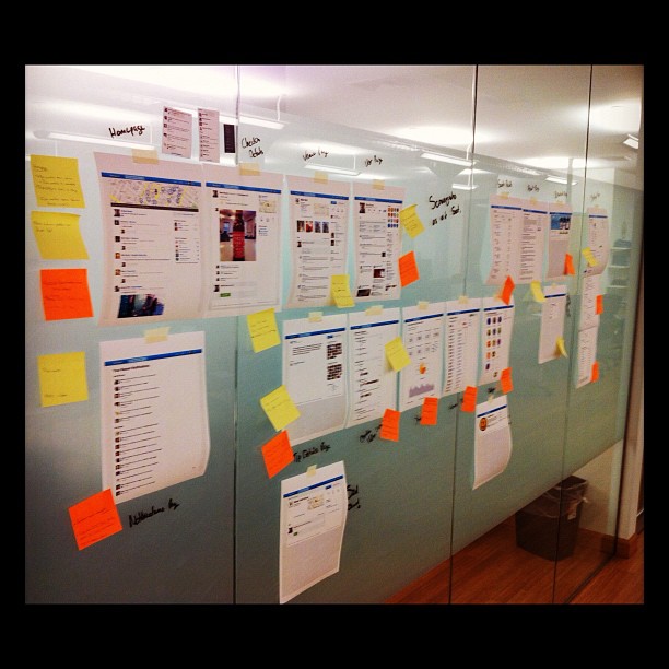
It looks like a Beautiful Mind moment...

foursquare redesign photo

But in reality I find this is the best way to see a project as a whole. While printing out your entire site isn’t exactly environmentally friendly, or cheap, it is massively beneficial to see the whole picture. Flicking between tabs of different views simply doesn’t compare. Have you tried this?

Paper is like a screen that never turns off

Connecting products to the Web lets them become smarter and friendlier – they can sit on a shelf and do a job well, for the whole family or office – without all the attendant complexities of computers, like updates or having to tell them what to do. Little Printer is more like a family member or a colleague than a tool.

Plus paper is like a screen that never turns off. You can stick to the fridge or tuck it in your wallet. You can scribble on it or tear it and give it to a friend.

A personal mini-newspaper printed from your home that you can set up subscriptions to via your phone, Little Printer from London Design studio BERG is a product I can’t wait to get my hands on in 2012.

The redesign of foursquare.com

One of the primary reasons I wanted to work at foursquare in early 2010 was to have the ability to work on one product alone and continue to improve that over time. The majority of my freelance projects never lasted more than 3 months, once a site had shipped I had very little to do with it and would move onto another project. Being able to rapidly iterate on a single product over time and see real measured improvements has been massively satisfying.

When I started working at foursquare we had two designers, a visual designer and a user experience designer. Both working across all aspects of the product on everything from web and iOS app design to communication materials and graphic design. A grand task for just two and thankfully the team has grown to almost 10 since then with a mix of visual, interaction, ux and web ui designers.

At foursquare we see the website as an integral part of our product and getting the chance to redesign this from the ground-up was a great opportunity, one that the small redesign team has slaved, sweated and poured a vast amount of our effort into over the last few months.

The new foursquare site is a breath of fresh air compared to our old utilitarian and generic 2009 website. While we continued to push amazing new features and projects to the site, we have always felt constrained by it’s abilities and style. Today we launch a brighter, fresher and more flexible design that is not only a huge improvement visually but lays the groundwork for new features and projects that are coming down our road map in the very near future.

foursquare.com

Gone are the days of content-in-a-blue-box and in moves the era of easier to digest content, interactivity and discovery. With easier navigation, even more photos & comments, and clearer venue details to interactive maps, venue recommendations and list discovery we hope that foursquare.com becomes the destination site for people looking to keep up with their friends, discover what’s nearby, save money and unlock rewards.

Hi, I'm the VP of Design at Foursquare in New York City.

DribbbleEndorseFacebookFoursquareInstagramTwitter