If you have read our analysis on the communities of WordPress.com and would like to know more about the methods behind it, then keep on reading! In this — slightly more technical — post, I will show how we constructed, filtered, projected, and clustered a network around WordPress.com users and blogs.
Building the Network of WP.com
People on WordPress.com create and engage with content. A user can write, like, reblog, or comment on a post, and follow or create a blog. Our goal is to turn these interactions into a network of users and sites.
Currently, we work with a network that has three main kinds of nodes: posts, blogs, and users. When a user creates a post, she can create multiple ties; first, a tie is created between the user and the post — the user authored a post, an IS_AUTHOR() type tie is created. A second tie is created between the blog and the post — the post appeared on the blog, an IN_BLOG() type tie is created. Another tie is created between the user and the blog — the user becomes a contributor to the blog, so an IS_CONTRIBUTOR tie is created, and so on.
Whenever a user engages with a piece of content — meaning likes, reblogs or comments on it — she creates a tie between herself and the post that she engaged with. This tie then can be further extended to a relationship between the engaged user and the author of the post, as well as a relationship between the engaged user and the blog that the post appeared on. In this project, of the multitude of options, I am only looking at relationships that a user creates between herself and a blog by liking a post on the given blog.
A potential model of a network on WP.com defined by Boris Gorelik. The network has three different kinds of nodes and many types of edges between these nodes.
Data and Technical Stuff
Our technical stack for graph analysis consists of a combination of Scala, PySpark, and Hive running on Hadoop clusters; as well as ElasticSearch for some pre- and post-processing — we also use Neo4J for offline in-depth analyses.
Projecting the Graph
In its current form, the WP.com network is a multipartite graph, which means that the network has multiple classes of nodes. There can be relationships between nodes of different classes, but not between nodes of the same class — there can be an explicit relationship between a user and a post, as when a user likes a post, but there can’t be a relationship between a post and a post.
A bipartite graph. For the sake of this project, our two classes are users and blogs . A user can create a tie between herself and a blog by liking a post on the blog, but ties can’t be created between users and users, or blogs and blogs. [Source: Wikipedia]Using a method called graph projection, we can show the implicit connections between the nodes that belong to the same class in a bipartite network.
An illustration of a bipartite network projection, where edge weight is simply the number of common neighbors. [Source: Wikipedia]Defining the weight of the edges between the nodes in the projected graph is not a straightforward task. After a lot of testing and iteration, we used a weighted and directed version of Newman projection, where the strength of the tie between a blog to another one also takes into account how many other blogs the given user liked. If a user liked only two blogs, then the strength of the tie between those two blogs are stronger than if a user liked three blogs.
The projection gave us a network with 3.5 billion+ edges and thanks to our technical stack, we were able to filter it to its most important top 20 million edges before running clustering algorithms on it. (I can tell you that it wasn’t a painless process to work with that many nodes and edges, though!)
Clustering the Graph
In order to see what kind of different community groups there are, we needed to identify clusters in the social network and show groups of nodes that are more similar to each other (which, in our case, roughly means that they were liked by the same people) than they are to the rest of the network. These groups are called communities, with each blog in the network belonging to a given community of blogs that are enjoyed by a similar group of users.
Demonstration of community structure, with three groups of nodes that have strong internal ties and sparse ties to other groups. [Source: Wikipedia]Of the various existing graph clustering algorithms, we picked a Scala implementation of Louvain modularity to run on our filtered graph. An important thing to remember here is that if we don’t pre-filter the graph to include only blogs from one language (which in our case was English), then we will have very biased clustering, where blogs of the same language will group together, since they will mostly be liked by similar people.
At this point, our initial graph with 3.5 billion edges between English-language blogs has been filtered down to the top 20 million edges with the clustering giving us a subset of 109,099 unique blogs that belong in 428 non-overlapping communities.
You can read about the initial results of our community mapping here!
Welcome to the second post in our “Intro to Search”-series! Today, we’ll dig into the building blocks of search engines to give you an idea of just how we identify what posts to show readers using WordPress.com’s search tool.
A (web) search engine connects users with relevant documents. This process generally has five main stages:
Document collection: Any search engine needs to gather the collection of documents to operate on. A document can be a website, a scientific paper, a medical record, or a blog post on WordPress.com. Search engines collect these documents either by crawling the web, or directly at the time when a new document is created. The place where they are collected is called a document store.
Indexing: Among other signals for relevance and importance, search engines use word or term counts. The basic idea is that documents are only relevant to terms that are mentioned in them, and that the more often a word is used in a document, the more important it is in that document. Counting words in a single document is easy, but counting billions of words takes a ton of time. Counting only once and storing the results is much more efficient than counting every time a user searches for something. This storing of term occurrences for each document is called indexing. As part of this process, the indexer may analyze the text to stem words and omit the most common ones. Indexing may condense “All four species of giraffes have long necks and all giraffes are awesome.” into
four1
species 1
giraffe 2
long1
neck1
awesome1
by dividing the sentence into words (tokenizing), mapping words to their roots (stemming), counting, and removing the common words “all,” “of,” “have,” “and,” and “are.”
Query Building: Whatever a user enters into the search box has to be translated into a query that can be run against the document collection. If words are stemmed as part of the indexing process, we have to stem the terms in the search query, too. If very common words are removed before indexing, like in the giraffe example, we have to remove them from the query as well. Queries may or may not take the order of words into account, and they can include synonymous words or allow wildcards.
Ranking: Once a set of matching documents have been identified, they have to be put in the best order for presentation. To maximize users’ happiness, we have to show the most relevant, novel, and engaging posts at the top of the list. We’ve covered users’ expectations in the previous post in this series. There are various well-known ranking algorithms and machine learning solutions for this problem, and we’ll introduce some of the most important ones later in this post.
Presentation: Finally,a great search engine needs a clear and clean user interface. Ideally, it makes the search results look inviting while also presenting the user with all the information they need to decide which result to pursue.
Post search in the WordPress.com Reader
WordPress.com is home to many publishers, and we continuously integrate the tens of millions of posts they write every month into our searchable document collection. For fast and parallel document access, scalability, and convenient full-text search methods, we use Elasticsearch. We use Elasticsearch’s built-in indexing methods to make our users’ content searchable, and rely on its own query language to retrieve the right documents for each search. Our largest Elasticsearch cluster has 45 nodes and handles about 35 million queries every day, with a median query time of 130 ms for post searches.
Ranking functions and algorithms
For a data scientist like me, the most exciting task of a search engine is the ranking. The ranking of a document can be based on term frequency as a proxy for relevance, or on the importance of a document in a network of documents. It can also take several other signs of social validation or text quality into account.
BM25: This family of ranking functions [1] is a popular choice for measuring relevance. Each document is regarded as a bag of words, and its relevance with respect to a search term is measured by the term’s frequency in the document in comparison to the term’s frequency across the document collection. The length of the document is taken into account as well, and two tunable parameters control the growth of a document’s ranking as a function of the term frequency. Compared to the collection of posts on WordPress.com, the slogan “Data for Breakfast – Ideas and Insights from the Data team at Automattic,” has a high BM25 score for the term “data” because it appears twice in the text and is not very frequent in our document collection, and it also has a high score for the less frequent term “Automattic.” Contrary to this, a word like “idea” is fairly common and the slogan doesn’t have a very high BM25 score for this term.
The BM25 score for a document given a term is calculated like this:
Here, is a (logarithmic) function of the inverse frequency of the term in the document collection, and is (a function of) the frequency of in the document itself. is the total number of words in the document and is the average word count per document in the collection. and are tuneable parameters of the ranking function.
In contrast to a simple scoring, ranking functions of the BM25 family rise more slowly when a word is mentioned many, many times. Using keywords over and over again is thus not a good recipe for a high search rank in BM25 based search engines. In fact, the best way to get posts high up in search results is to write high-quality content — that’s what readers and search engines, ours included, are really looking for.
Comparison of TDIDF and BM25 with two different settings for the parameter k. On the x-axis is the number of times that the term appears in the document . The scores are normalized to their value at . The document in this example has a total length of 500 words, so at , we would have a document that consists of only one word, repeated 500 times.
PageRank Probably the most famous of all ranking algorithms, PageRank [2] was published by Google founders Sergey Brin and Larry Page. PageRank is a recursive algorithm that ranks web pages by a weighted sum of incoming links; an incoming link from a page with high PageRank and few outgoing links counts the most. The PageRank of a page is
,
where is the set of pages that link to page , is an element of that set and the number of outgoing links in . is the number of documents in the collection and , the probability that a user clicks on a link instead of navigating to a random page, is a constant that can be tuned for performance.
PageRank isn’t applied only to web pages but can also be used to rank scientific papers or nodes in any network.
HITS: Hyperlink-Induced Topic Search is another recursive algorithm, and its goal is to find two particularly interesting types of pages: hubs and authorities [3]. An authority is a page with original, high-quality content about a given topic, and a hub is a page that collects links to authorities. In the WordPress.com universe, a Discover post like this one is a hub, and the sites it links to are authorities on portrait photography. Great hubs link to great authorities, and a great authority is one that is referenced by great hubs.
Each of these algorithms has strengths and weaknesses. Some are susceptible to link spam, and some may just be too well-known to content marketers who could use it to artificially improve a page’s ranking. Many search engines use a combination of these or similar algorithms with a wide range of other features. What exactly they use is often a secret, and for a good reason: a search engine would become useless if publishers and marketers knew the exact recipe to get top rankings.
What is clear, however, is that the best search engines use continuous testing to improve their algorithms and learn about the relevance of new documents in their collection. In the next post in this series, we’re going to look at how the performance of a search engine is measured, and show a few simple examples of how we’ve improved ours already.
Recommended reading and sources:
[1] Jones et al, A probabilistic model of information retrieval: development and comparative experiments: Part 2, Information Processing & Management 36.6 (2000), pages 809-840
[2] Brin & Page, The Anatomy of a Large-Scale Hypertextual Web Search Engine, article
[3] Kleinberg, Authoritative sources in a hyperlinked environment,Journal of the ACM (JACM), Volume 46 Issue 5, Pages 604-632, article
[4] Manning et al, An Introduction to Information Retrieval, Cambridge UP, 2009, pdf
[5] Liu, Learning to Rank for Information Retrieval, Springer, 2011
WordPress.com is home to hundreds of millions of sites, a place to produce and discover content. Logging in, you’re automatically taken to theReader, where you’ll find a stream of posts from sites you follow or that we’ve recommended for you. You can like, reblog, or comment on these posts. If you’re inspired, you can choose to publish a new post yourself.
Any time you take one of these actions, you become a part of an ever-shifting network. This network is what makes a WordPress.com site inherently different from a stand-alone site, and understanding networks is key to understanding the WordPress.com experience. In order to better understand what our users are reading and what kind of content they are producing, so that we can create tools and features that help them meet their goals, we set out to make this invisible network visible — to look at the communities of users, sites and posts within WordPress.com.
Community, in this sense, is a network science concept that denotes those entities within the WordPress.com ecosystem that have strong ties to each other. There are several ways to visualize the different communities within WordPress.com, since a community can be formed of blogs, users, posts, or a combination all of the above. Here, I looked at blogs to see which ones are connected to each other, how many communities they form in total, and how these communities can be characterized.
Let’s say you are a WordPress.com user and enjoy this post so much that you press the “like” button after reading it (consider that a subtle hint). Now we know that you have enjoyed content served on data.blog — it gives us a tie that connects you to data.blog. As you like more posts here, the tie grows stronger. You then move to another WordPress.com site, moredata.blog (which doesn’t exist… yet!) and like a post there. We now have another explicitaction, a show of preference, that connects you to another site in the WordPress.com ecosystem.
We also now have implicitinformation, an invisible tie that can now be made visible: data.blog and moredata.blog have a connection, because they both have been liked by you. While this tie isn’t visible, we can uncover it by analyzing the actions of our users. If another user, who is also interested in data.blog and moredata.blog, ends up finding a third site — say, evenmoredata.blog — we can say that those blogs are similar, define even more ties, and start building a network and identifying communities.
A network of blogs from a sample of all user activity. Each node in the network is a blog, each edge is a measure of similarity; two blogs are connected, if they were liked by the same people. Colors denote communities, so we can tell which blogs belong in which community.
The Various Topics on WP.com
Building, projecting, rigorous filtering, and clustering the user-blog network gave us a subset of the WP.com ecosystem with 109,099 unique blogs that belong in 428 distinct communities (an upcoming post will describe the methodology behind these steps). A few of these communities contain many blogs, and most of my analysis focuses on the largest communities with the greatest number of blogs — 15 communities in total. To better characterize these communities, I picked the top 1,000 most-liked posts from each one.
And now for the most exciting question of all — what kind of content are our users producing and reading? Are users searching for and consuming content based on particular topics? The short answer: yes! The top 15 communities’ most liked posts’ tag clouds are all very specifically centered around topics and themes. Blogs with distinct topics seem to cluster together — i.e., are liked by similar people.
Here are the top 15 English-language communities of WordPress.com from the past 45 days:
make-up
anime
writing4-mix
travel
writing3
fitness
writing2
writing1
religion-christianity
books
recipes
politics
crafts-sewing
photography
movies
Most of them are distinct, but there are multiple communities around writing; some are general and don’t seem too different from one another, whereas others seem to have a particular focus like motherhood or blogging.
I also looked at some random clusters that were smaller and found very distinct topics there, like a community centered around self-driving cars. These should be taken with a grain of salt; since they were chosen randomly, some of these communities might contain only a very few blogs and posts:
cakes only!
self-driving cars
Russian internal affairs
Cluster Dynamics (and Controversy!)
Posts in clusters behave differently, and looking at likes, comments, and reblogs demonstrates these dynamics. For each blog, I calculated an average number of likes, comments, and reblogs, then took the mean of these averages for each cluster. In the figure below, we can see the mean of the average number of likes, comments, and reblogs that the blogs belonging to a given cluster receive.
I highlighted some of the more interesting figures in bold, such as highly likable communities around writing and photography. But the most interesting part is in dark blue: a community where the blogs receive more comments than likes. This is very unusual; since liking is a micro-action, one that takes minimal effort, it is used more widely than commenting. Usually, comments exceed micro-actions when a topic is controversial and the platform only allows positive micro-actions (e.g., likes or upvotes) and no negative ones.
SPOILER ALERT: It’s the politics cluster! This is the moment that made me throw my arms up in the air and exclaim, “It actually worked!” Not only do our users congregate into demonstrable, topical communities, but we can also these communities’ differing dynamics.
Mean of average likes, comments and reblogs for communities.
Community Distances
A blog can only belong to one community. But since blogs also have ties to blogs from other communities, we can look at a network of communities to see how well-connected the different clusters are. If a blog from one community has a tie with a blog from another community, then we define a relationship between these two communities. The stronger the relationship, the thicker the edge.
If you generally like posts from photography sites as well as posts from data-themed sites, then you are defining a tie between the photography and data clusters.
Network of communities: Each node denotes a cluster, and two clusters are connected if people liked posts from both of them. The edges between clusters with the strongest ties are shown in red.
We see that photography is connected to almost everything — it’s at the center of the WordPress.com ecosystem. Matt started WordPress as a way to organize and showcase his photography, so it looks like we are sticking to our roots!
One of the advantages of using network science to analyze similarity — as opposed to text-based methods — is that we get to identify non-text based communities like photography. The graph visualization also tells us that while their topics might look similar, some of the writing communities are actually pretty distinct from each other.
These communities can now be used in various ways to power recommendations and understand our users and their sites better:
We can identify top sites per cluster to help our Editorial team discover popular posts from a wide variety of communities.
It allows us to define distances between communities – e.g., the makeup cluster is a short distance from the fashion cluster.
Community-based characterization serves as a poor man’s topic modeling; we can tell what topic a blog might cover by just looking at the community it belongs to. We can do this even when the blog doesn’t have any actual text — e.g., a photography blog.
It helps us characterize users based on which clusters they interact with, so we can recommend sites from the same cluster to them — if you liked this post, we can recommend additional posts to you from the data cluster.
There are many more ways we can analyze these clusters to uncover how they are different or similar, so stay tuned for more analyses on the communities of WordPress.com!
This post is the first in a series about what we learned from developing search products for WordPress.com. In this post, I’ll give you a brief tour of some learnings from deploying search in the WordPress.com Reader. Improving this search tool to help our users find engaging articles they really like is an effort, and an ongoing learning experience.
The WordPress.com Reader is the place where our users can keep up with sites they like, whether they’re personal blogs, high profile sites on WordPress.com, or sites that connect to WordPress.com with Jetpack. In fact, users can add any RSS feed they like. The list of sites I follow includes Office Today, TED Ideas and 500px ISO as well as several data science blogs.
The Reader is also a great tool for discovering new content, and this is where the search functionality contributes a lot. When we analyzed where our users found new sites to follow, we saw that a quarter of all new site follows originate with the search tool.
Challenges
At WordPress.com, we have a very large body of documents. There are literally billions of posts on our platform, and it is rapidly growing every day. We find that Elasticsearch is a great tool to handle all these documents and to make them searchable.
The documents we deal with are also very heterogenous: they cover all kinds of topics. Some are very long, like the ones you’ll find highlighted on Longreads, and some are photo posts. Some are written by professionals, some by novice writers who are just starting to find their voice. Our authors live in all parts of the world, and they write in many different languages.
As on any publishing platform, it is only natural that authors try to get as much attention for their sites as possible. At WordPress.com, we offer many tools to promote posts. But when an author crosses the line from self-promotion to spam, we have to protect readers’ interests. We constantly work to balance authors’ interests in promotion with readers’ interest in easily finding the highest quality content.
In addition to mastering these challenges, we have to match our users’ intents and expectations.
Users’ expectations
Users approach search with different intents [1]. Some are looking for information (informational searches). Some want to navigate to a specific site (navigational searches), and some wish to perform a transaction, like booking a flight or changing a setting (transactional searches). Users expect a search engine to cater to every type of search. In the WordPress.com Reader, we see all three of these search types. However, most searches don’t fit neatly into any category, and are best described as “looking for inspiration” or “keeping up with a topic.”
Even though we might each approach a search box with different goals, there are general trends in what most of us hope to find in search results. Broadly summarizing the research of Barry & Schamber [2] and Crystal & Greenberg [3], all of the following are important:
Relevance: Most importantly, the results should be relevant to the keywords we entered, especially the first couple of results — scrolling is tiring, and we form opinions about the quality of the search algorithm itself by skimming through the initial results.
Trust: No one likes being taken to a sketchy site or spammy article.
Originality: We prefer original content on trustworthy sites, ideally written or endorsed by experts in the subject matter. More detailed information is usually preferred over shallow content.
Clarity: At the same time, documents should be written with great clarity and should match our level of understanding; a tourist searching for the term Panther might not need the same type of information as a biologist searching for Panthera onca.
Novelty: New content is better than old, outdated documents.
Diversity: A list of search results is most compelling when it includes all possible meanings of the search terms, and contains different views and approaches to the subject. A classic example is the word “jaguar;” if no additional information is given, the search results should contain articles about both the animal and the car.
Top searches
To understand our own users’ needs better, we took a look at the top searches after the initial launch of the search box using a python wordcloud package to visualize the 500 most frequent search terms. The bigger the font size, the more users have entered the term.
(Note: Our search is search-as-you-type: When a user pauses while typing their search request, we return results that match the partial search string. If the user sees what they were looking for in these results, we record only a partial search string.)
The top searches contain many broad topics like fashion, travel, photography, and poetry. In addition, there are searches related to the website customization and management and blogs on our platform (like theme and widget). These make up roughly 2% of the total volume of searches in the WordPress.com Reader. Finally, we also see that users search for the work of our editorial team (like the daily post).
These observations highlight that it is important that we continue developing our search engine with our users’ interest in mind. In the next posts in our series Intro to Search, we’ll outline the anatomy of search engines in general and ours in particular, and discuss how to measure performance from click data.
Recommended reading and sources:
[1] Broder, A taxonomy of web search, AMC SIGIR Forum, Volume 36 Issue 2, Fall 2002, Pages 3 – 10, article
[2] Barry & Schamber, Users’ Criteria for Relevance Evaluation: a Cross-Situational Comparison, Information Processing & Management Vol. 34, No. 2/3, pp. 219-236, 1998, article
[3] Crystal & Greenberg, Relevance criteria identified by health information users during Web searches, TOC, Volume 57, Issue 10, August 2006, article
[4] Manning et al, An Introduction to Information Retrieval, Cambridge UP, 2009, pdf
[5] Liu, Learning to Rank for Information Retrieval, Springer, 2011
We get asked periodically about how extensively we are using Elasticsearch. And it has come up twice in the past week, so time to write a blog post.
We are constantly expanding what we are using Elasticsearch for and so although somepreviousposts have broadly define what we are doing, they don’t really capture the continually expanding scale.
So here are some quick bullet points about what we currently have deployed:
Five clusters with a mix of versions:
42 data nodes spread across 3 US data centers running ES 1.3.4. This cluster mostly runs related posts queries. 1925 shards. 11B docs. 43TB of data. 60m queries/day. 12m index ops/day (has been as high as 940m in a day though). Each index is 175 shards and has 10m blogs in it. Each blog is routed to a single shard so almost all queries only hit one shard, but we can (and do) search across multiple shards for some use cases.
6 data nodes across 3 DCs running ES 1.3.9. Hosts our WordPress.com VIP indices and lots of other use cases. 321 indices (mostly VIPs). ~8m queries/day. ~1.5m index ops/day. Typical VIP index config is a single shard that is replicated across the three data centers. Most of these indices are small enough that sharding would reduce performance and reduce query relevancy.
12 data nodes across 3 DCs running ES 1.7.5. Primarily powers search.wordpress.com. Indexes the past 6 quarters of all posts. One index per quarter with 30 shards per quarter. Queries typically hit all 180 shards.
3 data nodes across 3 DCs running ES 2.3.1. Currently an experimental cluster as we work to migrate to 2.x. Only production index right now is for en.support.wordpress.com.
15 (and possibly expanding to 100) data nodes for a Logstash cluster running ES 2.3. A lot of logging use cases for many different services. Growing rapidly.
All of our clusters use three dedicated master nodes with one master in each data center. The first cluster has its own master nodes. The next three share master servers with multiple instances of ES running on each server.
Typical data server config:
96GB RAM with 31GB for ES heap. Remaining gets used for file system caching
1-3 TB of SSD per server. In our testing SSDs are very worthwhile.
Query speed:
Related Posts: median 44ms; 95th percentile: 190ms; 99th percentile: 650ms. This is way lower than when we launched in 2013 and 99th percentile was 1.7 seconds.
We cache all queries results in memcache which cuts our ES query rate in half
memcache timeouts vary from 30 seconds to 36 hours depending on use case
We analyze all queries on the client side and optimize the ES filters:
have a blacklist of fields that we never cache (blog_id, post_id, author_id) because they have such high cardinality (100m+ unique ids)
we rewrite and/or/not filters into bool queries and try to flatten them into a single filter
We don’t allow some types of queries (we have a whitelist)
We don’t allow facets/aggregations on certain fields (content, title, excerpt)
We generally don’t allow paging too deep or returning thousands of results at once
A general pattern we use is to use ES to get IDs for content, and then we get the real content from MySQL for displaying to users. This reduces what data ES needs (we strip out HTML), and we can be certain the data is not out of date since ES can be up to 60 seconds out of date in some cases (though typically is less than 5 seconds).
Query Use Cases (in order of query frequency):
Related Posts
Replacing WP_Query calls by converting slow SQL calls to an ES query (WordPress tag/category pages, home pages, etc)
search.wordpress.com
Language Detection using ES langdetect plugin (used for every post we index)
Analyze API (used to perform reliable word counting regardless of language – in conjunction with the langdetect call)
Blog Search (replacing the built in WordPress site search)
Theme Search
Search Queries that are used when reindexing content (eg when a blog’s tag is renamed we need to search for all posts with that tag and reindex them)
Various support searches
A number of custom VIP use cases
A number of custom internal use cases (searching our p2s, suggesting posts that may be relevant to read, searching our internal docs, etc)
Calypso /posts and /pages for getting/searching all posts a user has authored across all their blogs (potentially hundreds)
ES Plugins Deployed:
Whatson for looking at shard distribution, disk usage, index size, etc
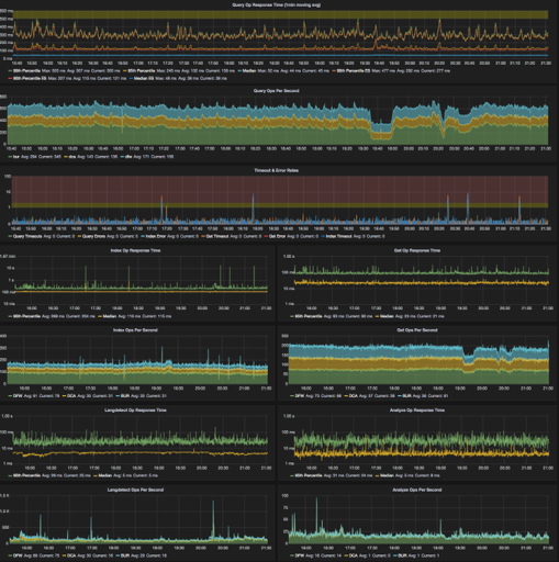
StatsD for performance monitoring (we also send StatsD data from the client about query speed) See the screenshots of dashboards below.
ICU Analysis
Langdetect
SmartCN and Kuromoji Analyzers
Head
Since images are always fun, here are our Graphana dashboards for our largest cluster over the past 6 hours. The first is our client-side tracking of query/indexing/etc speed
Second is our aggregated stats (from the StatsD plugin) about the cluster’s performance:
This cluster/index has been really solid for us over the past two years since it was last built. We have some known issues that have us stuck on 1.3.4, but we’ve also had times where the cluster went many months without any incidents. In general the incidents we have seen have been caused by external factors (usually over indexing or some other growth in the data).
WordPress.com is a freemium service, meaning that our awesome blogging platform is provided for free to everyone, and we make money by selling upgrades. We process thousands of user purchases each week and you might expect that we know a lot about our customers. The truth is, we are still learning. In this post, we will give you some insights into how we try to understand the needs and behaviors of users who buy upgrades.
We know there are many kinds of users and sites on WordPress.com. To understand the needs of users who purchase upgrades, one would naturally analyze their content consumption and creation patterns. After all, those two things should tell us everything about our users, right?
Somewhat surprisingly, the median weekly number of posts or pages a user creates, and the median weekly number of likes and comments a user receives is zero! And I’m not talking about dormant users. These are our paying customers. There are lots of reasons for this, like static sites that don’t need to change very often, or blogs with a lower frequency than weekly. But it doesn’t give us much data to work with. Well, let’s start with something that IS known about every user: their registration date.
Thousands of users register daily on WordPress.com. What does the day of the week on which the user registered with us say about their purchasing preferences? Is it possible that users who register during the week are more work-oriented, and users who register during weekends are more hobby oriented? To test this question, we’ll look at purchases that were made in our online store between March and September 2013.
We’ll divide the purchasing users into two groups: those who registered between Monday and Friday (let’s call them “workweek users”) and those who registered during Saturday and Sunday (let’s call them “weekend users”).
Side note: To the first approximation, we use registration GMT time to label a user as “registered on weekend” or “registered during the workweek”. We also ignore weekend differences that exist between the different countries. These are non-trivial approximations that make the analysis simpler and do not invalidate the answer to our question.
To examine the purchasing patterns of these groups let’s calculate the fraction of products purchased. For example the most prevalent products in both categories were [domain mapping and registration](http://en.support.wordpress.com/domains/). These two products, which are usually bought together, are responsible for about 35% of upgrades bought by our workweek and weekend users. Let us now continue this comparison using a graph:
What do we learn from this comparison? Almost nothing. Which is not surprising, as purchasing distribution pattern is mostly determined by factors such as user preferences, demand, price, etc.
Let’s look for more subtle differences. We’ll use a technique known as a Bland / Altman Plot. These British statisticians noted that plotting one value versus another implies that the one on the X axis is the cause, and the one on the Y axis is the result. An alternative implication is that the X axis represents the “correct value”. None of these is correct in our case. We are interested in understanding the agreement (disagreement, to be more precise) between two similar measurements when none of the two is superior over another. Thus, instead of plotting the two closely correlated metrics (purchase fractions in our case), we should plot their average values on the X axis and their difference on the Y axis. In this domain, higher X axis values designate more prevalent products, positive Y values designate preference towards the working days and negative Y values designate preference towards the weekend. This is what we get after transferring the fractions to logarithm domain:
Now things become interesting. Let us take a look at some of the individual points:
As I have already mentioned, domain mapping and registration are the most popular products. Not surprisingly, these products are equally liked by weekend and working week users. Recall our initial intuition that users who register during weekends will be more hobby-oriented and users that register during the week will be more job oriented. We now have some data that supports this intuition. Of all the products, private registration, followed by space upgrades have the strongest bias towards weekend users. Indeed, one would expect personal users to care about their privacy much more than corporate ones. Being more cost-sensitive, personal users are more likely to purchase space upgrade and not one of plans. The opposite side of the division line makes sense too: blocking ads is the cheapest option to differentiate a workplace site, followed by custom design. These two options are included in all our premium plans, but I can understand how a really small business would prefer buying some individual options.
Another note: If you are worried about the statistical significance of this analysis, you are completely right. I don’t show this here, but the same picture appears when we analyze data from different time periods.
So what?
As an app developer, you will at some point be frustrated about how little you know about your customers. Don’t give up! Start with the small things that you know. Things such as day of the week, geographical location and browser version may shed useful light, and you can build out a picture from there, adding to it bit by bit. Having such information is like gardening: it sounds like a lot of work, but you might be surprised at what you can get from a little investment of time. With determination (asking lots of questions) and creativity (looking at a problem from new angles, starting with the information you already have) and the right tools in your hands, you can learn something about your users and grow your garden of understanding.


 given a term
  is calculated like this:
 = \frac{IDF(t)\cdot TF(d, t) \cdot(k+1)}{TF(d, t)+k \cdot (1 - b +b \cdot \frac{wc(d)}{wc_{avg}})}")
") is a (logarithmic) function of the inverse frequency of the term
is a (logarithmic) function of the inverse frequency of the term ") is (a function of) the frequency of
is (a function of) the frequency of ") is the total number of words in the document and
is the total number of words in the document and  is the average word count per document in the collection.
  and
and  are tuneable parameters of the ranking function.
 scoring, ranking functions of the BM25 family rise more slowly when a word is mentioned many, many times. Using keywords over and over again is thus not a good recipe for a high search rank in BM25 based search engines. In fact, the best way to get posts high up in search results is to write high-quality content — that’s what readers and search engines, ours included, are really looking for.
 . The document in this example has a total length
  , we would have a document that consists of only one word, repeated 500 times.
 ") of a page
of a page  is
is=\frac{1-d}{N}+d\cdot\sum_{p_j\in M(p_i)} \frac{PR(p_j)}{L(p_j)}") ,
,") is the set of pages that link to page
is the set of pages that link to page  is an element of that set and
 ") the number of outgoing links in
the number of outgoing links in  is the number of documents in the collection and