is a blog about design, technology and culture written by Khoi Vinh, and has been more or less continuously published since December 2000 in New York City. Khoi is currently Principal Designer at Adobe, Design Chair at Wildcard and co-founder of Kidpost. Previously, Khoi was co-founder and CEO of Mixel (acquired by Etsy, Inc.), Design Director of The New York Times Online, and co-founder of the design studio Behavior, LLC. He is the author of “Ordering Disorder: Grid Principles for Web Design,” and was named one of Fast Company’s “fifty most influential designers in America.” Khoi lives in Crown Heights, Brooklyn with his wife and three children. Refer to the advertising and sponsorship page for inquiries.
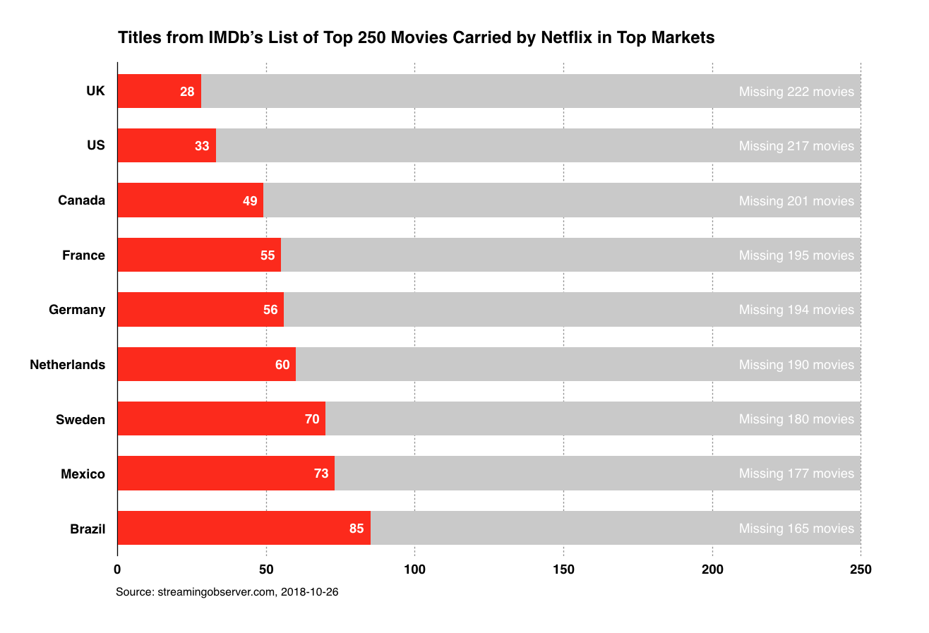
Back in May I wrote a post asking “Is Netflix Still Worth It?,” complaining that its catalog of high quality, interesting and surprising movies seemed to be diminishing all the time. All of that was subjective, but this week the site Streaming Observer has a more objective take on the question. They looked at the best ranked 250 movies at IMDb and cross-referenced that list with what is available from Netflix in the service’s top nine international markets. The results give us a much more concrete idea of something that has frustrated many customers for a while but only in vague terms. It’s especially eye-opening for those of us in the U.S. and the U.K., who are apparently suffering with the two lowest ranking catalogs of the group.
Streaming Observer also has a comprehensive chart of exactly which markets carry each of the movies on IMDb’s list. See the full article and chart at streamingobserver.com.
One of the unexpected revelations from the Clinton campaign emails released by Wikileaks is an interesting exchange on the process of developing Hillary’s 2016 logo. It turns out that the campaign’s chief strategist Joel Benson was skeptical that Pentagram, who had been hired to design the work, was up to the task. As Co. Design’s John Brownlee writes, there was concern that the new logo could not match the heights of Obama’s 2008 logo (a branding home run if there ever was one for a political campaign).
Benson expresses doubt that the Hillary logo shows this same sense of forward momentum. That could mean that at the time Benson wrote his email, Hillary’s logo did not contain the aisle-crossing arrow that became a hallmark of her identity. Benson further complains that instead of figuring out a way to introduce movement into the logo, Pentagram seems too strongly focused on the idea of using the mark as a ‘window,’ representing the openness and transparency of the Hillary campaign—a design motif that, indeed, has become a central tenet of Hillary brand’s, as the ‘H’ logo is a transparent mask overlaid on different campaign images.
Marketing veteran Wendy Clark was also consulting on the project, and she came to Pentagram’s defense with this impressive rejoinder on how branding really works.
To be clear, a logo can communicate and aid attribution of qualities, but it is not a proxy for the messaging of the campaign until they are relentlessly connected and delivered, repeatedly and consistently. That’s when brands take on meaning.
As Michael has used previously, no one would look at a red Target logo and think: design for all—fashionable yet affordable choices for my home and family—expect more, pay less. But their relentless, contemporary, fashion-forward products and aligned messaging has imbued that logo with meaning just that.
Similarly, Apple, the world’s most valuable brand, launched with their rainbow apple mark in 1976. It simply stood for creativity, thinking differently. Their repeated, consistent use of the mark along with some of the world’s most creative advertising has imbued that bitten apple logo with meaning, but no one would look at that mark stand-alone and say it means Apple is the leader in human-centered designed, electronic devices with a vision for the future.
In other words: logos gain their power when used repeatedly, consistently and well. I bet brand designers everywhere wish that their clients could read this.
Over the weekend I bought a new television, a Vizio M55-D0. It sports a beautiful 4K display with vibrant colors and deep blacks, and it’s sold for a surprisingly reasonable price. Actually, the official product name is the “VIZIO SmartCast M-Series 55″ Class Ultra HD HDR Home Theater Display.” Despite the use of the word “smart” in its branding, I would call it a “dumb” TV—in the very best sense of the word.
If you’re tech savvy in any respect, you’ve no doubt been bewildered and frustrated—if not downright offended—by the truly terrible user interfaces that television manufacturers have foisted on consumers over the past decade or so. Even as TVs have gotten more and more technologically capable, these interfaces have gotten only incrementally more sophisticated, at best. Almost without exception, they’re too elaborate for no good reason, throwing poor if not incompetent aesthetics in your way when all you want to do is accomplish simple tasks, e.g., switching inputs, or making the picture brighter. What’s worse, in order to navigate these screens, they ship with horrifying remote controls like this one which, in case it’s not clear from the picture, is a two-sided device, with a full-sized keyboard on the backside.
That remote shipped with last year’s M-line of TVs from Vizio, and the embarrassment must have cut deep, as they have seemingly learned their lesson well. The company’s 2016 televisions finally do away with the misguided conceit that that kind of interface is a good idea. Instead, the on-screen controls for their 2016 line are emphatically bare bones. I wasn’t able to get a screenshot, but the shockingly simple remote that the M55 ships with is a very telling indicator of how minimal the television’s interface is.
To do this, Vizio made a relatively daring but very simple calculation: their customers have smartphones, and they like controlling things from those smartphones—so why not let smartphones be the principal way that they control their TVs too? Rather than forcing users to cope with the misery of the company’s bespoke operating system, Vizio has offloaded nearly all of the controls you normally find on the television to what has become everybody’s unofficial but nevertheless reliably present second screen.
Once downloaded for your iPhone or Android, you pair Vizio’s SmartCast app with your TV and off you go. The software allows you to do everything the physical remote does and more, including assigning a custom name to the TV, setting up favorite channels, adjusting picture and sound, joining your wifi network, and more. It makes perfect sense. The app also happens to be very competently designed; it won’t blow anyone’s mind, but it’s still leagues better than anything I’ve used from a TV manufacturer in the past. (This is a reminder that the stack you design and develop on really matters; building the app on a widely used operating system obviously freed the company’s design team to do a caliber of work that building on top of their proprietary TV-based systems never allowed.)
All of this is actually made possible by Google’s Google Cast technology, which allows a phone or tablet to power an auxiliary screen. That means that you can send video and sound from any Google Cast-compatible app, either on iOS or Android, to the TV in essentially the same way that iOS users are accustomed to using AirPlay to do the same. I’m a devoted AppleTV user, so this feature doesn’t do a lot for me, but it’s worth noting that while all of Vizio’s 2016 TVs use this app-to-TV approach, some models actually come bundled with a 6-in. Android tablet for those who want a remote control that always stays in the living room. I had assumed that it would sport a stripped down flavor of Android tailored especially for Vizio usage, but in fact it’s basically a full-fledged Android tablet that comes pre-bundled with Vizio’s SmartCast app.
In the future, I tend to doubt that Vizio will continue shipping these tablets unless they can find a way to make them truly worthwhile for customers. For now, the tablet is basically superfluous; I would have been just as happy without it. But I’m still very enthusiastic about the basic value proposition that Vizio is proposing here: TV manufacturers should focus their energies on making great displays—and the “smart” part of their devices should be powered by the technologies that consumers are already familiar and comfortable with, like Android. It’s a model that I hope a lot of other tech manufacturers will follow.
Here’s every movie that I watched last month. The only one I got to see in theaters was “Southside with You,” the preposterously sweet and thoughtful imagining of Barack and Michelle Obama’s first date. It’ll bring tears to the eyes of every liberal and make steam come out of the ears of any conservative.
This might be the most powerful, clearly articulated speech of the entire 2016 election and I recommend that everyone watch it. Appearing at a pro-Hillary Clinton rally yesterday in New Hampshire, Michelle Obama delivered impassioned, highly personal remarks on the dangerous normalization of inappropriate behavior towards women that Donald Trump’s campaign has wrought. It moved me.
Obama’s words and impassioned tone are incredibly effective and unmistakably genuine. As a viewer though, you should be mindful of the deft intercutting of audience shots as she speaks; images of rapt audience members—women and young girls, particularly—are strategically interspersed throughout the running time to maximize the impact of her words. They add a powerful, emotionally moving element of relevance to the oratory, but they’re also manipulative in the way that any kind of editing of moving imagery always is. I don’t mean to take away from Obama’s address at all; I just mean to point out that, as authentic as the message is, like everything else in the campaign, this video too makes use of every means at its disposal to sway your opinion.
Last year I wrote briefly about BoxBox, a new design tool then still in development with a focus on responsive layout of UI elements. That project has now become Subform, and it’s raising money over at Kickstarter. Here is their video:
The team behind Subform is notable for their ability to express their mission in uncommonly lucid, relatable language. A few worthwhile quotes that capture their aim and scope, first from their Kickstarter campaign:
Subform empowers designers to create responsive layouts, enforce consistent styles, build stateful components, and work with real content—all inside of a familiar, desktop-based visual design environment.
Subform is emphatically a design tool, not a WYSIWYG code editor like Dreamweaver.
Subform’s focus is not on exporting production code (although it does export well-organized classes). Rather, code export is a way to create a standardized, versionable record of a UI design that preserves the designer’s intent, while making implementation and change-tracking easier for the developer.
We’ve started with HTML and CSS because they are mature, widely-used structural and styling languages.
So, essentially, the work product that Subform produces is not static PNG or JPG files like Sketch or Adobe Xd, or even a clickable prototype composed of constituent static images, like InVision or Principal. Instead Subform produces code, but for specification purposes, not for development purposes. Its goal seems to be to confer on designers the benefits of working in code—the ability to specify real values and behaviors that can be cleanly translated into the language of development—without having to write code. The user interface looks reasonably close to other design authoring tools, but its controls are heavily focused on the behavior of the design elements on the canvas. There seem to be a lot of values to input and controls to set.
The team makes prominent mention of drawing inspiration from CAD programs, which both intrigues and worries me. I’m not deeply familiar with that category of software, but I’ve never heard anyone say, “I wish our tools could be more CAD-like.” That said, allowing designers to be explicit about the behavioral intent of our designs is the next frontier for design authoring, so I’m excited to see how Subform solves this problem. (I’ve backed the project, but I have not been able to play with a working build yet.) At the very least, Subform looks set to broaden the conversation about the amount of control and specificity that designers should have at our disposal. That in itself will be a valuable contribution.
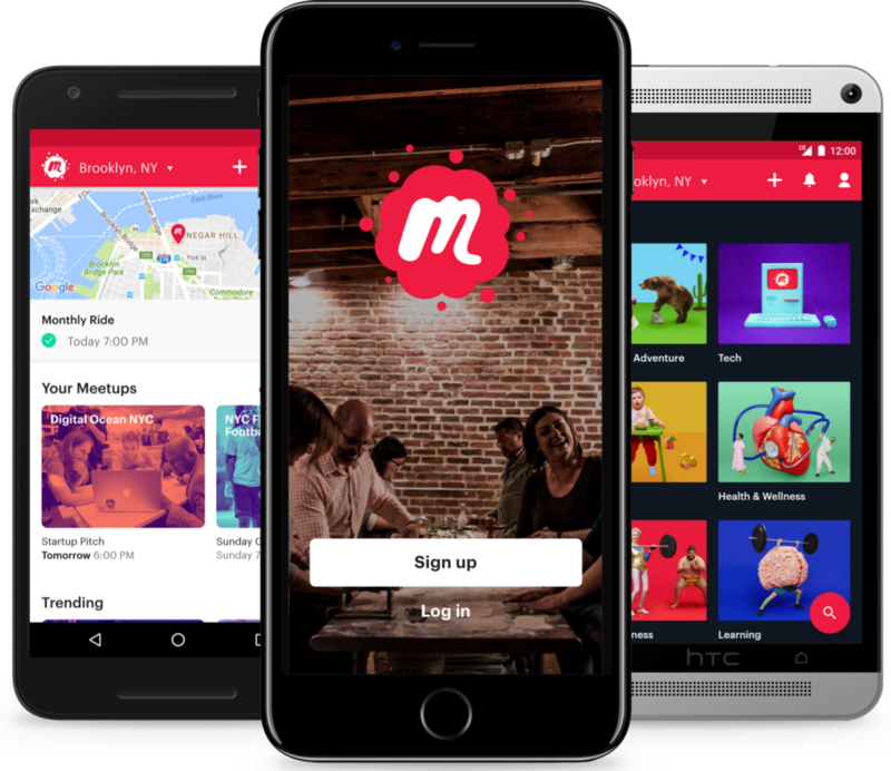
Late last month Meetup, one of the stalwarts of New York City’s tech scene, launched a new redesign, developed in partnership with the famous design studio Sagmeister & Walsh. This video gives you an enthusiastic tour of the new look:
As those familiar with Meetup will notice immediately, the new identity does away with the longstanding “Hi, My Name Is…” nametag logo that had been a defining feature of the brand for many years. This change surprised me; when I asked the Meetup team why they made this decision, they told me that the old logo, though much loved, felt dated. It also continually proved “hard to work with in the modern world. The most important example is that it made a bad app icon. If we tried to fit the entire nametag into the small square the text became unreadable, so we cut off the sides, and that made it unrecognizable as a name tag.”
What I really appreciate about this work is that it’s comprehensive in its approach to the problem of crafting a new brand for a company for which many people have tremendous affection. This is rare; what’s more common, especially for tech companies, is to roll out a new identity that gets shoehorned into the existing product. In this case, the Meetup team integrated its new design principles directly into a major revamp of the Meetup product itself as Sagmeister & Walsh developed the supporting system. The Meetup product design team told me:
Once we got a look at the direction they were thinking, we started integrating that into our mocks. It was a good amount of back and forth and we evolved the app’s visual language as the branding work developed. We also sent over prototypes of the app as we built it out, so that they could see the work in action and give us feedback.
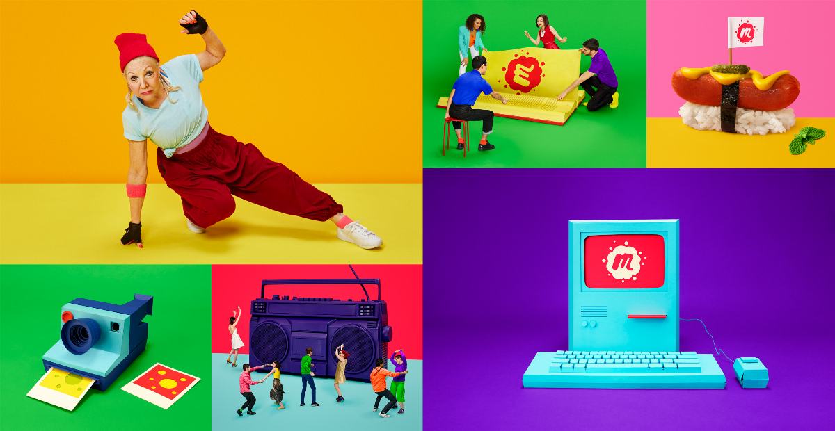
The result of this expansive system includes a photographic series articulated in a visual vocabulary that, from the start, is intimately tied into the new direction of the company. All the elements look of a piece. Here are some examples of the work:
I’m always curious about how effective it is for technology companies to work with design studios, especially veterans like Sagmeister & Walsh. There have been some truly bland outcomes from such pairings in the past, and it often seems clear to me that the act of going to a big name branding studio is really about validating the company in a way meant to comfort investors and business partners more than it’s about doing what’s best for products or customers. I wouldn’t say that Meetup’s rebranding falls into that category—it has far more personality than most, to begin with. There’s a good write-up of the logo and its merits over at Brand New, which captures my sentiments when it concludes, “I highly appreciate its effort for standing out in a sea of logo sameness.”
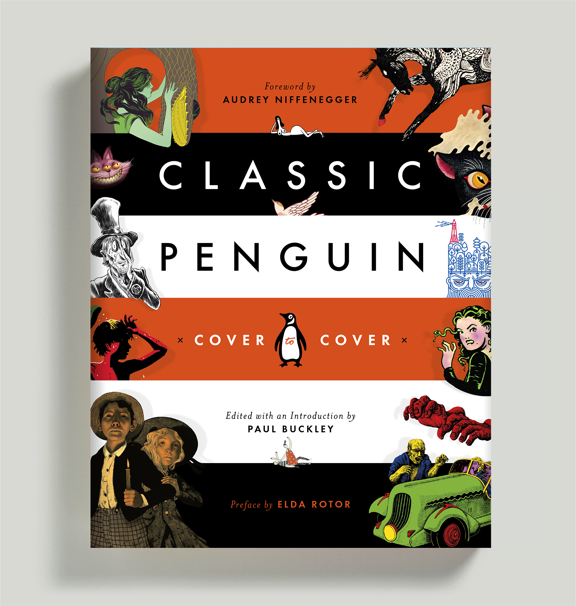
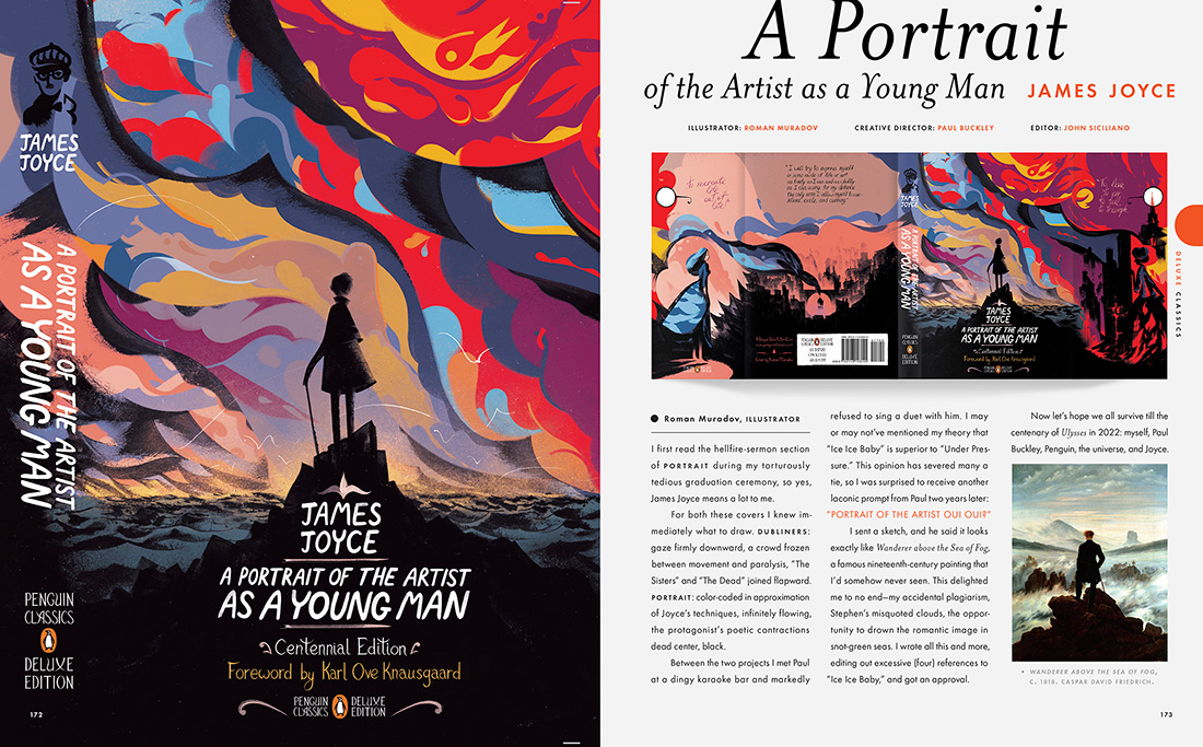
This new book from Penguin creative Director Paul Buckley is gorgeous overview of the past decade or so of wonderfully inventive design at the iconic publishing house. It‘s a “curated tour featuring illuminating commentary by artists and writers, including Malika Favre, Mike Mignola, James Franco, Jessica Hische, Jillian Tamaki and many more.” Buckley sent me five spreads to choose from for posting here; they’re all so graphically sumptuous that I couldn’t leave any of them out.
Last week Figma, a major new contender in the UX/UI design tool space, officially ended its lengthy beta period and launched publicly to the world. If you’ve followed along with its progress at all, you’d probably agree that Figma’s most notable feature is almost certainly that it lives in your web browser rather than as a native desktop app. That alone is a major departure from the kind of software that designers have been comfortable with for decades.
On that account at least, it’s a real achievement. Figma is almost surely the richest browser-based authoring tool ever released for design customers, a distinction that’s likely to inspire varying levels of skepticism among many. However, in my limited usage over the past several months, I’ve been surprised—impressed, even—by how compellingly the Figma team has delivered on this promise. It’s far more robust than you’d expect; there’s not a ton that you can do in Sketch, Photoshop or Illustrator that’s missing from Figma, and the ability to get up and running it without a download or installation process is the epitome of low friction. Kudos to the team.
That said, re-creating commonplace desktop functionality on a web stack still feels like more of a technically impressive demonstration than a true user necessity. Figma’s response to that is to use the inherently connected nature of the web platform to allow “multiplayer” designing—the ability to collaborate in real time with other designers on the same canvas. This video demonstrates it in action.
Again, many designer’s hackles will go up. Few of us were asking for live, simultaneous editing per se, but looked at another way, there’s a lot of potential here. As design problems get more complex and solutions demand that designers cover more and more surfaces and screens, the ability to have a team of designers working together in one canonical document—rather than splitting up a project into an untold number of individual documents to be recombined later—seems like a legitimate hypothesis for how the design process will work in the future. Figma thinks of it “Google Docs for design,” and indeed, the app provides a robust version history feature to let you roll back those ill advised layout or type choices that a coworker might have made while you were on your break.
It’s still early days for this approach though, as I discovered as I tried to push the multiplayer feature through some edge cases. In one instance, I tried editing a simple gray square by changing its color to red. Meanwhile, a colleague made some changes to the box’s shape. Figma reconciled both our sets of changes by returning the shape my colleague made, colored red. That may or may not be what users intend, but the granularity of change management seems like it can be too much for some users to fully grasp, or at least predict.
Still, this is what it means to add ambition to a relatively static feature set—whether you’re using Sketch, Photoshop, or Illustrator, the basic models for how we work are basically all the same and not dramatically different from what was available a decade or two ago. Some things are going to work great out of the box, some things are going to take some ironing out, and some things are going to take time for users to accept. Congratulations to the Figma team for nudging us all forward.
These two videos from filmmaker Vugar Efendi show some beautiful examples of films that have paid homage to famous works of art. They’re short but they’ll enhance your appreciation of many movies you’ve probably already seen.


