We use ad-blockers as well, you know. We gotta keep those servers running though. Did you know that we publish useful books and run friendly conferences — crafted for pros like yourself? E.g. upcoming SmashingConf Barcelona, dedicated to smart front-end techniques and design patterns.
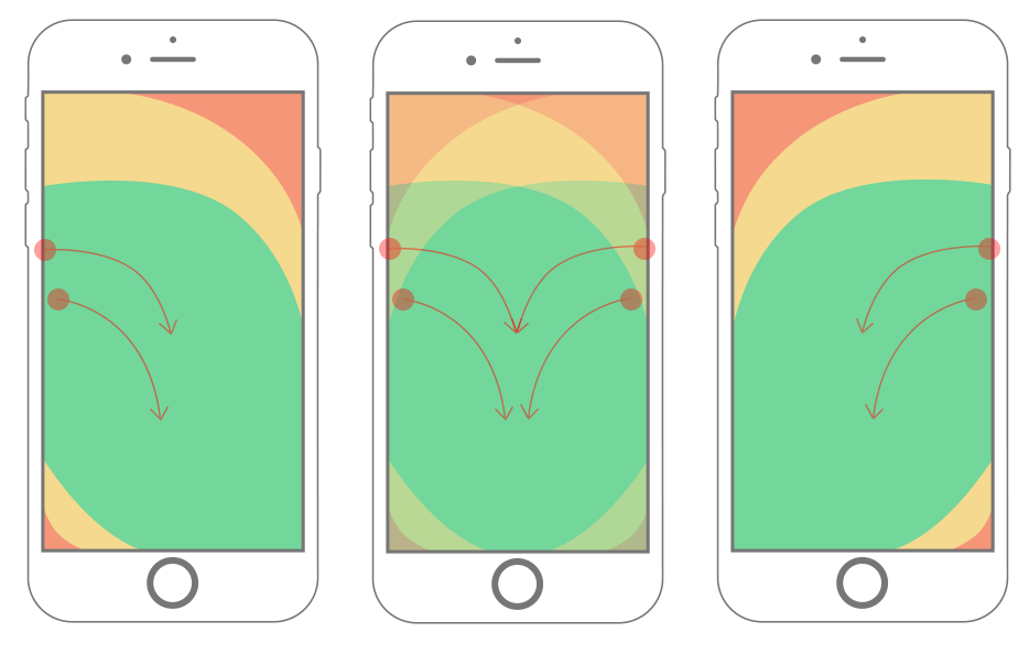
If there is one thing that will stand the test of time, it's thumb placement on mobile devices. This makes consideration of the "thumb zone", a term coined in Steven Hoober's research, an important factor in the design and development of mobile interfaces.
Have you ever interacted with a mobile website or app that simply didn't play nice with your thumbs? Perhaps you've had to stretch to get to an important menu, or swiping turned into a battle with multiple swiping elements. Mishaps such as these reveal poor consideration of the thumb zone.
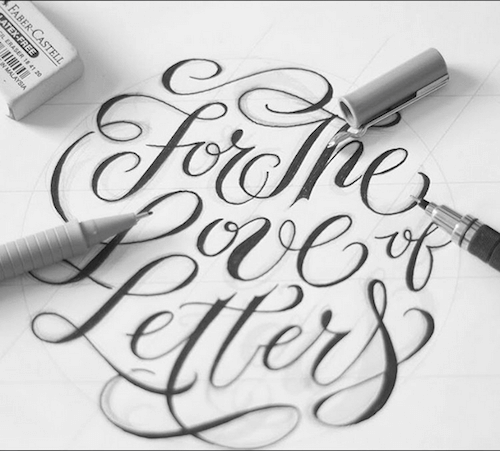
Hand lettering has taken the world by storm. It has become the beautiful connection — a juxtaposition — between design and words. The letter forms in the typography have been broken down into their shapes, flourishes, and textures.
Hand lettering speaks volumes. This is an art form which allows us to see the space between the letters, and the style of the lettering as a piece of art that can deeply evoke emotions and bring meaning — nostalgia, happiness, joy, and love.
Once upon a time, in the not-so-distant past, people considered websites to be a prime indication of how users’ attention was brief and unforgiving. Remember the dreaded bounce rate?
Remember the numerous times you worried that your content and graphics might not be 100% clear to users? That was nothing. Compared to mobile, engaging users on the web is a piece of cake.
Let's say you want to quickly sketch out your idea of a website, or just quickly whip up a small site for testing purposes. Also, neither should take a lot of time to build nor should they need a full-stack toolkit. So, where and how do you start?
Have you tried creating a website with some Dropbox-powered hosting tools? Well, they certainly can provide a fast and easy solution for these occasions. You don’t have to fiddle with servers or bother about deployment, some of them even come with pre-configured templates that you can use or customize to spare you coding time.
It is often easy to overlook the underlying principles that compel people to take action. Instead, we tend to obsess over minute details — things like button color, pricing and headlines. While these things can compel users to take action, it is worth considering the psychological principles that influence users’ behavior.
Unfortunately, few organizations try to understand what influences user action. Research by Eisenberg Holdings shows that for every $92 the average company spends attracting customers, a meager $1 is spent converting them. Real conversion optimization is rooted deeply in psychology.
A long time ago, my personal website was attacked. I do not know how it happened, but it happened. Fortunately, the damage from the attack was quite minor: A piece of JavaScript was inserted at the bottom of some pages. I updated the FTP and other credentials, cleaned up some files, and that was that.
One point made me mad: At the time, there was no simple solution that could have informed me there was a problem and — more importantly — that could have protected the website’s visitors from this annoying piece of code.
The best user experience is the one the user doesn’t notice. It appears smooth and simple on the surface, but hundreds of crucial design decisions have been made to guide, entertain and prevent trouble. If the user experience design does what it’s supposed to do, the user won’t notice any of the work that went into it.
The less users have to think about the interface or design, the more they can focus on accomplishing their goal on your website. Your job as a designer is to give them a straight path to their goal by clearing out the obstacles beforehand.
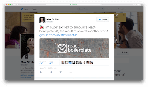
We recently released version 3 of React Boilerplate, one of the most popular React starter kits, after several months of work. The team spoke with hundreds of developers about how they build and scale their web applications, and I want to share some things we learned along the way.
We realized early on in the process that we didn’t want it to be "just another boilerplate." We wanted to give developers who were starting a company or building a product the best foundation to start from and to scale.
Inspiration isn't tied to a specific timeframe or shows up when you need it. There isn't a magic formula to rely on. Luckily, this year's summer vacation was fruitful in providing us with many visual stimuli to get the creative process going. Enjoy!
This illustration, just like all the other ones featured in today's article, takes on curiosity and exploration of different tastes and flavors. Its composition and color palette are truly inspiring.