Upload widget
Overview
Cloudinary is a cloud-based service that allows uploading images (or any other files) to the cloud, from any source and at any scale. Cloudinary can dynamically process and manipulate uploaded images to match your graphic design and deliver these highly optimized to your users via a fast CDN.
Cloudinary's powerful image uploading APIs support uploads at scale from your server-side applications or directly from your users' browsers or mobile devices.
Cloudinary's upload widget
Cloudinary's upload widget is an interactive, feature rich, simple to integrate method to add Cloudinary support to your website. The widget, requiring just a single line of code to integrate, should eliminate the hassle of developing an in-house interactive image upload capabilities.
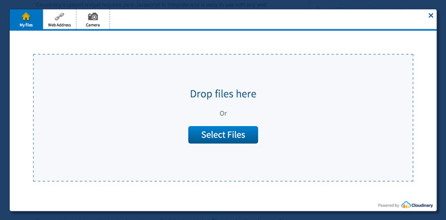
Cloudinary's widget includes a complete graphical interface. With it, a visitor can upload files from three different sources - one or more local images, a remote image (URL) or just snapping an image directly from the computer or mobile device's camera.
The widget supports a drag & drop functionality, interactive cropping, upload progress indication and thumbnail previews. The widget monitors and handles uploading errors.
The upload widget uploads your visitors images directly from their browsers over to Cloudinary, without burdening your servers in the process. The widget sends Javascript callbacks on successful uploads, so you can integrate the upload process back into your existing image pipeline with ease. You can configure Cloudinary to send server-side callbacks as well.
Once uploaded, images can be resized, cropped and manipulated by Cloudinary on-the-fly to be perfectly embedded back into your website or mobile app for viewing.
Cloudinary's upload widget requires pure Javascript to integrate and is easy to use with any web development framework. Advanced features are available using jQuery.

Quick example
In order to use Cloudinary's image upload widget in your site, simply include the the remote Javascript file of the widget (delivered optimized via a fast CDN) and specify the cloud_name of your Cloudinary account.
The following sample code binds to the click event of a link in a web page. The cloudinary.openUploadWidget method is called to programmatically open the upload widget when the opener link is clicked.
When uploading is completed, the widget is automatically closed and a given Javascript callback function is called with a list of uploaded images as the result parameter.
<a href="#" id="upload_widget_opener">Upload multiple images</a>

<script src="//widget.cloudinary.com/global/all.js" type="text/javascript"></script>

<script type="text/javascript">
  document.getElementById("upload_widget_opener").addEventListener("click", function() {

    cloudinary.openUploadWidget({ cloud_name: 'demo', upload_preset: 'a5vxnzbp'},
      function(error, result) { console.log(error, result) });

  }, false);
</script>
You can try out a live example by clicking on the following button:
The example above used standard Javascript code to open the widget and allows multiple image uploading. The following example uses jQuery this time for converting an existing link to a widget opener button. This time uploading to a certain folder and enabling interactive cropping of a single uploaded image.
<script src="//widget.cloudinary.com/global/all.js" type="text/javascript"></script>

<script type="text/javascript">
  $('#upload_widget_opener').cloudinary_upload_widget(
    { cloud_name: 'demo', upload_preset: 'a5vxnzbp',
      cropping: 'server', 'folder': 'user_photos' },
    function(error, result) { console.log(error, result) });
</script>
You can try out another live example by clicking on the following button:
Setup
Account setup
- Create a Cloudinary account and copy your cloud name.
- Enable unsigned uploading from the Upload Settings page of the management console. Copy the name of the created upload preset.
If you want to read more about upload presets, see the following articles: Direct upload made easy, from browser or mobile app to the cloud and Centralized control for image upload - image size, format, thumbnail generation, tagging and more .
Include widget script
HTTP URL:
HTTPS URL:
Protocol agnostic URL:
For example:
<script src="//widget.cloudinary.com/global/all.js" type="text/javascript">
</script>
Including jQuery in your website is optional. It allows showing thumbnails of uploaded images and creating hidden fields with the identifiers of the uploaded images. The following example is a Javascript include line of the jQuery library.
<script src='//ajax.googleapis.com/ajax/libs/jquery/1.11.1/jquery.min.js'></script>
API methods
The following Javascript method are publicly available for calling from your Website's code after including Cloudinary's upload widget Javascript file.
setCloudName(name)
Globally set the cloud name for all widget method calls.
For example:
<script src="http://widget.cloudinary.com/global/all.js" type="text/javascript">
</script>
<script>
  cloudinary.setCloudName('cadf1nga');
</script>
cloudinary.openUploadWidget(options, result_callback)
Programmatically create a widget frame and open it. options is a map of all widget options, including both client side settings and upload API parameters.
result_callback is an optional function called when the upload widget completes, either successfully uploading all images or when the widget is closed by user. The callback method is of the following signature function(error, result) . While error is either null if successful or an error message if there was a failure. result is an array of upload image infos, as returned by Cloudinary's upload API.
The method returns a widget object that has the following simple methods for opening and widget and closing it: open() and close().
For example:
cloudinary.openUploadWidget({upload_preset: 'a5vxnzbp'},
  function(error, result) {console.log(error, result)});
cloudinary.createUploadWidget(options, result_callback)
Same as openUploadWidget except that it creates a widget object and frame but does not display it until the open method of the returned widget object is called.
For example:
var widget = cloudinary.createUploadWidget({ upload_preset: 'a5vxnzbp' },
      function(error, result) {console.log(error, result)});

widget.open();
cloudinary.applyUploadWidget(element, options, result_callback)
Same as createUploadWidget except that it modifies the given element to be a nice blue button (customizable look & feel) that when clicked opens a pre-created upload widget. In addition, the form and thumbnails options are implicitly set by default to the containing form of the given element.
For example:
cloudinary.applyUploadWidget(document.getElementById('opener'),
  { upload_preset: 'a5vxnzbp' },
    function(error, result) {console.log(error, result)});
$.fn.cloudinary_upload_widget
Same as applyUploadWidget. Uses jQuery selector to apply on matching elements.
For example:
$('#opener2').cloudinary_upload_widget({ upload_preset: 'a5vxnzbp' });
'cloudinarywidgetsuccess' - Global success event binding
If jQuery is loaded in your site, you can bind to the the cloudinarywidgetsuccess event for receiving success callbacks of all matching upload widgets in your page.
For example:
$(document).on('cloudinarywidgetsuccess', function(e, data) {
  console.log("Global", e, data);
});
'cloudinarywidgetdeleted' - Image deletion event binding
If jQuery is loaded in your site, you can bind to the the cloudinarywidgetdeleted event for receiving a callback when an image is deleted using the 'x' within the image thumbnail (after the image upload completes). The event receives an object that includes the details of the deleted image (resource_type, type, public_id).
For example:
$(document).on('cloudinarywidgetdeleted', function(e, data) {
  console.log("Public ID", data.public_id);
});
Look & feel customization
The look & feel of the upload widget can be fully customized. You can modify colors, fonts, icons and other elements by providing your custom CSS styles. In addition, Cloudinary provides predefined themes instead of the default one.
Custom styles are specified using the 'stylesheet' option. It accepts either a URL of a CSS file with style override instructions or inline style as a string. See the CSS files of the white and minimal themes as reference implementations.
A theme can be applied by setting the 'theme' option to the name of one of the following predefined themes:
'default'

'white'

'minimal'

'purple'

Upload widget options
| Option name | Type | Description |
|---|---|---|
| Mandatory widget options | ||
| cloud_name |
Mandatory string.
Example: 'demo' |
The cloud name of your Cloudinary's account. Can be set either globally using setCloudName or explicitly for each widget creation call. |
| upload_preset |
Mandatory string (optional if upload_signature is used)
Example: 'a5vxnzbp' |
The name of an unsigned upload preset defined for your Cloudinary account either through the Settings page or using the Admin API. |
| Widget behavior | ||
| sources |
Array of strings:
local, url, camera Default: ['local', 'url', 'camera'] |
List of file sources that should be available as tabs of the widget's helper. Supported sources are: local files using selection or drag & drop, remote HTTP URL and webcam capturing.
Note: Camera is currently supported in all modern browsers, not including Internet Explorer and Desktop Safari. |
| default_source |
String.
Default: local |
The default selected source tab when the widget is opened. |
| multiple |
Boolean.
Default: true |
Whether selecting and uploading multiple images is allowed. Completion callback is called only when all images complete uploading. Multiple hidden fields of image identifiers are created if set to true. If set to false, only a single image is allowed in any source. |
| max_files |
Integer.
Default: null. Unlimited. Example: 10 |
The maximum number of files allowed in multiple upload mode. If selecting or dragging more files, only the first max_images files will be uploaded. |
| cropping |
String.
Cropping modes: 'server' Default: null. No cropping. Example: 'server' |
Whether to enable interactive cropping of images before uploading to Cloudinary. Interactive cropping allows users to mark the interesting part of images. The selected dimensions are sent as the custom_coordinates upload parameter of Cloudinary.
Setting gravity to custom when generating delivery URLs will focus on the marked region. Incoming cropping on the server-side can be applied by applying the crop mode with the custom gravity of in your upload preset. Enabling cropping forces single file uploading. |
| cropping_aspect_ratio |
Decimal.
Default: null. No constraint. Example: 0.5 |
If specified, enforce the given aspect ratio on selected region when performing interactive cropping.
Relevant only if cropping is enabled. The aspect ratio is defined as width/height. For example, 0.5 for portrait oriented rectangle or 1 for square. |
| cropping_default_selection_ratio |
Decimal.
Default: 0.9. Range: 0.1 to 1.0. Example: 0.75 |
Initialize the size of the cropping selection box to a different value from the default (0.9).
Relevant only if the cropping feature is enabled. The cropping_default_selection_ratio value is calculated as a proportion of the image's size. |
| cropping_show_dimensions |
Boolean.
Default: false. |
Displays the cropping dimensions in the top left corner of the cropping region.
Relevant only if the cropping feature is enabled. |
| cropping_coordinates_mode |
String: 'custom', 'face'.
Default: 'custom'. Example: 'face' |
Determines how to apply the selected region coordinates.
'custom': the selected region is set as the 'custom_coordinates' upload parameter (default value). 'face': the selected region is set as the 'face_coordinates' upload parameter. Relevant only if the cropping feature is enabled. |
| Upload parameters | ||
| public_id |
String.
Default: null. Example: 'profile_11002' |
Custom public ID to assign to a single uploaded image. If not specified, either a randomly generated string or the original file-name is used as the public ID according to the unsigned upload preset. To ensure secure usage, overwriting previously uploaded images sharing the same public ID is prevented. |
| folder |
String.
Default: null. Example: 'user_photos' |
Folder name for all uploaded images. Acts as the prefix of assigned public IDs. |
| tags |
String or array of strings.
Default: null. Example: '['users' 'content'] |
One or more tags to assign to the uploaded images. |
| resource_type |
String: 'auto', 'image', 'raw'.
Default: 'auto' Example: 'image' |
The resource type of the uploaded files. By default, both images and raw files are allowed. Setting to either 'raw' or 'image' forces only raw files or only images respectively. |
| context |
Map of key-value pairs.
Example: { alt: "my_alt", caption: "my_caption"} |
Additional context metadata to attach to the uploaded images. |
| upload_signature |
Optional string or function
Example: 'c347053314777423cd4f' |
Either a string representing the precalculated signature of all upload parameters used, or a function to generate the signature string dynamically. The function accepts 2 parameters, the first is a resultCallback (function) and the second is an object with the relevant upload parameters that are needed for generating the signature. See Request authentication for more information. |
| upload_signature_timestamp |
Number.
Example: 1315060076 |
The Unix time in seconds of the current time. The timestamp is valid for 1 hour.
Relevant only if upload_signature is also provided. |
| Client side actions | ||
| client_allowed_formats |
Array of file formats: png, jpg, gif, doc, xls, etc.
Default: null. All formats allowed. Example: ["png","gif", "jpeg"] |
Allows client-side validation of the uploaded files based on their file extensions. You can specify one or more image or raw file extensions. |
| max_file_size |
Integer. Number of bytes.
Default: 20000000 (20 MB) Example: 1300000 |
If specified, perform client side validation that prevents uploading files bigger than the given bytes size. |
| max_image_width |
Integer. Number of pixels.
Default: null (no resizing) Example: 2000 |
If specified, client-side scale-down resizing takes place before uploading if the width of the selected file is bigger than the specified value. |
| max_image_height |
Integer. Number of pixels.
Default: null (no resizing) Example: 2000 |
If specified, client-side scale-down resizing takes place before uploading if the height of the selected file is bigger than the specified value. |
| min_image_height |
Integer. Number of pixels.
Default: null (no validation) Example: 200 |
If specified, client-side validation takes place before uploading, checking if the height of the selected file is smaller than the specified value. |
| min_image_width |
Integer. Number of pixels.
Default: null (no validation) Example: 200 |
If specified, client-side validation takes place before uploading, checking if the width of the selected file is smaller than the specified value. |
| cropping_validate_dimensions |
Boolean.
Default: false. Example: true |
Relevant only if the cropping feature is enabled AND one or more of the following parameters are also set: max_image_width, max_image_height, min_image_width or min_image_height.
If specified, the client-side validation takes place on the size of the original image as well as on the size of the cropping region marked by the user. |
| max_chunk_size |
Integer. Number of bytes.
Default: 20000000 Example: 6000000 |
Configure the maximum chunk size for uploading large files. The default value for this parameter is 20MB and must be at least 5MB. |
| Containing page update | ||
| form |
String. jQuery-style selector.
Default: null Example: '#my_form' |
The selector (CSS path) of the form, to which you would like to append hidden fields with the identifiers of the uploaded images.
Implicitly set by default to the containing form of the given element when the widget is created using applyUploadWidget or $.fn.cloudinary_upload_widget. Note: Supported only if jQuery is loaded in your site. |
| field_name |
String. Form field name.
Default: 'image' Example: 'photo[]' |
The name of the hidden field added to your form when image uploading is completed. Multiple hidden fields with the same name are created for multiple uploaded images. The name may include '[]' for supporting web frameworks such as Ruby on Rails.
Note: Supported only if jQuery is loaded in your site. |
| thumbnails |
String. jQuery-style selector.
Default: null Example: '.content .uploaded' |
Selector (CSS path) of an HTML element that acts as the container for appending the uploaded images thumbnails.
Implicitly appended by default to the containing element (if it exists) of the upload widget element. If you don't want to display thumbnails at all, set to 'false'. Note: Supported only if jQuery is loaded in your site. |
| thumbnail_transformation |
String, Map or Array of maps.
Default: { width: 90, height: 60, crop: 'limit' } Examples: { width: 200, height: 200, crop: 'fill' } [ {width: 200, height: 200, crop: 'fill'}, {effect: 'sepia'} ] "w_200" |
The Cloudinary transformation (image manipulation) to apply on uploaded images for embedding thumbnails in your site.
Any resizing, cropping, effects and other Cloudinary transformation options can be applied by specifying a transformation string, a map of transformations parameters or an array of chained transformations. Thumbnails transformations can be eagerly generated during upload by defining a set of eager transformations in your defined upload preset. |
| Customization | ||
| button_class |
String.
Default: 'cloudinary-button' Example: 'my_button' |
Allows overriding the default CSS class name of the upload button added to your site. Default CSS style is applied to the cloudinary-button class, that you can override using CSS directives. Alternatively, you can specify any class name that matches your website design. |
| button_caption |
String.
Default: 'Upload image' Example: 'Pick photo...' |
Allows overriding the default caption of the upload button added to your site. |
| theme |
String. Supported themes: 'default', 'white', 'minimal', 'purple'.
Default: 'default' Example: 'white' |
The name of a predefined widget theme. Widget behavior is the same for all themes, while look & feel changes. |
| stylesheet |
String. Either a URL of a CSS file or inline CSS styles.
Default: null Examples: 'http://mydomain/widget_style.css' '//mydomain/widget_style.css' '#cloudinary-overlay { background-color: #a7a7a7; } #cloudinary-widget { background: #f0f0f0; }' |
Advanced customization of the widget's look & feel. Allows overriding the widget theme's colors, fonts, icons and other elements by providing custom style definition. See the white and minimal themes as reference implementations. |
| text |
Object. Optional
"key":"value" pairs of text to override the widget's default text labels |
Here you can see sample object containing all of the available keys & their default values. |
| inline_container |
String selector or DOM element. Optional
Default: null Examples: '#my-widget-container' document.getElementById('my-widget-container'); |
Embed the widget inside your web page instead of it appearing as a modal dialog. |
| Advanced | ||
| keep_widget_open |
Boolean.
Default: false |
Mainly for debug purposes. If set to true, the upload widget remains open when uploading is completed. |
| show_powered_by |
Boolean.
Default: true |
If set to false, the Powered By Cloudinary icon is not displayed.
Note: Supported only for paid Cloudinary accounts and requires some time for cache expiration. |