The Telegraph Media Group is the proprietor of The Daily Telegraph, a British, daily-morning, English-language broadsheet newspaper that is read throughout the United Kingdom and internationally. In addition to The Daily Telegraph, the Telegraph Media Group also publishes advice to travelers online in their app, The Telegraph Travel Guides. The guides are written by local experts, and the free app offers innovative functionality and intuitive advice covering what to do and where to stay, eat, drink and shop.
The Telegraph's editors and writers wanted a modern and simple UI for the Travel Guides App. Their previous CMS was outdated, and content population was a time-consuming process run through Google Spreadsheets. The team also wanted to improve the stability of their Travel Guides App.
The main objective of this project was to improve the stability, workflow and content delivery of the Telegraph Media Group's Travel Guides App.
Drupal was chosen for the content management system because the site is a heavily content-based project. The editors and writers need to have separate permissions, and that can be easily managed with Drupal. With this in place, content management can easily be distributed across departments.
Additionally, a major goal of the redesign was that the Telegraph's non-technical editors and writers should be able to easily create, edit and publish content. The previous system/workflow used Google Spreadsheets as their CMS. As there is a lot of content in the app, using Google Spreadsheets was frustrating for the content editors and writers when they tried to create, edit and delete content. Different tabs, columns and rows were used to store content and there was no easy workflow to search specific travel guides and relationships between them. There was also no form of efficient revisioning on any changes that were made. This forced the editors to create copies of spreadsheets, which quickly got messy and hard to maintain. Other tasks, such as sorting different types of content, were also wildly difficult and inefficient.
Drupal provided the needed search, revisioning, and categorization functionalities that the team was looking for. Specifically, the Drupal Views module provided functionality for a simple UI where the users can sort by content type or use an exposed filter for search with Views.
Building an easy-to-use CMS with a user-friendly user interface (UI)
Our first step was to review the existing IA structure, investigate existing content types and their dependencies, and build on the new structure of the website. Once this was in place, we began to focus on the UI for the editors, creating a simple solution to allow them to easily populate content.
For the look and feel of the site, we used Sass (a CSS preprocessor) to allow developers to write better code and keep the style sheets concise. This helped to define a clear structure, such as breaking the styles into global and partial files. Alongside Sass, Compass and Bootstrap were used for support.
For the backend development, we focused on using only one custom module and one feature module so that it can be easily maintained. We used the custom module as the main application module that handles the behaviour of allowing editors to create, edit and delete content through the Drupal UI. It also handles the processes of packaging and publishing available content to the staging or production app. The module handles various features such as controllers, exceptions, test cases, creation of forms, packaging/publishing and an overall management. The module was built for the integration between the workflow of publishing content from Drupal to the Travel Guides App.
The feature module stores various configuration settings of the site. This includes Views, content types and their fields, theme settings, taxonomy configurations and user permissions. This helped to export configuration from one Drupal environment to another. During the development workflow, it was used to deploy changes of components to various environments.
Despite the challenges that naturally come with working with a content-rich website, during the development phase we always endeavoured to make the UI as simple as possible without compromising the functionality and behaviour of the app. The idea of using the Views module as a display helped us with the UI: Views handles complex functionalities while keeping the display simple. It also provided us with the use of buttons such as creating and editing content.
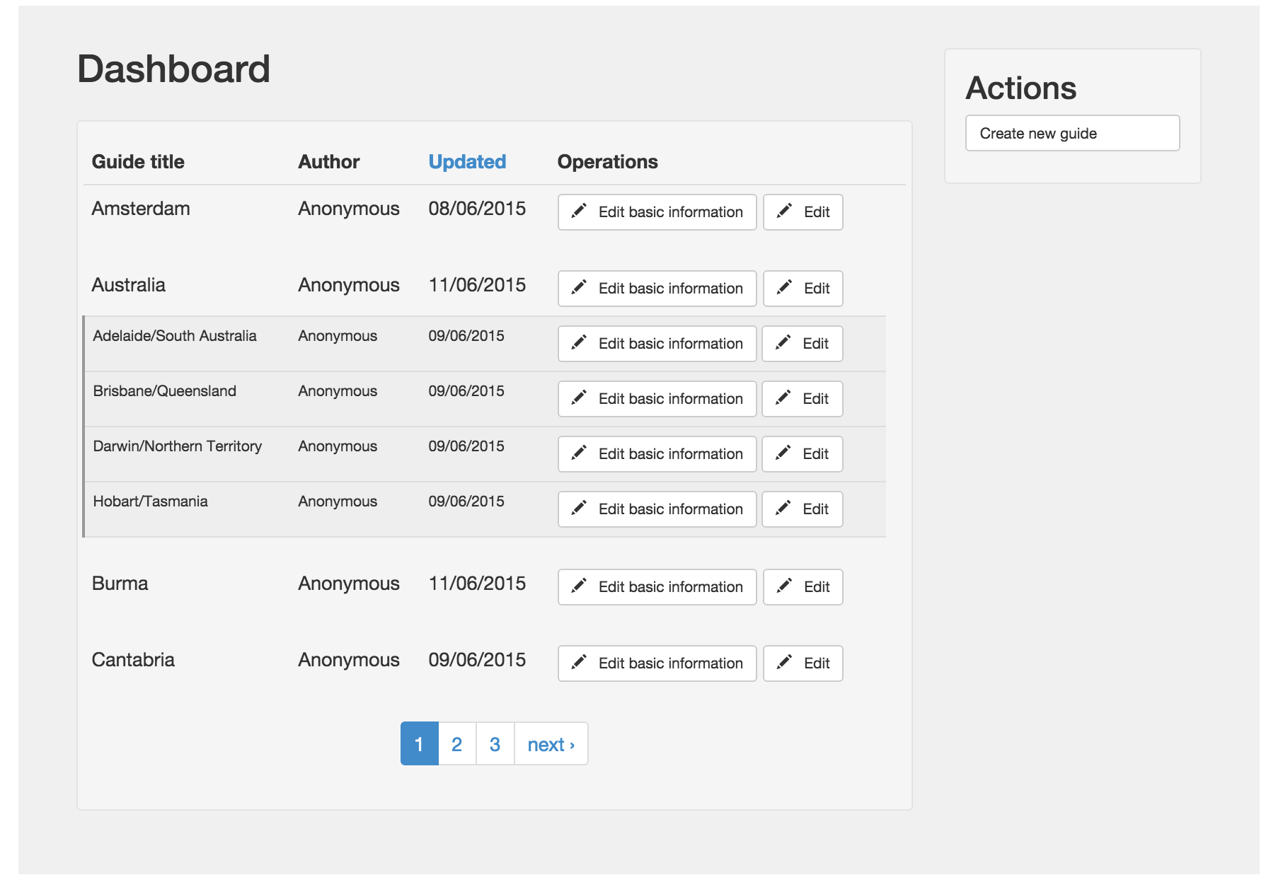
We considered various aspects such as navigation, layouts and the publishing process from the CMS to the app. We wanted an easy user-friendly navigation that allows the content editors to easily understand the workflow of building, managing and accessing content. In terms of the layout, we wanted to ensure that the content is easily scannable with no performance issues with loading. The introduction of using pagers provided by views worked well as there are lots of content available on the site. A simple layout also had the benefit of allowing the content editors to easily publish their content to the app. This was done by splitting up feature onto different pages. For example, a page that handles editing the basic information of a guide while another page handles publishing the guide with the ability to see its inner content that will get published.
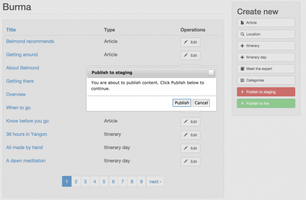
As a result we built two dashboards allowing users to create and manage a wide range of content. One dashboard allows users to create a new guide from scratch.

The second dashboard lists available content such as existing guides, locations, cities, hotels, restaurants, bars, beaches, shops and more.

With this new UI, an editor can simply click on any action button in the right hand side block to create new content for an existing guide. The Prepopulate module is used to help populate the guide so that the content added belongs to that specific guide. Once the content is created and saved successfully, the user is taken back to the guide dashboard.
Publishing workflow and testing
When publishing, the editor or writer is provided with two options: pushing the content of a specific guide to either a staging app or a production app. During the publishing process, the system goes through several stages: packaging all content that belongs to that guide, transforming it into JSON objects, generating a JSON file which is then zipped up (done by a custom zip creator API) with all relevant images uploaded. Each guide published will have a folder with its JSON file and images stored ready to be zipped.
If an existing guide is updated and published, its relevant JSON file (which consist of all data related to a particular guide) and images within the folder will also get updated before zipping. During this process, a global manifest JSON file (which holds summary data of all guides) also gets updated. The zipped folder then gets pushed to the staging/production server environment (using SFTP) which gets processed and displays the content on the app. Rsync and PHP-exec rights were also considered to ensure that the remote server can synchronise the files/folders. A module configuration settings page was created where the staging and production endpoints are set.
In terms of the structure of code, each content type is written as a controller class where it contains its relevant properties and methods. Each controller also extends a “global” controller for any common methods that can be shared between all specific controllers. An example of an article controller class is class ArticleController with const FIELD_HEADING = ‘field_article_body’; representing one of the fields. This is so that during the publishing process, we can easily get any set of data. Alongside of having controllers, we also had exporters. An Exporter plays the part of exporting data from its relevant nodes and transforming it into a JSON-like data structure. Each type of content had its own exporter class which makes up the different parts in the guide data json file. Some examples are:
Class ArticleExporter - handles export of all articles that belong to a guide.Class LocationExporter - handles export of all locations that belong to a guide.
An example of the structure of a guide data JSON file is:

Some validation was also added where the editor/writer cannot publish until the minimal set of content is available. Validation was also added to the SFTP settings where a message will be displayed if it fails to push to the app.
During testing, we had to ensure that the CMS had replaced the process of using Google Spreadsheets while maintaining its original purpose of publishing to The Telegraph Travel Guides App successfully. This was done by having a testing app where content was published to and compared with the production app. An in-house comparison tool from The Telegraph was also used to compare the json data created by our custom module on the testing app against the existing data on the production app.
Thanks to the Drupal interface, The Telegraph editors and writers are now able to easily and rapidly create, manage, and publish content to the travel app.
Cameron & Wilding Ltd.
Ben Wilding: Project director
Laura Delnevo: Project manager / Scrum master
Michael Otolorin: Drupal developer
Peter Arato: Lead developer
Brendan Macdonald: Automated / manual tester
The Telegraph Media Group
Emilio Vacca: Director of mobile
Wendy Cunniappen: Project manager
Mathias Douchet : Product owner
Francesca Cuda: Tech lead
The project team:
In order to achieve the best results, we collaborated extensively with both the editorial and technical teams at The Telegraph. The C&W team consisted of a Project Director, a Lead developer/ Consultant, a main Drupal developer, Project manager and a Tester. The Telegraph team comprised a Director of mobile, Project manager, Product owner and a Tech lead. The Telegraph writers and editors are very pleased to see how the CMS allows them to easily and rapidly create, manage and publish content to their travel app, eliminating the frustration of using Google spreadsheet as their content management system. The end result is a greatly simplified Drupal UI, created without having had to change the app itself.

