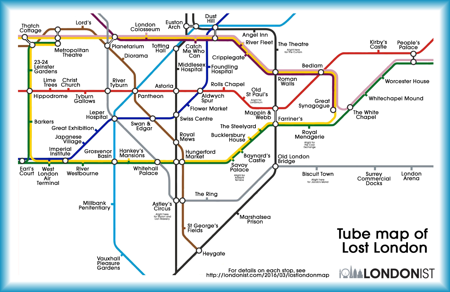
London is a ghost of all the things that were once there, and The Lost London Tube Map shows off some of the most famous forgotten landmarks. Biscuit Town and Bedlam are long gone, but others (like Vauxhall Pleasure Gardens) are still around to be rediscovered.
Some losses are definitely for the best. Few would welcome back the public horror of Tyburn gallows, or the miserable Marshalsea Prison. Other losses are a cause of some regret: Euston Arch and the Astoria, for example. Imagine a city where Whitehall Palace still stands, and Old London Bridge yet straddles the Thames. Of course, we're barely scratching the surface. We've not included the Overground or DLR, and have limited the scope to (roughly) zone 1. A whole heap of buildings such as Watkin's Folly and the White City Olympic stadium are left out, and we don't have room to include all the important stuff lost from central London.
Read the rest

Belzberg Architects built the magnificent "Skyline Residence" on a ridge in the Hollywood Hills. The 5,800 home consists of two separate structures, a main house and guest house, with a gathering space between them to watch a film outside.
Read the rest

If your website looks like the above, it just got old. HEY LOOK, IT'S EVERY BOOTSTRAP WEBSITE EVER [adventurega.me]
Want to make an original website yourself?
Forget that! Who would ever want to put in all of that effort for a website? Just open up your web browser and type "bootstrap template" into your favorite search engine, like Yahoo! or Bing, and you're on your way! There are hundreds of templates to choose from, but go ahead and pick this same exact template from the first result on google, edit a few lines, and you're on your way! No one will notice!
GOOGLE THAT SHIT
Read the rest

The Things Organized Neatly blog (previously), which celebrates the kentucky art of knolling, is now a gorgeous, essential book filled with photos of meticulously arranged wonders of all description.
Read the rest

Barcelona design firm Bel & Bel makes chairs out of the front farings of old Vespa scooters, with the option of working turn-signals (no side-mirrors in sight, alas).
Read the rest
In an IP infringement case involving the manufacturers of competing children's suitcases the UK's Supreme Court ruled in favor of the makers of the quasi-knockoff.
From BBC:
Supreme Court Justice Lord Neuberger said Trunki was "both original and clever" and he said it "appears clear" the Kiddee Case had been conceived "as a result of seeing a Trunki and discovering that a discount model was not available".
But he said: "Unfortunately for Magmatic, however, this appeal is not concerned with an idea or an invention, but with a design."
Over at the design website Core77, the commenters agree with the court's decision. "Similar, but not the same.... same complaint could be made between automakers... Ford truck looks like Chevy, vise versa....," says Noodle Time. "I think the scary part to designers is the fact that if you conceive anything even remotely related to some other product, you run the risk of being sued, and even if you win, may still be left with a monetary loss." Read the rest

I haven't seen High-Rise yet, but I'm looking forward to it. In this article from Creative Review, Mark Sinclair interviews graphic artists Michael Eaton and Felicity Hickson, who designed the stunning props for the movie.
Ben Wheatley’s High-Rise, looks at mid-70s Britain through the prism of an ultra-modern tower block. Adapted from JG Ballard’s 1975 novel by Amy Jump, the film follows Dr Robert Laing (played by Tom Hiddleston) as he adjusts to his new life as a tenant on the 25th floor and explores the relationships between the building’s various social groups and the tribal mentalities that emerge as the tower gradually descends into chaos. While working families live on its lower levels and aspirant professionals reside halfway up, a wealthy elite is confined to the uppermost floors – a structure that does not last long.
To help realise this unique world, envisioned by production designer Mark Tildesley, graphic artists Michael Eaton and Felicity Hickson created a legion of objects and products and several type treatments for the film’s locations: one for the high-rise itself, with its supermarket, gym, spa and swimming pool; a house font for the building’s architect, Anthony Royal; and signage for Laing’s place of work, the School of Physiology.
Read the rest
How far would you go to rescue the remains of a bygone world you've loved since you were a kid? Peter Knego went to Alang, India, and then did it again and again, to save what he could of the great ocean liners being scrapped there. But he didn't just want to save the ships. He wanted to live in one. And to a remarkable degree he's succeeded, filling his home in Oceanside, CA with a breathtaking array of maritime memorabilia.
This week on HOME: Stories From L.A., one man's mission to recreate, in landlocked miniature, the great days of the oceangoing ships.
Subscribe: iTunes | Android | Email |
Check out all the great podcasts that Boing Boing has to offer! Read the rest

See sample pages from this book at Wink.
I got my hands on a copy of The Art of Zootopia last week, days before the movie opened, and was so enamored with the fresh yet classic Disney-inspired art that I was already set on reviewing the book. Then over the weekend I watched the movie with my 12-year-old daughter and friends, and wow! What a brilliantly humorous and moving winner of a movie it was. Bravo to directors Byron Howard and Rich Moore! But this is Wink, so back to the book…
The Art of Zootopia is such a treat in the way that it not only revisits the movie’s delightfully heartwarming characters and fantastic art, but gives us an engaging look at what went into the making of Zootopia. The book starts with author Jessica Julius describing the movie’s original story pitch – a 1960s spy story – and how it evolved over four years into the modern day tale of underdogs, prejudice, and fighting for justice for all. She gives us the scoop on how the characters were developed (balancing a feminine yet tough, naïve yet sharp, optimistic yet challenged bunny cop isn’t so easy!), shows us amazing “sets” I don’t even remember in the fast-moving film, and she lets us in on all kinds of fun details, like the fact that it took eight months to get the various animals’ fur just right (color, texture, and direction of fur growth takes more contemplation than I realized). We are also privy to many sketches and scenes that were eventually cut from the film. Read the rest

The New York Public Library's spectacular Digital Public Library challenged designers to create new covers for some of the public domain's greatest books, which had been previously doomed to an undeserved dullness thanks to the auto-generated covers that book-scanning projects stuck them with.
Read the rest

Inspired by the "evolutionary tree diagram" format, Talking Heads vocalist, artist, and writer David Byrne drew numerous tree diagrams meant to "explain" everyday phenomena, terminology, and the irrationality of life. For example, above is the diagram of "Romantic Destiny" (2003). Ten years ago, Byrne collected his diagrams in a wonderful book titled Arboretum.
Möbius Structure of Relationships:
Legacy of Good Habits:
History of Mark-Making:
See more on Byrne's site: "Tree Drawings/Arboretum"
Read the rest
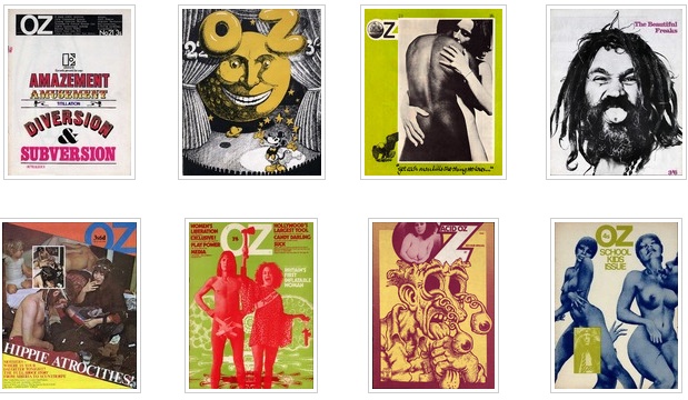
The University of Wollongong has kindly scanned every gorgeous issue of OZ, a psychedelic magazine from the UK, which ran from 1967 to 1973.
OZ was founded by Martin Ritchie Sharp (1942 – 2013).
[Sharp] was an Australian artist, underground cartoonist, songwriter and film-maker.
Sharp made contributions to Australian and international culture from the early 1960s, and was called Australia's foremost pop artist. His psychedelic posters of Bob Dylan, Donovan and others, rank as classics of the genre, and his covers, cartoons and illustrations were a central feature of OZ magazine, both in Australia and in London. Martin co-wrote one of Cream's best known songs, "Tales of Brave Ulysses," created the cover art for Cream's Disraeli Gears and Wheels of Fire albums, and in the 1970s became a champion of singer Tiny Tim, and of Sydney's embattled Luna Park. [Wikipedia]
OZ magazine was published in London between 1967 and 1973 under the general editorship of Richard Neville and later also Jim Anderson and Felix Dennis. Martin Sharp was initially responsible for art and graphic design. Copies of OZ can be viewed and downloaded for research purposes from this site. OZ magazine is reproduced by permission of Richard Neville.
Please be advised: This collection has been made available due to its historical and research importance. It contains explicit language and images that reflect attitudes of the era in which the material was originally published, and that some viewers may find confronting. [University of Wollongong]
[via] Read the rest

Objects of Desire: A Showcase of Modern Erotic Products and the Creative Minds Behind Them by Rita Catinella Orrell is a coffee table book that has photos of 100 design-centric sex toys and interviews with their designers. The cover features Crave's hit Vesper vibrator.
Design website Core77 interviewed the author, Rita Catinella Orrell about Objects of Desire, which out March 28 from Schiffer Publishing.
Read the rest

Suppose you wanted to design a home away from home. What would you put in? What would you leave out? What kind of seating would you have? (Soft? Hard? Low? High?) What kind of tables — big working slabs or intimate little two-tops?
A good “third place” may seem casually homey, but its design is the end result of a million tiny decisions. This week on HOME: Stories From L.A., it’s a conversation with Kambiz Hemati, who oversaw store design at Starbucks for two years and now owns Love Coffee Bar in Santa Monica, where he gets to think hard — and think small — about what makes a place feel like home.
Thanks for listening. And if you like what you hear, please subscribe and leave us a rating and/or review on the iTunes Store.
Check out all the great podcasts that Boing Boing has to offer! Read the rest

In 1979, MIT professor Christopher Schmandt and colleagues developed "Put That There," a voice and gesture interactive system, in the Architecture Machine Group (that later evolved into the famed MIT Media Lab). In this video, a researcher demonstrates the system while sitting comfortably in a stylish Eames Lounge Chair. From a 1982 paper about the project (PDF):
(Put That There) allows a user to build and modify a graphical database on a large format video dis- play. The goal of the research is a simple, conversational interface to sophisticated computer interaction. Natural language and gestures are used, while speech output allows the system to query the user on ambiguous input.
This project starts from the assumption that speech recognition hardware will never be 100% accurate, and explores other techniques to increase the use- fulness (i.e., the "effective accuracy") of such a system. These include: redundant input channels, syntactic and semantic analysis, and context- sensitive interpretation. In addition, we argue that recognition errors will be more tolerable if they are evident sooner through feedback and
easily corrected by voice.
(Thanks, Dustin Hostetler!)
Read the rest

Dutch design house Nightshop sourced soft urethane nonskid foam, which starts off as a liquid that you squirt out of a syringe, and they proceeded to weave a series of handmade rugs out of it.
Read the rest
