- published: 14 Mar 2014
- views: 1466
- author: Evan der Millner
-
remove the playlistRoman Cursive
- remove the playlistRoman Cursive
- published: 14 Mar 2014
- views: 1130
- author: Evan der Millner
- published: 03 Apr 2014
- views: 254
- author: Evan der Millner
- published: 28 Mar 2014
- views: 600
- author: Evan der Millner
- published: 20 Apr 2015
- views: 1
- published: 13 Sep 2014
- views: 322
- published: 20 Aug 2010
- views: 469
- author: Evan der Millner
- published: 26 Nov 2011
- views: 15189
- author: linuxfrik
- published: 28 Oct 2014
- views: 55
- published: 09 Mar 2015
- views: 8

Roman cursive (or Latin cursive) is a form of handwriting (or a script) used in ancient Rome and to some extent into the Middle Ages. It is customarily divided into old (or ancient) cursive, and new cursive.
Old Roman cursive, also called majuscule cursive and capitalis cursive, was the everyday form of handwriting used for writing letters, by merchants writing business accounts, by schoolchildren learning the Latin alphabet, and even by emperors issuing commands. A more formal style of writing was based on Roman square capitals, but cursive was used for quicker, informal writing. It was most commonly used from about the 1st century BC to the 3rd century AD, but it probably existed earlier than that. In the early 2nd century BC, the comedian Plautus, in Pseudolus, makes reference to the illegibility of cursive letters:
Calidorus: Cape has tabellas, tute hinc narrato tibi quae me miseria et cura contabefacit.
Pseudolus: Mos tibi geretur. Sed quid hoc, quaeso?
Calidorus: Quid est?
Pseudolus: Ut opinor, quaerunt litterae hae sibi liberos: alia aliam scandit.
Calidorus: Ludis iam ludo tuo?
Pseudolus: Has quidem pol credo nisi Sibylla legerit, interpretari alium posse neminem.
Calidorus: Cur inclementer dicis lepidis litteris lepidis tabellis lepida conscriptis manu?
Pseudolus: An, opsecro hercle, habent quas gallinae manus? Nam has quidem gallina scripsit.
This article is licensed under the Creative Commons Attribution-ShareAlike 3.0 Unported License, which means that you can copy and modify it as long as the entire work (including additions) remains under this license.

Taylor Alison Swift (born December 13, 1989) is an American singer-songwriter and occasional actress. Raised in Wyomissing, Pennsylvania, Swift moved to Nashville, Tennessee at the age of fourteen to pursue a career in country music. She signed to the independent label Big Machine Records and became the youngest songwriter ever hired by the Sony/ATV Music publishing house. The release of Swift's self-titled debut album in 2006 established her as a country music star. "Our Song", her third single, made her the youngest sole writer and singer of a number one song on the country chart. She received a Best New Artist nomination at the 50th Grammy Awards.
Swift's second album, Fearless, was released in late 2008. Buoyed by the chart success of the singles "Love Story" and "You Belong with Me", Fearless attracted a crossover audience and became the top-selling album of 2009. The record won four Grammy Awards, with Swift becoming the youngest ever Album of the Year winner. Fearless also received Album of the Year plaudits at the American Music Awards, Academy of Country Music Awards and Country Music Association Awards, making it the most awarded album in country music history. In 2010, Swift released her third album, Speak Now, which sold over one million copies in its first week. She then embarked on the 111-date Speak Now World Tour, which was attended by over 1.6 million fans and has become one of the highest-grossing concert tours of all time. The album's third single, "Mean", won two Grammy Awards for Best Country Song and Best Country Solo Performance. Swift is currently recording her fourth studio album, due for release in the fall of 2012.
This article is licensed under the Creative Commons Attribution-ShareAlike 3.0 Unported License, which means that you can copy and modify it as long as the entire work (including additions) remains under this license.
- Loading...

-
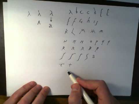 8:34
8:34Roman Cursive Lesson 01 Learn to write like an Ancient Roman letterforms from Ostia
Roman Cursive Lesson 01 Learn to write like an Ancient Roman letterforms from OstiaRoman Cursive Lesson 01 Learn to write like an Ancient Roman letterforms from Ostia
http://latinum.org.uk This video looks at the letterforms used for Roman cursive script from the examples surviving that have been found in ancient graffiti ... -
 8:30
8:30Roman Cursive Lesson 02 Learn to write like an Ancient Roman Cui Dono Lepidum Novum Libellum
Roman Cursive Lesson 02 Learn to write like an Ancient Roman Cui Dono Lepidum Novum LibellumRoman Cursive Lesson 02 Learn to write like an Ancient Roman Cui Dono Lepidum Novum Libellum
http://latinum.org.uk Catullus Ad Cornelium Read aloud and written in Roman Cursive Script, based on the surviving examples from the Vindolanda tablets. -
 11:11
11:11Roman Cursive Lesson 01 Dialogi Pueriles Basic by Sebaldus Mayer cursive writing Latin langu
Roman Cursive Lesson 01 Dialogi Pueriles Basic by Sebaldus Mayer cursive writing Latin languRoman Cursive Lesson 01 Dialogi Pueriles Basic by Sebaldus Mayer cursive writing Latin langu
http://latinum.org.uk -
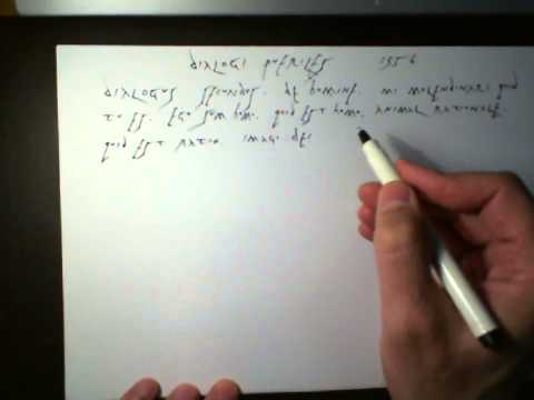 6:48
6:48Roman Cursive Lesson 02 Dialogi Pueriles Basic by Sebaldus Mayer cursive writing Latin langu
Roman Cursive Lesson 02 Dialogi Pueriles Basic by Sebaldus Mayer cursive writing Latin languRoman Cursive Lesson 02 Dialogi Pueriles Basic by Sebaldus Mayer cursive writing Latin langu
http://latinum.org.uk. -
 20:33
20:33Roman Cursive Lesson 03 Learn to write like an Ancient Roman Cicero In Catilinam Oratio Prima
Roman Cursive Lesson 03 Learn to write like an Ancient Roman Cicero In Catilinam Oratio PrimaRoman Cursive Lesson 03 Learn to write like an Ancient Roman Cicero In Catilinam Oratio Prima
http://latinum.org.uk. -
 6:53
6:53Write like an Ancient Roman 03 Dialogi Pueriles Basic dialogues by Sebaldus Mayer cursive writing La
Write like an Ancient Roman 03 Dialogi Pueriles Basic dialogues by Sebaldus Mayer cursive writing LaWrite like an Ancient Roman 03 Dialogi Pueriles Basic dialogues by Sebaldus Mayer cursive writing La
http://latinum.org.uk -
 0:29
0:29Roman cursive Meaning
Roman cursive MeaningRoman cursive Meaning
Video shows what Roman cursive means. the form of script used in ancient Rome until about the 3rd century AD for Latin handwriting. Roman cursive Meaning. How to pronounce, definition audio dictionary. How to say Roman cursive. Powered by MaryTTS, Wiktionary -
 11:19
11:19UFO September 2014 - Ampersand
UFO September 2014 - AmpersandUFO September 2014 - Ampersand
Possible attempt to communicate using ampersand symbol. A quick look online "the ampersand can be traced back to the 1st century A.D. and the Old Roman cursive, in which the letters E and T occasionally were written together to form a ligature. Yes, there are the ampersand gold balloons. This is an example of perfect adaptive camouflage. If you've been paying close attention, you'll notice this object has the same rotation and consistent morphing as past objects on this channel. www.newyorkskywatch.com All Rights Reserved. -
 1:11
1:11Latinum Latin Course 0147
Latinum Latin Course 0147Latinum Latin Course 0147
Please visit my pages at https://sites.google.com/site/latiumredivivum/ How did the Romans pronounce the alphabet? (The example here is in a Roman cursive sc... -
 65:31
65:31Frank O'Collins - The Roman Cult, Law & The Khazars
Frank O'Collins - The Roman Cult, Law & The KhazarsFrank O'Collins - The Roman Cult, Law & The Khazars
Frank O'Collins - The Roman Cult, Law & The Khazars November 24, 2011 Frank'O Collins is an author and futurist having developed over 60 web sites on global ... -
 2:37
2:37Penmanship — ROMAN CAPITALS + Lowercase Letters
Penmanship — ROMAN CAPITALS + Lowercase LettersPenmanship — ROMAN CAPITALS + Lowercase Letters
The focus of the project is to give an understanding of the mechanics of modern cursive handwriting through online workshop tutorials. How the Lowercase Letters were derived from the Roman CAPITALS. -
 3:44
3:44Half Uncial Free "B"
Half Uncial Free "B"Half Uncial Free "B"
This video will teach you Calligraphy Corner's Half Uncial Free "B". So why is it called Half Uncial? We would ask one Scipione Maffei (Italian, 1727) if we could. But he’s no longer speaking on the subject. Perhaps it is because it looks like a shorter version of Uncial. Both fonts actually developed independently of each other from Roman cursive. But if Uncial calligraphy feels to us today like "Irish LITE," then Half Uncial is Hard-Core Irish. This is the real green thing. -
![Sean Plays: Amnesia - Followed By Death - Part 3 "Roman Numerals Is Over Writing In Cursive" [HD+]; updated 01 Jun 2012; published 06 Apr 2012](http://web.archive.org./web/20160117104749im_/http://i.ytimg.com/vi/_mb4bIpAQdI/0.jpg) 15:47
15:47Sean Plays: Amnesia - Followed By Death - Part 3 "Roman Numerals Is Over Writing In Cursive" [HD+]
Sean Plays: Amnesia - Followed By Death - Part 3 "Roman Numerals Is Over Writing In Cursive" [HD+]Sean Plays: Amnesia - Followed By Death - Part 3 "Roman Numerals Is Over Writing In Cursive" [HD+]
From blasting through the portal and back home to our own I discover that MachetteMaster has broken inside and killed my audio player. Sadly my eyes randomly... -
 1:34
1:34Studying with cursive board
Studying with cursive boardStudying with cursive board
- Bastarda
- Beneventan script
- Blackletter
- Chancellor
- Chancery hand
- Chevron (insignia)
- Claudius
- Copperplate script
- Current Archaeology
- Cursive
- Demotic (Egyptian)
- Glagolitic alphabet
- Gothic alphabet
- Greek minuscule
- Half-uncial
- Handwriting
- Hieratic
- Humanist minuscule
- Insular script
- Italic script
- Kurrent
- Latin alphabet
- Library hand
- Majuscule
- Merovingian script
- Middle Ages
- Oxford University
- Plautus
- Pseudolus
- Renaissance
- Roman cursive
- Roman Emperor
- Rotunda (script)
- Round hand
- Russian cursive
- Rustic capitals
- Secretary hand
- Shorthand
- Sibyl
- Spencerian Script
- Sütterlin
- Uncial
- Uncial script
- Visigothic script
-

Roman Cursive Lesson 01 Learn to write like an Ancient Roman letterforms from Ostia
http://latinum.org.uk This video looks at the letterforms used for Roman cursive script from the examples surviving that have been found in ancient graffiti ... -

Roman Cursive Lesson 02 Learn to write like an Ancient Roman Cui Dono Lepidum Novum Libellum
http://latinum.org.uk Catullus Ad Cornelium Read aloud and written in Roman Cursive Script, based on the surviving examples from the Vindolanda tablets. -

Roman Cursive Lesson 01 Dialogi Pueriles Basic by Sebaldus Mayer cursive writing Latin langu
http://latinum.org.uk -

Roman Cursive Lesson 02 Dialogi Pueriles Basic by Sebaldus Mayer cursive writing Latin langu
http://latinum.org.uk. -

Roman Cursive Lesson 03 Learn to write like an Ancient Roman Cicero In Catilinam Oratio Prima
http://latinum.org.uk. -

Write like an Ancient Roman 03 Dialogi Pueriles Basic dialogues by Sebaldus Mayer cursive writing La
http://latinum.org.uk -

Roman cursive Meaning
Video shows what Roman cursive means. the form of script used in ancient Rome until about the 3rd century AD for Latin handwriting. Roman cursive Meaning. How to pronounce, definition audio dictionary. How to say Roman cursive. Powered by MaryTTS, Wiktionary -

UFO September 2014 - Ampersand
Possible attempt to communicate using ampersand symbol. A quick look online "the ampersand can be traced back to the 1st century A.D. and the Old Roman cursive, in which the letters E and T occasionally were written together to form a ligature. Yes, there are the ampersand gold balloons. This is an example of perfect adaptive camouflage. If you've been paying close attention, you'll notice this ob -

Latinum Latin Course 0147
Please visit my pages at https://sites.google.com/site/latiumredivivum/ How did the Romans pronounce the alphabet? (The example here is in a Roman cursive sc... -

Frank O'Collins - The Roman Cult, Law & The Khazars
Frank O'Collins - The Roman Cult, Law & The Khazars November 24, 2011 Frank'O Collins is an author and futurist having developed over 60 web sites on global ... -

Penmanship — ROMAN CAPITALS + Lowercase Letters
The focus of the project is to give an understanding of the mechanics of modern cursive handwriting through online workshop tutorials. How the Lowercase Letters were derived from the Roman CAPITALS. -

Half Uncial Free "B"
This video will teach you Calligraphy Corner's Half Uncial Free "B". So why is it called Half Uncial? We would ask one Scipione Maffei (Italian, 1727) if we could. But he’s no longer speaking on the subject. Perhaps it is because it looks like a shorter version of Uncial. Both fonts actually developed independently of each other from Roman cursive. But if Uncial calligraphy feels to us today like -

Sean Plays: Amnesia - Followed By Death - Part 3 "Roman Numerals Is Over Writing In Cursive" [HD+]
From blasting through the portal and back home to our own I discover that MachetteMaster has broken inside and killed my audio player. Sadly my eyes randomly... -

Studying with cursive board
-

Bad Blood parody Taylor Swift - Bad Blood Test
Pregnant Taylor Swift and 3 possible fathers. Who's the Dad? Cast: Taylor: Bar Paly https://instagram.com/barpaly/?hl=en Nerd: Reggie Couz https://vine.co/Reggie.COUZ Douche: Michael Callahan https://twitter.com/MCallahanTV One Night Stand: Jacob Sones https://twitter.com/jacobsones55 Nurse: Anna Lenes https://twitter.com/anna_lenes Doctor: Bryan Kerr https://twitter.com/NikkiBoyer Music: -

Jelly Tennis - The Slow Mo Guys
Gav and Dan find an impressive new way to serve jelly to hundreds of people at once with a well placed Tennis serve. Also yes, in England this is Jelly. Follow Gav on Twitter - https://twitter.com/gavinfree Follow Dan on Twitter - https://twitter.com/danielgruchy Watch our favourite videos! - https://www.youtube.com/playlist?list... Check out Newegg - http://www.newegg.com/?nm_mc=AFC-SlowMoGuys& -

† und du bist für mich größer als ewig!
LESEN! :) Ich weiß das dass Video nicht so gut geworden ist, aber es ist für meine kleine Nichte, die uns viel zu früh verlassen hat. ►Lied : größer als ewig - Johannes Sumpich (gekürzt) ►Schriftarten : times new roman, 5th grade cursive, a song for jennifer, ►Videoausschnitte : Sturm der Liebe, Anna und die Liebe ► Bilder : Google ► Bedeutung : Am 07.04.2014 bekam ich diesen anruf, seitde -

【MHP2G/MHFU】 Gunlance MAD 【Assortment of Roman Type N'】
最高画質 / High Quality:HD1080p ☆Is under Roman Chapter & Commentary. (=*3*)σ - - - - - - - - - - - - - - - - - - - - - - - - - - - - - ↓ ↓ ↓ ↓ 疾走感溢れるBGMに合わせて、新... -

(Development of tools for) present-day type design based on historic patterns
Download slides from: http://www.lettermodel.org/downloads/Mythical_Eye_Leipzig.pdf The transition from the handwritten Humanistic minuscule to roman type, and later from Humanistic cursive to italic type, must have been more complex than the transition from the written Textura Quadrata into Textura type if writing was taken literally as basis. But it is actually hard to trace a literal interpret -

Fancy Letters - How To Design Your Own Swirled Letters
http://www.overnightartist.com See pen here: http://amzn.to/1bIgaan My Gallery: http://etsy.me/1gfxpiX Fancy Letters - How To Design Your Own Swirled Letters... -

How to write in Ukrainian: Lesson 1
First tutorial on writing in Ukrainian. -

CSS Font Family
CSS Font Family - learn how to Change CSS Font Family for fonts in your web pages using CSS font-family property. See Full - Learn CSS Fast - Tutorial here: https://www.youtube.com/watch?v=cOw3WqAtBFA&list;=PL5Dq9xKbrI3DWfCeyVWpL9eWC5bSbV5mX font-family values you can use: Web Safe Font family values: Verdana Arial Georgia "Times New Roman" Courier Arial Black sans-serif Times Comic Sans cursive -

Calligraphy - Simple Chancery - Lower Case
A quick penning of the alphabet in 13th century Roman book keeper style. With a left hand. On cheap paper. =)
Roman Cursive Lesson 01 Learn to write like an Ancient Roman letterforms from Ostia
- Order: Reorder
- Duration: 8:34
- Updated: 21 Jul 2014
- views: 1466
- author: Evan der Millner
- published: 14 Mar 2014
- views: 1466
- author: Evan der Millner
Roman Cursive Lesson 02 Learn to write like an Ancient Roman Cui Dono Lepidum Novum Libellum
- Order: Reorder
- Duration: 8:30
- Updated: 25 Jun 2014
- views: 1130
- author: Evan der Millner
- published: 14 Mar 2014
- views: 1130
- author: Evan der Millner
Roman Cursive Lesson 01 Dialogi Pueriles Basic by Sebaldus Mayer cursive writing Latin langu
- Order: Reorder
- Duration: 11:11
- Updated: 03 Apr 2014
- views: 110
- published: 03 Apr 2014
- views: 110
Roman Cursive Lesson 02 Dialogi Pueriles Basic by Sebaldus Mayer cursive writing Latin langu
- Order: Reorder
- Duration: 6:48
- Updated: 09 Jun 2014
- views: 254
- author: Evan der Millner
- published: 03 Apr 2014
- views: 254
- author: Evan der Millner
Roman Cursive Lesson 03 Learn to write like an Ancient Roman Cicero In Catilinam Oratio Prima
- Order: Reorder
- Duration: 20:33
- Updated: 14 Aug 2014
- views: 600
- author: Evan der Millner
- published: 28 Mar 2014
- views: 600
- author: Evan der Millner
Write like an Ancient Roman 03 Dialogi Pueriles Basic dialogues by Sebaldus Mayer cursive writing La
- Order: Reorder
- Duration: 6:53
- Updated: 03 Apr 2014
- views: 6
- published: 03 Apr 2014
- views: 6
Roman cursive Meaning
- Order: Reorder
- Duration: 0:29
- Updated: 20 Apr 2015
- views: 1
- published: 20 Apr 2015
- views: 1
UFO September 2014 - Ampersand
- Order: Reorder
- Duration: 11:19
- Updated: 13 Sep 2014
- views: 322
- published: 13 Sep 2014
- views: 322
Latinum Latin Course 0147
- Order: Reorder
- Duration: 1:11
- Updated: 14 Aug 2014
- views: 469
- author: Evan der Millner
- published: 20 Aug 2010
- views: 469
- author: Evan der Millner
Frank O'Collins - The Roman Cult, Law & The Khazars
- published: 26 Nov 2011
- views: 15189
- author: linuxfrik
Penmanship — ROMAN CAPITALS + Lowercase Letters
- Order: Reorder
- Duration: 2:37
- Updated: 28 Oct 2014
- views: 55
- published: 28 Oct 2014
- views: 55
Half Uncial Free "B"
- Order: Reorder
- Duration: 3:44
- Updated: 09 Mar 2015
- views: 8
- published: 09 Mar 2015
- views: 8
Sean Plays: Amnesia - Followed By Death - Part 3 "Roman Numerals Is Over Writing In Cursive" [HD+]
- Order: Reorder
- Duration: 15:47
- Updated: 01 Jun 2012
- views: 183
- author: BlackBlur888
- published: 06 Apr 2012
- views: 183
- author: BlackBlur888
Studying with cursive board
- Order: Reorder
- Duration: 1:34
- Updated: 28 Aug 2013
- views: 20
- published: 28 Aug 2013
- views: 20
Bad Blood parody Taylor Swift - Bad Blood Test
- Order: Reorder
- Duration: 2:58
- Updated: 31 Aug 2015
- views: 112
- published: 31 Aug 2015
- views: 112
Jelly Tennis - The Slow Mo Guys
- Order: Reorder
- Duration: 5:16
- Updated: 30 Sep 2015
- views: 280363
- published: 30 Sep 2015
- views: 280363
† und du bist für mich größer als ewig!
- Order: Reorder
- Duration: 2:29
- Updated: 24 Aug 2015
- views: 7
- published: 24 Aug 2015
- views: 7
【MHP2G/MHFU】 Gunlance MAD 【Assortment of Roman Type N'】
- published: 08 Dec 2013
- views: 267
- author: KENTA
(Development of tools for) present-day type design based on historic patterns
- Order: Reorder
- Duration: 18:53
- Updated: 03 Nov 2014
- views: 52
- published: 03 Nov 2014
- views: 52
Fancy Letters - How To Design Your Own Swirled Letters
- Order: Reorder
- Duration: 7:22
- Updated: 06 Sep 2014
- views: 2102413
- author: OvernightArtist
- published: 03 May 2012
- views: 2102413
- author: OvernightArtist
How to write in Ukrainian: Lesson 1
- Order: Reorder
- Duration: 4:05
- Updated: 11 Jun 2015
- views: 212
- published: 11 Jun 2015
- views: 212
CSS Font Family
- Order: Reorder
- Duration: 3:55
- Updated: 02 Jun 2015
- views: 3
- published: 02 Jun 2015
- views: 3
Calligraphy - Simple Chancery - Lower Case
- Order: Reorder
- Duration: 2:40
- Updated: 23 May 2014
- views: 432
- author: Russ McClay
- published: 15 Apr 2014
- views: 432
- author: Russ McClay
- Playlist
- Chat
- Playlist
- Chat

Roman Cursive Lesson 01 Learn to write like an Ancient Roman letterforms from Ostia
- published: 14 Mar 2014
- views: 1466
-
author:
Evan der Millner
Add Playlist for this Author

Roman Cursive Lesson 02 Learn to write like an Ancient Roman Cui Dono Lepidum Novum Libellum
- published: 14 Mar 2014
- views: 1130
-
author:
Evan der Millner
Add Playlist for this Author

Roman Cursive Lesson 01 Dialogi Pueriles Basic by Sebaldus Mayer cursive writing Latin langu
- published: 03 Apr 2014
- views: 110

Roman Cursive Lesson 02 Dialogi Pueriles Basic by Sebaldus Mayer cursive writing Latin langu
- published: 03 Apr 2014
- views: 254
-
author:
Evan der Millner
Add Playlist for this Author

Roman Cursive Lesson 03 Learn to write like an Ancient Roman Cicero In Catilinam Oratio Prima
- published: 28 Mar 2014
- views: 600
-
author:
Evan der Millner
Add Playlist for this Author

Write like an Ancient Roman 03 Dialogi Pueriles Basic dialogues by Sebaldus Mayer cursive writing La
- published: 03 Apr 2014
- views: 6

Roman cursive Meaning
- published: 20 Apr 2015
- views: 1

UFO September 2014 - Ampersand
- published: 13 Sep 2014
- views: 322

Latinum Latin Course 0147
- published: 20 Aug 2010
- views: 469
-
author:
Evan der Millner
Add Playlist for this Author

Frank O'Collins - The Roman Cult, Law & The Khazars
- published: 26 Nov 2011
- views: 15189
-
author:
linuxfrik
Add Playlist for this Author

Penmanship — ROMAN CAPITALS + Lowercase Letters
- published: 28 Oct 2014
- views: 55

Half Uncial Free "B"
- published: 09 Mar 2015
- views: 8

Sean Plays: Amnesia - Followed By Death - Part 3 "Roman Numerals Is Over Writing In Cursive" [HD+]
- published: 06 Apr 2012
- views: 183
-
author:
BlackBlur888
Add Playlist for this Author

Studying with cursive board
- published: 28 Aug 2013
- views: 20
Usain Bolt found WADA IAAF report 'shocking'
Edit RTE 16 Jan 2016Iran frees American prisoners as international sanctions to end
Edit Deccan Chronicle 16 Jan 2016Taiwan's first female leader, shy but steely Tsai Ing-wen
Edit BBC News 16 Jan 2016For Iran, Is U.S. No Longer The Great Satan?
Edit WorldNews.com 15 Jan 2016Police confirm Syrian link to terror attacks
Edit Jakarta Post 16 Jan 2016Bath’s Roman curse tablets added to the UNESCO Memory of the World Register (UNESCO - United Nations Educational, Scientific and Cultural Organization)
Edit noodls 06 Nov 2014- 1
- 2
- 3
- 4
- 5
- Next page »


