preload
Mar 27

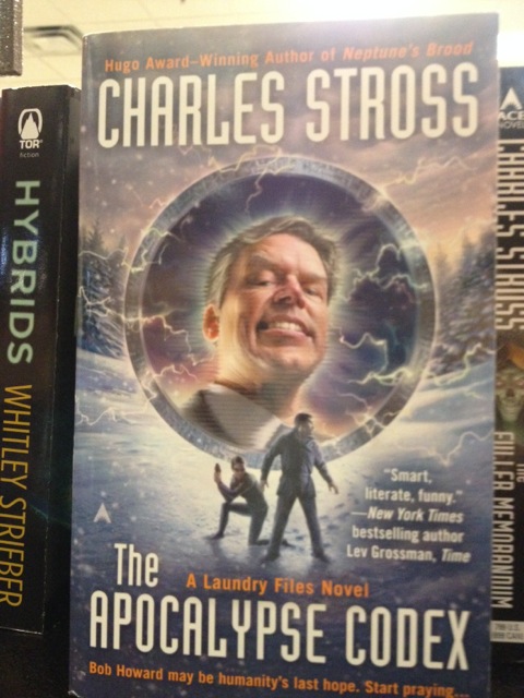
Portraits in the future are wayyyyy more awesome!Click for slightly larger image

Rachel and Thomas Comment: Fun fact! Megalatemeskephalesigakertomesephobia is the actual Greek for the fear that a large decapitated head is silently sneering at you.
Published 2012

Actually, that cover IS a classical work of art!I would touch it without protective gloves.I've seen worse. Far, far, worse.Interesting, but I would still read it in public.Middlng: Neither awful nor awfully goodWould not like to be seen reading that!Awful... just awful...That belongs in a gold-lame picture frame!Gah... my eyes are burning! Feels so good!Good Show Sir! (Average: 7.64 out of 10)
Loading...Loading...

Tagged with:

Feb 12

I command ye... to eat trees! mu hahahahahah! Click for full image

Good Show Sir’s Art Direction: So, I hear you have been seeing my daughter. Good artwork, my boy… be a real pity if someone would mess it up with a terrible grey cover plaque… wouldn’t it…
Published 1990

Actually, that cover IS a classical work of art!I would touch it without protective gloves.I've seen worse. Far, far, worse.Interesting, but I would still read it in public.Middlng: Neither awful nor awfully goodWould not like to be seen reading that!Awful... just awful...That belongs in a gold-lame picture frame!Gah... my eyes are burning! Feels so good!Good Show Sir! (Average: 6.52 out of 10)
Loading...Loading...

Tagged with:

Oct 08

Is that a gun or cake? Ah to hell with it... I'm going to shoot...Click for full image

Tom Noir Comments: With a sinking heart, Brad realized their skin-tight glam-rock outfits would not be an effective disguise in the forest.
Published 2007

Actually, that cover IS a classical work of art!I would touch it without protective gloves.I've seen worse. Far, far, worse.Interesting, but I would still read it in public.Middlng: Neither awful nor awfully goodWould not like to be seen reading that!Awful... just awful...That belongs in a gold-lame picture frame!Gah... my eyes are burning! Feels so good!Good Show Sir! (Average: 7.90 out of 10)
Loading...Loading...

Tagged with:

Apr 27

A fascinating planet... where the women looked like painted eggs kids would make at easter.Click for full UNSHEEPED & UNWHALED image!!

Joachim’s Art Direction: One-eyed sex runts. No other words are necessary….
Published 1970

Actually, that cover IS a classical work of art!I would touch it without protective gloves.I've seen worse. Far, far, worse.Interesting, but I would still read it in public.Middlng: Neither awful nor awfully goodWould not like to be seen reading that!Awful... just awful...That belongs in a gold-lame picture frame!Gah... my eyes are burning! Feels so good!Good Show Sir! (Average: 9.04 out of 10)
Loading...Loading...

Tagged with:

Nov 21

Keith really needed to get a new loincloth after his buttock enhancements.Click for full image

Tom Noir Comments: It’s the little details that separate the good artists from the bad. For instance, notice the bit of man-bun sticking out from under this fellow’s fuzzy tutu. GENIUS!
Published 1984

Actually, that cover IS a classical work of art!I would touch it without protective gloves.I've seen worse. Far, far, worse.Interesting, but I would still read it in public.Middlng: Neither awful nor awfully goodWould not like to be seen reading that!Awful... just awful...That belongs in a gold-lame picture frame!Gah... my eyes are burning! Feels so good!Good Show Sir! (Average: 8.43 out of 10)
Loading...Loading...

Tagged with:

Mar 23

Don't point that gun at me! Look! The other balloon!Click for full image

Zycrow’s Art Direction:
“So the art director told me he needed hot air balloons and they needed to be badass. How am I going to do that?”
“Easy. Add spikes.”
“Oh, that’s good. Like how many? Three? Four?”
“All of them. All of the spikes. Oh, and a dinosaur, and some wolves. That oughta cover it.”
Published 1980

Many thanks to Zycrow!

Actually, that cover IS a classical work of art!I would touch it without protective gloves.I've seen worse. Far, far, worse.Interesting, but I would still read it in public.Middlng: Neither awful nor awfully goodWould not like to be seen reading that!Awful... just awful...That belongs in a gold-lame picture frame!Gah... my eyes are burning! Feels so good!Good Show Sir! (Average: 7.67 out of 10)
Loading...Loading...

Tagged with:

Jan 21

I'll just put this Z&A here... there we go! See, it spells wizard!Click for full image

Tally ho! Well good chap I’ll have the one with swords and those smashing old wizards praising a big wolf in the clouds!
Published 2000

Hold on, we'll save the princess in a bit. I have a chance to look... awesome!Click for full image

Good show old bean, I’ll go for the one with double swords, a buxom beauty and a mighty cape. Spiffing!
Published 1993

Actually, that cover IS a classical work of art!I would touch it without protective gloves.I've seen worse. Far, far, worse.Interesting, but I would still read it in public.Middlng: Neither awful nor awfully goodWould not like to be seen reading that!Awful... just awful...That belongs in a gold-lame picture frame!Gah... my eyes are burning! Feels so good!Good Show Sir! (Average: 6.43 out of 10)
Loading...Loading...

Tagged with:

Jul 28

Unicorns are just more comfortable to ride than horses. Plus the chicks love it.Click for full image

Anders Art Direction: A pack of profoundly stoned giant proboscis monkeys in a garden! Nails in his nostrils! Both of them! Wha’? The cover? Knights and princesses and shit. You know, the usual.
Published 2002

Many thanks to Ander!

Actually, that cover IS a classical work of art!I would touch it without protective gloves.I've seen worse. Far, far, worse.Interesting, but I would still read it in public.Middlng: Neither awful nor awfully goodWould not like to be seen reading that!Awful... just awful...That belongs in a gold-lame picture frame!Gah... my eyes are burning! Feels so good!Good Show Sir! (Average: 6.39 out of 10)
Loading...Loading...

Tagged with:

Jul 05

HORSE KAT TRANZPORTS HOOMAN 2 CASTLE.Click for full image

Liz’s Art Direction: We’d like for you to use some cats on this cover. Not just any old cats no, we want one that is sized up enough to be able to carry a human. In furs. And randomly in the background, give us a horse drawn sled too. Oh, and to illuminate the picture, throw in a random lamp somewhere…and the biggest sickle moon in the world, ever.
Published 2000

Ah Cat travel, the only way to break the speed of light. Or so I have read.
Many thanks to Liz!

Actually, that cover IS a classical work of art!I would touch it without protective gloves.I've seen worse. Far, far, worse.Interesting, but I would still read it in public.Middlng: Neither awful nor awfully goodWould not like to be seen reading that!Awful... just awful...That belongs in a gold-lame picture frame!Gah... my eyes are burning! Feels so good!Good Show Sir! (Average: 6.74 out of 10)
Loading...Loading...

Tagged with:

May 11

GAH, there's hardly enough room in this border for an evil ork to swing his arms!Click for full image

Eron comments: This cover isn’t really funny. The art isn’t even particularly bad. But a warning to anyone who has ever even had the passing notion to take a graphic design class: do not look at this cover, you will get a rage-migrane for days. The layout is so shockingly poor and amateur that the thought that someone got paid for this, not beaten in a alley, just plain makes me want to drink whiskey and punch random objects!

My eyes…my eyes! Thanks to Eron!

Actually, that cover IS a classical work of art!I would touch it without protective gloves.I've seen worse. Far, far, worse.Interesting, but I would still read it in public.Middlng: Neither awful nor awfully goodWould not like to be seen reading that!Awful... just awful...That belongs in a gold-lame picture frame!Gah... my eyes are burning! Feels so good!Good Show Sir! (Average: 4.74 out of 10)
Loading...Loading...

Tagged with:

  • Page 1 of 2
  • 1
  • 2
  • >