WordPress.org

Ready to get started?Download WordPress

Make WordPress UI

Recent Updates Toggle Comment Threads | Keyboard Shortcuts

  • trishasalas 3:27 am on March 14, 2014 Permalink | Log in to leave a Comment
    Tags: Admin Help   

    Admin Help Updates from 3/10/2014 Meeting 

    There are some big changes and a new direction for the team, new co-leads are myself and @Clorith.  @jazzs3quence will still be involved in a supportive role.

    The first part of the meeting was used to discuss the Feature Plugin Meeting and the helpful comments @jazzs3quence received regarding the current implementation of the plugin. The key takeaways are:

    • This really comes down to storyboarding, not building. Which is great, but it doesn’t really lend itself to a plugin model, at least until later in the process.
    • (but) Before even storyboarding I’d start with a list of goals, a list of problems. I’d run user tests on starting with WP and starting with features they’ve never seen and see where they trip up.

    We agreed as a group that we need to not think about solutions at this stage but rather, to figure out what the problem(s) are. It was also mentioned that a singular solution will not be enough, we need to identify personas and do user testing as well as story boards.  (Not necessarily in that order.)

    @Clorith Mentioned that the idea of guided tour had been mentioned before and @Sams reminded us that @Nacin recommended we look at the user testing again.

    Our previous user tests can be found here:

    http://make.wordpress.org/docs/2013/09/04/admin-help-user-testing-videos/

    http://make.wordpress.org/docs/2013/09/16/admin-help-videos-round-two/

    @Sams suggested that “it’s better to have user tests of different user types and, if you’d like, build personas off of those” so that will be the initial direction we take along with storyboards.

    We would like to expand on the user testing by identifying any and all tasks with WordPress so that we can identify as many ‘pain points’ as possible.  There have also been some significant changes in the theme screen and the widgets since our last tests so we would like to essentially start fresh with user testing.

    The initial plan is to start a P2 post to gather task ideas for  user testing.  We would like to get input from as many of you as possible so that we generate a thorough list of all of the tasks within WordPress (multisite included!)

    As always, we welcome more input and participation.  The meeting is on Mondays — 18:30 UTC

     
    • Christian Foellmann 5:20 pm on March 14, 2014 Permalink | Log in to Reply

      I just want to make a suggestion: Desktop monitors “all” have widescreen resolutions (try to find a 4:3 monitor). I captured this:
      http://i.imgur.com/XkeBhcz.gif
      from the admin-panel of MS Office365. The tab on the right accounts for the limited vertical screen real estate of modern monitors

      • trishasalas 5:21 am on March 16, 2014 Permalink | Log in to Reply

        Thanks for the suggestion, Christian. These are the kinds of idea I’m hoping to explore more in depth as we move forward. I’ll have your screenshot be the first in our collection of UI ideas.

  • Janneke Van Dorpe 8:08 pm on March 10, 2014 Permalink | Log in to leave a Comment
    Tags:   

    Front-end Editor Meeting 4 March 

    With @avryl (me), @azaozz, @hugobaeta, @kraftbj, @melchoyce, @mrroundhill, @rhurling, @samuelsidler, @ubernaut. Log.

    Links: Front-end Editor plugin, GitHub.

    • You probably noticed, but @designsimply did two usability tests with the front-end editor. One. Two. Main problems:
      • The “save” button seems to be hard to find.
      • The featured image area needs to be more descriptive.
    • Gallery previews have recently been added to trunk by @gcorne. I’ve been trying to implement the same plugin with the front-end editor, but since templates are used instead of the actual shortcode output, it will need to be adjusted. After all, we’re trying to make an accurate WYSIWYG editor. #52
    • Currently edit links on the front-end link to the front-end editor, and edit links on the back-end to the back-end editor. It’d be better if there was a drop down in the admin bar to choose which editor you’d like to use (?), but how should both editors be described? ‘Edit in admin’ and ‘Edit not on the front-end’ might make sense to us, but probably not to the average user. #53
    • The ‘meta modal‘ needs to improve. It’s a bit too clunky. It might be better to have a (collapsable) side bar with collapsed meta boxes (a bit like the customiser). Needs mock ups.
    • We should experiment with an inline toolbar (one that pops up after selecting text). I think this would only be useful in addition to the main toolbar, since it cannot have all the tools the main toolbar has. Needs mock ups.
    • Mobile: the editor works on small screens, but doesn’t have a TinyMCE toolbar. It should have one, or at least one with a few tools. Needs mock ups. #14

    The next meeting is tomorrow, 11 March 2014, 17:00 UTC in #wordpress-ui.

     
    • Janneke Van Dorpe 10:46 pm on March 10, 2014 Permalink | Log in to Reply

      Thinking about it, giving the user the option to choose the editor for edit links would require the same for new post links… While drop downs could be added for those admin bar items as well, doing so would add a lot. Too much in my opinion. There must be a better way.

  • Mel Choyce 9:13 pm on March 7, 2014 Permalink | Log in to leave a Comment  

    Super quick media survey 

    Hello! If you have a minute, please take this super quick media survey for us.

     
  • Sheri Bigelow (designsimply) 11:09 pm on March 5, 2014 Permalink | Log in to leave a Comment
    Tags: ,   

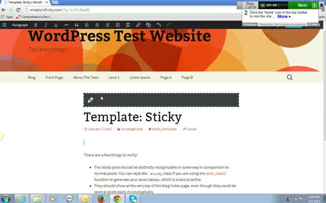
    WordPress Front-end Editor — Usability Test 2 

    I did a usability test on the WordPress Front-end Editor 0.8.5 plugin with the Twenty Thirteen theme on WordPress r27243.

    Summary

    • No trouble finding the Edit link inline, editing a title, or adding a paragraph
    • Lots of difficulty saving
    • Difficulty adding a new post
    • Featured image area is not clear
    • Back button results in lost edits
    • Difficulty adding a link (back-end editor)
    • Difficulty adding an image (back-end editor)

    You can download the full video here: deaea9a3.mp4.

    Points of Confusion

    Difficulty saving (Length: 1:56)

    Difficulty adding a new post on the front end (Length: 0:42)

    Featured image area looks like a place you can “write something” (Length: 0:07)

    Back button exits the editor without saving and without a prompt (Length: 0:06)

    See more highlight reels after the jump.

     
    • Janneke Van Dorpe 10:12 am on March 6, 2014 Permalink | Log in to Reply

      I’ll leave several comments on the different topics today, don’t have time to post them all at once. :)

      The onbeforeunload alert (when navigating away from the page) can only be done with a browser alert, it’s not possible to style it or have a save button there. What could be done is intercept when a user clicks on a link that will trigger this event and show a custom modal with a save button, but not when navigating away with the browser (close, previous, next, refresh etc.). But then in half of the cases you’ll still have the browser alert.

      • Janneke Van Dorpe 10:14 am on March 6, 2014 Permalink | Log in to Reply

        So “Prompt the user to save or cancel if the back button is clicked.” is technically not possible (as fas as I know). @azaozz?

        • Andrew Ozz 7:37 pm on March 6, 2014 Permalink | Log in to Reply

          Right. There is a “special” event that is used in these cases, however it always displays a browser provided dialog. In WebKit and IE it is possible to add some text (but not html) to that dialog. FIrefox doesn’t show the added text.

          So, the only thing possible is to trigger the dialog that asks the user to confirm leaving the page. We can add some text to it that will be shown in some browsers, but cannot add html, buttons, etc.

          It is possible to open a modal “under” that dialog so in case the user clicks “Stay on this page”, they will see our modal with Save and Cancel. Not sure if that’s the best UX though.

          • Janneke Van Dorpe 5:17 pm on March 10, 2014 Permalink | Log in to Reply

            Having two dialogs overlapping is not ideal… It looks like it’s going to stay like this, we should just find a way to highlight the save button.

    • Janneke Van Dorpe 10:50 pm on March 10, 2014 Permalink | Log in to Reply

      I still really think “Save” makes more sense for users than “Update” in the front end editor context. I think it would make it easier for them to find.

      Not sure if being in a front-end editor makes a difference. @melchoyce, chat do you think about this?

    • Janneke Van Dorpe 10:52 pm on March 10, 2014 Permalink | Log in to Reply

      Changing the colour of the update button would mean diverging from the main styles. I wouldn’t do that. Adding a pointer should do the job. Once the user knows where the button is, they won’t forget.

    • Janneke Van Dorpe 10:59 pm on March 10, 2014 Permalink | Log in to Reply

      Once the inline Edit link is clicked, replace it with links for Cancel and Save

      Do you mean the inline links in the theme? Unfortunately they need to stay about the same size to prevent breaking the theme.

  • Chris Reynolds 8:48 pm on March 3, 2014 Permalink | Log in to leave a Comment
    Tags:   

    AH-O₂ Update — 3 March, 2014 

    Help Overview refactoring
    @brainfork has been ill and was unable to work on this this week. @jazzs3quence created tickets for some of the issues that were reported in https://github.com/jazzsequence/WordPress-Admin-Help/issues/50 many of which were things that @brainfork was planning to work on. See:

    https://github.com/jazzsequence/WordPress-Admin-Help/issues/55

    https://github.com/jazzsequence/WordPress-Admin-Help/issues/57

    https://github.com/jazzsequence/WordPress-Admin-Help/issues/47

    https://github.com/jazzsequence/WordPress-Admin-Help/issues/46

    Tooltips
    @clorith is going to work on refactoring the tooltip structure a bit to make it more flexible for devs and give us more options for tooltip styles.
    @trishasalas will be working on some new styles for the tooltips
    Between the two of them, we’re hoping to nail:

    https://github.com/jazzsequence/WordPress-Admin-Help/issues/58

    https://github.com/jazzsequence/WordPress-Admin-Help/issues/56

    https://github.com/jazzsequence/WordPress-Admin-Help/issues/45

    Admin Help Inventory spreadsheet
    @ubernaut has added tooltip locations to the Pages admin pages in the spreadsheet we’re using to keep track of such things. He will work on adding the actual TinyMCE formatting buttons this week.

    Target Date
    We’ve set a tentative target date for April 1. This will give us time to test the plugin and fix any issues before the discussion begins about WordPress 4.0 feature plugins.

    Help wanted!
    To meet this target, we need help:

    • adding tooltips — though this process may be changing, the changes should make things easier and we can help with the transition — mostly we need new tooltips to be added (or at least written) for all the elements (that have not been added already) in the spreadsheet (or for anything else that’s missing that isn’t included)
    • testers — we’d love to have more testers look at this and let us know if/when they find any issues

    If either of these things sound like ways in which you could contribute, you can let us know in the Google Group, in the comments of this post, or in our Monday meeting.

    Our next meeting is next Monday 18:30UTC.

     
    • Sjoerd Boerrigter 9:13 pm on March 3, 2014 Permalink | Log in to Reply

      Hi Chris,

      I see you guys can use some help to test the new help section of WordPress.

      What can I do to help out? Can I just download the plugin from Github and test away? Where would you like me to leave my testing feedback? Should I create separate issues for everything I find in Github or is there another way to report bugs and suggestions?

      • Chris Reynolds 9:56 pm on March 3, 2014 Permalink | Log in to Reply

        For the latest, bleeding edge version, you can just download from GitHub. We update the WordPress.org version once a week, so it’s a little bit behind the GitHub version (but would be easier to update if you don’t use Git — if you do, you can clone it and then you’ll see when there have been updates made).

        Should I create separate issues for everything I find in Github or is there another way to report bugs and suggestions?

        Yes, we’re using GitHub’s issue tracker for everything. Try to be as specific as possible if you’re reporting an issue and screenshots help. :)

        If it’s just general feedback/comments/suggestions either posting it here or in our Google Group is probably the best way to communicate that (trying to keep the issues/tickets for actionable items that can be closed when they are resolved in the code).

        I will say that if you are testing and have WP_DEBUG set to true and you notice a bunch of errors, to refer to these tickets for info on that:
        https://github.com/jazzsequence/WordPress-Admin-Help/issues/20
        https://github.com/jazzsequence/WordPress-Admin-Help/issues/21

        There’s a reason and hopefully if/when we get merged into core it will get taken care of.

        All that said, THANKS! :)

  • Sheri Bigelow (designsimply) 8:40 pm on February 27, 2014 Permalink | Log in to leave a Comment
    Tags: ,   

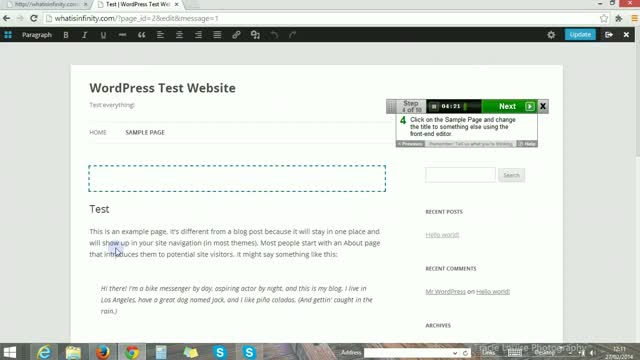
    WordPress Front-end Editor — Usability Test 1 

    I did a usability test on the WordPress Front-end Editor 0.8.4 plugin with the Twenty Twelve theme on WordPress r27162.

    Summary

    • Misses the “Edit Post” link in the toolbar completely but finds the inline “Edit” link
    • Struggles to figure out how to save changes
    • Secondary editor functions are hard to find
    • Unable to find the tag icon in the toolbar
    • No trouble adding or modifying content and links

    This is a great first look, so I would recommend watching the entire video through. (Length: 8:45)

    You can download the full video: c41ea9a3.mp4.

    See highlight reels after the jump.

     
    • Janneke Van Dorpe 8:43 pm on February 27, 2014 Permalink | Log in to Reply

      Thanks a lot for doing this! Watching everything right now.

    • Rouven Hurling 9:27 pm on February 27, 2014 Permalink | Log in to Reply

      we could maybe use the pointer, that is used for new features, on first activation of the front-end editor to highlight editing options and saves?

    • Janneke Van Dorpe 9:29 pm on February 27, 2014 Permalink | Log in to Reply

      • I guess having only one post on the home page of the website makes it look a bit like that’s the post’s page. So you don’t immediately get that you have to go to the post’s page to see the ‘edit’ link in the toolbar. But as we can see, if the theme adds edit links to posts, it’s easy to discover. I don’t think you should remove it, most themes seem to have it.
      • It’s pretty frustrating not to find the save button! Not sure how we can make this more obvious, but a dismissible pointer might help. Having a save button in the onbeforeunload alert is definitely a good suggestion. Actually the exact same thing is used on the back-end, so there’s room for improvement there as well.
      • Why do you think the secondary buttons are hard to find? I thought it was found quite quickly. On the back-end this would be equally hard; you’d have to toggle the kitchen sink.
      • Not sure how to make tagging easier. If they had gone over the toolbar buttons, they would have found it. They would probably have had the same reflex to add a hash in other environments.
      • I agree on the feature image area, but something needs to be there. A tooltip saying ‘Add featured image’ to inform the user would be helpful indeed.
      • While the post is saving, the update button is disabled. After the page is reloaded, a message shows up that the post has been saved successfully. I think that should be enough?
      • The button reads ‘Update’ because the one on the back-end reads the same. I think things like this should be the same on the front- and back-end.
      • The kitchen sink button is on the left because that way it stays in the same place and you don’t have to move your mouse to toggle back.
      • Sheri Bigelow (designsimply) 8:14 pm on February 28, 2014 Permalink | Log in to Reply

        Great notes!!

        Why do you think the secondary buttons are hard to find?

        It looked to me like the user hesitated and had to really look around before they spotted the toggle icon. I think you’re right that “hard to find” was a little too strong of a description in this case though. Something like “had to hunt for the secondary buttons” would’ve been more accurate. It’s worth more testing to see if it shows up as a trend.

        I agree on the feature image area, but something needs to be there. A tooltip saying ‘Add featured image’ to inform the user would be helpful indeed.

        What about adding a text label right inside the dashed area? Is that area supposed to be a drag and drop zone? Also, why does it have a pencil icon? An image or gear icon would be more accurate because a pencil usually indicates something related to writing, not images.

        While the post is saving, the update button is disabled. After the page is reloaded, a message shows up that the post has been saved successfully. I think that should be enough?

        Let’s watch out for trends on this one — if users keep wondering if they’ve saved or not in other tests, then it would be worth re-visiting.

        The button reads ‘Update’ because the one on the back-end reads the same. I think things like this should be the same on the front- and back-end.

        While it’s a good idea to be consistent, don’t do it at the cost of usability. If users look past “Update” while saying aloud they can’t find the “Save” button, as they did in this first test, then consider changing it. It may turn out in the end that “Update” is just fine. Let’s keep an eye on it.

        Whatever the button label, I think a different color for the button could also help. It’s pretty hard to ignore orange. :) Might be worth testing since that particular button is a pretty important action and shouldn’t be allowed to be missed if we can help that.

        The kitchen sink button is on the left because that way it stays in the same place and you don’t have to move your mouse to toggle back.

        I suggest testing it on the right to see if users have trouble with it there. If they do, then it would be a good confirmation that the best place for it is on the left.

        • Janneke Van Dorpe 5:58 pm on March 10, 2014 Permalink | Log in to Reply

          Also, why does it have a pencil icon?

          I changed it to a + icon now. I’ll probably add a label to it, or something similar, but I’ll do that together with some other updates.

      • Dan 5:20 pm on March 4, 2014 Permalink | Log in to Reply

        It’s pretty frustrating not to find the save button!

        It looked to me like he thought a save button might be at the bottom of the post. He also hadn’t discovered the toolbar yet which was interesting since he hit the ‘Edit’ link instead of using the toolbar button.

    • Janneke Van Dorpe 9:38 pm on February 27, 2014 Permalink | Log in to Reply

      I’d definitely like to see additional tests. If not now, then maybe in a few weeks as things get better. I’ll think about other tasks that might be interesting.

    • Janneke Van Dorpe 9:51 pm on February 27, 2014 Permalink | Log in to Reply

      Are you sure the link added in the media modal was not an image? Not sure why a preview shows up then. In any case, this would be a core bug.

  • Janneke Van Dorpe 8:01 pm on February 26, 2014 Permalink | Log in to leave a Comment
    Tags:   

    Front-end Editor Meeting 25 February 

    With @avryl (me), @kraftbj, @samuelsidler, @ubernaut. Log.

    Not much to report this time since I’ve been away since the last meeting. Everything has been moved to GitHub, so new tickets should now be added there. I also added Grunt with jshint. @samuelsidler asked @designsimply to do some user tests. Exciting! :)

    The next meeting will be Tuesday, 4 March 2014, 17:00 UTC, hopefully with a lot of updates to share.

     
  • Chris Reynolds 6:29 pm on February 25, 2014 Permalink | Log in to leave a Comment
    Tags:   

    AH-O₂ Update — 24 February, 2014 

    Cross-posted from make/docs

    Help Overview refactoring
    @brainfork was going to work on this but didn’t have the time. He was able to review the code though, but no progress has been made. @trishasalas has stepped up to help out with this. They will be taking a look at the issues reported in this ticket (moving help footer over) as well as this ticket (text next to dashicons are not aligned vertically) and creating new tickets for any other issues that come up.

    Tooltip hover delay
    @clorith reported that the tooltips were sometimes taking the focus away from the actual item. he then submitted a pull request which has been merged that increases the hover delay. This will be included in the next version in the WordPress.org repository.

    Tooltip arrow positioning
    …is still an issue for some tooltips which is mostly to do with not having good selectors to work with (not everything in the WordPress admin has IDs or classes associated with them). @trishasalas is going to look at this, but since this could be done completely differently in core by just adding more specific ids to the things that need tooltips, I’ve given it a lower priority. @trishasalas may try to do at least one admin page, though, as a proof-of-concept.

    Versioning
    Because I can’t consider this plugin “done” (and therefore 1.0) until tooltips are on every page, and because we’re going to run out of digits if we keep going at the 0.x rate for every weekly update, and because looking at a plugin in the repo that has a 0.x version looks less like a completed entity than a 1.x release, we’ve agreed to tweak how the versioning is handled a bit to make better use of minor point release versions. Updates with minor fixes or new tooltips will be considered a 0.0.x release, more significant changes will be a 0.x release. There was some discussion about this that can be read in the logs, but the main reasoning is that it seems misleading to call something a 1.0 if it’s still incomplete (in this case, missing tooltips) and we’d be at a 1.0 in 4 weeks at our current rate.

    Admin Help Inventory spreadsheet
    @ubernaut will work on tackling the Pages…pages next in the spreadsheet having just finished filling out the Network Admin screens.

    @nikv has started work on adding tooltips to the comments page but that has not been merged into the plugin yet.

    Tooltips on Mobile
    We’ve decided to go with the tap-and-hold interaction for tooltips on mobile devices. This takes a lower priority to getting the tooltips in and no work has been done on it yet, but if someone would like to tackle it, let us know by commenting in the open ticket here: https://github.com/jazzsequence/WordPress-Admin-Help/issues/32

    The logging bot was having a fit, so here’s my copy of the logs from the meeting (the first 15 minutes are cut off, unfortunately): http://s3q.us/log/ah-o2-log-2014-02-24.html

     
  • Sheri Bigelow (designsimply) 2:08 pm on February 20, 2014 Permalink | Log in to leave a Comment
    Tags: ,   

    I’ve tested the Widget Customizer 0.14 plugin with the Twenty Fourteen theme on WordPress r27060.

    Summary

    • No trouble adding, rearranging, or removing widgets
    • Widgets can be tough to spot if they are added “below the fold”
    • Widgets that require extra prep are easily dismissed

    (More …)

     
  • Janneke Van Dorpe 9:49 pm on February 18, 2014 Permalink | Log in to leave a Comment
    Tags:   

    Front-end Editor Meeting 18 February 

    With @avryl (me), @kraftbj, @samuelsidler, @melchoyce and @ubernaut. Log.

    Download the WordPress Front-end Editor plugin.

    • We decided to move the development to git and GitHub, hopefully that makes it easier for people to contribute! @kraftbj will port over the existing Trac tickets and then we’ll use GitHub as our bug tracker.
    • Not many updates this week, I’ve only been working on post locking and a responsive admin bar.

    Screen Shot 2014-02-18 at 16.29.14

     
c
compose new post
j
next post/next comment
k
previous post/previous comment
r
reply
e
edit
o
show/hide comments
t
go to top
l
go to login
h
show/hide help
shift + esc
cancel