Home Reno
A little more living
I hope everyone had a nice weekend. Monday is our day off so today was pretty relaxed, with brunch at Luna, a visit with Sali Tabacchi, coffee at Full Stop and some grocery shopping. Since the dwell article a few things in our home have changed so we thought we would give you a little update.
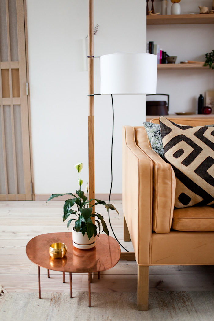
The first little thing is our tiny little Peace Lily in an Arabia Finland planter, along with the Luca Nichetto Timeline bowl and copper Zoo table by Claesson Koivisto Rune. We also sell the TMM floor lamp by Spanish designer Miguel Mila, we always have his designs on display at Mjölk.
Available at Mjölk but not on the webstore yet: Luca Nichetto Timeline bowl and TMM floor lamp in white oak, beech, walnut or wenge. Please enquire here.

Underneath this little side table is our new (old) mid-century Swedish carpet by Judith Johansson. She is one of our favourite rug designers, you might recognize her work from the red and blue carpet we have at our cottage.
When we first moved in we didn’t have any rugs on the floor at all, and in the beginning it was really nice and minimalistic. However, as we grew into our home we starting craving the warmth you get from incorporating textiles. They are also so nice underfoot and remarkably cut down on sound.

The full shot of the living room rug.


The untreated vegetable tanned leather on our 2213 sofa is about 2 years old, and wearing beautifully. Eventually it will be a cognac brown.

Elodie rolling around on the carpet.

You might be wondering where our old Berber rug moved to. We found a great place for it in our bay window underneath the Conoid bench. The two carpets play off each other really well. We’ve always loved textiles but incorporating different styles in the same room can be challenging. That’s why we really took our time waiting for the perfect rug to tie everything together.
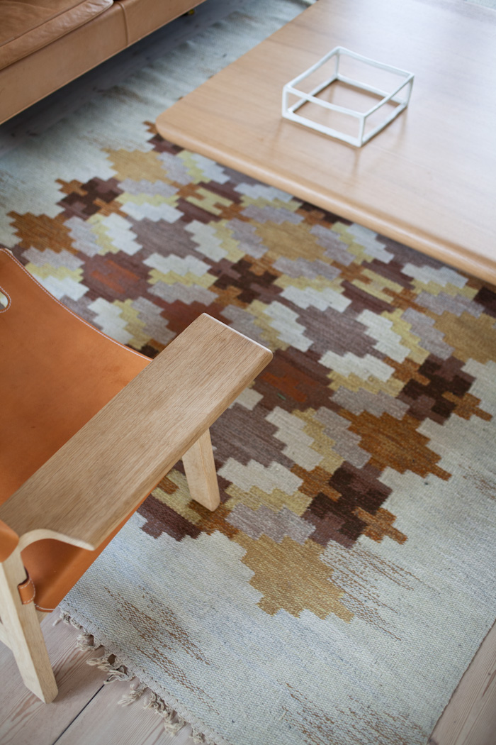
All of the subdued fall colours are really nice. Funny enough, when we bought the rug via an online auction, the colours in the photograph were more blue, pink and orange, so we were really disappointed when this colourway showed up. Thankfully because of all the white oak and natural leather it works and it ended up being a win!
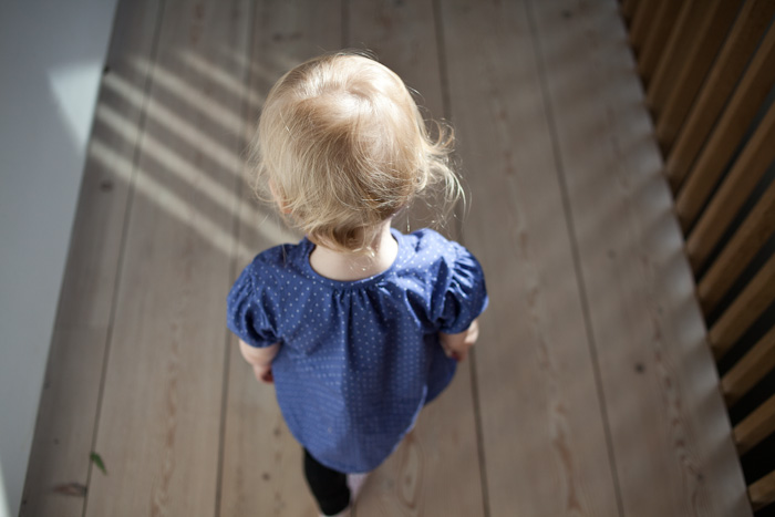
A photo of Elodie to end with.
Around the house

I hope everyone is having a nice week! It’s been a busy month here, and we found a little bit of time to show you a few new things around the homestead that have been inspiring us lately. If you follow our instagram you have probably already seen photos of our mid century Danish piano. We finally got it all tuned up and it sounds pretty good for such a tiny pianette.
In the festive spirit we have our little Aarikka elves sitting on the ledge.
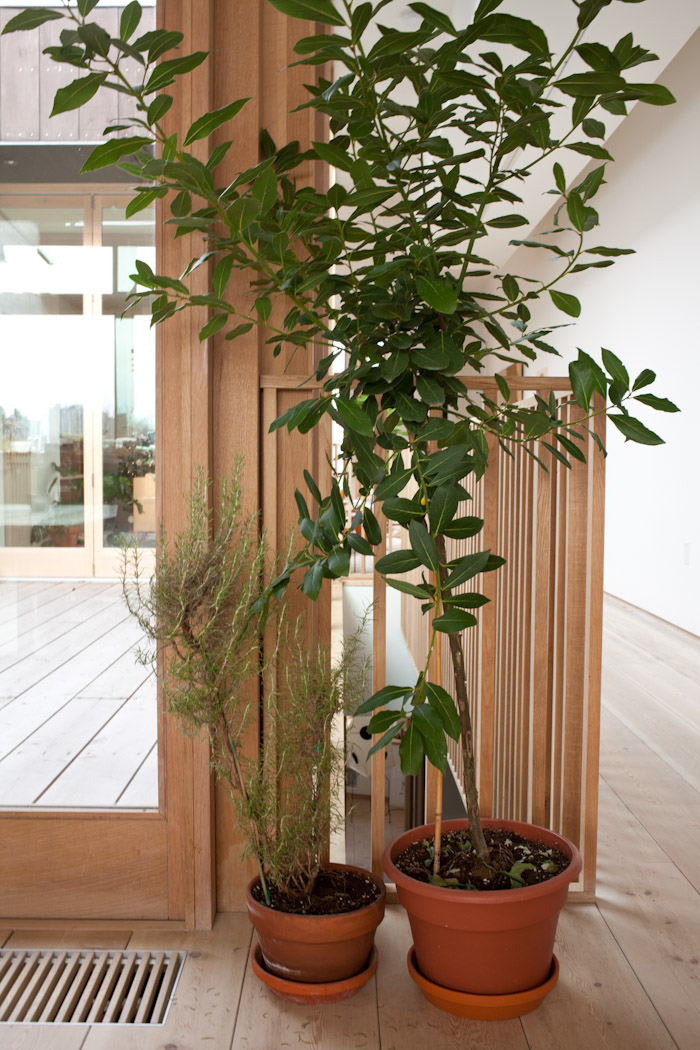
Our Rosemary bush and Bay leaf tree. The bay leaves come in handy for making soups this winter!
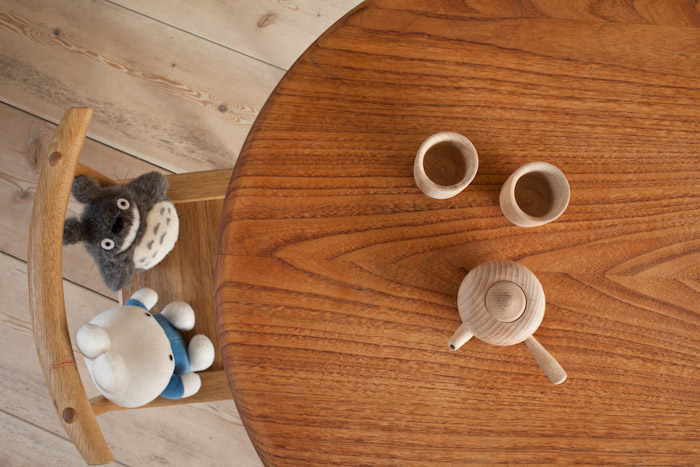
Studio Junction lent us their Danish coffee table to be used as Elodie’s play table. Little friends Miffy and Totoro sitting on Elodie’s African chair, a gift from Tomii Takashi (complete with red crayon).
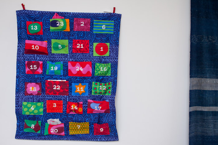
Advent Calendar bought on our yearly pilgrimage to The Finnish Place. Marimekko with little pockets. Elodie loves discovering the treasures, though it seems that the pleasure in finding out surpasses the enjoyment of the object. Usually she just says More! More!
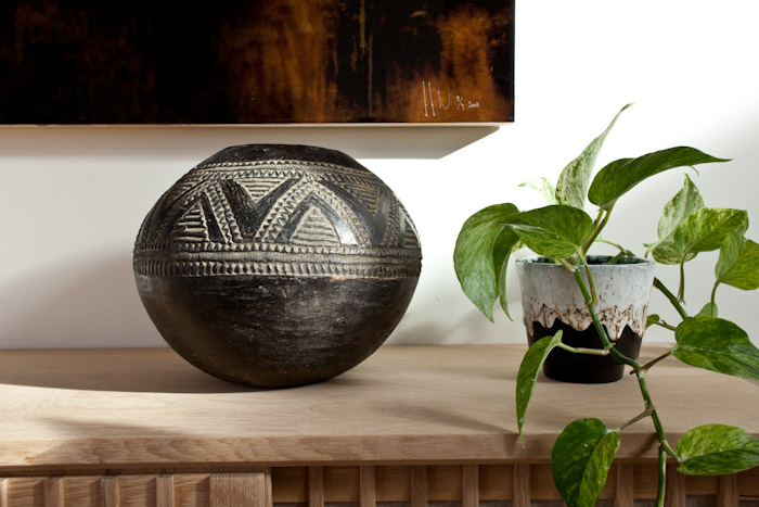
An antique Zulu beer fermenting pot in clay, such a nice shape and pattern.
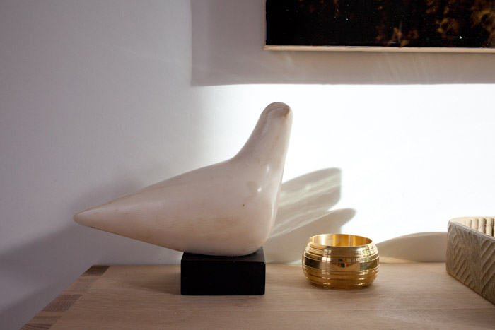
A mid century Cleo Hartwig sculpture of a dove, next to a brass bowl by Luca Nichetto for Skultuna.


Left, we bought the most interesting looking tree on the lot (Georgian Bay Xmas Trees outside No Frills on Pacific – convenience!). All of the trees are full and perfect looking but they didn’t feel right. Then we saw this scraggly thing and well, home it came. Tree skirt by Marimekko, from The Finnish Place.
On the right is Elodie’s decorating.
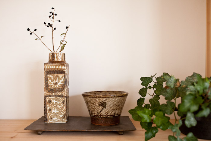
Left, a Royal Copenhagen vase and to the right the only work of a Japanese National treasure that we will ever own, a unique tea bowl by Tatsuzo Shimaoka. The lines in the bowl are actually from ropes that were embedded into the clay, the bowl has a gold repair to the rim.
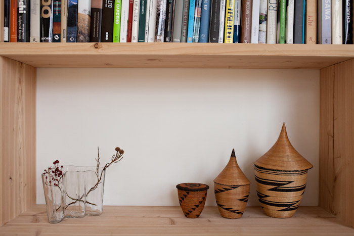
A vintage wood-mold Savoy vase by Alvar Aalto, along with a collection of 3 Tutsi baskets from Africa. Some of the tightest weaving I have ever seen, and such an incredible form and pattern.

Isha update: happy cat.
Antique Scrolls

Well, winter looming outside our doors and we’re all spending a lot more time around the house and finally getting around to framing art and finding places to hang them. We have a couple of interesting antique Japanese *correction – Chinese scrolls (I bought these from a shop in Japan)* that we thought we should share with you. One is finding its home in a narrow wall in our bathroom to the right of the sink.
It is the popular motif of the plum blossom, but this one is the lucky double plum blossom *peach blossom?* ensuring a good spring. It’s a nice reminder during winter, the promise of the spring to come. Also, the artist used their finger print to make all of the little dots – I think that little bit of charm was what encouraged me to buy it.

A closeup detail of the finger prints used for the blossoms.
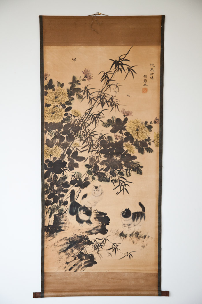
The other is just a fun piece that I bought for Elodie. When I saw the cats, bamboo and flowers I thought it would look great in her future bedroom. Plus one of the cats looks just like Isha! Elodie really likes this piece, she likes counting the cats.
Remodelista: book review

We recently bought a copy of the new Remodelista book, which contains a mix of houses, kitchens, bathrooms and design ideas that are surprisingly accessible. It’s definitely a particular aesthetic, but of course one that we gravitate to: natural materials, plenty of white, and considered accessories.

Notably for us, we couldn’t believe it when Julianne Moore mentioned our shop in her foreword. I think her experience of using Remodelista is one that many can relate to. It’s the only resource on the internet that we’ve found that does such a great job of sourcing the best within a particular aesthetic. I mean, try googling “modern [insert fixture, furniture, accessory, building material etc here]“. I can guarantee you will spend a lot of time sifting through very unmodern products!

The aforementioned Sori Yanagi flatware. We use it at the cottage and love it. Substantial but not heavy, and the knife is so sharp it can cut steak easily.

We were also pleased to see Pia Wallen’s Cross Blanket in The Remodelista 100 listing.

But enough about us. The spaces featured all have a calm, homey feel. I really loved the Remodelista Headquarters, and their investment in mill work. That said, there are enough spaces to provide inspiration for more limited budgets.

In the Remodeling Reality section there are plenty of things to remember when renovating, and some good tips too.

Each featured space has a Steal this Look section. The Shaker peg display is something we were considering at the cottage (the bedrooms were never really finished).

Same goes for the wall of Josef Frank wallpaper. This is the exact one we were thinking about for Elodie’s bedroom! It’s nice to see it used in a large application.
You can get it here or preferably at your local independent bookshop or retailer.
Max Papart lithograph

I’m not going to lie, it’s been awhile since we’ve been able to blog properly. A mixture of travel, sickness and everyday life getting in the way. Things are happening over here but there’s no time to report on it! Who knew, kids need attention. A lot of it.
The last Junction Flea happened earlier in the month (sniffle) and it was a great run while it lasted! We thank Micah and Paul for putting it all together and wish them all the best for their future plans.
At the second to last flea (which I thought was the last flea) there was a piece of art that caught my eye, but price and mood got in the way. When I chanced upon it again at the actual last flea and found out the price was now $80, I just had to go for it. We had recently swapped out our sofa–it was time to let the 1960s sofa go – don’t worry, we replaced it with the same one, in natural–and found that our living room acquired a new vibe in the process.
I find it so hard to acquire art. On the one hand I want contemporary work but cannot necessarily afford to acquire it quickly. On the other hand I think it’s nice to balance the contemporary out with some older work. But striking a balance, and not going too kitchy is always a concern. I think this piece plays well with the contemporary piece it’s placed beside, as well as the natural leather and oak in the room.

A detail.

Max Papart (1911-1994), France.
Lithograph on Arches with Embossing, Signed and numbered in pencil.
Just needs a frame to finish it off!
Living with a toddler and nice things.

I’ve been meaning to write about this subject for some time, but between summer and the Nakashima exhibition, we’ve been in a bit of a whirlwind. We haven’t shared much of our house yet, mostly because we are still settling in! It takes quite some time to feel comfortable putting art up (or acquiring it) and finding special textiles that take a space to the next level of homeyness.
We have a flex space that is currently Elodie’s bedroom (she’ll move to another room once either a) another baby comes along, or b) she escapes her crib and becomes ready for a big kid bed. She has been sleeping in here since December but we’ve only just felt like the room is complete. It’s a small space that is ALL windows and doors. So that makes for a challenge when it comes to shelving and art. I think ultimately though, this isn’t a play room. It’s a sleeping space and needs to be calm and minimal. There is a nice pop of nature out the window (in Canada you legally need to have an operable window in each bedroom, so Studio Junction made a clever little courtyard, where we are in the process of planting some bamboo).
The second we saw the Leander crib and change table we knew it would be perfect for our new home. I had some serious baby brain going on when I put it together but the craftsmanship is really solid and it’s wearing really well despite the odd bite mark around the edges. We invested in the bed because it also turns into a toddler bed, by expanding by about another foot and a half. The only worry I have is that if I turn it into a toddler bed now, we’ll eventually need another crib. I wish buying the toddler bed wasn’t as expensive as buying the crib. If anyone in the Toronto area is selling or sees one for sale, let me know!!!
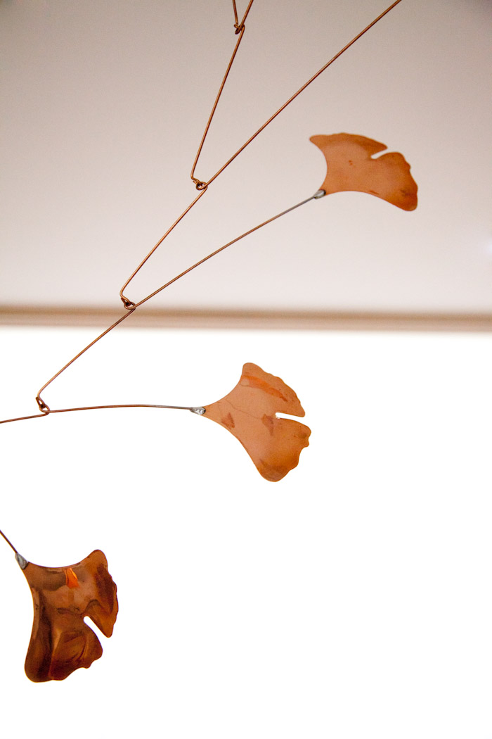
We found this mobile via Remodelista (oddly I cannot find the post) and ultimately bought it from the maker as the store they had linked in the story didn’t ship to Canada. Another piece that is perfect for both a baby and an adult space (would look nice in a sheltered garden for example).

Pia Wallen Cross Baby Blanket is now available at Mjölk (though may not be online yet). Adult version also available.
Bunny was a birthday gift from a very lovely customer.
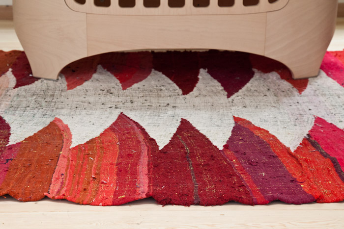
This carpet we bought via Etsy. John was looking for Moroccan rugs and this was added while he was lurking on a page. It jumped out at us for Elodie’s room. Since she lives in a pretty neutral world, we thought it’d be that extra punch of colour necessary to make it a less serious space. And even though it’s kid friendly, I think it’s a rug she could love and use into adulthood (that is, after her inevitable rejection phase).

Needing some storage we turned to the much loved Ribba picture shelves from Ikea.
Painting at top was commissioned by Melinda Josie, of our cats. The elephant picture was made by our friend Hollie as a birthday gift. The wood blocks with Elodie’s name are from our friends over at Ltd. Supply Kitchen Brewery (ok, they are our besties, but check out what they are up to if you’re into craft beer).

The Muji CD player is the perfect little thing for a nursery. The giraffe was a surprise gift from Jake of Machine Age Modern. Some vintage and new Moomin books. A Dala Horse from our wedding. The Chalk Piggy Bank was bought from Ladies & Gentlemen Studio (wow they’ve been busy!). Monkey is from our first trip to Copenhagen together. String is from when we tried to sell it in the shop but it proved too complicated. Portrait of us (just pregnant and not knowing it) is by Phillipa C in collaboration with what was Russet & Empire, during the first Junction Design Crawl (mark your calendar, next one is Friday August 23rd!!).
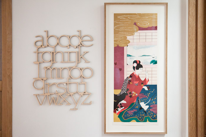
On the left was a gift from Arounna and John of Bookhou.
The print on the right is a signed and numbered lithograph that I coincidentally bought on the same day the rug arrived. Serendipitously they have the same colour scheme and sealed the look for the space. I happened to wander over to Williams on Keele, and as I was chatting away my eyes kept scouring. The print was originally in a fake bamboo style frame and I could only see a part of the gold section – somehow I knew it was a Japanese print worth checking out. I asked to look at it and was shocked, $45! I NEVER luck out with finds like this. Honestly, we debated putting this piece in our room, but Elodie liked it from the get go. She gave it a kiss.
We immediately took it to our new framing friends over at The Gilder. It costs a bit more to get a custom white oak frame but so much better than all the generic styles that are readily available.

The Hans Wegner J16 rocking chair and Artek Zebra Pillow. We use this rocking chair every day, and once this room is no longer a nursery, it will most likely move up to the cottage to continue to be enjoyed.

Moving away from the bedroom, we all know kids stuff gets everywhere. I was starting to feel like we have too much stuff, but have realized we barely have anything. We have two bins and half the stuff is for babies. Elodie doesn’t slow down much to play anyway. She likes running around and practicing skills like climbing up and down. So books and balls and babies are the only things she really interacts with (not even blocks!). The above cardboard box? Needs to go in the recycling…she’s over it.
Elodie loves her chair by Tomii Takashi. It’s the perfect size.
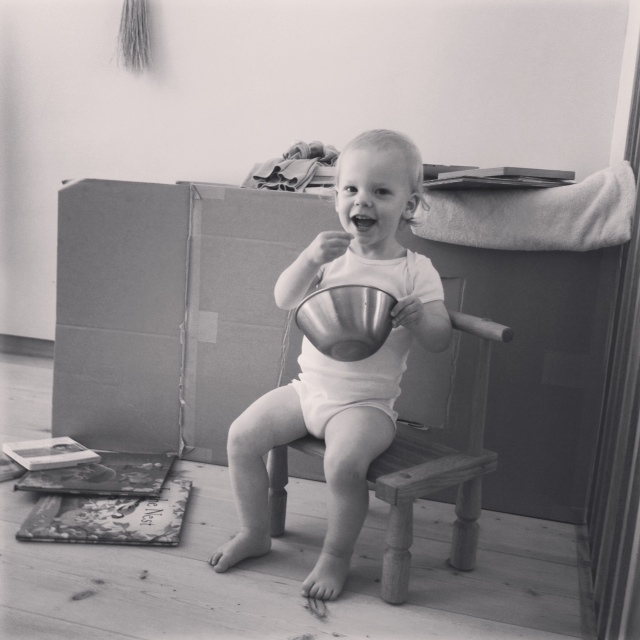
Not pictured is the Ikea easel, for colouring….

And yes, she colours outside of the box. This has been like this for weeks too. Ohhh we are certainly not perfect over here!

The Brasilia coffee table by Claesson Koivisto Rune is a perfect sort of coffee table. Soft rounded corners and hollow means we don’t have to worry about bumps on the head. Except when she climbs up onto the table and jumps off, a constant fascination.
She barely pays any mind to that Masanobu Ando sculpture. And if she does we just take it and move it up high. But generally she’s not all that interested in the stuff around the house. Now that’s obviously her personality, and not all kids will act this way. I find that she gets into trouble if she’s bored or tired.

In the living room there are some low shelves for Elodie’s toys.
Shhh sleeping bunny. Also, banana hands, everywhere, always.

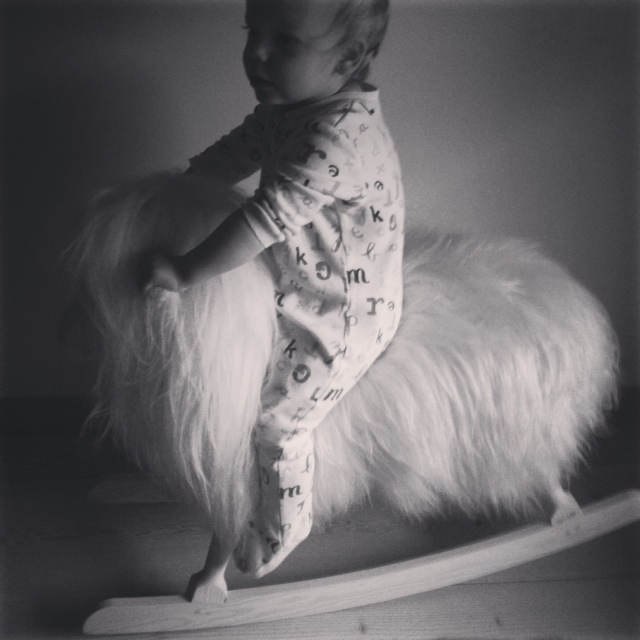
Finally on this not so kid friendly yet kid friendly home tour, the rocking sheep (contact us for info, not on website), which for some reason ended up in our bedroom but has yet to leave. And really, it’s quite nice in our room. A touch of kid in an adult space.
Note: Based on this post it seems like we get a lot of free stuff, but it’s not usually the case. Babies bring the love.

