WordPress.org

Ready to get started?Download WordPress

Make WordPress UI

Recent Updates Toggle Comment Threads | Keyboard Shortcuts

  • Chris Reynolds 1:38 am on February 4, 2014 Permalink | Log in to leave a Comment
    Tags:   

    AH-O₂ Update — 3 February 2014 

    (cross-posted from docs, sorry for any duplicates)

    @jazzs3quence added a few tooltips to the Users pages. Adding new tooltips is pretty easy, but we may want to revisit our documentation to clarify some things
    @brainfork closed out a few tickets, including positioning the tooltips so they aren’t bouncing around and setting the anchor tag title attributes to be the tooltip content where applicable (as opposed to our own custom tooltip content).

    We still need testers and documentors as well as volunteers to help add tooltips. All of these tasks are pretty simple and should only require a few minutes of instruction. The plugin in the wp.org repo should get updated tomorrow with this week’s commits.

    It should be noted to any make/ui-ers who haven’t looked at it yet, that we’ve removed both tabs (help/screen options) in favor of icons and text. Right now, clicking screen options just mimics the current behavior, just in the help overview area.

    @jazzs3quence also created a page on github that’s a bit more friendly to non-techy peeps who want to just get the information and/or download the latest version (before it makes it to .org). That page is here: http://jazzsequence.github.io/WordPress-Admin-Help/

     
  • Sheri Bigelow (designsimply) 2:25 pm on January 31, 2014 Permalink | Log in to leave a Comment
    Tags: ,   

    User Testing the Widget Customizer 0.13 Plugin

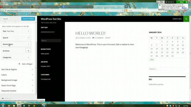
    I’ve tested the Better Widgets 0.1 plugin with the Twenty Fourteen theme on WordPress r26863.

    Summary

    • No problems adding, reordering, or removing widgets
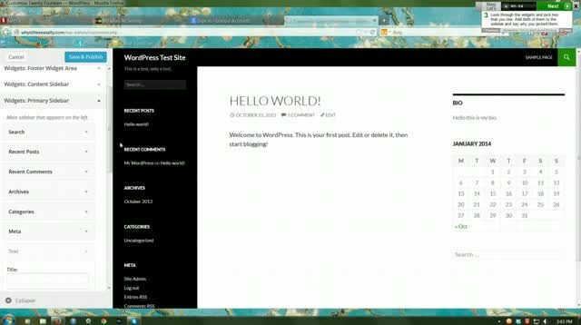
    • Content and Primary labels for widget locations weren’t clear to the user
    • Trouble with scrolling the slide-out, but it could have been a one-time user error</
    • Widgets can get a little lost if you add one to an already long list
    • ”Find widgets” search seems to obscure the last widget description
    • Feels messy to see all the widget controls stay open
    • Its not clear, at first, how to exit the customizer

    Successes

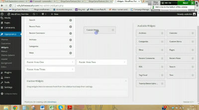
    No trouble adding a text widget. She clicks “Save & Pubilsh” a lot—seems to assume it’s needed to see the changes. (0:23)

    No trouble reordering widgets, but again hesitates when looking for right vs left sidebar. (0:56)

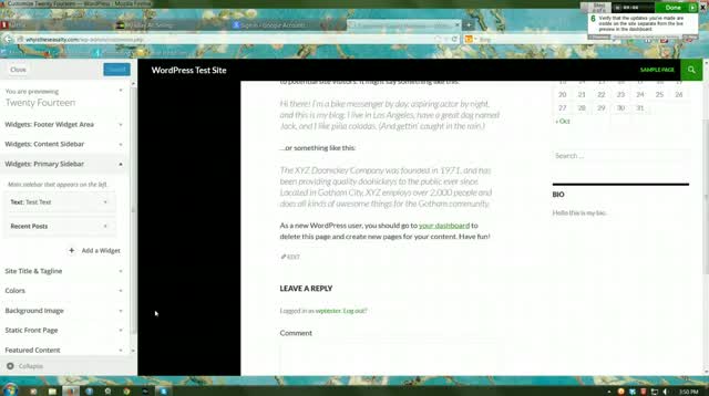
    No trouble removing widgets. (1:01)

    Points of Confusion

    She has no idea what sidebar is which. The quick red glow seems to have helped a bit. (0:31)

    Scrollbar jumps back to the top, not sure what she did to trigger that. (0:12)

    She expected the new widgets to be added to the top. (0:18)

    Has some trouble reading the “Twenty Fourteen Ephemera” widget description at the bottom of the slide-out panel. (0:17)

    Other Insights

    It doesn’t seem to bother her that all the widget controls stay open — but boy does it feel messy. (0:19)

    Its not clear, at first, how to exit the customizer. But she gets it eventually. (0:33)

    If you’d like to see the full video, you can download it here: 2b86a9a1.mp4 (9:25)

    (For Reference) Tasks Used in the Test

    • Go to Appearance > Customize Add some text in a new widget at the top of the left sidebar.
    • Look through the widgets and pick two that you like. Add both of them to the sidebar and say why you picked them.
    • Rearrange the widgets so the bio appears at the bottom of the right sidebar.
    • Remove all of the widgets from the left sidebar except the text you added before and one other widget you think is the most important to keep.
    • Verify that the updates you’ve made are visible on the site separate from the live preview in the dashboard.

    User’s Computer Info

    • Operating System: Windows 7 6.1
    • Browser: Windows Firefox 26.0
    • Display: 1920

    Next up: a couple more tests with version 0.14 of this widget.

     
    • shaunandrews 2:33 pm on January 31, 2014 Permalink | Log in to Reply

      Awesome. Thanks for doing these tests — they’re super insightful and helpful.

      She has no idea what sidebar is which. The quick red glow seems to have helped a bit. (0:31)

      That red glow has always been a sort of “placeholder” — we’ll work on making it more obvious, and slightly better looking.

    • Weston Ruter 9:58 pm on January 31, 2014 Permalink | Log in to Reply

      She expected the new widgets to be added to the top.

      Actually, widgets used to be added at the top. There was a dropdown SELECT to choose a widget, and then it got prepended to the list of widgets. @shaunandrews Should the “Add a widget” link move to the top?

    • Weston Ruter 10:00 pm on January 31, 2014 Permalink | Log in to Reply

      Content and Primary labels for widget locations weren’t clear to the user

      Would this actually be an issue with the theme itself? These labels are defined by the Theme.

    • Weston Ruter 10:03 pm on January 31, 2014 Permalink | Log in to Reply

      It doesn’t seem to bother her that all the widget controls stay open — but boy does it feel messy. (0:19)

      We talked about automatically collapsing a widget control when another is opened, but I thought that maybe they’d want to have more than one open to make it easier to copy/paste between widgets, or to compare two widget controls. Also, the widgets admin page allows multiple widgets to be expanded at a time.

    • Weston Ruter 10:07 pm on January 31, 2014 Permalink | Log in to Reply

      “Find widgets” search seems to obscure the last widget description

      This seems to be a browser rendering bug, but I can’t reproduce on Firefox 26 on OS X nor on Chrome on OS X. @shaunandrews can you reproduce this bug?

    • Weston Ruter 10:09 pm on January 31, 2014 Permalink | Log in to Reply

      Widgets can get a little lost if you add one to an already long list

      What if we added the new widget icons to prepend the widget titles? We have them in the widget addition panel, but we’re not using them in the widget controls. The icons would help locate and differentiate between widgets in a long list. Specifically, I’m talking about adding the icon at .widget-title > h4:before. @shaunandrews?

  • Chris Reynolds 10:54 pm on January 27, 2014 Permalink | Log in to leave a Comment
    Tags:   

    AH-O₂ Update — 27 January, 2014 

    The new time threw me and I ended up starting the meeting a half hour early. Apologies to anyone who may have arrived *on time* who ended up missing the first half hour of the meeting.

    This week there were some significant contributions from @mdbitz for the help overviews, @trishasalas for the tooltip styling and @brainfork and @mdbitz for new tooltips. We also have some documentation now for adding new tooltips. Most things are now functionally in place and we’re just trying to fill in the gaps.

    GitHub repo contributors

    I didn’t realize this was possible until @trishasalas pointed it out, but I added some folks on as contributors to the project repo on GitHub. This essentially gives them commit/merge access but it also means I can assign tickets directly to specific people/contributors. If you are interested in jumping in and would like to be added as a contributor, let me know, but I think I got everyone who’s been submitting pull requests thus far. (Pull request can still be submitted normally, the only real difference is I’m not the only one able to merge them in and/or able to push commits to the repo.)

    Tooltips on mobile?

    I’ve opened a ticket to discuss how to (and whether we should) handle tooltips on mobile devices. My feeling is that the value of the tooltips is discovering them accidentally when you are trying to do something and mousing around the screen. User interaction on touch devices doesn’t work the same, and any kind of interaction that would generate a tooltip that I can think of would involve more intentional interaction with the interface, which defeats the purpose to me. I’m open to other ideas, though, if anyone has them. https://github.com/jazzsequence/WordPress-Admin-Help/issues/32

    New tooltips

    The plugins pages should have tooltips on them now (including the subpages), so we’re going to start working through the list of admin pages to add tooltips to. Now that we have documentation on how to add them, I would like everybody on the team (and anyone else interested) to try taking an admin page and start adding tooltips. We’ll use the spreadsheet to mark what’s been done and what needs to be done as well as allow people to claim pages so we aren’t stepping on each others’ toes. This will also draw more attention to the documentation we have, and whether it needs to be updated (and to what extent it should be updated). The more people we have working on these, the faster we’ll be done, and this is the biggest chunk of work in front of us right now.

    On that note, we’re going to be looking into adding tooltips to the admin sidebar. One thing I was thinking about from testing was how a lot of people would move their mouse around the screen looking for things to pop out at them to guide them to their task. A tooltip that appeared over “Appearance”, for example, could explain that that’s where you go to change the look and feel of your site which might otherwise be (and was) ambiguous to some users.

    Known Issues

    There are a number of issues we’re currently working on fixes for, but there’s probably a lot more we aren’t aware of. If you are testing the plugin and are having some issue that hasn’t been reported already, please create a ticket for us on Github so we can look at it. Make sure you check the closed tickets as well as there may be some tickets that got closed for one reason or another.

    I’ve created a number of tags to filter different types of tickets. This list is growing, but hopefully can give a casual observer a frame of reference in terms of what we might need help on and in what context:

    needs testing means we need another pair of eyes on it to confirm that it is a) is happening for more than just the person reporting the issue and b) under what circumstances the issue can be reproduced. This status may also be used later for issues that have been fixed but need confirmation that the fix is working. These tickets are things where anyone is welcome to jump in and try to reproduce the issue and report back with their experience. The more information we have on these, the better.

    question means the issue is open to the floor for feedback regarding how something can/should be handled. these may or may not be technical. anyone is welcome to put in their 2 cents.

    priority-* refers to the priority of the ticket

    wontfix means that, for whatever reason, this isn’t something that can be fixed. One example of a wontfix ticket is the $WP_Screen errors that appear with WP_DEBUG turned on. This was the only way we could pull in the existing help content without hacking core (and therefore is a non-issue if/when this gets merged into core). (If anyone has a better way to handle this, feel free to let us know.)

    enhancements are tickets that will add some new functionality. unless assigned to someone, these are open to anyone who wants to jump in and comment or take ownership of that particular proposed functionality.

    One issue that seems to resurfaced is that the add new tooltip on the plugins page is empty. I saw this early on but it seemed to fix itself and other people weren’t been able to reproduce it. It’s come back again for another tester, so we really need more testers to confirm to help us isolate this and try to figure out what’s up. Any assistance peeps can give is greatly appreciated.
     
  • Janneke Van Dorpe 11:47 pm on January 20, 2014 Permalink | Log in to leave a Comment
    Tags:   

    Front-end Editor Meeting 20 January 

    Screen Shot 2014-01-20 at 23.18.25

    With @avryl (me), @melchoyce, @helen, @samuelsidler, @gcorne, @obenland, @azzaoz and @ubernaut. (Log.)

    We changed the meeting time to Tuesdays 17:00 UTC since that’s going to be much easier for some of us. Next meeting is Tuesday, 28 January 2014, 17:00 UTC in #wordpress-ui.

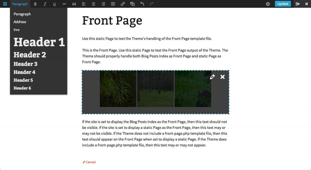
    There’s been a lot of updates since the last post. You can now create posts and pages from the front-end. I’ve added some more TinyMCE tools and a meta modal that looks very similar to the media modal and holds meta boxes based on the ones on the back-end. Because they’re just a copy, the lay out still needs to be improved. It looks like this:

    Screen Shot 2014-01-20 at 23.00.50

    All bugs/tasks/ideas/suggestions are now centralised in the plugins Trac. At the moment it’s a fairly small list of the things that popped up in my mind, but hopefully you test the plugin, stumble upon a bug and report it and share all your thoughts. Make sure you’ve added the ticket to the wp-front-end-editor component. Sometimes it ends up as not-listed and I won’t notice it.

    If you’re interested in contributing, this is also the place where you can find things to do.

    If you’d like to join our Skype conversation, just add jannekevandorpe and mention the front-end editor.

     
    • Scott Kingsley Clark 12:26 am on January 21, 2014 Permalink | Log in to Reply

      Are the modal sections like ‘Custom Fields’ added via the normal metabox API? Any word on possible integration points for plugins? Or at the very least, anything plugins need to be prepared for in their UI modeling to be able to support this when it’s opened up?

      • Janneke Van Dorpe 9:21 am on January 21, 2014 Permalink | Log in to Reply

        No, only core boxes will show up. It’s impossible to support meta boxes added by plugins since they’re not designed for that and could add javascript anywhere in the back-end. But plugins will be able to hook in the modal of course.

    • Jamil Ahmed 2:29 pm on January 25, 2014 Permalink | Log in to Reply

      Front-end Editor is best update for upcoming wp version and as a designer and QA analyst i will be happy to help in anything you need either its testing or anything related to UI /design. Please let me know that is this a right place for me to help. Already installed plugin in development server. Thanks

    • Ahmad Awais 9:12 pm on January 25, 2014 Permalink | Log in to Reply

      I would like to be a contributor. In case of this new front end UI development. Adding you at Skype :)

  • Chris Reynolds 6:57 pm on January 20, 2014 Permalink | Log in to leave a Comment
    Tags:   

    AH-O₂ Update, the first 

    Hey UI team!

    @samuelsidler thought it would be good for me to post over here for the AH-O2 project. All the previous AH-O2 posts are over on make/docs, and I don’t want to try to recreate the entire history here, but I’ll try to either cross-post or post what would be relevant from a UI perspective over here.

    What is AH-O2?

    AH-O2 is the project to refactor/reinvent/revitalize admin help. The main plugin repository is here: https://github.com/jazzsequence/WordPress-Admin-Help and is updated weekly on WordPress.org here: http://wordpress.org/plugins/ah-o2/.

    What it does

    The AH-O2 plugin does 2 things:

    1. It transforms the help tab into a help overview that appears at the top of the page.
    2. It enables tooltips that appear when hovering over actionable elements on the page (buttons, links, headings, etc)

    Both things are controlled by user meta settings from the user profile page.

    Where we’re at

    The help overviews have been mostly implemented, however whether the content stays the way it is now (pulling from the existing help content) or changes dramatically to fill the new space depends on whether we can get people to help write and shape the docs. @mdbitz has been responsible for most of that work and is currently working on making the overviews more responsive. Currently the help overviews will pull from the existing help content by default but can be overridden by the plugin (documentation here: https://github.com/jazzsequence/WordPress-Admin-Help/wiki/Help-Overview)

    The overviews and help/screen options links have been based on some of @melchoyce‘s mockups, but we haven’t made any significant changes to what the screen options stuff does. (@melchoyce if/when you want to start looking at that again, let me know — I’d love to help)

    We’ve built an API for adding tooltip handles and tooltip content. Currently only a few specific areas have had the tooltips enabled (Add New button on the Plugins page, All/Published/Drafts links on the Posts page) and we haven’t done any real styling to those yet.

    What we’re trying to accomplish

    We did user testing early on in the cycle just to try to identify if, in fact, there was an issue. We asked users, specifically people who have not used WordPress, to complete a series of normal WordPress-y tasks like writing a blog post, changing the theme, adding sidebar widgets, etc, to identify what happens when they run into problems — where they look for help. Uniformly, none of them found the help tab whether they had issues or not. We tried, briefly, changing the color of the help tab and moving the help to the admin bar and tested that. The admin bar help went completely ignored and, while no one clicked on the colored help tab, a few users at least seemed to indicate that they knew it was there if they needed it.

    Our approach, therefore, has been to put help in front of people so it’s not hidden. Ideally, by default, on new installations, both tooltips and help overviews will be enabled by default. For existing installations, tooltips will be enabled but overviews will be deactivated.

    When we meet

    We’ve been meeting on Mondays at 17:30UTC, but we are looking to change our meeting time starting next week to next Monday 18:30UTC in #wordpress-sfd. Anyone/everyone is welcome to come and contribute!

     
    • Ansel Taft 8:07 pm on January 20, 2014 Permalink | Log in to Reply

      I love the idea of tooltips. I think it could only *ahem* help bring contextual aides to the forefront.

      • Chris Reynolds 8:09 pm on January 20, 2014 Permalink | Log in to Reply

        That’s the general idea. The overviews are meant to be just that — a general overview of what’s on the page and how to use it — whereas the tooltips can be used for more specific descriptions of particular items.

    • Sam Sidler 5:38 am on January 24, 2014 Permalink | Log in to Reply

      I’m had some thoughts about the user testing you did in the past.

      The nature of user testing is such that I imagine many users felt the need to complete the task without using help. Did you try using a different prompt? I’m not sure of the exact wording I’d use, but something along the lines of “Try and complete [task]. Feel free to use any resource to learn how to complete the task.” A certain subset of users may Google for help. But others will look for it in WordPress and hopefully we can see how they use it. (I’m sure even others will just try and complete it without help at all. That’s okay too.)

      It also seems like your current direction is answering the question “Is help discoverable?” as opposed to the question “Is help helpful?” I’m not saying one question is righter than the other, but when looking at making large changes in admin help, I imagine all questions are on the table. Have you done any user testing of our current help text to see if it’s actually useful?

      • Chris Reynolds 4:20 pm on January 24, 2014 Permalink | Log in to Reply

        Discoverability is definitely the problem we’re trying to solve. @siobhan was running things when we were doing the user testing pieces and worked a lot on the wording of those questions. There were several prompts that gave the user the opportunity to look for help within WordPress or elsewhere.

        In the introduction:

        If you get confused please feel free to look for help both in the admin and elsewhere.

        In the tasks:

        Find the menu item that lets you do that and choose a new design (use the help in the admin or on other sites on the internet to if you need help to do this).

        and

        Find the menu item that allows you to do this and add a calendar. (use the help in the admin or on other sites on the internet to if you need help to do this).

        and, finally, in the post-testing assessment questions:

        Were you able to find all of the help that you needed?
        What additional help would you have found useful?

        The general impression that watching the user testing videos and reading the responses gave was that the help content (i.e. is the help helpful?) could be the most brilliantly-written thing imaginable and it still wouldn’t make any difference since very few people even know that it’s there. The only time the help became discoverable at all and people actually noticed it, was when we made the tab green, which contributes to the theory that discoverability is the main issue.

        Another thing that was observable from the user testing was how they went about trying to solve their problems. Many users would come back to the Dashboard, where they knew the Welcome panel existed, and hunt around in there to see if anything matched with the task they were trying to accomplish. Or they would hover over every single item on the sidebar to see if that gave them any clues about what they were trying to do. I think that the wording we used was maybe not the best thing ever — people stumbled when trying to figure out what a “widget” was, or that changing the design of the site meant changing the “theme” (as opposed to “customizing” the look of the site, as linked in the Welcome panel) — but these are things that people would run into anyway unless the terminology and labels were changed in general. (Of course, a tooltip that appears when you hover over Appearance saying something like “This is where you change the look and feel of the site” or an overview or tooltip explaining what a widget is could solve those problems.)

        @siobhan and I also got a spreadsheet of raw wp.com data from @dllh regarding admin help screen usage, but none of it was very conclusive, particularly because he did not have data about total admin page views to compare against total number of clicks on the show/hide buttons. (However, overall the show help was clicked at a ratio of 4:1 vs. hiding the help once it was shown, which is somewhat interesting.)

        I don’t think that discoverability is the only problem. I don’t think that this plugin/enhancement means we should use AH-O2 in favor of making other UX improvements. But I’d vote for a ubiquitous help that is maybe not as helpful as it could be against the best help content ever that no one ever sees. Content and whether the help is helpful only matters if people actually read it, and my observation — and the assumption that we’ve been going on thus far based on the user testing — was that we haven’t even gotten that.

        Ultimately, once we have the system more or less in place, we’ll want to do more user testing to see if there are any improvements in user behavior or if we’ve just been spinning our wheels this whole time (which I really hope is not the case 8| ).

    • Jamil Ahmed 2:26 pm on January 25, 2014 Permalink | Log in to Reply

      Its great step and recommended feature to provide tooltips. I am designer and QA analyst and will be happy to help in anything you need either its testing or anything related to UI /design. Please let me know that is this a right place for me to help. Already installed plugin in development server.

  • Janneke Van Dorpe 10:15 pm on December 26, 2013 Permalink
    Tags:   

    Front-end Editor: Quick Christmas Update 

    • The plugin had a few updates recently: it now automatically embeds links that are supported by oEmbed, it generates a preview of galleries and captions, you can add/edit/remove the featured image and the toolbar moved into the admin bar. If you quickly want to see what that looks like, take a look at this video:

    • We’ve had some good Skype conversations lately. If you’d like to join the group to help with the design and development, add jannekevandorpe (but do mention the front-end editor in your request).
    • Normally the next meeting is Monday, but since a lot of people are busy around this time of the year, I’m going to cancel it. I should be around though, so feel free to come anyway. So now the next meeting is Monday, 6 January 2014, 16:00 UTC on the #wordpress-ui IRC channel.
    • TinyMCE will most likely be updated to 4.0.x (the version on which the Front-end Editor depends) by 3.9. Here’s the ticket if anyone’s interested to test/help @azaozz: #24067.
    • There’s also a ticket regarding the new styles not being applied to the Media Modal on the front-end (as you can see in the video). Would be nice if there’s a patch by 3.8.1. #26677.
    • So, what’s next and what can you do?
      • TinyMCEThis toolbar should also move into the admin bar. I wonder whether we should keep the default API, or completely create a new one that fits the admin bar’s API. There was also talk about creating an inline toolbar with some basic tools, but it’s probably best to develop this next to the one in the admin bar and show/hide them to test which one scores best in terms of user experience.
      • Shortcode previews. Along with oEmbed previews, this is something that could be used for the back-end editor too. It might be good to split this from the main project, but it’s obvious that this is important to any project that tries to improve WYSIWYG. Creating previews of core shortcodes isn’t that difficult because we know exactly what they do. Adding support for all shortcodes could be a nightmare as they can do anything. It’s also quite difficult to detect if the shortcode is going to represent a block or inline element, currently the code just assumes it’s going to be block. One solution could be to make the shortcode define whether it’s compatible, but it’s nicer if things just work out of the box. Still, it’s better than nothing.
      • Add things such as date and time, visibility, permalink, status and format next to the categories and tags, and think about where these should go. It might be easier and interesting to put them in a modal (similar to the media modal). The main things to keep in mind are accessibility, space and extendibility.
      • Also note that switching between categories, tags, format and status actually requires the html to be updated. Not only could the theme have some CSS for the content based on these, it might also changes its lay out.
      • Creating/drafting posts through the front-end.
      • Add support for CPTs.
      • Responsiveness/mobile interface. Only keep the most basic TinyMCE tools.
      • It would be nice if some people could continuously check the security of the plugin.
      • Low priority, but autosave (and local storage), post locking and expired sessions.
     
    • @ubernaut 10:24 pm on December 26, 2013 Permalink | Log in to Reply

      this is looking great!

    • Paal Joachim Romdahl 10:52 pm on December 26, 2013 Permalink | Log in to Reply

      Very nice!

    • idealien 3:20 am on December 27, 2013 Permalink | Log in to Reply

      Absolutely gorgeous!

      Would meta field support be tied to the APIs of the metamorphosis work?

    • Trifon 5:46 pm on December 27, 2013 Permalink | Log in to Reply

      It’s really working well now. It has come a long way since the project started and, as it matures further, I would love to see the plugin being added to core someday. :)

    • Lachlan MacPherson 2:21 am on December 28, 2013 Permalink | Log in to Reply

      Great work! This is a fantastic addition and will make a big difference to WordPress. Here hoping it makes it to 3.9 :)

    • Weston Ruter 10:56 pm on December 28, 2013 Permalink | Log in to Reply

      Regarding shortcode previews, this is an analogous problem we’ve wrestled with for Widget Customizer. Specifically, themes and widgets need to opt-in for whether they support postMessage (non-refresh) updates to the Customizer preview. Widget Customizer has built-in support for core-bundled themes and widgets, but others must opt-in as we don’t know if a theme’s sidebar has dynamic positioning of widgets, or a widget has dynamic initialization via JavaScript. See full writeup: http://wordpress.org/plugins/widget-customizer/other_notes/#Live-Previews

      • Janneke Van Dorpe 9:59 am on December 30, 2013 Permalink | Log in to Reply

        Yeah, really annoying… It be awesome if there’s a way to make these things work out of the box. But at least you have a refresh fallback!

    • brashell 8:57 am on December 30, 2013 Permalink | Log in to Reply

      You know how the tag for when you insert an image with a caption you see then see the image and the caption beneath it inside the editor. What about using the same concept?

      • brashell 8:58 am on December 30, 2013 Permalink | Log in to Reply

        caption tag / shortcode

        • brashell 8:59 am on December 30, 2013 Permalink | Log in to Reply

          Also I would like to recommend that you add a drop down under the edit button to edit in the backend. Also maybe something in the settings to chooses if you edit in the front or back by default.

      • Janneke Van Dorpe 9:56 am on December 30, 2013 Permalink | Log in to Reply

        I’m not sure what you mean… Captions are converted?

        I’d not use a drop down, but a button in both editors to switch. And yeah, a setting like that would be nice!

        • brashell 5:00 am on January 7, 2014 Permalink | Log in to Reply

          I don’t know why I wasn’t notified of a reply… How can I send you some screenshots of what I mean? It filters out everything I write here so I can’t post it either.

    • venkmanuk 8:46 pm on January 2, 2014 Permalink | Log in to Reply

      This is looking great.. good workin! I have a small idea/request – I’ve implemented this using an icon for the ‘edit_post_link’ link – but need to change the icon to show we are in the edit mode ( don’t like the ‘cancel’ message but that’s another issue ) .. it would be great if when in front-end editor mode we could have an editor_open css class added to the body or the edit_post_link.

  • Janneke Van Dorpe 11:40 am on November 28, 2013 Permalink
    Tags:   

    Front-end Editor Update 

    I’ll briefly summarise some of the things we said in last week’s meeting, at WordCamp London and on Skype.

    • We’d like to experiment with the toolbar (or part of it) popping up on selecting some text, even though it’s not easy to discover without clearly pointing it out to the user, and there’s no way all the options could fit in. It’s probably best to keep a fixed and permanent toolbar on top and develop a smaller inline toolbar next to it. We can then hide one of both to do some user testing. Some inspiration here, here and here.
    • For now, it’s better to focus on the most basic TinyMCE functionality, keeping in mind that it should be extendible. Let’s also just focus on the most used WordPress options, things like Custom Fields, Discussion, Author and other custom meta boxes are low priority and maybe not even in scope.
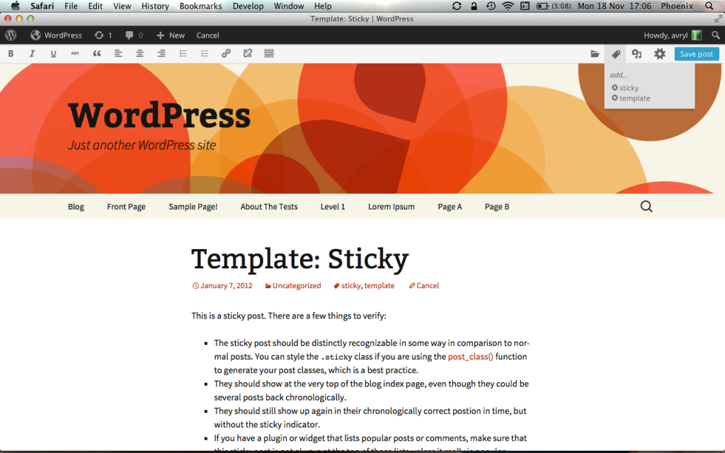
    • In the next version of the plugin, the toolbar will move up, like this: Screen Shot 2013-11-18 at 17.06.14
    • It now also depends on WordPress 3.8-alpha or higher, so you’ll need to update your install to test it.
    • Another thing that needs to be done is, apart from experimenting with different editing interfaces and taming TinyMCE, designing and developing a way to preview oEmbeds and shortcodes/galleries and thinking about other ways to insert shortcodes other than manually inserting them. If we want a real WYSIWYG editor, having a preview for those is a must.
    • A Skype group has been set up, so if you’d like to join, add jannekevandorpe and let me know.
    • The next meeting will be Monday, 2 December, 16:00 UTC on the #wordpress-ui IRC channel.
     
    • Tom Greenwood 12:22 pm on November 28, 2013 Permalink | Log in to Reply

      Thanks for the update.

      I agree that having the main toolbar fixed at the top is simple and intuitive – the screenshot looks good.

      The inline toolbars shown on CodersGrid are a really nice idea. I don’t think they are essential, but probably a nice to have so worth testing. The Barley Editor is pretty similar to TextMorph in that you can just type over text on the front end and the simplicity is great. However, the big issue I have with it is that there is not visual indicator that you are in editing mode. I think it is essential that the user always knows when they are/are not able to edit the content on the front end.

      I think as discussed at WordCamp, most if not all meta boxes could be handled in some sort of overlay that can be accessed when you need it, but which doesn’t clutter up the page the rest of the time.

      Also as mentioned at the weekend, I 100% agree that things like shortcodes need to be visual in the editor so that you get a real WYSIWYG experience.

      I have added you on skype. I may have a client meeting at that time but if I can make the call then I will.

    • Janneke Van Dorpe 12:42 pm on November 28, 2013 Permalink | Log in to Reply

      Yes, that was the idea, to have all the meta boxes in a modal, but we can experiment with that later.
      The meeting will be on IRC, not on Skype. Sorry for the ambiguity. I’ve added it to the post.

      • venkmanuk 7:01 pm on December 10, 2013 Permalink | Log in to Reply

        i’m new so maybe i have the wrong end of the stick… let me know if so!

        i think that one of the reasons Medium is so good is the simplicity of the editor.

        I recognize that previews for embedded content would be good – but i feel like modals are a step backwards in terms of ux. The idea is to edit directly into the page – right? So why not just allow pasting embed code into the page. once the user moves on to the next thing the embed is previewed live in the browser. if the issue is identifying/differentiating embedded code from text then maybe have one of the controls ‘switch’ that section to HTML mode instead of editor..

    • Native Imaging 3:16 pm on November 28, 2013 Permalink | Log in to Reply

      If the front editor had responsive column templates with some drag & drop features, I think I would use the Front End Editor for everything. But at the moment, a lot of important WP features are not available when making pages or posts. I also prefer to use plugins for grid layouts such as the Page Builder and others. I’ve pretty much ruled out all possibilities of clients and users using shortcodes for columns. If any code at all is involved with page composition, it will fail every-time. lol.

      • Tom Greenwood 4:42 pm on November 29, 2013 Permalink | Log in to Reply

        I agree about drag and drop columns and keeping code out of the editor. I think that is pretty fundamental in a visual editor.

    • Weston Ruter 7:50 am on November 29, 2013 Permalink | Log in to Reply

      What about abandoning TinyMCE in favor HTML5′s ContentEditable? With it, you can turn any element in a page whatsoever into a rich text area (i.e. it is seamless), which seems exactly what is needed for the frontend editor.

    • Tom Greenwood 4:44 pm on November 29, 2013 Permalink | Log in to Reply

      Quick question. I may be missing something obvious, but do you know why the front end editor is not visible on the front end of this site where I am testing it when I am logged in? http://www.eatwholegrain.co.uk

      Running 3.8 beta and Front End editor plugin is installed.

    • Gabriel Gil 12:41 pm on December 2, 2013 Permalink | Log in to Reply

      hey guys!
      I would love to be part of the testers of this great plugin but let me introduce little bit before.
      I’m a web developer from Vigo, Spain. Currently working by myself using WordPress on the most of my projects. For example: odd-barcelona.com and newworldsgroup.com

      Thanks in advance.

      • Sam Sidler 11:16 pm on December 2, 2013 Permalink | Log in to Reply

        Welcome Gabriel! You can install the plugin right now and test, but keep in mind it’s still under active development and might be rough around the edges. Test away and let us know what you think! We’d love to have to at the weekly chats (were you there today?!). If you have Skype add me (samuelsidler) or Janneke (see above) and we’ll add you to the Skype channel. Cheers!

    • alpha1beta 8:48 pm on December 6, 2013 Permalink | Log in to Reply

      I would love to be part of this project. I have been testing it a bit myself and have felt the need for similar featured in the past. I have hacked together some things that may compliment the editor and would love to contribute ideas and maybe code.

      Specifically, I would like to:
      Mark the location of the More Tag
      Mark the Location or the Next Page tags
      Add a class of Preview to the Body when editing or previewing a post. (Written and working)
      Allow Preview as an article would show up on the homepage/category pages and others, not just the single-preview page. (I have a work in progress on this)
      Ensure the Front End Editor takes or can take all changes applied to the current edit post page (If you enable and add custom types they do not show up currently.
      Add Support for Custom Taxonomies in the edit bar (Just like the categories and tags have now) if they have the permissions to show in adminbar.

      • Janneke Van Dorpe 11:59 am on December 27, 2013 Permalink | Log in to Reply

        • The more and next page tags are currently visible as an html comment, but they should be visualised and added to TinyMCE.
        • What would the benefit of a body class be?
        • I’m not sure how you would preview archive pages, and I don’t really see the point of that. How would it be useful?
        • CPTs will be supported at some point. Probably custom taxonomies too, but the toolbar or modal will be extendible in any case.
    • Rafael Angeline 8:11 am on December 11, 2013 Permalink | Log in to Reply

      Hello! Fantastic project, exactly what I was thinking to develop. Would be amazing see it integrated to WP core in the future. WP is missing a great front-end editor!

      Looks like the hardest part is the shortcode/embed integration and how can we handle it, it’s hard but we can develop something to solve this!

      Added you guys at Skype :)

      When will the next meeting happen?

    • Tom Greenwood 6:26 pm on December 13, 2013 Permalink | Log in to Reply

      I don’t know whether it is best to post feedback here or in the skype chat, but I tossed a coin and here it is.

      I know we touched on this in last weeks IRC, but having played around with the editor more now, it is clear that there are some usablity issues with the way we are locating things.

      1. The floating toolbar just doesn’t work in my mind. It isn’t located anywhere that you would logically look and so isn’t easy to see at a glance. As we discussed last week, an inline position would be much better.

      2. It is really confusing that we have tools and options spread in several locations. We have the toolbar on the page, the EDIT/Cancel button in the top bar and the other tools and buttons at the bottom of the browser. I think it is really important that we clarify the logic and workflow of this. I’d suggest that any tools used to actually edit text should be in the inline toolbar, even if they are in the kitchen sink. For example, it is frustrating as a user that I have to look elsewhere to insert an image or add a hyperlink. It would then also make a lot of sense to put the save button in the top bar next to the EDIT/Cancel button, because I think that is where you would expect it to be. As discussed last week, perhaps the other info in the top bar could be hidden when you are in edit mode to reduce clutter/confusion, allow more space for editing relating elements and also make it more obvious that you are in edit more because the top bar is distinctly different.

      3. Following on from above really, I think we do need to make a bigger visual statement that you are in editing mode. I’m trying to think about the general public using WordPress and figure that if I have to look around for a clue then less experienced users are going to feel really lost.

      4. I am testing on a site with a dark grey background and the toolbars just blend in. Either we could have it automatically switch between light/dark depending on your theme colour, or perhaps there could be an option in your site settings to change this manually.

      As discussed previously, the ability to create content on the front end and to edit other elements (e.g. widgets) and live preview shortcodes should be on the list of things to do long term, but I know we’re focussing on getting the basics right first.

      I’ll post more when I’ve tested in more detail.

      • Janneke Van Dorpe 12:14 pm on December 27, 2013 Permalink | Log in to Reply

        Thanks for the feedback!

        1. I agree. The floating toolbar will go away. I my opinion it needs to be integrated in the admin bar, but it’d be useful to experiment with and inline toolbar.
        2. That makes sense. You probably noticed that everything moved to the admin bar, but I guess the media button has a better place inside the TinyMCE toolbar.
        3. Would the sudden change in structure of the admin bar help? It might be good to do something more visual there. I think the edit mode should look as real as possible though.
        4. Hm. Maybe. Changing background colour to e.g. blue might solve 3 and 4.
    • alexpatin 7:16 pm on December 13, 2013 Permalink | Log in to Reply

      I’ve been meaning to take a look at this. I saw it the other day when I was exploring front end editors, so I’m definitely excited for this as a feature to come to core. I’ll start playing around and follow along with the updates, looking forward to contributing!

  • Sheri Bigelow (designsimply) 4:32 pm on November 20, 2013 Permalink
    Tags: ,   

    User Testing the Better Widgets 0.1 Plugin 

    Let’s keep going with the work on widgets! I’ve tested the Better Widgets 0.1 plugin with the Twenty Eleven theme on WordPress 3.7.1 and there is some interesting stuff in the results.

    Summary

    • No problem at all rearranging or deleting widgets
    • Had trouble with the drag-and-drop target area at first
    • Suggests adding a way to add new widgets directly from the Widgets page
    • Uses the wrong widget area, completely misses the pre-expanded “Main Sidebar”
    • Customizer is slow

    Successes

    No problem rearranging widgets:

    No problem deleting widgets:

    Points of Confusion

    Unsure where to go when asked to add a bio to the sidebar:

    Drag-and-drop misfires:

    Completely misses the pre-expanded “main sidebar” widgets (longest clip at 4:11):

    Other Insights

    Wants to know how to add more widgets from the Widgets screen:

    Reasons for picking search and calendar widgets:

    Unrelated to Widgets

    Slow customizer is slow, takes ~24s for this user to load it up:

    If you’d like to see the full video, you can download it here: Better Widgets v0.1

    (For Reference) Tasks Used in the Test

    • Add a bio to the bottom of the sidebar.
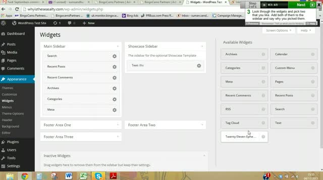
    • Look through the widgets and pick two that you like. Add both of them to the sidebar and say why you picked them.
    • Rearrange the widgets so the bio appears at the top of the sidebar.
    • Remove all of the widgets except the bio and one other widget you think is the most important to keep.
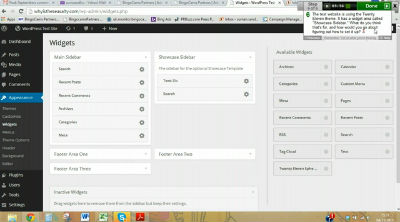
    • The test website is using the Twenty Eleven theme. It has a widget area called “Showcase Sidebar.” What do you think that’s for, and how would you go about figuring out how to set it up?

    User’s Computer Info

    • Operating System: Windows NT (unknown) 6.2
    • Browser: Windows Chrome 30.0.1599.101
    • Display: 1366

    My Observations & Suggestions

    • The drag-and-drop misses in this video are interesting, makes me wonder if having widget areas side-by-side is good or not—or perhaps arranging them more masonry style instead of in a grid would be better
    • Interesting that she didn’t connect “sidebar” and “widgets” right away, but getting into that label is tricky business and I’d like to watch that area with more users in order to spot trends
    • Love the suggestion to have an “Add New” button on the widgets page
    • Different sidebar areas for themes is tough, I think it’s pretty hard to tell what in the world the “Showcase Sidebar” is for if you’re not familiar with Twenty Eleven
    • It’d be great to focus on customizer performance speed

    Next up: same test, except run it on WP 3.8 trunk. What specifics are you interested in finding out from tests like these?

     
    • Weston Ruter 5:55 pm on November 20, 2013 Permalink | Log in to Reply

      Perhaps the slow loading for the customizer was just a network problem? It seems like an external script was blocking the page loading. In my experience the customizer loads very fast.

      • designsimply 7:27 pm on November 20, 2013 Permalink | Log in to Reply

        Could be. I’ve seen the problem show up more than once in tests, so I’ll keep watching to see if it continues to be a trend.

    • danhomer4 2:15 am on December 17, 2013 Permalink | Log in to Reply

      Windows NT 6.2 is Windows 8, for those confused

  • Andrew Nacin 3:17 pm on November 19, 2013 Permalink
    Tags:   

    Targeting the new dashboard design in a post-MP6 world 

    There’s been a lot of chatter about how to handle the detection of the new dashboard design in a plugin in WordPress 3.8, now that the “mp6″ body class is gone. I have three suggestions, any of which can be used depending on the situation.

    The WordPress admin assigns a “branch-x-y” class to the body. So, branch-3-8, branch-3-9, etc. But rather than targeting 3.8 or newer this way (which will require you to add selectors for versions far into the future), target 3.7 or older. So if the latest version of your plugin supports 3.6 or later:

    .branch-3-6 .some-selector,
    .branch-3-7 .some-selector {
         /* some rules go here for 3.6 and 3.7 */
    }
    .some-selector {
         /* 3.8+ rules go here */
    }
    

    As your minimum requirements increase over time, the older rules can simply be removed. Pretty easy.

    The second method is for when you require greater UI robustness. (This is also good for instant compatibility with existing code written against MP6.) Simply add your own mp6 class to the admin. The admin_body_class filter is a little funky, so bear with me:

    add_filter( 'admin_body_class', 'nacin_please_prefix_this_add_mp6_class' );
    function nacin_please_prefix_this_add_mp6_class( $classes ) {
        if ( version_compare( $GLOBALS['wp_version'], '3.8-alpha', '>' ) ) {
            $classes = explode( " ", $classes );
            if ( ! in_array( 'mp6', $classes ) ) {
                $classes[] = 'mp6';
            }
            $classes = implode( " ", $classes );
        }
        return $classes;
    }
    

    An added benefit here is some nice standardization: If multiple plugins need this same class, it’ll simply be added once and be subject to shared usage.

    The final method is for if you need to know in PHP whether MP6 the plugin is enabled outside the body class. For that, simply use the version_compare() above.

    if ( version_compare( $GLOBALS['wp_version'], '3.8-alpha', '>' ) ) {
        // 3.8 dashboard theme
    }
    

    To those asking why we shouldn’t just include the class in 3.8: WordPress evolves over time, and even 3.8 has significant changes when compared to MP6 the plugin. While we do strive to maintain backwards compatibility — including, to some extent, when we merge in popular plugins — a line needs to be drawn somewhere. Short of introducing a “version” string of the UI (which would be redundant, given WP versions), there’s just no great way to solve this, especially when trying to be forwards compatible with future design changes (to 3.8 and beyond). It’s worth noting that the branch-x-y classes were introduced a few versions ago specifically for the purposes of managing UI changes in plugins.

    A side note, and this is purely a personal preference, I’d really like to *stop* calling the dashboard design “MP6″. I don’t just mean in code, I also mean in general nomenclature and bug reports. Code names are cute in software development, and it helps to have a shorthand. (We already have a lot of them — too many, even.) But we’ve reached the point where we are about to ship this to tens of millions of users. It’s time to drop it. In bug reports, let’s simply set the “version” field to “trunk” and file it under the Administration component. In general, let’s celebrate it as the new design and aesthetic that WordPress 3.8 brings/brought us. It’s no longer MP6. It’s now just WordPress.

     
    • John Blackbourn 4:21 pm on November 19, 2013 Permalink | Log in to Reply

      I’m not sure this addresses the main concern that was brought up (#25906), which is themes that have a fixed header and need to fix it at a certain number of px from the top in order to clear the admin toolbar.

      The height of the toolbar has changed in 3.8, so themes that want to retain backwards compat with pre-3.8 need a simple way of targeting pre-3.8 in CSS.

      Sergey’s added a patch to #25906 which adds the branch number to the front end body class. Is this likely to go in? If so, themes will be able to use that.

      • Andrew Nacin 4:59 pm on November 19, 2013 Permalink | Log in to Reply

        Great question. I have been thinking about this for a while.

        For starters, themes could use one of the techniques listed here by adding their own classes for 3.7 or earlier. Twenty Fourteen is already filtering the body classes, so it would be a few short lines of code. This likely affects very few themes anyway.

        It would be great if we can come up with a solution for Twenty Fourteen that negates the need to account for the toolbar. I hate that the situation even exists where a theme must know 28px versus 32px, and we should pursue multiple avenues to avoid it. A new class is possible (for the branch or something like .admin-bar-32). But, it’s not like this is a CSS-only situation; the JS is already being used to fix the header and could be used to look at the height of the toolbar.

        It would be interesting to see if the toolbar can be designed without those extra 4 pixels, even if just on the frontend. It actually looks quite good at that height. The extra pixels are most needed in the admin so it doesn’t feel cramped when compared to the rest of the admin.

    • Hassan 4:43 pm on November 19, 2013 Permalink | Log in to Reply

      The demise of the “MP6″… sniff :P

    • George Stephanis 4:57 pm on November 19, 2013 Permalink | Log in to Reply

      If doing the `version_compare()` check against a src checkout, it’ll actually not work, as version_compare returns `-1` when doing `version_compare( $wp_version, ’3.8-alpha’ )` — as $wp_version is `3.8-alpha-src` — which is calculated to be less than `3.8-alpha`

      So do `version_compare( $GLOBALS['wp_version'], ’3.8-alpha-src’, ‘>=’ )` instead and you should be good.

      • Andrew Nacin 5:00 pm on November 19, 2013 Permalink | Log in to Reply

        $wp_version is currently 3.8-alpha-26127-src, which is greater than 3.8-alpha. The check in the post is fine.

        • George Stephanis 5:04 pm on November 19, 2013 Permalink | Log in to Reply

          Ah, just needed an `svn up` locally. I was at the interim revision before r26127 where it was merged in, but the version was still 3.8-alpha-src without the revision.

    • Jason (Theme Blvd) 7:47 pm on November 20, 2013 Permalink | Log in to Reply

      Within the various admin color schemes, there are a lot of useful CSS classes we can use that are all prefixed with “mp6-” — i.e. mp6-primary, mp6-text-primary, mp6-highlight, mp6-text-highlight, etc.

      Will these end up being changed to something else?

    • Shea Bunge 9:36 am on November 21, 2013 Permalink | Log in to Reply

      How are we now supposed to specifically target all versions running new interface or the old interface in CSS?

    • Bryce Corkins 9:46 pm on November 21, 2013 Permalink | Log in to Reply

      Didn’t see anywhere to post general questions, so thought I’d ask here:
      I’m writing a new plugin framework and I’d like to support the new WordPress admin style / MP6 from launch as much as possible. Is there a guideline for how to style jquery-ui tabs within a single plugin’s settings page? I’m thinking either white page body with the “active” tab also white, or grey page body with the inactive tabs dimmed somehow.

    • Juanfra Aldasoro 3:50 pm on December 4, 2013 Permalink | Log in to Reply

      Is there a simple way/function to get the current admin color scheme programmatically speaking and not css? I’ve seen that I can find that within the $GLOBALS, but is not so handy.

      I’m asking this because I now have to call different icons for the menu, depending on the color scheme (the default style requires light icons, light style requires dark icons ).

      Thanks!

    • olyma 7:04 pm on December 5, 2013 Permalink | Log in to Reply

      Okay, this entry above seems to sort of maybe answer my question, but I could use a little more clarity. It sounds like from what people are saying here and there is that the admin interface is now quite skinnable. If this is true, that the interface is much more skinnable:

      1) Where are the skin files located in my wordpress installation?
      2) Is there a skin to change it to appear the 3.7.1 way or in any other way than what comes box-standard?
      3) Should we use the method above and where should we plop that code in order to change the skin?

      Many Thanks!

  • Mel Choyce 6:45 pm on November 11, 2013 Permalink
    Tags:   

    Since there have been some questions about CEUX recently, as announced in our 10/22 meeting, CEUX has been put on hold until there are more available developers interested in working on the project.

    Thanks to @joen for collaborating on concepts with me, everyone who pitched ideas here and in our weekly chats, and @diegoliv and @briandichiara for their hard work on the CEUX plugin. Diego has expressed interest in working on the plugin some more in his spare time. If anyone else is interested, I’m happy to give commit access.

    ’til next time. See you, space cowboys.

     
    • julianprice 3:30 am on November 16, 2013 Permalink | Log in to Reply

      Hi @melchoyce looks awesome thanks you guys for all your hard work. First of all I am newbie here commenting but for some time I have been wanting to find away to contribute to the wordpress community even though I do not have has much web exp at all but have been learning … I guess :) who knows…

      Anyway I was unsure where to post so you the first I came to just for user experience and have followed you and Helen tuts from word camps on .tv.

      I will cut to the chase now in part to vent that word camps video sessions are constantly talking about engage in the community contribute make WordPress better. In my opinion though and certainly know this is all voluntarily contribution but you have engage perspective of others that are not remotely in your business.

      So my means of engaging contribution was as follow: http://wordpress.org/support/topic/suggesting-box?replies=1

      No replies no engagement nothing from someone that is a complete outsider trying to contribute. I know this probably should be in support or plugin ; bottom line I consider this u/x on the overhaul of wordpress.org usability especially with plugins in catgorories of functionality, requirements for plugin in developers to at least place in 1 cat no more than 3 & no more than 5-10 tags.

      I see the plugin repo as a pin board with catgories of functionally: sliders, galleries, content types, social media tools, admin tools, styling tools, short codes,…you probably know best how to categorize than I do.
      In addition ensuring tags on the submissions. On top of bringing to front by 6 months updated, 1 yr updated and removing all others.

      I certainly giving suggestion in addition I am happy to go in start catgorzing/ tagging them in right format or even better I am pretty sure there could be a user suggest script to place in cat and/or tag.

      That’s all I have at this to contribute to make.wordpress.org better.

      • Mel Choyce 5:27 pm on November 20, 2013 Permalink | Log in to Reply

        Hey! Glad to see you’re interested in getting involved in improving WordPress UX and usability. From your post, it sounds like you’re interested in improving WordPress.org itself. The best place to get involved on that front is http://make.wordpress.org/meta/, the Make subgroup that helps tackle the WordPress community websites and tools. They have their own track, where you can bring up usability and UX issues: http://meta.trac.wordpress.org/

    • Leah 12:52 pm on November 18, 2013 Permalink | Log in to Reply

      Perhaps something to check out: http://madebymany.github.io/sir-trevor-js/

    • roodlicht 4:35 pm on November 20, 2013 Permalink | Log in to Reply

      And here is the English version of the last URL regarding TYPO3 Neos: http://www.roodlicht.com/typo3-neos-or-typo3-cms/3364?lang=en

c
compose new post
j
next post/next comment
k
previous post/previous comment
r
reply
e
edit
o
show/hide comments
t
go to top
l
go to login
h
show/hide help
shift + esc
cancel