WordPress.org

Make WordPress UI

Recent Updates Toggle Comment Threads | Keyboard Shortcuts

  • designsimply 8:04 pm on October 24, 2013 Permalink | Log in to leave a Comment
    Tags: ,   

    User Testing Widgets+MP6 v1 Layout 

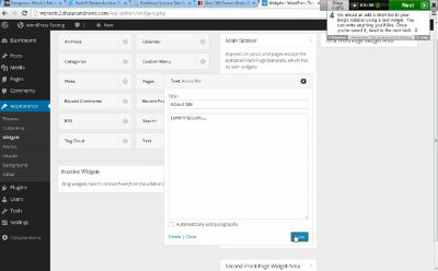
    I’ve analyzed user testing for two videos shaunandrews kicked off for v1 of Widgets + MP6. The clips represent the main points of interest and user confusion from the tests and range from 12 to 49 seconds, so they should be quick and easy to watch.

    Expects clicking “Save” will close the widget:

    Troubles with drag and drop:

    • Windows 7 6.1
    • Mozilla/5.0 (Windows NT 6.1; WOW64) AppleWebKit/537.36 (KHTML, like Gecko) Chrome/30.0.1599.101 Safari/537.36
    • 1920 x 1080

    Hover tip proves useful when figuring out the Meta widget:

    No trouble with drag and drop to add a widget:

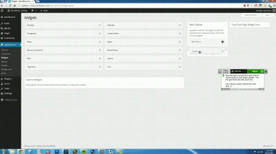
    Expects widget to close after saving:

    • Windows Vista 6.0
    • Mozilla/5.0 (Windows NT 6.0) AppleWebKit/537.36 (KHTML, like Gecko) Chrome/30.0.1599.101 Safari/537.36
    • 1280 x 800

    If you’d like to see the full videos, you can download them here: Widgets+MP6 001, Widgets+MP6 002.

    Key Observations

    • One user spotted the hover tips and the other didn’t
    • Both users said they expected the widget to close after saving
    • May need to increase sensitivity of the widget drop area, check Chrome 30 on Win7 for issues

    Just because a couple users mention they’d like to see a widget area close after saving doesn’t necessarily mean you should do that. Additional testing in situations where someone is working for a longer time with one particular widget and may want to save periodically would be good. Adding some other visual indicator to show when saving is finished might be sufficient, as opposed to closing the widget on save.

     
    • Ulrich 8:24 pm on October 24, 2013 Permalink | Log in to Reply

      I think the problem with the saving of the widgets is that there is no confirmation anywhere that the widget is saved.

    • Archetyped 8:28 pm on October 24, 2013 Permalink | Log in to Reply

      Save on close

      Another way to pose this is: why shouldn’t the widget button close on save?

      Or perhaps the better question is: Are the actionable options provided to the user the right ones?

      If you break it down, the actions available to users are basically:

      • Edit widget settings
      • Close widget without making any further changes
      • Delete widget

      Therefore, perhaps more appropriate user actions would be:

      • Done — Save widget and close
      • Cancel — Close widget without saving changes
      • Delete — Completely remove widget

      In the current UI, you could make the argument that the widget should not close on save because the user may just want to save their progress as they continue to work on the widget’s settings.

      But why should the user have to do this? This is a burden that the machine should be offloading from the user.

      Post progress is saved automatically as you edit a post, why shouldn’t widgets have the same intelligence?

      With the machine saving your progress, the UI no longer needs a “save” button. You can focus on your work until you’re done. Then you just have to decide what your final action will be– save or cancel your changes (or remove widget entirely).

      • Jon Brown 12:02 am on October 25, 2013 Permalink | Log in to Reply

        WordPress saving changes is confusing enough as it is (metadata/featured image on posts. I wouldn’t want incremental changes to widgets saving prior to clicking save. Especially if the widget settings are versioned and undo-able.

        The buttons should read “close” and then upon making changes the button should change “save” then after saving change back to “close”. While there were changes to save a link for cancel changes and close would replace the current link for close next to delete.

        Personally I don’t want the widget closing on save, I just want a stronger confirmation that my changes were actually saved. I often want two widgets open at the same time so I can copy settings between the two.

      • designsimply 12:30 am on October 25, 2013 Permalink | Log in to Reply

        Take user suggestions like this one with a grain of salt. Sometimes people say one thing and then turn around and do another. So you have to look at a group of tests and find trends, and even then I think there’s a little magic that goes into interpreting the tests. :)

        Post progress is saved automatically as you edit a post, why shouldn’t widgets have the same intelligence?

        I imagine it’s because you don’t always want your widget changes live until they are finished—if you auto-saved, your widgets would be all skewampus on the front end during editing.

        I’m not advocating for one solution over another btw. I think it’d be cool to test the different scenarios more.

      • designsimply 12:32 am on October 25, 2013 Permalink | Log in to Reply

        Thanks for the feedback btw!

      • shaunandrews 2:34 am on October 25, 2013 Permalink | Log in to Reply

        Post progress is saved automatically as you edit a post, why shouldn’t widgets have the same intelligence?

        The key difference here is that the auto-save functionality that you see in the post editor is saving a revision. Widgets don’t have the concept of revisions. So, if widgets auto-saved, they’d be pushing out new versions of your widget to your live site. Not ideal.

        Now, one day we may have the ability to save revisions of widgets — then auto-save makes a lot of sense. However, you’d still want a “Save” button, or perhaps a “Publish” button, to push your changes to your site.

      • Archetyped 7:03 am on October 25, 2013 Permalink | Log in to Reply

        Yes, I understand the data infrastructure that allows posts to autosave progress as revisions, etc. My point is that users should not need to care about any of that.

        Obviously nothing should be live until the user commits those changes. Apologies if it seemed the opposite was implied. I’m also not saying autosave should be implemented without the necessary infrastructure changes, but that infrastructure should conform to user needs, not other way around.

        Take user suggestions like this one with a grain of salt.

        Indeed. My comments are not based on a single user’s comments but rather based on the usability issues observed working with clients over the years.

        • designsimply 2:13 pm on October 25, 2013 Permalink | Log in to Reply

          Apologies if it seemed the opposite was implied.

          No worries, I think it’s just a current technical limitation that widgets are confined to for this iteration. Frustrating :) so I think people like the ideas but are just explaining limitations.

          My comments are not based on a single user’s comments but rather based on the usability issues observed working with clients over the years.

          Awesome! i’m glad to read about your insights and that you’re participating.

    • shaunandrews 2:35 am on October 25, 2013 Permalink | Log in to Reply

      A huge thanks to @designsimply for going through these user tests and pulling out the highlights. Thanks, Sheri!

  • designsimply 3:15 am on October 23, 2013 Permalink | Log in to leave a Comment
    Tags: ,   

    THX38 0.7.1 User Testing 

    I put THX38 0.7.1 through some testing. Here are some clips showing the main points of interest. Most are around a minute or so in length, some are shorter.

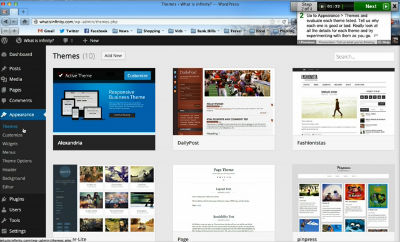
    Accidentally clicks into the customizer and gets disoriented, first click on the “Customize” button doesn’t work (not sure why), thinks the magnifying glass hover icon indicates search:

    While the themes page is blazingly fast :) the customizer is slow:

    Suggests the “Delete Theme” button should be red all the time:

    Overlooks “Customize” button on the active theme:

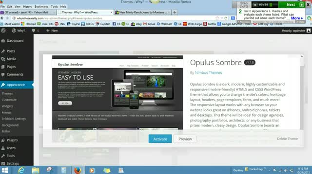
    “Delete Theme” is a little hard to find for this user:

    Wishes clicking on the large screenshot in the modal would show a full view:

    Wants more screenshot detail:

    “Delete Theme” process not immediately visible, but found fairly easily:

    Theme description details are a little too technical, i.e. “post format-packed,” HTML, SEO:

    “Delete Theme” is easy:

    Keeps clicking the back button instead of the “x” in the modal and it disorients her a little:

    Tries right-clicking to delete:

    If you’d like to see the full videos, you can download them here: THX38 001THX38 002THX38 003THX38 004THX38 005.

    What would make finding really good themes easier? (survey question responses)

    • Tags or categories for subject matter, colors, or any number of style ideas and needs
    • Marketing maybe? Make it free?
    • If I were given an option of more than 20 themes to choose from, I would like to be able to choose by category, color theme, or complexity.
    • I can’t think of anything to really beat browsing. I mean, you could categorize them and even list them according to common uses (like Church) but I think I’d have to keep looking to find the perfect one. If you categorized based on HTML5 and all that, I think you’d lose a chunk of your user base (although having more technical categories for advanced users isn’t a bad idea at all).
    • The ability to search by genre. e.g. if I was a hairdresser key in the term hairdresser and get back a range of themes that could work for that business model. Complete with a choice of images would be fantastic.

    Key Observations

    • The magnifying glass/search icon was only mentioned by one user. The visibility icon could still be a good alternate because an eye symbol is often used for “view” online.
    • Themes load very fast! This makes it especially noticeable when the customizer loads slowly.
    • Viewing most themes on a brand new WordPress install is lackluster because there isn’t much data to customize per se.
    • Users had no trouble finding “Preview,” “Activate,” and “Delete Theme” in the modal when hover buttons were removed. Consider taking the hover buttons out. I know this adds one click to activating a theme (pushback if you feel strongly about it).
    • Noteworthy user suggestion:  make the “Delete Theme” button red all the time
    • Noteworthy user suggestion:  make it so you can click the screenshots in the modal to enlarge them (carousel style?) or make them zoomable

    All in all, the plugin is in really good shape. It’s fast! The “delete theme” link doesn’t get triggered accidentally but is still relatively easy to find. All of the bugs found via user testing were fixed in plugin version 0.8. If I could vote for two updates for v1, I would recommend: remove preview and activate hover buttons, change hover icon to a “view” symbol.

     
    • Lea Cohen 6:26 am on October 23, 2013 Permalink | Log in to Reply

      I have been following the posts and I love this plugin. If I could request one thing, I would appreciate RTL treatment :)
      I’ve never collaborated before in such things, so am not sure if and how I can help, but if there’s any way I can – I’ll be glad to.

      • Matías Ventura 4:50 pm on October 23, 2013 Permalink | Log in to Reply

        Good call — yes RTL will be added for sure. You are welcome to contribute anyway you can. We have chats on IRC on Tuesdays if you want to join. Otherwise you can keep participating on these threads.

    • biznis86 12:29 pm on October 23, 2013 Permalink | Log in to Reply

      I already suggested a concept without the popup modal, but haven’t received any response. Here is what I was thinking of:

      Also:

      • Move theme name above theme screenshot
      • Move all theme action buttons to the bottom of screenshot
      • designsimply 2:41 pm on October 23, 2013 Permalink | Log in to Reply

        The modal window is performing well in user testing. What problem are you trying to solve by trying to change it? I think one of the reasons for the theme name and action buttons being at the bottom of things is to put emphasis on the visuals, the screenshots specifically. Are your suggestions to move the theme name and action buttons a personal preference? Or how are you proposing that change will benefit users?

      • designsimply 3:30 pm on October 23, 2013 Permalink | Log in to Reply

        Btw, personal preferences are cool to bring up (you’re a user too!), but it would be awesome to include why you’d like to see things moved and how you think it will help along with the suggestions if you can.

        Aside: feedback on design (and reacting to it) is not as easy as it seems :) and my initial response sounded too defensive to me (maybe?) when I re-read it after posting. Anyway, I’m always looking for ways to get better at the feedback thing, both sides of it—just something that’s on my mind.

        • biznis86 3:56 pm on October 23, 2013 Permalink | Log in to Reply

          Sure, here are my arguments:

          Modals are not a good user experience, especially not on mobile devices. Inspiration behind my design comes from redesigned google image search, which was previously modal and is now similar to what I’ve posted. It works very well, at least for me. I really hate when links open in new window and I hate modals for the same reason. They add confusion and navigate user from their focus field.

          Theme name: there’s no reason to place it inside screenshot as it is not immediately visible to user. To make the name more obvious you need to add a background color to it and wrap everything with borders (which you did). But why? It would be simpler and nicer if you just added the name on top of screenshot, so the screenshot is cleaner and more obvious to user.

          Action buttons (activate, preview, delete, customize): It confuses users if they see buttons positioned differently on active theme and inactive themes and would be better to place them all at the bottom of screenshot. If you add theme name on top as previously suggested, you can also add “Active theme” text where theme name is currently positioned.

          I hope what I posted made any sense. As my company makes 90% of revenues from WP, it’s in my best interest to help as much as I can ;)

          • designsimply 4:13 pm on October 23, 2013 Permalink | Log in to Reply

            The modal isn’t used for mobile. The design is responsive. Try testing it out! Also, the modal isn’t done in a separate page load, so it’s super fast, which might help. Also, my role is more testing than design, so maybe one of the designers will chime in about modal vs. inline theme details.

            Ah, but I think the intention is to take away focus from the theme name and put it on the visual, the screenshot.

            It might be cool to experiment with user testing with the buttons in the detail view moved to the top. Are you interested in coding it up and running a test?

            • biznis86 4:26 pm on October 23, 2013 Permalink

              Do you need me to code our version of THX38 plugin or can we send over layered PSD file to save the dev work? Either way, no problem, first one will only take a bit more time.

              Otherwise, here is a fully sized screenshot of my previous image.

              I still believe, no matter how good modal is, it is never better than inline editing. Still, thank you for participating in this conversation – it just proves WP cares about users ;)

            • designsimply 4:31 pm on October 23, 2013 Permalink

              Do you need me to code our version of THX38 plugin or can we send over layered PSD file to save the dev work?

              For the button moving from the bottom to the top inside the modal? I’d suggest making a patch. I imagine you could do it with a bit of CSS. If you patch it, I’ll test it. Oh hey, I noticed the buttons are at the bottom of the description in your inline theme details mockup too! ;)

              it just proves WP cares about users

              True! so. true.

      • Matías Ventura 4:37 pm on October 23, 2013 Permalink | Log in to Reply

        One of the problems with the inline overlay is that we’ll run out of space quickly for the things we’d like to do, namely: more screenshots (gallery), showcase of real blogs using a theme, support forums, etc.

        Also, it doesn’t feel like the best use of space to duplicate the information (theme name + screenshots) on the same visual canvas.

        The overlay on mobile is a full screen page. Nothing indicates it’s a “modal” on that environment.

        Having said that, if anyone wants to code a version with the inline view and test it, I’d be happy to discuss it. I’m hesitant myself of modals, but in this case (with the url updating, arroy keys navigation, and being quite fast) think of it as a really quick “new page”. You can send people to themes.php#theme/twentyfourteen and it will open the theme for them, with all the details and actions at hand in a focused screen.

        Action buttons (activate, preview, delete, customize [...] you can also add “Active theme” text where theme name is currently positioned.

        We had this in one of the versions and eventually decided against it. The theme name is not that important and throws off the layout balance a bit when it is at the top.

        • designsimply 4:39 pm on October 23, 2013 Permalink | Log in to Reply

          themes.php#theme/twentyfourteen and it will open the theme for them

          I love that.

        • biznis86 5:09 pm on October 23, 2013 Permalink | Log in to Reply

          Not sure I agree that we’ll run out of space, since the modal is of the same size as inline overlay I suggested. More screenshots can be added the same way as to the modal. And user is never confused or disoriented. Although, some info is duplicated on the visual canvas, it follows user action, so there is no confusion about its purpose.

          One other benefit to inline overlay is also that you actually don’t need to “Add new” themes in a separate page. You could add new themes the same way with inline overlay at the end of themes list (with same Add New thumbnail you have now), so it would feel like you’re in control of your overall themes list and nothing would distract you from building it.

          You are spot on with URL updating and sending people to selected theme, but I’m not sure how many users will actually use this. This feature would only be usable if I could send my customers to their admin, where they could open/preview my custom theme (not yet installed) – if that is the case here, I’m really impressed and blown away really.

          I guess this is more my preference than a general opinion, so even if I feel really strongly about my case, I’ll stop here and won’t add more confusion to it.

      • Paal Joachim Romdahl 6:41 pm on October 23, 2013 Permalink | Log in to Reply

        Inline.

        • Keeps the connection with the other themes even when previewing.
        • It is easy to select another theme in the open preview area. One could also scroll through using the arrow keys having one theme after another open as a preview. Move the mouse inside the open preview and scroll to see additional screenshots and features. Or perhaps have small thumbnails below the main preview image. Clicking them opens into the main preview area. It seems like a good idea to code. To test out modal and inline methods.
    • Matías Ventura 4:25 pm on October 23, 2013 Permalink | Log in to Reply

      Thanks a lot for doing these.

      “Keeps clicking the back button instead of the “x” in the modal and it disorients her a little”.

      We can probably make it so the browsers back button takes you back to the grid view. I had it working with pushState but had to switch to normal hashes due to some troubles dealing with the .php extension of the themes page.

      • designsimply 4:33 pm on October 23, 2013 Permalink | Log in to Reply

        I thought you might appreciate the short video clip reporting format. :D

        Making the back button trigger the grid view would be awesome.

        Another idea: make the escape key exit the modal.

        • Matías Ventura 4:46 pm on October 23, 2013 Permalink | Log in to Reply

          Escape would be good, too.

        • Bryan Petty 6:56 pm on October 23, 2013 Permalink | Log in to Reply

          Both sound like good ideas, and escape is certainly standard.

          I think in general that all modal windows should probably be pushed onto the history stack honestly. Less of a specific theme issue here, and more of a general observation.

      • Andy Mercer 1:08 am on October 24, 2013 Permalink | Log in to Reply

        Having the back button return to the grid doesn’t necessarily make sense, but users (myself included) have been trained for decades that when you click something that makes the page change, the back button will undo it.

        Though it will probably add complexity to the code, I’d say it will be worth it just for the comfort factor, and for easing people in. It can always be removed down the line someday.

        • designsimply 9:16 pm on October 28, 2013 Permalink | Log in to Reply

          Clicking the back button could be perceived as broken if you’re in theme details view :) and it has to do with how the modal is setup. You can see it in the test above labeled “Keeps clicking the back button” where she clicks back and ends up on the main dashboard then has to navigate back to Appearance > Themes.

    • Archetyped 6:38 pm on October 23, 2013 Permalink | Log in to Reply

      Some thoughts/suggestions based on the videos

      Delete Theme

      • Delete option in grid view would be nice so that users can easily delete themes without having to go into a modal for every single theme. Using a simple trash can icon would be pretty much universally understood
      • Then, replace the “delete” button in the modal with the same trash can icon to standardize the UI in both views. This will make it less obtrusive while still easy to find when desired.

      View Icon

      The “eye” icon is scary and doesn’t really communicate “more detail” as well as it communicates “Eye of Ra”. The magnifying glass icon is a better direction and the functionality could be even better communicated by adding a “+” in the magnifying glass, which would give us the standard “zoom in” icon. It would communicate “zoom in for more detail” better than the eye.

      Modal

      The responsive modal works well. Normally a modal is a problem on mobile because they are generally not responsive so you have wasted space and positioning/scaling issues when the user interacts with the page. Here the modal is quite usable on mobile with large buttons and a simple layout.

      • designsimply 7:57 pm on October 23, 2013 Permalink | Log in to Reply

        Thanks for watching the videos!

        Two of the tests experimented with taking out all of the hover buttons all together. Even though a couple testers commented that the “delete theme” link is a little bit hard to find at first, most of them found it within a few seconds of looking around. Plus, it shouldn’t be too terribly easy to delete a theme, so I think the tests show it’s in line with the designers’ intention.

        It’s good to hear specific feedback about the icon. I never thought of the eye as scary! :)

        Cool feedback on the responsive design. I agree.

        • landwire 9:34 am on October 24, 2013 Permalink | Log in to Reply

          Delete:
          I also think there should be a “Delete” option in the grid view. Especially if there is another window popping up saying “Do you really want to delete XXXX theme”. So it cannot really happen accidental and that is the main concern I would think.

          • Matías Ventura 1:43 pm on October 24, 2013 Permalink | Log in to Reply

            I don’t think the frequency of deleting themes warrants the placement on the front — specially with the goal being to streamline the interface weight.

            We did play with a “bulk edit” mode in which you get an “x” to delete themes quickly. We couldn’t find an elegant way to invoke it, though. Still totally open to improving this in the future. Not sure it’s an area that warrants a lot of attention at this stage.

            https://cloudup.com/cdC2ME6Y1oK

            • Ipstenu (Mika Epstein) 2:04 pm on October 24, 2013 Permalink

              As someone who handles a lot of cases where people download a bajillion themes (seriously I deleted 30 off someone’s site this week) testing them out, and then never upgrade, a bulk delete option really is needed. Its VERY common for newer users to do that, and every time I give a session in how to use WP to the non-Tech people, I get asked ‘Why can’t I bulk delete?’

              I get why it’s not there now, but it needs to stay on the radar please :)

            • Matías Ventura 2:53 pm on October 24, 2013 Permalink

              Hah, thanks for the feedback from the front! It’s definitely on the radar, and we may very well get to it soon. Open to ideas about how to invoke the edit mode, if possible without another button next to “add new”. :)

        • Archetyped 8:09 pm on October 24, 2013 Permalink | Log in to Reply

          Why wouldn’t we want theme deletion to be easy? It’s an action that a user would feasibly want to do, so why discourage the it? There’s nothing inherently “bad” about deleting a theme.

          As theme deletion is destructive in nature, a confirmation of the action is important, which the popup handles. There’s no other reason to make it any more difficult than that.

          A trash can icon could be unobtrusive enough to not distract the user (like an always-on hot red button might), but would still be recognizable enough. In fact, after ages of UI conditioning, you could reason that a trash can icon is what users would actually be looking for when they want to delete a theme.

          Having to read the text of every button slows the user down from performing the desired action. While the a red-colored button may help to draw the eye to the button, it does nothing in terms of accessibility (e.g. color-blind users).

          • designsimply 8:17 pm on October 24, 2013 Permalink | Log in to Reply

            Looks like we’re going to try some bulk delete options, and I’m sure we’ll discuss a trash icon option in our next office hours. Thanks for the feedback!

  • shaunandrews 2:07 pm on October 22, 2013 Permalink | Log in to leave a Comment
    Tags:   

    Widgets Update 

    Howdy!

    The widgets team has been working hard! We’ve spent some time working with (and joining) the MP6 team to get a redesigned widgets screen into the latest version of MP6. If you haven’t seen it yet, download (or update) MP6, and you’ll get this beauty:

    We’ve also created a new plugin named Widget Area Chooser, which lets you click to add a widget to any of your sidebars:

    We’ve also made some great progress on the Widget Customizer plugin, which lets you manage your widgets from within the customizer:

    How can you help?
    This week, we’ll be focusing on getting the Widget Customizer plugin updated to let you add new widgets. If you want to join in, you can head over to GitHub and submit some patches, do some testing and add an issue, or just drop your ideas/thoughts. Or, you can just post a comment below and we’ll add you to our group Skype chat.

    Also, we’d love some code review on the Widget Area Chooser plugin.

    We’ll be meeting next week in #wordpress-ui at our normal time, October 28 @ 20:00 UTC.

     
    • Michael Arestad 2:08 pm on October 22, 2013 Permalink | Log in to Reply

      Group Skype chat. michael.arestad

    • jeffr0 8:16 pm on October 22, 2013 Permalink | Log in to Reply

      I’ve been using the new widget screens via MP6 and they are an improvement over what existed there. Out of curiosity knowing that you’ve been working on this area of the back-end for awhile, can you fill me in on why the performance of this particular page is so bad? That is, there appears to be a delay in doing anything on the widget management page. Click on a sidebar arrow and there’s a delay, click it again, another delay, click a widget to drag it to another sidebar and the delay/responsiveness is terrible.

      What is it that causes such a delay between me clicking on something and the reaction?

    • Andy Mercer 1:10 am on October 23, 2013 Permalink | Log in to Reply

      Looking great! I think I may have found a slight bug in the sizing. I’m running Firefox 24 on Windows 7 (classic theme; I think that makes a difference for the position bars). When playing around with sizing, I found that in what looks like the smallest mobile version, a slider bar is a bit too far to the right. It goes off the screen. Link to screenshot with the area in question circled: http://i210.photobucket.com/albums/bb80/Kelderic/Screen02_zpsdb08cf0b.png

  • Till Krüss 8:54 am on October 21, 2013 Permalink | Log in to leave a Comment
    Tags:   

    MP6 2.1.1 

    Holla!

    We just released this minor point release to have you look at a beautiful WP 3.7 update page, just in time for it’s release. Besides that, this release also includes:

    • Major overhaul of the widgets screen (again)
    • Better styling of un-approved comments
    • Improved highlight color for pointers
    • Several RTL fixes

    …and more. Have a look at the full changelog.

    MP6 2.1.1 includes contributions from Joen Asmussen, Kelly Dwan, Shaun Andrews and myself.

    As always, thanks to everyone who tested, suggested and reported. Keep the feedback coming!

    The next weekly IRC meeting in #wordpress-ui will be on Tuesday, October 22, 2013 02:00 UTC+8.

     
    • Rami Yushuvaev 1:34 pm on October 21, 2013 Permalink | Log in to Reply

      Good work with the RTL, i see all the issues solved. Now try the “RTL Tester” plugin with “mp6″ and witout “mp6″. The rtl-tester helps developers to see the site/admin in rtl view. but it seems like mp6 breaks with rtl-tester.

    • Trifon 6:43 pm on October 21, 2013 Permalink | Log in to Reply

      Nice work on the widgets overhaul! It really seems to set the widgetized areas in the spotlight.
      I only noticed one thing; scrolling through the widget list doesn’t work in Opera 12.16. Although I don’t know if that’s still supported…

    • Ulrich 7:13 pm on October 21, 2013 Permalink | Log in to Reply

      Hi, you want to do that same thing as 791083 but with “wp-admin-bar-top-secondary” also.
      http://plugins.trac.wordpress.org/changeset?reponame=&new=791093%40mp6&old=791083%40mp6

    • Justin Tadlock 1:44 am on October 22, 2013 Permalink | Log in to Reply

      This update has broken widget controls that are wider than the size of the sidebar. WordPress allows developers to define a width of the widget control options. I believe the standard width is 200, but we need to make sure to allow the widget controls to expand outside of the sidebar if larger than that.

      Here’s a quick screenshot of the issue:
      http://justintadlock.com/blog/wp-content/uploads/2013/10/mp6-2.1.1-widgets.png

      • Justin Tadlock 2:02 am on October 22, 2013 Permalink | Log in to Reply

        I dug into the CSS a bit and found the line of code overwriting widget control widths. It’s line 171 of /mp6/components/widgets/style.css. In particular, the !important set on the width: auto. It also needs a little z-index love to make sure really wide widget controls aren’t hidden by the list of sidebars.

        Here are my changes for that bit of code:

        div.widget-liquid-right div#widgets-right .widget {
        	z-index: 999;                    /* New code. */
        	margin: 0 auto !important;
        	width: auto;                    /* Altered code. */
        	min-width: 50%;
        	box-shadow: none;
        	border-bottom: none;
        	-webkit-box-sizing: border-box;
        	-moz-box-sizing: border-box;
        	box-sizing: border-box;
        }
      • shaunandrews 7:46 pm on October 22, 2013 Permalink | Log in to Reply

        This update has broken widget controls that are wider than the size of the sidebar.

        “Broken” isn’t the word I would have used. This was an intentional decision made by me. The ability for widgets to “break out” of the sidebar containers has always struck me as very strange. Its a weird experience all around.

        This latest update to the widgets.php design gives sidebars a fluid width. At window sizes above 900px, sidebars are split into two columns taking up a combined 55% of the screen. At smaller sizes, sidebars are shown in a single column.

        Sidebars are no longer restricted to a fixed width — this means your widgets should no longer expect to be contained inside a fixed width container.

        …we need to make sure to allow the widget controls to expand outside of the sidebar…

        I don’t think we do. Widgets should respect their containers and adjust their layouts as needed. Widget/Plugin authors can provide responsive styles to make sure their widget’s content displays properly.

        • Justin Tadlock 4:27 am on October 24, 2013 Permalink | Log in to Reply

          “Broken” isn’t the word I would have used. This was an intentional decision made by me. The ability for widgets to “break out” of the sidebar containers has always struck me as very strange. Its a weird experience all around.

          This is literally an option in the core WP widgets code. This plugin doesn’t respect that option. I consider that broken, but the word itself is largely irrelevant to this discussion.

          For many of us, we’ve relied on this for years now and don’t see it as strange. Currently, I’m fielding support tickets for users of this plugin who can no longer use their widgets. I’m having to tell them to roll back a version or alter the plugin code, which doesn’t really help anyone.

          I’ve provided the above code to you as a patch and hope you implement it or find another fix.

          If this is an option you’d like to see removed from WordPress core, you should open a Trac ticket first and get it implemented into core. This way, developers will have a version or so to make the changes they need. Then, this plugin can make those types of design decisions.

          I don’t think we do. Widgets should respect their containers and adjust their layouts as needed. Widget/Plugin authors can provide responsive styles to make sure their widget’s content displays properly.

          Responsive styles are not the issue at hand. I’m fine with adding responsive styles to my plugin/theme widget controls. I’m referring to not having the ability to create widget controls that are wider than the sidebar, which is not the same thing.

          This is also made much harder to style by !important used in the CSS.

        • Justin Tadlock 4:54 am on October 24, 2013 Permalink | Log in to Reply

          If nothing else, can you please remove the !important on the width so those of us who want to change this behavior can do so?

    • boldfish 12:46 pm on October 28, 2013 Permalink | Log in to Reply

      Can anyone tell me why MP6 makes the fonts go fuzzy in Safari?

      Chrome has nice rounded smooth fonts, but something in MP6 is switching the rendering in Safari from smooth to spindly – I can see it happen on first page load.

    • mrwweb 6:33 pm on October 28, 2013 Permalink | Log in to Reply

      This is an issue in the existing admin bar and the MP6 admin bar, but it seems like MP6 may be the best place to fix it. When there are a lot of items in the admin bar (such as when you have a lot of debug bar extensions), there can be widths where the items overflow the admin bar.

      Screenshot: https://dl.dropboxusercontent.com/u/9941629/adminbaroverflow.PNG

      It would be great if the admin bar could handle this probably-not-that-unlikely edge case by adding height to encompass the additional items.

    • Zack Tollman 6:45 pm on October 31, 2013 Permalink | Log in to Reply

      I found a bug in version 2.1.1 of MP6 and it is still present in trunk.

      I get two errors with MP6 in IE10 when “swiping” left or right. A “swipe” occurs when you click and drag the mouse. The errors are:

      SCRIPT5007: Unable to get property ‘removeClass’ of undefined or null reference
      moby6.js, line 46 character 5

      SCRIPT5007: Unable to get property ‘addClass’ of undefined or null reference
      moby6.js, line 44 character 5

      To reproduce:

      1. Open any admin screen in IE10 with MP6 installed
      2. Locate a piece of screen real estate that is relatively blank (easier for testing)
      3. Perform a left or right swipe. Sometimes you need to repeat it multiple times to produce the error

      I could not reproduce this issue in Chrome, Safari, or Firefox. It may have to do with differences in response to the swipe event.

      The problem is that within the callbacks for the swipe functions, the `this` reference is incorrect.

      My patch is here: https://gist.github.com/tollmanz/7254803

    • Christian Foellmann 11:29 am on November 1, 2013 Permalink | Log in to Reply

      Hi guys,

      I am not sure where to ask this but I think this is a place where it will be seen by the right people.

      The “icon32″ gone in MP6. Will it stay this way?

      I am not pro or con but if it is scraped from core I will not bother adding icon32s into my plugins anymore.

    • geertvanderheide 2:26 pm on November 2, 2013 Permalink | Log in to Reply

      The new design looks awesome Matt! Good luck getting it finished up and into WP 3.8.

      One question: Where / how do I choose a color scheme? I understand there’s several, but I can’t find the setting to change it. Thanks!

  • Matías Ventura 5:40 pm on October 12, 2013 Permalink | Log in to leave a Comment
    Tags: ,   

    THX (Themes) Update 

    The past week we’ve been committing significant updates to the plugin.

    Screen Shot 2013-10-12 at 3.19.55 PM

    Here’s a list of the changes that went in for version 0.7 (major props to @shaunandrews):

    • A lot of work went into rethinking how modal-overlay works and looks for showing the expanded theme view.
    • Adds keyboard navigation (with arrow keys) to quickly browse through themes while on details/modal view.
    • Significant JavaScript refactoring and cleanup.
    • Adds “delete” theme functionality.
    • Implements theme updates notices on theme grid, and update info on modal view.
    • Adds a theme count to the section title that updates immediately with search.
    • Several style improvements: theme blocks on grid view, add new theme, hover indicators, active theme more prominent, screenshot gallery with thumbnails, responsive styles, and a bunch more.

    The keyboard navigation is becoming a pretty nice way to quickly flip through themes.

    Screen Shot 2013-10-12 at 3.20.05 PM

    What’s left?

    Functionality wise it’s getting there, but we still have to keep polishing. (I’m being told modals are broken in Firefox.) We are a small team, so any reviews and suggestions are welcome — code or otherwise. Next up for JS rendering is looking into scaling issues (when, say, you have 200+ themes).

     
    • Ulrich 5:53 pm on October 12, 2013 Permalink | Log in to Reply

      Looks really good. :)

      Some strings are not internationalized or could be improved.

      There are some issues on the install theme page. The upload theme button is also missing.

      • Matías Ventura 5:27 pm on October 15, 2013 Permalink | Log in to Reply

        Added some more i18n. I should have mentioned it in the post but the theme-install page is all sort of broken. I’ll disable it until we have it more in shape.

    • biznis86 7:16 am on October 15, 2013 Permalink | Log in to Reply

      Not sure where to start. Overall, it’s nice, but loads of stuff is just wrong:

      • Missing upload button.
      • Missing navigation button (left,right) for multiple themes slider
      • If theme has no image screenshot, it gets crippled, plain white CSS image would be a good replacement
      • Spacing between theme thumbnails is not in line, top-bottom : left-right. Overall it’s too much white space
      • Magnifier icon on-hover doesn’t link to search, so it would be better to use icon that links to keywords “detail, more, open,…”
      • Instead of modals that are pretty bad for mobile experience, use sth like google image search has

      I hope my feedback helps in any way to make WP a better product.

      • shaunandrews 5:39 pm on October 15, 2013 Permalink | Log in to Reply

        Missing upload button.
        Missing navigation button (left,right) for multiple themes slider

        The install themes page is still a work-in-progress.

        If theme has no image screenshot, it gets crippled, plain white CSS image would be a good replacement

        Ah, thanks for pointing this out. We’ll look into supporting themes without a screenshot.

        Spacing between theme thumbnails is not in line, top-bottom : left-right. Overall it’s too much white space

        The spacing is a percentage, and varies depending on your window width. I think the whitespace is balanced well.

        Magnifier icon on-hover doesn’t link to search, so it would be better to use icon that links to keywords “detail, more, open,…”

        I’m open to other suggestions for the icon. The magnifying glass felt natural to me, but I can see your point about it being related to search. Perhaps the “eye” icon: https://cloudup.com/cY2LbtWKezc

        Instead of modals that are pretty bad for mobile experience, use sth like google image search has

        Did you look at the screen on a smaller device? Or just shrink your browser window down — The modal becomes a full-screen overlay at smaller sizes.

        I’m not sure what “sth” is…

    • alexdumitru 5:29 pm on October 15, 2013 Permalink | Log in to Reply

      I’ve just installed it on WP 3.7 beta 2 and it came with broken permissions. All folders were 750 instead of 755, so all files were returning 404.

      I think it must have something to do with MP6, as I’ve tried installing other plugins too and they do work very well.

      • alexdumitru 5:30 pm on October 15, 2013 Permalink | Log in to Reply

        P.S. I LOVE MP6. It looks wonderful !

      • designsimply 4:45 pm on October 19, 2013 Permalink | Log in to Reply

        The THX38 plugin files were the wrong permissions, or the MP6 ones? Did you install the plugin by going to Plugins > Add New > Search and clicking the “Install Now” link? Could you try deleting the plugin and installing it again using that route? If you see the same problem happen again, could you start a help request at http://wordpress.org/support/ and link it in a reply here?

    • TimothyBlynJacobs 9:20 pm on October 17, 2013 Permalink | Log in to Reply

      Looks really awesome. Curious, why did you round off the previously square version box. I think it looks far better without the rounded corners – they seem out of place since the rest of the modal is highly rectangular.

    • JakePT 6:28 am on October 22, 2013 Permalink | Log in to Reply

      Minor criticism: The Updates available banner doesn’t really stand out. At first, out of the corner of my eye, I thought it was just part of the theme.

      Perhaps putting it next to/near the name of the theme would work better?

    • designsimply 3:16 pm on October 22, 2013 Permalink | Log in to Reply

      Over the weekend, I tested these actions with WP 3.6.1, MP6 2.1, THX 0.7.1:

      • hover > preview button
      • hover > activate button
      • hover > details
      • hover > details > keyboard shortcuts
      • hover > details > preview
      • hover > details > activate
      • search (check that the count is correct)
      • add new theme
      • delete theme
      • speed tests with 230+ themes installed

      ^^ Did I miss any actions here?

      In these browsers:

      • IE10 on Win8 via browserstack.com
      • Chrome 30.0.1599.69 on Mac OS X 10.8.4
      • Firefox 24.0 on MacOS 10.8.4
      • Safari 6.0.5 on MacOS 10.8.4
      • Safari on iOS 6.1.3

      And found these bugs (most of which I think Matias has already fixed in the plugin trunk):

      Asides, AKA things I don’t want to forget about the nifty new multiple screenshots feature:

      • To use multiple screenshots, add files named screenshot-2.png, screenshot-3.png, etc.
      • You can have up to 5 screenshots
      • Screenshot files should be 4:3 or larger aspect ratio
    • designsimply 8:38 pm on October 22, 2013 Permalink | Log in to Reply

      Noting a couple additional bugs found in 0.7.1 and already fixed in 0.8:

      Bugs I’m still seeing in 0.8:

      New 0.8 bugs:

      This set of tests were done with WP 3.6.1, MP6 2.1.1, THX38 0.8 on Chrome 30.0.1599.101, Safari 6.0.5 on Mac OS X 10.8.5.

      If anyone else is able to do a little more testing on Windows 7 and 8, that would be appreciated because I spotted some troubles in user testing (such as not being able to see scroll properly and see long theme descriptions in the modal) that I couldn’t reproduce in my own testing on Windows via browserstack.com.

    • designsimply 1:17 pm on October 25, 2013 Permalink | Log in to Reply

      Noting one additional bug reported by siobhyb on the make/core proposal post.

      Tested with WP 3.6.1, MP6 2.1.1, THX38 0.8.2

    • Terry Sutton 7:37 pm on October 29, 2013 Permalink | Log in to Reply

      Hey All

      Apologies for being a bit (very?) late on this, but I just had a look at the ui this afternoon. First like to say great job. It cleans up that page quite a bit.

      My only feedback is that the ui around the thumbnails feels a bit heavy. When the active thumbnail’s theme has the Active/Customize bar at the top, it feels like a lot of the thumbnail gets lost. Here’s a quick pass at trying to keep everything at the bottom of the thumbnail.

      https://cloudup.com/cD9NoPW3WSE

      But that’s just my two cents — I know I haven’t been active in this development all the way along, so I’m not up to speed on where / how this grew to its current state.

      Thanks guys, and great work!

      Terry

  • lessbloat 7:11 pm on October 11, 2013 Permalink | Log in to leave a Comment
    Tags:   

    DASH Update 

    It’s been a couple of weeks. We’ve been heads down getting stuff done.

    So, where are we at?

    Here’s the existing dashboard:

    Here’s what our new dashboard looks like:

    What’s changed?

    We removed one widget:

    • Incoming links (which doesn’t really work anymore)

    We combined several widgets:

    • “WordPress Blog”, “Other WordPress News”, and “Plugins” as combined to form the new “WordPress News” plugin.
    • “Recent Comments” was merged into the new “Activity” widget, which now also shows you any scheduled posts and your last 5 most recently published posts.
    • “QuickPress” was changed to “Quick Drafts”, and we merged in “Recent Drafts”.

    Plus we worked on a few additional things:

    • The Right Now widget was simplified.
    • We removed the “Number of columns” screen option. Instead the dashboard is now responsive, and shows the appropriate number of columns based on your screen resolution.
    • We replaced the “Dashboard” H2 title with a fun group of friendly welcome text and idioms.
    • The new “Activity” widget will be hookable, so plugin authors can easily add additional info to it.
    • There’s a fun little smiley if you delete all posts and comments

    What’s left?

    • Code reviews. If you have time over the weekend, please look over our code. If you spot something, and need commit access to the plugin, just ping me in IRC. I’ll be doing a code review of my own (but I’m not a PHP developer, so we could still use your help). We’d like to have this code core-ready by Monday.
    • We still need to write new help tab text for each of these dashboard widget changes.
    • I’ll be adding the “Activity” widget hooks this weekend.

    Huge thanks!

    Major props to @joen, @ryelle, @dbernar1, @kraftbj, and @tillkruess without whom, this plugin would not exist.

    Also big props to @helen, @melchoyce, @samuelsidler, Hassan Hisham, and Valerio Al Kalib for helping out along the way.

     
    • Ulrich 7:24 pm on October 11, 2013 Permalink | Log in to Reply

      Looks nice

      Have you thought how this will be translated?
      “We replaced the “Dashboard” H2 title with a fun group of friendly welcome text and idioms.”

      I saw one array where the values were not starting on a new line.
      http://make.wordpress.org/core/handbook/coding-standards/php/#indentation
      There were a few places where the spacing was not to WordPress coding standards.

      What is going to happen about inline documentation?

    • Manuel Schmalstieg 7:41 pm on October 11, 2013 Permalink | Log in to Reply

      “Recent Comments” was merged into the new “Activity” widget, which now also shows you any scheduled posts and your last 5 most recently published posts.

      Yes! Showing the 5 most recent posts is such a great idea. This will save me a gazillion of clicks. Lovely work, DASH team!

    • Ipstenu (Mika Epstein) 9:01 pm on October 11, 2013 Permalink | Log in to Reply

      Last 5 posts isn’t working.

      http://cl.ly/image/1R0o2Y3e3t1n

      Those are my first couple posts. Happens on all sites I tested running 3.7-nightly

    • Rami Yushuvaev 10:15 pm on October 11, 2013 Permalink | Log in to Reply

      Found few RTL issues, i uploaded 6 screenshots to:

      https://core.trac.wordpress.org/ticket/25577

    • Andy Mercer 3:09 pm on October 12, 2013 Permalink | Log in to Reply

      Been busy for the past few weeks and haven’t been following the weekly updates. It’s looking good! If I might ask though, what happened to the stats widget that was floated a while back?

      • Hassan 8:12 pm on October 12, 2013 Permalink | Log in to Reply

        It was a wishful mockup!

        Core won’t ship with stats out of the box. Apparently because of DB load concerns and stuff, but hey! we still have plugins for that :D

    • Daniel Bachhuber 3:50 pm on October 14, 2013 Permalink | Log in to Reply

      One thing I might suggest is making the widgets as hookable as possible. I think you could offer a lot of flexibility by offering actions at the beginning and ending of each widget, as you’ve done with the activity widget, and applying a filter to each set of post / comment query arguments.

      Also, based on a cursory look, this plugin would benefit from a code review sooner rather than later.

      • lessbloat 4:04 pm on October 14, 2013 Permalink | Log in to Reply

        think you could offer a lot of flexibility by offering actions at the beginning and ending of each widget, as you’ve done with the activity widget, and applying a filter to each set of post / comment query arguments.

        That’s a great idea.

        Also, based on a cursory look, this plugin would benefit from a code review sooner rather than later.

        We’d love, love, love for someone to step up and do this. :-)

    • Manuel Schmalstieg 10:21 am on October 16, 2013 Permalink | Log in to Reply

      I notice that the usual “unset” commands don’t work – if I want to hide the QuickDraft for some reason, I usually did it with this:

      unset($wp_meta_boxes['dashboard']['side']['core']['dashboard_quick_press']);

      Is there a new syntax to use, or did the names of the boxes change, or is it just not working yet?

      Also, I remember that there was no simple way to assign a new custom widget to a specific place in the dashboard. For instance, if I add a very important custom dashboard widget, there was no way to tell “Your default position shall be on TOP of the RIGHT column, for every user”.

      Is this going to change? (wishful thinking)

      • Manuel Schmalstieg 10:26 am on October 16, 2013 Permalink | Log in to Reply

        Also, wondering why DASH isn’t using i18n functions for terms that already exist? Many of the strings are already translated in the main UI, why not use them?

      • lessbloat 1:32 pm on October 23, 2013 Permalink | Log in to Reply

        The quick draft widget is no longer ‘dashboard_quick_press’, it’s now ‘dashboard_quick_draft’.

        I’d love for us to add that too, but it will have to come in the form of a patch outside of this plugin.

    • Manuel Schmalstieg 10:36 am on October 16, 2013 Permalink | Log in to Reply

      Regarding the new and improved “Site Content” widget, I wonder if it’s necessary to show any content that has “zero” items…

      Imagine a portfolio site that has entirely disabled comments, there’s no reason to plague the user with the “0 Comments” message – which can be misinterpreted in a “see how unpopular you are” way :)

    • Ipstenu (Mika Epstein) 5:48 pm on October 21, 2013 Permalink | Log in to Reply

      One thing that I don’t love is that it’s not filling up my screen

      http://cl.ly/image/1m2X413n0H3G

      I get that it’s defaulting to 3 columns based on my width, but I really don’t want that. I like two fat columns, and there’s no wat to override it :/

      • lessbloat 1:36 pm on October 23, 2013 Permalink | Log in to Reply

        Hey Mika,

        Is this still happening for you (the not filling up your screen bit)? I can’t seem to replicate it. What browser are you using?

    • Ipstenu (Mika Epstein) 7:44 pm on October 25, 2013 Permalink | Log in to Reply

      So after a long time of thinking and testing, I actively miss having Recent Drafts.

      When you have multiple authors, and are cross checking each other’s work, this is really important.

      • lessbloat 8:05 pm on October 25, 2013 Permalink | Log in to Reply

        You’ve got your 3 most recent drafts under “Quick Draft” right?

        • Ipstenu (Mika Epstein) 8:42 pm on October 25, 2013 Permalink | Log in to Reply

          No because I never use Quick Draft so it’s turned off, same with a lot of users. It’s not necessarily a logical association, even with the rename. I’m more often pressing the ‘new post’ button on the toolbar.

  • Joen Asmussen 7:00 pm on October 11, 2013 Permalink | Log in to leave a Comment
    Tags:   

    MP6 2.1 

    Been a while since last tagged release, but it’s not been quiet on the MP6 dev front. Major new items aside from a plethora of bugfixes include:

    • A bunch of new dashicons
    • A spiffy new widgets page by Shaun Andrews from his Widgets project
    • Improvements to customizer, color schemes, menus section and much more
    • New color scheme, Midnight!

    You can also peruse the full changelog, and of course get the plugin at the MP6 plugin page.

    MP6 2.1 includes contributions from Till Krüss, Mel Choyce, Ben Dunkle, Kelly Dwan, Shaun Andrews, Payton Swick, Matt Thomas, Helen Hou-Sandi, Dave Whitley, Kate Whitley, and myself.

    Big thanks to the contributors, bug reporters, testers, moral supporters and givers of ideas and suggestions! Keep it coming.

    The next weekly open meeting in #wordpress-ui will be Monday, October 14 at 18:00 UTC.

     
    • toscho 10:41 pm on October 11, 2013 Permalink | Log in to Reply

      When will the automatic update be rolled out? Reinstalling this plugin manually each time is not very convenient.

      • Ipstenu (Mika Epstein) 11:27 pm on October 11, 2013 Permalink | Log in to Reply

        Huh? WP 3.7 auto updates itself, not plugins. And this plugin can be normal upgraded. Worked fine on 3.6 and 3.7 beta

        • toscho 7:04 am on October 12, 2013 Permalink | Log in to Reply

          Sorry for the confusion. What I meant: I never get an update indicator for MP6. Works fine for all other plugins, but not for MP6. I always have to delete and to reinstall it.

          • Justin Tadlock 1:18 am on October 17, 2013 Permalink | Log in to Reply

            It was like that for a long time for me too. Then, one day it just started working. I have no idea why.

            • toscho 6:17 am on October 17, 2013 Permalink

              Yesterday I got finally my first update notice for this plugin. Looks like it is fixed now. I just would like to know why it didn’t before.

            • Till Krüss 7:44 am on October 17, 2013 Permalink

              Automatic updates are working since a couple of MP6 releases, 1.4 if I remember correctly, but you only see them if you WordPress version matches the version requirement of MP6′s readme.txt file.

      • Till Krüss 1:22 am on October 12, 2013 Permalink | Log in to Reply

        You can update to MP6 2.1 through your WordPress admin, no need to reinstall anymore. If you are referring to automatic background updates, you can enable them for MP6 using the `auto_upgrade_plugin` filter.

    • addressee 5:38 pm on October 12, 2013 Permalink | Log in to Reply

      re: MP6 2.1 Appearance > Widgets

      Liking the new icons and styling/behavior for this section of admin. It’s nice to see but seems perhaps a little incomplete

      Overall, the Widgets page no longer has a description, leaving a user to guess what the Widgets page does.

      The widgets location section (“widget-liquid-right”) could be improved with a hinting of the status of a widget location: If populated, indicate with a visible icon or shading. If empty, present the collapsed location as-is with no icon visible. The side-by-side presentation of widget locations unfortunately hinders presentation of the natural top-down precedence of the widget areas. The same hinting could also be used for the Inactive Widgets section.

      Available Widgets no longer has a description, leaving a user to guess what the widget does, or a new widget to be left unexplained. A description could be hinted on hover or on mousedown (preferred) or selected optionally.

      Available widgets are placed in a scrolling list, which is located inside a scrolling window. This is the styling that long-plagued the post-editor page, only to be ‘fixed’ with a full-screen editor option. Please don’t let the widgets page suffer the scroll-within-a-scroll problem. Also, if Inactive Widgets is collapsed, you’re left with a scrolling window above a large expanse of blank page.

      The evolution of MP6 is interesting to follow.

    • Ulrich 1:32 pm on October 15, 2013 Permalink | Log in to Reply

      There is a slight issue with the admin bar on smaller screens. Some plugins and themes add links to the admin bar and as these links break the layout on smaller devices. RTL tester is a plugin that adds a link if anyone want to test it. http://wordpress.org/plugins/rtl-tester/

      • Joen Asmussen 7:27 pm on October 15, 2013 Permalink | Log in to Reply

        Excellent point. I’ll take a look at that this week.

      • Joen Asmussen 8:25 am on October 21, 2013 Permalink | Log in to Reply

        Pushed a change to hide *all* third party toolbar items in responsive view.

        • toscho 8:29 am on October 21, 2013 Permalink | Log in to Reply

          That’s dangerous. Some necessary debug tools would be inaccessible now: language switcher, screen info, error lists.

          • Joen Asmussen 8:36 am on October 21, 2013 Permalink | Log in to Reply

            On smartphones, all 3rd party toolbar items are invisible, so they can’t break the toolbar as they have done so far. If you need to see the items for development or debugging purposes there’s an argument to be made that you’re working on a desktop anyway. You can expand the window to make the items available, click the items you need, then size the window small again.

            Could certainly be worth exploring putting all 3rd party items in an “overflow menu”. But for now, I believe this is a decent fix.

    • Looimaster 8:27 am on October 16, 2013 Permalink | Log in to Reply

      Just my two cents: customizer that changes its colors makes it difficult to be used with color pickers or jQuery UI sliders and other custom sections. Do theme authors need to style it for each customizer skin? In my opinion Customizer should have plain white background at all times.

    • Justin Tadlock 1:27 am on October 17, 2013 Permalink | Log in to Reply

      Nice work. I’m loving the new Midnight theme and have switched all my sites to it.

      The widgets screen is awesome too. I’m not sure I’m sold on the scrollbar for the “widgets” section of that screen though.

      The customizer design is a nice touch. I did find one minor issue with the image uploader on the customizer. With three tabs (Upload New, Uploaded, and Default), the third tab drops down. It’d be nice if we could get at least that third one in line with the others. Check out the screenshot:
      http://justintadlock.com/blog/wp-content/uploads/2013/10/mp6-three-image-tabs.png

    • Amado.Miami 4:31 pm on October 17, 2013 Permalink | Log in to Reply

      Definitely missing the widget descriptions. Finding myself going back to non MP6 widget screens to get the description. It looks nice, yet for me personally the widget descriptions are very important.

    • Paal Joachim Romdahl 9:05 pm on October 18, 2013 Permalink | Log in to Reply

      What about right below the drop down select color scheme have 4 hexcode boxes for the user to add custom hexcode for the most used color areas?

    • mrwweb 10:33 pm on October 18, 2013 Permalink | Log in to Reply

      I think it’s been this way for a while, but I’m suddenly really struck by the lack of visible arrow indicators on metaboxes/widgets etc. They appear on hover, but for something like a collapsed sidebar on Appearance > Widgets, there is no visual indication that a sidebar is toggled closed or toggled open.

      I think making these indicators persistently visible would be a fairly minimal and easy change with a big win. Items that can collapse/expand would suddenly be much clearer for everyone new to the interface. Also, no hover on touch, so that.

      • Joen Asmussen 7:43 am on October 21, 2013 Permalink | Log in to Reply

        I’ve pushed a change to this. Collapse arrow indicators are now always visible on the widgets page (though semitransparent until hovered). For now this change is on the widgets page only, let’s discuss whether it’s necessary also on the dashboard.

    • Ulrich 7:01 am on October 19, 2013 Permalink | Log in to Reply

      There is some layout issues on the new 3.7 about page. /wp-admin/about.php

      Here it how it looks normally-
      https://www.diigo.com/item/image/4dblo/a7wj

      And here with mp6
      https://www.diigo.com/item/image/4dblo/876j

    • Paal Joachim Romdahl 12:57 pm on October 19, 2013 Permalink | Log in to Reply

      MP6 and contrast between boxes and the background. Looking through various screen the boxes blend too much into the background. Having just a pinch of darker border contrast will help to separate the two.

      In regards to the widget screen. A large layout causes there to be two columns for both widget areas. Taking it one step smaller we suddenly have a large left widgets area and a smaller right area. It would be nice to wait with taking the one step smaller until the screen size is even smaller then what is seen today. I created a post about this: http://easywebdesigntutorials.com/wordpress/mp6-and-the-widgets-screen/

      When looking at my contrast screen one can obviously see the difference between a little darker border around the boxes then what mp6 uses today. Perhaps someplace between what I am showing and the existing mp6 css will help create a better contrast of boxes and background.

  • Mel Choyce 5:22 pm on October 1, 2013 Permalink
    Tags: ,   

    MP6 Color Schemes 

    Hi there, WordPress community.

    The MP6 team has been working on adding color schemes in the past couple weeks. Now, we’d like to get your input about which color schemes you want to see make it into the core plugin. Please check out the schemes and let us know which color schemes you would use:

    Which of these MP6 color schemes would you use?

    We’re also taking suggestions for color scheme names.

     
    • Terry Sutton 5:24 pm on October 1, 2013 Permalink | Log in to Reply

      Ectoplasm for life!

    • Valerio Souza 5:37 pm on October 1, 2013 Permalink | Log in to Reply

      I would love it if it had an option to force all users to have a pre-defined layout.

    • esmi 7:07 pm on October 1, 2013 Permalink | Log in to Reply

      All of the suggested color schemes re very pretty but what would be really cool would be to have at least 1 user-selectable high contrast scheme for visually impaired users. Yellow on black would be one possible option. Ditto a very low contrast scheme for some dyslexics. I’d be more than happy to wok on this with someone.

      • Helen Hou-Sandi 7:19 pm on October 1, 2013 Permalink | Log in to Reply

        Have you taken a look at the default and light themes? Note that this poll is regarding *extra* schemes.

      • Trifon 8:47 am on October 3, 2013 Permalink | Log in to Reply

        The readability of the default is really good for me (being dyslexic myself). You should take a look at it, for I think that it works great for your purposes.

      • Mel Choyce 8:58 am on October 3, 2013 Permalink | Log in to Reply

        Let me know if either of the default schemes (light or dark) works — if not, I’d love to chat some time in the next week about making a high and/or low contrast scheme. At the very least, we could create a plugin pack of accessibility-focused color schemes.

        That reminds me — it would also be great to make a plugin that replaces Open Sans with OpenDyslexic (which would be super easy if we were using a pre-processor for more than just color schemes!).

        • Joe Dolson 11:17 pm on October 4, 2013 Permalink | Log in to Reply

          I looked into the OpenDyslexic question, but unfortunately it’s not under a GPL compatible license (CCA 3.0 Unported). I couldn’t find any other Dyslexia-focused fonts that were under GPL licenses, so doesn’t seem to be an option.

          • Mel Choyce 11:19 pm on October 4, 2013 Permalink | Log in to Reply

            Oh no! For some reason I thought it was MIT. Bummer.

            • Joe Dolson 12:12 am on October 5, 2013 Permalink

              Yeah, I thought so too — I knew they’d been wanting to get it into Google Fonts, so I’d assumed it was something GPL compatible…but no.

    • Native Imaging 8:00 pm on October 1, 2013 Permalink | Log in to Reply

      I thin Color schemes are a bit of waste of efforts. Why not just create a panel to define your own color schemes, and let users import and export them.

      What I am hoping to see are the bug fixes and hard CSS resets for the Admin.

      I know it must be hard or nearly impossible to hard reset all of the CSS HTML and scripts running inside of 3rd party plugin developers. but what I see, is a Union of Compliance that needs to be set and sponsored by the best-of-the-best plugin developers. There needs to be some form of speed-optimization and responsive-touch standards implemented into all plugins, or else, get chucked-from-the-movement. The utmost complaint I have from 90% of clients is that their windows OS’s are not working , and they can’t even get online due to Anti-Virus softwares. #2, they are completely flabbergasted when trying to understand the wordpress backend, even when all they see is Posts, Pages, and Profile as an Author. WordPress has an awesome core that can be configured in anyway, but I’m watching the innovative progress of the MP6 plugin slowing down.

      Certain things that are unfixed problems i’ve personally noticed (yet I still use MP6 on every single website I maintain)
      • unchecked boxes are horizontally collapsed.
      • viewing admin bar horizontally on mobile devices is broken.
      • Media Uploader does not work at all for mobile touch ready devices. Should load in a full screen container with BIG BUTTONS creating galleries and/or images.
      • Drag and drop does not seem to utilize the predefined styles for Android & iOS.
      • No one uses their computers anymore, and sadly said that the WordPress App does not work at all for 90% of the devices I’ve test it on.
      • The MP6 is a good start, but it’s still labeled as a secret. WE NEED Responsive and Speed Optimized Compliance with all large plugin authors. I hope to see a network created soon to encourage this type of flexible development for all successful developers.
      • Users are On-the-go and this should be taken into consideration for all developed plugins. (Hence some sort of compliance needs to be encouraged. )

      Other than that, other bugs are small, and I hope that the MP6 does see its way into the WP, core and probably should’ve been a while back. Social Media continues to dominate the average/Non-Savvy computer user. Today, only 10% of clients use computers, and less than 2% of visitors come from desktop computers. The numbers are staggering and falling each day.

      Sorry if i’m posting in the wrong thread, but just wanted to share my opinions about the MP6 development and where its getting of track and falling behind…

      • Hassan 9:02 am on October 3, 2013 Permalink | Log in to Reply

        Good points here.

        While I agree that desktop traffic is slowly declining, I believe your statements “No one uses their computers anymore” and “only 10% of clients use computers” are a bit incorrect. I maintain a couple of sites where the vast majority of users come from their desktop PCs. Mobile might be on the rise, but it is still site-specific. Some sites -by their nature- attract more mobile visitors, while others do the opposite. So, yeah, it’s subjective.

        That said, I do not see desktops going anywhere anytime soon. They still have looong life left :)

    • hakaner 11:16 pm on October 2, 2013 Permalink | Log in to Reply

      I prefer an option to create your own.

    • Hassan 10:06 am on October 3, 2013 Permalink | Log in to Reply

      MP6 dark, light, and midnight schemes are the one’s I’d probably use. Not particularly fond with the other ones; they look kind of “out of sync” to me, though I’m not really sure what that means :)

      The idea of users having the ability to create their own custom schemes sounds interesting indeed! Perhaps something like a color picker..

    • Terence 2:51 pm on October 10, 2013 Permalink | Log in to Reply

      Sorry, not a bug or a fix, just a want ~ I would really like to know if anyone is working on a plugin or extension/s to MP6 which would allow me to run a webstore (Woo Commerce) in the back-end, like WordPress.com does. Either that or I am going to have to break my promise and go learn how to code it. Now you wouldn’t want that on your conscience would you? Well WOULD YOU?… 8^)

      • Mel Choyce 2:54 pm on October 10, 2013 Permalink | Log in to Reply

        Hi Terence, MP6 is just a visual update to wp-admin. There are plenty of e-commerce plugins for WordPress.org you can use. If you google “best wordpress ecommerce plugins” you should be able to find some helpful information.

  • lessbloat 1:30 am on September 29, 2013 Permalink  

    DASH Update 

    Accomplished this week

    1) Fairly quiet week. Some progress on our planning spreadsheet.

    2) No IRC chat this week. None next week either. Our next chat will be Tuesday, October 8th, 2:00pm UTC in #wordpress-ui.

    3) @ryelle coded up the new “Right Now” widget.

    4) I made a few adjustments to the structure of the plugin.

    5) @kraftbj made a first stab at removing the columns screen option

    Up next

    • Coding, coding, coding. Continue bringing Joen’s designs to life.
    • Again, we’ll skip our regularly scheduled IRC chat next week. Our next IRC chat will be Tuesday, October 8th, 2:00pm UTC in #wordpress-ui.
     
  • Matías Ventura 6:27 pm on September 25, 2013 Permalink
    Tags: ,   

    THX38 Update 

    We’ve been busy building and improving the plugin. We are approaching the point of a full feature prototype, which will allow us to start testing smaller incremental changes.

    I committed the first pass at the browse themes screen based on the mockups we’ve discussed before:

    Screen Shot 2013-09-24 at 4.30.13 PM

    By the way, we are running a bit short on development resources, so if you are proficient in PHP and/or JS and want to contribute to this project, please, either chime in to one of our weekly chats or ping me directly. We are using Backbone to build all the theme views. We started a short document with the current tasks.

    Screen Shot 2013-09-24 at 4.29.43 PM

    We have two tasks going on: make theme switching work with the current prototype, and finish implementing theme fetching to the install-themes screen.

     
c
compose new post
j
next post/next comment
k
previous post/previous comment
r
reply
e
edit
o
show/hide comments
t
go to top
l
go to login
h
show/hide help
shift + esc
cancel