Tagged with HIV surveillance

HIV infections are going up – or are they?

Lots of discussion over the last couple of days about the recently released annual surveillance report for HIV, which shows a big jump in the number of HIV notifications for the last year, especially in NSW. Obviously any rise in HIV is concerning and I’ll leave it to the experts to debate the likely causes of that rise, but as I have previously argued, a seemingly important measure of the infection rate remains unreported.

Three years ago, I argued that HIV infections aren’t going up, they’re going down – if you consider that the number of new infections must be a function of the number of people living with HIV, the picture over the last few years is starkly different. I’ve updated the data from that post in the chart below (click it for a larger version):

HIV infections 2000-2012

The pink line on the chart shows the number of new diagnoses per 100 people living with HIV, based on the Kirby Institute data. There has been a noticeable increase in that measure over the last year but this follows a long period of decline from a high in 2002 of 6.29 to a low in 2011 of 4.60 (incidence per 100 PLHIV).

My argument here is that, whenever an HIV infection occurs, one HIV-positive person is the source of that infection, and as the number of people living in the community with HIV rises, some rise in the total number of new infections is inevitable. The picture over the last few years shows that rise has been lower than would be predicted by the increase in the HIV-positive population alone, which I think is a strong sign that HIV prevention efforts have been working.

The increase in the last 12 months – from 4.60 to 4.87 (incidence per 100 PLHIV) – represents a 6 percent rise in infections, and while that’s lower than the 10 percent rise in the raw numbers, it’s definitely worrying. But it’s a single data point and we won’t know for a year or two if that is the beginning of a sustained rise or just a blip in the trend.

It’s understandable that researchers, government and the media are troubled by the annual jump in new infections (and it has been an annual event for many years now) but, as long as positive people are remaining healthy and sexually active, at least part of that rise is directly explained by the increase in the population of people who are available to be the source of new infections.

The usual caveats apply: I am neither an epidemiologist nor a statistician, and the only data I have to work with is that published in the surveillance reports. Happy to be corrected on any of the data or to be (politely) disagreed with as to my interpretation of it.

Tagged , ,

HIV infections aren’t going up, they’re going down

The annual HIV surveillance figures are out today and, as usual, there is lots of reporting of apparently bad figures. “Australians newly diagnosed with HIV totalled 1050 during 2009, the highest number in almost two decades,” according to this AAP story.

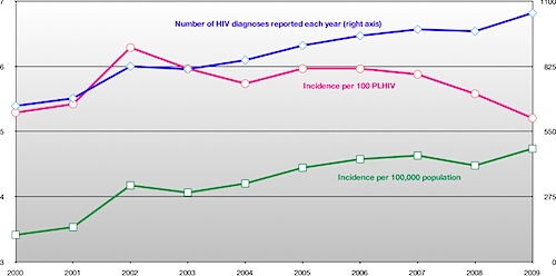
Indeed, there was a rise in HIV diagnoses last year, and we’ve crossed the seemingly symbolic 1000-cases barrier, and that is of course significant cause for concern. But HIV diagnoses have been up around the 1000 mark for several years now, and deaths from AIDS are at an all-time low – just nine people were reported to have died from AIDS-related causes in 2009, a piece of good news that the media has pretty much ignored. Because of this, the number of people living with HIV in Australia has risen every year, and so the number of new HIV diagnoses should be read in that context.

The chart below shows what happens when you do. The blue and green lines show the number of HIV diagnoses per year since 2000, and the consequent raw incidence rate per 100,000 population. The pink line shows the raw incidence rate per 100 people living with HIV, and shows a clear downward trend since 2005, as HIV infections have not risen in proportion to the number of positive people living in Australia. (Click the image to see a larger version).

hiv-2010.png

To my mind, this is a significant piece of good news that the media has ignored. But that’s not surprising as NCHECR’s annual surveillance report doesn’t include this measure, making a ‘bad news’ interpretation of the data almost inevitable.

That falling pink line suggests that positive people are succeeding in preventing onward HIV transmission. With a larger HIV-positive population, you’d naturally expect more HIV transmission to occur, yet this isn’t happening.

If this falling incidence rate were acknowledged, we could begin to ask why it is so. What has changed since 2005 to reduce HIV incidence, and how can we extend that success? Reported rates of unprotected sex among gay men have risen during that period, so how do we explain this apparently contradictory effect? These are important, and potentially valuable, questions.

HIV incidence is falling, not rising, when you take into account the growing positive population. This is something we should be celebrating, and for which positive people should be congratulated, instead of focusing on raw numbers that give a skewed perception of the epidemiology of HIV in Australia.

There are several caveats to the data I used for the chart. Most of the data came from the published NCHECR surveillance reports, which can be found here and from ABS population data. The 2010 report isn’t up yet, so I have taken the figures for 2009 from today’s media reports. And as I say, I’m no statistician, so I will accept criticism of my methods with my usual sanguine humour.

Tagged , , , ,