Home Reno
Living with a toddler and nice things.
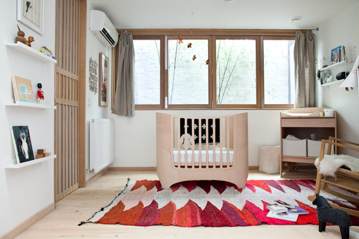
I’ve been meaning to write about this subject for some time, but between summer and the Nakashima exhibition, we’ve been in a bit of a whirlwind. We haven’t shared much of our house yet, mostly because we are still settling in! It takes quite some time to feel comfortable putting art up (or acquiring it) and finding special textiles that take a space to the next level of homeyness.
We have a flex space that is currently Elodie’s bedroom (she’ll move to another room once either a) another baby comes along, or b) she escapes her crib and becomes ready for a big kid bed. She has been sleeping in here since December but we’ve only just felt like the room is complete. It’s a small space that is ALL windows and doors. So that makes for a challenge when it comes to shelving and art. I think ultimately though, this isn’t a play room. It’s a sleeping space and needs to be calm and minimal. There is a nice pop of nature out the window (in Canada you legally need to have an operable window in each bedroom, so Studio Junction made a clever little courtyard, where we are in the process of planting some bamboo).
The second we saw the Leander crib and change table we knew it would be perfect for our new home. I had some serious baby brain going on when I put it together but the craftsmanship is really solid and it’s wearing really well despite the odd bite mark around the edges. We invested in the bed because it also turns into a toddler bed, by expanding by about another foot and a half. The only worry I have is that if I turn it into a toddler bed now, we’ll eventually need another crib. I wish buying the toddler bed wasn’t as expensive as buying the crib. If anyone in the Toronto area is selling or sees one for sale, let me know!!!

We found this mobile via Remodelista (oddly I cannot find the post) and ultimately bought it from the maker as the store they had linked in the story didn’t ship to Canada. Another piece that is perfect for both a baby and an adult space (would look nice in a sheltered garden for example).
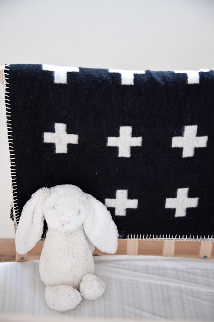
Pia Wallen Cross Baby Blanket is now available at Mjölk (though may not be online yet). Adult version also available.
Bunny was a birthday gift from a very lovely customer.
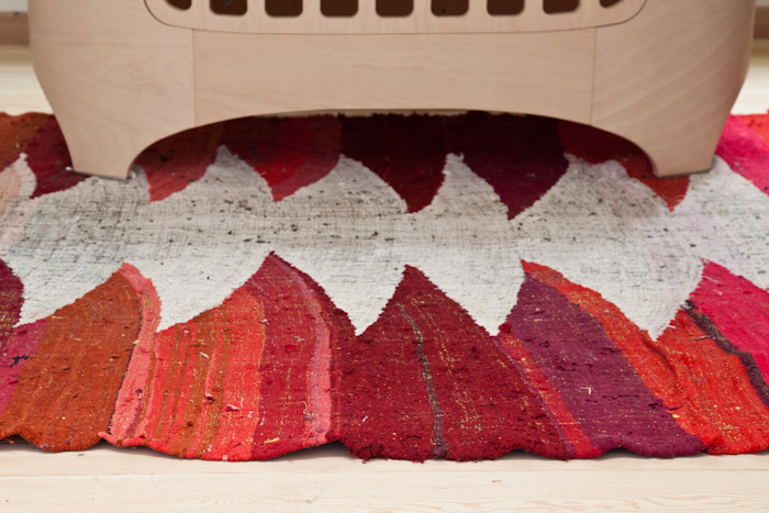
This carpet we bought via Etsy. John was looking for Moroccan rugs and this was added while he was lurking on a page. It jumped out at us for Elodie’s room. Since she lives in a pretty neutral world, we thought it’d be that extra punch of colour necessary to make it a less serious space. And even though it’s kid friendly, I think it’s a rug she could love and use into adulthood (that is, after her inevitable rejection phase).

Needing some storage we turned to the much loved Ribba picture shelves from Ikea.
Painting at top was commissioned by Melinda Josie, of our cats. The elephant picture was made by our friend Hollie as a birthday gift. The wood blocks with Elodie’s name are from our friends over at Ltd. Supply Kitchen Brewery (ok, they are our besties, but check out what they are up to if you’re into craft beer).

The Muji CD player is the perfect little thing for a nursery. The giraffe was a surprise gift from Jake of Machine Age Modern. Some vintage and new Moomin books. A Dala Horse from our wedding. The Chalk Piggy Bank was bought from Ladies & Gentlemen Studio (wow they’ve been busy!). Monkey is from our first trip to Copenhagen together. String is from when we tried to sell it in the shop but it proved too complicated. Portrait of us (just pregnant and not knowing it) is by Phillipa C in collaboration with what was Russet & Empire, during the first Junction Design Crawl (mark your calendar, next one is Friday August 23rd!!).
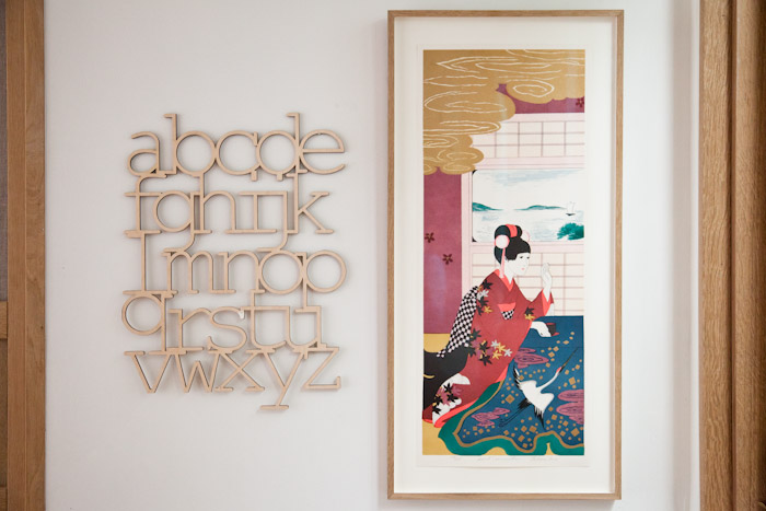
On the left was a gift from Arounna and John of Bookhou.
The print on the right is a signed and numbered lithograph that I coincidentally bought on the same day the rug arrived. Serendipitously they have the same colour scheme and sealed the look for the space. I happened to wander over to Williams on Keele, and as I was chatting away my eyes kept scouring. The print was originally in a fake bamboo style frame and I could only see a part of the gold section – somehow I knew it was a Japanese print worth checking out. I asked to look at it and was shocked, $45! I NEVER luck out with finds like this. Honestly, we debated putting this piece in our room, but Elodie liked it from the get go. She gave it a kiss.
We immediately took it to our new framing friends over at The Gilder. It costs a bit more to get a custom white oak frame but so much better than all the generic styles that are readily available.
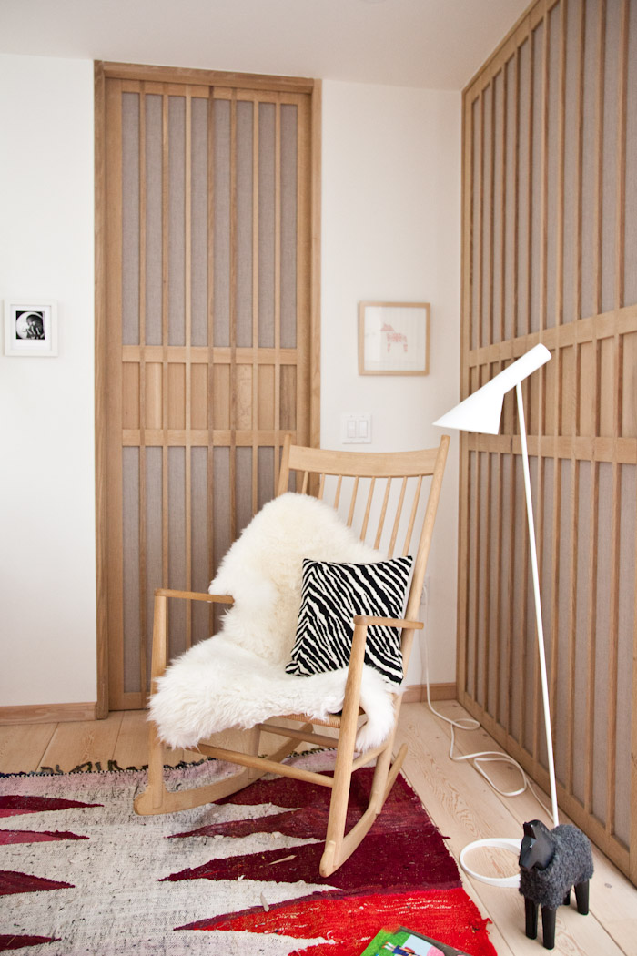
The Hans Wegner J16 rocking chair and Artek Zebra Pillow. We use this rocking chair every day, and once this room is no longer a nursery, it will most likely move up to the cottage to continue to be enjoyed.
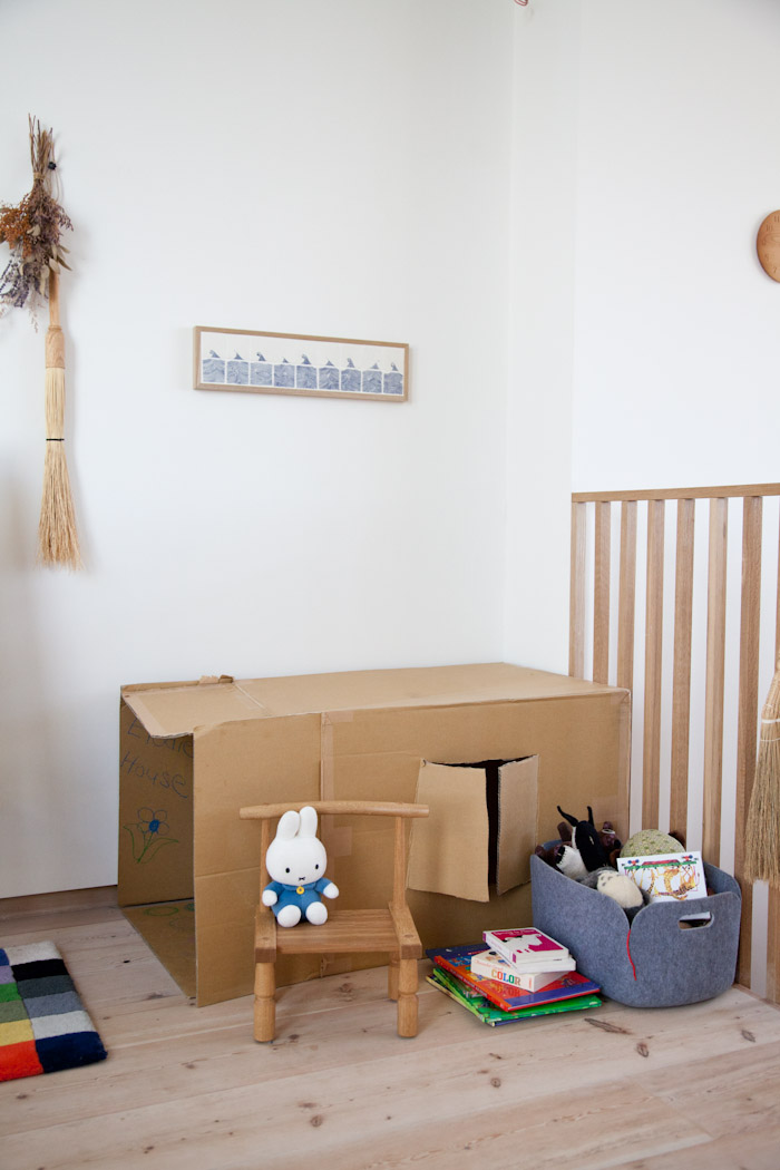
Moving away from the bedroom, we all know kids stuff gets everywhere. I was starting to feel like we have too much stuff, but have realized we barely have anything. We have two bins and half the stuff is for babies. Elodie doesn’t slow down much to play anyway. She likes running around and practicing skills like climbing up and down. So books and balls and babies are the only things she really interacts with (not even blocks!). The above cardboard box? Needs to go in the recycling…she’s over it.
Elodie loves her chair by Tomii Takashi. It’s the perfect size.
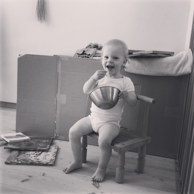
Not pictured is the Ikea easel, for colouring….
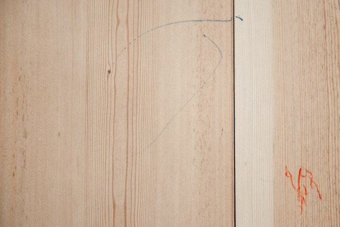
And yes, she colours outside of the box. This has been like this for weeks too. Ohhh we are certainly not perfect over here!
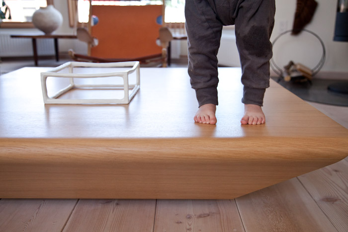
The Brasilia coffee table by Claesson Koivisto Rune is a perfect sort of coffee table. Soft rounded corners and hollow means we don’t have to worry about bumps on the head. Except when she climbs up onto the table and jumps off, a constant fascination.
She barely pays any mind to that Masanobu Ando sculpture. And if she does we just take it and move it up high. But generally she’s not all that interested in the stuff around the house. Now that’s obviously her personality, and not all kids will act this way. I find that she gets into trouble if she’s bored or tired.

In the living room there are some low shelves for Elodie’s toys.
Shhh sleeping bunny. Also, banana hands, everywhere, always.
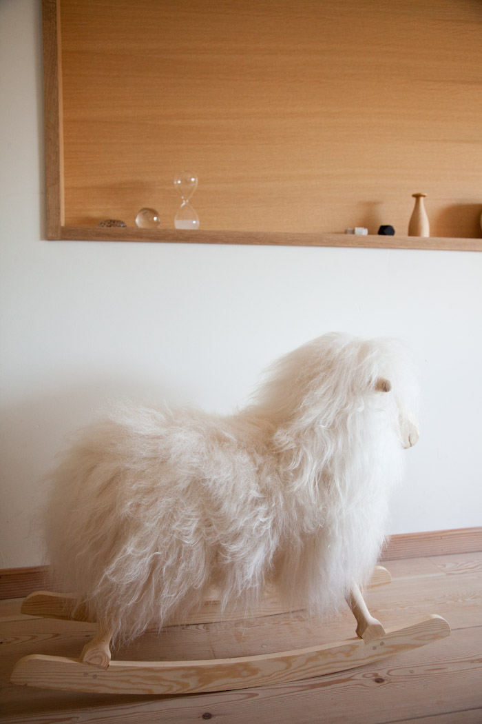
Finally on this not so kid friendly yet kid friendly home tour, the rocking sheep (contact us for info, not on website), which for some reason ended up in our bedroom but has yet to leave. And really, it’s quite nice in our room. A touch of kid in an adult space.
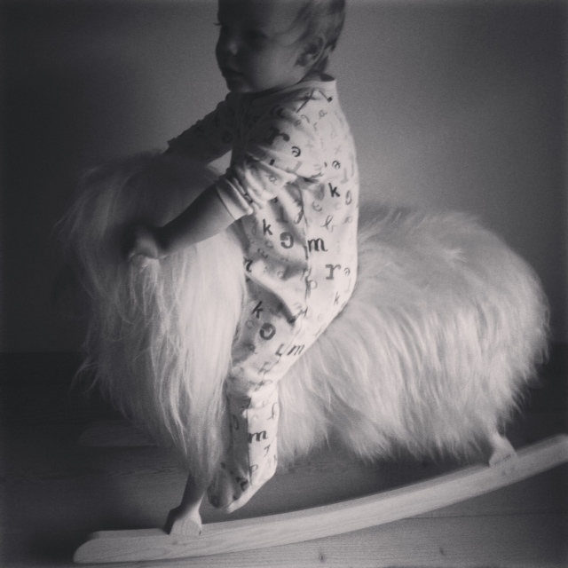
Note: Based on this post it seems like we get a lot of free stuff, but it’s not usually the case. Babies bring the love.
Alvar Aalto tea trolley and tiles by Atelier des Cent-ans
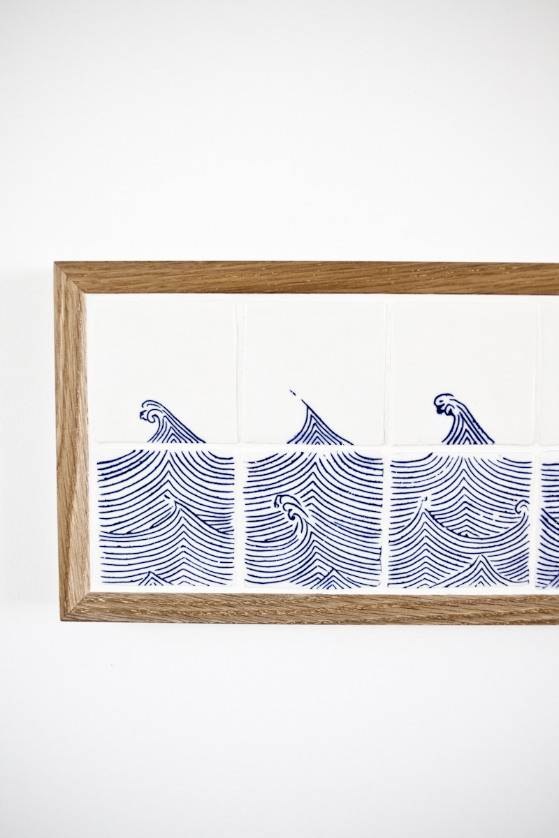
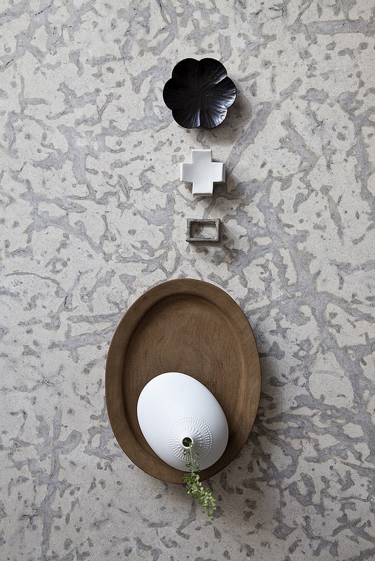
It’s another busy week here at the Kitka/Mjolk homestead. We’ve finally gotten to a place where we can start putting our nice things out permanently and hang pictures on the wall. We’ve been working on a little vignette across from our dining table with our baby high chair and Aalto Tea trolley. It all came together after our acquisition of the above tile work by Renaud Sauve (Atelier Des Cent-ans). We commissioned the piece last time we saw him back in the winter, and he dropped off this beautiful work when he came back to Toronto for the spring One of a Kind Show.
He also brought us some new pieces that were not shown at the One of a Kind Show, so if you had the opportunity to see his beautiful booth last week and didn’t get your hands on a piece of his work, don’t fret. We have some amazing unique works for you here at the shop!
The tiles are made of porcelain and feature a hand “tattooed” dyeing technique which originates from Korea. The white oak frame was made by Renaud’s partner Gilbert Garcia.
Very Japanese, but uniquely Renaud.
Some more treasures: Japanese indigo coasters and a birch sake cup by Kota Fukunaga (who we represent at Mjölk). Also, some Swedish matches from our last trip to Stockholm.
Little by little the place is coming together.
Our bedroom this morning
Hello everyone, I hope you all had a nice weekend.
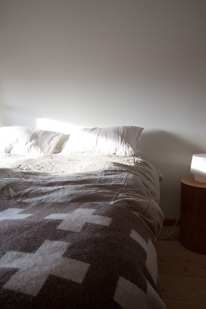
We get some nice light in our bedroom, so I thought I would take a couple of snaps to share it with you this morning. When we first moved into our home, the upstairs kitchen and living room still were being renovated, so our bedroom became our sanctuary and we kept it nice and tidy while the rest of the rooms were filled with boxes or being worked on.
We’ve developed such a connection to this room that we find ourselves having lunch or a spot of coffee here like we did those first few weeks of moving in.
We lovingly refer to this floor as our apartment. A habit I don’t think we will ever shake.
Rough linen sheets, and Pia Wallen Crux blanket.
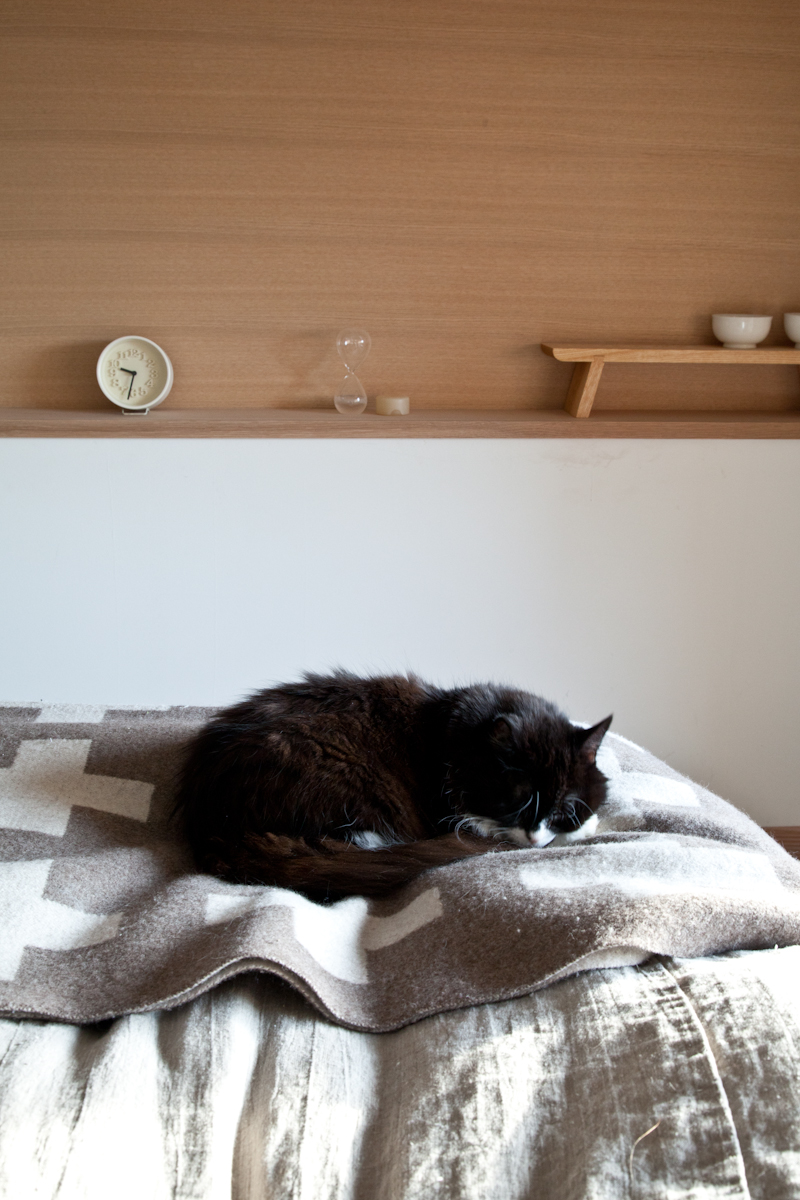
A permanent fixture in our bedroom – Isha.
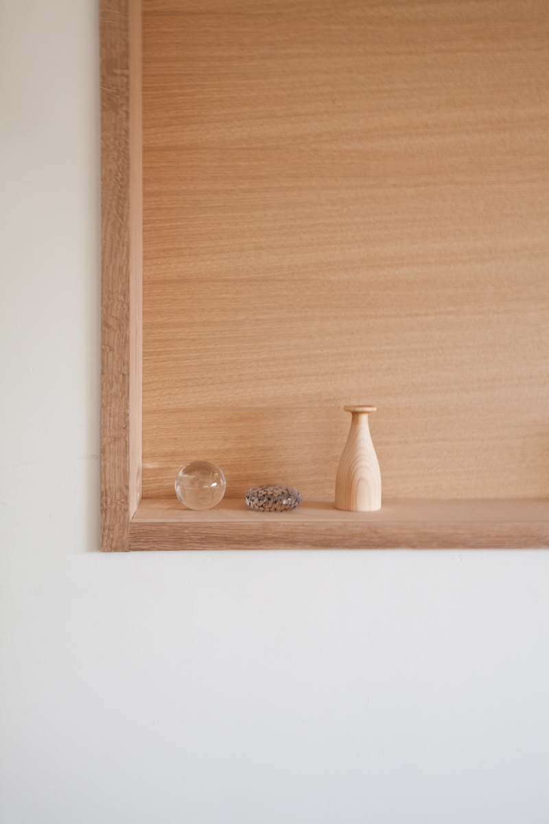
My brother gave me this beautiful Hinoki cedar wood aroma diffuser. It makes our room smell like a Japanese spa. The other little objects are glass paper weights by Tsuji Kazumi.
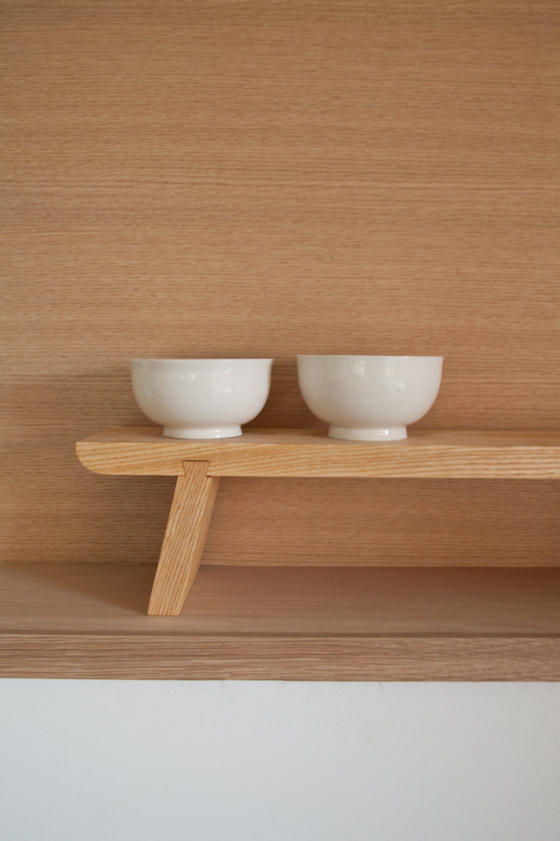
A set of bowls by our friend Renaud the potter (Atelier Des cent-ans).
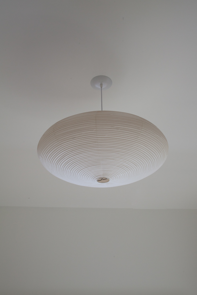
Did you know we carry Noguchi lights at Mjölk? We don’t sell them online by request of the manufacturer, but we have some beautiful specimens in our showroom right now. This light we specially ordered for the bedroom because it’s the same one that adorns Mirei Shigemori’s tea house.
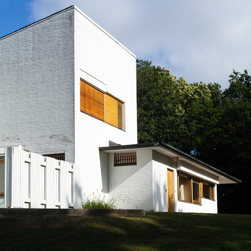
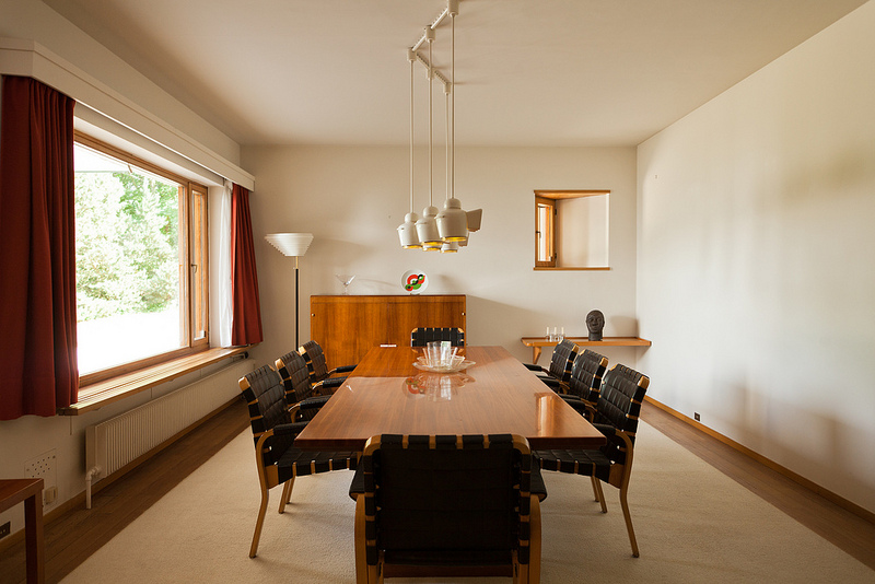
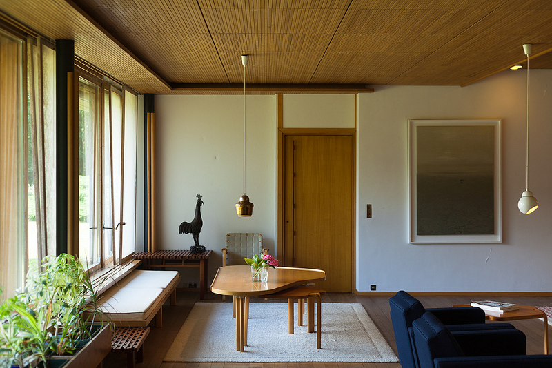
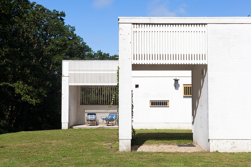
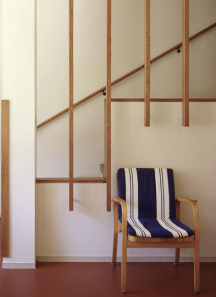
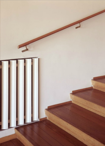
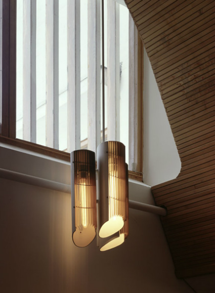
Maison Louis Carré by Alvar Aalto
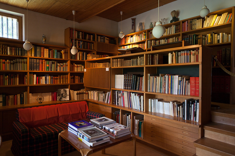
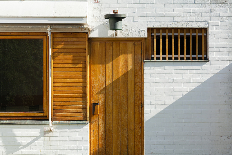
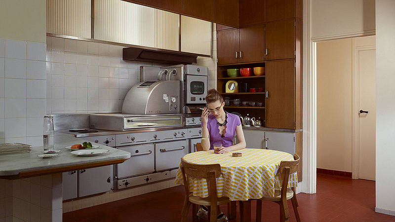
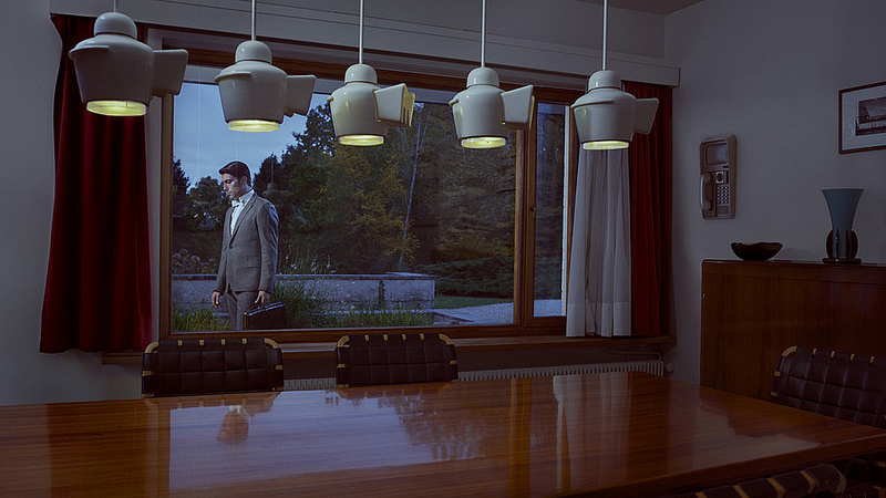
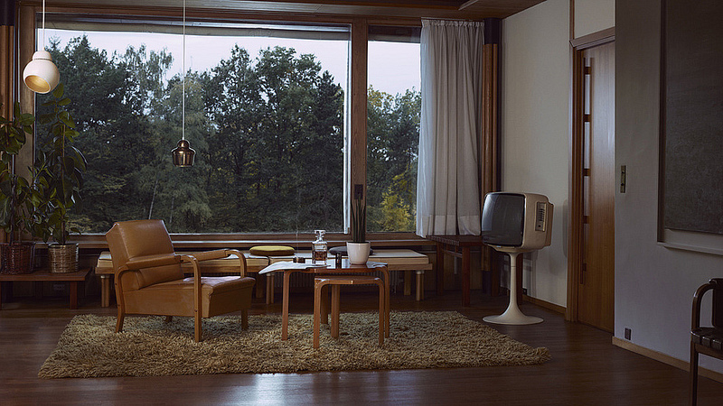
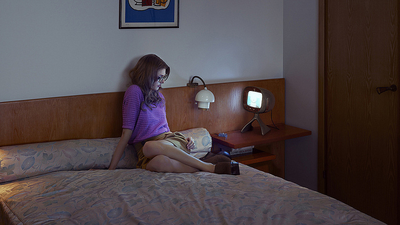
I was having a conversation last week about my favourite architect Alvar Aalto, and as I chirped away I mentioned the very beautiful details of Maison Louis Carré. I’m usually not one for taking others photographs and putting them on Kitka, but I’ve been compiling some inspirational photography to keep as a reference for our own home and I felt compelled to share with you these beautiful photographs.
Each set actually comes from very different places:
The first is by Doctor Casino – a Flickr user who has a wonderful eye for architectural photography.
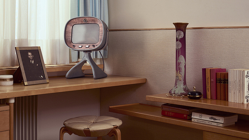
The second was pulled from the Maison Louis Carré website.
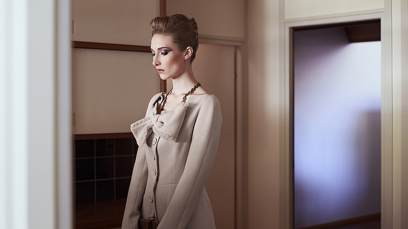
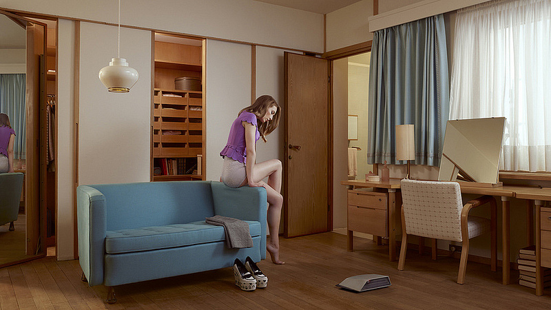
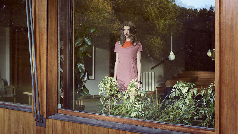
And the third – a contemporary fashion shoot by photographer Ben Sandler.
The home itself was completed in 1959 for very famous art collector Louis Carré. Aalto was asked to make a family home in the French country side with an incorporated gallery. Aalto felt that both art and family life are not separated by one and another, in fact the tendency is the reverse. There is a very intimate connection between them.
The other stipulation the client asked of Aalto was that the home be made of materials that had lived.
This was a task that Aalto was pleased with. He sourced the stone work locally from Chartres, and treated the brick with a white plaster lime-wash. The exterior was completed with copper sheeting, pine, and a slate roof.
The exterior is perhaps one of Aalto’s most extensive with regards to landscaping – carving down the elevation from the back of the home like waves creating a visual downward movement.
The elements on the inside are just as beautiful as the exterior.
Let’s take a look…
An armchair 406 in natural leather.
Many of the lighting fixtures were produced specifically for this project.
A room surrounded by books was very important to the client.
The exterior with lime-washed bricks.
The elevations in the landscaping.
Above photos by Doctor Casino.
—————–
Some details worth taking a close look at.
Above photos from: http://www.maisonlouiscarre.fr/
——————–

This collection of photographs was something I’ve had bookmarked forever, and since it was featured in so many places I didn’t think it was necessary to share them. However, if we’re compiling photographs of Maison Louis Carré, it would be a sin to not include this set.
One of my favourite pendants, the turnip light. I’m hoping Artek will put this back into production at some point.
Photography by Ben Sandler
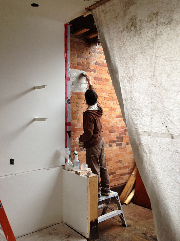
Just in the midst of finishing up this post our Lime-washer Ben, who is actually from Britain started lime-washing our own exposed brick wall. The elements of wood, copper, and white lime plaster are all inspired by Aalto’s natural palette and we’re excited to incorporate these elements in our new home.
I can’t wait to see what it looks like when it’s all finished.
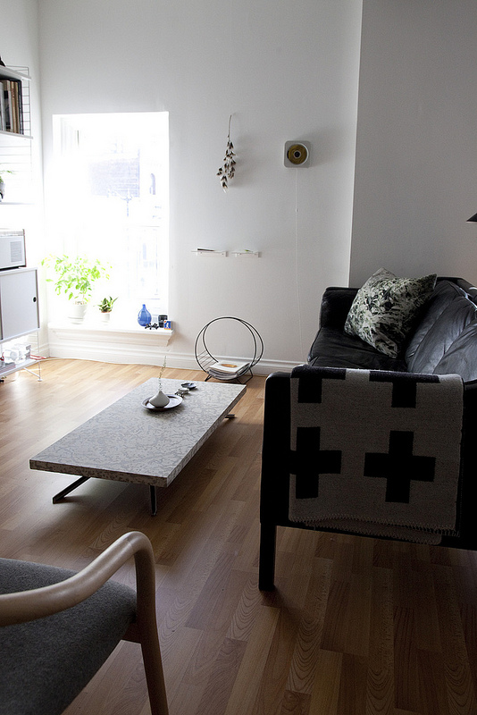
New coffee table
I hope everyone’s week is going well. I’m sorry for our blog neglect recently, we are so close to having the baby and there are so many loose ends to tie up before her arrival. Something we’ve been meaning to share with you all that we needed to clean the apartment up first to photograph is our new table by Winnipeg based architect and designer Thom Fougere.
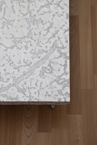
You might recognize it from the IDS coverage we did this year, the beautiful Manitoba tyndal stone was unlike anything we’ve ever seen. We asked Thom during the event if he would consider selling us his prototype, I think our enthusiasm paid off and he accepted.
The table is nice and low, so when you stand over it the stone looks as if it’s hovering above the steel structure.
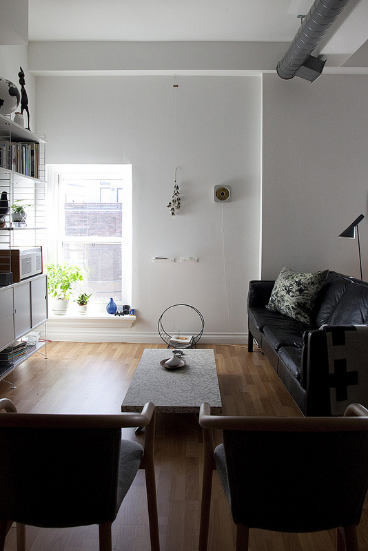
This is our view of it from the sofa. Don’t worry, we have some very nice Pia Wallen felt coasters that will keep the top looking nice and crisp for a long time.
Nesting Part 1: Bringing in some nature
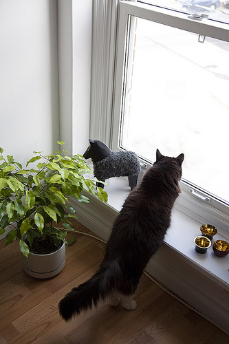
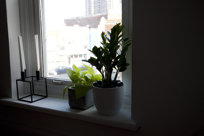
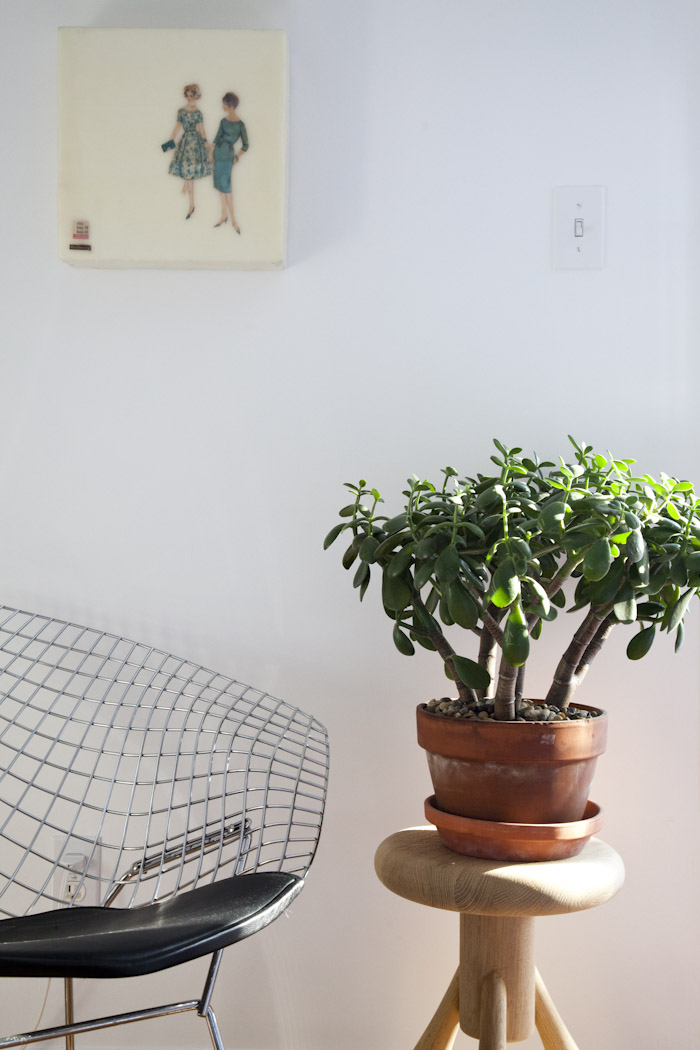
Recently we found out that because of the delayed permits, our renovation is not going to be complete until the fall. As a result, we figured we better make ourselves feel more at home in our temporary apartment, because we’ll be spending a lot of time there in the early baby days. So the first thing we did was head over to ecostems to buy some plants!
On the left are some special edition Kin tea light holders by Claesson Koivisto Rune. Seventy-five were made for disaster relief in Japan through the shop Sfera. Coated with traditional Japanese Urushi, we have a black, red and green version.
Large furry Dala horse was bought off Ebay.
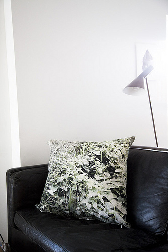
On the right is a Pure Nature Pillow by Dorte Agergaard. We will have more stock in the shop soon (we just need to order pillows for the cases).
Encaustic artwork is by Beverly Owens.
Photographic artwork is by Joshua Jensen-Nagle (our first art purchase).
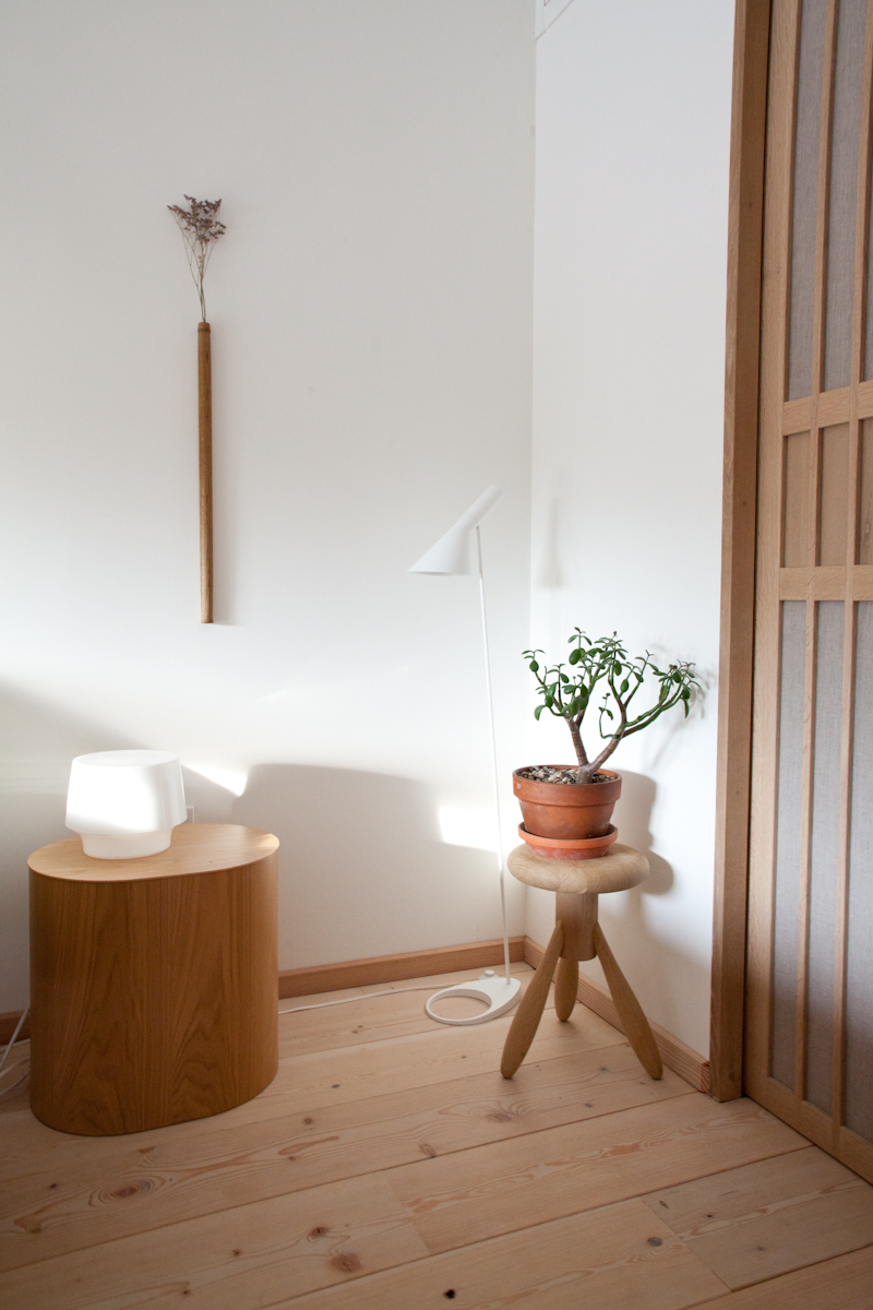
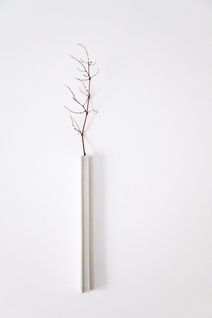
We bought this wall vase by Masanobu Ando on our honeymoon in Hokkaido. We will be hosting Ando-san on February 23rd at Mjölk for an exhibition of his amazing ceramics. We’ll post the invite this week!


