Collaboration: Walkman vs. iPod

I get this email every day with an excerpt of something interesting from delanceyplace.com. Usually I delete them without reading because however interesting it doesn’t seem worth the few minutes it would take that I would be stealing from something else that requires my time (story of my life). Today, though, I read the email, which was delanceyplace.com 10/5/12 – sony’s walkman vs. apple’s ipod. Give it a look. It’s an excerpt from a book on collaboration and shows how poor collaboration skills caused Sony to totally lose in a space they should have dominated.

I’ve been thinking a lot about WordPress on my leave (Yes, I know I started leave a month and a half late and am supposed to be thinking about other stuff. Shut up.), and a lot about perceptions of .org vs. .com, and about why there’s a “vs.” in that phrase in the first place. It’s not helping users of WordPress, and it’s not even helping those of us who make such a big deal about the differences. It’s just creating factions.* Going to try to get my thoughts on this in a more coherent format in time for the summit, so hopefully one of the topics we look at can be how to move forward collaboratively instead of competitively.

* – If I can work in any analogies with the factions from the Jane True series that Ryan, Andrea, and I all love, I totally will. If I lived in Jane True’s universe, I think I would turn into either a dolphin or a sea turtle. Halflings rule!

On Negativity, Part I

How many times a day do you encounter someone being rude, mean, aggressive, or telling you that you did something wrong because it wasn’t what they wanted? How often is that person you (acting that way toward someone else)? I deal with a lot of negativity in my job — with a community of tens of million users, thousands of professionals, and hundreds of contributors, there are always people who are dissatisfied. Now that I’m also running a cafe, it’s a dozen times worse (if you can imagine). Every day I encounter mostly wonderful people, and it sucks that even one negative encounter can throw off your whole day. Even worse, it sucks that being treated negatively can cause you to act in a similar manner, thus spreading the nastiness. I know I’ve been guilty of falling into this more than once.

Years ago (decades ago?) there was a Dykes To Watch Out For strip titled “Horizontal Hostility” that hit me like a bus and has never left me. Sadly I can’t find the strip online, but the basic plot was that each panel showed a different character in an interaction gone wrong. An old man yells at a kid for knocking over the trash cans (or something — it was 20 years ago, cut me some slack) in one panel. In the next, the kid throws a tantrum or breaks a window. In the next, the person on the receiving end of the kid’s hostility in turn gets snippy with a friend. Then the friend yells at… you get the picture. In the last panel, the hostility has gone full circle, and the old man is on the receiving end of someone’s else’s hostility, hostility that started with him.

There was a lot of meanness 20 years ago — it inspired that comic strip! But that was all in-person interactions. Today, it’s so much easier to be mean. People type things about other people on the internet that they would never say to your face, whether it’s on a forum, a blog, Twitter, Facebook, Yelp, or any of a dozen other social media sites. But why? If they really feel that way, why don’t they have the guts to stand behind those feelings/opinions and say it to your face?

In some cases, people don’t have the opportunity to be mean in person, because they are geographically distant. This is often the case around sniping in the WordPress community. Meeting at a WordCamp and sharing a drink or two can usually resolve even the meanest snipefests. In person it’s a lot harder to lob fireballs at someone, because you can see the expression on their face when it hits, and you don’t feel clever or smart then, you feel mean. Most decent people do not like being mean when they realize they are hurting someone’s feelings. But what other outcome is there? That being mean will make someone feel good?

I think most people consider themselves to be decent people. And yet, there’s another social construct that reinforces the mean behavior, in that telling someone they’ve hurt your feelings is seen as weak and/or manipulative. Why has it evolved this way?

I had a roommate once upon a time who worked for United Cerebral Palsy. She came home every day upset because her client/patient had been mean to her. He was a dick! A dick with cerebral palsy, so she didn’t feel comfortable being mean back. One day when he bitched at her while she was helping him onto the bus, she replied, “You know, that really hurts my feelings. I’ll be upset for at least 2 days because of what you just said about me.” He shut up. I remember thinking (when she told me the story that night) that it was a bummer that she had to be manipulative to get him to be nice. A decade later I thought what a bummer it was that my reaction to someone expressing their feelings was that it was manipulative, when in reality it was honest, and kind of seriously brave, given the potential for retaliatory mocking. And you know what? The next day the guy went back to being a dick, and she told him every day that he was hurting her feelings. He didn’t care. He wasn’t a decent person.

I had an illustrative experience at a WordCamp with someone who’d said some nasty things about me (mostly on Twitter). I made sure to meet this person at the afterparty — in truth, I’d gone to this particular WC expressly to meet this person and see if we could work out a more constructive way to communicate when he didn’t like my/core decisions. We ordered a round of drinks and were being friendly when I took a deep breath and asked him why he was so mean to me. He tried to laugh it off, but I kept going, and said he’d hurt my feelings. I could tell by his face that he didn’t like hearing that, but he kept up the cheerful demeanor, said he was sorry if I took it that way but that he hadn’t actually been mean. Then I opened my laptop and showed him my browser, where I’d pulled up the meanest dozen or so tweets. I read them out loud. Immediately, I could see that this decent guy didn’t like/was embarrassed the words he’d posted. The next couple of minutes were awkward and uncomfortable as we had to face the things we’d said online, and how much we were or weren’t willing to stand behind them. We’re friends now. But if we hadn’t met in person, if we hadn’t had that awkward and uncomfortable experience of having to be honest about who we were and how we felt, could we have gotten past the online sniping to talk seriously about WordPress and the issues that were causing a problem in the first place?

I’ll say it again: Most decent people do not like being mean when they realize they are hurting someone’s feelings.

The next time you’re about to be snarky, or snipey, or just plain mean, think about that. Are you a non-decent person? Do you enjoy hurting people’s feelings? Do you want to have a negative effect on the person you attack for days to come? If the answer to these questions is no, then think before you tweet or post to facebook or leave a comment, and make sure your words and tone are the same ones you would use to the other person’s face. I’m going to try harder to make sure my words match my feelings. A smiley face after an insult doesn’t make things right. If you consider yourself a decent person, then be one. 

Oops, Ignore!

I wrote this long post this morning, then went looking for an old post to see if I’d written about it before (I thought I might have but couldn’t remember). I went to edit.php to see if any titles looked like they might be about that topic (horizontal hostility). Quickly glanced through each and closed. On one though, I saw a typo in the 1st line and fixed it (ordCamp instead of WordCamp), then clicked the Update button. At least I meant to… I then noticed that it was actually the Publish button and that I’d just published an abandoned draft from a past wp community kerfuffle. Even though the screen hadn’t refreshed yet and the spinner by the button was still spinning, on the backend it was published, and Jetpack sent all my subscribers the draft by email before my screen even stopped spinning so I could click Trash. Gah! Apologies! Didn’t mean to stir anything up, it was an accident. That’ll teach me not to clear out the drafts folder more regularly.

Please ignore the emailed post titled “Seriously?”

Thanks much.

Baby Sea Turtle Hatch

As many of you know, I’m one of the volunteers with the Tybee Marine Science Center’s Sea Turtle Project. This involves dawn patrol on the beach checking for turtle crawls in nesting season (May-August), nest sitting during the hatch windows, and being around for crowd control and assistance during hatches (until October).

Last night, I was headed down to the beach at 7:45 for a planned release of some loggerhead babies that had hatched in the morning and were taken off the beach for safety. Most of them hatch at night, when there’s less chance of immediate predation (seagulls etc) or being stepped on by a beach swimmer. When I arrived at the nest, one little guy (well, probably a girl, given our high temperatures this summer — sand temperature is a determiner of sex) that had still been in the nest throughout the day had poked its head out, and after about 40 minutes had saved up enough energy to emerge fully and begin its journey to the ocean and eventually the (Sargasso) Sea. It took about 15 minutes once the first flipper was out, and since it was still light out, I was able to catch it all on my iPhone.

The reason it was unusual to be able to film this trek is that when they hatch at night, we don’t allow lights on the beach except for red filtered or infrared light, because the turtles use the reflected light off the ocean as a guide and flashlights or other artificial lighting confuses them and they go toward the lights instead of the ocean. We don’t pick them up and carry them to the water because the crawl across the beach is an important strength-builder — they’re going to be swimming for 24 hours straight once they hit the water! Also, not enough is known about how their brains imprint on their natal sand, but sea turtles return to the beach where they were born to lay their eggs, so it’s important to let them do their thing.

About 1 in 1,000 babies like this one will survive, though other estimates say that’s just the first year and it’s more like 1 in 4,000 or up to 10,000 for reaching adulthood (source numbers vary, and remember that sea turtles live a long time when they do make it). Each nest contains around 100 eggs, and we have 23 nests on Tybee this year. Will this one be one of the ones that make it? Odds aren’t good, but I’m always hopeful.

What can you do to help? Support conservation groups. Stop using disposable plastic (to-go cups, straws, saran wrap, etc). It mostly ends up in the ocean — it looks like jellyfish (a main turtle food) in the water and turtles eat it, which can kill them.

For more information about the sea turtle program, please visit the Tybee Island Marine Science Center.

Wishlist: P2 Template Plugin

I have been wanting this plugin to exist for something like 2 years now. If someone would be so awesome as to make it, that would be fantastic.

P2: A theme! A theme with a bunch of functionality in post/comment display that has nothing special going on in the layout or branding areas. It’s all about the content area (and an associated sidebar widget or two).

Other Theme(s): A theme! A bunch of stuff going on in the layout and branding department areas, but no great auto-display functionality in the posts/comments area.

The Dream: Make a plugin that will take the P2 functions and post/comments display within the content/loop area and create a template within your existing theme that keeps your header/footer/sidebar bits but subs out the P2 stuff for your default content area, and applies the stylesheet from your own theme but creates whatever additional classes are needed for the P2 display.

Why: Because P2 is good for conversations and planning, but not for marketing or straight information display. Other themes do that better. But what about when you have a business website (total custom theme usually), but would like the blog you have on one of the pages to be P2 style? What about event sites, that need specialized templates for schedules, attendee listings, and the like, but have planning blogs that would be best served up P2 style?

I would install this plugin on every single site I set up, and would use it as the Blog page template when there’s a static front page.

This is an idea that is long overdue. Would someone please make it a reality? Thanks ever so!

Jitterbug Playlists, Take II

The speakers are finally hooked up throughout the Jitterbug, and PlayMySong is up and running. Woohoo! Haven’t put much music on the iPod attached to it yet, since in the meantime I was just streaming kexp or Pandora on a dock speaker, and it’s time to load it up. I’ll be adding a bunch of songs and albums this weekend (and thank you everyone for your suggestions last time around), but I was thinking it might be fun to feature some playlists from all my favorite WordPress people. So, say, someone could come in and listen to Ipstenu’s playlist while we troubleshot their broken blog, or Jaquith’s playlist while digging into some custom code. Even better, since people could potentially submit multiple playlists, someone might choose from Ipstenu’s Rock Out playlist, Ipstenu’s Relax-o-meter playlist, Jaquith’s Morning Mix, Jaquith’s In the Code Zone playlist, whatever.

Your challenge: Put together a playlist of about 90 minutes (20-30 songs depending on their length) that has a common thread to the songs, be it genre, tempo, cheering-up-factor, memories from your senior year, whatever. Basically, make a perfect mix tape. Give it a name. You can make as many of these as you want!

Put it/them in a comment on this post, or if you are shy, you can send it to me using the contact form on this site (or email me). Playlists MUST be about 90 minutes in length. Lists of albums or too few/too many songs will not be considered a playlist. I would love to have playlists we could put on from all the people I see at WordCamps, people who backed the Jitterbug, and people who are contributing to the WordPress project. My personal musical tastes bear some weight here, so know that I am unlikely to put death metal, contemporary country, or Christian rock in the rotation. (Punk, Americana/old school country, or gospel would be okay, though!)

Playlists, playlists, playlists!

And yes, once everything is all loaded up, you would be able to activate your playlist from where you live using the app. :)

Breaking Into a Lock

I wanted to have some books at the Jitterbug on the shelf by the couches. Since my mom moved down here in October, I’ve had boxes of books sitting in a $65/mo storage unit one island over…mainly because I lost the lock combination. A friendly neighbor came over with bolt cutters, but the way the storage unit lock protector is designed, bolt cutters don’t fit (which makes sense, in retrospect). The storage unit people said to get a lock cut off they had to call a locksmith for $100. I turned to the internet.

There are a lot of videos out there on how to break into a Master lock. Cutting up a soda can to make a shim seems popular, but be warned: the new master locks have an anti-shim protection built in (not that I tried this method, since I don’t have any soda cans). The method I tried involved slowly making my way around the dial noting the natural stops and writing the points in the middle of each, crossing off the ones with a .5, and of the ones left discarding all those with the same last digit. This left me with the 3rd digit in the combination. Then there was a chart to try various combinations. It took a total of about 3 minutes. I should have googled it sooner.

A Tale of Two Brothers: Plans, Construction, and Dev Styles

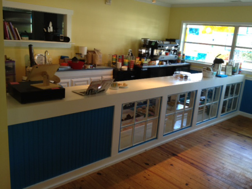
When we first moved into the Jitterbug building, my two brothers came to help fix it up. I wanted to get rid of the bar that had been in place before, and build a little bakery counter that would be a comfortable height for me to work behind (I’m short) and use some old windows I’d bought off craigslist to showcase the baked goods.

Brother #1′s Approach:

We can definitely build it. First I need you to figure out exactly what size you want it to be, where the windows should go, and draw me up a plan — a basic blueprint to work from. Then we can look it over and figure out what exactly we’ll need and then we can put it together.

Brother #2′s Approach:

Counter about this high, stretching across this space, and using as many of those windows as we can fit in, with a shelf inside and some kind of back covering to keep dirt away? Yeah, I can do that. I’ll do it right after I finish this other thing.

Jane: But, Brother #2, don’t you need a plan, a blueprint?

Nah, I know what you want. If it’s not exactly what you were thinking as we go along, we’ll just check in along the way and we can always redo a bit if I don’t do it how you pictured it. It’s not rocket science, you’ll be happy with the end result one way or another.

Guess which brother was in charge of building the counter? Brother #2. Brother #1 worked on it as well, and so did I, but Brother #2 was ready to jump in and rough it out to move things along quickly. He had no compunction about ripping something out if it didn’t work the way we intended, and embodied the idea of prototyping into iterative improvement/development so completely that I couldn’t help compare this experience to working on WordPress.

There are two schools of thought among WordPress core developers, it seems — the coding equivalents of Brother #1 and Brother #2.  Brother #1 in core terms would be asking for wireframes before writing a line of code, and for everything to be completely figured out in advance. Brother #2 would be more of a jump in and get something started kind of dev, who prototypes using his best judgment and solicits feedback on design aspects as the build itself comes together and can be experienced as a prototype.

When I started working on WordPress, it was mostly Brother #2s. If I said an idea in skype or IRC, someone had it roughly coded to look at before the rest of us were even done talking. Lately, it has felt like we’ve shifted more toward Brother #1s. Statements like, “We need wireframes,” or “You have to decide exactly how you want it to work,” come at me in IRC and Skype, making me a bottleneck and a gatekeeper to development. Yuck!

I don’t want to make any more wireframes. Period. 10+ years is too much. I don’t mind doing up a sketch now and then and putting it on Trac, but I’d like to see more of a return to Brother #2 style development. (There are definitely some in core who do work this way currently.) Just start prototyping. Better UX decisions will almost always come from playing with a prototype vs just imagining with pen and paper (or computer and mouse/wacom). That’s not to say there isn’t a place for specs — when there are a lot of developers working on something, a spec is really useful for keeping people on the same page. But that spec could be as simple as a written description of the feature or change that’s archived and updated as the project evolves.

I did a lot of wireframes in the beginning with WP. In 2.7 we had the Crazyhorse wireframes, which Liz and I did to communicate something totally different to developers I’d never worked with before. In 2.8 with widgets, I did them because we were radically changing the UI, but even more because the underlying widgets code was so sucky that experimentation would have taken forever in a live situation and I didn’t want to put Andrew through that.

Since then, I’ve avoided doing many wireframes. I like it when the dev takes the first stab. Not only does it remove me as a bottleneck, it puts more UI/UX ideas into play before things get finalized. If I do wireframes, then the devs are basically just builders. Which some like, I know, but many want to do product design thinking as well. And really, even for devs that don’t want input into design, having a conversation with a whiteboard or doing a rough sketch is just about always enough for a dev to rough it in as a 1st pass/prototype.

Think about how fast we could go. In this example, we’re talking about doing an update to the way Gallery tab works.

Brother #1 Style: I (and/or some other UI people and devs with a UI bent) review what we have, look at what else is out there right now, get some community feedback, throw around some interaction model ideas, core group debates, pick one, wireframe/write spec, start the build.

Brother #2 Style: “Hey, let’s make the Gallery tab better! Here are the 3 things we want to solve in this iteration. Core people: if you have an idea of how to improve 1-3 of these things, we want you!” Core people discuss their ideas, those deemed of interest make a rough prototype, I/core team/Matt/whoever reviews proposals (in prototype and/or mockup form depending on skillsets), picks one to use as base, makes list (for reference) of what to change in next round to better address the goals, someone starts development.

In the Brother #2 scenario, there’s no initial ux bottleneck, more people have a chance to propose ideas, proposals are focused on solving specific issues (vs being everything cool we can think of), and the real development begins with something to look at/refer to already in place. In Brother #1 scenario, it could be up to several weeks before anything gets coded… the same amount of time it would take to do several rounds of prototypes in the Brother #2 scenario!

I forgot to mention: my counter came out awesome. Not exactly as I’d first imagined it, true, but it served all my goals, was attractive — I’d never even thought of using beadboard until Brother #2 told me to start putting it on the front panel — and I was really happy with the end result:
Jitterbug counter

The counter whose construction was led by Brother #2.

So: no more wireframes for me. Brother #2s, I’m at your disposal for ux feedback!

Proposing Navigation Changes

I just made a ticket on Trac with a proposal to address navigation in the WordPress dashboard. Here is the description.

  1. Explaining the difference between Posts and Pages to new users is time consuming and often frustrating. We’ve all done it, have our best/fastest version of the talk down pat, but it still takes longer than it should to get many new users to the point of understanding the difference.
  1. Back in 2.7, when we set up the left navigation we put Pages at the bottom of the content nav section because in testing 2.5/2.6 so many people complained about accidentally clicking Posts/Pages by accident because they were close together in the old UI and both started with P (blame it on capital_p). Because of this, Pages falls below the less-frequently accessed areas of Media and Links, and people don’t necessarily see it right away because they expect it to be higher up.

I’ve been testing out two changes to the left navigation aimed at reducing these two issues on my test blog for some time now, and have been using it during demos with both new and existing users to great success, so I think it’s time to propose it for core.

Change 1: Change the Posts label to Blog. All Posts can remain as is, or could be reduced to just Posts, since the reason we added the All in the first place was that Matt thought it looked weird to have the same word shown twice.

This change reduces the amount of time it takes me to get a new user really understanding the difference between posts and pages by about 75% (very informal testing, have kept track with about 30 new users by just keeping an eye on the computer clock to see how long it is before we move on). The dynamic blog/static site difference is much easier to grasp when they see that familiar word Blog instead of Posts because “posting” is an action that applies even to static content, and even posts are displayed in web pages (vs Pages).

Change 2: move Pages up the menu to sit below Blog, so the two most important content types are at the top. Since they wouldn’t look similar (ha ha capital_p) there would be much less risk of accidental misclick based on letter shape (poor manual dexterity would not be affected, but in that case those people are already clicking the wrong things, right?)

I’ve attached a screenshot showing what the navigation would look like with these changes.

screenshot of proposed navigation changes