Greyzed is dirty and grungy-looking—but that’s just what makes it so good! While it looks rough on the outside it’s been carefully designed and it isn’t short on features. Starting at the top, it has a really sharp drop-down menu ready for our menus feature. Visit Appearance → Menus and you can order the links here any way you like.

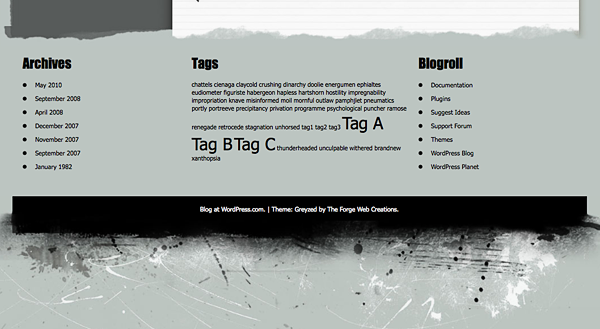
The distinctive Greyzed design elements are repeated throughout your blog and finish off nicely at the bottom of each page with an optional extra-large widgetized footer in the same tough style. Visit Appearance → Widgets and add any Widget to Footer Left, Footer Middle, or Footer Right, to create your own unique footer.

Quick Specs (all measurements in pixels):
- The main column width is
614. - The sidebar width is
275.